## Components - ribbon API skeleton
As the following sections will take a deep dive into how the ribbon is built bottom-up, here is a skeleton overview of how the ribbon is built top-down.
### Ribbon frame and ribbon
 The `AuroraRibbonWindow` is the only officially supported way to use the Aurora ribbon component. Its implementation enforces that the ribbon is always at the top of the window, spanning the full window width.
The `ribbon` parameter is a data class that describes the full content of the ribbon component.
### Configuring ribbon content
* The `tasks` property for the ribbon tasks
* The `contextualTaskGroups` property for the contextual task groups
* The `anchoredCommands` property for the anchored commands
* The `taskbarElements` property for the taskbar content, and the `taskbarKeyTipPolicy` property for the associated keytip policy
* The `applicationMenuCommandButtonProjection` property for the application menu content
* The `isMinimized` property to configure the minimized state of the ribbon
* The `onShowContextualMenuListener` property for the contextual menu listener
### Ribbon tasks and bands
Each ribbon task is represented by the `RibbonTask` data class. It has properties for the task title, the task's bands and others:
```kotlin
val pageLayoutTask = RibbonTask(
title = resourceBundle.getString("PageLayout.textTaskTitle"),
bands = listOf(clipboardBand, quickStylesBand, fontBand, documentBand, findBand),
resizeSequencingPolicy = CoreRibbonResizeSequencingPolicies.CollapseFromLast,
keyTip = "P",
isActive = (ribbonState.selectedTask == Task.PageLayout),
onClick = { ribbonState = ribbonState.copy(selectedTask = Task.PageLayout) }
)
```
The `AbstractRibbonBand` is the base sealed interface for ribbon bands. There are two types of bands - general and flow.
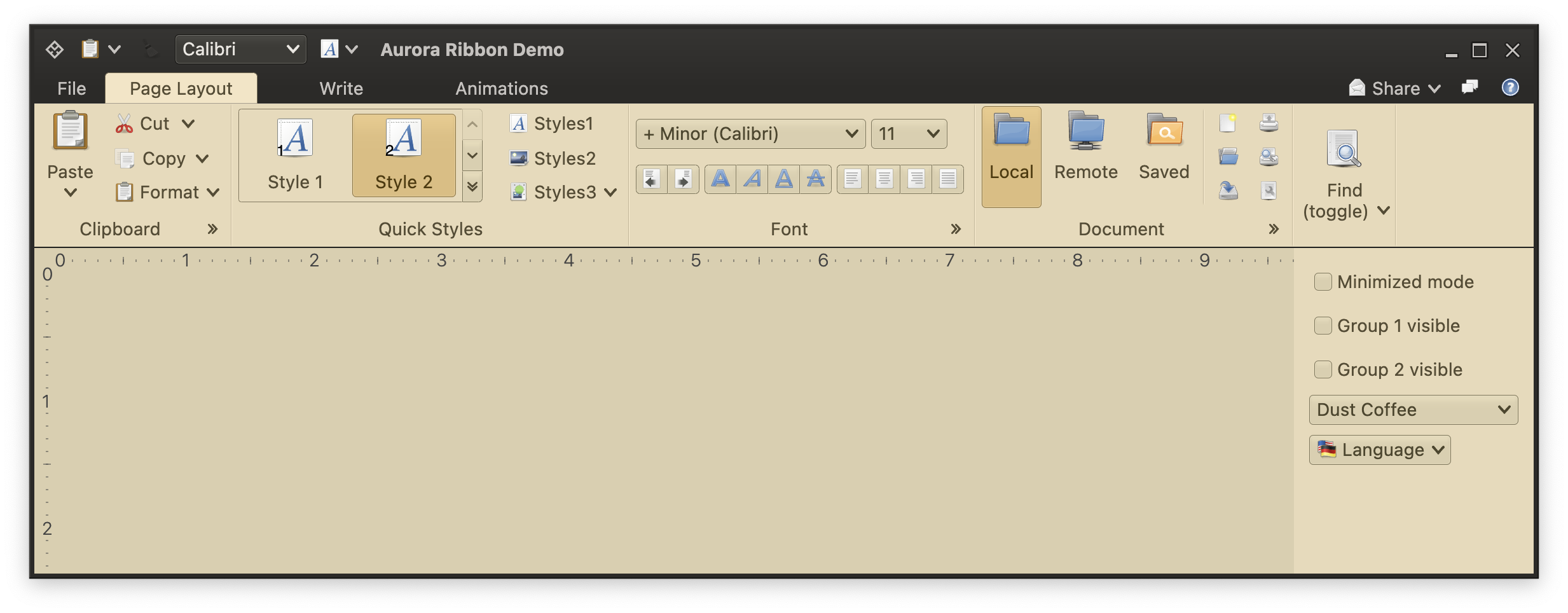
A flow band can be seen in the screenshot above in the middle of the ribbon - the "Font" band with two comboboxes in the first row and three [command strips](CommandStrip.md) in the second row. When the ribbon is resized and horizontal space is reduced, a flow band can switch from two-row to three-row layout.
To create a new flow band, use the `FlowRibbonBand` data class:
```kotlin
val fontBand = FlowRibbonBand(
title = resourceBundle.getString("Font.textBandTitle"),
icon = preferences_desktop_font(),
collapsedStateKeyTip = "ZF",
expandCommandKeyTip = "FN",
expandCommand = Command(
text = "",
icon = null,
action = { println("Expand button clicked! ") }
),
flowComponentProjections = listOf(
...
)
)
```
To configure content of a flow band, use `FlowRibbonBand.flowComponentProjections` property:
```kotlin
flowComponentProjections = listOf(
RibbonMetaComponentProjection(
projection = ComboBoxProjection(
contentModel = fontFamilyComboBoxContentModel,
presentationModel = ComboBoxPresentationModel(displayConverter = { "+ Minor ($it) " })
),
enabled = { fontFamilyComboBoxContentModel.enabled },
ribbonComponentPresentationModel = RibbonComponentPresentationModel(keyTip = "SF")
),
...
RibbonMetaComponentProjection(
projection = CommandButtonStripProjection(
contentModel = CommandGroup(commands = listOf(indentLeft, indentRight)),
presentationModel = CommandStripPresentationModel(
orientation = StripOrientation.Horizontal
),
overlays = mapOf(
indentLeft to BaseCommandButtonPresentationModel.Overlay(actionKeyTip = "AO"),
indentRight to BaseCommandButtonPresentationModel.Overlay(actionKeyTip = "AI")
)
),
enabled = { true },
ribbonComponentPresentationModel = RibbonComponentPresentationModel()
),
...
)
```
All the other bands in the screenshot above are general bands. A general band can host command projections, component projections and in-ribbon galleries.
The "Clipboard" band in the screenshot above hosts four command projections - Paste, Cut, Copy and Format. The first is configured to have `Top` priority and is displayed in `Big` [presentation state](CommandButtonPresentation.md). The other three are configured to have `Medium` priority. When there is enough horizontal space, each one is displayed in 'Medium' presentation state, and the overall layout is a vertical stack of three buttons. When horizontal space is reduced, these buttons can switch to the `Small` presentation state.
To add a command (projection) to a general ribbon band, use the `RibbonBandCommandGroup` data class:
```kotlin
RibbonBandCommandGroup(
commandProjections = listOf(
CommandButtonProjection(
contentModel = pasteCommand,
presentationModel = CommandButtonPresentationModel(
actionKeyTip = "Y",
popupKeyTip = "V",
textClick = TextClick.Action
),
secondaryOverlays = mapOf(
popupCommand1 to BaseCommandButtonPresentationModel.Overlay(popupKeyTip = "1"),
popupCommand2 to BaseCommandButtonPresentationModel.Overlay(popupKeyTip = "2"),
popupCommand3 to BaseCommandButtonPresentationModel.Overlay(popupKeyTip = "3"),
popupCommand4 to BaseCommandButtonPresentationModel.Overlay(popupKeyTip = "4"),
popupCommand5 to BaseCommandButtonPresentationModel.Overlay(popupKeyTip = "5"),
)
) at PresentationPriority.Top,
CommandButtonProjection(
contentModel = cutCommand,
presentationModel = CommandButtonPresentationModel(
popupKeyTip = "X",
textClick = TextClick.Action
)
) at PresentationPriority.Medium,
...
)
)
```
To add a component projection to a general ribbon band, use the `RibbonBandComponentGroup` data class:
```kotlin
RibbonBandComponentGroup(
componentProjections = listOf(
RibbonMetaComponentProjection(
projection = CheckBoxProjection(contentModel = rulerContentModel),
enabled = { rulerContentModel.enabled },
ribbonComponentPresentationModel = RibbonComponentPresentationModel(keyTip = "SR")
),
RibbonMetaComponentProjection(
projection = CheckBoxProjection(contentModel = gridlinesContentModel),
enabled = { gridlinesContentModel.enabled },
ribbonComponentPresentationModel = RibbonComponentPresentationModel(keyTip = "SG")
),
...
)
)
```
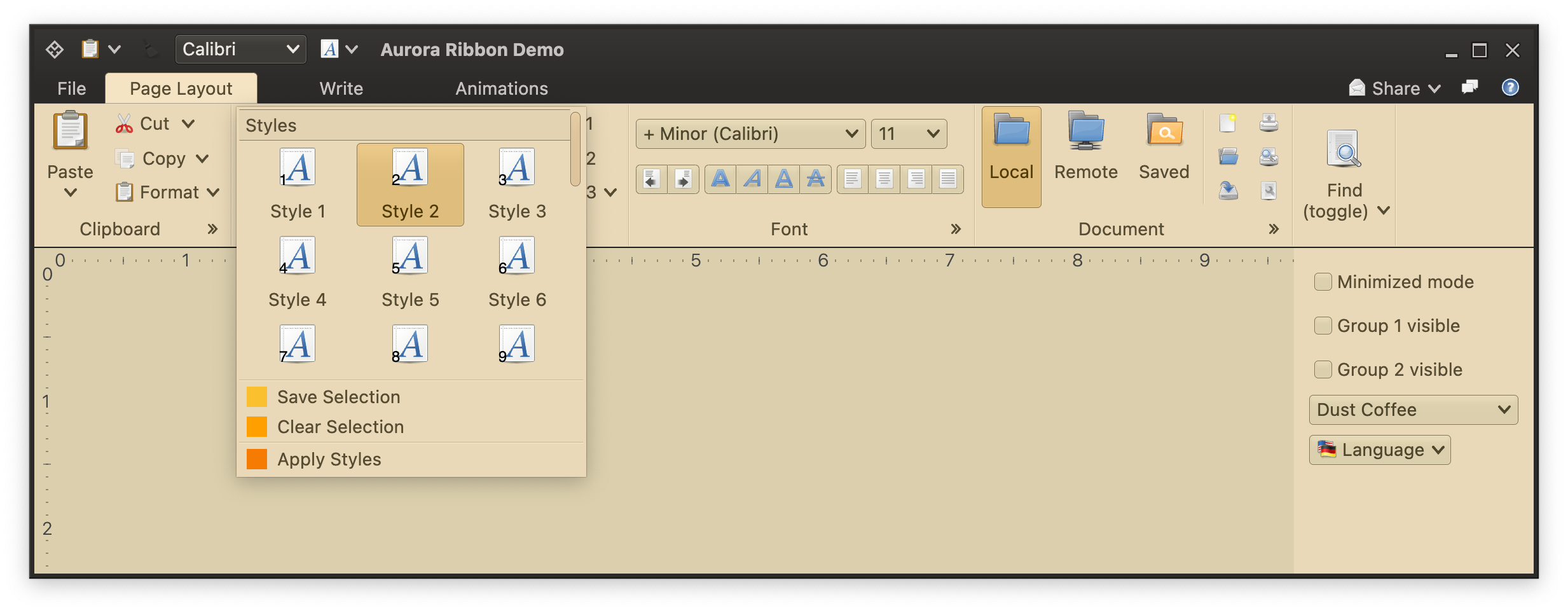
The "Quick Styles" band shows an in-ribbon gallery. In-ribbon galleries are configured to display a certain (usually small) number of selections, with a vertical strip right next to them to scroll the selections inline up and down, and display the available selections in a larger popup:
The `AuroraRibbonWindow` is the only officially supported way to use the Aurora ribbon component. Its implementation enforces that the ribbon is always at the top of the window, spanning the full window width.
The `ribbon` parameter is a data class that describes the full content of the ribbon component.
### Configuring ribbon content
* The `tasks` property for the ribbon tasks
* The `contextualTaskGroups` property for the contextual task groups
* The `anchoredCommands` property for the anchored commands
* The `taskbarElements` property for the taskbar content, and the `taskbarKeyTipPolicy` property for the associated keytip policy
* The `applicationMenuCommandButtonProjection` property for the application menu content
* The `isMinimized` property to configure the minimized state of the ribbon
* The `onShowContextualMenuListener` property for the contextual menu listener
### Ribbon tasks and bands
Each ribbon task is represented by the `RibbonTask` data class. It has properties for the task title, the task's bands and others:
```kotlin
val pageLayoutTask = RibbonTask(
title = resourceBundle.getString("PageLayout.textTaskTitle"),
bands = listOf(clipboardBand, quickStylesBand, fontBand, documentBand, findBand),
resizeSequencingPolicy = CoreRibbonResizeSequencingPolicies.CollapseFromLast,
keyTip = "P",
isActive = (ribbonState.selectedTask == Task.PageLayout),
onClick = { ribbonState = ribbonState.copy(selectedTask = Task.PageLayout) }
)
```
The `AbstractRibbonBand` is the base sealed interface for ribbon bands. There are two types of bands - general and flow.
A flow band can be seen in the screenshot above in the middle of the ribbon - the "Font" band with two comboboxes in the first row and three [command strips](CommandStrip.md) in the second row. When the ribbon is resized and horizontal space is reduced, a flow band can switch from two-row to three-row layout.
To create a new flow band, use the `FlowRibbonBand` data class:
```kotlin
val fontBand = FlowRibbonBand(
title = resourceBundle.getString("Font.textBandTitle"),
icon = preferences_desktop_font(),
collapsedStateKeyTip = "ZF",
expandCommandKeyTip = "FN",
expandCommand = Command(
text = "",
icon = null,
action = { println("Expand button clicked! ") }
),
flowComponentProjections = listOf(
...
)
)
```
To configure content of a flow band, use `FlowRibbonBand.flowComponentProjections` property:
```kotlin
flowComponentProjections = listOf(
RibbonMetaComponentProjection(
projection = ComboBoxProjection(
contentModel = fontFamilyComboBoxContentModel,
presentationModel = ComboBoxPresentationModel(displayConverter = { "+ Minor ($it) " })
),
enabled = { fontFamilyComboBoxContentModel.enabled },
ribbonComponentPresentationModel = RibbonComponentPresentationModel(keyTip = "SF")
),
...
RibbonMetaComponentProjection(
projection = CommandButtonStripProjection(
contentModel = CommandGroup(commands = listOf(indentLeft, indentRight)),
presentationModel = CommandStripPresentationModel(
orientation = StripOrientation.Horizontal
),
overlays = mapOf(
indentLeft to BaseCommandButtonPresentationModel.Overlay(actionKeyTip = "AO"),
indentRight to BaseCommandButtonPresentationModel.Overlay(actionKeyTip = "AI")
)
),
enabled = { true },
ribbonComponentPresentationModel = RibbonComponentPresentationModel()
),
...
)
```
All the other bands in the screenshot above are general bands. A general band can host command projections, component projections and in-ribbon galleries.
The "Clipboard" band in the screenshot above hosts four command projections - Paste, Cut, Copy and Format. The first is configured to have `Top` priority and is displayed in `Big` [presentation state](CommandButtonPresentation.md). The other three are configured to have `Medium` priority. When there is enough horizontal space, each one is displayed in 'Medium' presentation state, and the overall layout is a vertical stack of three buttons. When horizontal space is reduced, these buttons can switch to the `Small` presentation state.
To add a command (projection) to a general ribbon band, use the `RibbonBandCommandGroup` data class:
```kotlin
RibbonBandCommandGroup(
commandProjections = listOf(
CommandButtonProjection(
contentModel = pasteCommand,
presentationModel = CommandButtonPresentationModel(
actionKeyTip = "Y",
popupKeyTip = "V",
textClick = TextClick.Action
),
secondaryOverlays = mapOf(
popupCommand1 to BaseCommandButtonPresentationModel.Overlay(popupKeyTip = "1"),
popupCommand2 to BaseCommandButtonPresentationModel.Overlay(popupKeyTip = "2"),
popupCommand3 to BaseCommandButtonPresentationModel.Overlay(popupKeyTip = "3"),
popupCommand4 to BaseCommandButtonPresentationModel.Overlay(popupKeyTip = "4"),
popupCommand5 to BaseCommandButtonPresentationModel.Overlay(popupKeyTip = "5"),
)
) at PresentationPriority.Top,
CommandButtonProjection(
contentModel = cutCommand,
presentationModel = CommandButtonPresentationModel(
popupKeyTip = "X",
textClick = TextClick.Action
)
) at PresentationPriority.Medium,
...
)
)
```
To add a component projection to a general ribbon band, use the `RibbonBandComponentGroup` data class:
```kotlin
RibbonBandComponentGroup(
componentProjections = listOf(
RibbonMetaComponentProjection(
projection = CheckBoxProjection(contentModel = rulerContentModel),
enabled = { rulerContentModel.enabled },
ribbonComponentPresentationModel = RibbonComponentPresentationModel(keyTip = "SR")
),
RibbonMetaComponentProjection(
projection = CheckBoxProjection(contentModel = gridlinesContentModel),
enabled = { gridlinesContentModel.enabled },
ribbonComponentPresentationModel = RibbonComponentPresentationModel(keyTip = "SG")
),
...
)
)
```
The "Quick Styles" band shows an in-ribbon gallery. In-ribbon galleries are configured to display a certain (usually small) number of selections, with a vertical strip right next to them to scroll the selections inline up and down, and display the available selections in a larger popup:
 To add an in-ribbon gallery to a general ribbon band, use the `RibbonBandCommandGroup` data class:
```kotlin
val styleGalleryInlineProjection = RibbonGalleryProjection(
contentModel = styleGalleryContentModel,
presentationModel = RibbonGalleryPresentationModel(
popupLayoutSpec = MenuPopupPanelLayoutSpec(
columnCount = 3, visibleRowCount = 3
),
commandButtonPresentationState = RibbonBandCommandButtonPresentationStates.BigFixedLandscape,
commandButtonTextOverflow = TextOverflow.Ellipsis,
expandKeyTip = "L",
collapsedVisibleCountLow = 1,
collapsedVisibleCountMedium = 2,
collapsedVisibleCountTop = 2
),
inlineState = ribbonState.documentStyleGalleryInlineState
)
RibbonBandCommandGroup(
commandProjections = listOf(...),
galleries = listOf(
styleGalleryProjection at PresentationPriority.Top
)
)
```
### Ribbon band resize policies
The `AbstractRibbonBand.resizePolicies` property controls what happens when the ribbon is resized horizontally, and how the available horizontal space is distributed among the ribbon band content in the currently selected ribbon task. Here's an example of configuring a ribbon band with two built-in resize policies:
```kotlin
RibbonBand(
title = resourceBundle.getString("Clipboard.textBandTitle"),
icon = edit_paste(),
...
resizePolicies = listOf(CoreRibbonResizePolicies.Mirror, CoreRibbonResizePolicies.Mid2Low),
...
)
```
### Next
Continue to the [ribbon band command projections](RibbonBandCommandProjections.md).
To add an in-ribbon gallery to a general ribbon band, use the `RibbonBandCommandGroup` data class:
```kotlin
val styleGalleryInlineProjection = RibbonGalleryProjection(
contentModel = styleGalleryContentModel,
presentationModel = RibbonGalleryPresentationModel(
popupLayoutSpec = MenuPopupPanelLayoutSpec(
columnCount = 3, visibleRowCount = 3
),
commandButtonPresentationState = RibbonBandCommandButtonPresentationStates.BigFixedLandscape,
commandButtonTextOverflow = TextOverflow.Ellipsis,
expandKeyTip = "L",
collapsedVisibleCountLow = 1,
collapsedVisibleCountMedium = 2,
collapsedVisibleCountTop = 2
),
inlineState = ribbonState.documentStyleGalleryInlineState
)
RibbonBandCommandGroup(
commandProjections = listOf(...),
galleries = listOf(
styleGalleryProjection at PresentationPriority.Top
)
)
```
### Ribbon band resize policies
The `AbstractRibbonBand.resizePolicies` property controls what happens when the ribbon is resized horizontally, and how the available horizontal space is distributed among the ribbon band content in the currently selected ribbon task. Here's an example of configuring a ribbon band with two built-in resize policies:
```kotlin
RibbonBand(
title = resourceBundle.getString("Clipboard.textBandTitle"),
icon = edit_paste(),
...
resizePolicies = listOf(CoreRibbonResizePolicies.Mirror, CoreRibbonResizePolicies.Mid2Low),
...
)
```
### Next
Continue to the [ribbon band command projections](RibbonBandCommandProjections.md).