## Components - ribbon application menu
 Ribbon application menu is the optional part of the ribbon that hosts projected commands that are "global". For example, "Paste" command has local context - it operates on the specific current selection in the main content, be it text editor or a graphical editor. But "Save" operated at the global context - saving the entire document no matter which part of it is being viewed or edited.
### Application menu structure
When the application menu button is activated (with mouse or via [keytip traversal](RibbonKeytips.md)), it shows the primary level of application menu content:
Ribbon application menu is the optional part of the ribbon that hosts projected commands that are "global". For example, "Paste" command has local context - it operates on the specific current selection in the main content, be it text editor or a graphical editor. But "Save" operated at the global context - saving the entire document no matter which part of it is being viewed or edited.
### Application menu structure
When the application menu button is activated (with mouse or via [keytip traversal](RibbonKeytips.md)), it shows the primary level of application menu content:
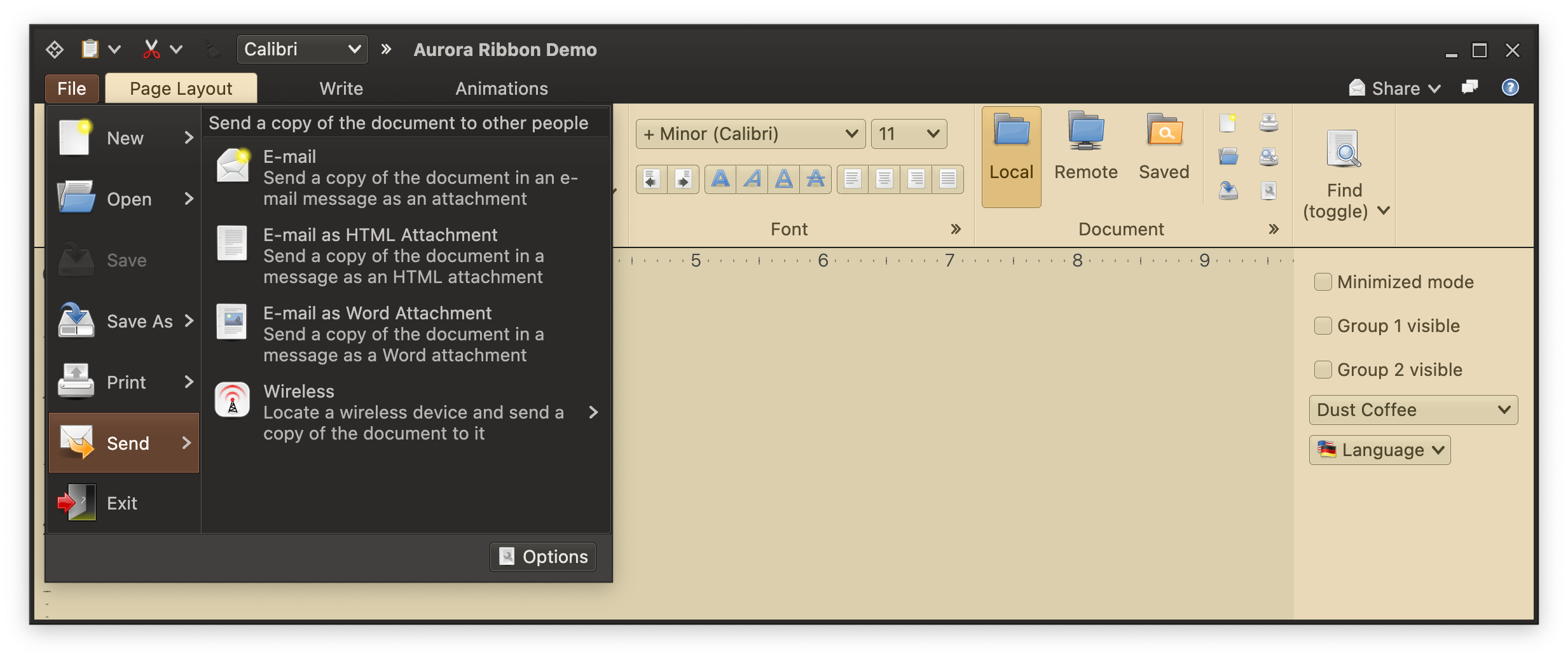
 Activating one of these primary entries (with mouse rollover or keytip travesal) shows the matching secondary level commands:
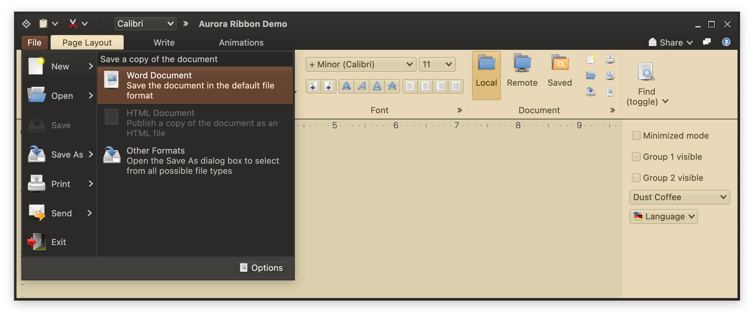
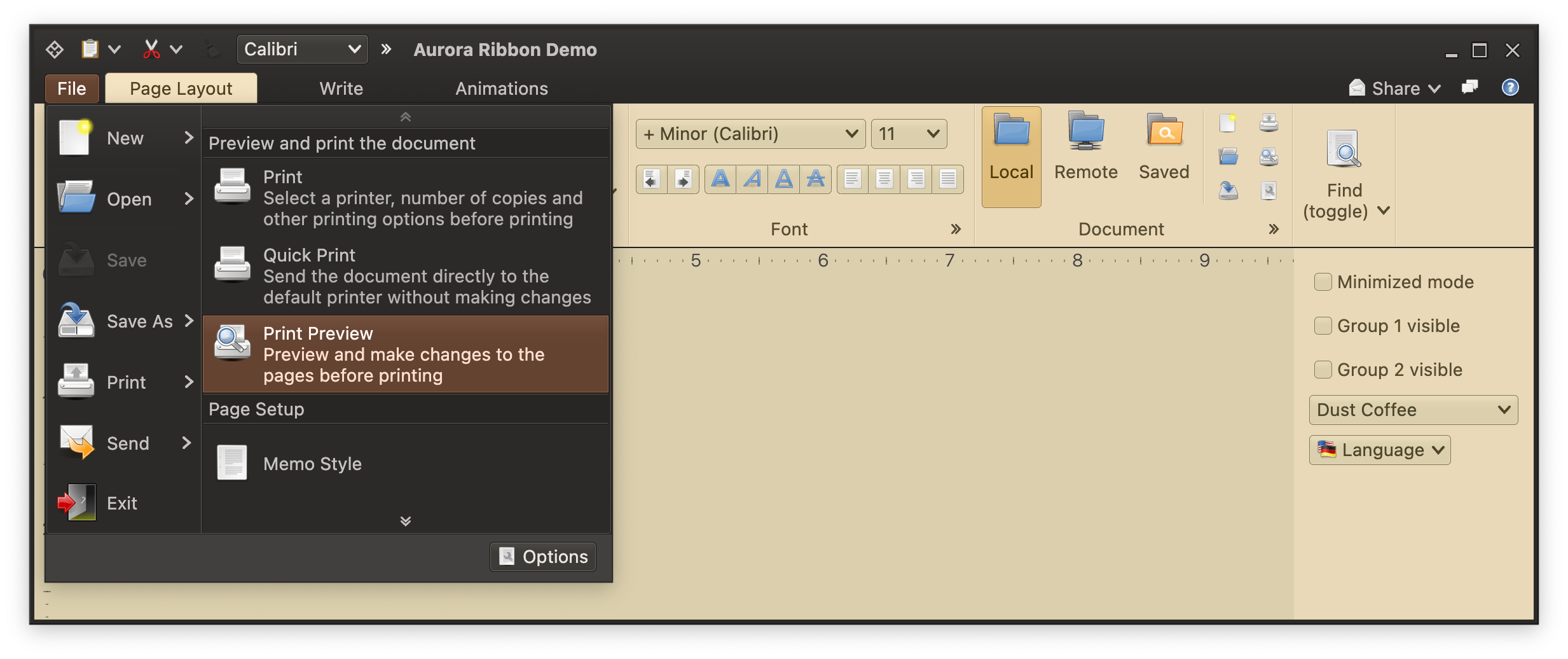
 Secondary level commands can have different presentation states (size and internal layout) for different primary commands:
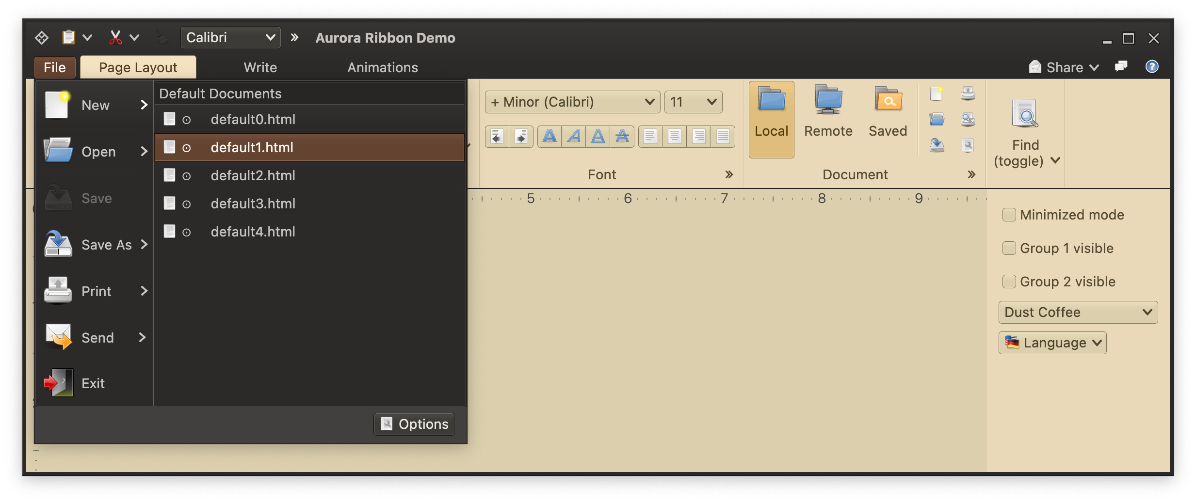
 If there is not enough vertical space to show all secondary command projections, vertical scrolling kicks in:
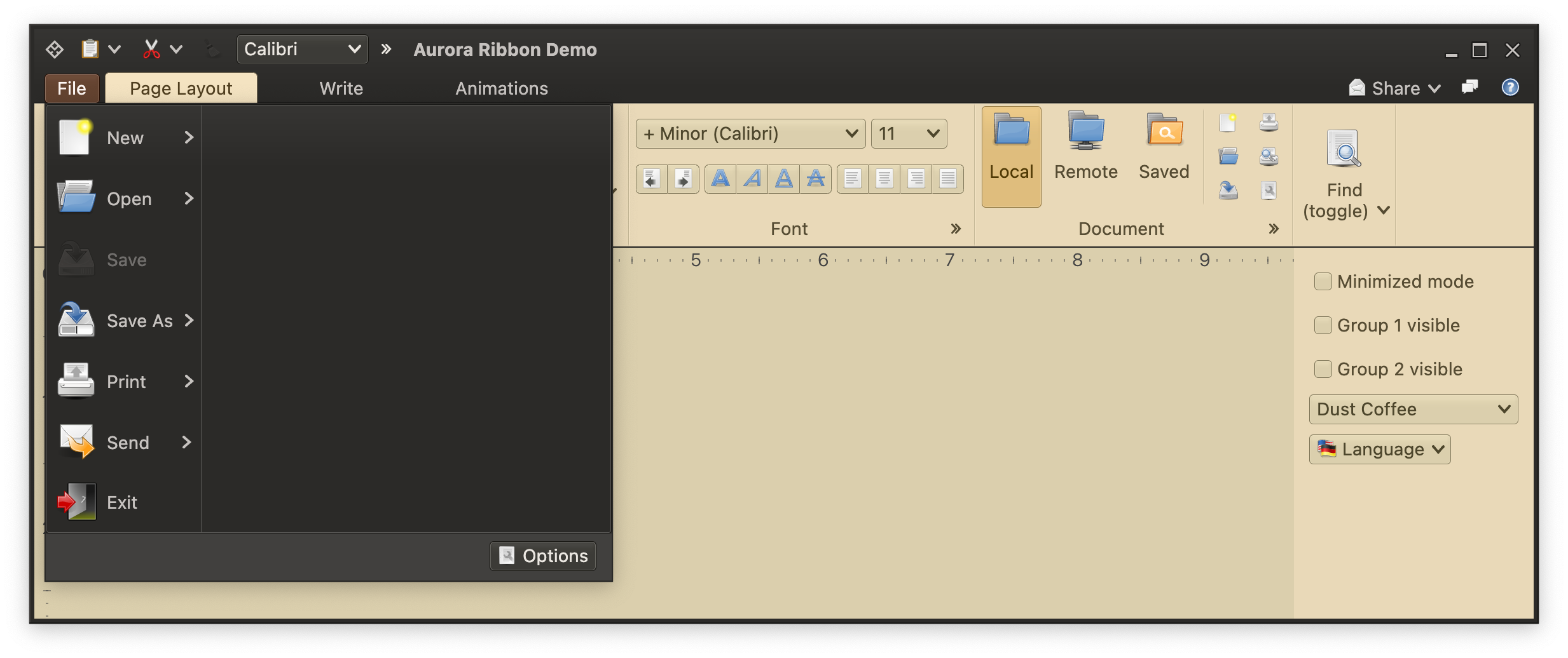
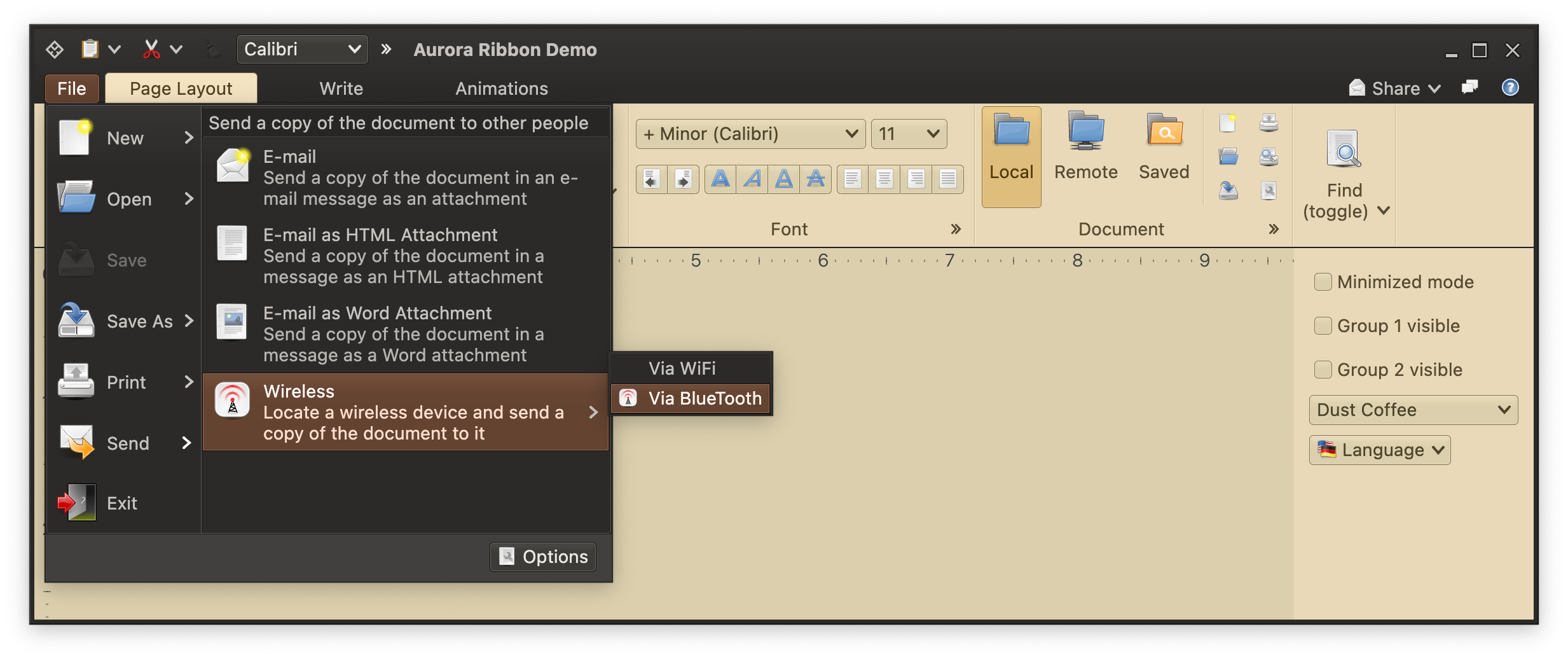
 If your application menu hierarchy requires more than two levels of cascading commands, the rest of those levels will be shown as regular popup content:
 ### Creating application menu
To set application menu content, use the `applicationMenuCommandButtonProjection` property of the `Ribbon` data class.
This is how you work with this API:
```kotlin
val applicationMenuCommandButtonProjection = RibbonApplicationMenuCommandButtonProjection(
contentModel = RibbonApplicationMenuCommand(
text = resourceBundle.getString("AppMenu.title"),
secondaryRichTooltip = RichTooltip(
title = resourceBundle.getString("AppMenu.tooltip.title"),
descriptionSections = listOf(resourceBundle.getString("AppMenu.tooltip.paragraph1")),
mainIcon = tooltipImage,
footerIcon = help_browser(),
footerSections = listOf(resourceBundle.getString("AppMenu.tooltip.footer1"))
),
secondaryContentModel = applicationMenu
),
presentationModel = RibbonApplicationMenuCommandButtonPresentationModel(
popupKeyTip = "F",
popupRichTooltipPresentationModel = RichTooltipPresentationModel(
mainIconSize = tooltipImageScaledSize
)
),
secondaryOverlays = overlays,
secondaryStates = secondaryStates
)
...
val ribbon = Ribbon(
tasks = listOf(pageLayoutTask, writeTask, animationsTask),
contextualTaskGroups = contextualTaskGroups,
taskbarElements = taskbarElements,
taskbarKeyTipPolicy = DefaultRibbonTaskbarKeyTipPolicy(),
anchoredCommands = getAnchoredCommands(),
applicationMenuCommandButtonProjection = applicationMenuCommandButtonProjection,
isMinimized = minimizedMode,
onShowContextualMenuListener = onShowContextualMenuListener
)
```
Here we have configured the "outer shell", so to speak of the application menu:
- The text displayed on the application menu button
- The secondary (popup) rich tooltip associated with the application menu button
- The popup key tip for traversing the application menu with keyboard
The primary/secondary/additional content of the application menu itself is set here with `Command.Builder.setSecondaryContentModel()` call. Let's see how we construct that secondary content model.
For the "Save As" primary command, we start by creating its secondary commands:
```kotlin
val amEntrySaveAsWord = Command(
text = resourceBundle.getString("AppMenuSaveAs.word.text"),
icon = x_office_document(),
extraText = resourceBundle.getString("AppMenuSaveAs.word.description"),
action = { println("Invoked saved as Word") }
)
val amEntrySaveAsHtml = Command(
text = resourceBundle.getString("AppMenuSaveAs.html.text"),
icon = text_x_generic(),
extraText = resourceBundle.getString("AppMenuSaveAs.html.description"),
action = { println("Invoked saved as HTML") },
isActionEnabled = false
)
val amEntrySaveAsOtherFormats = Command(
text = resourceBundle.getString("AppMenuSaveAs.other.text"),
icon = document_save_as(),
extraText = resourceBundle.getString("AppMenuSaveAs.other.description"),
action = { println("Invoked saved as other") }
)
```
Now we create the "Save As" command itself, and configure its secondary content model from these three commands:
```kotlin
var saveAsMenu = CommandMenuContentModel(
CommandGroup(
title = resourceBundle.getString("AppMenuSaveAs.secondary.textGroupTitle1"),
commands = listOf(amEntrySaveAsWord, amEntrySaveAsHtml, amEntrySaveAsOtherFormats)
)
)
val amEntrySaveAs = Command(
text = resourceBundle.getString("AppMenuSaveAs.text"),
icon = document_save_as(),
action = { println("Invoked saving document as") },
secondaryContentModel = saveAsMenu
)
```
Note that this is exactly the same way as working with [commands](Command.md) and [command popup menus](CommandPopupMenu.md) - as far as content models go. This is quite intentional. Ribbon does not force you to have commands that can only be placed in the application menu. As the design of your application evolves, you can move commands between different places in the ribbon (ribbon tasks, ribbon anchored area, ribbon application menu) with no changes required to the content models.
After you have all your primary commands configured, use `RibbonApplicationMenuContentModel` that accepts one or more `CommandGroup`s to set the primary application menu content:
```kotlin
val applicationMenu = RibbonApplicationMenuContentModel(
groups = listOf(
CommandGroup(commands = listOf(amEntryNew, amEntryOpen, amEntrySave, amEntrySaveAs)),
CommandGroup(commands = listOf(amEntryPrint, amEntrySend)),
CommandGroup(commands = listOf(amEntryExit))
),
footerCommands = CommandGroup(commands = listOf(amFooterProps))
)
```
You can also place one or more command projections in the footer area of the ribbon application menu with the `footerCommands` property - see the "Options" button in the screenshots above.
Now we are done with the content model for the ribbon application menu - that is set as secondary content model on the application menu command button projection:
```kotlin
val applicationMenuCommandButtonProjection = RibbonApplicationMenuCommandButtonProjection(
contentModel = RibbonApplicationMenuCommand(
text = resourceBundle.getString("AppMenu.title"),
secondaryRichTooltip = RichTooltip(...),
secondaryContentModel = applicationMenu
),
presentationModel = RibbonApplicationMenuCommandButtonPresentationModel(
popupKeyTip = "F",
popupRichTooltipPresentationModel = RichTooltipPresentationModel(
mainIconSize = tooltipImageScaledSize
)
),
secondaryOverlays = overlays,
secondaryStates = secondaryStates
)
...
val ribbon = Ribbon(
tasks = listOf(pageLayoutTask, writeTask, animationsTask),
contextualTaskGroups = contextualTaskGroups,
taskbarElements = taskbarElements,
taskbarKeyTipPolicy = DefaultRibbonTaskbarKeyTipPolicy(),
anchoredCommands = getAnchoredCommands(),
applicationMenuCommandButtonProjection = applicationMenuCommandButtonProjection,
isMinimized = minimizedMode,
onShowContextualMenuListener = onShowContextualMenuListener
)
```
### Configuring secondary content presentation state
Let's go back to these two screenshots:
How do we "tell" the ribbon that secondary content for "New" should be presented differently from secondary content for "Save As"? We use the `RibbonApplicationMenuCommandButtonProjection.setSecondaryLevelCommandPresentationState()` API:
```kotlin
val secondaryStates = hashMapOf()
secondaryStates[amEntryNew] = CommandButtonPresentationState.Medium
secondaryStates[amEntrySaveAs] = RibbonApplicationMenuButtonPresentationStates.RibbonAppMenuSecondaryLevel
...
val applicationMenuCommandButtonProjection = RibbonApplicationMenuCommandButtonProjection(
contentModel = RibbonApplicationMenuCommand(
text = resourceBundle.getString("AppMenu.title"),
secondaryRichTooltip = RichTooltip(...),
secondaryContentModel = applicationMenu
),
presentationModel = RibbonApplicationMenuCommandButtonPresentationModel(
popupKeyTip = "F",
popupRichTooltipPresentationModel = RichTooltipPresentationModel(
mainIconSize = tooltipImageScaledSize
)
),
secondaryOverlays = overlays,
secondaryStates = secondaryStates
)
```
Here we have configured "New" to use `Medium` presentation state on its secondary content - a small icon + single line of text / title. And "Save As" is using the `RibbonAppMenuSecondaryLevel` presentation state on its secondary content - large icon, single line of text / title and two lines of extra text.
If you want to switch the presentation of secondary content in your ribbon application menu as your design evolves, there is no need to touch the content model of any command or the application menu itself. You only need to update the secondary presentation state mapping.
### Next
Continue to [ribbon anchored commands](RibbonAnchoredCommands.md).
### Creating application menu
To set application menu content, use the `applicationMenuCommandButtonProjection` property of the `Ribbon` data class.
This is how you work with this API:
```kotlin
val applicationMenuCommandButtonProjection = RibbonApplicationMenuCommandButtonProjection(
contentModel = RibbonApplicationMenuCommand(
text = resourceBundle.getString("AppMenu.title"),
secondaryRichTooltip = RichTooltip(
title = resourceBundle.getString("AppMenu.tooltip.title"),
descriptionSections = listOf(resourceBundle.getString("AppMenu.tooltip.paragraph1")),
mainIcon = tooltipImage,
footerIcon = help_browser(),
footerSections = listOf(resourceBundle.getString("AppMenu.tooltip.footer1"))
),
secondaryContentModel = applicationMenu
),
presentationModel = RibbonApplicationMenuCommandButtonPresentationModel(
popupKeyTip = "F",
popupRichTooltipPresentationModel = RichTooltipPresentationModel(
mainIconSize = tooltipImageScaledSize
)
),
secondaryOverlays = overlays,
secondaryStates = secondaryStates
)
...
val ribbon = Ribbon(
tasks = listOf(pageLayoutTask, writeTask, animationsTask),
contextualTaskGroups = contextualTaskGroups,
taskbarElements = taskbarElements,
taskbarKeyTipPolicy = DefaultRibbonTaskbarKeyTipPolicy(),
anchoredCommands = getAnchoredCommands(),
applicationMenuCommandButtonProjection = applicationMenuCommandButtonProjection,
isMinimized = minimizedMode,
onShowContextualMenuListener = onShowContextualMenuListener
)
```
Here we have configured the "outer shell", so to speak of the application menu:
- The text displayed on the application menu button
- The secondary (popup) rich tooltip associated with the application menu button
- The popup key tip for traversing the application menu with keyboard
The primary/secondary/additional content of the application menu itself is set here with `Command.Builder.setSecondaryContentModel()` call. Let's see how we construct that secondary content model.
For the "Save As" primary command, we start by creating its secondary commands:
```kotlin
val amEntrySaveAsWord = Command(
text = resourceBundle.getString("AppMenuSaveAs.word.text"),
icon = x_office_document(),
extraText = resourceBundle.getString("AppMenuSaveAs.word.description"),
action = { println("Invoked saved as Word") }
)
val amEntrySaveAsHtml = Command(
text = resourceBundle.getString("AppMenuSaveAs.html.text"),
icon = text_x_generic(),
extraText = resourceBundle.getString("AppMenuSaveAs.html.description"),
action = { println("Invoked saved as HTML") },
isActionEnabled = false
)
val amEntrySaveAsOtherFormats = Command(
text = resourceBundle.getString("AppMenuSaveAs.other.text"),
icon = document_save_as(),
extraText = resourceBundle.getString("AppMenuSaveAs.other.description"),
action = { println("Invoked saved as other") }
)
```
Now we create the "Save As" command itself, and configure its secondary content model from these three commands:
```kotlin
var saveAsMenu = CommandMenuContentModel(
CommandGroup(
title = resourceBundle.getString("AppMenuSaveAs.secondary.textGroupTitle1"),
commands = listOf(amEntrySaveAsWord, amEntrySaveAsHtml, amEntrySaveAsOtherFormats)
)
)
val amEntrySaveAs = Command(
text = resourceBundle.getString("AppMenuSaveAs.text"),
icon = document_save_as(),
action = { println("Invoked saving document as") },
secondaryContentModel = saveAsMenu
)
```
Note that this is exactly the same way as working with [commands](Command.md) and [command popup menus](CommandPopupMenu.md) - as far as content models go. This is quite intentional. Ribbon does not force you to have commands that can only be placed in the application menu. As the design of your application evolves, you can move commands between different places in the ribbon (ribbon tasks, ribbon anchored area, ribbon application menu) with no changes required to the content models.
After you have all your primary commands configured, use `RibbonApplicationMenuContentModel` that accepts one or more `CommandGroup`s to set the primary application menu content:
```kotlin
val applicationMenu = RibbonApplicationMenuContentModel(
groups = listOf(
CommandGroup(commands = listOf(amEntryNew, amEntryOpen, amEntrySave, amEntrySaveAs)),
CommandGroup(commands = listOf(amEntryPrint, amEntrySend)),
CommandGroup(commands = listOf(amEntryExit))
),
footerCommands = CommandGroup(commands = listOf(amFooterProps))
)
```
You can also place one or more command projections in the footer area of the ribbon application menu with the `footerCommands` property - see the "Options" button in the screenshots above.
Now we are done with the content model for the ribbon application menu - that is set as secondary content model on the application menu command button projection:
```kotlin
val applicationMenuCommandButtonProjection = RibbonApplicationMenuCommandButtonProjection(
contentModel = RibbonApplicationMenuCommand(
text = resourceBundle.getString("AppMenu.title"),
secondaryRichTooltip = RichTooltip(...),
secondaryContentModel = applicationMenu
),
presentationModel = RibbonApplicationMenuCommandButtonPresentationModel(
popupKeyTip = "F",
popupRichTooltipPresentationModel = RichTooltipPresentationModel(
mainIconSize = tooltipImageScaledSize
)
),
secondaryOverlays = overlays,
secondaryStates = secondaryStates
)
...
val ribbon = Ribbon(
tasks = listOf(pageLayoutTask, writeTask, animationsTask),
contextualTaskGroups = contextualTaskGroups,
taskbarElements = taskbarElements,
taskbarKeyTipPolicy = DefaultRibbonTaskbarKeyTipPolicy(),
anchoredCommands = getAnchoredCommands(),
applicationMenuCommandButtonProjection = applicationMenuCommandButtonProjection,
isMinimized = minimizedMode,
onShowContextualMenuListener = onShowContextualMenuListener
)
```
### Configuring secondary content presentation state
Let's go back to these two screenshots:
How do we "tell" the ribbon that secondary content for "New" should be presented differently from secondary content for "Save As"? We use the `RibbonApplicationMenuCommandButtonProjection.setSecondaryLevelCommandPresentationState()` API:
```kotlin
val secondaryStates = hashMapOf()
secondaryStates[amEntryNew] = CommandButtonPresentationState.Medium
secondaryStates[amEntrySaveAs] = RibbonApplicationMenuButtonPresentationStates.RibbonAppMenuSecondaryLevel
...
val applicationMenuCommandButtonProjection = RibbonApplicationMenuCommandButtonProjection(
contentModel = RibbonApplicationMenuCommand(
text = resourceBundle.getString("AppMenu.title"),
secondaryRichTooltip = RichTooltip(...),
secondaryContentModel = applicationMenu
),
presentationModel = RibbonApplicationMenuCommandButtonPresentationModel(
popupKeyTip = "F",
popupRichTooltipPresentationModel = RichTooltipPresentationModel(
mainIconSize = tooltipImageScaledSize
)
),
secondaryOverlays = overlays,
secondaryStates = secondaryStates
)
```
Here we have configured "New" to use `Medium` presentation state on its secondary content - a small icon + single line of text / title. And "Save As" is using the `RibbonAppMenuSecondaryLevel` presentation state on its secondary content - large icon, single line of text / title and two lines of extra text.
If you want to switch the presentation of secondary content in your ribbon application menu as your design evolves, there is no need to touch the content model of any command or the application menu itself. You only need to update the secondary presentation state mapping.
### Next
Continue to [ribbon anchored commands](RibbonAnchoredCommands.md).