## Components - in-ribbon galleries
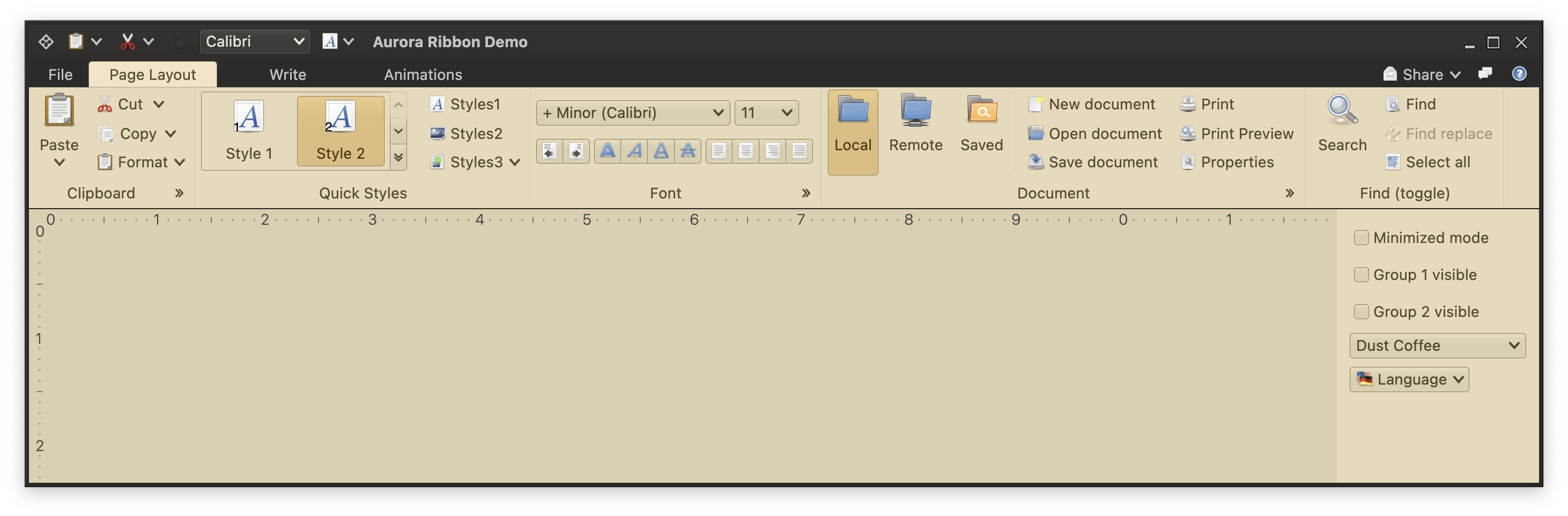 In-ribbon galleries are the third type of content that can be placed in a ribbon band. In the screenshot above the "Quick Styles" band shows an in-ribbon gallery. In-ribbon galleries are configured to display a certain (usually small) number of selections, with a vertical strip right next to them to scroll the selections inline up and down, and display the available selections in a larger popup:
 Let's take a look at the various moving pieces involved in configuring an in-ribbon gallery.
### Main gallery content
We start by configuring the main gallery content - commands shown in the scrollable area of the gallery when it is shown in its ribbon band, or shown in the larger popup as in the last screenshot.
```kotlin
val stylesGalleryCommandList = CommandGroup(
title = resourceBundle.getString("StylesGallery.textGroupTitle1"),
commands = (1..10).map { index ->
Command(
text = mfButtonText.format(arrayOf(index)),
icon = DecoratedIcon(main = font_x_generic(),
decoration = object : Painter() {
override val intrinsicSize: Size = Size.Unspecified
override fun DrawScope.onDraw() {
this.drawIntoCanvas { canvas ->
val nativeCanvas = canvas.nativeCanvas
nativeCanvas.drawTextLine(
line = TextLine.make(
text = "$index",
font = overlayFont
),
x = 2.0f,
y = size.height - 4.0f,
paint = Paint().also { skiaPaint ->
skiaPaint.color4f = Color4f(
r = 0f,
g = 0f,
b = 0f,
a = 1.0f
)
}
)
}
}
}),
isActionToggle = true,
isActionToggleSelected = (ribbonState.documentStyle == DocumentStyle.entries[index - 1]),
onTriggerActionToggleSelectedChange = {
if (it) {
println("Activating $index")
onRibbonStateUpdate.invoke(ribbonState.copy(documentStyle = DocumentStyle.entries[index - 1]))
}
},
actionPreview = styleGalleryCommandPreview
)
}
)
val stylesGalleryCommandList2 = CommandGroup(
title = resourceBundle.getString("StylesGallery.textGroupTitle1"),
commands = (11..30).map { index ->
Command(
text = mfButtonText.format(arrayOf(index)),
icon = DecoratedIcon(main = font_x_generic(),
decoration = object : Painter() {
override val intrinsicSize: Size = Size.Unspecified
override fun DrawScope.onDraw() {
this.drawIntoCanvas { canvas ->
val nativeCanvas = canvas.nativeCanvas
nativeCanvas.drawTextLine(
line = TextLine.make(
text = "$index",
font = overlayFont
),
x = 2.0f,
y = size.height - 4.0f,
paint = Paint().also { skiaPaint ->
skiaPaint.color4f = Color4f(
r = 0f,
g = 0f,
b = 0f,
a = 1.0f
)
}
)
}
}
}),
isActionToggle = true,
isActionToggleSelected = (ribbonState.documentStyle == DocumentStyle.entries[index - 1]),
onTriggerActionToggleSelectedChange = {
if (it) {
onRibbonStateUpdate.invoke(ribbonState.copy(documentStyle = DocumentStyle.entries[index - 1]))
}
},
actionPreview = styleGalleryCommandPreview
)
}
)
val styleGalleryContentModel = RibbonGalleryContentModel(
icon = font_x_generic(),
commandGroups = listOf(stylesGalleryCommandList, stylesGalleryCommandList2),
extraPopupGroups = listOf(
CommandGroup(commands = listOf(this.menuSaveSelection, this.menuClearSelection)),
CommandGroup(commands = listOf(this.applyStyles))
)
)
```
Here we've built a `RibbonGalleryContentModel` from two `CommandGroup`s, one with 10 commands and the other with 20 commands.
### Extra popup content
These are commands shown below the expanded scrollable panel of gallery commands in the popup:
```kotlin
val menuSaveSelection = Command(
text = resourceBundle.getString("Format.menuSaveSelection.text"),
icon = ColorSolidIcon(Color(red = 0xFB, green = 0xC0, blue = 0x2D)),
action = { println("Save Selection activated") }
)
val menuClearSelection = Command(
text = resourceBundle.getString("Format.menuClearSelection.text"),
icon = ColorSolidIcon(Color(red = 0xFF, green = 0xA0, blue = 0x00)),
action = { println("Clear Selection activated") }
)
val applyStyles = Command(
text = resourceBundle.getString("Format.applyStyles.text"),
icon = ColorSolidIcon(Color(red = 0xF5, green = 0x7C, blue = 0x00)),
action = { println("Apply Styles activated") }
)
```
These are added to the `extraPopupGroups` of our `RibbonGalleryContentModel` created above.
### Tracking command preview and selection
Same as with [commands](Command.md) and [color selector popup menus](ColorSelectorCommand.md), you can register listeners to be notified when the user previews and / or changes selection in the gallery content:
```kotlin
val styleGalleryCommandPreview = object : CommandActionPreview {
override fun onCommandPreviewActivated(command: BaseCommand) {
println("Preview activated for '${command.text}'")
}
override fun onCommandPreviewCanceled(command: BaseCommand) {
println("Preview canceled for '${command.text}'")
}
}
```
### Gallery projection
Now it's time to create our [projection](ModelProjectionOverview.md). We configure our `RibbonGalleryPresentationModel` with the following properties:
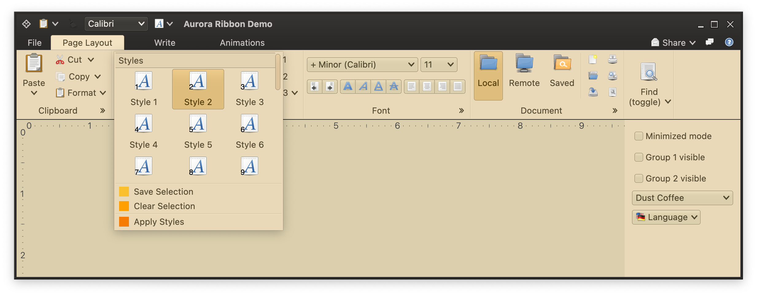
* `popupLayoutSpec` for how many rows and columns of content we want to see in the popup. In our case we want 3 columns and at most 3 visible rows (kicking in vertical scrolling if necessary).
* `commandButtonPresentationState` for the presentation state for projected commands inline, as well as in the popup. Using `Small` presentation state will display three rows of small buttons inline.
* `expandKeyTip` with the key tip for the expand button of the gallery.
* `collapsedVisibleCountXyz` for how many commands we want to see displayed inline (not in popup) under different presentation priorities. The mapping defined above is the reason this particular in-ribbon gallery displays 2 items (from `collapsedVisibleCountTop`) when there is enough horizontal space for everything.
```kotlin
val styleGalleryInlineMetaPresentationModel = RibbonGalleryPresentationModel(
popupLayoutSpec = MenuPopupPanelLayoutSpec(
columnCount = 3, visibleRowCount = 3
),
commandButtonPresentationState = RibbonBandCommandButtonPresentationStates.BigFixedLandscape,
commandButtonTextOverflow = TextOverflow.Ellipsis,
expandKeyTip = "L",
collapsedVisibleCountLow = 1,
collapsedVisibleCountMedium = 2,
collapsedVisibleCountTop = 2
)
```
And now we can create and add our gallery projection:
```kotlin
val styleGalleryInlineProjection = RibbonGalleryProjection(
contentModel = styleGalleryContentModel,
presentationModel = styleGalleryInlineMetaPresentationModel,
inlineState = ribbonState.documentStyleGalleryInlineState
secondaryOverlays = mapOf(
menuSaveSelection to BaseCommandButtonPresentationModel.Overlay(actionKeyTip = "SS"),
menuClearSelection to BaseCommandButtonPresentationModel.Overlay(actionKeyTip = "SC"),
applyStyles to BaseCommandButtonPresentationModel.Overlay(actionKeyTip = "SA"),
)
)
RibbonBand(
title = resourceBundle.getString("QuickStyles.textBandTitle"),
icon = preferences_desktop_theme(),
collapsedStateKeyTip = "ZS",
resizePolicies = CoreRibbonResizePolicies.getCorePoliciesRestrictive(),
groups = listOf(
RibbonBandCommandGroup(
commandProjections = listOf(...),
galleries = listOf(
styleGalleryProjection at PresentationPriority.Top
)
)
)
)
```
With our `RibbonGalleryContentModel` as the content model and `RibbonGalleryPresentationModel` as the presentation model, we create `RibbonGalleryProjection` with its `secondaryOverlays` for the extra popup content - and that is passed to the `galleries` property of the `RibbonBandCommandGroup` at `Top` presentation priority.
### Next
Continue to the [keytips](RibbonKeytips.md).
Let's take a look at the various moving pieces involved in configuring an in-ribbon gallery.
### Main gallery content
We start by configuring the main gallery content - commands shown in the scrollable area of the gallery when it is shown in its ribbon band, or shown in the larger popup as in the last screenshot.
```kotlin
val stylesGalleryCommandList = CommandGroup(
title = resourceBundle.getString("StylesGallery.textGroupTitle1"),
commands = (1..10).map { index ->
Command(
text = mfButtonText.format(arrayOf(index)),
icon = DecoratedIcon(main = font_x_generic(),
decoration = object : Painter() {
override val intrinsicSize: Size = Size.Unspecified
override fun DrawScope.onDraw() {
this.drawIntoCanvas { canvas ->
val nativeCanvas = canvas.nativeCanvas
nativeCanvas.drawTextLine(
line = TextLine.make(
text = "$index",
font = overlayFont
),
x = 2.0f,
y = size.height - 4.0f,
paint = Paint().also { skiaPaint ->
skiaPaint.color4f = Color4f(
r = 0f,
g = 0f,
b = 0f,
a = 1.0f
)
}
)
}
}
}),
isActionToggle = true,
isActionToggleSelected = (ribbonState.documentStyle == DocumentStyle.entries[index - 1]),
onTriggerActionToggleSelectedChange = {
if (it) {
println("Activating $index")
onRibbonStateUpdate.invoke(ribbonState.copy(documentStyle = DocumentStyle.entries[index - 1]))
}
},
actionPreview = styleGalleryCommandPreview
)
}
)
val stylesGalleryCommandList2 = CommandGroup(
title = resourceBundle.getString("StylesGallery.textGroupTitle1"),
commands = (11..30).map { index ->
Command(
text = mfButtonText.format(arrayOf(index)),
icon = DecoratedIcon(main = font_x_generic(),
decoration = object : Painter() {
override val intrinsicSize: Size = Size.Unspecified
override fun DrawScope.onDraw() {
this.drawIntoCanvas { canvas ->
val nativeCanvas = canvas.nativeCanvas
nativeCanvas.drawTextLine(
line = TextLine.make(
text = "$index",
font = overlayFont
),
x = 2.0f,
y = size.height - 4.0f,
paint = Paint().also { skiaPaint ->
skiaPaint.color4f = Color4f(
r = 0f,
g = 0f,
b = 0f,
a = 1.0f
)
}
)
}
}
}),
isActionToggle = true,
isActionToggleSelected = (ribbonState.documentStyle == DocumentStyle.entries[index - 1]),
onTriggerActionToggleSelectedChange = {
if (it) {
onRibbonStateUpdate.invoke(ribbonState.copy(documentStyle = DocumentStyle.entries[index - 1]))
}
},
actionPreview = styleGalleryCommandPreview
)
}
)
val styleGalleryContentModel = RibbonGalleryContentModel(
icon = font_x_generic(),
commandGroups = listOf(stylesGalleryCommandList, stylesGalleryCommandList2),
extraPopupGroups = listOf(
CommandGroup(commands = listOf(this.menuSaveSelection, this.menuClearSelection)),
CommandGroup(commands = listOf(this.applyStyles))
)
)
```
Here we've built a `RibbonGalleryContentModel` from two `CommandGroup`s, one with 10 commands and the other with 20 commands.
### Extra popup content
These are commands shown below the expanded scrollable panel of gallery commands in the popup:
```kotlin
val menuSaveSelection = Command(
text = resourceBundle.getString("Format.menuSaveSelection.text"),
icon = ColorSolidIcon(Color(red = 0xFB, green = 0xC0, blue = 0x2D)),
action = { println("Save Selection activated") }
)
val menuClearSelection = Command(
text = resourceBundle.getString("Format.menuClearSelection.text"),
icon = ColorSolidIcon(Color(red = 0xFF, green = 0xA0, blue = 0x00)),
action = { println("Clear Selection activated") }
)
val applyStyles = Command(
text = resourceBundle.getString("Format.applyStyles.text"),
icon = ColorSolidIcon(Color(red = 0xF5, green = 0x7C, blue = 0x00)),
action = { println("Apply Styles activated") }
)
```
These are added to the `extraPopupGroups` of our `RibbonGalleryContentModel` created above.
### Tracking command preview and selection
Same as with [commands](Command.md) and [color selector popup menus](ColorSelectorCommand.md), you can register listeners to be notified when the user previews and / or changes selection in the gallery content:
```kotlin
val styleGalleryCommandPreview = object : CommandActionPreview {
override fun onCommandPreviewActivated(command: BaseCommand) {
println("Preview activated for '${command.text}'")
}
override fun onCommandPreviewCanceled(command: BaseCommand) {
println("Preview canceled for '${command.text}'")
}
}
```
### Gallery projection
Now it's time to create our [projection](ModelProjectionOverview.md). We configure our `RibbonGalleryPresentationModel` with the following properties:
* `popupLayoutSpec` for how many rows and columns of content we want to see in the popup. In our case we want 3 columns and at most 3 visible rows (kicking in vertical scrolling if necessary).
* `commandButtonPresentationState` for the presentation state for projected commands inline, as well as in the popup. Using `Small` presentation state will display three rows of small buttons inline.
* `expandKeyTip` with the key tip for the expand button of the gallery.
* `collapsedVisibleCountXyz` for how many commands we want to see displayed inline (not in popup) under different presentation priorities. The mapping defined above is the reason this particular in-ribbon gallery displays 2 items (from `collapsedVisibleCountTop`) when there is enough horizontal space for everything.
```kotlin
val styleGalleryInlineMetaPresentationModel = RibbonGalleryPresentationModel(
popupLayoutSpec = MenuPopupPanelLayoutSpec(
columnCount = 3, visibleRowCount = 3
),
commandButtonPresentationState = RibbonBandCommandButtonPresentationStates.BigFixedLandscape,
commandButtonTextOverflow = TextOverflow.Ellipsis,
expandKeyTip = "L",
collapsedVisibleCountLow = 1,
collapsedVisibleCountMedium = 2,
collapsedVisibleCountTop = 2
)
```
And now we can create and add our gallery projection:
```kotlin
val styleGalleryInlineProjection = RibbonGalleryProjection(
contentModel = styleGalleryContentModel,
presentationModel = styleGalleryInlineMetaPresentationModel,
inlineState = ribbonState.documentStyleGalleryInlineState
secondaryOverlays = mapOf(
menuSaveSelection to BaseCommandButtonPresentationModel.Overlay(actionKeyTip = "SS"),
menuClearSelection to BaseCommandButtonPresentationModel.Overlay(actionKeyTip = "SC"),
applyStyles to BaseCommandButtonPresentationModel.Overlay(actionKeyTip = "SA"),
)
)
RibbonBand(
title = resourceBundle.getString("QuickStyles.textBandTitle"),
icon = preferences_desktop_theme(),
collapsedStateKeyTip = "ZS",
resizePolicies = CoreRibbonResizePolicies.getCorePoliciesRestrictive(),
groups = listOf(
RibbonBandCommandGroup(
commandProjections = listOf(...),
galleries = listOf(
styleGalleryProjection at PresentationPriority.Top
)
)
)
)
```
With our `RibbonGalleryContentModel` as the content model and `RibbonGalleryPresentationModel` as the presentation model, we create `RibbonGalleryProjection` with its `secondaryOverlays` for the extra popup content - and that is passed to the `galleries` property of the `RibbonBandCommandGroup` at `Top` presentation priority.
### Next
Continue to the [keytips](RibbonKeytips.md).