## Components - ribbon overview
The `AuroraRibbonWindow` composable provides the functionality of Microsoft Office Command Bar:
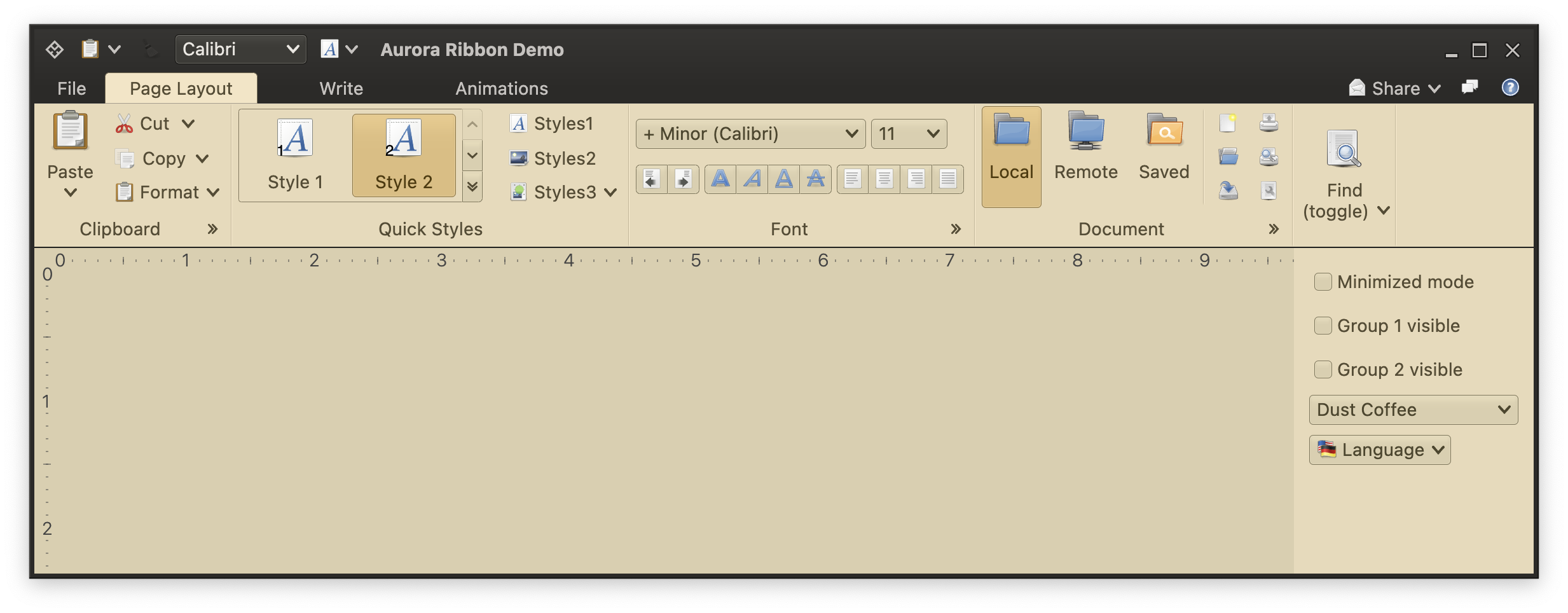 The ribbon has a lot of parts, and before diving into the code behind each one of them, let's get a little bit more familiar with where each part is, and the terminology used throughout the rest of the ribbon documentation.
### Ribbon
The ribbon has a lot of parts, and before diving into the code behind each one of them, let's get a little bit more familiar with where each part is, and the terminology used throughout the rest of the ribbon documentation.
### Ribbon
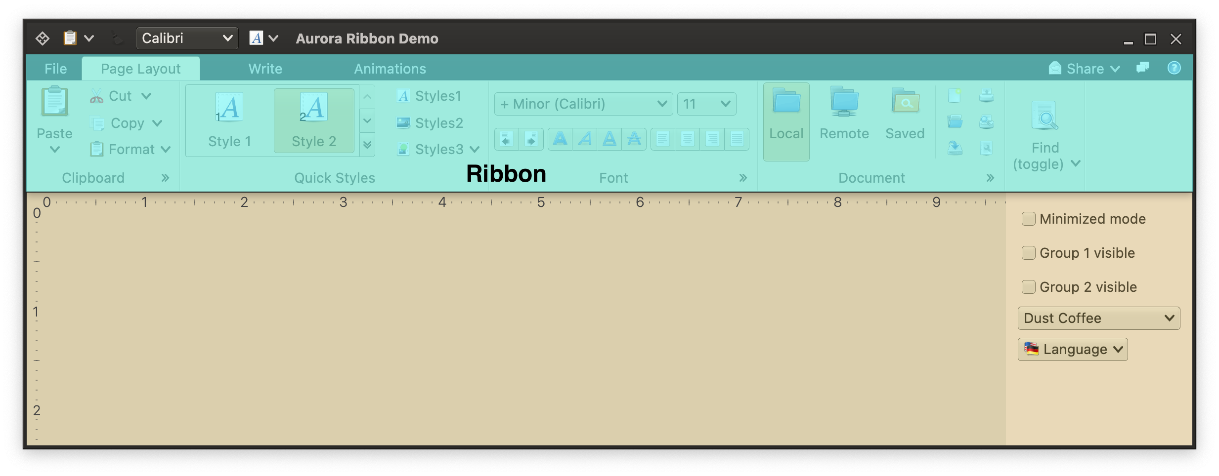 While the whole window is an `AuroraRibbonWindow`, the ribbon itself is the highlighted part. However, it also contributes some of the "content" into the title pane of the frame, as will be seen shortly.
### Ribbon tasks
While the whole window is an `AuroraRibbonWindow`, the ribbon itself is the highlighted part. However, it also contributes some of the "content" into the title pane of the frame, as will be seen shortly.
### Ribbon tasks
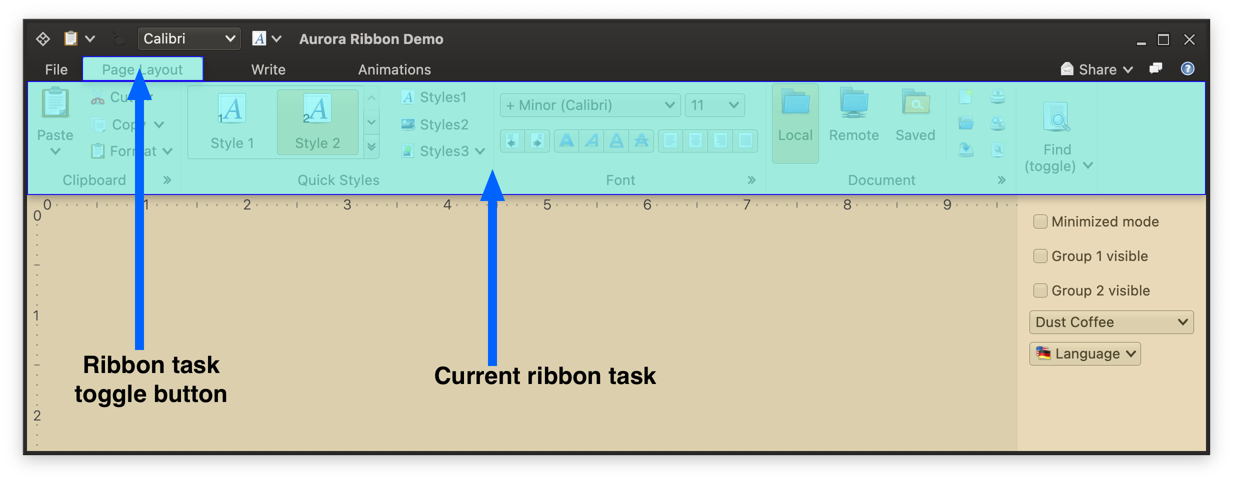 Ribbon is, at its core, a tabbed container. In ribbon's terminology, each "tab" is called a task. Only one task can be visible at any given time, and that task spans the entire width of the ribbon. Tasks can be switched using the matching task toggle buttons.
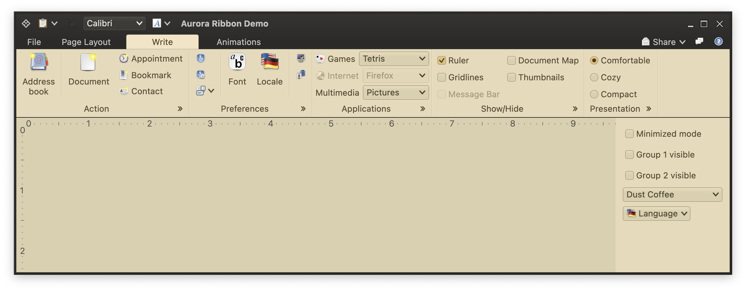 This screenshot shows the ribbon after the "Write" task has been set as the current task.
### Ribbon contextual task groups
This screenshot shows the ribbon after the "Write" task has been set as the current task.
### Ribbon contextual task groups
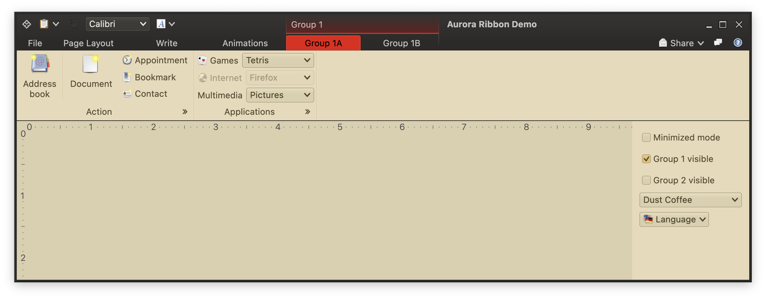 Contextual task groups can be shown and hidden dynamically based on the application-specific logic. For example, a word processor might show "Table"-related tasks only when the current document selection is a table. Task toggle buttons for such groups are highlighted with group-associated color (pink in this screenshot), and the entire group's header is also highlighted in the window title pane.
### Ribbon control area
Contextual task groups can be shown and hidden dynamically based on the application-specific logic. For example, a word processor might show "Table"-related tasks only when the current document selection is a table. Task toggle buttons for such groups are highlighted with group-associated color (pink in this screenshot), and the entire group's header is also highlighted in the window title pane.
### Ribbon control area
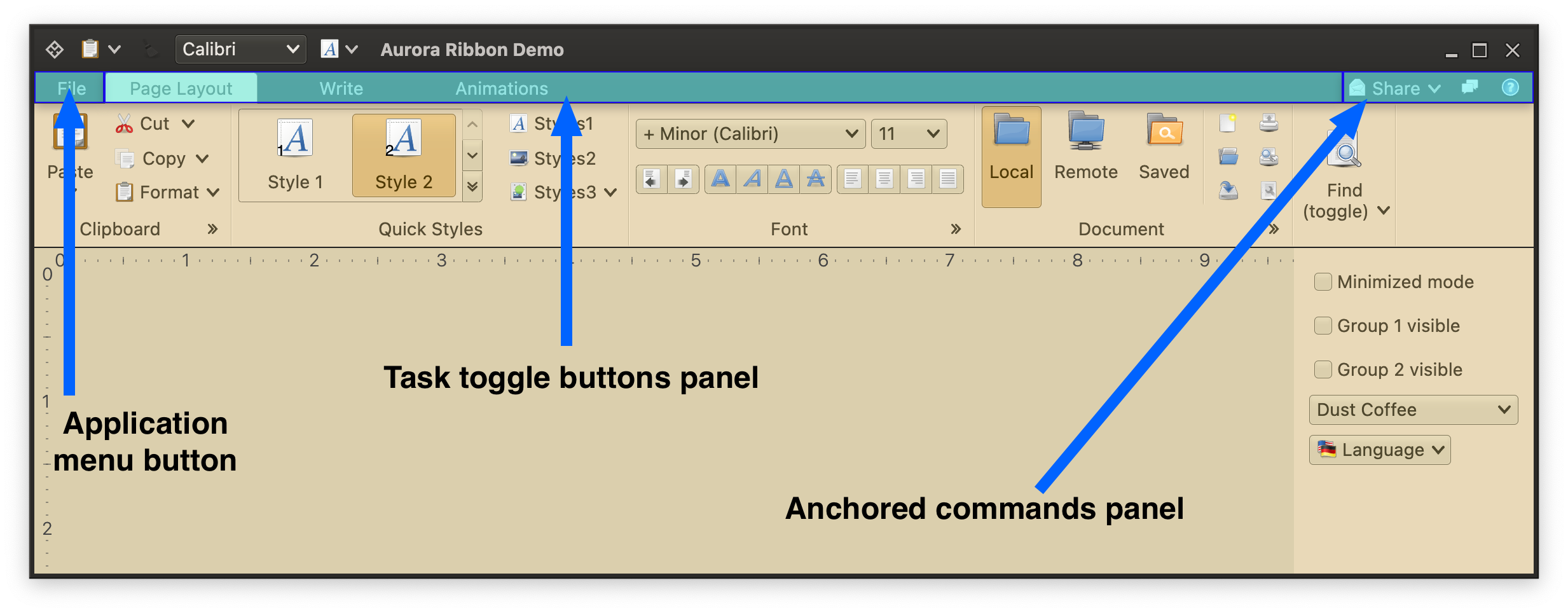 The horizontal strip above the ribbon task contains three parts:
- Application menu button
- Panel with all task toggle buttons
- Panel with anchored commands
### Ribbon bands
The horizontal strip above the ribbon task contains three parts:
- Application menu button
- Panel with all task toggle buttons
- Panel with anchored commands
### Ribbon bands
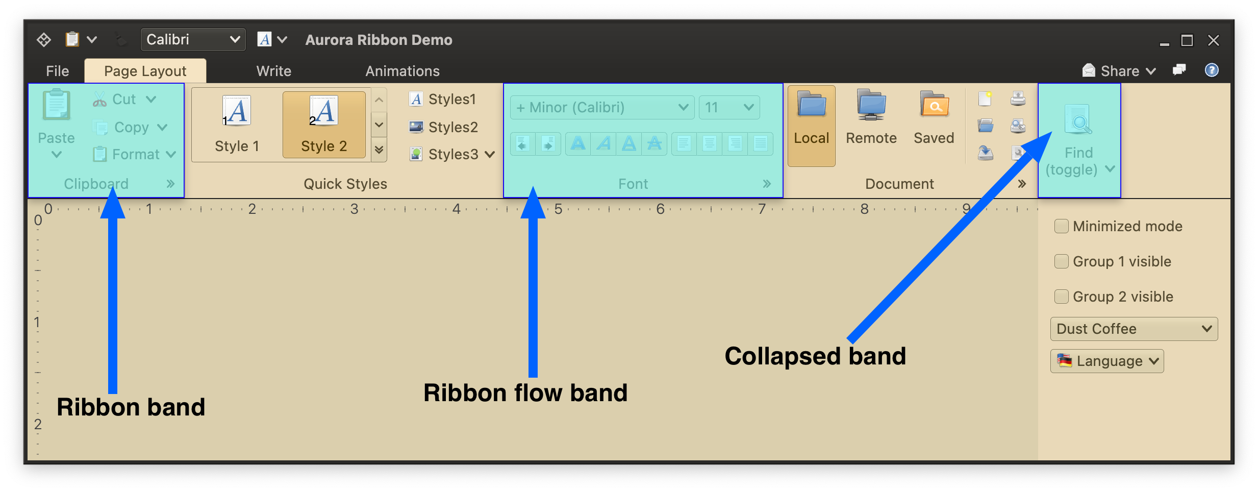 Each ribbon task is comprised of one or more ribbon bands. There are two types of bands:
- General
- Flow
When there is not enough horizontal space to display the ribbon band content at its most compact mode, the entire band is collapsed into a popup button (as seen above with the rightmost band). Activating that button shows the band content in a popup.
### Ribbon band content
Each ribbon task is comprised of one or more ribbon bands. There are two types of bands:
- General
- Flow
When there is not enough horizontal space to display the ribbon band content at its most compact mode, the entire band is collapsed into a popup button (as seen above with the rightmost band). Activating that button shows the band content in a popup.
### Ribbon band content
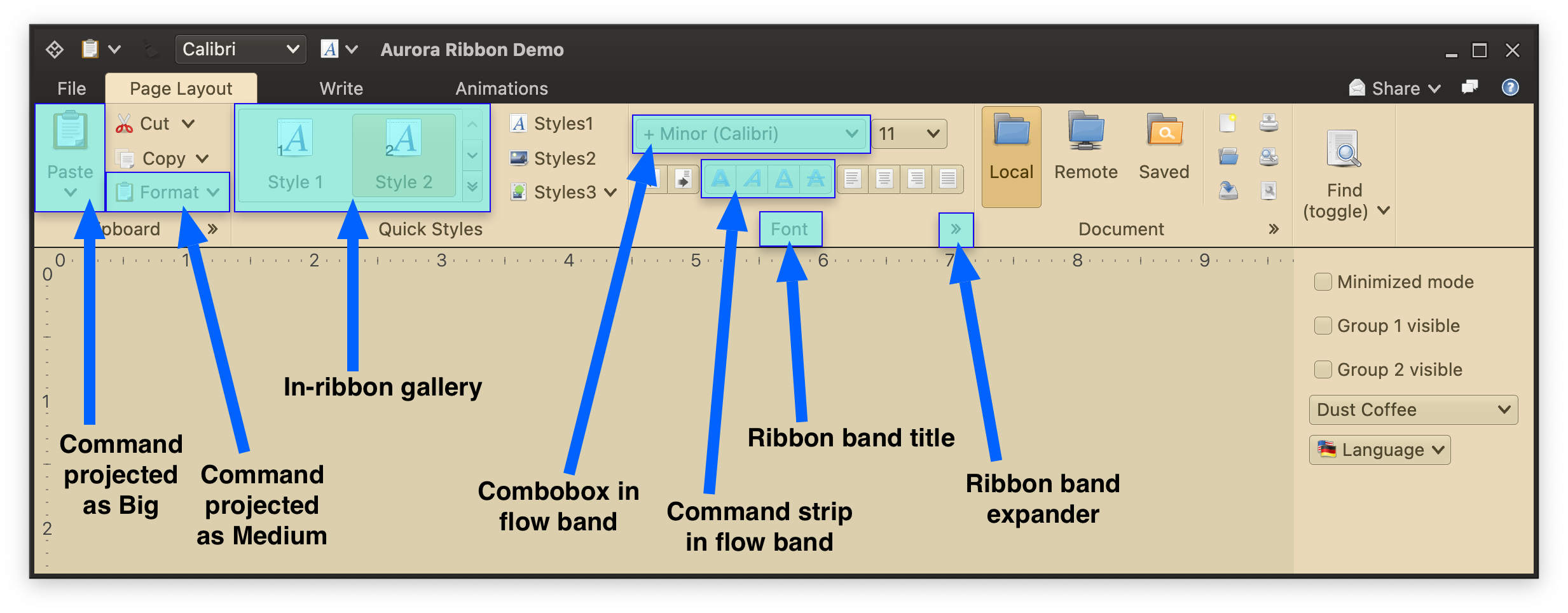 Ribbon bands can host the following content:
- [Commands](Command.md) [projected](CommandProjections.md) at different presentation states.
- In-ribbon galleries - a horizontal strip of commands with built-in vertical scrolling and full content popup display.
- Additional composable components exposed via the generic [projection](ModelProjectionOverview.md) mechanism.
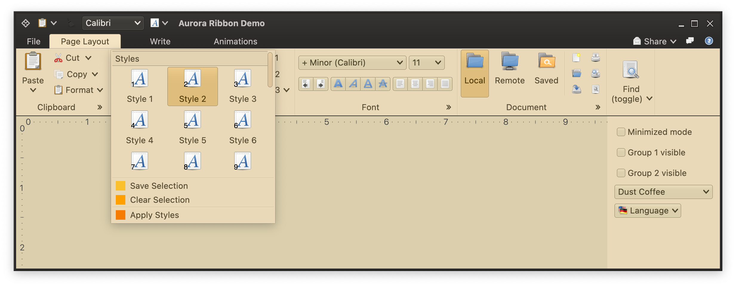
Here is the gallery in "Quick Styles" band expanded to show more of its content (with [additional](CommandPopupMenu.md) popup menu commands):
Ribbon bands can host the following content:
- [Commands](Command.md) [projected](CommandProjections.md) at different presentation states.
- In-ribbon galleries - a horizontal strip of commands with built-in vertical scrolling and full content popup display.
- Additional composable components exposed via the generic [projection](ModelProjectionOverview.md) mechanism.
Here is the gallery in "Quick Styles" band expanded to show more of its content (with [additional](CommandPopupMenu.md) popup menu commands):
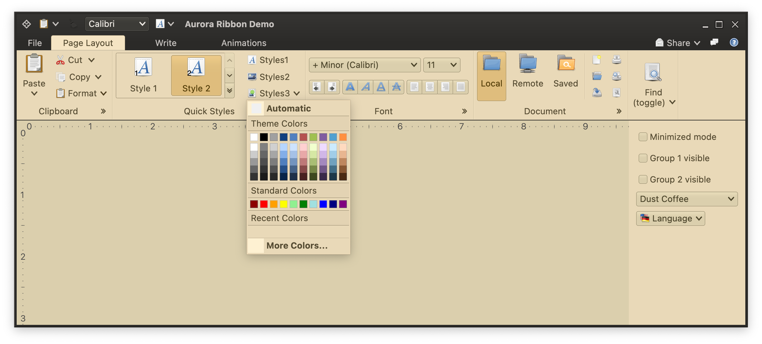
 Here is a [color selector command](ColorSelectorCommand.md) configured with a variety of sections:
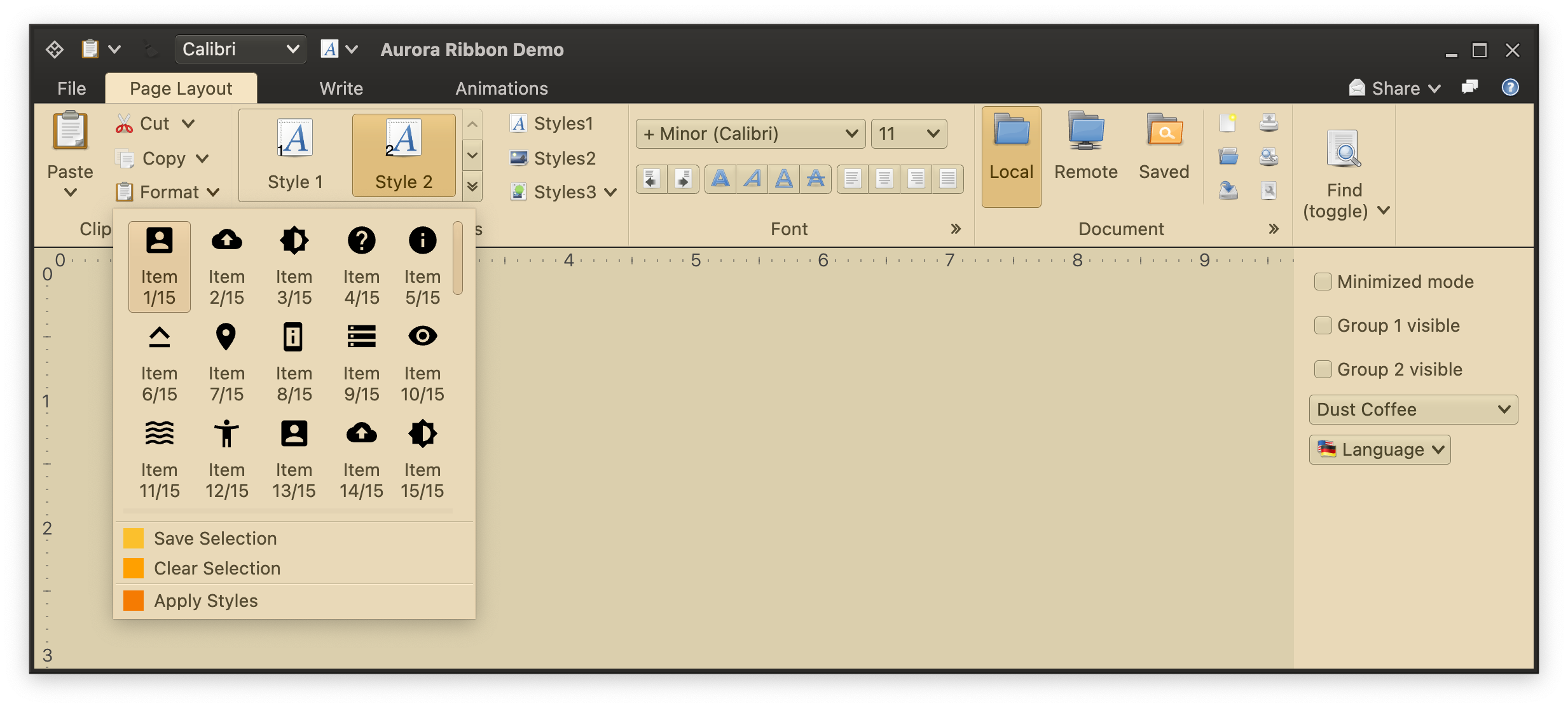 Here is a [command](Command.md) configured with complex [popup content](CommandPopupMenu.md):
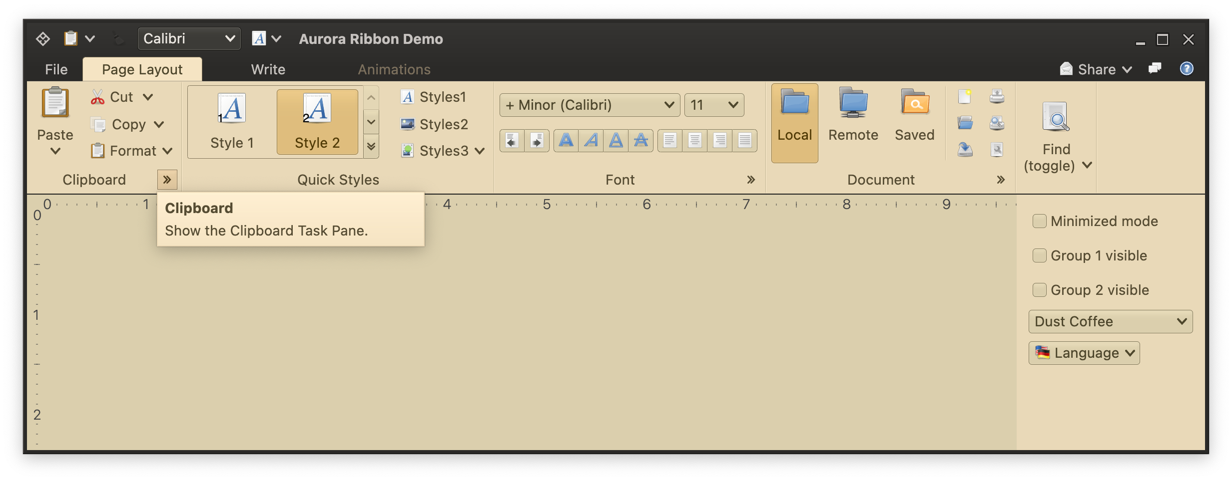
 Ribbon bands display their title below the main content. In addition, a band can have an associated "expander" action that is accessible via the small icon in its bottom-right corner (see the "Clipboard", "Font" and "Document" bands in the screenshot above):
 ### Ribbon taskbar
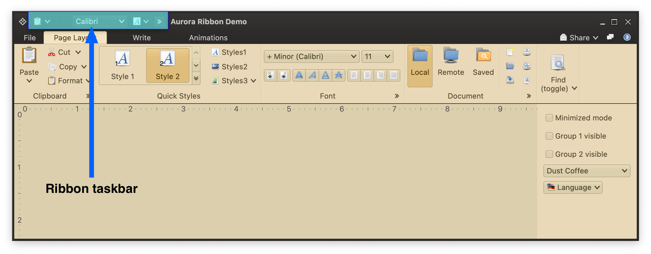 Frequently used commands and other ribbon content can be placed into the taskbar - a reserved area in the title pane of the entire window. Taskbar content is accessible no matter which ribbon task is displayed currently.
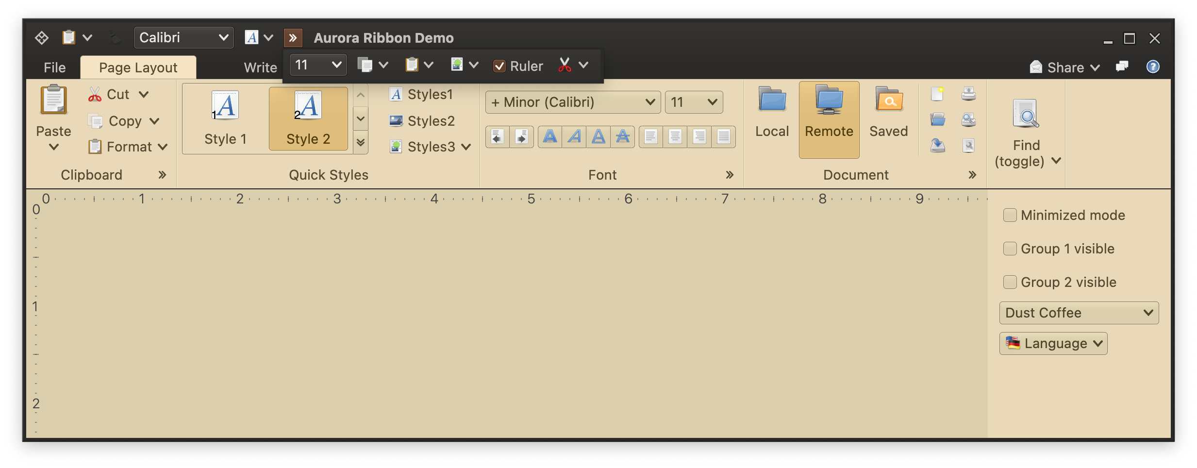 If there is not enough horizontal space in the window title pane to show the full taskbar content, the taskbar will show a trailing expander button that, when activated, will display the rest of the taskbar content right below. In the screenshot above, see that additional content displayed "over" the "Animations" task toggle button.
### Ribbon application menu
If there is not enough horizontal space in the window title pane to show the full taskbar content, the taskbar will show a trailing expander button that, when activated, will display the rest of the taskbar content right below. In the screenshot above, see that additional content displayed "over" the "Animations" task toggle button.
### Ribbon application menu
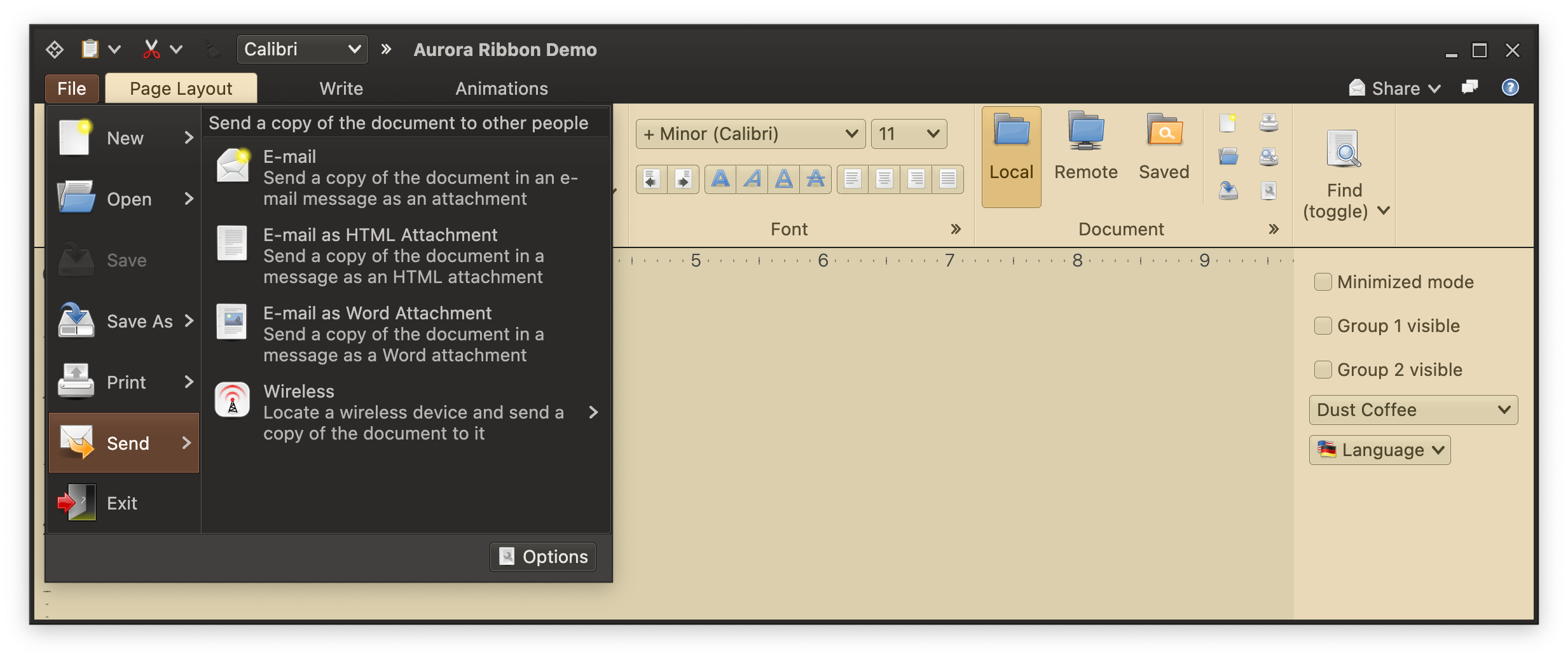 Ribbon application menu displays content that is "global", in a sense. Commands such as opening a new document, sending the current document to printer, etc belong at the level of the application menu. It is a two-panel container that displays a vertically scrollable list of secondary commands that correspond to the current selection in the primary list.
### Ribbon contextual menu
Ribbon application menu displays content that is "global", in a sense. Commands such as opening a new document, sending the current document to printer, etc belong at the level of the application menu. It is a two-panel container that displays a vertically scrollable list of secondary commands that correspond to the current selection in the primary list.
### Ribbon contextual menu
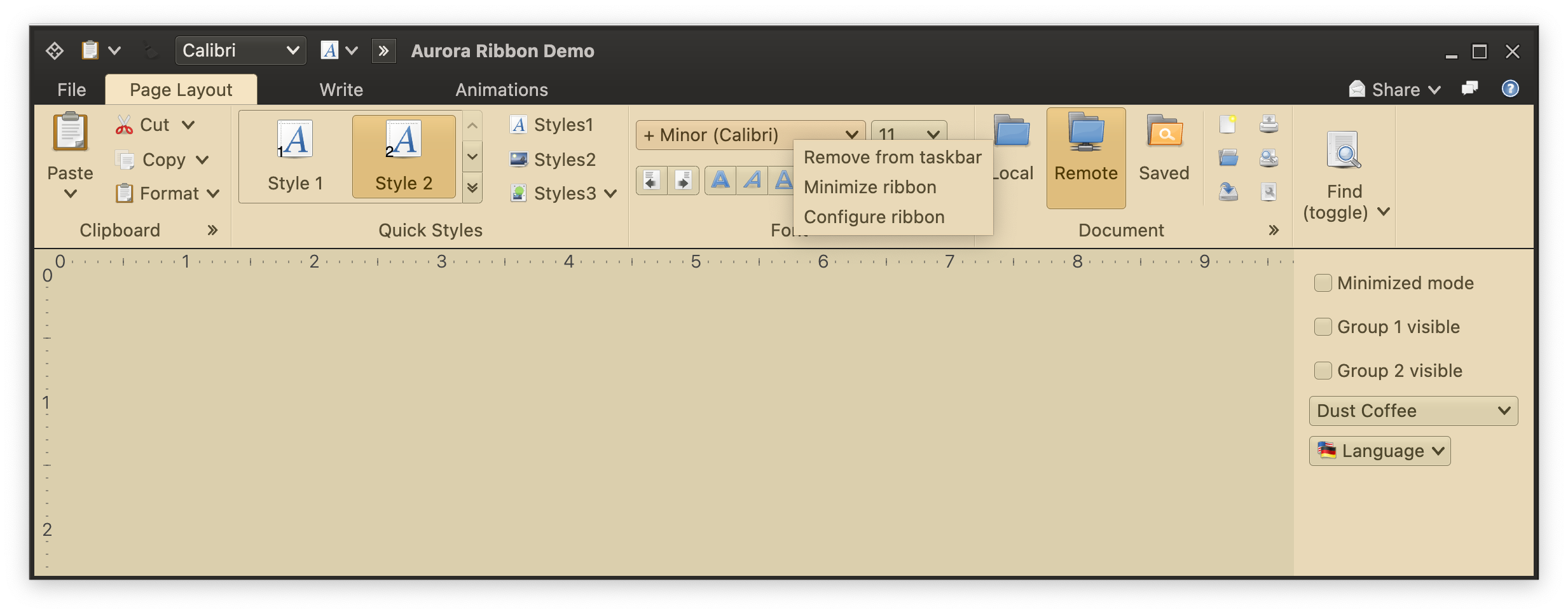 The ribbon can have a globally configured listener for populating the contextual menu that will be shown on right-clicking any element in the ribbon (including the taskbar). In the screenshot above, the application code is in full control over what to show in such a contextual menu.
### Ribbon key tips
The ribbon can have a globally configured listener for populating the contextual menu that will be shown on right-clicking any element in the ribbon (including the taskbar). In the screenshot above, the application code is in full control over what to show in such a contextual menu.
### Ribbon key tips
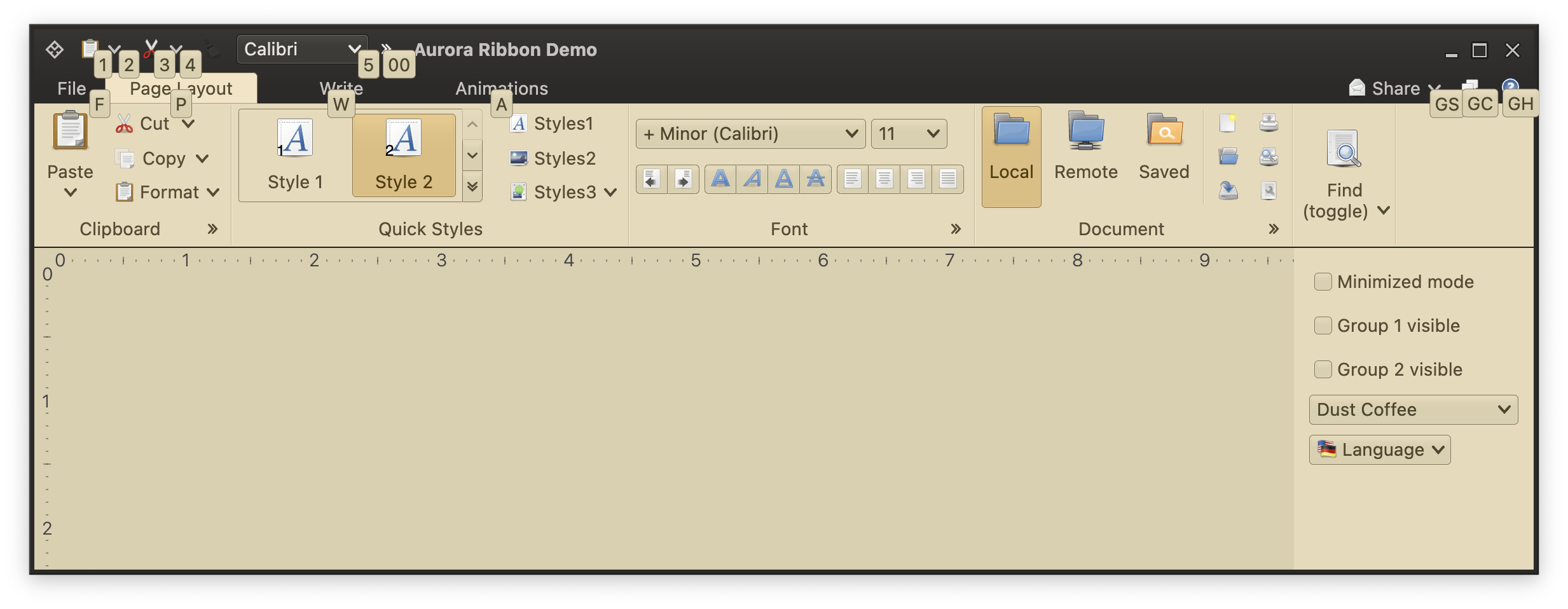 Keytips are evolution of mnemonics - a way to quickly navigate to and activate a specific component in the ribbon without using the mouse. Shown above are the "top-level" keytips activated when the user taps the "Alt" key. Tapping one of the shown letters will "activate" the corresponding entity (be it the application menu, one of the ribbon tasks or one of the taskbar / anchrored panel commands) and will, if relevant, show the keytips for that entity's content.
### Ribbon rich tooltips
Keytips are evolution of mnemonics - a way to quickly navigate to and activate a specific component in the ribbon without using the mouse. Shown above are the "top-level" keytips activated when the user taps the "Alt" key. Tapping one of the shown letters will "activate" the corresponding entity (be it the application menu, one of the ribbon tasks or one of the taskbar / anchrored panel commands) and will, if relevant, show the keytips for that entity's content.
### Ribbon rich tooltips
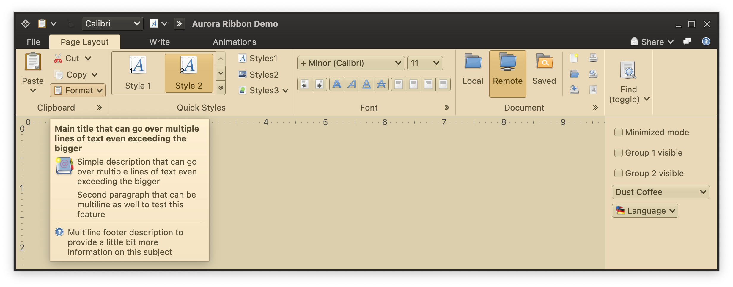 Every component displayed in the ribbon can have associated rich tooltips. For ribbon band content, these are displayed below the ribbon, as seen in the screenshot above.
### Next
Continue to the [ribbon API skeleton](RibbonApiSkeleton.md).
Every component displayed in the ribbon can have associated rich tooltips. For ribbon band content, these are displayed below the ribbon, as seen in the screenshot above.
### Next
Continue to the [ribbon API skeleton](RibbonApiSkeleton.md).