## Components - ribbon taskbar
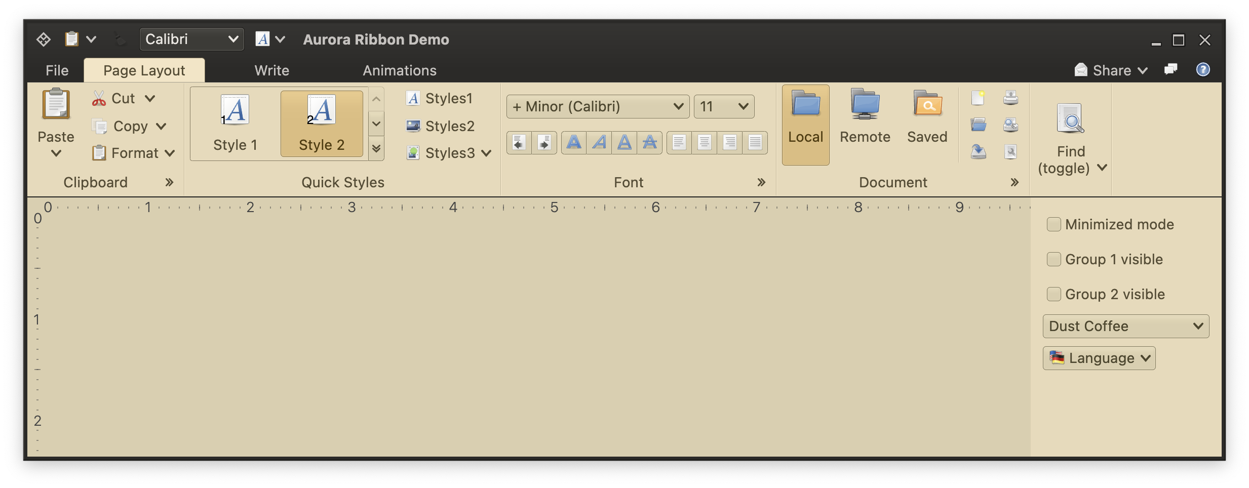 Similar to the [anchored command area](RibbonAnchoredCommands.md), the taskbar panel can be used to host content that does not get "switched away", so to speak, whenever a different ribbon task is selected. For example, some of your users might use the formatting functionality a lot, and always want to have the corresponding command projection on the screen no matter which ribbon task they are in right now. Some others might be working a lot with text formatting, such as changing font sizes, font styles or alignments.
The taskbar is a place that allows your users - when enabled in your application code by ribbon APIs described below - to configure their own set of commands and other content that suits their usage patterns.
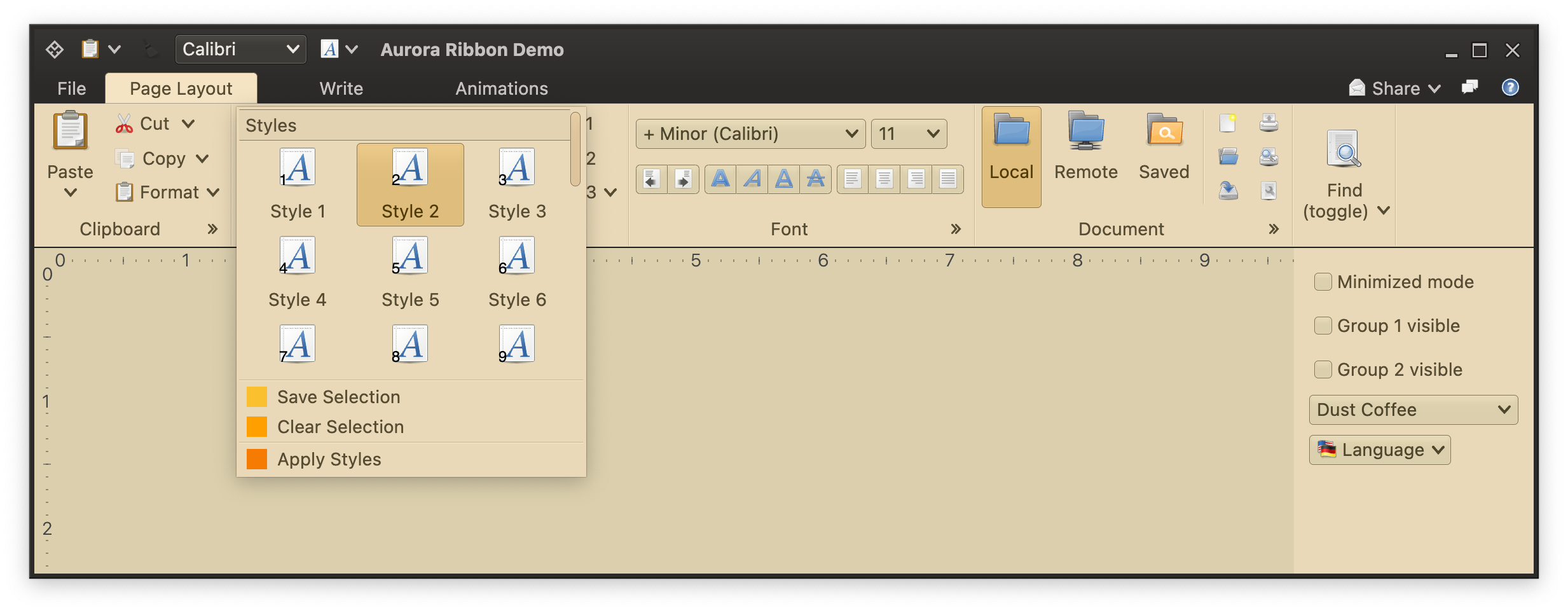
Unlike the anchored command area, the taskbar is much more versatile. Any element in the ribbon can be added to the taskbar. In the screenshot above we see a small button for the "Paste" command (which has main action and secondary content rendered as a popup menu), another small, disabled button for one of the formatting commands, and a full combobox with the available font selection.
Taskbar content is arranged as a single-line horizontal flow of components. If there is not enough horizontal space available to show all that content, a small double-arrow is added at the end of the available space. When activated, the rest of the taskbar content is shown in a popup right below that button. If necessary, that popup kicks in horizontal scrolling.
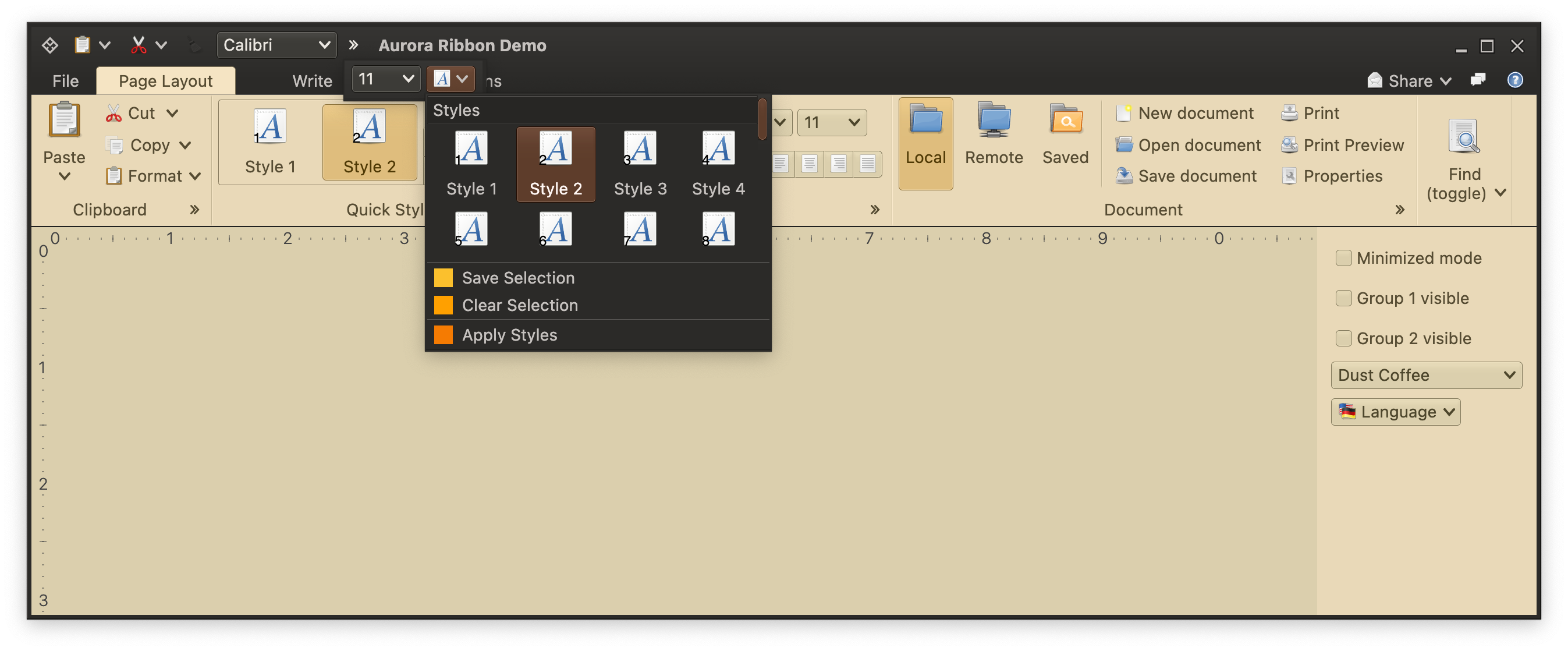
In the screenshot below you can see that overflow taskbar content that has a number of buttons and one checkbox. One of the buttons corresponds to the [in-ribbon gallery](RibbonBandGalleries.md) from the "Quick Styles" ribbon band. In the taskbar that gallery is projected as a small popup button with the full ribbon content and extra popup commands shown when that button is activated:
Similar to the [anchored command area](RibbonAnchoredCommands.md), the taskbar panel can be used to host content that does not get "switched away", so to speak, whenever a different ribbon task is selected. For example, some of your users might use the formatting functionality a lot, and always want to have the corresponding command projection on the screen no matter which ribbon task they are in right now. Some others might be working a lot with text formatting, such as changing font sizes, font styles or alignments.
The taskbar is a place that allows your users - when enabled in your application code by ribbon APIs described below - to configure their own set of commands and other content that suits their usage patterns.
Unlike the anchored command area, the taskbar is much more versatile. Any element in the ribbon can be added to the taskbar. In the screenshot above we see a small button for the "Paste" command (which has main action and secondary content rendered as a popup menu), another small, disabled button for one of the formatting commands, and a full combobox with the available font selection.
Taskbar content is arranged as a single-line horizontal flow of components. If there is not enough horizontal space available to show all that content, a small double-arrow is added at the end of the available space. When activated, the rest of the taskbar content is shown in a popup right below that button. If necessary, that popup kicks in horizontal scrolling.
In the screenshot below you can see that overflow taskbar content that has a number of buttons and one checkbox. One of the buttons corresponds to the [in-ribbon gallery](RibbonBandGalleries.md) from the "Quick Styles" ribbon band. In the taskbar that gallery is projected as a small popup button with the full ribbon content and extra popup commands shown when that button is activated:
 ### Taskbar content - commands
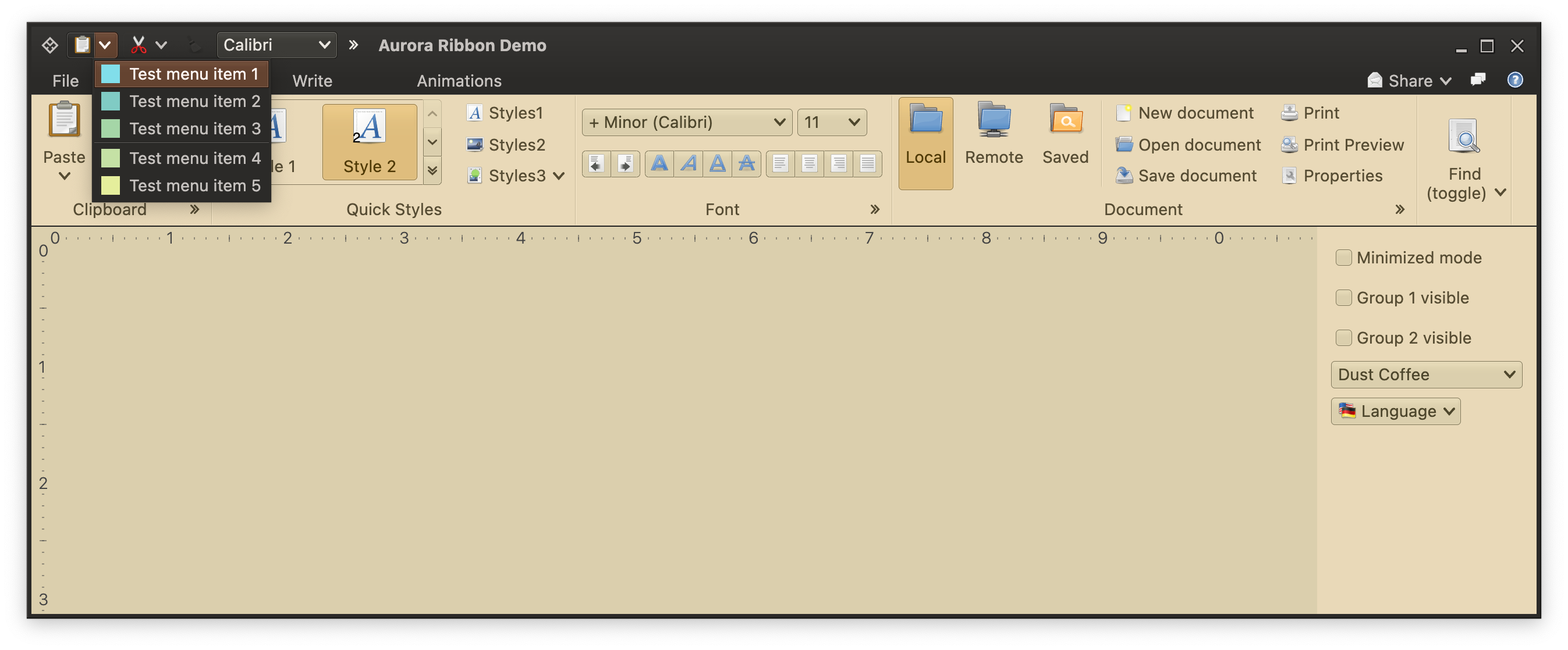
Any [command](Command.md) can be added to the taskbar with the `JRibbon.addTaskbarCommand()` API. Here is all the code that is needed to have the "Paste" command that is seen in the "Clipboard" band to also appear in the taskbar:
```kotlin
val taskbarElements: MutableList = remember {
mutableStateListOf(
RibbonTaskbarCommand(
CommandButtonProjection(
contentModel = pasteCommand,
presentationModel = CommandButtonPresentationModel()
)
),
...
val ribbon = Ribbon(
tasks = listOf(pageLayoutTask, writeTask, animationsTask),
contextualTaskGroups = contextualTaskGroups,
taskbarElements = taskbarElements,
taskbarKeyTipPolicy = DefaultRibbonTaskbarKeyTipPolicy(),
anchoredCommands = builder.getAnchoredCommands(),
applicationMenuCommandButtonProjection = applicationMenuCommandButtonProjection,
isMinimized = minimizedMode,
onShowContextualMenuListener = onShowContextualMenuListener
)
```
This is the true power of commands - as a content model for a piece of the application model realm, it can be projected into multiple places in the application UI. As long as all those projections use the same content model (command in our case), they will be automatically and seamlessly [synchronized](CommandSynchronization.md) on any change in the underlying data, as well as on any user interaction. For example, if the `pasteCommand` in the code snippet above has its `isActionEnabled` backed by a `MutableState`, updates to that mutable state will be reflected to both projections of that command - the one in the "Clipboard" band and the one in the taskbar - will be switched to the disabled look.
The same goes for all the other parts of that content model. You don't need to configure the secondary / popup content twice for the same "Paste" command. It just works:
### Taskbar content - commands
Any [command](Command.md) can be added to the taskbar with the `JRibbon.addTaskbarCommand()` API. Here is all the code that is needed to have the "Paste" command that is seen in the "Clipboard" band to also appear in the taskbar:
```kotlin
val taskbarElements: MutableList = remember {
mutableStateListOf(
RibbonTaskbarCommand(
CommandButtonProjection(
contentModel = pasteCommand,
presentationModel = CommandButtonPresentationModel()
)
),
...
val ribbon = Ribbon(
tasks = listOf(pageLayoutTask, writeTask, animationsTask),
contextualTaskGroups = contextualTaskGroups,
taskbarElements = taskbarElements,
taskbarKeyTipPolicy = DefaultRibbonTaskbarKeyTipPolicy(),
anchoredCommands = builder.getAnchoredCommands(),
applicationMenuCommandButtonProjection = applicationMenuCommandButtonProjection,
isMinimized = minimizedMode,
onShowContextualMenuListener = onShowContextualMenuListener
)
```
This is the true power of commands - as a content model for a piece of the application model realm, it can be projected into multiple places in the application UI. As long as all those projections use the same content model (command in our case), they will be automatically and seamlessly [synchronized](CommandSynchronization.md) on any change in the underlying data, as well as on any user interaction. For example, if the `pasteCommand` in the code snippet above has its `isActionEnabled` backed by a `MutableState`, updates to that mutable state will be reflected to both projections of that command - the one in the "Clipboard" band and the one in the taskbar - will be switched to the disabled look.
The same goes for all the other parts of that content model. You don't need to configure the secondary / popup content twice for the same "Paste" command. It just works:
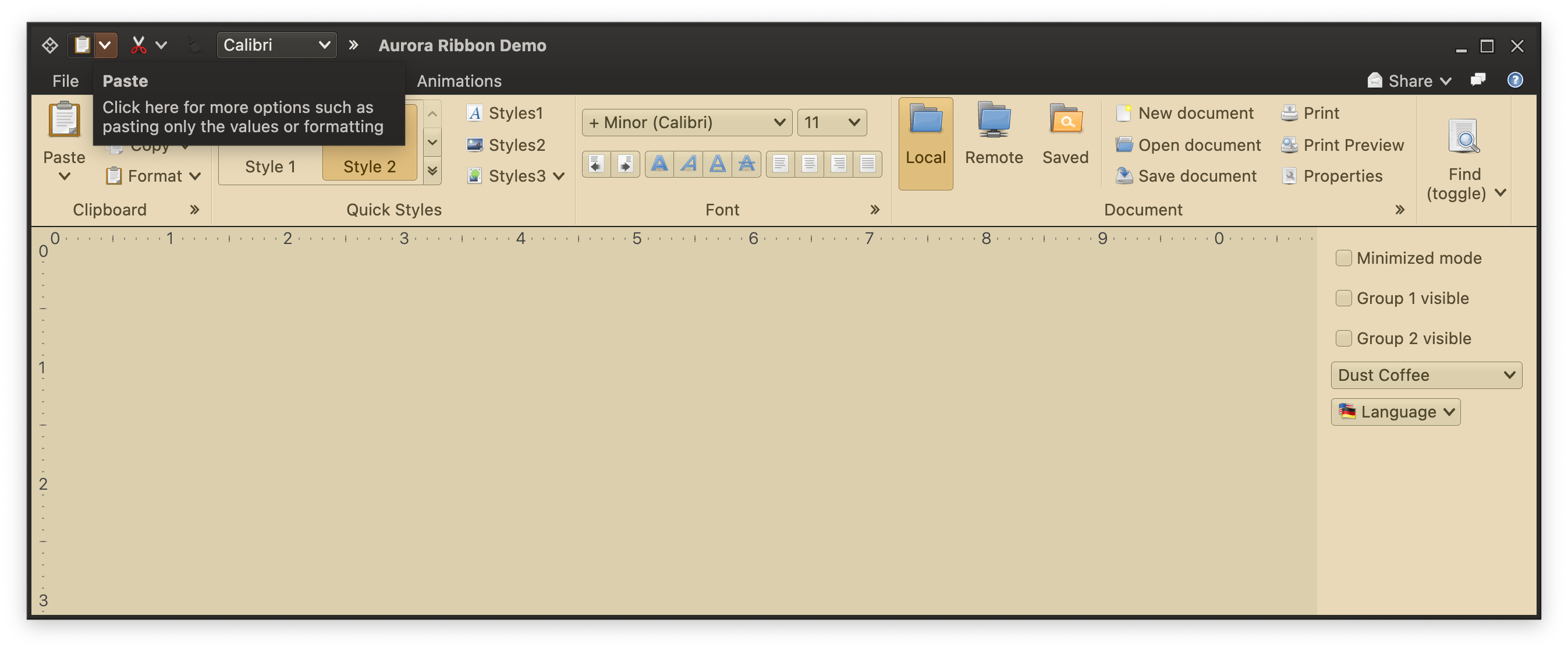
 You don't need to configure the rich tooltip twice for the same "Paste" command. It just works:
 ### Taskbar content - galleries
Here is the code behind this popup button that, when activated, shows the ribbon gallery content in its popup menu:
```kotlin
val taskbarElements: MutableList = remember {
mutableStateListOf(
...
// Add the same gallery we have in the first ribbon task to the taskbar, configuring
// its popup presentation with a 4x2 grid of slightly smaller buttons (instead of a 3x3
// grid of slightly larger ones in the in-task gallery popup).
// Content preview and selection is controlled by the same model and is kept in sync
// along all usages of the gallery content model in our ribbon.
RibbonTaskbarGallery(
RibbonGalleryProjection(
contentModel = styleGalleryContentModel,
presentationModel = RibbonGalleryPresentationModel(
popupLayoutSpec = MenuPopupPanelLayoutSpec(columnCount = 4, visibleRowCount = 2),
commandButtonPresentationState = RibbonBandCommandButtonPresentationStates.BigFixed,
collapsedVisibleCountLow = styleGalleryInlineMetaPresentationModel.collapsedVisibleCountLow,
collapsedVisibleCountMedium = styleGalleryInlineMetaPresentationModel.collapsedVisibleCountMedium,
collapsedVisibleCountTop = styleGalleryInlineMetaPresentationModel.collapsedVisibleCountTop
),
inlineState = ribbonState.documentStyleGalleryInlineState
)
)
)
)
```
Once again, as in the case of commands, we use the same exact content model to keep both gallery projections in sync (commands themselves, selection, preview listener, etc). The only difference here is the presentation model configured on the taskbar projection - using 4 columns and 2 visible rows. Here is, for reference, the gallery projection configured for the "Quick Styles" ribbon band - with 3 columns and 3 visible rows, but otherwise the same exact content (as they are based on the same exact content model):
### Taskbar content - galleries
Here is the code behind this popup button that, when activated, shows the ribbon gallery content in its popup menu:
```kotlin
val taskbarElements: MutableList = remember {
mutableStateListOf(
...
// Add the same gallery we have in the first ribbon task to the taskbar, configuring
// its popup presentation with a 4x2 grid of slightly smaller buttons (instead of a 3x3
// grid of slightly larger ones in the in-task gallery popup).
// Content preview and selection is controlled by the same model and is kept in sync
// along all usages of the gallery content model in our ribbon.
RibbonTaskbarGallery(
RibbonGalleryProjection(
contentModel = styleGalleryContentModel,
presentationModel = RibbonGalleryPresentationModel(
popupLayoutSpec = MenuPopupPanelLayoutSpec(columnCount = 4, visibleRowCount = 2),
commandButtonPresentationState = RibbonBandCommandButtonPresentationStates.BigFixed,
collapsedVisibleCountLow = styleGalleryInlineMetaPresentationModel.collapsedVisibleCountLow,
collapsedVisibleCountMedium = styleGalleryInlineMetaPresentationModel.collapsedVisibleCountMedium,
collapsedVisibleCountTop = styleGalleryInlineMetaPresentationModel.collapsedVisibleCountTop
),
inlineState = ribbonState.documentStyleGalleryInlineState
)
)
)
)
```
Once again, as in the case of commands, we use the same exact content model to keep both gallery projections in sync (commands themselves, selection, preview listener, etc). The only difference here is the presentation model configured on the taskbar projection - using 4 columns and 2 visible rows. Here is, for reference, the gallery projection configured for the "Quick Styles" ribbon band - with 3 columns and 3 visible rows, but otherwise the same exact content (as they are based on the same exact content model):
 ### Taskbar content - components
In addition to commands and galleries, you can also place the third type of content supported by the ribbon - [component projections](RibbonBandComponentProjections.md). Here is all that is needed to add the font selection combobox projected from the same exact content model as the one in the "Font" ribbon band:
```kotlin
val taskbarElements: MutableList = remember {
mutableStateListOf(
...
RibbonTaskbarComponent(
ComboBoxProjection(
contentModel = fontFamilyComboBoxContentModel,
presentationModel = ComboBoxPresentationModel(displayConverter = { it.name }),
)
),
...
)
)
```
### Taskbar keytips
Taskbar keytips are not set on individual projections (commands, components, galleries, application menu links). Since the taskbar content [can be configured by the user](RibbonContextualListener.md) if the application design allows, it does not make sense to configure hard-coded keytips to every single projection that can be added to the taskbar.
How does it work instead? First, let's take a look at the following screenshot:
### Taskbar content - components
In addition to commands and galleries, you can also place the third type of content supported by the ribbon - [component projections](RibbonBandComponentProjections.md). Here is all that is needed to add the font selection combobox projected from the same exact content model as the one in the "Font" ribbon band:
```kotlin
val taskbarElements: MutableList = remember {
mutableStateListOf(
...
RibbonTaskbarComponent(
ComboBoxProjection(
contentModel = fontFamilyComboBoxContentModel,
presentationModel = ComboBoxPresentationModel(displayConverter = { it.name }),
)
),
...
)
)
```
### Taskbar keytips
Taskbar keytips are not set on individual projections (commands, components, galleries, application menu links). Since the taskbar content [can be configured by the user](RibbonContextualListener.md) if the application design allows, it does not make sense to configure hard-coded keytips to every single projection that can be added to the taskbar.
How does it work instead? First, let's take a look at the following screenshot:
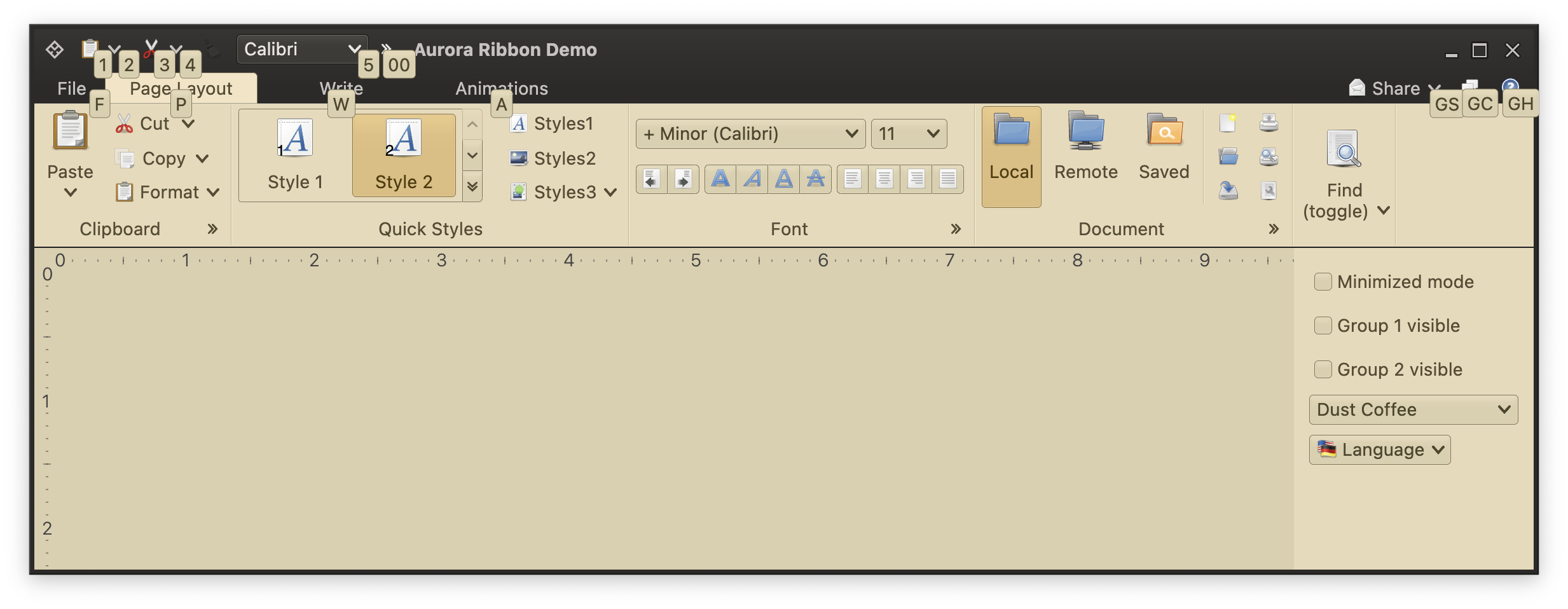 When the [root keytip level](RibbonKeytips.md) is shown, the ribbon displays keytips for all visible taskbar components, and for the overflow button if it is shown. Where do these keytips come from? They come from the taskbar key policy.
The `RibbonTaskbarKeyTipPolicy` defines the keytip policy. It has the following methods:
```kotlin
interface RibbonTaskbarKeyTipPolicy {
/**
* Returns the keytip for the task bar content (command, component, gallery, menu link)
* at the specified index.
*
* @param contentIndex Index of the task bar content. Content index starts at 1.
* @return Keytip for the specified content.
*/
fun getContentKeyTip(contentIndex: Int): String
/**
* Returns the keytip for the overflow button of the task bar.
*
* @return Keytip for the overflow button of the task bar.
*/
val overflowButtonKeyTip: String
}
```
The default `DefaultRibbonTaskbarKeyTipPolicy` implementation of this interface has the following logic:
- Use *00* as the keytip for the overflow button
- For regular content, start with *1* through *9* (see in the screenshot above how the first "Paste" projection has keytip *1*, the second has keytip *2*, the third combobox has keytip *3* etc). After *9* it returns the sequence of *01* through *09* followed by *0A* through *0Z*. Then the sequence of *11* through *19* followed by *1A* through *1Z*. And so on.
This default implementation aims to address the following expected scenario: once the specific user has finished customizing the ribbon in your application to their liking, this numeric / alphanumeric sequence becomes a sort of hardcoded list of keytips. It also, conveniently, corresponds to the location of elements in the taskbar.
To provide your own custom taskbar keytip policy, use the `taskbarKeyTipPolicy` property of the `Ribbon` data class API.
### Next
Continue to [ribbon global contextual listener](RibbonContextualListener.md).
When the [root keytip level](RibbonKeytips.md) is shown, the ribbon displays keytips for all visible taskbar components, and for the overflow button if it is shown. Where do these keytips come from? They come from the taskbar key policy.
The `RibbonTaskbarKeyTipPolicy` defines the keytip policy. It has the following methods:
```kotlin
interface RibbonTaskbarKeyTipPolicy {
/**
* Returns the keytip for the task bar content (command, component, gallery, menu link)
* at the specified index.
*
* @param contentIndex Index of the task bar content. Content index starts at 1.
* @return Keytip for the specified content.
*/
fun getContentKeyTip(contentIndex: Int): String
/**
* Returns the keytip for the overflow button of the task bar.
*
* @return Keytip for the overflow button of the task bar.
*/
val overflowButtonKeyTip: String
}
```
The default `DefaultRibbonTaskbarKeyTipPolicy` implementation of this interface has the following logic:
- Use *00* as the keytip for the overflow button
- For regular content, start with *1* through *9* (see in the screenshot above how the first "Paste" projection has keytip *1*, the second has keytip *2*, the third combobox has keytip *3* etc). After *9* it returns the sequence of *01* through *09* followed by *0A* through *0Z*. Then the sequence of *11* through *19* followed by *1A* through *1Z*. And so on.
This default implementation aims to address the following expected scenario: once the specific user has finished customizing the ribbon in your application to their liking, this numeric / alphanumeric sequence becomes a sort of hardcoded list of keytips. It also, conveniently, corresponds to the location of elements in the taskbar.
To provide your own custom taskbar keytip policy, use the `taskbarKeyTipPolicy` property of the `Ribbon` data class API.
### Next
Continue to [ribbon global contextual listener](RibbonContextualListener.md).