## Aurora theming - overlay painters
[Decoration painters](decoration.md) are used to paint the entire background area of the relevant containers - such as menu bars, tool bars, panels etc. Overlay painters, on the other hand, add the final polish that usually affects relatively small areas at the edges of the relevant decoration areas. Aurora also provides a set of published APIs for applications that wish to add visually consistent overlays to custom application composables.
### Overlays
The overlays are best illustrated with screenshots. The following screenshot is a skeleton window under the [Nebula Brick Wall](../skins/toneddown.md#nebula-brick-wall) skin:
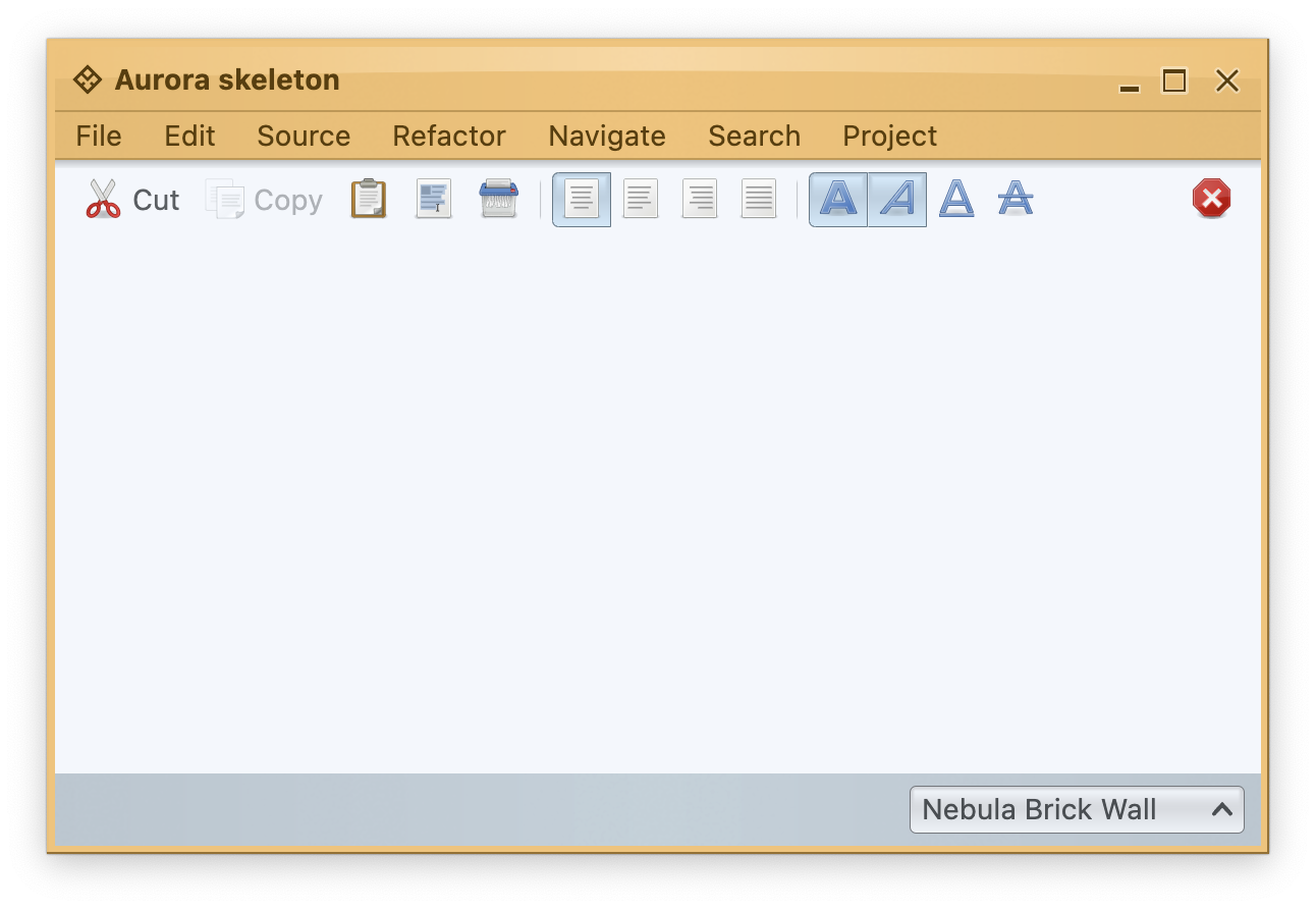 This skin defines custom visual appearance for the title pane, the menu bar and the status bar - the background of these areas is painted by the matching decoration painter - in this case, the `MarbleNoiseDecorationPainter`. To add the final polishing touch and create a unique visual footprint for this skin, we use a number of overlay painters. The Nebula Brick Wall skin defines two separate overlay painters, each one associated with the relevant decoration areas:
```kotlin
// add an overlay painter to paint a drop shadow along the top edge of toolbars
painters.addOverlayPainter(
TopShadowOverlayPainter.getInstance(60),
DecorationAreaType.Toolbar
)
// add an overlay painter to paint separator lines along the bottom
// edges of title panes and menu bars
painters.addOverlayPainter(
BottomLineOverlayPainter(
composite({ it.darkColor }, ColorTransforms.alpha(0.625f))
),
DecorationAreaType.TitlePane, DecorationAreaType.Header
)
```
* The `TopShadowOverlayPainter` is associated with the `Toolbar` decoration area - adding the drop shadow along the top edge of all application toolbars (see the bottom half of the zoomed area in the screenshot above).
* The `BottomLineOverlayPainter` is associated with `TitlePane` and `Header` decoration areas - adding a thin separator line along the bottom edge of the title pane and the menubar (see the top half of the zoomed area in the screenshot above). Note that the application needs to specify what color is used to paint the separator line - using the `(ContainerColorTokens) -> Color` lambda and an optional list of color transformations (in this case, applying alpha of 62.5%).
Here is the same skeleton window under the [Gemini](../skins/toneddown.md#gemini) skin:
This skin defines custom visual appearance for the title pane, the menu bar and the status bar - the background of these areas is painted by the matching decoration painter - in this case, the `MarbleNoiseDecorationPainter`. To add the final polishing touch and create a unique visual footprint for this skin, we use a number of overlay painters. The Nebula Brick Wall skin defines two separate overlay painters, each one associated with the relevant decoration areas:
```kotlin
// add an overlay painter to paint a drop shadow along the top edge of toolbars
painters.addOverlayPainter(
TopShadowOverlayPainter.getInstance(60),
DecorationAreaType.Toolbar
)
// add an overlay painter to paint separator lines along the bottom
// edges of title panes and menu bars
painters.addOverlayPainter(
BottomLineOverlayPainter(
composite({ it.darkColor }, ColorTransforms.alpha(0.625f))
),
DecorationAreaType.TitlePane, DecorationAreaType.Header
)
```
* The `TopShadowOverlayPainter` is associated with the `Toolbar` decoration area - adding the drop shadow along the top edge of all application toolbars (see the bottom half of the zoomed area in the screenshot above).
* The `BottomLineOverlayPainter` is associated with `TitlePane` and `Header` decoration areas - adding a thin separator line along the bottom edge of the title pane and the menubar (see the top half of the zoomed area in the screenshot above). Note that the application needs to specify what color is used to paint the separator line - using the `(ContainerColorTokens) -> Color` lambda and an optional list of color transformations (in this case, applying alpha of 62.5%).
Here is the same skeleton window under the [Gemini](../skins/toneddown.md#gemini) skin:
 This skin defines custom visual appearance for the title pane, the menu bar, the toolbars and the status bar - the background of these areas is painted by the matching [decoration painter](decoration.md) - in this case, the `MatteDecorationPainter`. To add the final polishing touch and create a unique visual footprint for this skin, we use overlay painters. The Gemini skin defines a number of overlay painters, each one associated with the relevant decoration areas:
```kotlin
// add an overlay painter to paint a bezel line along the top
// edge of footer
painters.addOverlayPainter(
TopBezelOverlayPainter(
colorTokensQueryTop = ContainerColorTokens::containerOutlineVariant,
colorTokensQueryBottom = { it.inverseContainerOutline.withAlpha(0.28125f) },
),
DecorationAreaType.Footer
)
// add two overlay painters to create a bezel line between
// menu bar and toolbars
painters.addOverlayPainter(
BottomLineOverlayPainter(ContainerColorTokens::containerOutline),
DecorationAreaType.Header
)
painters.addOverlayPainter(
TopLineOverlayPainter( { it.complementaryContainerOutline.withAlpha(0.1875f) }),
DecorationAreaType.Toolbar
)
// add overlay painter to paint drop shadows along the bottom
// edges of toolbars
painters.addOverlayPainter(
BottomShadowOverlayPainter.getInstance(100),
DecorationAreaType.Toolbar
)
// add overlay painter to paint a dark line along the bottom
// edge of toolbars
painters.addOverlayPainter(
BottomLineOverlayPainter(colorTokensQuery = ContainerColorTokens::containerOutline),
DecorationAreaType.Toolbar
)
```
This skin shows two different ways to add double-line bezel separators - the first between the menu bar and tool bar, and the second between the main application area and the footer:
* The double separator along the top edge of the footer (status bar) is painted by an instance of `TopBezelOverlayPainter` which is associated with the footer decoration area - see the bottom zoomed area in the screenshot above.
* The double separator between the menu bar and the tool bar is painted by two different overlay painters - see the top zoomed area in the screenshot above:
* An instance of `BottomLineOverlayPainter` associated with header decoration area - paints the top (darker) separator line along the bottom edge of the menu bar.
* An instance of `TopLineOverlayPainter` associated with toolbar decoration area - paints the bottom (lighter) separator line along the top edge of the tool bar.
The last example comes from the [Twilight](../skins/dark.md#twilight) skin:
This skin defines custom visual appearance for the title pane, the menu bar, the toolbars and the status bar - the background of these areas is painted by the matching [decoration painter](decoration.md) - in this case, the `MatteDecorationPainter`. To add the final polishing touch and create a unique visual footprint for this skin, we use overlay painters. The Gemini skin defines a number of overlay painters, each one associated with the relevant decoration areas:
```kotlin
// add an overlay painter to paint a bezel line along the top
// edge of footer
painters.addOverlayPainter(
TopBezelOverlayPainter(
colorTokensQueryTop = ContainerColorTokens::containerOutlineVariant,
colorTokensQueryBottom = { it.inverseContainerOutline.withAlpha(0.28125f) },
),
DecorationAreaType.Footer
)
// add two overlay painters to create a bezel line between
// menu bar and toolbars
painters.addOverlayPainter(
BottomLineOverlayPainter(ContainerColorTokens::containerOutline),
DecorationAreaType.Header
)
painters.addOverlayPainter(
TopLineOverlayPainter( { it.complementaryContainerOutline.withAlpha(0.1875f) }),
DecorationAreaType.Toolbar
)
// add overlay painter to paint drop shadows along the bottom
// edges of toolbars
painters.addOverlayPainter(
BottomShadowOverlayPainter.getInstance(100),
DecorationAreaType.Toolbar
)
// add overlay painter to paint a dark line along the bottom
// edge of toolbars
painters.addOverlayPainter(
BottomLineOverlayPainter(colorTokensQuery = ContainerColorTokens::containerOutline),
DecorationAreaType.Toolbar
)
```
This skin shows two different ways to add double-line bezel separators - the first between the menu bar and tool bar, and the second between the main application area and the footer:
* The double separator along the top edge of the footer (status bar) is painted by an instance of `TopBezelOverlayPainter` which is associated with the footer decoration area - see the bottom zoomed area in the screenshot above.
* The double separator between the menu bar and the tool bar is painted by two different overlay painters - see the top zoomed area in the screenshot above:
* An instance of `BottomLineOverlayPainter` associated with header decoration area - paints the top (darker) separator line along the bottom edge of the menu bar.
* An instance of `TopLineOverlayPainter` associated with toolbar decoration area - paints the bottom (lighter) separator line along the top edge of the tool bar.
The last example comes from the [Twilight](../skins/dark.md#twilight) skin:
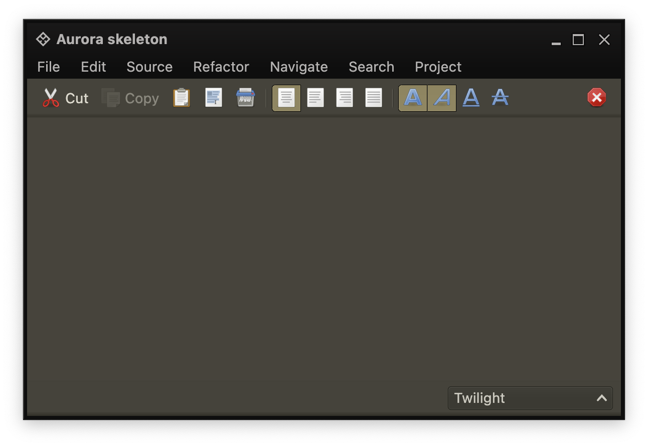 This skin defines custom visual appearance for the title pane, the menu bar, the toolbars and the status bar - the background of these areas is painted by the matching decoration painter - in this case, the `MatteDecorationPainter`. To add the final polishing touch and create a unique visual footprint for this skin, we use overlay painters. The Twilight skin defines a number of overlay painters, each one associated with the relevant decoration areas:
```kotlin
// Add overlay painters to paint drop shadows along the bottom
// edges of toolbars and footers
painters.addOverlayPainter(BottomShadowOverlayPainter.getInstance(100), DecorationAreaType.Toolbar)
painters.addOverlayPainter(BottomShadowOverlayPainter.getInstance(100), DecorationAreaType.Footer)
// add an overlay painter to paint a dark line along the bottom
// edge of toolbars
painters.addOverlayPainter(
BottomLineOverlayPainter( { it.containerOutlineVariant } ),
DecorationAreaType.Toolbar
)
// add an overlay painter to paint a light line along the top
// edge of toolbars
painters.addOverlayPainter(
TopLineOverlayPainter( { it.inverseContainerOutline.withAlpha(0.125f) } ),
DecorationAreaType.Toolbar
)
// add an overlay painter to paint a bezel line along the top
// edge of footer
painters.addOverlayPainter(
TopBezelOverlayPainter(
colorTokensQueryTop = { it.containerOutlineVariant },
colorTokensQueryBottom = { it.inverseContainerOutline.withAlpha(0.28125f) }
), DecorationAreaType.Footer
)
```
The overlay painters used in the Twilight skin are:
* An instance of `TopLineOverlayPainter` associated with `toolbar` decoration area - paints the lighter top separator line along the top edge of the tool bar - see the top zoomed area in the screenshot above.
* An instance of `BottomLineOverlayPainter` associated with `toolbar` decoration area - paints the darker bottom separator line along the bottom edge of the tool bar - see the top zoomed area in the screenshot above.
* An instance of `TopBezelOverlayPainter` associated with `footer` decoration area - paints the double bezel separator lines along the top edge of the status bar - see the bottom zoomed area in the screenshot above.
* The instance of `BottomShadowOverlayPainter` associated with `toolbar` and `footer` decoration areas - paints the drop shadow along the bottom edge of these areas - see the top zoomed area in the screenshot above.
### Application-facing APIs
To use the matching overlay painters in custom painting routines of your application, call the following published Aurora APIs:
* `AuroraSkin.decorationAreaType` to retrieve the decoration area type of the composable.
* `AuroraSkin.painters` to retrieve the painters associated with the current skin.
* `AuroraPainters.getOverlayPainters()` to retrieve the overlay painters registered for the specific decoration area type.
* Loop over the overlay painters and use the `AuroraOverlayPainter.paintOverlay()` (see below) to paint the overlays on the specific draw scope.
The base class for Aurora overlay painters is `AuroraOverlayPainter`. The only painting method in this class is:
```kotlin
fun paintOverlay(
drawScope: DrawScope,
decorationAreaType: DecorationAreaType,
width: Float,
height: Float,
colors: AuroraSkinColors
)
```
The `width` and `height` parameters specify the rectangle for the overlays (the overlay painters can only paint on rectangular areas), the `colors` specifies the Aurora colors to be used to compute the colors, while `decorationAreaType` indicates the decoration area type.
This skin defines custom visual appearance for the title pane, the menu bar, the toolbars and the status bar - the background of these areas is painted by the matching decoration painter - in this case, the `MatteDecorationPainter`. To add the final polishing touch and create a unique visual footprint for this skin, we use overlay painters. The Twilight skin defines a number of overlay painters, each one associated with the relevant decoration areas:
```kotlin
// Add overlay painters to paint drop shadows along the bottom
// edges of toolbars and footers
painters.addOverlayPainter(BottomShadowOverlayPainter.getInstance(100), DecorationAreaType.Toolbar)
painters.addOverlayPainter(BottomShadowOverlayPainter.getInstance(100), DecorationAreaType.Footer)
// add an overlay painter to paint a dark line along the bottom
// edge of toolbars
painters.addOverlayPainter(
BottomLineOverlayPainter( { it.containerOutlineVariant } ),
DecorationAreaType.Toolbar
)
// add an overlay painter to paint a light line along the top
// edge of toolbars
painters.addOverlayPainter(
TopLineOverlayPainter( { it.inverseContainerOutline.withAlpha(0.125f) } ),
DecorationAreaType.Toolbar
)
// add an overlay painter to paint a bezel line along the top
// edge of footer
painters.addOverlayPainter(
TopBezelOverlayPainter(
colorTokensQueryTop = { it.containerOutlineVariant },
colorTokensQueryBottom = { it.inverseContainerOutline.withAlpha(0.28125f) }
), DecorationAreaType.Footer
)
```
The overlay painters used in the Twilight skin are:
* An instance of `TopLineOverlayPainter` associated with `toolbar` decoration area - paints the lighter top separator line along the top edge of the tool bar - see the top zoomed area in the screenshot above.
* An instance of `BottomLineOverlayPainter` associated with `toolbar` decoration area - paints the darker bottom separator line along the bottom edge of the tool bar - see the top zoomed area in the screenshot above.
* An instance of `TopBezelOverlayPainter` associated with `footer` decoration area - paints the double bezel separator lines along the top edge of the status bar - see the bottom zoomed area in the screenshot above.
* The instance of `BottomShadowOverlayPainter` associated with `toolbar` and `footer` decoration areas - paints the drop shadow along the bottom edge of these areas - see the top zoomed area in the screenshot above.
### Application-facing APIs
To use the matching overlay painters in custom painting routines of your application, call the following published Aurora APIs:
* `AuroraSkin.decorationAreaType` to retrieve the decoration area type of the composable.
* `AuroraSkin.painters` to retrieve the painters associated with the current skin.
* `AuroraPainters.getOverlayPainters()` to retrieve the overlay painters registered for the specific decoration area type.
* Loop over the overlay painters and use the `AuroraOverlayPainter.paintOverlay()` (see below) to paint the overlays on the specific draw scope.
The base class for Aurora overlay painters is `AuroraOverlayPainter`. The only painting method in this class is:
```kotlin
fun paintOverlay(
drawScope: DrawScope,
decorationAreaType: DecorationAreaType,
width: Float,
height: Float,
colors: AuroraSkinColors
)
```
The `width` and `height` parameters specify the rectangle for the overlays (the overlay painters can only paint on rectangular areas), the `colors` specifies the Aurora colors to be used to compute the colors, while `decorationAreaType` indicates the decoration area type.