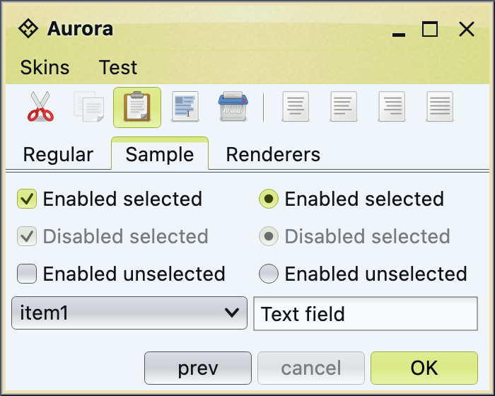
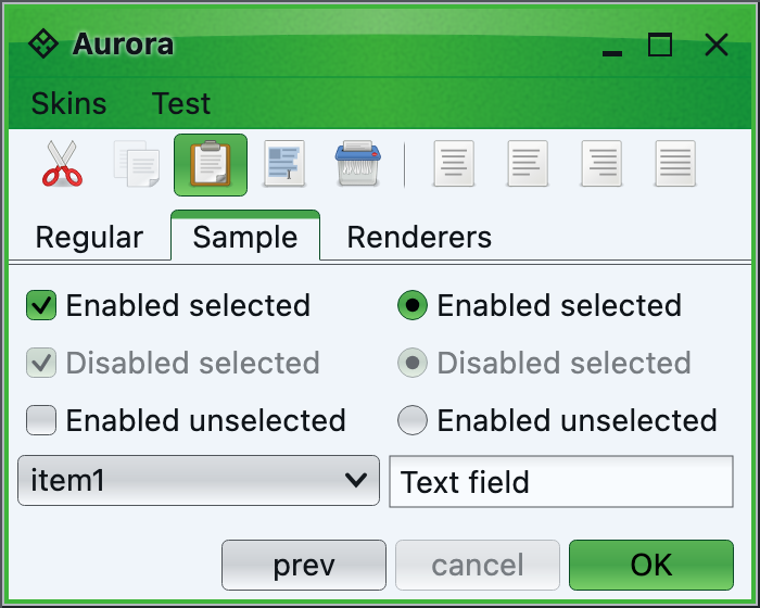
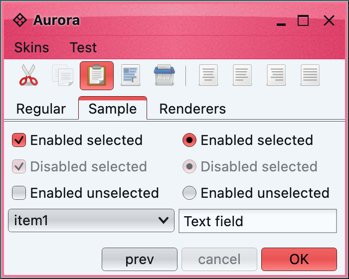
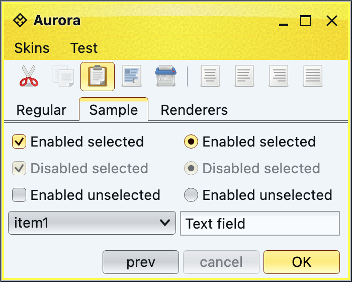
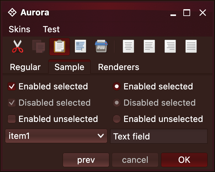
 To point out just a few places where Aurora is using derived colors:
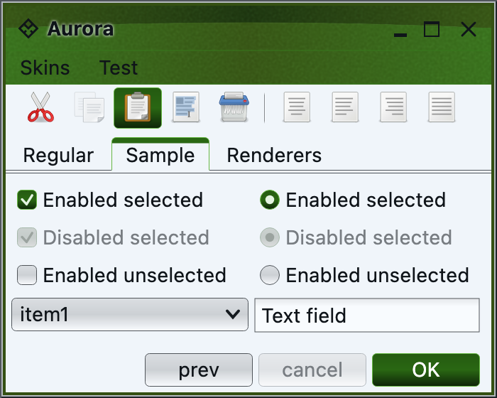
* Mark color is used for the selected mark / dot of checkboxes and radio buttons, as well as the arrow of the combobox.
* Separator secondary color is used for the double content border of the tabbed pane
* Separator primary and secondary colors are used to paint the drag bump dots of the toolbar, as well as the separators in the toolbar
* Accented background fill is used to fill the scroll bar track
* Text background fill is used to fill the text field for better visual indication of editable content
Providing one or more of the derived colors in your [color schemes file](colorschemes-fileformat.md) is the recommended approach to tweaking the overall visual language of your application while maintaining continuity across different UI surfaces.
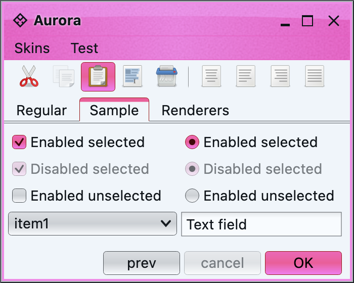
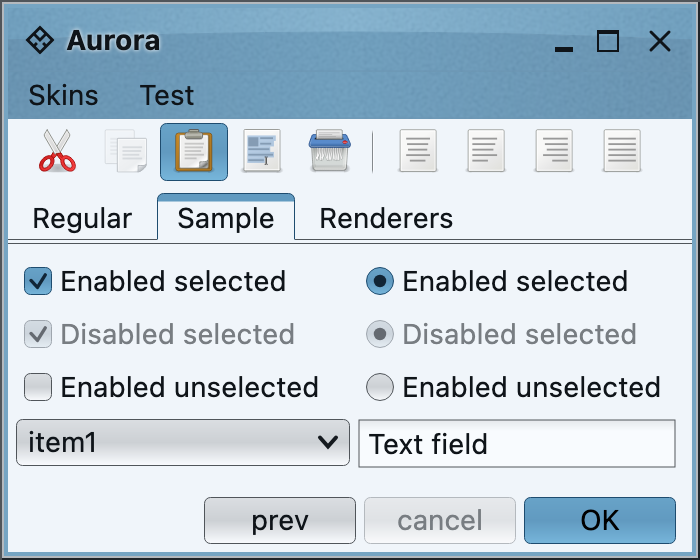
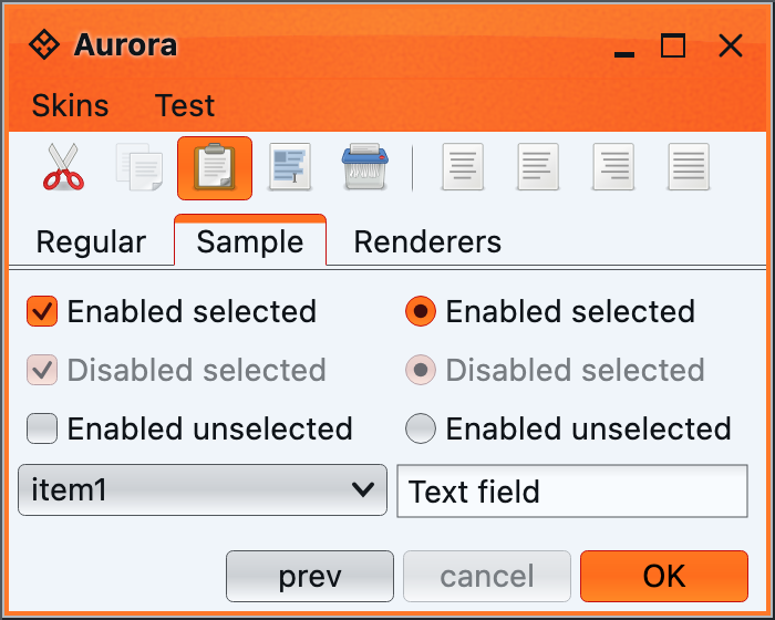
### Core light color schemes
The Aurora theming library provides the following sixteen light color schemes:
Aqua, Barby Pink
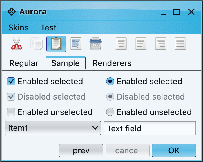
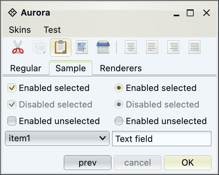
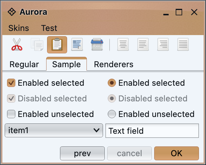
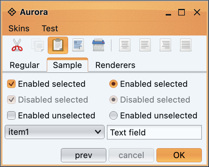
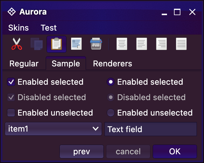
To point out just a few places where Aurora is using derived colors:
* Mark color is used for the selected mark / dot of checkboxes and radio buttons, as well as the arrow of the combobox.
* Separator secondary color is used for the double content border of the tabbed pane
* Separator primary and secondary colors are used to paint the drag bump dots of the toolbar, as well as the separators in the toolbar
* Accented background fill is used to fill the scroll bar track
* Text background fill is used to fill the text field for better visual indication of editable content
Providing one or more of the derived colors in your [color schemes file](colorschemes-fileformat.md) is the recommended approach to tweaking the overall visual language of your application while maintaining continuity across different UI surfaces.
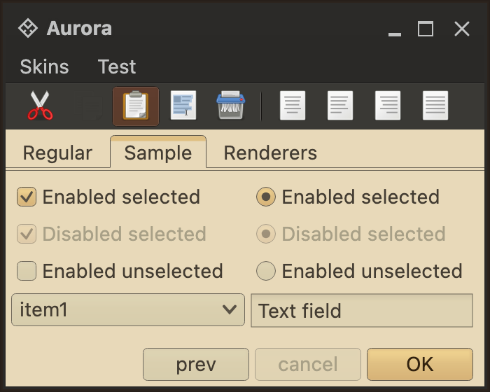
### Core light color schemes
The Aurora theming library provides the following sixteen light color schemes:
Aqua, Barby Pink


this scheme.
*
* @param backgroundShiftColor
* Shift color for background colors. Should have full opacity.
* @param backgroundShiftFactor
* Value in 0.0...1.0 range. Larger values shift more towards the
* specified color.
* @param foregroundShiftColor
* Shift color for foreground colors. Should have full opacity.
* @param foregroundShiftFactor
* Value in 0.0...1.0 range. Larger values shift more towards the
* specified color.
* @return Shift version of this scheme.
*/
fun shift(
backgroundShiftColor: Color,
backgroundShiftFactor: Float,
foregroundShiftColor: Color,
foregroundShiftFactor: Float
): AuroraColorScheme
```
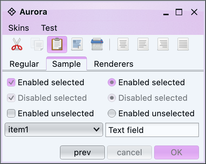
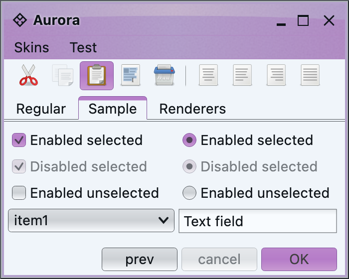
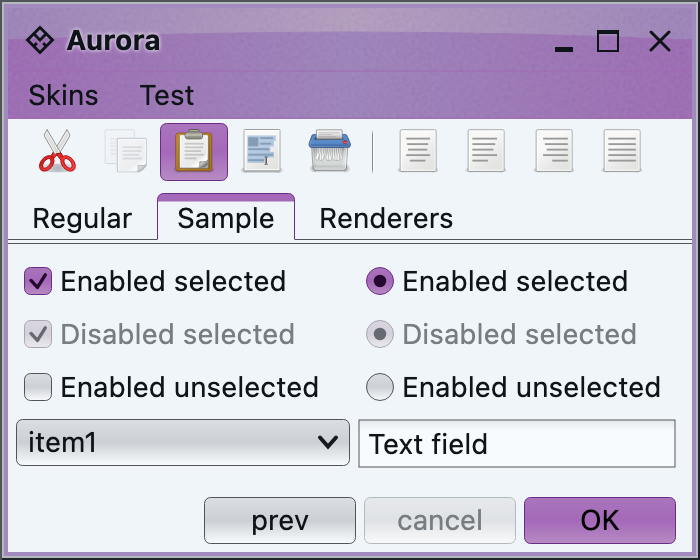
Here is the `Purple` color scheme shifted 80% towards light green in background colors and 70% towards dark red in foreground color (see the foreground color of the default button):
 The following API allows tinting the colors (shifting towards white):
```kotlin
/**
* Creates a tinted (shifted towards white) version of
The following API allows tinting the colors (shifting towards white):
```kotlin
/**
* Creates a tinted (shifted towards white) version of this
* color scheme.
*
* @param tintFactor
* Value in 0.0...1.0 range. Larger values shift more towards white
* color.
* @return Tinted version of this scheme.
*/
fun tint(tintFactor: Float): AuroraColorScheme
```
The following API allows toning the colors (shifting towards gray):
```kotlin
/**
* Creates a toned (shifted towards gray) version of this color
* scheme.
*
* @param toneFactor
* Value in 0.0...1.0 range. Larger values shift more towards gray
* color.
* @return Toned version of this scheme.
*/
fun tone(toneFactor: Float): AuroraColorScheme
```
The following API allows shading the colors (shifting towards black):
```kotlin
/**
* Creates a shaded (shifted towards black) version of this
* color scheme.
*
* @param shadeFactor
* Value in 0.0...1.0 range. Larger values shift more towards black
* color.
* @return Shaded version of this scheme.
*/
fun shade(shadeFactor: Float): AuroraColorScheme
```
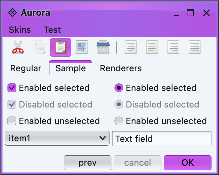
Here is the same `Purple` color scheme tinted 40%, toned 40% and shaded 40%:
 The following API allows saturating or desaturating the colors:
```kotlin
/**
* Creates a saturated or desaturated version of
The following API allows saturating or desaturating the colors:
```kotlin
/**
* Creates a saturated or desaturated version of this scheme.
* The value and brightness stay the same.
*
* @param saturateFactor
* Value in -1.0...1.0 range. Positive values create more saturated
* colors. Negative values create more desaturated colors.
* @return Saturated version of this scheme.
*/
fun saturate(saturateFactor: Float): AuroraColorScheme
```
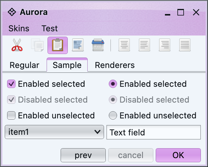
Here is the same `Purple` color scheme saturated 40% and desaturated 40%:
 The following API allows inverting the colors:
```kotlin
/**
* Creates an inverted version of
The following API allows inverting the colors:
```kotlin
/**
* Creates an inverted version of this scheme.
*
* @return Inverted version of this scheme.
*/
fun invert(): AuroraColorScheme
```
The following API allows negating the colors:
```kotlin
/**
* Creates a negated version of this scheme.
*
* @return Negated version of this scheme.
*/
fun negate(): AuroraColorScheme
```
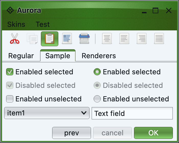
Here is the same `Purple` color scheme inverted and negated:
 The following API allows shifting the hue of the colors:
```kotlin
/**
* Creates a hue-shifted (in HSB space) version of
The following API allows shifting the hue of the colors:
```kotlin
/**
* Creates a hue-shifted (in HSB space) version of this color
* scheme.
*
* @param hueShiftFactor
* Value in -1.0...1.0 range.
* @return Hue-shifted version of this scheme.
*/
fun hueShift(hueShiftFactor: Float): AuroraColorScheme
```
Here is the same `Purple` color scheme hue-shifted 40%: