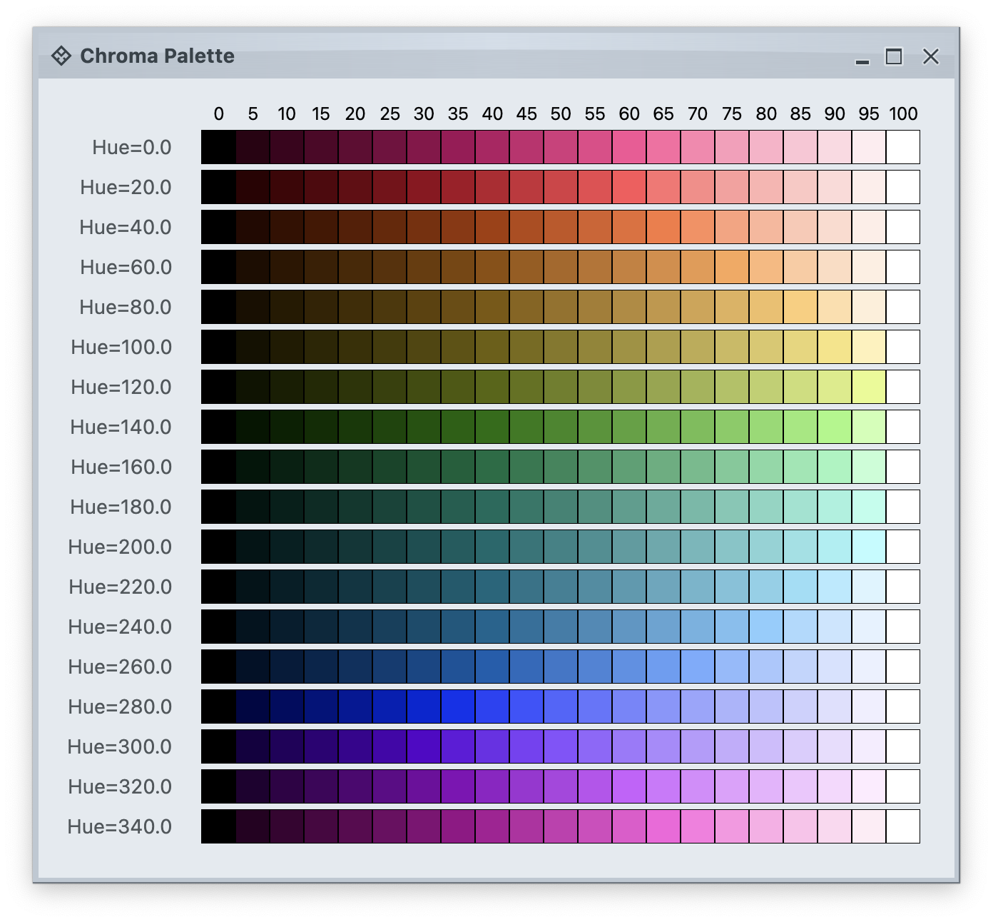
 Each row in this image is a single tonal palette. Tone 0 is full white. Tone 100 is full black. The intermediate tones are a gradation that maintains the same hue and chroma (colorfullness).
The next image shows tonal palettes generated from the same hue (purple), but with different chroma values:
Each row in this image is a single tonal palette. Tone 0 is full white. Tone 100 is full black. The intermediate tones are a gradation that maintains the same hue and chroma (colorfullness).
The next image shows tonal palettes generated from the same hue (purple), but with different chroma values:
 This is an example of how increasing values of chroma make for a more colorful tonal palette.
### Aurora container color tokens
The next layer in the Chroma color system is **container color tokens**. Aurora has three types of containers:
* **active**
* **muted**
* **neutral**
A container has three parts:
* **surface**
* **outline**
* **content**
Each one of these three parts has multiple color tokens available to render them:
* For **surface**
* `containerSurfaceLowest`
* `containerSurfaceLow`
* `containerSurface`
* `containerSurfaceHigh`
* `containerSurfaceHighest`
* `containerSurfaceDim`
* `containerSurfaceBright`
* `inverseContainerSurface`
* For **outline**
* `containerOutline`
* `containerOutlineVariant`
* `inverseContainerOutline`
* `complementaryContainerOutline`
* For **content**
* `onContainer`
* `onContainerVariant`
* `inverseOnContainer`
* `complementaryOnContainer`
* `accentOnContainer`
In addition, a container has the following alpha tokens for rendering disabled elements:
* `containerSurfaceDisabledAlpha`
* `containerOutlineDisabledAlpha`
* `onContainerDisabledAlpha`
Let's take a look at how these are defined:
This is an example of how increasing values of chroma make for a more colorful tonal palette.
### Aurora container color tokens
The next layer in the Chroma color system is **container color tokens**. Aurora has three types of containers:
* **active**
* **muted**
* **neutral**
A container has three parts:
* **surface**
* **outline**
* **content**
Each one of these three parts has multiple color tokens available to render them:
* For **surface**
* `containerSurfaceLowest`
* `containerSurfaceLow`
* `containerSurface`
* `containerSurfaceHigh`
* `containerSurfaceHighest`
* `containerSurfaceDim`
* `containerSurfaceBright`
* `inverseContainerSurface`
* For **outline**
* `containerOutline`
* `containerOutlineVariant`
* `inverseContainerOutline`
* `complementaryContainerOutline`
* For **content**
* `onContainer`
* `onContainerVariant`
* `inverseOnContainer`
* `complementaryOnContainer`
* `accentOnContainer`
In addition, a container has the following alpha tokens for rendering disabled elements:
* `containerSurfaceDisabledAlpha`
* `containerOutlineDisabledAlpha`
* `onContainerDisabledAlpha`
Let's take a look at how these are defined:
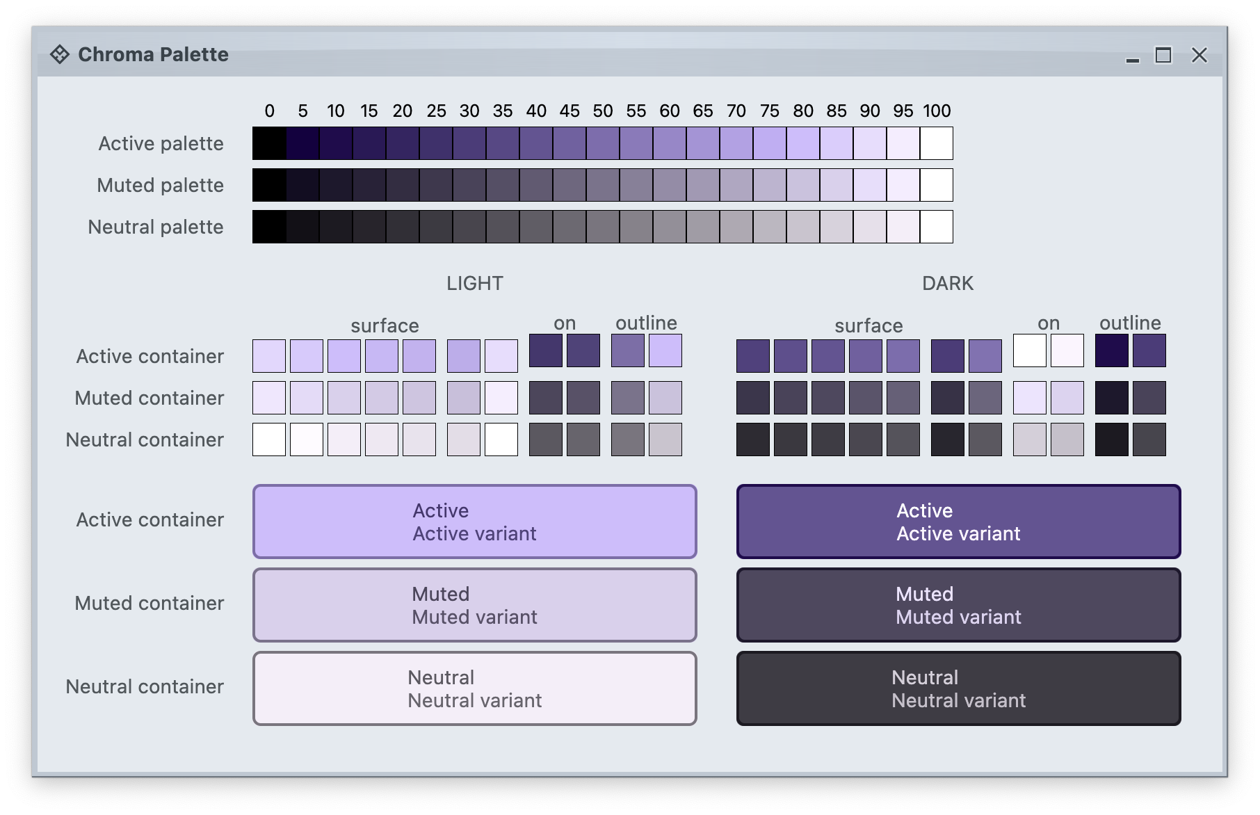 The top section in this image shows three tonal palettes generated from the same purple hue, but with different chroma values. The active palette has higher chroma, the muted palette has medium chroma, and the neutral palette has lower chroma. Even though these three palettes have different chroma values, the usage of the same hue creates a visual connection between them, keeping all tonal stops in the same "visual space" bound by the purple hue.
The next section shows surface, outline and content color tokens generated from each one of those tonal palettes. The tokens are generated based on the intended usage - **light** mode vs **dark** mode:
* Surface tokens in light mode use lighter tones, while surface tokens in dark mode use darker tones.
* Content tokens in light mode use darker tones, while content tokens in dark mode use lighter tones.
* Outline tokens in light mode use medium tones, while content tokens in dark mode use darker tones.
The last section shows sample usage of these color tokens to draw a sample container - a rounded rectangle with a piece of text in it:
* The container background fill is drawn with the `surfaceContainer` color token.
* The container outline is drawn with the `containerOutline` color token.
* The text is drawn with the `onContainer` color token.
Let's take another look at this image:
There is a clear visual connection across all three tonal palettes that are generated from the same purple hue, but with different chroma values. This visual connection is then reflected in the final visuals of our containers, across all three types (active, muted and neutral), both in light mode and in dark mode.
The color system provides strong guarantees about contrast ratio between surfaces and content, and at the same time it keeps all container tokens visually connected.
### Aurora components
The top section in this image shows three tonal palettes generated from the same purple hue, but with different chroma values. The active palette has higher chroma, the muted palette has medium chroma, and the neutral palette has lower chroma. Even though these three palettes have different chroma values, the usage of the same hue creates a visual connection between them, keeping all tonal stops in the same "visual space" bound by the purple hue.
The next section shows surface, outline and content color tokens generated from each one of those tonal palettes. The tokens are generated based on the intended usage - **light** mode vs **dark** mode:
* Surface tokens in light mode use lighter tones, while surface tokens in dark mode use darker tones.
* Content tokens in light mode use darker tones, while content tokens in dark mode use lighter tones.
* Outline tokens in light mode use medium tones, while content tokens in dark mode use darker tones.
The last section shows sample usage of these color tokens to draw a sample container - a rounded rectangle with a piece of text in it:
* The container background fill is drawn with the `surfaceContainer` color token.
* The container outline is drawn with the `containerOutline` color token.
* The text is drawn with the `onContainer` color token.
Let's take another look at this image:
There is a clear visual connection across all three tonal palettes that are generated from the same purple hue, but with different chroma values. This visual connection is then reflected in the final visuals of our containers, across all three types (active, muted and neutral), both in light mode and in dark mode.
The color system provides strong guarantees about contrast ratio between surfaces and content, and at the same time it keeps all container tokens visually connected.
### Aurora components
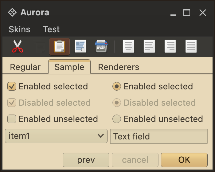
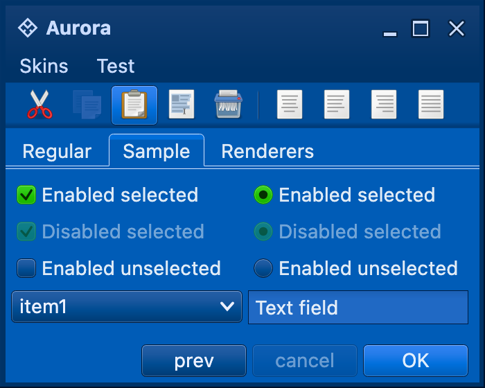
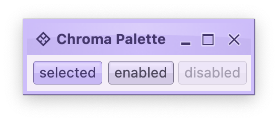 **Aurora treats every element as a container, and Aurora draws every element with container color tokens.**
For the main content area:
* The panel with the 3 buttons is a **neutral container**. Its background is rendered with the `containerSurface` color token.
* The selected toggle button is an **active container**.
* The enabled button is a **muted container**.
* The disabled button is a **muted container**. The draw logic uses the three `xyzDisabledAlpha` tokens for rendering the background, the border and the text.
* All buttons use the same color tokens:
* `containerOutline` for the outline / border
* `onContainer` for the text
* A combination of various `containerSurfaceXyz` tokens for the gradient stops of the background fill
* What is different between drawing a selected button and an enabled button? The draw logic uses the same tokens (surface, outline and content). The difference is that a selected button is an **active container** while an enabled button is a **muted container**. In this particular case, an active container uses a higher chroma value as the seed for its tonal palette, resulting in more vibrant purple colors - while an enabled container uses a lower chroma value as the seed for its tonal palette, resulting in more muted purple colors.
* What is different between drawing an enabled button and a disabled button? The draw logic uses the same tokens **and** the same **muted container** type. The only difference is in the alpha tokens applied to the surface, outline and content color tokens during the drawing pass.
For the title area, the application of color is the same:
* The background is rendered with a gradient that uses a number of `containerSurfaceXyz` color tokens
* The text and the icons are rendered with the `onContainer` token
Finally, the window pane border is rendered with a combination of `containerSurface` and `containerOutline` / `containerOutlineVariant` color tokens.
**Aurora treats every element as a container, and Aurora draws every element with container color tokens.**
For the main content area:
* The panel with the 3 buttons is a **neutral container**. Its background is rendered with the `containerSurface` color token.
* The selected toggle button is an **active container**.
* The enabled button is a **muted container**.
* The disabled button is a **muted container**. The draw logic uses the three `xyzDisabledAlpha` tokens for rendering the background, the border and the text.
* All buttons use the same color tokens:
* `containerOutline` for the outline / border
* `onContainer` for the text
* A combination of various `containerSurfaceXyz` tokens for the gradient stops of the background fill
* What is different between drawing a selected button and an enabled button? The draw logic uses the same tokens (surface, outline and content). The difference is that a selected button is an **active container** while an enabled button is a **muted container**. In this particular case, an active container uses a higher chroma value as the seed for its tonal palette, resulting in more vibrant purple colors - while an enabled container uses a lower chroma value as the seed for its tonal palette, resulting in more muted purple colors.
* What is different between drawing an enabled button and a disabled button? The draw logic uses the same tokens **and** the same **muted container** type. The only difference is in the alpha tokens applied to the surface, outline and content color tokens during the drawing pass.
For the title area, the application of color is the same:
* The background is rendered with a gradient that uses a number of `containerSurfaceXyz` color tokens
* The text and the icons are rendered with the `onContainer` token
Finally, the window pane border is rendered with a combination of `containerSurface` and `containerOutline` / `containerOutlineVariant` color tokens.