## Aurora theming - themed states
### Introduction
Aurora comes with built-in support for animating state transitions for its components.
Let's take a look at this screenshot from the [component states](skins/componentstates.md) documentation:
 Here we see how a custom Aurora skin (that implements some parts of Office Silver 2007 look) provides different visuals for different component states - light yellow for rollover, light orange for selected, deeper orange for pressed, etc. As the composable - such as `AuroraCommandButton` in this case - reacts to the user interaction and changes state, Aurora smoothly animates the visuals of that component to reflect the new state. In the case of our `AuroraCommandButton`, that includes the inner fill, the border and the text.
This comes particularly handy for skins that mix light and dark visuals for different states of the same component. Here is the same UI under the Magellan skin:
Here we see how a custom Aurora skin (that implements some parts of Office Silver 2007 look) provides different visuals for different component states - light yellow for rollover, light orange for selected, deeper orange for pressed, etc. As the composable - such as `AuroraCommandButton` in this case - reacts to the user interaction and changes state, Aurora smoothly animates the visuals of that component to reflect the new state. In the case of our `AuroraCommandButton`, that includes the inner fill, the border and the text.
This comes particularly handy for skins that mix light and dark visuals for different states of the same component. Here is the same UI under the Magellan skin:
 Note how the selected button uses light text on dark background, while the rollover selected button uses dark text on light background. If your UI uses the Magellan skin (or any other skin that uses a mix of light and dark color tokens), Aurora will do the right thing to animate all relevant parts of your UI as the user interacts with it.
What about the icons?
### Theming icons
Note how the selected button uses light text on dark background, while the rollover selected button uses dark text on light background. If your UI uses the Magellan skin (or any other skin that uses a mix of light and dark color tokens), Aurora will do the right thing to animate all relevant parts of your UI as the user interacts with it.
What about the icons?
### Theming icons
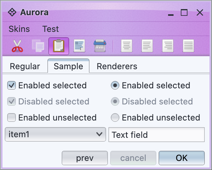 This is a screenshot of a small Aurora demo app running under the Nebula Amethyst skin. As UIs with lots of icons can get pretty busy, Aurora provides APIs to theme the icons based on the current skin visuals.
All Aurora API that accept icons (as core Compose `Painter`) also get an optional `IconFilterStrategy` parameter. Depending on where the specific icon is used, you can specify up to three icon filter strategies that apply for components / icons in three states:
* Disabled
* Enabled
* Active (any combination of rollover, pressed, selected)
Three icon filtering strategies are supported:
* `IconFilterStrategy.Original` - leave the icon as supplied by the application with no filtering applied
* `IconFilterStrategy.ThemedFollowText` - filter the icon to use the text color that matches the current component state
* `IconFilterStrategy.ThemedFollowColorTokens` - filter the icon to use the Aurora color tokens from the currently set skin that matches the component in its current state
`ThemedFollowColorTokens` which works best for multi-color / multi-tone icons and Aurora skins with multi-color color tokens. Here is the same UI with this icon filter strategy applied on enabled and disabled component states:
This is a screenshot of a small Aurora demo app running under the Nebula Amethyst skin. As UIs with lots of icons can get pretty busy, Aurora provides APIs to theme the icons based on the current skin visuals.
All Aurora API that accept icons (as core Compose `Painter`) also get an optional `IconFilterStrategy` parameter. Depending on where the specific icon is used, you can specify up to three icon filter strategies that apply for components / icons in three states:
* Disabled
* Enabled
* Active (any combination of rollover, pressed, selected)
Three icon filtering strategies are supported:
* `IconFilterStrategy.Original` - leave the icon as supplied by the application with no filtering applied
* `IconFilterStrategy.ThemedFollowText` - filter the icon to use the text color that matches the current component state
* `IconFilterStrategy.ThemedFollowColorTokens` - filter the icon to use the Aurora color tokens from the currently set skin that matches the component in its current state
`ThemedFollowColorTokens` which works best for multi-color / multi-tone icons and Aurora skins with multi-color color tokens. Here is the same UI with this icon filter strategy applied on enabled and disabled component states:
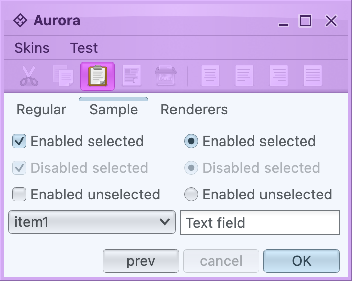 Take a look at the icons in the toolbar. The icon for the active / selected button (paste) is still in full original color, but the rest of the icons have been themed with the colors of the enabled color tokens configured for the toolbar area of the Nebula Amethyst skin. This work well in this particular case because:
* The original Tango icons have enough contrast to continue being easily recognizable when they are themed in what is essentially a mono-chrome purple color palette
* Nebula Amethyst skin uses color tokens with different background colors for the ultra light to ultra dark range, so that when these colors are used to theme the original icons, the icons remain crisp and legible.
`ThemedFollowText` works best for single-tone icons found in such popular icon packs as [Material](https://material.io/resources/icons/), [Ionicons](https://ionicons.com/), [Friconix](https://friconix.com/), [Flexicons](https://setproduct.com/flexicons), [Font Awesome](https://fontawesome.com/) and many others:
Take a look at the icons in the toolbar. The icon for the active / selected button (paste) is still in full original color, but the rest of the icons have been themed with the colors of the enabled color tokens configured for the toolbar area of the Nebula Amethyst skin. This work well in this particular case because:
* The original Tango icons have enough contrast to continue being easily recognizable when they are themed in what is essentially a mono-chrome purple color palette
* Nebula Amethyst skin uses color tokens with different background colors for the ultra light to ultra dark range, so that when these colors are used to theme the original icons, the icons remain crisp and legible.
`ThemedFollowText` works best for single-tone icons found in such popular icon packs as [Material](https://material.io/resources/icons/), [Ionicons](https://ionicons.com/), [Friconix](https://friconix.com/), [Flexicons](https://setproduct.com/flexicons), [Font Awesome](https://fontawesome.com/) and many others:
 In this screenshot of the same UI from earlier under the Magellan skin, all the buttons use the same help icon from the Material icon pack converted by [SVG Transcoder](../tools/svg-transcoder/svg-transcoder.md). At runtime, Aurora filters the icon to follow the foreground / text color of the button for a consistent look across all component states.