---
title: 'Data Visualiation with R'
author: "Kevin Donovan"
date: "`r format(Sys.time(), '%B %d, %Y')`"
output: slidy_presentation
---
```{r setup, include=FALSE}
knitr::opts_chunk$set(echo=FALSE, warning=FALSE, message=FALSE, results='asis', fig.width=6, fig.height=6)
library(tidyverse)
library(readr)
library(sf)
library(rnaturalearth)
library(rnaturalearthdata)
```
# Introduction
Data visualization is key element of analysis pipeline
- Intuitive presentation of results
- Motivate analysis plan
- Excite audience
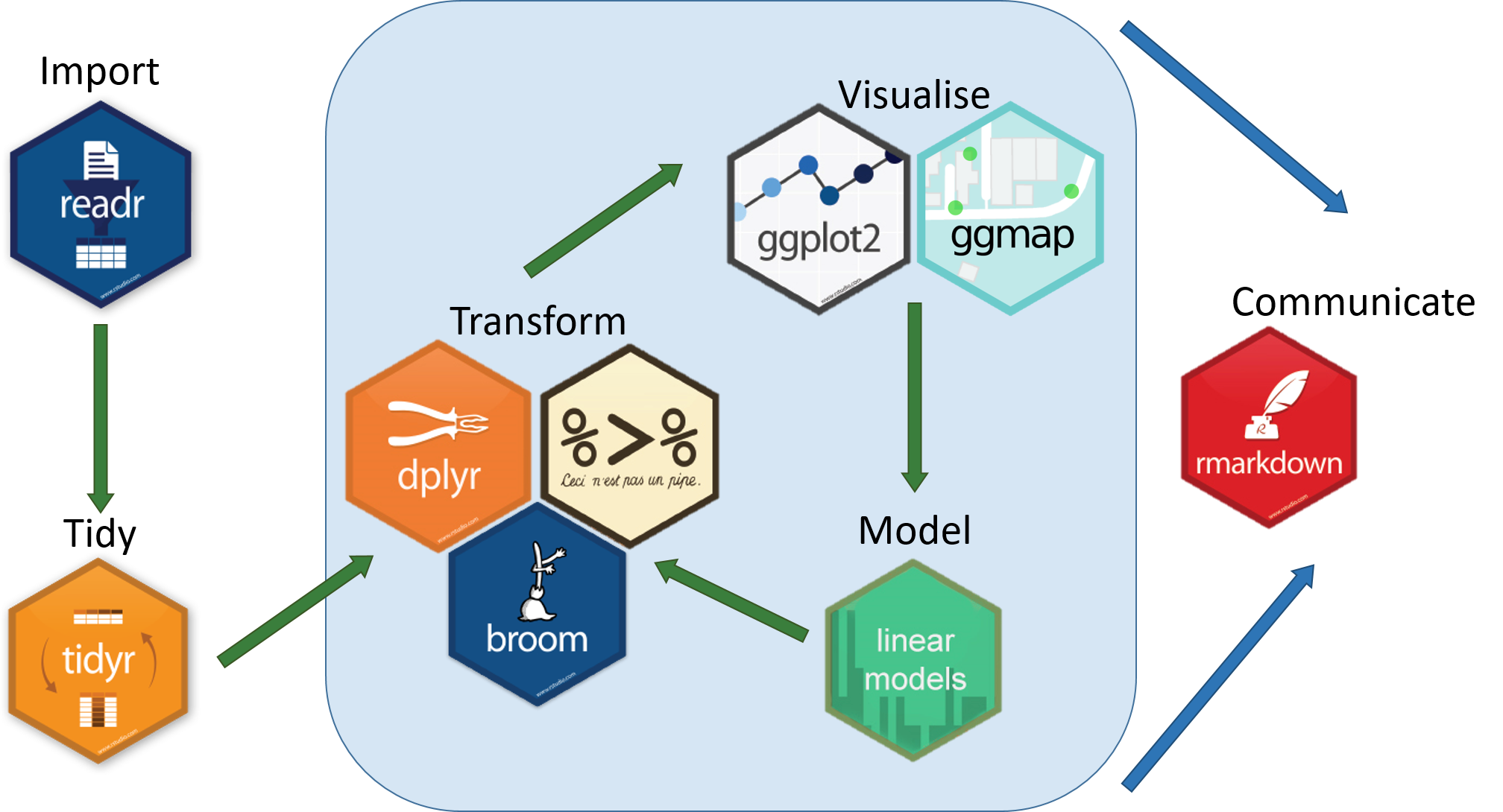 Tidyverse
# Why R?
- Incorporate all previous and future steps of analysis pipeline
- Very flexible and powerful tools
- Reproducibility
# Visualization in R
Tidyverse
# Why R?
- Incorporate all previous and future steps of analysis pipeline
- Very flexible and powerful tools
- Reproducibility
# Visualization in R
 ggplot2
 Base R
----
```{r plot_ex}
library(tidyverse)
plot(cars, main="Base R")
ggplot(data = cars,
mapping = aes(x=speed, y=dist))+
geom_point()+
ggtitle("ggplot")+
theme(text = element_text(size=15, face="bold"))
```
# ggplot Examples
Data source: [National Basketball Association (NBA) data](https://www.basketball-reference.com/)
```{r nba_ex_1, fig.width=6, fig.height=5}
# Team data plotting
nba_teams_19_20 <-
left_join(read_csv("../Data/nba_teams_19_20.csv") %>%
mutate(playoff_ind = ifelse(grepl("[*]", Team), "Y", "N"),
Team = gsub("[*]","",Team)),
read_csv("../Data/team_abrev.csv")) %>%
mutate(season="19_20")
ggplot(data=nba_teams_19_20,
mapping=aes(x=ORtg, y=DRtg, color=W/(W+L), shape=playoff_ind))+
geom_point(size=7)+
scale_colour_gradient(low = "white", high = "red", na.value = "black")+
labs(shape="Made Playoffs?", color="Win %")+
geom_hline(yintercept = nba_teams_19_20%>%
filter(Team=="League Average")%>%
select(ORtg)%>%
unlist(),
linetype="dashed")+
geom_vline(xintercept = nba_teams_19_20%>%
filter(Team=="League Average")%>%
select(DRtg)%>%
unlist(),
linetype="dashed")+
geom_text(mapping=aes(label=abbrev), color="black")
# Player data plotting
nba_players_19_20 <-
read_csv("../Data/nba_players_19_20.csv") %>%
separate(col=Player, into=c("Player", "Trash"), sep="\\\\") %>%
select(-Trash) %>%
mutate(position_type=
ifelse(Pos%in%c("PG","PG-SG","SG","SF-SG","SG-SF"),"Backcourt",
"Frontcourt"),
season="19_20")
ggplot(nba_players_19_20%>%filter(MP>200),
aes(x=PER, fill=position_type, fill=position_type)) +
geom_histogram()+
labs(fill="Position")+
hrbrthemes::theme_ipsum_rc(axis_title_size = 20,
caption_size = 15)+
theme(legend.title=element_text(size=15),
legend.text=element_text(size=15))
```
```{r second_nba_plot, fig.width=11, fig.height=5}
# Second plot
top_BPM <- nba_players_19_20 %>%
filter(MP>100) %>%
arrange(desc(BPM))
top10_BPM <- top_BPM[1:10,] %>% select(Player) %>% unlist()
ggplot(nba_players_19_20 %>% filter(MP>100), aes(x = OBPM, y = DBPM,
color = position_type)) +
geom_point()+
gghighlight::gghighlight(Player %in% top10_BPM,
label_key = Player,
unhighlighted_params = list()) +
geom_hline(yintercept = 0, alpha = 0.6, lty = "dashed") +
geom_vline(xintercept = 0, alpha = 0.6, lty = "dashed") +
labs(title = "Offensive vs. Defensive Box Plus-Minus: Top 10 Box Plus/Minus",
subtitle = glue::glue("NBA 2019-2020 Season"),
x = "OBPM",
y = "DBPM") +
hrbrthemes::theme_ipsum_rc()
```
----
```{r nba_ex_cont, fig.width=12, fig.height=6}
# Load older NBA data
nba_players_09_10 <-
read_csv("../Data/nba_players_09_10.csv") %>%
separate(col=Player, into=c("Player", "Trash"), sep="\\\\") %>%
select(-Trash) %>%
mutate(position_type=
ifelse(Pos%in%c("PG","PG-SG","SG","SF-SG","SG-SF"),"Backcourt",
"Frontcourt"),
season="09_10")
nba_players_99_00 <-
read_csv("../Data/nba_players_99_00.csv") %>%
separate(col=Player, into=c("Player", "Trash"), sep="\\\\") %>%
select(-Trash) %>%
mutate(position_type=
ifelse(Pos%in%c("PG","PG-SG","SG","SF-SG","SG-SF"),"Backcourt",
"Frontcourt"),
season="99_00")
# Merge all data together
nba_players_all <- do.call("rbind", list(nba_players_99_00,
nba_players_09_10,
nba_players_19_20)) %>%
mutate(season=factor(season, levels=c("99_00", "09_10", "19_20")))
# Look at faceted example
season_labels <- c(
'99_00'="1999-2000",
'09_10'="2009-2010",
'19_20'="2019-2020"
)
ggplot(data=nba_players_all%>% filter(MP>100),
mapping=aes(x=position_type,
y=`3PAr`,
fill=position_type))+
geom_boxplot()+
labs(fill="Position",
title=
"Percentage of shots from 3 point range by player position, by season",
subtitle = "Data from 1999-2000, 2009-2010, 2019-2020 seasons")+
xlab("Position")+
ylab("% of Shots From 3 Pt. Range")+
facet_grid(~season,
labeller = as_labeller(season_labels))+
theme_classic()+
theme(text = element_text(size=20))
```
----
```{r spatial_ex, fig.width=12, fig.height=6}
world <- ne_countries(scale = "medium", returnclass = "sf")
ggplot(data = world) +
geom_sf(aes(fill = pop_est)) +
scale_fill_viridis_c(option = "plasma", trans = "sqrt")
```
# How ggplot Works
Plots built by adding layers on top of one another with `+` key
```{r ggplot_step_by_step, fig.width=6, fig.height=5}
ggplot(data=nba_teams_19_20)+
labs(title="1: Canvas")
ggplot(data=nba_teams_19_20,
mapping=aes(x=ORtg, y=DRtg, color=W/(W+L), shape=playoff_ind))+
labs(title="2: Add Axes")
ggplot(data=nba_teams_19_20,
mapping=aes(x=ORtg, y=DRtg, color=W/(W+L), shape=playoff_ind))+
geom_point(size=7)+
scale_colour_gradient(low = "white", high = "red", na.value = "black")+
labs(title="3: Add Points")
ggplot(data=nba_teams_19_20,
mapping=aes(x=ORtg, y=DRtg, color=W/(W+L), shape=playoff_ind))+
geom_point(size=7)+
scale_colour_gradient(low = "white", high = "red", na.value = "black")+
geom_text(mapping=aes(label=abbrev), color="black")+
labs(shape="Made Playoffs?", color="Win %", title="4: Add Point Labels")
```
# Song of the Session
Base R
----
```{r plot_ex}
library(tidyverse)
plot(cars, main="Base R")
ggplot(data = cars,
mapping = aes(x=speed, y=dist))+
geom_point()+
ggtitle("ggplot")+
theme(text = element_text(size=15, face="bold"))
```
# ggplot Examples
Data source: [National Basketball Association (NBA) data](https://www.basketball-reference.com/)
```{r nba_ex_1, fig.width=6, fig.height=5}
# Team data plotting
nba_teams_19_20 <-
left_join(read_csv("../Data/nba_teams_19_20.csv") %>%
mutate(playoff_ind = ifelse(grepl("[*]", Team), "Y", "N"),
Team = gsub("[*]","",Team)),
read_csv("../Data/team_abrev.csv")) %>%
mutate(season="19_20")
ggplot(data=nba_teams_19_20,
mapping=aes(x=ORtg, y=DRtg, color=W/(W+L), shape=playoff_ind))+
geom_point(size=7)+
scale_colour_gradient(low = "white", high = "red", na.value = "black")+
labs(shape="Made Playoffs?", color="Win %")+
geom_hline(yintercept = nba_teams_19_20%>%
filter(Team=="League Average")%>%
select(ORtg)%>%
unlist(),
linetype="dashed")+
geom_vline(xintercept = nba_teams_19_20%>%
filter(Team=="League Average")%>%
select(DRtg)%>%
unlist(),
linetype="dashed")+
geom_text(mapping=aes(label=abbrev), color="black")
# Player data plotting
nba_players_19_20 <-
read_csv("../Data/nba_players_19_20.csv") %>%
separate(col=Player, into=c("Player", "Trash"), sep="\\\\") %>%
select(-Trash) %>%
mutate(position_type=
ifelse(Pos%in%c("PG","PG-SG","SG","SF-SG","SG-SF"),"Backcourt",
"Frontcourt"),
season="19_20")
ggplot(nba_players_19_20%>%filter(MP>200),
aes(x=PER, fill=position_type, fill=position_type)) +
geom_histogram()+
labs(fill="Position")+
hrbrthemes::theme_ipsum_rc(axis_title_size = 20,
caption_size = 15)+
theme(legend.title=element_text(size=15),
legend.text=element_text(size=15))
```
```{r second_nba_plot, fig.width=11, fig.height=5}
# Second plot
top_BPM <- nba_players_19_20 %>%
filter(MP>100) %>%
arrange(desc(BPM))
top10_BPM <- top_BPM[1:10,] %>% select(Player) %>% unlist()
ggplot(nba_players_19_20 %>% filter(MP>100), aes(x = OBPM, y = DBPM,
color = position_type)) +
geom_point()+
gghighlight::gghighlight(Player %in% top10_BPM,
label_key = Player,
unhighlighted_params = list()) +
geom_hline(yintercept = 0, alpha = 0.6, lty = "dashed") +
geom_vline(xintercept = 0, alpha = 0.6, lty = "dashed") +
labs(title = "Offensive vs. Defensive Box Plus-Minus: Top 10 Box Plus/Minus",
subtitle = glue::glue("NBA 2019-2020 Season"),
x = "OBPM",
y = "DBPM") +
hrbrthemes::theme_ipsum_rc()
```
----
```{r nba_ex_cont, fig.width=12, fig.height=6}
# Load older NBA data
nba_players_09_10 <-
read_csv("../Data/nba_players_09_10.csv") %>%
separate(col=Player, into=c("Player", "Trash"), sep="\\\\") %>%
select(-Trash) %>%
mutate(position_type=
ifelse(Pos%in%c("PG","PG-SG","SG","SF-SG","SG-SF"),"Backcourt",
"Frontcourt"),
season="09_10")
nba_players_99_00 <-
read_csv("../Data/nba_players_99_00.csv") %>%
separate(col=Player, into=c("Player", "Trash"), sep="\\\\") %>%
select(-Trash) %>%
mutate(position_type=
ifelse(Pos%in%c("PG","PG-SG","SG","SF-SG","SG-SF"),"Backcourt",
"Frontcourt"),
season="99_00")
# Merge all data together
nba_players_all <- do.call("rbind", list(nba_players_99_00,
nba_players_09_10,
nba_players_19_20)) %>%
mutate(season=factor(season, levels=c("99_00", "09_10", "19_20")))
# Look at faceted example
season_labels <- c(
'99_00'="1999-2000",
'09_10'="2009-2010",
'19_20'="2019-2020"
)
ggplot(data=nba_players_all%>% filter(MP>100),
mapping=aes(x=position_type,
y=`3PAr`,
fill=position_type))+
geom_boxplot()+
labs(fill="Position",
title=
"Percentage of shots from 3 point range by player position, by season",
subtitle = "Data from 1999-2000, 2009-2010, 2019-2020 seasons")+
xlab("Position")+
ylab("% of Shots From 3 Pt. Range")+
facet_grid(~season,
labeller = as_labeller(season_labels))+
theme_classic()+
theme(text = element_text(size=20))
```
----
```{r spatial_ex, fig.width=12, fig.height=6}
world <- ne_countries(scale = "medium", returnclass = "sf")
ggplot(data = world) +
geom_sf(aes(fill = pop_est)) +
scale_fill_viridis_c(option = "plasma", trans = "sqrt")
```
# How ggplot Works
Plots built by adding layers on top of one another with `+` key
```{r ggplot_step_by_step, fig.width=6, fig.height=5}
ggplot(data=nba_teams_19_20)+
labs(title="1: Canvas")
ggplot(data=nba_teams_19_20,
mapping=aes(x=ORtg, y=DRtg, color=W/(W+L), shape=playoff_ind))+
labs(title="2: Add Axes")
ggplot(data=nba_teams_19_20,
mapping=aes(x=ORtg, y=DRtg, color=W/(W+L), shape=playoff_ind))+
geom_point(size=7)+
scale_colour_gradient(low = "white", high = "red", na.value = "black")+
labs(title="3: Add Points")
ggplot(data=nba_teams_19_20,
mapping=aes(x=ORtg, y=DRtg, color=W/(W+L), shape=playoff_ind))+
geom_point(size=7)+
scale_colour_gradient(low = "white", high = "red", na.value = "black")+
geom_text(mapping=aes(label=abbrev), color="black")+
labs(shape="Made Playoffs?", color="Win %", title="4: Add Point Labels")
```
# Song of the Session