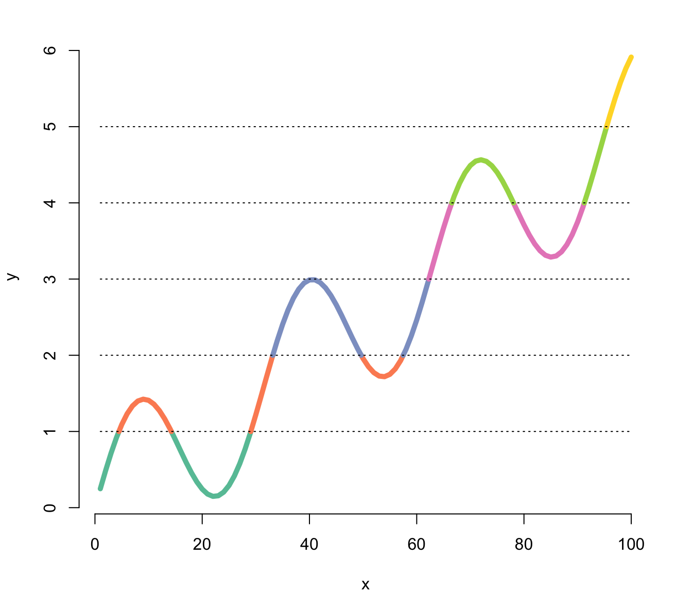
The plotrix library allows to change the line color according to the value of the Y axis thanks to the clplot function.
Here, the RColorBrewer package is used to set a palette of 8 colors.
Note:: Thanks to Carl Witthoft for sending this chart.

This post explains how to build a line chart in base R, where the line color is set according to the Y axis value. Reproducible code is provided.
The plotrix library allows to change the line color according to the value of the Y axis thanks to the clplot function.
Here, the RColorBrewer package is used to set a palette of 8 colors.
Note:: Thanks to Carl Witthoft for sending this chart.
