Density with geom_density
A density chart is built thanks to the geom_density geom of ggplot2 (see a basic example). It is possible to plot this density upside down by specifying y = -..density... It is advised to use geom_label to indicate variable names.
# Libraries
library(ggplot2)
library(hrbrthemes)

# Dummy data
data <- data.frame(
  var1 = rnorm(1000),
  var2 = rnorm(1000, mean=2)
)

# Chart
p <- ggplot(data, aes(x=x) ) +
  # Top
  geom_density( aes(x = var1, y = ..density..), fill="#69b3a2" ) +
  geom_label( aes(x=4.5, y=0.25, label="variable1"), color="#69b3a2") +
  # Bottom
  geom_density( aes(x = var2, y = -..density..), fill= "#404080") +
  geom_label( aes(x=4.5, y=-0.25, label="variable2"), color="#404080") +
  theme_ipsum() +
  xlab("value of x")

#p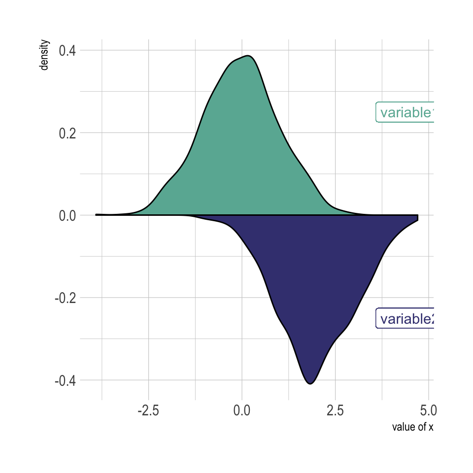
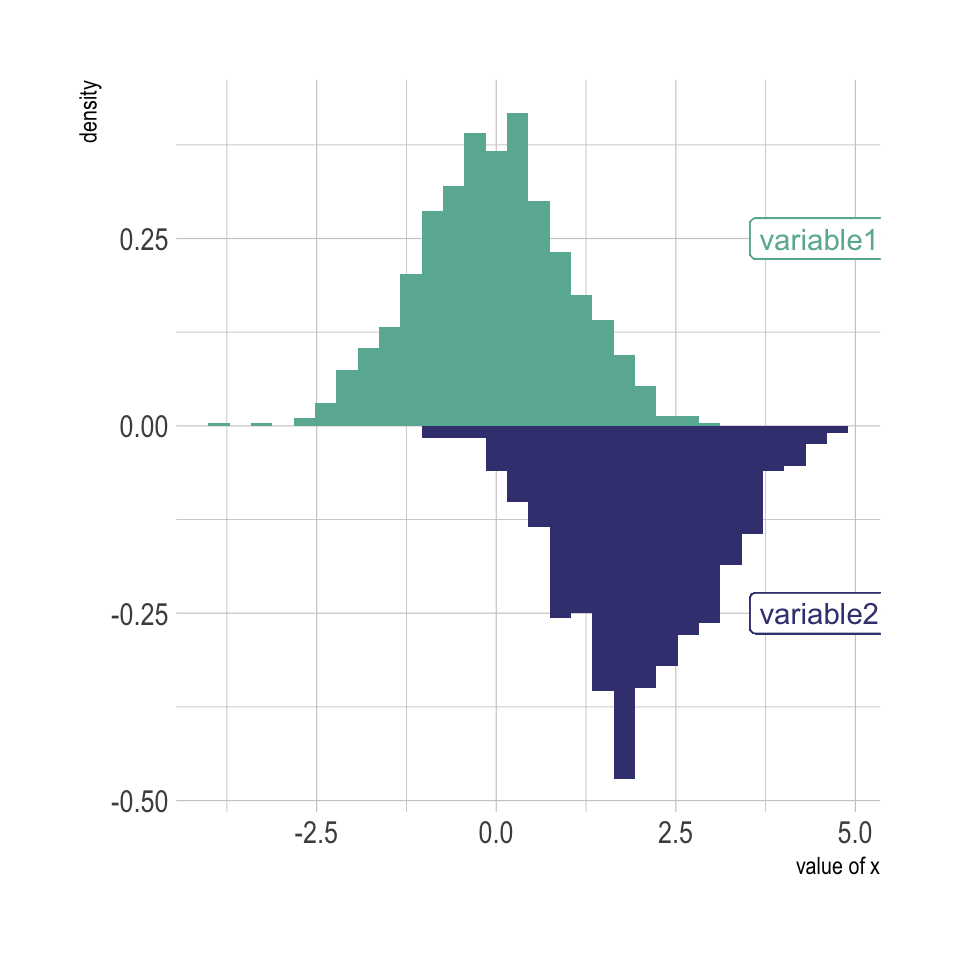
Histogram with geom_histogram
Of course it is possible to apply exactly the same technique using geom_histogram instead of geom_density to get a mirror histogram:
# Chart
p <- ggplot(data, aes(x=x) ) +
  geom_histogram( aes(x = var1, y = ..density..), fill="#69b3a2" ) +
  geom_label( aes(x=4.5, y=0.25, label="variable1"), color="#69b3a2") +
  geom_histogram( aes(x = var2, y = -..density..), fill= "#404080") +
  geom_label( aes(x=4.5, y=-0.25, label="variable2"), color="#404080") +
  theme_ipsum() +
  xlab("value of x")

#p