Ggplot2
Lollipop charts can be created using ggplot2: the trick is to combine geom_point() for the dots with geom_segment() for the stems. See this basic example to see how to proceed.
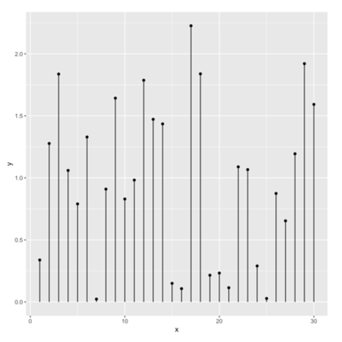
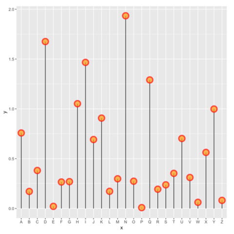
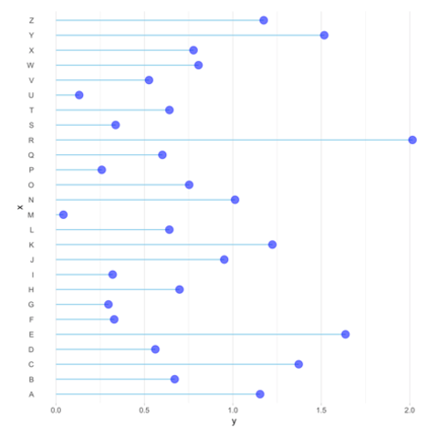
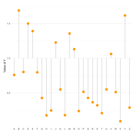
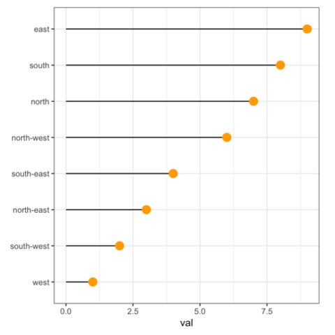
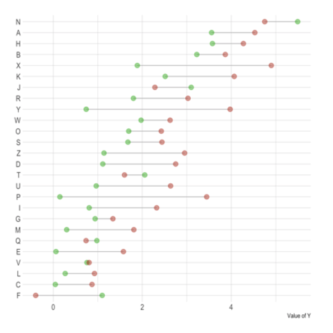
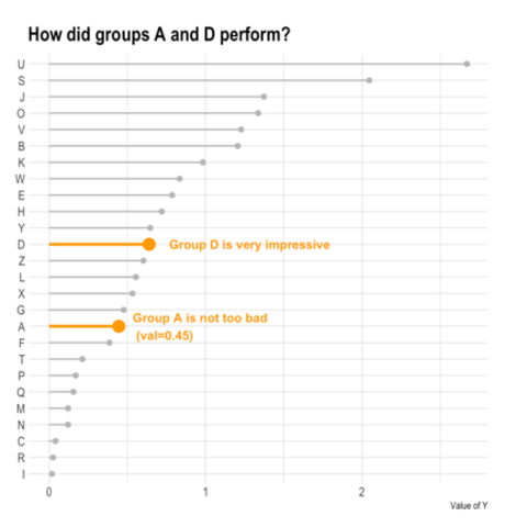
A lollipop plot is basically a barplot, where the bar is transformed in a line and a dot. It shows the relationship between a numeric and a categorical variable.
Lollipop charts can be created using ggplot2: the trick is to combine geom_point() for the dots with geom_segment() for the stems. See this basic example to see how to proceed.
Related chart types