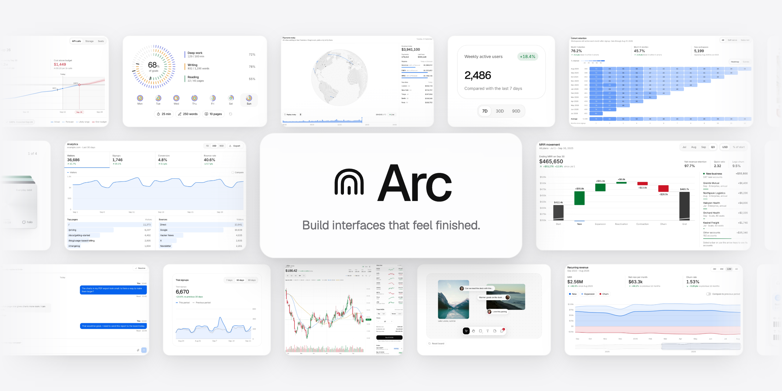


Arc: React components and blocks with motion built in. Free and open source, install with shadcn.

License: MIT shadcn registry: @uiarc CI 120 components 22 blocks React 19

Docs  ·  Components  ·  Install  ·  AI and MCP  ·  Pro

Arc is a library of React components and blocks with motion built in. Every item is plain source you own: CSS modules on a small set of design tokens, [Motion](https://motion.dev) for animation, keyboard support, and a reduced motion path for every animation. Install anything with the shadcn CLI or copy the files by hand. It works in Next.js and Vite, with or without Tailwind. This repository holds the free, open source part: **120 components and 22 blocks**, plus the design and motion tokens they share. Every one of them has a live preview at [uiarc.dev](https://uiarc.dev). ## Showcase A few favorites, recorded live from [uiarc.dev](https://uiarc.dev). Items marked Pro are part of [Arc Pro](https://uiarc.dev/pro) and are not in this repository; everything else installs from here for free.
Cover flow: A depth rail of photos you can throw, with soft grounded shadows and a quiet reflection.
Cover flow Pro
A depth rail of photos you can throw, with soft grounded shadows and a quiet reflection.
Donut chart: Arcs morph between datasets while the total rolls into the center.
Donut chart
Arcs morph between datasets while the total rolls into the center.
Billing toggle: Monthly and yearly prices roll into each other, savings included.
Billing toggle
Monthly and yearly prices roll into each other, savings included.
Orbit logos: Integrations orbit your product mark. Filter them by category.
Orbit logos Pro
Integrations orbit your product mark. Filter them by category.
Wallet stack: Fan a stack of cards and lift one out to see its activity.
Wallet stack Pro
Fan a stack of cards and lift one out to see its activity.
Line chart: Switch the range and the line redraws against the previous period.
Line chart
Switch the range and the line redraws against the previous period.
Number field: Bounded steppers that say so when you reach the limit.
Number field
Bounded steppers that say so when you reach the limit.
Activity rings: Daily goals sweep, count up and trace a second lap past 100%.
Activity rings Pro
Daily goals sweep, count up and trace a second lap past 100%.
## Contents - [Showcase](#showcase) - [Install](#install) - [Requirements](#requirements) - [With the shadcn CLI](#with-the-shadcn-cli) - [Copy and paste](#copy-and-paste) - [Usage](#usage) - [Theming](#theming) - [Components](#components) - [Blocks](#blocks) - [AI tools](#ai-tools) - [Troubleshooting](#troubleshooting) - [How releases work](#how-releases-work) - [Repository layout](#repository-layout) - [Arc Pro](#arc-pro) - [Contributing](#contributing) - [License](#license) ## Install ### Requirements - **React 19** with TypeScript. The source compiles under `strict`, `noUncheckedIndexedAccess` and `verbatimModuleSyntax`, and needs `lib` ES2023 or newer (a few items use `findLast`) - **Next.js** (App Router) or **Vite** - **[motion](https://www.npmjs.com/package/motion)** for animation. Some items also use [lucide-react](https://lucide.dev) or a [Radix UI](https://www.radix-ui.com) primitive; the CLI installs whatever an item needs. - The `@/*` import alias (Next.js and shadcn set it up by default) No Tailwind is required. Arc styles are CSS modules that read CSS variables. ### With the shadcn CLI Register the `@uiarc` namespace once in `components.json`: ```json { "registries": { "@uiarc": "https://uiarc.dev/r/{name}.json" } } ``` Then add items by name. Local dependencies, such as the components inside a block, come along automatically: ```bash npx shadcn@latest add @uiarc/button @uiarc/dialog ``` Every item also installs from its full URL, without touching `components.json`: ```bash npx shadcn@latest add https://uiarc.dev/r/button.json ``` Install the design tokens once per app with `npx shadcn@latest add @uiarc/arc-foundation`, then import them at the root of your app. Components only pull in the motion presets (`arc-motion-tokens`) and never reinstall `foundation.css`, so you can also keep the tokens in your own theme package. ```tsx // app/layout.tsx (Next.js) or src/main.tsx (Vite) import "@/components/arc/foundation.css"; ```
Setting up a new project
**Next.js** ```bash npx create-next-app@latest my-app cd my-app npx shadcn@latest init ``` Accept the default `@/*` import alias. **Vite** ```bash npm create vite@latest my-app -- --template react-ts cd my-app npx shadcn@latest init ``` Map `@/*` to `src` in `tsconfig.json` and `vite.config.ts`, as shadcn expects: ```json { "compilerOptions": { "baseUrl": ".", "paths": { "@/*": ["./src/*"] } } } ``` ```ts import path from "node:path"; import react from "@vitejs/plugin-react"; import { defineConfig } from "vite"; export default defineConfig({ plugins: [react()], resolve: { alias: { "@": path.resolve(__dirname, "./src") } }, }); ```
### Copy and paste 1. Install the shared packages: `npm install motion lucide-react`. 2. Copy `registry/foundation.css`, `registry/motion-tokens.ts` and `lib/motion-tokens.ts` from this repository into the same paths under your `@/` root, and import the CSS once at the root. 3. Copy the item's folder from `registry/components//` or `registry/blocks//`, keeping the path. Copied files keep this repository's layout and import each other through `@/`; the CLI install above rewrites that for you. Its `public/r/.json` file lists every file and npm package it needs. Each page on [uiarc.dev](https://uiarc.dev/components) also has a Manual tab with the exact files. ## Usage The CLI puts every file in an `arc/` folder under the `components` alias in your `components.json`, for example `components/arc/button/button.tsx`, or `src/components/arc/…` in a `src/` project or monorepo package. Arc files import each other with relative paths, so any alias setup works; move the `arc/` folder as a whole if you want it elsewhere. Use them like any local component: ```tsx import { Button } from "@/components/arc/button/button"; export default function Page() { return ; } ``` The code is yours: edit it, rename it, move it. There is no runtime package to keep in sync. ## Theming Components read semantic tokens, never raw colors. Change a token in `foundation.css` (`components/arc/foundation.css` after a CLI install) and every component follows, in both themes. | Token | Used for | | --- | --- | | `--background` | The page behind everything | | `--surface`, `--surface-raised`, `--surface-muted` | Cards and inputs, floating layers, quiet fills | | `--foreground`, `--text-secondary`, `--text-muted` | Primary, supporting and hint text | | `--border`, `--border-subtle`, `--border-strong` | Separators and edges | | `--accent`, `--accent-strong`, `--accent-subtle` | Selection, progress and helpful context | | `--success`, `--warning`, `--danger` | Status, always paired with a label | | `--radius-control`, `--radius-panel`, `--radius-surface` | Controls, menus, cards | | `--font-display`, `--font-body` | Geist for headings, Inter for everything else | - **Dark mode:** set `data-theme="dark"` on ``. Dark values are tuned separately, not inverted. - **Accent:** set `data-accent` on `` to `neutral`, `violet`, `blue`, `green`, `amber`, `orange`, `coral` or `rose`. - **Motion:** springs and durations live in `lib/motion-tokens.ts` (`components/arc/lib/motion-tokens.ts` after a CLI install). Every animation respects `prefers-reduced-motion`. More in the [theming docs](https://uiarc.dev/docs/theming) and [motion docs](https://uiarc.dev/docs/motion). ## Components 120 free components, grouped as on the site. Click a name for the live preview and docs. [Actions](#actions) (20) · [Inputs](#inputs) (38) · [Disclosure](#disclosure) (14) · [Feedback](#feedback) (11) · [Data](#data) (32) · [Text](#text) (4) · [Special](#special) (1) ### Actions **Buttons** | Component | Description | Install | | --- | --- | --- | | [Button](https://uiarc.dev/components/button) | A clear, responsive action with quiet secondary states. | `npx shadcn@latest add @uiarc/button` | | [Action button](https://uiarc.dev/components/action-button) | A compact button for frequent toolbar actions. | `npx shadcn@latest add @uiarc/action-button` | | [Split button](https://uiarc.dev/components/split-button) | A primary action with a menu of nearby alternatives. | `npx shadcn@latest add @uiarc/split-button` | | [Button group](https://uiarc.dev/components/button-group) | Related actions joined into one surface with hairline dividers: a hover highlight glides between segments, the pressed one answers in place, and an attached menu can close the row. | `npx shadcn@latest add @uiarc/button-group` | | [Floating button group](https://uiarc.dev/components/floating-button-group) | Separate soft buttons in a quiet tray, with one shared highlight that morphs from button to button as you move, and a pressed state that settles in place. | `npx shadcn@latest add @uiarc/floating-button-group` | | [Expanding button group](https://uiarc.dev/components/expanding-button-group) | Icon buttons in a compact group: the one you point at or focus grows to reveal its label while its neighbours slide aside, and an action confirms in place. | `npx shadcn@latest add @uiarc/expanding-button-group` | | [Copy button](https://uiarc.dev/components/copy-button) | Copy a value with immediate confirmation. | `npx shadcn@latest add @uiarc/copy-button` | | [Action swap](https://uiarc.dev/components/action-swap) | Swap an action label while preserving its place and intent. | `npx shadcn@latest add @uiarc/action-swap` | | [Icon morph](https://uiarc.dev/components/icon-morph) | Icons that morph between states: menu to close, play to pause, copy to check, and more. | `npx shadcn@latest add @uiarc/icon-morph` | | [Confirm morph](https://uiarc.dev/components/confirm-morph) | A destructive button that morphs into an inline confirmation, a spinner, and a result with undo. | `npx shadcn@latest add @uiarc/confirm-morph` | **Gestures** | Component | Description | Install | | --- | --- | --- | | [Hold to confirm](https://uiarc.dev/components/hold-to-confirm) | Confirm a destructive action by holding, not tapping. | `npx shadcn@latest add @uiarc/hold-to-confirm` | | [Swipe actions](https://uiarc.dev/components/swipe-actions) | Reveal row actions with a swipe, or from the same actions in a menu. | `npx shadcn@latest add @uiarc/swipe-actions` | | [Reactions](https://uiarc.dev/components/reactions) | Acknowledge a post in one tap, with counts that roll. | `npx shadcn@latest add @uiarc/reactions` | **Menus** | Component | Description | Install | | --- | --- | --- | | [Dropdown menu](https://uiarc.dev/components/dropdown-menu) | A focused list of actions anchored to a trigger. | `npx shadcn@latest add @uiarc/dropdown-menu` | | [Context menu](https://uiarc.dev/components/context-menu) | Secondary actions kept close to the selected object. | `npx shadcn@latest add @uiarc/context-menu` | | [User menu](https://uiarc.dev/components/user-menu) | Your account, settings, theme, and sign out behind the avatar. Opens as a bottom sheet on phones. | `npx shadcn@latest add @uiarc/user-menu` | **Theme** | Component | Description | Install | | --- | --- | --- | | [Theme switcher](https://uiarc.dev/components/theme-switch) | Four smooth ways to move between light and dark appearance. | `npx shadcn@latest add @uiarc/theme-switch` | | [Eclipse](https://uiarc.dev/components/theme-switch-eclipse) | The next appearance crosses the page like an eclipse. | `npx shadcn@latest add @uiarc/theme-switch-eclipse` | | [Split](https://uiarc.dev/components/theme-switch-split) | The next appearance opens from a slim center seam. | `npx shadcn@latest add @uiarc/theme-switch-split` | | [Rise](https://uiarc.dev/components/theme-switch-rise) | The next appearance rises into place. | `npx shadcn@latest add @uiarc/theme-switch-rise` | ### Inputs **Text fields** | Component | Description | Install | | --- | --- | --- | | [Input](https://uiarc.dev/components/input) | A single line field with clear labels and useful states. | `npx shadcn@latest add @uiarc/input` | | [Textarea](https://uiarc.dev/components/textarea) | A multiline field for notes, descriptions, and longer text. | `npx shadcn@latest add @uiarc/textarea` | | [Password field](https://uiarc.dev/components/password-field) | Capture sensitive text with a visible reveal control. | `npx shadcn@latest add @uiarc/password-field` | | [Password strength](https://uiarc.dev/components/password-strength) | Show how strong a new password is while it is typed. | `npx shadcn@latest add @uiarc/password-strength` | | [Search field](https://uiarc.dev/components/search-field) | A recognizable search entry point with clear affordances. | `npx shadcn@latest add @uiarc/search-field` | | [Expanding search](https://uiarc.dev/components/expanding-search) | An icon that morphs into a search field with results beneath it. | `npx shadcn@latest add @uiarc/expanding-search` | | [Inline edit](https://uiarc.dev/components/inline-edit) | Rename in place: the text becomes a field without moving. | `npx shadcn@latest add @uiarc/inline-edit` | **Special inputs** | Component | Description | Install | | --- | --- | --- | | [Number field](https://uiarc.dev/components/number-field) | Enter a bounded number with clear increment controls. | `npx shadcn@latest add @uiarc/number-field` | | [Money input](https://uiarc.dev/components/money-input) | A currency field with live grouping, stable width, rolling digits, and minor-unit output. | `npx shadcn@latest add @uiarc/money-input` | | [Phone input](https://uiarc.dev/components/phone-input) | A phone field with a country picker, formatting as you type, and E.164 output. | `npx shadcn@latest add @uiarc/phone-input` | | [Scrub input](https://uiarc.dev/components/scrub-input) | A Figma-style number field: drag the label to scrub, or type values, units, and arithmetic. | `npx shadcn@latest add @uiarc/scrub-input` | | [Tag input](https://uiarc.dev/components/tag-input) | Turn short text values into removable tags. | `npx shadcn@latest add @uiarc/tag-input` | | [Mention input](https://uiarc.dev/components/mention-input) | A textarea with @people and #channel mentions that act as single tokens, with suggestions at the caret. | `npx shadcn@latest add @uiarc/mention-input` | | [Shortcut recorder](https://uiarc.dev/components/shortcut-recorder) | Record key combinations into key caps, with conflict warnings, Kbd, and a searchable cheatsheet. | `npx shadcn@latest add @uiarc/shortcut-recorder` | **Selects** | Component | Description | Install | | --- | --- | --- | | [Select](https://uiarc.dev/components/select) | A compact choice field with a keyboard friendly menu. | `npx shadcn@latest add @uiarc/select` | | [Combobox](https://uiarc.dev/components/combobox) | Search and select from a list without leaving the field. | `npx shadcn@latest add @uiarc/combobox` | | [Multi-select](https://uiarc.dev/components/multi-select) | Select several values while keeping the field readable. | `npx shadcn@latest add @uiarc/multi-select` | | [Morph select](https://uiarc.dev/components/morph-select) | A select whose trigger grows into the list, with a gliding highlight and type-ahead. | `npx shadcn@latest add @uiarc/morph-select` | | [Chip group](https://uiarc.dev/components/chip-group) | Filter by a few facets with chips that morph as you pick them. | `npx shadcn@latest add @uiarc/chip-group` | **Toggles** | Component | Description | Install | | --- | --- | --- | | [Radio cards](https://uiarc.dev/components/radio-cards) | Selectable option cards with a sliding selection ring, price and description slots, and radio keyboard behavior. | `npx shadcn@latest add @uiarc/radio-cards` | | [Billing toggle](https://uiarc.dev/components/billing-toggle) | A monthly and yearly switch with a savings badge and prices that roll to the new amount. | `npx shadcn@latest add @uiarc/billing-toggle` | | [Checkbox](https://uiarc.dev/components/checkbox) | A binary choice with a precise, legible state. | `npx shadcn@latest add @uiarc/checkbox` | | [Radio group](https://uiarc.dev/components/radio-group) | Choose one option from a visible set. | `npx shadcn@latest add @uiarc/radio-group` | | [Switch](https://uiarc.dev/components/switch) | A tactile toggle for settings that take effect immediately. | `npx shadcn@latest add @uiarc/switch` | | [Segmented control](https://uiarc.dev/components/segmented-control) | Switch between a small set of related views. | `npx shadcn@latest add @uiarc/segmented-control` | | [Rating](https://uiarc.dev/components/rating) | A simple, accessible way to capture a numeric opinion. | `npx shadcn@latest add @uiarc/rating` | **Sliders** | Component | Description | Install | | --- | --- | --- | | [Slider](https://uiarc.dev/components/slider) | Pick a value or a range on a track that follows your finger. | `npx shadcn@latest add @uiarc/slider` | | [Elastic slider](https://uiarc.dev/components/elastic-slider) | A slider that stretches like rubber past its ends, with a swaying value tag and detents the thumb clicks into. | `npx shadcn@latest add @uiarc/elastic-slider` | | [Range histogram slider](https://uiarc.dev/components/range-histogram-slider) | A price range over a live histogram of the data, lighting the bars inside the range and settling on bar edges. | `npx shadcn@latest add @uiarc/range-histogram-slider` | | [Ruler slider](https://uiarc.dev/components/ruler-slider) | A tape of ticks that slides under a fixed needle, with momentum, snapping, and a rolling readout. | `npx shadcn@latest add @uiarc/ruler-slider` | **Pickers** | Component | Description | Install | | --- | --- | --- | | [Calendar](https://uiarc.dev/components/calendar) | Browse dates in a clear, compact month view. | `npx shadcn@latest add @uiarc/calendar` | | [Date picker](https://uiarc.dev/components/date-picker) | Choose a date without losing context. | `npx shadcn@latest add @uiarc/date-picker` | | [Date range picker](https://uiarc.dev/components/date-range-picker) | A range picker that grows from its trigger into two months with presets and a stretching range highlight. | `npx shadcn@latest add @uiarc/date-range-picker` | | [Time picker](https://uiarc.dev/components/time-picker) | Choose a time with sensible keyboard behavior. | `npx shadcn@latest add @uiarc/time-picker` | | [Color picker](https://uiarc.dev/components/color-picker) | A swatch that grows into a picker with format morphing, eyedropper, saved swatches, and contrast readout. | `npx shadcn@latest add @uiarc/color-picker` | **Editors** | Component | Description | Install | | --- | --- | --- | | [Rich text editor](https://uiarc.dev/components/rich-text-editor) | A lightweight editor with markdown shortcuts, a floating toolbar, a slash menu, and HTML and markdown output. | `npx shadcn@latest add @uiarc/rich-text-editor` | | [Signature pad](https://uiarc.dev/components/signature-pad) | Smooth ink that thins with speed, with undo, replay, and PNG or SVG export. | `npx shadcn@latest add @uiarc/signature-pad` | | [File dropzone](https://uiarc.dev/components/file-dropzone) | A generous target for dropping one or more files. | `npx shadcn@latest add @uiarc/file-dropzone` | ### Disclosure **Navigation** | Component | Description | Install | | --- | --- | --- | | [Tabs](https://uiarc.dev/components/tabs) | Switch between related content in the same context. | `npx shadcn@latest add @uiarc/tabs` | | [Breadcrumb](https://uiarc.dev/components/breadcrumb) | Show where a page sits in a hierarchy. | `npx shadcn@latest add @uiarc/breadcrumb` | | [Pagination](https://uiarc.dev/components/pagination) | Move through a long collection with clear bounds. | `npx shadcn@latest add @uiarc/pagination` | **Expand** | Component | Description | Install | | --- | --- | --- | | [Scroll area](https://uiarc.dev/components/scroll-area) | A native scroll container with thin overlay scrollbars and edge fades that appear only when content overflows. | `npx shadcn@latest add @uiarc/scroll-area` | | [Accordion](https://uiarc.dev/components/accordion) | Progressively reveal supporting information in place. | `npx shadcn@latest add @uiarc/accordion` | | [Expandable card](https://uiarc.dev/components/expandable-card) | Give a dense card more room when requested. | `npx shadcn@latest add @uiarc/expandable-card` | | [Resizable panels](https://uiarc.dev/components/resizable-panels) | Trade space between panes by dragging the divider between them. | `npx shadcn@latest add @uiarc/resizable-panels` | | [Expandable text](https://uiarc.dev/components/expandable-text) | Long text clamped to a few lines with a soft fade that glides open with Read more and closes with Show less, shown only when the text overflows. | `npx shadcn@latest add @uiarc/expandable-text` | **Overlays** | Component | Description | Install | | --- | --- | --- | | [Dialog](https://uiarc.dev/components/dialog) | A focused surface for decisions that need attention. | `npx shadcn@latest add @uiarc/dialog` | | [Drawer](https://uiarc.dev/components/drawer) | A temporary side surface for focused work. | `npx shadcn@latest add @uiarc/drawer` | | [Bottom sheet](https://uiarc.dev/components/bottom-sheet) | A sheet that rests at a peek or full height and follows your finger. | `npx shadcn@latest add @uiarc/bottom-sheet` | | [Popover](https://uiarc.dev/components/popover) | A small anchored surface for contextual information. | `npx shadcn@latest add @uiarc/popover` | | [Hover card](https://uiarc.dev/components/hover-card) | Preview a person or link on hover or focus without leaving the page. | `npx shadcn@latest add @uiarc/hover-card` | | [Tooltip](https://uiarc.dev/components/tooltip) | Short supporting text for unfamiliar controls. | `npx shadcn@latest add @uiarc/tooltip` | ### Feedback **Messages** | Component | Description | Install | | --- | --- | --- | | [Alert](https://uiarc.dev/components/alert) | A persistent message that helps people recover or continue. | `npx shadcn@latest add @uiarc/alert` | | [Toast](https://uiarc.dev/components/toast) | Brief confirmation for a completed background action. | `npx shadcn@latest add @uiarc/toast` | | [Toast stack](https://uiarc.dev/components/toast-stack) | Stack short results at the edge until you reach for them. | `npx shadcn@latest add @uiarc/toast-stack` | | [Announcement bar](https://uiarc.dev/components/announcement-bar) | A top banner that rotates messages, counts down, and collapses smoothly when dismissed. | `npx shadcn@latest add @uiarc/announcement-bar` | | [Cookie consent](https://uiarc.dev/components/cookie-consent) | A consent bar that morphs into preferences and folds into a reopen button. | `npx shadcn@latest add @uiarc/cookie-consent` | **Progress** | Component | Description | Install | | --- | --- | --- | | [Progress](https://uiarc.dev/components/progress) | Show how much of a known task is complete. | `npx shadcn@latest add @uiarc/progress` | | [Skeleton](https://uiarc.dev/components/skeleton) | Reserve space while content is still loading. | `npx shadcn@latest add @uiarc/skeleton` | | [Stepper](https://uiarc.dev/components/stepper) | Show where a person is in a multi-step flow and what is done. | `npx shadcn@latest add @uiarc/stepper` | | [Countdown](https://uiarc.dev/components/countdown) | A launch countdown with rolling digits that morphs into a live state at zero. | `npx shadcn@latest add @uiarc/countdown` | | [Usage meter](https://uiarc.dev/components/usage-meter) | Show what fills an allowance and how close it is to the limit. | `npx shadcn@latest add @uiarc/usage-meter` | | [Onboarding checklist](https://uiarc.dev/components/onboarding-checklist) | Guide a new workspace through setup, one step at a time. | `npx shadcn@latest add @uiarc/onboarding-checklist` | ### Data **Avatars** | Component | Description | Install | | --- | --- | --- | | [Avatar](https://uiarc.dev/components/avatar) | A compact identity marker for people and accounts. | `npx shadcn@latest add @uiarc/avatar` | | [Avatar group](https://uiarc.dev/components/avatar-group) | Show a team or set of contributors in a small space. | `npx shadcn@latest add @uiarc/avatar-group` | | [Badge](https://uiarc.dev/components/badge) | A small label for status, category, or metadata. | `npx shadcn@latest add @uiarc/badge` | **Cards** | Component | Description | Install | | --- | --- | --- | | [Card](https://uiarc.dev/components/card) | A contained group of related content and actions. | `npx shadcn@latest add @uiarc/card` | | [Metric card](https://uiarc.dev/components/metric-card) | A compact summary for a number that needs context. | `npx shadcn@latest add @uiarc/metric-card` | | [Empty state](https://uiarc.dev/components/empty-state) | A useful next step when there is nothing to show yet. | `npx shadcn@latest add @uiarc/empty-state` | **Charts** | Component | Description | Install | | --- | --- | --- | | [Line chart](https://uiarc.dev/components/line-chart) | A multi-series line chart with a gliding crosshair, legend toggles, and paths that morph between ranges. | `npx shadcn@latest add @uiarc/line-chart` | | [Bar chart](https://uiarc.dev/components/bar-chart) | Compare one measure across days and scrub any bar for its value. | `npx shadcn@latest add @uiarc/bar-chart` | | [Donut chart](https://uiarc.dev/components/donut-chart) | A donut whose arcs morph between datasets, with the active value rolling into the center. | `npx shadcn@latest add @uiarc/donut-chart` | | [Streamgraph](https://uiarc.dev/components/streamgraph) | Layered streams on a wiggle baseline that morph between ranges, with a layer you can isolate and read week by week. | `npx shadcn@latest add @uiarc/streamgraph` | | [Brush chart](https://uiarc.dev/components/brush-chart) | A dense time series with an overview strip: drag a window to zoom, resize it by its handles, and read events in place. | `npx shadcn@latest add @uiarc/brush-chart` | | [Waffle chart](https://uiarc.dev/components/waffle-chart) | A ten by ten unit chart where every cell is one percent, and cells fly to their new group when the data changes. | `npx shadcn@latest add @uiarc/waffle-chart` | | [Slope chart](https://uiarc.dev/components/slope-chart) | Before and after on two axes: lines draw in, rank moves sit beside each value, and switching datasets slides every line to its new slope. | `npx shadcn@latest add @uiarc/slope-chart` | | [Sparkline](https://uiarc.dev/components/sparkline) | Show a compact trend beside a value. | `npx shadcn@latest add @uiarc/sparkline` | | [Gauge](https://uiarc.dev/components/gauge) | Show a value against a known range. | `npx shadcn@latest add @uiarc/gauge` | | [Activity heatmap](https://uiarc.dev/components/activity-heatmap) | See a year of activity at a glance, one square per day. | `npx shadcn@latest add @uiarc/activity-heatmap` | | [Animated counter](https://uiarc.dev/components/animated-counter) | Give changing totals a clear sense of movement. | `npx shadcn@latest add @uiarc/animated-counter` | | [Ridgeline](https://uiarc.dev/components/ridgeline) | Overlapping distributions, one ridge per group: hover to lift a ridge and read its quartiles, switch datasets and every curve morphs. | `npx shadcn@latest add @uiarc/ridgeline` | | [Treemap](https://uiarc.dev/components/treemap) | A squarified treemap: click to drill and the tiles grow to fill the view, with a breadcrumb back and metrics that morph every tile. | `npx shadcn@latest add @uiarc/treemap` | **Tables** | Component | Description | Install | | --- | --- | --- | | [Sortable data table](https://uiarc.dev/components/sortable-data-table) | Compare structured records with sortable columns. | `npx shadcn@latest add @uiarc/sortable-data-table` | | [Tree table](https://uiarc.dev/components/tree-table) | A table with nested rows, tri-state selection, hierarchy-preserving sort, and lazy-loaded children. | `npx shadcn@latest add @uiarc/tree-table` | | [Tree view](https://uiarc.dev/components/tree-view) | Navigate nested folders and structured content. | `npx shadcn@latest add @uiarc/tree-view` | | [Reorderable list](https://uiarc.dev/components/reorderable-list) | Organize items with direct drag and drop. | `npx shadcn@latest add @uiarc/reorderable-list` | | [Filter toolbar](https://uiarc.dev/components/filter-toolbar) | Keep collection filters close and easy to reset. | `npx shadcn@latest add @uiarc/filter-toolbar` | | [Code block](https://uiarc.dev/components/code-block) | Present code with legible hierarchy and copy access. | `npx shadcn@latest add @uiarc/code-block` | | [JSON viewer](https://uiarc.dev/components/json-viewer) | A collapsible JSON tree with search, paging for long arrays, and copy value or path. | `npx shadcn@latest add @uiarc/json-viewer` | **Activity** | Component | Description | Install | | --- | --- | --- | | [Timeline](https://uiarc.dev/components/timeline) | Follow what happened, newest first, grouped by day. | `npx shadcn@latest add @uiarc/timeline` | | [Comment thread](https://uiarc.dev/components/comment-thread) | Threaded comments with replies, reactions, mentions, inline edit, and resolve. | `npx shadcn@latest add @uiarc/comment-thread` | | [Chat thread](https://uiarc.dev/components/chat-thread) | A chat thread with grouped messages, reactions, read receipts, typing, and a composer with attachments. | `npx shadcn@latest add @uiarc/chat-thread` | **Media** | Component | Description | Install | | --- | --- | --- | | [Image compare](https://uiarc.dev/components/image-compare) | Drag a divider across two images to see what changed. | `npx shadcn@latest add @uiarc/image-compare` | | [Carousel](https://uiarc.dev/components/carousel) | Browse a row of slides by dragging, flicking, or arrowing through them. | `npx shadcn@latest add @uiarc/carousel` | | [Card stack](https://uiarc.dev/components/card-stack) | Review a deck one card at a time, with a throw and an undo. | `npx shadcn@latest add @uiarc/card-stack` | ### Text **Text effects** | Component | Description | Install | | --- | --- | --- | | [Text reveal](https://uiarc.dev/components/text-reveal) | Reveal a short piece of content with restrained motion. | `npx shadcn@latest add @uiarc/text-reveal` | | [In-view title](https://uiarc.dev/components/in-view-title) | Bring a section title in as it scrolls into view. | `npx shadcn@latest add @uiarc/in-view-title` | | [Text morph](https://uiarc.dev/components/text-morph) | Morph a label into its next state, letter by letter. | `npx shadcn@latest add @uiarc/text-morph` | | [Text shimmer](https://uiarc.dev/components/text-shimmer) | Show ongoing work with a calm light across the words. | `npx shadcn@latest add @uiarc/text-shimmer` | ### Special **Type** | Component | Description | Install | | --- | --- | --- | | [Slot text](https://uiarc.dev/components/slot-text) | Text and numbers that spin into their new value on staggered slot machine reels. | `npx shadcn@latest add @uiarc/slot-text` | ## Blocks 22 free blocks: complete sections and screens built from Arc components. ### App shell | Block | Description | Install | | --- | --- | --- | | [Page header](https://uiarc.dev/components/blocks/page-header) | A project page header that folds into a compact bar as you scroll, with tabs whose counts roll. | `npx shadcn@latest add @uiarc/page-header` | | [Command palette](https://uiarc.dev/components/blocks/command-palette) | A complete keyboard driven action surface with search, grouped results, and shortcuts. | `npx shadcn@latest add @uiarc/command-palette` | | [Notification center](https://uiarc.dev/components/blocks/notification-center) | A home for updates with read state, grouped information, and animated disclosure. | `npx shadcn@latest add @uiarc/notification-center` | | [Empty states](https://uiarc.dev/components/blocks/empty-states) | Four empty states in one illustration whose shapes morph between scenes as you switch tabs. | `npx shadcn@latest add @uiarc/empty-states` | ### Auth | Block | Description | Install | | --- | --- | --- | | [Sign up form](https://uiarc.dev/components/blocks/signup-form) | An account creation flow with field validation, password strength, and a clear completion state. | `npx shadcn@latest add @uiarc/signup-form` | | [Sign in](https://uiarc.dev/components/blocks/sign-in) | A sign in card that morphs from email to a six digit code to your account. | `npx shadcn@latest add @uiarc/sign-in` | | [Centered login](https://uiarc.dev/components/blocks/login-centered) | A passkey-first login card on a quiet ring backdrop that morphs through email and code. | `npx shadcn@latest add @uiarc/login-centered` | | [OTP input](https://uiarc.dev/components/blocks/otp-input) | A six digit verification flow with paste support and keyboard navigation. | `npx shadcn@latest add @uiarc/otp-input` | ### Pricing | Block | Description | Install | | --- | --- | --- | | [Plan comparison](https://uiarc.dev/components/blocks/plan-comparison) | Compare meaningful differences between plans and billing periods. | `npx shadcn@latest add @uiarc/plan-comparison` | ### Media | Block | Description | Install | | --- | --- | --- | | [File upload](https://uiarc.dev/components/blocks/file-upload) | A complete file selection flow with constraints, progress, and error feedback. | `npx shadcn@latest add @uiarc/file-upload` | ### Heroes | Block | Description | Install | | --- | --- | --- | | [Hero section](https://uiarc.dev/components/blocks/hero-section) | Three full screen SaaS heroes: a live dashboard rising from the bottom edge over a drifting mesh, a workflow graph that routes sample events node by node, and editorial type over a mesh gradient. | `npx shadcn@latest add @uiarc/hero-section` | ### Features | Block | Description | Install | | --- | --- | --- | | [Comparison table](https://uiarc.dev/components/blocks/comparison-table) | An us versus them table with a sticky header, a highlighted column, and a stacked phone view. | `npx shadcn@latest add @uiarc/comparison-table` | ### Social proof | Block | Description | Install | | --- | --- | --- | | [Logo marquee](https://uiarc.dev/components/blocks/logo-marquee) | A quiet, continuously moving row of brand marks with a pause control. | `npx shadcn@latest add @uiarc/logo-marquee` | | [Stats band](https://uiarc.dev/components/blocks/stats-band) | Headline numbers that count up in view, each with a tiny visual that proves it and a context line on hover, plain or in a hairline grid. | `npx shadcn@latest add @uiarc/stats-band` | ### Content | Block | Description | Install | | --- | --- | --- | | [Changelog feed](https://uiarc.dev/components/blocks/changelog-feed) | Release notes you can filter, open in place, and scroll through month by month. | `npx shadcn@latest add @uiarc/changelog-feed` | | [FAQ section](https://uiarc.dev/components/blocks/faq-section) | FAQs as an accordion, a topic rail, or a searchable list that highlights matches. | `npx shadcn@latest add @uiarc/faq-section` | | [Contact section](https://uiarc.dev/components/blocks/contact-section) | A validated contact form that morphs into a confirmation, support channels, and office cards with local times. | `npx shadcn@latest add @uiarc/contact-section` | | [Blog grid](https://uiarc.dev/components/blocks/blog-grid) | A blog index with a featured post, category filter, post cards, pagination and an in-place reader. | `npx shadcn@latest add @uiarc/blog-grid` | ### Headers and footers | Block | Description | Install | | --- | --- | --- | | [Site header](https://uiarc.dev/components/blocks/site-header) | A sticky website header that turns solid on scroll, with a gliding active link, mega menu panels, and a mobile sheet. | `npx shadcn@latest add @uiarc/site-header` | | [Site footer](https://uiarc.dev/components/blocks/site-footer) | A website footer with link columns and newsletter, a minimal layout, and a large fading Arc mark. | `npx shadcn@latest add @uiarc/site-footer` | | [CTA section](https://uiarc.dev/components/blocks/cta-section) | A call to action as a centered closing section, a split beside a setup card that completes itself, or a dismissible banner. | `npx shadcn@latest add @uiarc/cta-section` | | [Newsletter signup](https://uiarc.dev/components/blocks/newsletter-signup) | An email signup framed by a stack of past issues; subscribing drops the next issue, addressed to you, onto the front. | `npx shadcn@latest add @uiarc/newsletter-signup` | ## AI tools Arc is built to be used from AI coding tools. - **MCP server:** `https://uiarc.dev/api/mcp` (Streamable HTTP, no key needed for free items). Search, read docs and fetch source from Claude Code, Cursor, VS Code or Codex. ```bash claude mcp add --transport http arc https://uiarc.dev/api/mcp ``` - **llms.txt:** [`https://uiarc.dev/llms.txt`](https://uiarc.dev/llms.txt) for an index, [`llms-full.txt`](https://uiarc.dev/llms-full.txt) for everything in one file. - **Markdown docs:** every page has a Markdown version at `/components//markdown`. Setup for each client is in the [AI and MCP docs](https://uiarc.dev/docs/ai). ## Troubleshooting
Cannot find module @/registry/...
Arc files import each other through the `@/*` alias. Map it to your project root in `tsconfig.json` (and in `vite.config.ts` for Vite). See [Setting up a new project](#with-the-shadcn-cli).
Components render without styles or colors
Import the tokens once at the root: `import "@/registry/foundation.css";`. If the file is missing, run `npx shadcn@latest add @uiarc/arc-foundation`.
The CLI says @uiarc is an unknown registry
Add the `registries` entry to `components.json` (see [With the shadcn CLI](#with-the-shadcn-cli)), or install from the full URL: `npx shadcn@latest add https://uiarc.dev/r/.json`.
Dark mode does not switch
Arc follows the `data-theme` attribute on ``, not the `dark` class. Set `data-theme="dark"` before the page paints to avoid a flash of the light theme.
Links and images: using next/link, next/image or your own components
Components render a plain `` and ``, so they work in Vite, Remix, Astro or plain React. To route them through Next.js, or through your own `Link` (for example a locale-aware one), wrap the app once with `ArcProvider`. It installs with the components that use it. ```tsx "use client"; import Image from "next/image"; import Link from "next/link"; import { ArcProvider } from "@/components/arc/lib/arc-provider"; export function Providers({ children }: { children: React.ReactNode }) { return {children}; } ``` `link` receives `href` plus anchor attributes, and `image` receives `src`, `alt`, `width` and `height` or `fill`, `sizes` and `priority`, the same props next/image takes. A few blocks are Next.js page examples and still import `next/image` or `next/link` directly: [`changelog-feed`](https://uiarc.dev/components/blocks/changelog-feed), [`site-header`](https://uiarc.dev/components/blocks/site-header), [`newsletter-signup`](https://uiarc.dev/components/blocks/newsletter-signup). In another framework, replace `Image` with `` (or `ArcImage` from `arc-provider`) and `Link` with ``.
Animations do not play
Arc honors the reduced motion setting of your operating system and swaps movement for simple fades. Turn it off to see the full motion, and make sure `motion` is installed.
The CLI asks to overwrite foundation.css
Only `arc-foundation` writes `foundation.css`; components and blocks depend on `arc-motion-tokens` instead. If you re-run `add @uiarc/arc-foundation` after customizing your tokens, answer no to keep your file, or keep your overrides in a separate stylesheet loaded after it.
## How releases work New free components and blocks ship regularly, a few at a time. Each release updates this repository, the `@uiarc` registry and the [changelog](./CHANGELOG.md) together, so the code here always matches what the CLI installs. Watch or star the repository to hear about new items. ## Repository layout ```text registry/foundation.css design tokens, light and dark themes registry/motion-tokens.ts motion presets lib/motion-tokens.ts motion presets, shared path lib/ small shared helpers registry/components// components registry/blocks// blocks registry.json shadcn registry index public/r/.json prebuilt registry items, one per component or block ``` ## Arc Pro [Arc Pro](https://uiarc.dev/pro) adds 229 more components and blocks on top of this library: galleries like the Cover flow above, wallet and finance surfaces, richer charts, and complete product screens. They follow the same rules as everything here: plain source you own, both themes, keyboard support and a reduced motion path. - Source for every Pro component and block, installed with the same shadcn CLI through a personal token, or through the MCP server - Every new Pro release, plus fixes and updates to the pieces you already have - Yearly, or one payment for lifetime access. See [pricing](https://uiarc.dev/pricing) Everything in this repository stays free and MIT licensed. ## Contributing Bug reports, fixes and component ideas are welcome. Read [CONTRIBUTING.md](./CONTRIBUTING.md) first, and please follow the [code of conduct](./CODE_OF_CONDUCT.md). To report a security issue, see [SECURITY.md](./SECURITY.md). ## License [MIT](./LICENSE) © 2026 Elia Kuratli