# CSS Basics
> *Click ★ if you like the project. Your contributions are heartily ♡ welcome.*
## Table of Contents
* [CSS Coding Practice](css-practice.md)
* [CSS3 Properties](css3-properties.md)
* [SCSS Basics](https://github.com/learning-zone/scss-basics)
* [CSS Multiple Choice Questions](css-multiple-choice-questions.md)
## Q. What is CSS?
**CSS** stands for **Cascading Style Sheets**. CSS is used to define styles for web pages, including the design, layout and variations in display for different devices and screen sizes. CSS was intended to allow web professionals to separate the content and structure of a website\'s code from the visual design.
CSS can be used for document text styling — for example changing the color and size of headings and links. It can be used to create layout — for example turning a single column of text into a layout with a main content area and a sidebar for related information. It can even be used for effects such as animation.
**Example:**
```css
h1 {
color: red;
font-size: 5em;
}
p {
color: black;
}
```
## Q. What is the use of css ruleset?
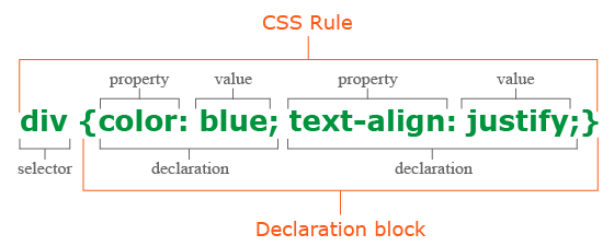
CSS is a rule or set of rules that describe the formatting (change of appearance) of individual elements on a web page. The rule consists of two parts: the selector and the next declaration block. The image below shows the structure (syntax) of the rule:
```css
div {
color: blue;
text-align: justify;
}
```
* The first is always the **selector**, it tells the browser which element or elements of the web page will be styled.
* Next is the **declaration block**, which begins with the opening curly brace { and ends with the closing }, between the curly braces are specified formatting commands (declarations), which are used by the browser to stylize the selected selector element.
* Each **declaration** consists of two parts: the property and its value. The declaration must always end with a semicolon (;). You can omit the ; only at the end of the last declaration before the closing curly brace.
* A **property** is a formatting command that defines a specific style effect for an element. Each property has its own predefined set of values. After the property name, a colon is specified, which separates the property name from the valid value.
## Q. What are the possible ways to apply CSS styles to a web page?
There are three ways to apply CSS to HTML: Inline, internal, and external.
**1. Inline CSS:**
Inline CSS is specified directly in the opening tag of the element you want it to apply to. It is entered into the style attribute within HTML. This allows CSS properties on a "per tag" basis.
**Example:**
```html
Bold Font
```
This CSS type is not really recommended, as each HTML tag needs to be styled individually. However, inline CSS in HTML can be useful in some situations. For example, in cases where you don\'t have access to CSS files or need to apply styles for a single element only.
**2. Internal CSS:**
Internal or Embedded, styles are used for the whole page. Inside the head element, the style tags surround all of the styles for the page.
**Example:**
```html
Internal CSS Example
...
```
This CSS style is an effective method of styling a single page. However, using this style for multiple pages is time-consuming as you need to put CSS rules to every page of your website.
**3. External CSS:**
In external CSS rules are stored in a separate file. To refer to that file from the HTML page, add the link element (and its closing element within XHTML) to the head element. This CSS type is a more efficient method, especially for styling a large website. By editing one **.css** file, you can change your entire site at once.
**style.css:**
```css
p {
color: red;
}
a {
color: blue;
}
```
```html
External CSS Example
...
```
The link element in the example has three attributes. The first, `rel`, tells the browser the type of the target of the link. The second, `type`, tells the browser what type of stylesheet it is. And the third, `href`, tells the browser under which URL to find the stylesheet.
## Q. What does the cascading portion of CSS mean?
The **cascading** in CSS refers to the fact that styling rules "cascade" down from several sources. This means that CSS has an inherent hierarchy and styles of a higher precedence will overwrite rules of a lower precedence.
Even the simplest HTML document may have three or more style sheets associated with it including:
* The browser\'s style sheet
* The user\'s style sheet
* The author\'s style sheet
**1. Browser style sheets:**
Browsers apply style sheets to all web documents. Although these style sheets vary from browser to browser, they all have common characteristics such as black text, blue links, purple visited links etc. These are referred to as a "default" browser stylesheet.
As soon as you, the author, apply a style sheet to a document, it will override the browser\'s style sheet. This is because author style sheets will always override browser style sheets.
**2. User style sheets:**
Most modern browsers allow users to set their own style sheets within their browser. These style sheets will override the browsers default style sheets - for that user only.
**3. Author style sheets:**
As soon as you apply a basic style sheet or an inline style to a page, you have added what is referred to as an "author style sheet". Everything you do, from choosing fonts, colours and laying out pages in CSS is done using author style sheets.
## Q. Explain new features in CSS3?
**1. CSS3 Selectors:**
* Matches any element **E** whose attribute **attr** starts with the value **val**. In other words, the val matches the beginning of the attribute value.
```css
E[attr^=val]
/* Example */
a[href^='http://sales.']{color: teal;}
```
* Matches any element **E** whose attribute **attr** ends in **val**. In other words, the val matches the end of the attribute value.
```css
E[attr$=val]
/* Example */
a[href$='.jsp']{color: purple;}
```
* Matches any element **E** whose attribute **attr** matches **val** anywhere within the attribute. It is similar to E[attr~=val], except the val can be part of a word.
```css
E[attr*=val]
/* Example */
img[src*='artwork']{
border-color: #C3B087 #FFF #FFF #C3B087;
}
```
**2. Pseudo-classes:**
CSS2 supports user interaction pseudo-classes, namely `:link`, `:visited`, `:hover`, `:active`, and `:focus`.
A few more pseudo-class selectors were added in CSS3. One is the `:root` selector, which allows designers to point to the root element of a document.
```css
:root{overflow:auto;}
```
As a complement to the `:first-child` selector, the `:last-child` was added. With it one can select the last element named of a parent element.
```css
div.article > p:last-child{font-style: italic;}
```
A new user interaction pseudo-class selector was added, the `:target` selector.
```html
Section 2
...
```
The negation pseudo-class selector, `:not` can be coupled with almost any other selector that has been implemented.
```css
img:not([border]){ border: 1; }
```
**3. CSS3 Colors:**
The color keyword list has been extended in the CSS3 color module to include 147 additional keyword colors (that are generally well supported), CSS3 also provides us with a number of other options: **HSL**, **HSLA**, **RGBA** and **Opacity**.
```css
div.halfopaque {
background-color: rgb(0, 0, 0);
opacity: 0.5;
color: #000000;
}
div.halfalpha {
background-color: rgba(0, 0, 0, 0.5);
color: #000000;
}
```
**4. Rounded Corners: border-radius:**
```css
border-radius: 25px;
```
**5 Drop Shadows:**
```css
box-shadow: 2px 5px 0 0 rgba(72,72,72,1);
```
**6. Text Shadow:**
```css
text-shadow: topOffset leftOffset blurRadius color;
```
**7. Linear Gradients:**
```css
#grad {
background: linear-gradient(to right, red, yellow);
}
```
**8. Radial Gradients:**
```css
#grad {
background: radial-gradient(red, yellow, green);
}//Default
#grad {
background: radial-gradient(circle, red, yellow, green);
}//Circle
```
**9. Multiple Background Images:**
In CSS3, there\'s no need to include an element for every background image; it provides us with the ability to add more than one background image to any element, even to pseudo-elements.
```css
background-image:
url(firstImage.jpg),
url(secondImage.gif),
url(thirdImage.png);
```
## Q. What are the css selectors?
A CSS selector is the part of a CSS rule set that actually selects the content you want to style.
**i) Universal Selector**: The universal selector works like a wild card character, selecting all elements on a page. Every HTML page is built on content placed within HTML tags. Each set of tags represents an element on the page.
```css
* {
color: green;
font-size: 20px;
line-height: 25px;
}
```
**ii) Element Type Selector**: This selector match one or more HTML elements of the same name.
```css
ul {
list-style: none;
border: solid 1px #ccc;
}
```
```html
Fish
Apples
Cheese
Example paragraph text.
Water
Juice
Maple Syrup
```
**iii) ID Selector**: This selector matches any HTML element that has an ID attribute with the same value as that of the selector.
```css
#container {
width: 960px;
margin: 0 auto;
}
```
```html
```
**iv) Class Selector**: The class selector also matches all elements on the page that have their class attribute set to the same value as the class.
```css
.box {
padding: 20px;
margin: 10px;
width: 240px;
}
```
```html
```
**v) Descendant Combinator**: The descendant selector or, more accurately, the descendant combinator lets you combine two or more selectors so you can be more specific in your selection method.
```css
#container .box {
float: left;
padding-bottom: 15px;
}
```
This declaration block will apply to all elements that have a class of box that are inside an element with an ID of `container`. It’s worth noting that the `.box` element doesn’t have to be an immediate child: there could be another element wrapping `.box`, and the styles would still apply.
```html
```
**vi) Child Combinator**: A selector that uses the child combinator is similar to a selector that uses a descendant combinator, except it only targets immediate child elements.
```css
#container > .box {
float: left;
padding-bottom: 15px;
}
```
The selector will match all elements that have a class of `box` and that are immediate children of the `#container` element. That means, unlike the descendant combinator, there can’t be another element wrapping `.box`—it has to be a direct child element.
```html
```
**vii) General Sibling Combinator**: A selector that uses a general sibling combinator matches elements based on sibling relationships. The selected elements are beside each other in the HTML.
```css
h2 ~ p {
margin-bottom: 20px;
}
```
In this example, all paragraph elements (`
`) will be styled with the specified rules, but only if they are siblings of `
` elements. There could be other elements in between the `
` and `
`, and the styles would still apply.
```html
Title
Paragraph example.
Paragraph example.
Paragraph example.
Paragraph example.
```
**viii) Adjacent Sibling Combinator**: A selector that uses the adjacent sibling combinator uses the plus symbol (+), and is almost the same as the general sibling selector. The difference is that the targeted element must be an immediate sibling, not just a general sibling.
```css
p + p {
text-indent: 1.5em;
margin-bottom: 0;
}
```
In this example will apply the specified styles only to paragraph elements that immediately follow other paragraph elements. This means the first paragraph element on a page would not receive these styles. Also, if another element appeared between two paragraphs, the second paragraph of the two wouldn’t have the styles applied.
```html
Title
Paragraph example.
Paragraph example.
Paragraph example.
Paragraph example.
Paragraph example.
```
**ix) Attribute Selector**: The attribute selector targets elements based on the presence and/or value of HTML attributes, and is declared using square brackets
```css
input[type="text"] {
background-color: #444;
width: 200px;
}
```
```html
```
The attribute selector can also be declared using just the attribute itself, with no value, like this:
```css
input[type] {
background-color: #444;
width: 200px;
}
```
**x) Pseudo-class**: A pseudo-class uses a colon character to identify a pseudo-state that an element might be in—for example, the state of being hovered, or the state of being activated.
```css
a:hover {
color: red;
}
```
**xi) Pseudo-element**: A CSS pseudo-element is used to style specified parts of an element. For example, it can be used to:
* Style the first letter, or line, of an element
* Insert content before, or after, the content of an element
```html
Lorem Ipsum is simply dummy text of the printing and typesetting industry.
Lorem Ipsum has been the industry\'s standard dummy text ever since the 1500s,
when an unknown printer took a galley of type and scrambled it to make a
type specimen book.
## Q. What is contextual selector?
Contextual selector addresses specific occurrence of an element. It is a string of individual selectors separated by white space (search pattern), where only the last element in the pattern is addressed providing it matches the specified contex.
It also check the context of the class in the html tree, assigning the style to the element through a specific route, taking into account the order of depth in the tree.
**Example:**
```css
table p { property: value; }
```
## Q. What is the difference between Pseudo-classes and pseudo-elements?
A pseudo-class is a selector that assists in the selection of something that cannot be expressed by a simple selector, for example `:hover`. A pseudo-element however allows us to create items that do not normally exist in the document tree, for example `::after`.
**Pseudo-classes:**
Pseudo-classes select regular elements but under certain conditions, like when their position relative to siblings or when they\'re under a particular state. Here is a list of pseudo-classes in CSS3:
**a) Dynamic pseudo-classes:**
* :link
* :visited
* :hover
* :active
* :focus
**b) UI element states pseudo-classes:**
* :enabled
* :disabled
* :checked
**c) Structural pseudo-classes:**
* :first-child
* :nth-child(n)
* :nth-last-child(n)
* :nth-of-type(n)
* :nth-last-of-type(n)
* :last-child
* :first-of-type
* :last-of-type
* :only-child
* :only-of-type
* :root
* :empty
**d) Other pseudo-classes:**
:not(x)
:target
:lang(language)
**Pseudo-elements:**
Pseudo-elements effectively create new elements that are not specified in the markup of the document and can be manipulated much like a regular element.
* ::before
* ::after
* ::first-letter
* ::first-line
* ::selection
## Q. What is Combinator selector?
A combinator is the character in a selector that connects two selectors together. There are four types of combinators.
**a) Descendant Combinator (space)**: The descendant selector matches all elements that are descendants of a specified element.
The following example selects all `
` elements inside `
` elements:
```css
div p {
background-color: yellow;
}
```
**b) Child Combinator (>)**: The child selector selects all elements that are the children of a specified element.
The following example selects all `
` elements that are children of a `
` element:
```css
div > p {
background-color: yellow;
}
```
**c) Adjacent Sibling Combinator (+)**: The adjacent sibling selector selects all elements that are the adjacent siblings of a specified element.
The following example selects all `
` elements that are placed immediately after `
` elements:
```css
div + p {
background-color: yellow;
}
```
**d) General Sibling Combinator (~)**: The general sibling selector selects all elements that are siblings of a specified element.
The following example selects all `
` elements that are siblings of `
` elements:
```css
div ~ p {
background-color: yellow;
}
```
## Q. What is the difference between class selectors and id selectors?
In the CSS, a class selector is a name preceded by a full stop (".") and an ID selector is a name preceded by a hash character ("#"). The difference between an ID and a class is that an ID can be used to identify one element, whereas a class can be used to identify more than one.
```css
#top {
background-color: #ccc;
padding: 20px
}
.intro {
color: red;
font-weight: bold;
}
```
```html
## Q. What is the difference between the “nth-child()” and “nth-of-type()” selectors?
The `nth-child()` pseudo-class is used to match an element based on a number, which represents the element\'s position amongst it\'s siblings. More specifically, the number represents the number of siblings that exist before the element in the document tree (minus 1).
**Example:**
```css
.example :nth-child(4) { background: #ffdb3a; }
```
```html
This is a paragraph.
This is a paragraph.
This is a paragraph.
This is a divider.
This is a divider.
```
The `nth-of-type()` pseudo-class, like nth-child(), is used to match an element based on a number. This number, however, represents the element\'s position within only those of its siblings that are of the same element type.
This number can also be expressed as a function, or using the keywords even or odd.
```css
.example p:nth-of-type(odd) { background: #ffdb3a; }
```
```html
## Q. Explain CSS grid layout with example?
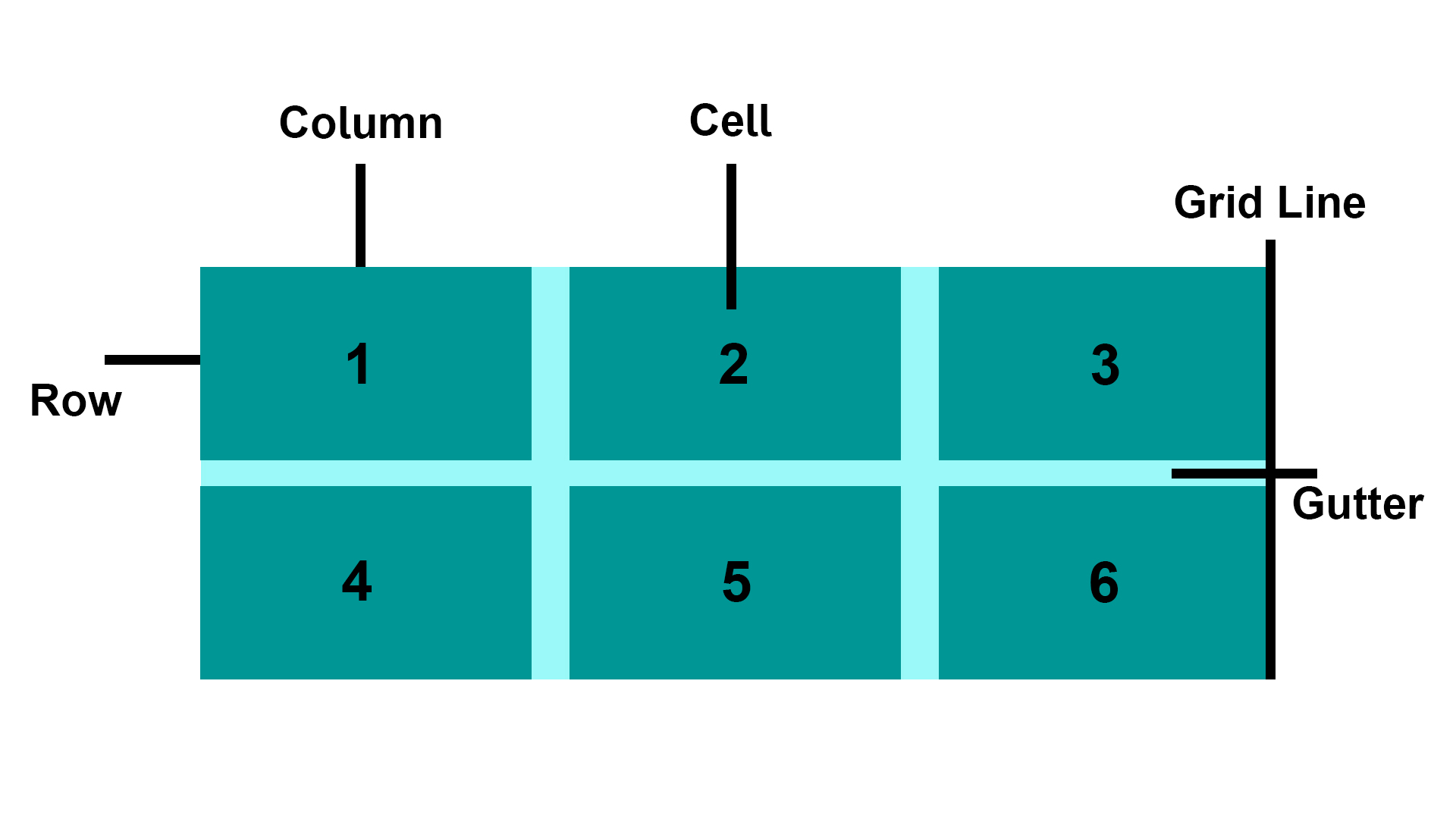
CSS Grid Layout excels at dividing a page into major regions or defining the relationship in terms of size, position, and layer, between parts of a control built from HTML primitives. Like tables, grid layout enables us to align elements into columns and rows.
**Basic Terminology:**
* **Grid Item**: The grid container contains the grid items.
* **Grid Line**: The grid line is either a vertical or horizontal grid line that makes up the structure of the grid.
* **Grid Cell**: The smallest unit on a grid is referred to as a Grid cell. It is the space between the two adjacent rows and columns.
* **Rows**: The grid row is the horizontal track of the grid.
* **Columns**: The grid column is the vertical track of the grid.
* **Gutter**: A gutter is a space between the rows and columns in the grid.
**CSS Grid Properties:**
|Property |Description |
|-----------------|----------------------------------|
|column-gap |Specifies the gap between the columns|
|gap |A shorthand property for the row-gap and the column-gap properties|
|grid |A shorthand property for the grid-template-rows, grid-template-columns, grid-template-areas, grid-auto-rows, grid-auto-columns, and the grid-auto-flow properties|
|grid-area |Either specifies a name for the grid item, or this property is a shorthand property for the grid-row-start, grid-column-start, grid-row-end, and grid-column-end properties|
|grid-auto-columns|Specifies a default column size|
|grid-auto-flow |Specifies how auto-placed items are inserted in the grid|
|grid-auto-rows |Specifies a default row size|
|grid-column |A shorthand property for the grid-column-start and the grid-column-end properties|
|grid-column-end |Specifies where to end the grid item|
|grid-column-gap |Specifies the size of the gap between columns|
|grid-column-start|Specifies where to start the grid item|
|grid-gap |A shorthand property for the grid-row-gap and grid-column-gap properties|
|grid-row |A shorthand property for the grid-row-start and the grid-row-end properties|
|grid-row-end |Specifies where to end the grid item|
|grid-row-gap |Specifies the size of the gap between rows|
|grid-row-start |Specifies where to start the grid item|
|grid-template |A shorthand property for the grid-template-rows, grid-template-columns and grid-areas properties|
|grid-template-areas|Specifies how to display columns and rows, using named grid items|
|grid-template-columns |Specifies the size of the columns, and how many columns in a grid layout|
|grid-template-rows |Specifies the size of the rows in a grid layout|
|row-gap |Specifies the gap between the grid rows|
**Example:**
```html
Grid Layout
Grid Layout
This grid layout contains six columns and three rows:
## Q. What is CSS flexbox?
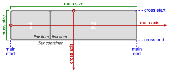
The Flexible Box Layout Module, makes it easier to design flexible responsive layout structure without using float or positioning. Flexbox makes it simple to align items vertically and horizontally using rows and columns. Items will "flex" to different sizes to fill the space.
Before the Flexbox Layout module, there were four layout modes:
* **Block**, for sections in a webpage
* **Inline**, for text
* **Table**, for two-dimensional table data
* **Positioned**, for explicit position of an element
**Flex Container:**
An area of a document laid out using flexbox is called a **flex container**. To create a flex container, we set the value of the area\'s container\'s `display` property to `flex` or `inline-flex`. As soon as we do this the direct children of that container become **flex items**.
**Flexbox Terminology:**
## Q. When to use css grid and flexbox?
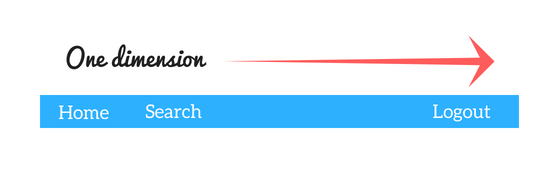
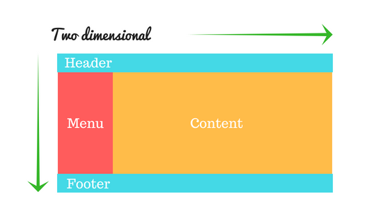
* CSS Grid Layout is a **two-dimensional** system, meaning it can handle both columns and rows, unlike flexbox which is largely a **one-dimensional** system (either in a column or a row).
* A core difference between CSS Grid and Flexbox is that — CSS Grid’s approach is **layout-first** while Flexbox’ approach is **content-first**. If you are well aware of your content before making layout, then blindly opt for Flexbox and if not, opt for CSS Grid.
* Flexbox layout is most appropriate to the components of an application (as most of them are fundamentally linear), and **small-scale** layouts, while the Grid layout is intended for **larger-scale** layouts which aren’t linear in their design.
* If you only need to define a layout as a row or a column, then you probably need flexbox. If you want to define a grid and fit content into it in two dimensions — you need the grid.
**Example:**
```html
Grid vs Flexbox Layout
Grid Layout Example
Column - 1
Column - 2
Column - 3
Column - 1
Column - 2
Column - 3
Column - 1
Column - 2
Column - 3
Flexbox Layout Example
One
Two
Three
Four
Five
```
**Live Demo**: [CSS Grid and flexbox](https://learning-zone.github.io/css-interview-questions/assets/files/grid-flexbox-layout.html)
## Q. What is CSS BEM?
The BEM (**Block Element Modifier**) methodology is a naming convention for CSS classes in order to keep CSS more maintainable by defining namespaces to solve scoping issues. A Block is a standalone component that is reusable across projects and acts as a "namespace" for sub components (Elements). Modifiers are used as flags when a Block or Element is in a certain state or is different in structure or style.
```css
/* block component */
.block {
}
/* element */
.block__element {
}
/* modifier */
.block__element--modifier {
}
```
**Example:**
```css
.button {
display: inline-block;
border-radius: 3px;
padding: 7px 12px;
border: 1px solid #D5D5D5;
background-image: linear-gradient(#EEE, #DDD);
font: 700 13px/18px Helvetica, arial;
}
.button--state-success {
color: #FFF;
background: #569E3D linear-gradient(#79D858, #569E3D) repeat-x;
border-color: #4A993E;
}
.button--state-danger {
color: #900;
}
```
```html
```
**Benefits:**
* **Modularity**: Block styles are never dependent on other elements on a page, so you will never experience problems from cascading.
* **Reusability**: Composing independent blocks in different ways, and reusing them intelligently, reduces the amount of CSS code that you will have to maintain.
* **Structure**: BEM methodology gives your CSS code a solid structure that remains simple and easy to understand.
## Q. What are the benefits of using CSS sprites?
CSS sprites combine multiple images into one single larger image. It is a commonly-used technique for icons.
**Advantages:**
* Reduce the number of ```HTTP``` requests for multiple images (only one single request is required per spritesheet). But with ```HTTP2```, loading multiple images is no longer much of an issue.
* Advance downloading of assets that won\'t be downloaded until needed, such as images that only appear upon `:hover` pseudo-states. Blinking wouldn\'t be seen.
* When you have multiple images/ icons, browser makes separate call to the server for each one of them. sprite is a technique to combine all/ some of them (usually similar one in terms of type of image. For example, you will put jpg in one sprite) in one image. To display the icon you set height, width and background position.
**Alternatives:**
* Data URIs - allow you to embed the image data directly into a stylesheet. This avoids additional HTTP requests for images, making it essentially the same thing as a sprite, without the fancy positioning.
* Icon Fonts
* SVGs
## Q. What is tweening in css?
The pose-to-pose option is to create a few keyframes throughout the sequence, and then fill in the gaps later. Filling in these gaps is known as **tweening**. It is the process of generating intermediate frames between two images. It gives the impression that the first image has smoothly evolved into the second one. In CSS3, Transforms (matrix, translate, rotate, scale etc.) module can be used to achieve tweening.
**Example:**
```css
p {
animation-duration: 3s;
animation-name: slidein;
}
@keyframes slidein {
from {
margin-left: 100%;
width: 300%;
}
to {
margin-left: 0%;
width: 100%;
}
}
```
## Q. Explain the difference between `visibility: hidden;` and `display: none;`? What are the pros and cons of using `display:none`?
* **visibility: hidden** simply hides the element but it will occupy space and affect the layout of the document.
* **display: none** removes the element from the normal layout flow (causes DOM reflow). It will not affect the layout of the document nor occupy space.
## Q. What is the purpose of the `z-index` and how a stacking context is formed?
The `z-index` helps specify the stack order of positioned elements that may overlap one another. The `z-index` default value is zero, and can take on either a positive or negative number. An element with a higher `z-index` is always stacked above than a lower index.
`z-index` can take the following values:
* **Auto**: Sets the stack order equal to its parents.
* **Number**: Orders the stack order.
* **Initial**: Sets this property to its default value (0).
* **Inherit**: Inherits this property from its parent element.
**Example:**
```html
CSS z-index Property
The z-index Property
Because the image has a z-index of -1, it will be placed behind the heading.
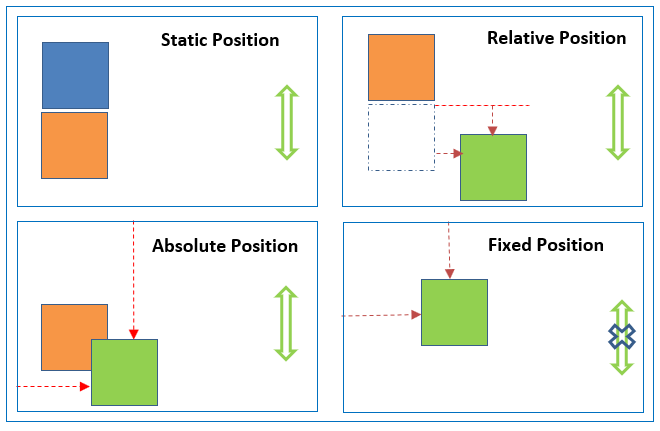
* **absolute**, place an element exactly where you want to place it. absolute position is actually set relative to the element\'s parent. if no parent available then relatively place to the page itself (it will default all the way back up to the element).
* **relative**, means "relative to itself". Setting position: relative; on an element and no other positioning attributes, it will no effect on it\'s positioning. It allows the use of `z-index` on the element and it limits the scope of absolutely positioned child elements. Any child element will be absolutely positioned within that block.
* **fixed**, element is positioned relative to viewport or the browser window itself. viewport doesn\'t changed if you scroll and hence fixed element will stay right in the same position.
* **static** default for every single page element. The only reason you would ever set an element to position: static is to forcefully-remove some positioning that got applied to an element outside of your control.
* **sticky** - Sticky positioning is a hybrid of relative and fixed positioning. The element is treated as `relative` positioned until it crosses a specified threshold, at which point it is treated as `fixed` positioned.
**Live Demo**: [CSS Position Property](https://learning-zone.github.io/css-interview-questions/assets/files/position-index.html)
## Q. What are the differences between relative and absolute in CSS?
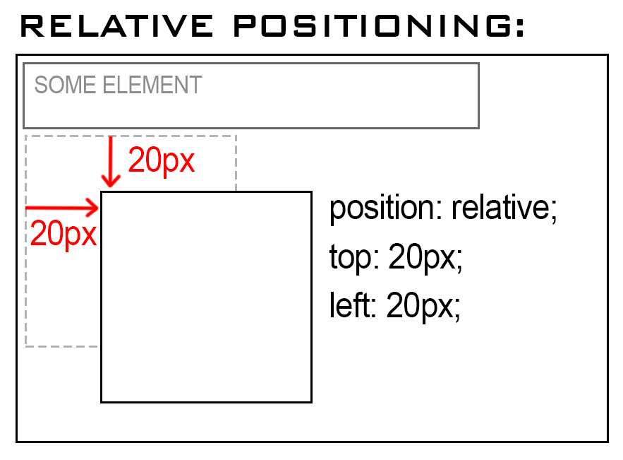
**Relative Position**
An element with `position: relative;` is positioned relative to its normal position.
Setting the top, right, bottom, and left properties of a relatively-positioned element will cause it to be adjusted away from its normal position. Other content will not be adjusted to fit into any gap left by the element.
**Example:**
```html
Relative Position
position: relative;
An element with position: relative; is positioned relative to its normal position:
This div element has position: relative;
```
**Live Demo**: [Relative Position Property](https://learning-zone.github.io/css-interview-questions/assets/files/relative-position.html)
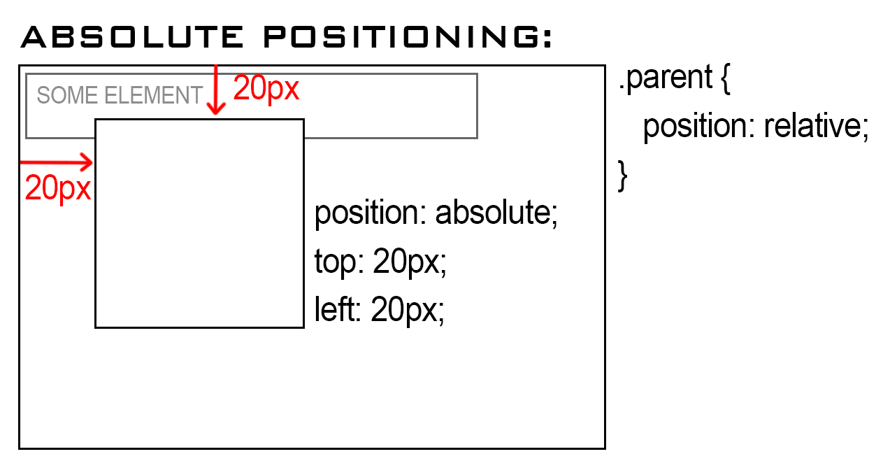
**Absolute Position:**
An element with `position: absolute;` will cause it to adjust its position with respect to its parent. If no parent is present, then it uses the document body as parent.
**Example:**
```html
Absolute Position
position: absolute;
An element with position: absolute; is positioned relative to the nearest positioned ancestor
(instead of positioned relative to the viewport, like fixed):
This div element has position: relative;
This div element has position: absolute;
```
**Live Demo**: [Absolute Position Property](https://learning-zone.github.io/css-interview-questions/assets/files/absolute-position.html)
## Q. The difference between block, inline and inline-block element?
**a) Block Elements**
The block elements always start on a new line. They will also take space of an entire row or width. List of block elements are `
`, `
`, `
`, ``.
**Example:**
```html
Lorem ipsum dolor sit amet consectetur adipisicing elit. Unde autem,
consequatur deleniti nobis beatae quo dolore nemo corporis. Ad delectus
dignissimos pariatur illum eveniet dolor rem eius laborum sed iure!
Lorem ipsum dolor sit amet consectetur adipisicing elit. Unde autem,
consequatur deleniti nobis beatae quo dolore nemo corporis. Ad delectus
dignissimos pariatur illum eveniet dolor rem eius laborum sed iure!