# Vue 3 Time Picker
[](https://manos02.github.io/vue3-time-picker/) [](https://www.npmjs.com/package/@manik02/vue3-timepicker) [](LICENSE)
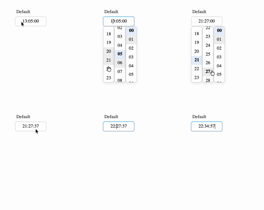
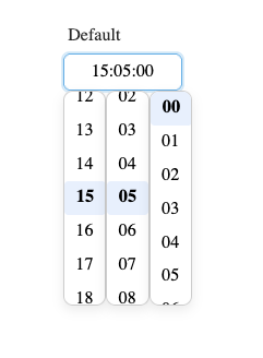
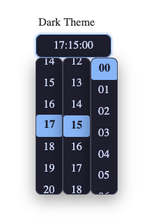
A Vue 3 time picker component with TypeScript support, multiple display formats, range selection, min/max constraints, disabled times, validation events, and full CSS variable theming.
- Live docs: [Interactive Playground](https://manos02.github.io/vue3-time-picker/)
- Package page: [npm package](https://www.npmjs.com/package/@manik02/vue3-timepicker)
- Issues: [GitHub issues](https://github.com/manos02/vue3-time-picker/issues)
If this project helps you, a [GitHub star](https://github.com/manos02/vue3-time-picker) is appriciated.
| Demo | Default | Dark |
| --- | --- | --- |
|  |  |  |
## Features
- Single and range time selection
- 24-hour, 12-hour, and `k`/`kk` 1-24 hour display formats
- Optional seconds
- Typing support with an overwrite-only masked input
- Keyboard and screen-reader friendly (arrow-key navigation, ARIA attributes)
- Step intervals for hours, minutes, and seconds
- `minTime`, `maxTime`, `disabledTimes`, and callback-based disable rules
- Validation and error events for form workflows
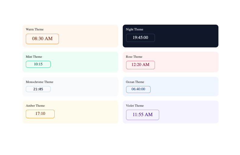
- Size presets, width control, custom classes, and CSS variable theming
- TypeScript types exported with the package
## Installation
```bash
npm install @manik02/vue3-timepicker
```
This package expects Vue 3 as a peer dependency.
## Quick Start
```vue
```
### Important Value Behavior
- `format` only changes how the value is displayed and edited.
- The bound `v-model` value is always normalized as `HH:mm:ss` when present.
- In single mode, use `string | null | undefined`.
- In range mode, use `[string, string] | null | undefined`.
Example: with `format="HH:mm"`, the UI may show `14:30`, but `v-model` still contains `14:30:00`.
## Playground
Run Storybook locally:
```bash
npm run storybook
```
Build the static docs site:
```bash
npm run build-storybook
```
The repo includes a GitHub Pages workflow for publishing Storybook from `.github/workflows/storybook.yml`.
## Examples
Unless noted otherwise, the examples below assume this shared setup:
```vue
```
### Basic Single Picker
```vue
```
### 24-Hour Format with Seconds
```vue
```
### 12-Hour Format
```vue
```
While the input is focused, press `a` or `p` to toggle AM/PM.
### Lowercase am/pm
```vue
```
### `k` Format (1-24 Hours)
```vue
```
### Start Empty and Clear Programmatically
```vue
{{ time }}
```
### Range Picker
```vue
```
### Range Picker with 30-Minute Intervals
```vue
```
### Typing-Only Input
```vue
```
### Step Intervals
```vue
```
### Working-Hours Bounds
```vue
```
If the user enters a value outside the allowed bounds, the component clamps it and emits `out-of-range` validation.
### Disable Specific Times and Ranges
```vue
```
### Disable Times with a Callback
```vue
```
### React to Validation State
```vue
{{ message }}
```
### Listen to Validation and Error Events
```vue
```
### Range Validation Example
```vue
Validation: {{ validationState }}
```
### Form-Friendly Attributes
```vue
```
In range mode, the second input automatically uses `${id}-end` and `${name}-end`.
### Custom Input Class
```vue
```
### Width Control
```vue
```
Width precedence for each input field:
1. `inputWidth` prop
2. `--vtp-input-width` CSS variable
3. Built-in width heuristic based on `format` and `placeholder`
### Size Presets
```vue
```
### CSS Variables Theme Example
```vue
```
### Rounded Minimal Theme Example
```vue
```
## Props
| Prop | Type | Default | Description |
| --- | --- | --- | --- |
| `modelValue` | `string \| [string, string] \| null` | `undefined` | Current value. In range mode use a two-item tuple. |
| `format` | `TimeFormat` | `"HH:mm"` | Display and input format. |
| `placeholder` | `string` | `"Select time"` | Placeholder text for empty input(s). |
| `id` | `string` | `undefined` | Input id. In range mode the second input uses `${id}-end`. |
| `name` | `string` | `undefined` | Input name. In range mode the second input uses `${name}-end`. |
| `tabindex` | `number` | `0` | Tab index for input field(s). |
| `autocomplete` | `string` | `"off"` | Native HTML autocomplete value. |
| `inputClass` | `string \| string[] \| Record` | `undefined` | Extra class or classes applied to each input. |
| `inputWidth` | `string \| number` | `undefined` | Explicit width for each input. Numeric values are treated as `px`. |
| `minInputWidth` | `string \| number` | `undefined` | Minimum width for each input. Numeric values are treated as `px`. |
| `maxInputWidth` | `string \| number` | `undefined` | Maximum width for each input. Numeric values are treated as `px`. |
| `componentWidth` | `string \| number` | `undefined` | Width for the outer shell. Numeric values are treated as `px`. |
| `range` | `boolean` | `false` | Enables two inputs for a time range. |
| `disabled` | `boolean` | `false` | Disables typing and dropdown interaction. |
| `hideDropdown` | `boolean` | `false` | Hides the column picker and keeps the input typing-only. |
| `hourStep` | `number` | `1` | Hour interval in the dropdown. |
| `minuteStep` | `number` | `1` | Minute interval in the dropdown. |
| `secondStep` | `number` | `1` | Second interval in the dropdown. |
| `minTime` | `string` | `undefined` | Minimum allowed time in `HH:mm` or `HH:mm:ss`. |
| `maxTime` | `string` | `undefined` | Maximum allowed time in `HH:mm` or `HH:mm:ss`. |
| `disabledTimes` | `(string \| [string, string])[]` | `undefined` | Disabled time points or ranges. |
| `isTimeDisabled` | `(time: InternalFormat) => boolean` | `undefined` | Callback for custom disabled-time rules. Return `true` to block a time. |
| `size` | `"xs" \| "sm" \| "md" \| "lg" \| "xl"` | `"md"` | Size preset mapped to CSS variables. |
### Autocomplete Notes
- `autocomplete` is forwarded directly to the native `` element.
- In range mode, both inputs receive the same `autocomplete` value.
- Browser autofill behavior also depends on the surrounding form, `id`, and `name` attributes.
## Events
| Event | Payload | Description |
| --- | --- | --- |
| `update:modelValue` | `string \| [string, string] \| null` | Emitted when the value changes. |
| `update:validationState` | `"valid" \| "invalid" \| "out-of-range"` | Emitted whenever the aggregated validation state changes. |
| `validate` | `{ target, state, reason?, value }` | Emitted after validation runs for one input. |
| `error` | `{ code, message }` | Emitted when invalid or disabled input is encountered. |
### `validate` Payload
```ts
{
target: "first" | "second";
state: "valid" | "invalid" | "out-of-range";
reason?: "BAD_TIME" | "OUT_OF_RANGE" | "DISABLED";
value: string | null;
}
```
- `value` is always normalized to `HH:mm:ss` when present.
- `target` is always included, even in single-input mode.
### Validation States
- `valid`: the value is accepted.
- `invalid`: the value is incomplete, malformed, or blocked by disable rules.
- `out-of-range`: the value was outside `minTime`/`maxTime` and was clamped.
## Format Tokens
| Token | Output | Description |
| --- | --- | --- |
| `HH` | `00`-`23` | 24-hour, zero-padded |
| `H` | `0`-`23` | 24-hour |
| `hh` | `01`-`12` | 12-hour, zero-padded |
| `h` | `1`-`12` | 12-hour |
| `kk` | `01`-`24` | 1-24 hour, zero-padded |
| `k` | `1`-`24` | 1-24 hour |
| `mm` | `00`-`59` | Minutes, zero-padded |
| `m` | `0`-`59` | Minutes |
| `ss` | `00`-`59` | Seconds, zero-padded |
| `s` | `0`-`59` | Seconds |
| `A` / `P` | `AM` / `PM` | Uppercase AM/PM |
| `a` / `p` | `am` / `pm` | Lowercase am/pm |
Examples:
- `HH:mm`
- `HH:mm:ss`
- `hh:mm A`
- `hh:mm:ss a`
- `kk:mm`
## Keyboard Behavior
- Typing is overwrite-only rather than free-form insertion.
- The mask auto-inserts `:` separators.
- In 12-hour mode, press `a` or `p` while focused to toggle AM/PM.
- `Backspace` moves the cursor left without clearing the entire value.
- `ArrowUp` / `ArrowDown` open the dropdown, then step the segment under the cursor (hours, minutes, seconds, or AM/PM), skipping disabled times.
- `ArrowLeft` / `ArrowRight` move the cursor to choose which segment the arrows change.
- `Enter` commits the typed value and closes the dropdown.
- `Escape` closes the dropdown columns.
- Focus stays on the input; dropdown options are not tab stops.
## Styling
The component exposes CSS custom properties on `.timepicker-shell`, so you can theme it from any parent container.
```css
.my-theme .timepicker-shell {
--vtp-font-family: Inter, sans-serif;
--vtp-font-size: 14px;
--vtp-bg: #ffffff;
--vtp-color: #111827;
--vtp-border: #d1d5db;
--vtp-border-radius: 8px;
--vtp-padding: 0.5rem 0.75rem;
--vtp-focus-border: #2563eb;
--vtp-focus-ring: 0 0 0 3px rgba(37, 99, 235, 0.18);
--vtp-error-border: #ef4444;
--vtp-error-ring: 0 0 0 3px rgba(239, 68, 68, 0.15);
--vtp-component-width: auto;
--vtp-input-width: 12ch;
--vtp-input-min-width: 0;
--vtp-input-max-width: none;
--vtp-separator-color: #9ca3af;
--vtp-dropdown-bg: #ffffff;
--vtp-dropdown-border: #e5e7eb;
--vtp-dropdown-shadow: 0 4px 12px rgba(0, 0, 0, 0.1);
--vtp-dropdown-radius: 8px;
--vtp-dropdown-max-height: 240px;
--vtp-option-padding: 0.375rem 0.75rem;
--vtp-option-radius: 6px;
--vtp-option-hover-bg: #f3f4f6;
--vtp-option-active-bg: #dbeafe;
--vtp-option-active-color: #1e40af;
--vtp-option-active-weight: 600;
--vtp-columns-gap: 0.5rem;
}
```
Common styling variables:
| Variable | Purpose |
| --- | --- |
| `--vtp-bg` | Input background |
| `--vtp-color` | Input text color |
| `--vtp-border` | Input border color |
| `--vtp-focus-border` | Focused border color |
| `--vtp-focus-ring` | Focus ring shadow |
| `--vtp-dropdown-bg` | Dropdown background |
| `--vtp-dropdown-border` | Dropdown border color |
| `--vtp-option-hover-bg` | Hovered option background |
| `--vtp-option-active-bg` | Active option background |
| `--vtp-option-active-color` | Active option text color |
| `--vtp-input-width` | Default input width |
| `--vtp-component-width` | Outer shell width |
## TypeScript
The package exports these useful types:
```ts
import type {
DisabledTimeInput,
InternalFormat,
TimeFormat,
TimePickerProps,
ValidationReason,
ValidationState,
} from "@manik02/vue3-timepicker";
```
## Development
```bash
npm run dev
npm run storybook
npm run test
npm run build
```
## License
MIT