# MockFrame Device mockups for React. Showcase your apps in realistic phone, tablet, and laptop frames. Perfect for SaaS landing pages, product demos, and marketing websites. Built and maintained by [Matter Development](https://matterdevelopment.com/?utm_source=react-mockframe&utm_medium=readme). [![npm version](https://img.shields.io/npm/v/react-mockframe.svg)](https://www.npmjs.com/package/react-mockframe) [![TypeScript](https://img.shields.io/badge/%3C%2F%3E-TypeScript-blue.svg)](http://typescriptlang.org/) [![License: MIT](https://img.shields.io/badge/License-MIT-yellow.svg)](https://opensource.org/licenses/MIT)

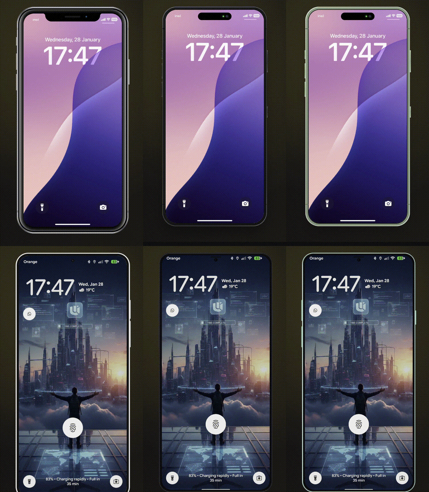
MockFrame Demo

## Features - **12 Devices** - iPhone 8/8 Plus, iPhone X, iPhone 17, iPhone 18 Pro, iPhone Duo (foldable), Pixel 10, Galaxy S25, iPad Mini, iPad Pro, MacBook Pro 2020, MacBook Pro - **Measured, Not Eyeballed** - iPhone 17, iPhone 18 Pro, iPhone Duo, iPad Pro and MacBook Pro frames are measured from Apple's official product bezels (99.8% shape match): real screen sizes, corner radii, bezels, Dynamic Island and button positions, with frame colours sampled per finish - **Multiple Color Variants** - Authentic device colors for each model - **Landscape Mode** - Rotate phones and tablets - **Notch/Dynamic Island Toggle** - Show or hide notches - **Smooth Animations** - Optional animated transitions - **Custom Device Frames** - Create your own frames with `CustomMockFrame` - **Modular CSS** - Import only the device families you need - **TypeScript First** - Full type safety with discriminated unions - **Lightweight** - ~21KB ESM (~5.7KB gzipped), tree-shakeable ## Supported Devices | Device | Colors | Landscape | Notch/Island | |--------|--------|-----------|--------------| | iPhone X | - | Yes | Notch | | iPhone 8 | black, silver, gold | Yes | - | | iPhone 8 Plus | black, silver, gold | Yes | - | | iPhone 17 | black, white, mist-blue, sage, lavender, cosmic-orange, deep-blue | Yes | Dynamic Island | | iPhone 18 Pro | black, silver, glacier, burgundy, gold, natural-titanium | Yes | Dynamic Island | | iPhone Duo | night-sky, star-white | Yes | Camera (3 fold poses) | | Pixel 10 | obsidian, frost, indigo, lemongrass | Yes | - | | Galaxy S25 | blue-black, icy-blue, navy, mint, silver-shadow, coral-red, pink-gold | Yes | - | | iPad Mini | black, silver | Yes | - | | iPad Pro | space-black, silver | Yes | - | | MacBook Pro 2020 | - | - | - | | MacBook Pro | space-black, silver | - | Notch | Default screen sizes (CSS px) match each device's real viewport: iPhone 17 / 18 Pro 402×874, Pixel 10 412×924, Galaxy S25 360×780. iPad Pro (512×683) and MacBook Pro (960×624) are scaled down from the real 13" and 14" screens, keeping their exact proportions. `gold` and `natural-titanium` are not iPhone 18 Pro finishes (Apple sells Black, Silver, Glacier and Burgundy). `gold` is Apple's iPhone Air Light Gold applied to the 18 Pro's satin aluminium, and `natural-titanium` is sampled from Apple's iPhone 16 Pro Natural Titanium. Older colour names stay accepted for compatibility: `space-gray` (iPad Pro, MacBook Pro), `porcelain` / `mint` / `rose` (Pixel 10), `phantom-black` / `silver` (Galaxy S25). ## Installation ```bash npm install react-mockframe # or pnpm add react-mockframe # or yarn add react-mockframe ``` ## Quick Start ```tsx import { MockFrame } from 'react-mockframe' import 'react-mockframe/styles/mockframe.css' export default function App() { return ( ) } ``` ## Usage Examples ### Basic Device Frame ```tsx App screenshot ``` ### Device with Color ```tsx ``` ### Landscape Mode ```tsx ``` ### iPhone Duo: closed, half-open, open Apple's foldable has three poses. Each is measured from Apple's iPhone Duo product bezels: the closed outer display (466×678), the open inner display (951×669) and the half-open book pose, where each half is placed with the perspective of Apple's own render. ```tsx {/* closed (default) */} {/* book pose */} {/* inner display */} ``` - Closed is naturally portrait and open naturally landscape (the book spread); `landscape` turns either one (`landscape` on closed, `landscape={false}` on open). The half-open pose is always the book pose. - `width` / `height` set the screen size of the current pose; `hideNotch` hides the camera. - With `animated`, changing `pose` folds the device in 3D: the halves swing on the hinge, and closing it brings the outer display over. It runs between the natural orientations at the default size, and is skipped when the visitor prefers reduced motion. Content is remounted while it folds. - In the half-open pose your content is drawn once per half. The right-hand copy is `inert` and hidden from screen readers, so interactive content only works on the left half. Images and videos look right across both. - The half turned away from the light is shaded; set the CSS variable `--duo-fold-shade` (default `0.22`) on the frame to change it, or `0` to turn it off. ### Hide Notch / Dynamic Island ```tsx // Hide notch on iPhone X // Hide Dynamic Island on iPhone 17 // Hide notch on MacBook Pro ``` ### Custom Zoom & Dimensions ```tsx ``` ### Animated Transitions ```tsx ``` ### Landing Page Hero ```tsx
Your product headline

Describe your product value proposition here.

App preview
``` ### Dashboard Showcase ```tsx
Dashboard preview
``` ## Props ### MockFrame | Prop | Type | Description | |------|------|-------------| | `device` | `DeviceName` | **Required.** The device model to render | | `color` | `string` | Device color variant (required for devices with colors) | | `landscape` | `boolean` | Rotate to landscape orientation (phones/tablets only) | | `hideNotch` | `boolean` | Hide the notch or dynamic island | | `width` | `number` | Override screen content width in pixels | | `height` | `number` | Override screen content height in pixels | | `zoom` | `number` | Scale the entire device frame (e.g., `0.75` for 75%) | | `animated` | `boolean` | Enable smooth transitions for zoom changes | | `children` | `ReactNode` | Content to render inside the device screen | The `color` prop is **type-safe** - TypeScript only allows valid colors for each device: ```tsx // Valid - iPhone 17 supports 'lavender' // TypeScript error - iPhone X has no color variants // TypeScript error - 'pink' is not a valid iPhone 17 color ``` ## Custom Device Frames Create your own device frames with `CustomMockFrame`: ```tsx import { CustomMockFrame } from 'react-mockframe' ``` ### CustomMockFrame Props | Prop | Type | Default | Description | |------|------|---------|-------------| | `width` | `number` | **Required** | Screen content width in pixels | | `height` | `number` | **Required** | Screen content height in pixels | | `bezelWidth` | `number \| object` | `12` | Bezel thickness (uniform or per-side) | | `borderRadius` | `number` | `44` | Outer frame corner radius | | `screenBorderRadius` | `number` | auto | Screen corner radius | | `bezelColor` | `string` | `#1a1a1a` | Bezel background color | | `zoom` | `number` | - | Scale factor for the frame | | `animated` | `boolean` | - | Enable smooth transitions | | `landscape` | `boolean` | - | Display in landscape orientation | | `frameClassName` | `string` | - | CSS class for the outer frame | | `screenClassName` | `string` | - | CSS class for the screen area | Per-side bezel example: ```tsx ``` ## Modular CSS Bundles Import only the device families you need to reduce bundle size: Sizes below are minified (gzipped in parentheses). ```tsx // Full bundle - all devices (~50KB min / ~10KB gzip) import 'react-mockframe/styles/mockframe.css' // iPhones only (~36KB min / ~7.4KB gzip) import 'react-mockframe/styles/mockframe-iphones.css' // Android only (~5KB min / ~1.4KB gzip) import 'react-mockframe/styles/mockframe-android.css' // Tablets only (~5KB min / ~1.5KB gzip) import 'react-mockframe/styles/mockframe-tablets.css' // Laptops only (~6KB min / ~1.7KB gzip) import 'react-mockframe/styles/mockframe-laptops.css' ``` ## TypeScript The library exports helpful types: ```tsx import type { DeviceName, // Union of all device names MockFrameProps, // Full props with type safety DeviceConfig, // Get config for a specific device DeviceColor, // Get available colors for a device DeviceHasLandscape, // Check if device supports landscape DevicePose, // Fold poses of a foldable ('closed' | 'half-open' | 'open') CustomMockFrameProps, } from 'react-mockframe' // Get available colors for a specific device type iPhone17Colors = DeviceColor<'iPhone 17'> // => 'black' | 'white' | 'mist-blue' | 'sage' | 'lavender' | 'cosmic-orange' | 'deep-blue' // Check if a device supports landscape type CanRotate = DeviceHasLandscape<'iPad Pro'> // => true ``` Access device data programmatically: ```tsx import { DeviceNames, DeviceOptions } from 'react-mockframe' // Array of all device names console.log(DeviceNames) // ['iPhone X', 'iPhone 8', 'iPhone 8 Plus', 'iPhone 17', 'iPhone 18 Pro', ...] // Access device configuration const config = DeviceOptions['iPhone 17'] console.log(config.colors) // ['black', 'white', 'mist-blue', ...] console.log(config.width) // 402 console.log(config.height) // 874 ``` ## Demo Website The interactive demo website includes: - **Device Preview** - Switch between all devices and colors in real-time - **Orientation Toggle** - Portrait and landscape modes - **Notch Toggle** - Show/hide notch and dynamic island - **Auto-Fit Zoom** - Automatically scale device to fit the viewport - **Screenshot Upload** - Drag & drop images into the device frame - **Image Controls** - Zoom, pan, and reposition uploaded images - **Background Options** - Solid colors and gradient presets - **Export to PNG/WebP** - Download mockups with transparent backgrounds - **Live Code Preview** - Copy-paste ready code snippets - **Dark/Light Theme** - Full theme support ## Browser Support - Chrome 95+ - Firefox 95+ - Safari 15+ - Edge 95+ ## Credits Device frame styles are adapted from [Marvel devices.css](https://github.com/marvelapp/devices.css) (MIT © 2014 Marvelapp). Newer device frames (iPhone 17, iPhone 18 Pro, iPhone Duo, Pixel 10, Galaxy S25, iPad Pro, MacBook Pro) and all React/TypeScript code are original to this project. Apple frame measurements come from Apple's [product bezels](https://developer.apple.com/design/resources/#product-bezels); no Apple artwork is included. ## Author **Mohammed Banani** — [@mbdev3](https://github.com/mbdev3) · [Matter Development](https://matterdevelopment.com/?utm_source=react-mockframe&utm_medium=readme) ## Contributing Contributions are welcome! Please open an issue or submit a pull request. ## License MIT License — see [LICENSE](./LICENSE) for details.