# Flutter EasyLoading
[](https://pub.dev/packages/flutter_easyloading)
[](https://github.com/nslogx/flutter_easyloading/actions/workflows/ci.yml)
[](https://pub.dev/packages/flutter_easyloading/score)
[](https://pub.dev/packages/flutter_easyloading/score)
[](./LICENSE)
🌐 English | [简体中文](./README-zh_CN.md)
A lightweight, customizable loading, progress, result, and toast overlay for
Flutter. Display calls do not require a `BuildContext`.
- Loading, determinate progress, result states, and toast messages
- Global calls without passing a `BuildContext`
- Built-in indicators, custom widgets, and custom transitions
- Global defaults with immutable per-call overrides
- Material and Cupertino application support
## 🎬 Preview
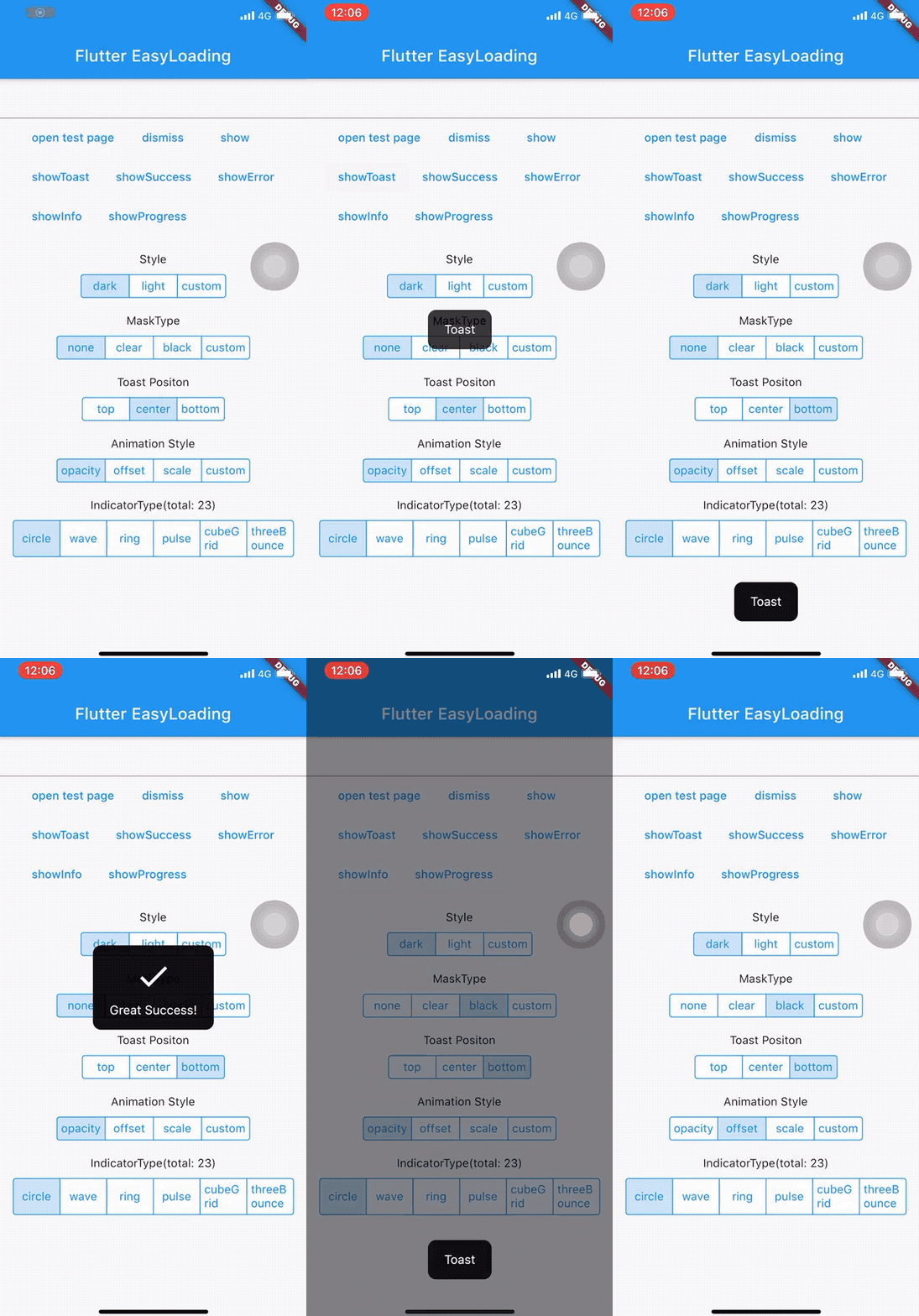
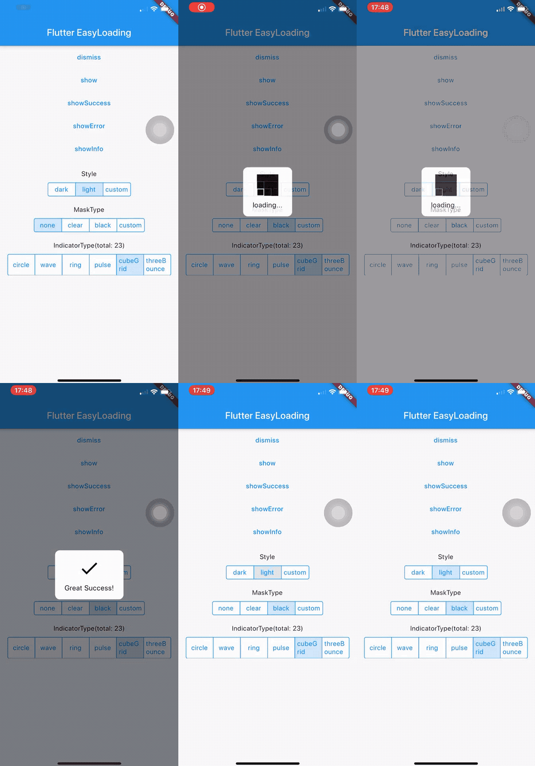
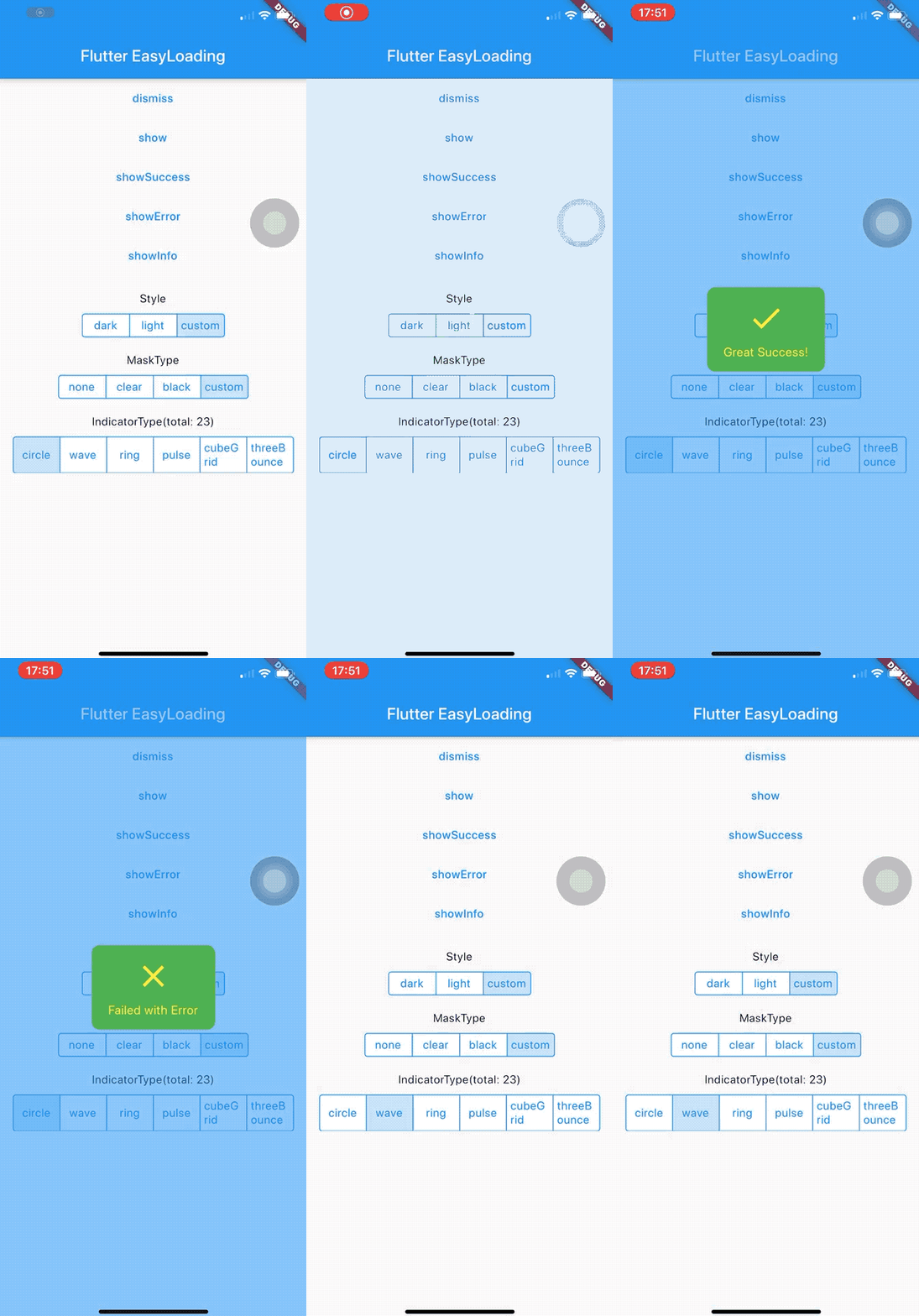
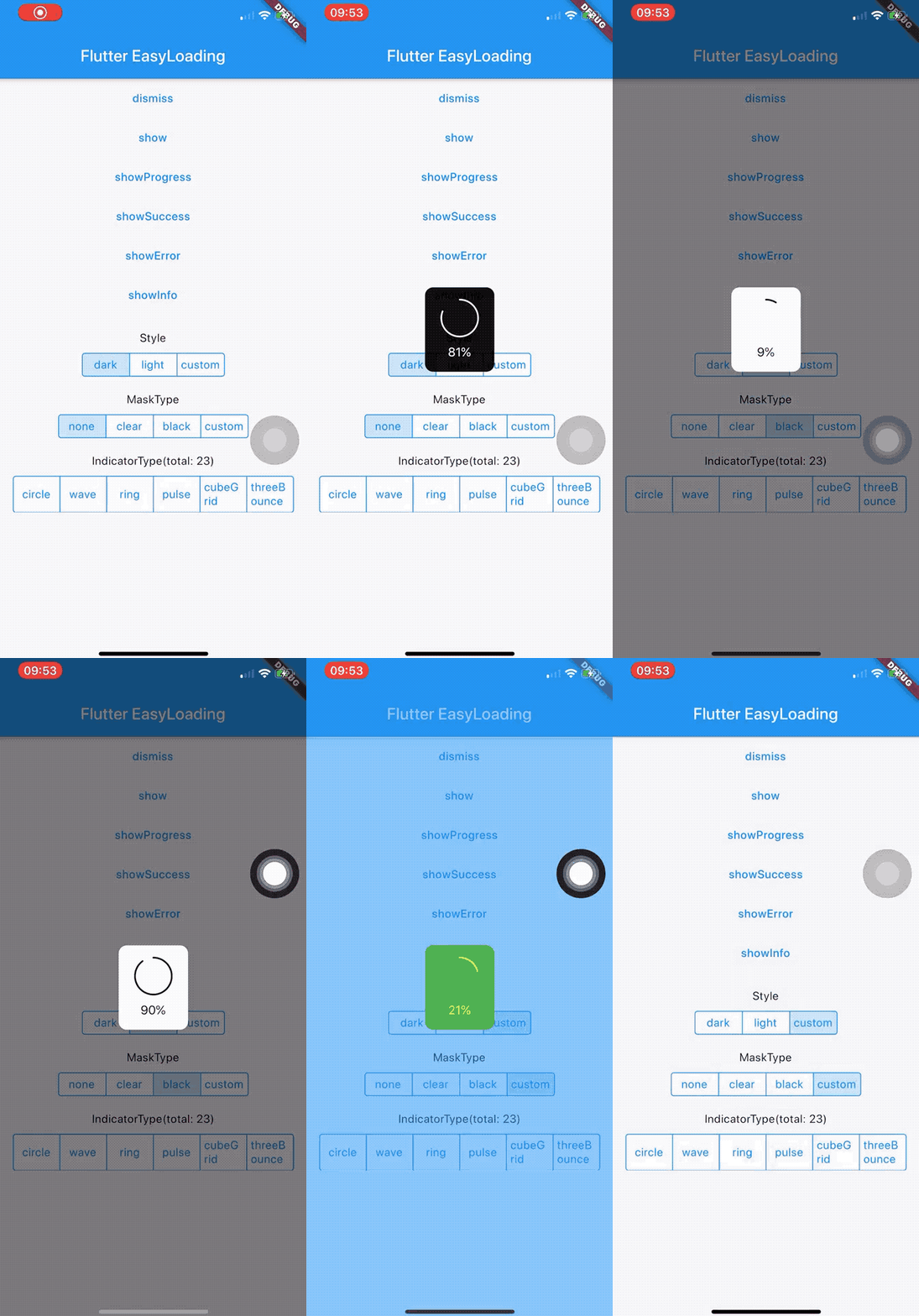
**[Open the interactive Flutter EasyLoading preview](https://nslogx.github.io/flutter_easyloading/#/)**
## 🧰 Requirements
- Dart 3.6.0 or later, below Dart 4.0.0
- Flutter 3.27.0 or later
Read the [4.0 migration guide](./MIGRATION.md) before upgrading from 3.x.
## 📦 Installation
```shell
flutter pub add flutter_easyloading
```
Or add the dependency manually:
```yaml
dependencies:
flutter_easyloading: ^4.0.2
```
```dart
import 'package:flutter_easyloading/flutter_easyloading.dart';
```
## 🚀 Quick Start
Install one EasyLoading Host at the root `MaterialApp` or `CupertinoApp`:
```dart
MaterialApp(
builder: EasyLoading.init(),
home: const HomePage(),
);
```
Display and dismiss content from anywhere after the Host is mounted:
```dart
await EasyLoading.show(status: 'Loading...');
await EasyLoading.showProgress(0.5, status: 'Downloading...');
await EasyLoading.showSuccess('Completed');
await EasyLoading.showError('Request failed');
await EasyLoading.showInfo('Update available');
await EasyLoading.showToast('Saved');
await EasyLoading.dismiss();
```
All display and dismissal methods return `Future` and can be awaited.
If the application already has a root builder, compose it through `init`:
```dart
MaterialApp(
builder: EasyLoading.init(
builder: (context, child) => ExistingRoot(child: child),
),
home: const HomePage(),
);
```
## 📖 API Reference
### Initialization and state
| API | Returns | Description |
| --- | --- | --- |
| `EasyLoading()` | `EasyLoading` | Returns the shared configuration instance. |
| `EasyLoading.instance` | `EasyLoading` | Accesses the shared configuration instance. |
| `EasyLoading.isShow` | `bool` | Reports whether an EasyLoading overlay is active. |
| `EasyLoading.init({builder})` | `TransitionBuilder` | Creates the application-level Host builder and optionally composes another builder. |
| `FlutterEasyLoading(child: child)` | `FlutterEasyLoading` | Creates the Host widget directly. Most applications should use `EasyLoading.init()`. |
### Display and dismissal
| API | Parameters | Description |
| --- | --- | --- |
| `EasyLoading.show(...)` | `status`, `indicator`, `maskType`, `dismissOnTap`, `duration`, `options` | Shows or updates an indeterminate loading indicator. |
| `EasyLoading.showProgress(value, ...)` | `status`, `maskType`, `indicator`, `duration`, `dismissOnTap`, `options` | Shows or updates determinate progress from `0.0` to `1.0`. |
| `EasyLoading.showSuccess(status, ...)` | `duration`, `maskType`, `dismissOnTap`, `options` | Shows a success result. |
| `EasyLoading.showError(status, ...)` | `duration`, `maskType`, `dismissOnTap`, `options` | Shows an error result. |
| `EasyLoading.showInfo(status, ...)` | `duration`, `maskType`, `dismissOnTap`, `options` | Shows an information result. |
| `EasyLoading.showToast(status, ...)` | `duration`, `toastPosition`, `maskType`, `dismissOnTap`, `options` | Shows a text-only toast. |
| `EasyLoading.showCustom(content, ...)` | `duration`, `maskType`, `dismissOnTap`, `options` | Shows arbitrary widget content. |
| `EasyLoading.dismiss({animation})` | `animation` defaults to `true` | Dismisses the active overlay. |
### Callbacks
| API | Description |
| --- | --- |
| `EasyLoading.addStatusCallback(callback)` | Adds an `EasyLoadingStatusCallback`. |
| `EasyLoading.removeCallback(callback)` | Removes one status callback. |
| `EasyLoading.removeAllCallbacks()` | Removes every status callback. |
| `EasyLoading.addDismissCallback(callback)` | Adds an `EasyLoadingDismissCallback`. |
| `EasyLoading.removeDismissCallback(callback)` | Removes one dismissal callback. |
| `EasyLoading.removeAllDismissCallbacks()` | Removes every dismissal callback. |
```dart
void onStatus(EasyLoadingStatus status) {
// EasyLoadingStatus.show or EasyLoadingStatus.dismiss
}
void onDismiss(EasyLoadingDismissReason reason) {
// programmatic, tap, timeout, or hostDetached
}
EasyLoading.addStatusCallback(onStatus);
EasyLoading.addDismissCallback(onDismiss);
// Remove callbacks when their owner is disposed.
EasyLoading.removeCallback(onStatus);
EasyLoading.removeDismissCallback(onDismiss);
```
## ⚙️ Configuration
Set global defaults once during application startup:
```dart
EasyLoading.instance
..loadingStyle = EasyLoadingStyle.dark
..indicatorType = EasyLoadingIndicatorType.fadingCircle
..maskType = EasyLoadingMaskType.none
..toastPosition = EasyLoadingToastPosition.bottom
..displayDuration = const Duration(seconds: 2)
..animationDuration = const Duration(milliseconds: 200);
```
### General
| Property | Type | Default | Description |
| --- | --- | --- | --- |
| `loadingStyle` | `EasyLoadingStyle` | `dark` | Panel color style. |
| `indicatorType` | `EasyLoadingIndicatorType` | `fadingCircle` | Built-in loading indicator. |
| `maskType` | `EasyLoadingMaskType` | `none` | Default barrier style and interaction mode. |
| `toastPosition` | `EasyLoadingToastPosition` | `center` | Default toast placement. |
| `animationStyle` | `EasyLoadingAnimationStyle` | `opacity` | Panel transition style. |
| `displayDuration` | `Duration` | `2000 ms` | Default result and toast duration. |
| `animationDuration` | `Duration` | `200 ms` | Presentation and dismissal transition duration. |
| `userInteractions` | `bool?` | `null` | Optional override for input reaching the application below the overlay. |
| `dismissOnTap` | `bool?` | `null` (`false`) | Default tap-to-dismiss override. |
### Layout and text
| Property | Type | Default | Description |
| --- | --- | --- | --- |
| `textAlign` | `TextAlign` | `center` | Status text alignment. |
| `contentPadding` | `EdgeInsets` | `vertical: 15, horizontal: 20` | Panel content padding. |
| `textPadding` | `EdgeInsets` | `bottom: 10` | Space between the indicator and status text. |
| `indicatorSize` | `double` | `40` | Built-in indicator width and height. |
| `radius` | `double` | `5` | Panel corner radius. |
| `fontSize` | `double` | `15` | Status font size when `textStyle` is not set. |
| `progressWidth` | `double` | `2` | Determinate progress stroke width. |
| `lineWidth` | `double` | `4` | Stroke width for supported built-in indicators. |
| `textStyle` | `TextStyle?` | `null` | Complete status text style. |
### Colors and effects
| Property | Type | Default | Description |
| --- | --- | --- | --- |
| `textColor` | `Color?` | `null` | Status color for `EasyLoadingStyle.custom`. |
| `indicatorColor` | `Color?` | `null` | Indicator color for `EasyLoadingStyle.custom`. |
| `progressColor` | `Color?` | `null` | Progress color for `EasyLoadingStyle.custom`. |
| `backgroundColor` | `Color?` | `null` | Panel color for `EasyLoadingStyle.custom`. |
| `boxShadow` | `List?` | `null` | Panel shadows for `EasyLoadingStyle.custom`. |
| `maskColor` | `Color?` | `null` | Barrier color for `EasyLoadingMaskType.custom`. |
### Custom widgets and animation
| Property | Type | Default | Description |
| --- | --- | --- | --- |
| `customAnimation` | `EasyLoadingAnimation?` | `null` | Transition used by `EasyLoadingAnimationStyle.custom`. |
| `indicatorWidget` | `Widget?` | `null` | Global replacement for the loading indicator. |
| `successWidget` | `Widget?` | `null` | Global replacement for the success icon. |
| `errorWidget` | `Widget?` | `null` | Global replacement for the error icon. |
| `infoWidget` | `Widget?` | `null` | Global replacement for the information icon. |
Custom modes require their corresponding values:
- `EasyLoadingStyle.custom`: `backgroundColor`, `indicatorColor`, and `textColor`; progress also requires `progressColor`.
- `EasyLoadingMaskType.custom`: `maskColor`.
- `EasyLoadingAnimationStyle.custom`: `customAnimation`.
## 🎛️ Per-call Options
`EasyLoadingOptions` is an immutable snapshot for one display call. Every field
is optional and inherits the corresponding global value when omitted.
| Group | Supported fields |
| --- | --- |
| Appearance | `loadingStyle`, `indicatorType`, `animationStyle`, `backgroundColor`, `boxShadow` |
| Indicator and progress | `indicatorSize`, `indicatorColor`, `progressColor`, `progressWidth`, `lineWidth` |
| Text | `textAlign`, `textStyle`, `textColor`, `fontSize`, `textPadding` |
| Layout | `alignment`, `constraints`, `contentPadding`, `radius` |
| Animation | `animationDuration`, `customAnimation` |
| Mask and interaction | `maskColor`, `userInteractions` |
`maskType`, `dismissOnTap`, and `duration` remain direct method parameters.
`toastPosition` is a direct parameter of `showToast`.
```dart
await EasyLoading.show(
status: 'Uploading',
maskType: EasyLoadingMaskType.black,
duration: const Duration(seconds: 10),
options: const EasyLoadingOptions(
loadingStyle: EasyLoadingStyle.auto,
alignment: AlignmentDirectional.topEnd,
constraints: BoxConstraints(maxWidth: 320),
indicatorType: EasyLoadingIndicatorType.ring,
),
);
```
## 🧩 Public Types
| Type | Values or purpose |
| --- | --- |
| `EasyLoadingStyle` | `light`, `dark`, `custom`, `auto` |
| `EasyLoadingToastPosition` | `top`, `center`, `bottom` |
| `EasyLoadingAnimationStyle` | `opacity`, `offset`, `scale`, `custom` |
| `EasyLoadingMaskType` | `none`, `clear`, `black`, `custom` |
| `EasyLoadingIndicatorType` | 30 built-in indicators listed below. |
| `EasyLoadingStatus` | `show`, `dismiss` |
| `EasyLoadingDismissReason` | `programmatic`, `tap`, `timeout`, `hostDetached` |
| `EasyLoadingStatusCallback` | `void Function(EasyLoadingStatus status)` |
| `EasyLoadingDismissCallback` | `void Function(EasyLoadingDismissReason reason)` |
| `EasyLoadingOptions` | Immutable visual and layout overrides for one call. |
| `EasyLoadingAnimation` | Base class for custom transitions; implement `buildWidget`. |
| `FlutterEasyLoading` | Application-level Host widget created by `EasyLoading.init()`. |
All EasyLoadingIndicatorType values
`fadingCircle`, `circle`, `threeBounce`, `chasingDots`, `wave`,
`wanderingCubes`, `rotatingPlain`, `doubleBounce`, `fadingFour`, `fadingCube`,
`pulse`, `cubeGrid`, `rotatingCircle`, `foldingCube`, `pumpingHeart`,
`dualRing`, `hourGlass`, `pouringHourGlass`, `fadingGrid`, `ring`, `ripple`,
`spinningCircle`, `squareCircle`, `dancingSquare`, `pianoWave`,
`pouringHourGlassRefined`, `pulsingGrid`, `spinningLines`, `threeInOut`, and
`waveSpinner`.
## 🎨 Custom Content
```dart
await EasyLoading.showCustom(
const Material(
child: Padding(
padding: EdgeInsets.all(16),
child: Text('Custom content'),
),
),
maskType: EasyLoadingMaskType.black,
options: const EasyLoadingOptions(
alignment: AlignmentDirectional.bottomCenter,
constraints: BoxConstraints(maxWidth: 320),
),
);
```
See the example application's
[custom animation](./example/lib/custom_animation.dart) for an
`EasyLoadingAnimation` implementation.
## 🔄 Migrating From 3.x
Common `init`, `show...`, `dismiss`, status callback, and
`EasyLoading.instance` call forms remain valid. Review the SDK baseline and
removed undocumented internals in the [4.0 migration guide](./MIGRATION.md).
## 🗂️ Project
- [Example application](./example)
- [Changelog](./CHANGELOG.md)
- [Contributing](./CONTRIBUTING.md)
- [Security policy](./SECURITY.md)
- [Issue tracker](https://github.com/nslogx/flutter_easyloading/issues)
## ⚖️ License
Flutter EasyLoading is available under the [MIT License](./LICENSE).
## 🙏 Credits
Built-in loading indicators are provided by
[flutter_spinkit](https://pub.dev/packages/flutter_spinkit).