Love your devices: adaptive web design with media queries, viewport and more
Introduction
It's time again to reflect on happiness and well being: that of yourselves and the members of the public who consume the web content and services you create. Today we are going to talk about getting more satisfaction from battery-powered devices...
...no silly, I'm talking about the vast profusion of alternative browsing devices sweeping through our society like wildfire. A lot of us used to deal with support for mobile browsers with very short-sighted expressions of duality, such as completely separate mobile and desktop sites, or handheld media type stylesheets to provide separate styling to mobile. Or we'd detect the UA string and serve suitable content for the browser.
But designing for specific browsers hasn't been cool since IE and Netscape were slugging it out in the mid to late 90's, and it sucked even more back then because we pretty much had to create separate site versions if we wanted to support both contenders. Designing for specific platforms is not much better: these days it's not just mobile phones versus desktop any more — there are a vast number of portable devices of varying sizes in use, with different screen sizes, resolutions and other attributes.
What we need is a different way of thinking. We need to accept the inherent variability and unpredictability of the Web, and design sites that can breathe a little and adapt to such variations as resolution and screen size. This is generally called "adaptive design" or "responsive design": below I will explore some techniques for creating such sites, using technologies such as media queries and viewport, and techniques like sizing your UI using percentages.
Sit back and enjoy the ride.
The tools of adaptive design
The main tools we have for adaptive design are as follows, loosely speaking:
- Fluid dimensions: Mainly fluid grids and images, achieved through percentages. We also have things like
object-fit, a new CSS3 property that allows more control over how images are displayed. - Media queries: Control layouts by selectively applying CSS depending on media attributes such as screen and browser width. We also have a new
mediaattribute that you can use on the HTML5 video<source>element to serve tailored video files to say, narrow-screen devices that don't need or want huge videos. - Viewport: Allows you to control how mobile devices display web apps. As well as the HTML-based viewport meta tag, Opera has also introduced a
@-o-viewportCSS container to do the same thing inside CSS instead.
We'll look at all these chunks of loveliness in more detail later on, but for now, let's introduce an example I've written to demonstrate all of this to you.
Tantric obstacles - a psychedelic joyride
I have always been a big fan of psychedelic imagery and music, so I went ahead and created a site called Tantric obstacles, named after an album by awesome psychedelic British band The Ozric Tentacles. Check out the Tantric Obstacles site, and the accompanying Tantric video page running live before you read further. Garish? Obnoxious? I actually thought I was fairly restrained, given what I could've done with the psychedelic theme.
The site is written in HTML5, with a typical structure of <header>, <footer>, <nav> bar, <section> elements for the different columns and <article> elements for the different image and video items. It is laid out using floats for the columns and articles, and mostly percentage dimensions, giving it ultra-flexibility. I have used very little CSS3, save for the media queries and Web Fonts, so it even looks ok in older IE versions (more on browser compatibility later on).
I have used a total of five media queries to provide reasonable layouts at different screen widths, and a viewport <meta> tag to make the display look better on small screen devices. The different layouts are as follows:
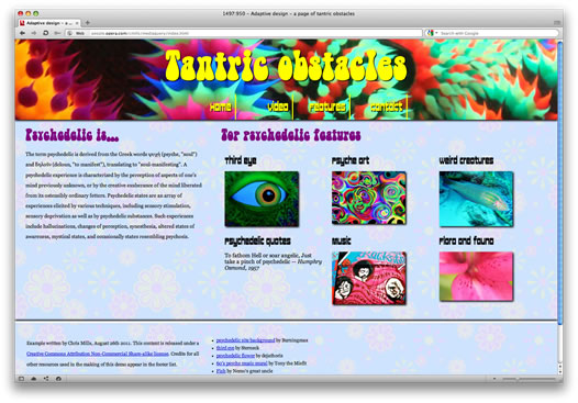
Figure 1: The standard layout before any media queries come into play.
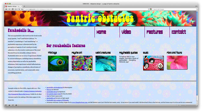
Figure 2: The expanded widescreen layout, which kicks in when the browser width increases beyond 1500 pixels. You might want to instead set a max-width on your <body> content, depending on your situation. Just beware that lines of content don't get too long, as they become hard to read at wider widths.
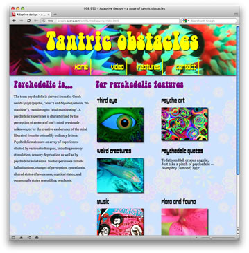
Figure 3: A narrower layout ideal for smaller resolution laptops and monitors, and tablets in landscape mode: it kicks in when the browser width gets below 1000 pixels.
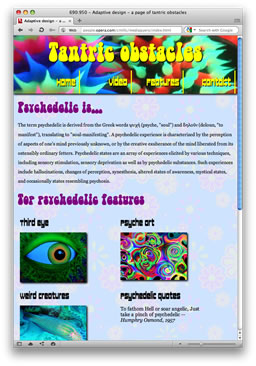
Figure 4: The first single column layout, which comes into action at a browser width of below 700 pixels. This might be good for tablets in portrait mode, perhaps?
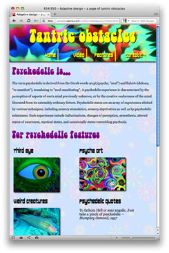
Figure 5: Identical to the last layout, but with the heading and navigation set to slightly less than 680 pixels wide, so that the layout doesn't break. Slightly cheaty, but it works.
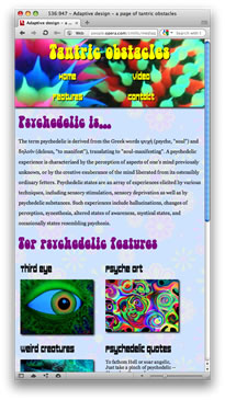
Figure 6: the narrowest layout, for smaller/typical mobile phones. It comes into play at 560 pixels or lower, and again makes the heading smaller so it will stay on one line, while changing the navigation to a 2 x 2 grid.
You might think that this is a lot of media queries for one example, but I'm deliberately showing a fairly complex example, to illustrate what is possible. Each media query simply builds on and overrides what has come before it in the style sheet.
Flexible layout units: fluid grids and fluid images
Note: throughout the article I've cut out the CSS rules and properties that aren't directly interesting to the immediate discussion, to make things clearer and cut down on space. Check out the live examples for the full code.
The premise behind flexible layout units is using percentages for your layout dimensions (such as column and image widths.) If I'm doing a fixed width layout, I usually set a specific percentage for the font-size (usually Mr Rutter's magic 62.5%), and then set all dimensions in ems, so the whole layout is manipulated proportionally to that size. However, recently I've started playing more and more with flexible layouts. In my psychedelic example, I have used the body as the wrapper for the page, and set margins to 0, plus a min-width so things don't break at really low widths when the media queries are put in place.
body {
  margin: 0;
  min-width: 320px;
}
Note that Firefox and Chrome automatically apply a minimum width to pages, even if you don't specify it in the CSS.
I have then floated the left and right columns left and right and given them percentage widths that total a little less than 100% to form a natural gutter in the middle:
section#main {
  width: 33%;
  float: left;
  margin-left: 2%;
}

section#features {
  width: 62%;
  float: right;
  margin-bottom: 3%;
}
This is mundane really, but things start to get more interesting when you look at using percentages for the different contents of the columns. The <article> elements that contain the "psychedelic features" are all floated left, meaning that they will fit comfortably across the width of the container, nearly regardless of what that width might be. In addition, I have set max-width: 100%; on the images, so they will never expand outside the width of their containers, even when the containers are reduced in width.
article {
  float: left;
  width: 30%;
  height:22em;
  margin: 0 1% 0 1%;
}

img {
  max-width: 100%;
}
The below screenshot illustrates what effect these rules have when the container width is reduced:

Figure 7: max-width means that the images always sit comfortably inside their containers.
object-fit
If you look at the final live code, you'll see some additional properties present in the img rule:
img {
  max-width: 100%;
  -o-object-fit: none;
  overflow: hidden;
}
object-fit is a CSS property introduced in the CSS3 CSS Image Values and Replaced Content module, which allows you to control how the content of replaced elements behaves. By default, the image will break out of its container and display full size, unless constrained by settings such as width, height, or max-width, as in the case above. object-fit overrides this default and can give some useful advantages, if your browser supports it (it is currently only supported by Opera 11+, and WebKit nightlies, with vendor prefixes). For example, in this case I am using object-fit: none, which makes the image completely ignore any kind of resizing efforts and display full size, regardless. I am then using overflow: hidden; to hide the overflowing image portion, which will differ in size depending on the width of the container. So now, instead of the image resizing to fit the container, it stays the same size, and a different amount of it is cut off by the overflow: hidden;:

Figure 8: overflow: hidden; in combination with object-fit: none; means that the image will be cropped by a different amount as the image size changes.
This has a definite advantage — image resizing can look ugly, especially on Windows, so cropping instead could definitely be preferred in many situations. There are other object-fit options too, for example if you always want your differently-sized images all to fit inside <img> elements of exactly the same size but maintain aspect ratio, you could use object-fit: contain; along with width and height settings to cause wrongly-sized images to letterbox inside the <img> element. There is also a closely-related property available called object-position, which allows you to change the display position of the media inside the replaced element in the same way that background-position does for background images.
To find out more about these properties and their use cases, read my article The CSS3 object-fit and object-position properties.
Other thoughts on fluid layouts
There are a couple more points worthy of note here, before we move on. For a start, I have used a very long image for the header, so that as the header size increases, you still get an image spanning all the way across it. Well, up until the point the browser reaches 1920 pixels wide, anyway! This is a useful technique to consider with adaptive layouts, although of course you need to optimize such images as much as possible in a real production environment so that it doesn't adversely affect mobile users/low bandwidth users too much.
Second, the CSS3 multi-column layout module has some uses in this area. Look at my multi-col example that uses fixed widths for the columns. When you resize the browser window, the number of columns changes because the browser is able to fit different multiples of that column width into the container. For more on multi-col, read CSS3 Multi-column layout by Molly Holzschlag.
The heavy hitter: media queries
Media queries are awesome. They are quite simply my favourite CSS3 feature — they fill a real need, are supported well across all modern browsers and degrade gracefully. To sum it up, media queries allow you to specify a condition for a block of CSS - if that condition is met, the block is applied to your HTML. If not, it is completely ignored. The conditions tend to look like this — all and (max-width: 1000px) — which means "apply this CSS to all media types if the browser window width is 1000 pixels or smaller". You can set these conditions on entire external stylesheets like this:
<link rel="stylesheet" type="text/css" href="core.css" media="all and (max-width: 1000px)">or, as I have done in my examples, you can apply them to specific blocks of CSS inside a stylesheet:
@media all and (max-width: 1000px) {

 /* CSS rules go here */

}
You can also add further conditions to a media query rule like this:
all and (max-width: 1000px) and (min-height: 600px)Or chain together multiple media queries so that the CSS will be applied if any are met, like this:
screen and (max-width: 1000px), print and (max-width: 29.7cm)The obvious - width media queries
The most common media query you'll use is one that alters your design when browser width gets below or above a certain amount, and this is what I've done a lot in my example. I won't go through everything, but for example, I have changed the percentage width that the <article> elements span across their containing <section> when width gets below 1000 pixels, so that the layout goes from three per row to two per row. They are initially styled like this:
article {
    ...
  width: 30%;
  margin: 0 1% 0 1%;
    ...
}@media all and (max-width: 1000px) {
article {
width: 40%;
margin: 0 5% 0 1%;
}
}As another example, I also have an extra-wide layout that kicks in at 1500 pixels and above, for wide monitors. This changes the percentage width again so that all six "psychedelic features" fit on one row:
article {
  width: 14%;
  margin: 0 1% 0 1%;
}
I also used a media query to get rid of the <section> floats, to make the 2-column layout turn to 1-column, when the browser width is 700 pixels or less. I think that's enough examples - the rest of them work in the same way.
Other uses
Media queries aren't just limited to setting rules based on widths and heights. You can also set rules based on many other variables, such as resolution, aspect ratio, whether the screen is monochrome or not, orientation (portrait or landscape?) and more. For example, you could bump up the font size on high resolution devices such as the iPhone 4, so the text isn't teeny tiny (although be aware that some such devices tend to automatically bump up text size for the same reason).
@media screen and (resolution: 163dpi) {
  p { font-size: 200%; }
}
You could use min-pixel-ratio: 2 in place of resolution: 163dpi, for a similar result.
For a full list of the media features you can create rules based on, look them up on the media queries specification.
The media attribute on video
And that's not all, folks. Recently, the HTML5 specification was changed to allow the media attribute to be used on the video <source> attribute. This means that you can serve different video files to different devices — for example, my "psychedelic video" page contains the following player code:
<article>
  <video controls>
    <source type="video/mp4" src="video/windowsill_small.mp4" media="all and (max-width: 480px), all and (max-device-width: 480px)">
    <source type="video/webm" src="video/windowsill_small.webm" media="all and (max-width: 480px), all and (max-device-width: 480px)">
    <source type="video/mp4" src="video/windowsill.mp4">
    <source type="video/webm" src="video/windowsill.webm">
	  <!-- proper fallback content goes here -->
  </video>
</article>
Here, the first two <source> attributes contain a media query rule that is passed if the browser or device screen width is 480 pixels or less, i.e., probably some kind of mobile device. If the rule is passed, then the browser will load the video from one of those <source> attributes (depending on which video format it understands). If not, the browser will skip down the list and load the video from the third or fourth <source> attribute. This is great, as mobile browser users with small screen widths don't need a large video file, so you might as well serve them a smaller-sized version and save them a bit of bandwidth. This works on all the latest versions of modern browsers.
Note: You may notice that Chrome does something odd with my weird aspect ratio video, seemingly wanting to make it look more normal and less deviant: I'm not sure why this is.
Note#2: To get Firefox to play the video, I needed to include an .htaccess file in the root of my example, containing the line AddType video/webm webm. Firefox is a bit more stringent about the video mime types than other browsers.
Mobile browsers lie
If I just had the media queries present in my example as they are, the view on an average smart phone browser would look like so:
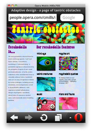
Figure 9: The layout on Opera Mobile 11 on a phone, with just the media queries in place.
This is a bit strange - the device is only 480 pixels wide, so how come it is still showing a two column layout, when the media query to switch it into a one column layout kicks in at 700 pixels? The answer is that mobile browsers lie - most of them don't render web pages at their true browser width. Instead, they pretend that the browser is a lot wider than it really is, render the page at that width, and then shrink the result down to display it on the mobile screen; Opera Mobile for example uses 850 pixels for its rendering width. It is not hard to see why they might do this — a lot of your favourite sites would probably look pretty crappy if you viewed them at say, 320 pixels wide — but it is annoying for us when we've used media queries to create tailored narrow layouts for such devices, and the site is presented to mobile browser users in a very small unreadable way (at least initially).
So what do we do? Well, there are a couple of approaches we could use, either separately, or in combination.
max-device-width
Instead of just including max-width in your media query, you could chain together two media queries to test for max-width and max-device-width, like I did in the video source media attribute. For example:
@media all and (max-width: 700px), all and (max-device-width: 700px) {
  ...
}
So here we are saying we want the CSS block to kick in if either the browser width is 700 pixels wide or less (the one the mobile browsers lie about), or the actual device screen is 700 pixels of less (the mobile browsers find it harder to lie about this). I do however find this a bit messy to deal with on all your media queries: can't we just make those mobile browsers tell the truth?
Viewport
There is a way: Apple invented the viewport meta tag with the aim of giving developers more control over how their web apps display on the iPhone. Other browser vendors thought it was a good idea, and so it was also adopted by the Opera Mobile browsers, Android, and more. The viewport meta tag I have included in my pages looks like so:
<meta name="viewport" content="width=device-width">This tells the mobile browsers that support it to render the page assuming a browser width equal to the physical pixel width of the device, and not their default lying width. Our layout now looks like so on modern mobile browsers:
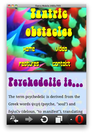
Figure 10: The layout on Opera Mobile 11, with viewport in action (I've scrolled down a bit to illustrate a bit more what the text looks like).
Viewport allows you to do more that just specify rendering screen widths. You can also specify initial zoom level, whether the users can zoom at all or not (handle with care — this could create accessibility issues), maximum and minimum allowed zoom levels, and more besides. You can also chain multiple viewport values together, separating them with commas inside the content attribute:
<meta name="viewport" content="width=device-width, initial-scale=2">Coming soon to a browser near you — @viewport
Us lovely folks at Opera like the viewport meta tag, but we thought it strange that it is implemented as a meta tag at all, when what it is doing is really quite, well, CSS-ish. So we decided to create a new implementation of viewport, reformulated as a CSS at-rule. If you look near the top of my CSS, you'll find this construct, commented out:
@-o-viewport {
  width: device-width;
}
This does the same thing as the viewport meta tag we discussed above. Try swapping the comments around from one to the other and loading the page in Opera Mobile 11 (or later), and you'll see the same effect as before. We are hoping this will catch on in other browsers soon. The CSS version has been submitted to the W3C as an editor's draft — see the CSS device adaptation spec.
@viewport has equivalents for all the things you can do with the viewport meta tag. For a much deeper, more complete treatment of viewport, read An introduction to meta viewport and @viewport by Andreas Bovens.
Tablets and viewport
The recent growth in popularity of tablet devices has given us even more to think about in terms of adaptive web design, to be sure. Generally there are not too many horrors to consider, but one thing to bear in mind is that some tablet browsers behave like mobile browsers and therefore follow viewport rules, and some don't. As an example, I originally had my viewport rule set to width=320, to give a more consistent small screen layout that would blow up the text to be as big and readable as possible (bear in mind that my layout has a min-width of 320 pixels set, as it looks awful if set to thinner than this). The layout did look great across most smartphone browsers I tested it on.
Then it came to tablets. I tested the layout on my Samsung Galaxy 10.1. On the default Webkit-based browser it looked fine, as it doesn't pay attention to viewport. However, on Opera Mobile 11 it rendered at 320 pixels and then blew the result up, which looked dreadful:
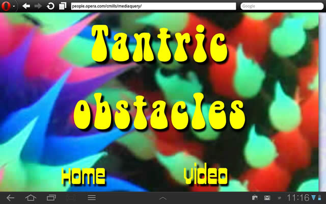
Figure 11: The layout on Opera Mobile 11, on an Android tablet, with viewport width set to 320 pixels: not good.
To fix this, I used a viewport width of device-width instead. With this set, Opera Mobile 11 now behaves itself:
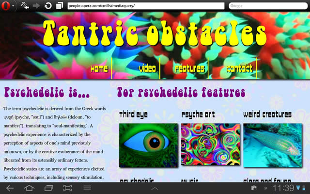
Figure 12: The layout on Opera Mobile 11 on an Android tablet in landscape mode, with viewport width set to device-width: much better.
And now it works nicely in portrait mode too:

Figure 13: The layout now works nicely in portrait mode too!
Slaying the IE dragon
Looking at my default layout in older versions of IE, it actually looks pretty darn good by default. I've used very little in the way of CSS3 bling for this one, apart from web fonts, which IE handles very well due to EOT support going back a long way. And even IE6 can be coaxed into coping with floats and percentages without too much special treatment. The main place we start to run into problems here is with max-width/min-width, and the media queries themselves. Let's look at these two in turn.
IE6 doesn't support max-width and min-width, therefore our images would start to spill out of their containers if we didn't do anything about it. In addition, once you get down below 320 pixels — the min-width we have set on the layout — it breaks horribly. As a final stab in the back, IE before 9 doesn't support our lovingly-crafted media queries. So what to do?
We could just have an IE fix stylesheet inside a conditional comment that sets the body to a fixed width for older versions of IE. That would work - IE users would get a layout that works, and wouldn't need to know about all the media query cleverness. To be honest, I think this is what most of us will do in these situations.
However, some of you will want to explore the possibility of introducing responsiveness into older versions of IE, so for you guys, I went the extra mile. I've actually gone with setting width: 100%; as the width for the images in the IE stylesheet, so that the image effect will still work on old IE versions. You need to be careful here — this works for my demo, but it could go horribly wrong for images that are significantly narrower than their container. Resizing them all to 100% would make them look nasty. You need to select your images to apply this to carefully.
I also made use of the css3-mediaqueries.js library, which adds support for media queries to older browsers, including IE5-8. It isn't perfect, and you'll notice a lag when resizing your browser, but it is nice to know there is a way.
Oh wait, one more thing - I haven't implemented a fallback for users of browsers that don't support HTML5 <video>. You can read about how to do that in Simple HTML5 video player with Flash fallback and custom controls, by Bruce Lawson and Vadim Makeev.
Summary
So that's it for now folks — hope you've found my little foray into adaptive/responsive/awesome/[insert your own groovy word here] design useful. For a whole boatload of inspiringly cool sites that use media queries, look at mediaqueri.es.
Read more...
- The CSS3 object-fit and object-position properties
- CSS3 Multi-column layout
- An introduction to meta viewport and @viewport
Credits
- psychedelic header background by Burningmax
- third eye by Sterneck
- psychedelic flower by dejathoris
- 60's psyche music mural by Tony the Misfit
- Fish by Nemo's great uncle
- psychedelic art by move-at-light-speed
- Psychedelic text courtesy of Wikipedia
- Awesome web fonts: Cowboy Hippie Pro by www.CheapProFonts.com, and Bell Bottom Laser (can't find the font creator, sorry - let me know if you need credit! I did download it from a free font site, and the license says it is ok to use for non-commercial projects.)
- Video by Patrick Lauke
- Article review provided by Rudy Rigot and Raphael Goetter. Thank you so much guys!
This article is licensed under a Creative Commons Attribution 3.0 Unported license.
Comments
-

Nice article - but the whole example is based on a wrong usage of the SECTION element!
-

Great Work, Thanks Chris
-

Excellent article, thank You Chris!
-

@Yury N. media queries always refer to logical/device pixels, not physical pixels. They can be the same thing if the device has a low PPI/pixel density, but on devices like the iPhone 4, you can have 2 physical pixels per device pixel, or possibly more.
-

Excellent article!
-

Thanks Chris
-

Thanks for the nice write-up. It's notably missing reference to the viewport-based units (vh, vw), but I guess that since very few browsers support them yet (and Opera is not among them ;-)) it might make sense to not talk about them to much ;-)
-

Great article,
No new comments accepted.Martin Gartner
Saturday, January 21, 2012
"The section element represents a generic document or application section…The section element is not a generic container element. When an element is needed for styling purposes or as a convenience for scripting, authors are encouraged to use the div element instead."
Source: http://www.whatwg.org/specs/web-apps/current-work/multipage/sections.html#the-section-element
justguy
Sunday, April 29, 2012
http://mobilephonestracker.blogspot.com
Yury N.
Monday, May 7, 2012
I'd like to ask a question. Say I use /media="all and (max-width: 1000px)"/. Is it spoken about logical or physical 1000 pixels?
Thanks again
Chris Mills
Monday, May 7, 2012
If you want to force one device pixel to equal one physical pixel all the time, you can use
<meta name="viewport" content="target-densitydpi=device-dpi">
Andreas has written a nice article about viewport, including dealing with high resolution device issues, at
http://dev.opera.com/articles/view/an-introduction-to-meta-viewport-and-viewport/
Lollo Andersen
Tuesday, May 29, 2012
Lollo Andersen
Tuesday, May 29, 2012
Giuseppe Bilotta
Tuesday, September 4, 2012
giuliano antola
Friday, March 15, 2013
j want just to segnalize an error of a tag not closed correctly.
It's the small tag that include this text "Awesome web fonts: Cowboy Hippie Pro by www.CheapProFonts.com, and Bell Bottom Laser (can't find the font creator, sorry - let me know if you need credit! I did download it from a free font site, and the license says it is ok to use for non-commercial projects.)"