# React Native fade gradient wrapper
**`rn-fade-wrapper`** is a simple, highly-performant React Native component that adds smooth, customizable **fade gradients** to the edges of any content. Perfect for enhancing the user experience in scrollable containers, lists, carousels, modals, or any view with overflowing content.
---
## ✨ Features
- ⚡ Native rendering for **iOS** and **Android**
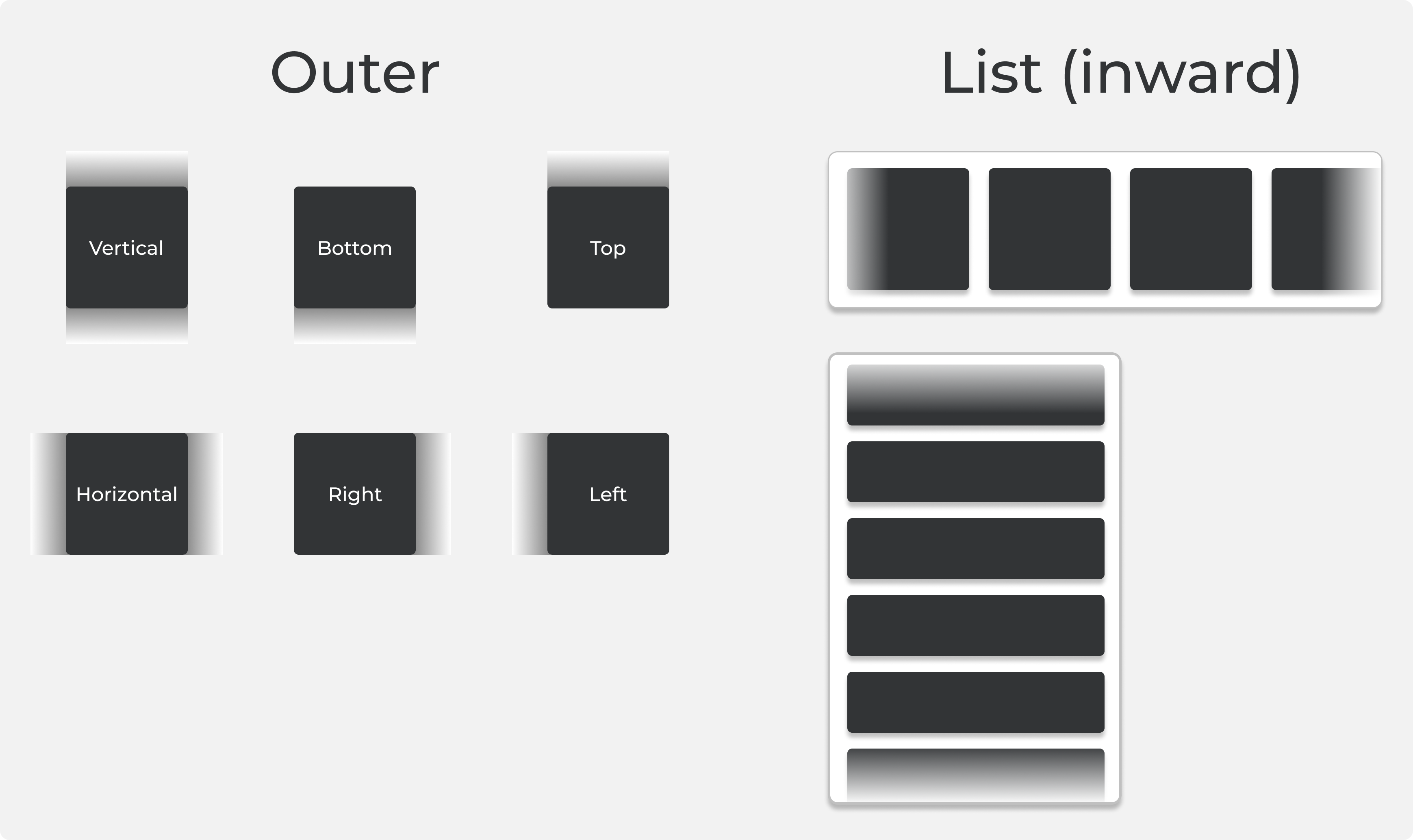
- 🔁 Supports **vertical** and **horizontal** gradient directions
- 🎨 Fully **customizable fade size and color** (per side or uniform)
- ↕️ Optional `inward` mode to fade **towards content** instead of outward
- 🧩 Simple API: drop-in wrapper with intuitive props
- 💪 Great performance with low overhead — ideal for scroll views and animations
---
## 📦 Installation
```bash
yarn add rn-fade-wrapper
```
or
```bash
npm install rn-fade-wrapper
```
### Expo
This library works in Expo (with `expo prebuild`) without additional configuration.
---
## 📱 Platform Support
| Platform | Old Arch | Fabric |
|----------|----------|--------|
| iOS | ✅ | ✅ |
| Android | ✅ | ✅ |
---
## 🚀 Quick Start
```tsx
import { FadeWrapper } from 'rn-fade-wrapper';
const MyComponent = () => {
return (
Fading edges example
);
};
```
---
## 🧩 Props
| Prop | Type | Default | Description |
|--------------|----------------------------|----------------------|-------------|
| `color` | `string` | `"#ffffff"` | Fade color (can be any valid color string) |
| `size` | `number` | `20` | Uniform fade size in points |
| `style` | `ViewStyle` | `{ zIndex: 2 }` | Custom style applied to the wrapper view |
| `inward` | `boolean` | `false` | Makes the gradient fade inward (towards the center) instead of outward |
| `sizes` | `{ top?: number, right?: number, bottom?: number, left?: number }` | `undefined` | Specific fade sizes per edge (overrides `size` and `orientation`) |
| `orientation`| `'horizontal' \| 'vertical'` | `'vertical'` | Preset for direction: applies `size` to top/bottom or left/right |
| `children` | `React.ReactNode` | — | Your wrapped content |
> **Note:** `sizes` takes precedence over both `size` and `orientation`.
---
## 🎛 Examples
### 🎯 Custom sides + inward fade:
```tsx
```
### 📜 Horizontal scroll fade:
```tsx
{/* content */}
```
---
## 🛠 Under the Hood
- **iOS:** Uses `CAGradientLayer` inside native `UIView`
- **Android:** Draws `LinearGradient` on custom `ViewGroup` using Canvas
- Handles layout and re-renders with platform-specific logic for consistency
---
## 💡 UX Tip
Use `rn-fade-wrapper` to subtly indicate content overflow — especially in carousels, scroll views, and horizontal sliders. Gradients help hint to the user that there's more to scroll, improving engagement.
---
## 📘 License
MIT — free to use, improve and contribute 🎉

