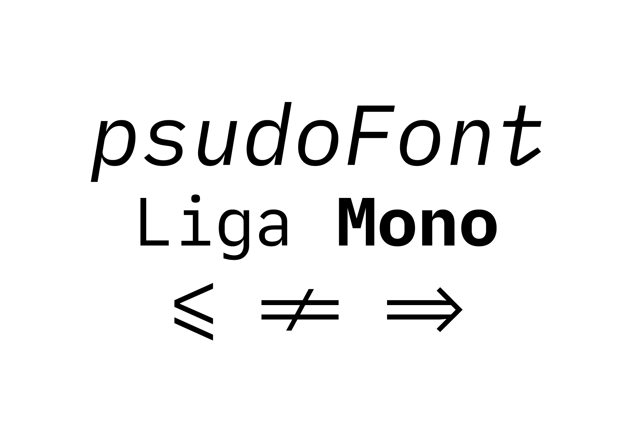
## psudoFont Liga Mono
`psudoFont Liga Mono` is a `monospaced` font family with `programming ligatures`, based on `Meslo/Menlo` and `IBM Plex Mono/Lilex`. It's designed for coding and terminal use.
This font has two different weights: Regular/Italic (`400`) and Bold/Bold Italic (`700`).
This is a new font family, a lot of glyphs were redesigned, some resemble `Menlo/Meslo`, some `IBM Plex Mono/Lilex`, and some others are unique to `psudoFont Liga Mono`. The changes and adjustments vary from small details to entire characters but always keeping the core identity within the font family.
The whole journey resembled a lot what I went through when I created my color theme [Nebula Oni Theme](https://github.com/psudo-dev/nebula-oni-theme/) - the same theme used to render the examples [below](#examples). Like a small adventure, since I had no idea how to create a theme - or a font.
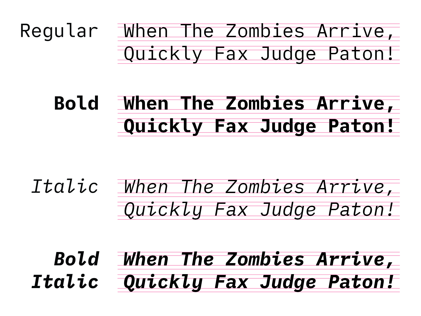
- Works better with font size `16` or higher.
### Installation
0. Uninstall the previous version if you have it installed.
1. Go to [Releases > Assets](https://github.com/psudo-dev/psudofont-liga-mono/releases) > Download and Unzip the file.
2. Install the font:
- Windows: Select all font files in the folder, right-click and click Install from the menu.
- Mac: Select all font files in the folder and double-click them and Install.
### Visual Studio Code
1. Go to `File` > `Preferences` > `Settings`.
2. Search for `Font Family`.
3. Add `psudoFont Liga Mono` to the list of font families.
4. To enable `ligatures`, search for `Font Ligatures` and edit the `settings.json` file by adding the following line:
```json
"editor.fontLigatures": true
```
### Additional Font Features
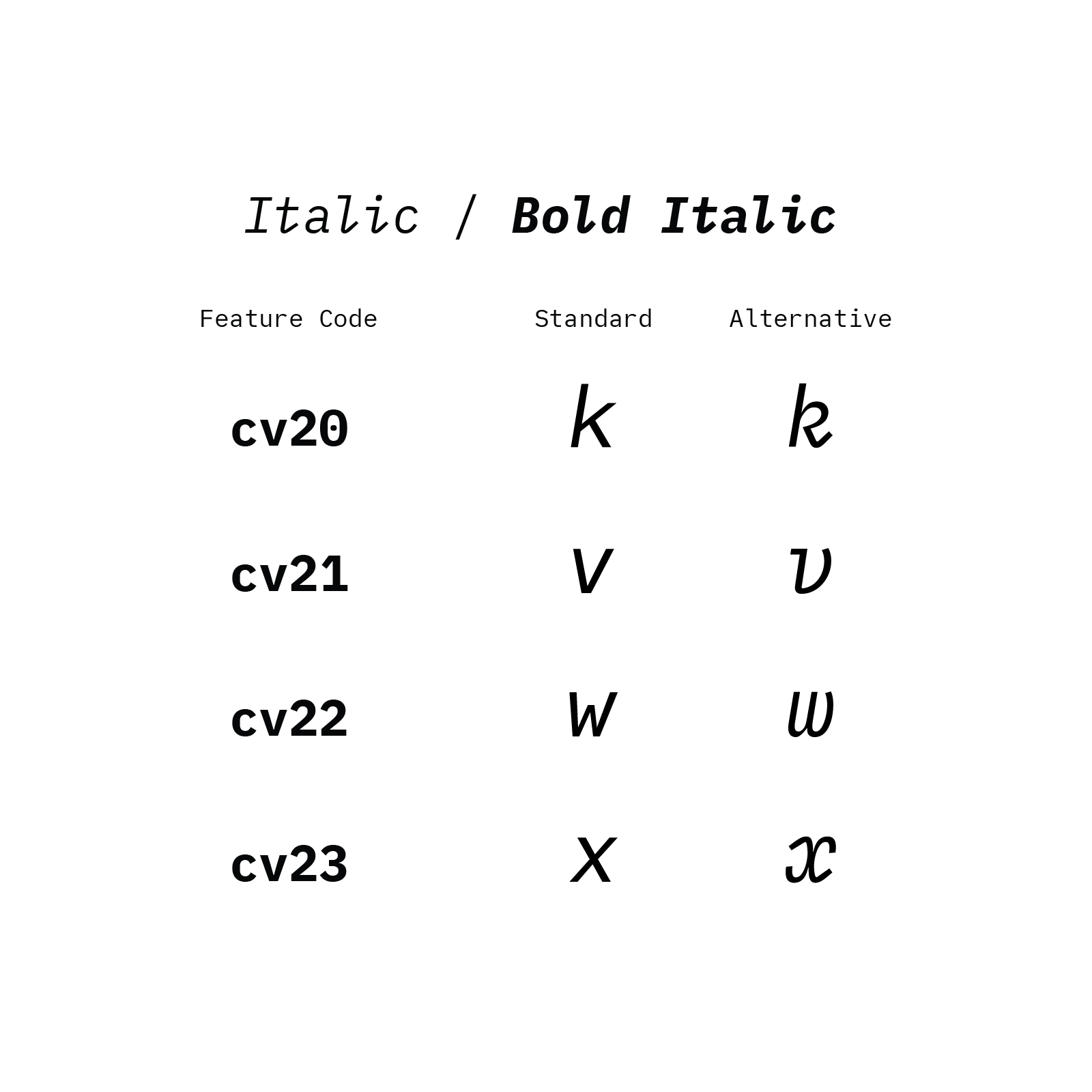
The base for the **Font Features** comes from `Lilex`, so all its [features](https://github.com/mishamyrt/Lilex?tab=readme-ov-file#features) are supported, plus some additional ones that I added.
- Usage Example:
```json
"editor.fontLigatures": "'ss01', 'cv11', 'cv20'"
```
## Examples
Click on the images to see a larger version with more details, the low-res image rendering is pretty bad for texts with dark backgrounds.
- TypeScript
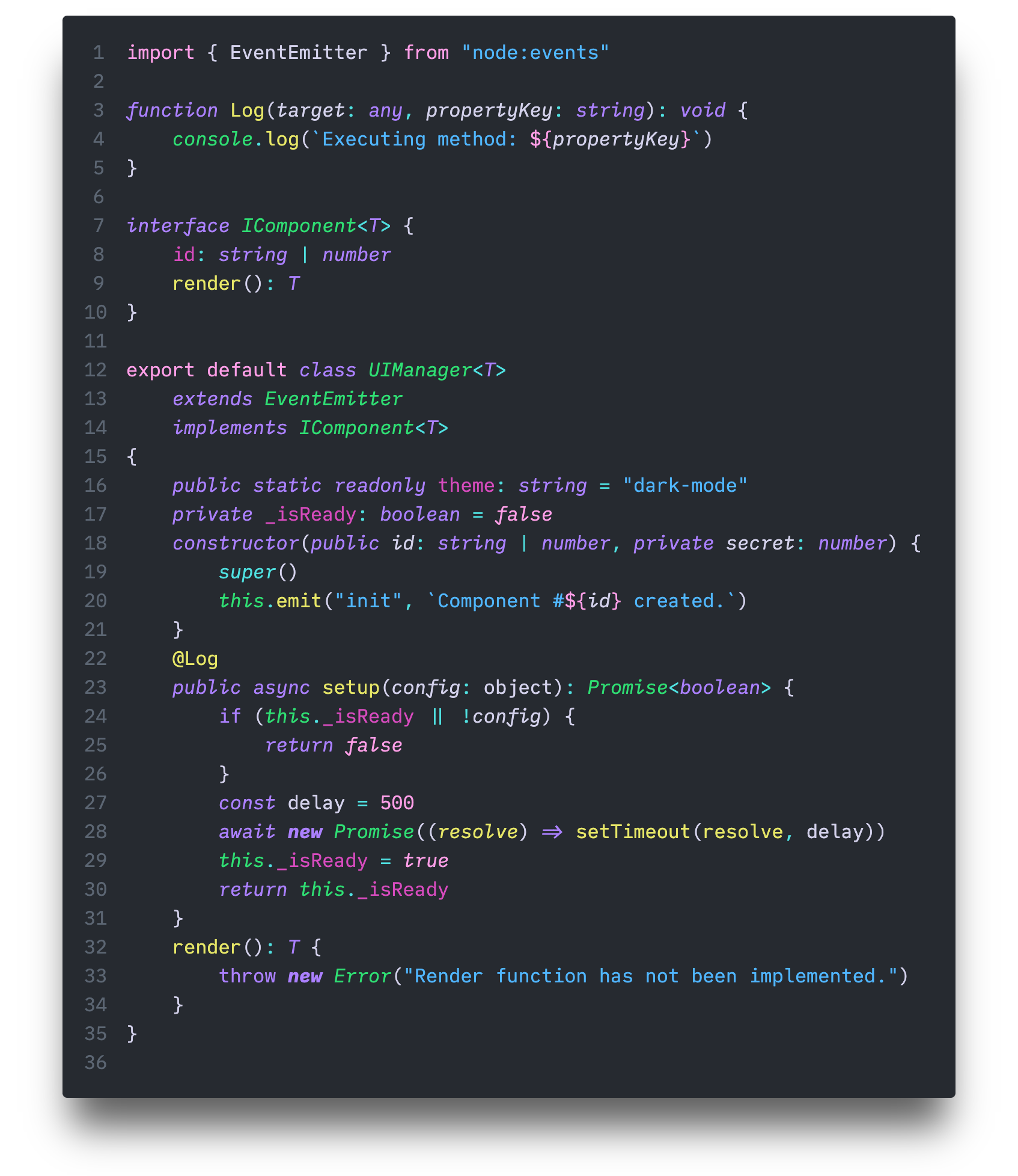
(Nebula Oni Theme: Hourglass/Grey)
- Python
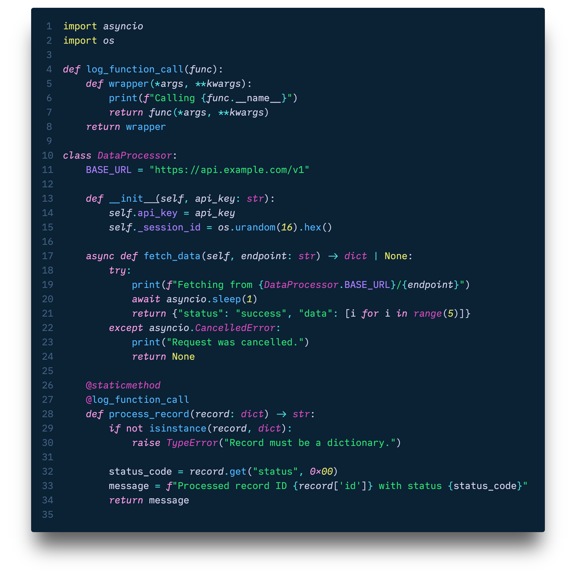
(Nebula Oni Theme: Cerberus/Glacial Blue)
- C
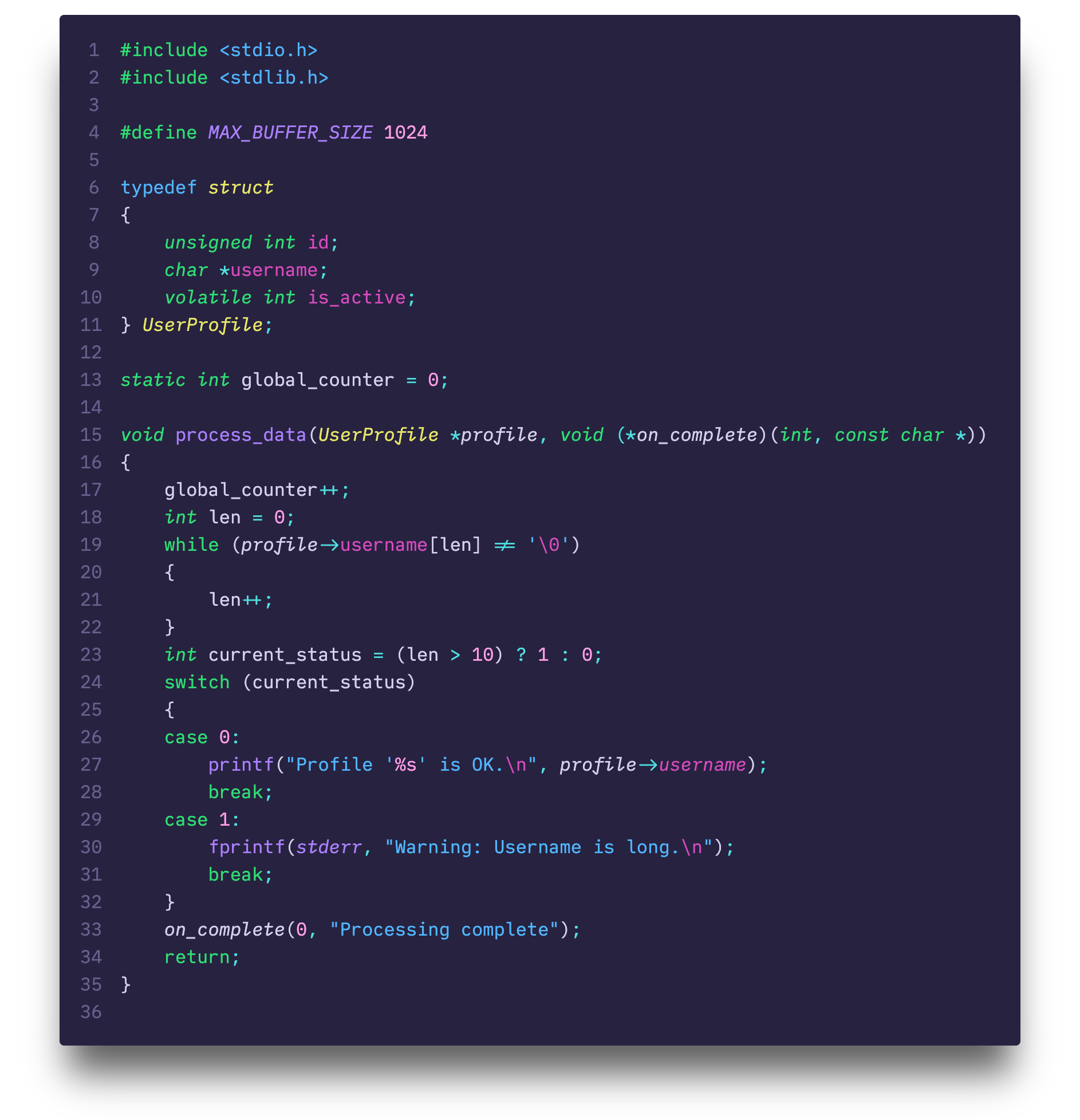
(Nebula Oni Theme: Spirograph/Purple)
- Terminal
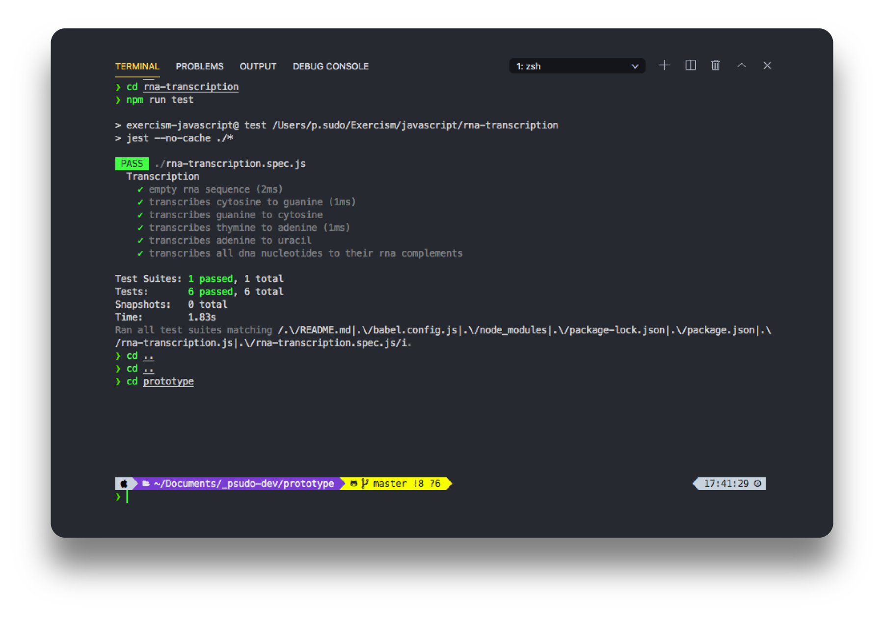
(Nebula Oni Theme)
## Major Version History
For a complete list of changes, see the release notes on [Releases](https://github.com/psudo-dev/psudofont-liga-mono/releases).
### V.1.0.0 (August, 8th, 2025)
I wanted to use `Menlo/Meslo Regular` but I also wanted `IBM Plex Mono/Lilex Italic`... So what if I mixed and matched these two together into a single font?
And that's what I did.
Like so many other things, it started with a lingering and persistent "what if...", and that's how this _Frankenstein Font_ was born. It's aliiiiveeee!
### V.2.0.0 (October, 1st, 2025)
I was naive... I thought I wouldn't actually edit and design glyphs myself because it would be too much work - not to mention the fact that I didn't know how to do it - but I was wrong, I underestimated myself... and here we are, a completely new version!
I previously complained that I liked `Menlo/Meslo` but I wanted to make it a bit thinner and that I liked `IBM Plex Mono/Lilex`'s italic but not all of it. So I went ahead and changed all of that.
This version of `psudoFont Liga Mono` is much more cohesive and consistent and now I can say it's actually a Font Family.
## Motivation
**TL;DR:** It always starts with an itch, usually when something bothers me, the itch grows through time and _sometimes_ I end up following through. That's how I ended up here, somehow creating my own programming font.
---
I've tried several different fonts over the years but I kept using [Meslo](https://github.com/andreberg/Meslo-Font) as my go-to font. For the past few years I've been using a version with ligatures and powerline: `Liga Meslo LG M DZ`.
I came across `IBM Plex Mono` and I liked its x-height to base ratio, but it wasn't quite it for me, there were some characters and symbols that I didn't quite like. On the other hand, its `italic` was quite different from its `regular` style, it looked elegant, it made me interested in testing it.
I tried using [Lilex](https://github.com/mishamyrt/Lilex) for a bit - which is based on `IBM Plex Mono` but with ligatures - therefore the name, Ligature Plex, Lilex, or so I think.
I think `Meslo/Menlo`'s `regular` look a bit too thick, and although I really liked `IBM Plex Mono/Lilex`'s `italic`, I didn't like it enough to overlook what I didn't like about it, so I ended up switching back to `Meslo/Menlo`.
That, until I started thinking about making my own font design...
## Design Choices
I used `Lilex` as a base because it would be easier than starting from scratch or making all `Meslo` glyphs thinner, plus, I would have to adjust the x-height of all characters of either font.
`Lilex` has `1000UPM`, so I scaled up all glyphs to `2048UPM`, which seems to be the standard for most new fonts.
For `regular` I kept `Meslo` as a reference but there were also some symbols, marks and even small details that I preferred from `Lilex` - like the ending's curves and angles - so I used those as well.
`Lilex`'s `italic` had a lot of sharp corners, so I redesigned them all to be more rounded and smooth. This small detail made me redesigned lots of glyphs. I also changed some characters like `k`, `w`, `v`, `r`, `x`, `{`, `}`, `@`, `5`, `6`, `9`, etc. Actually, I had to change the numbers in both `regular` and `italic`.
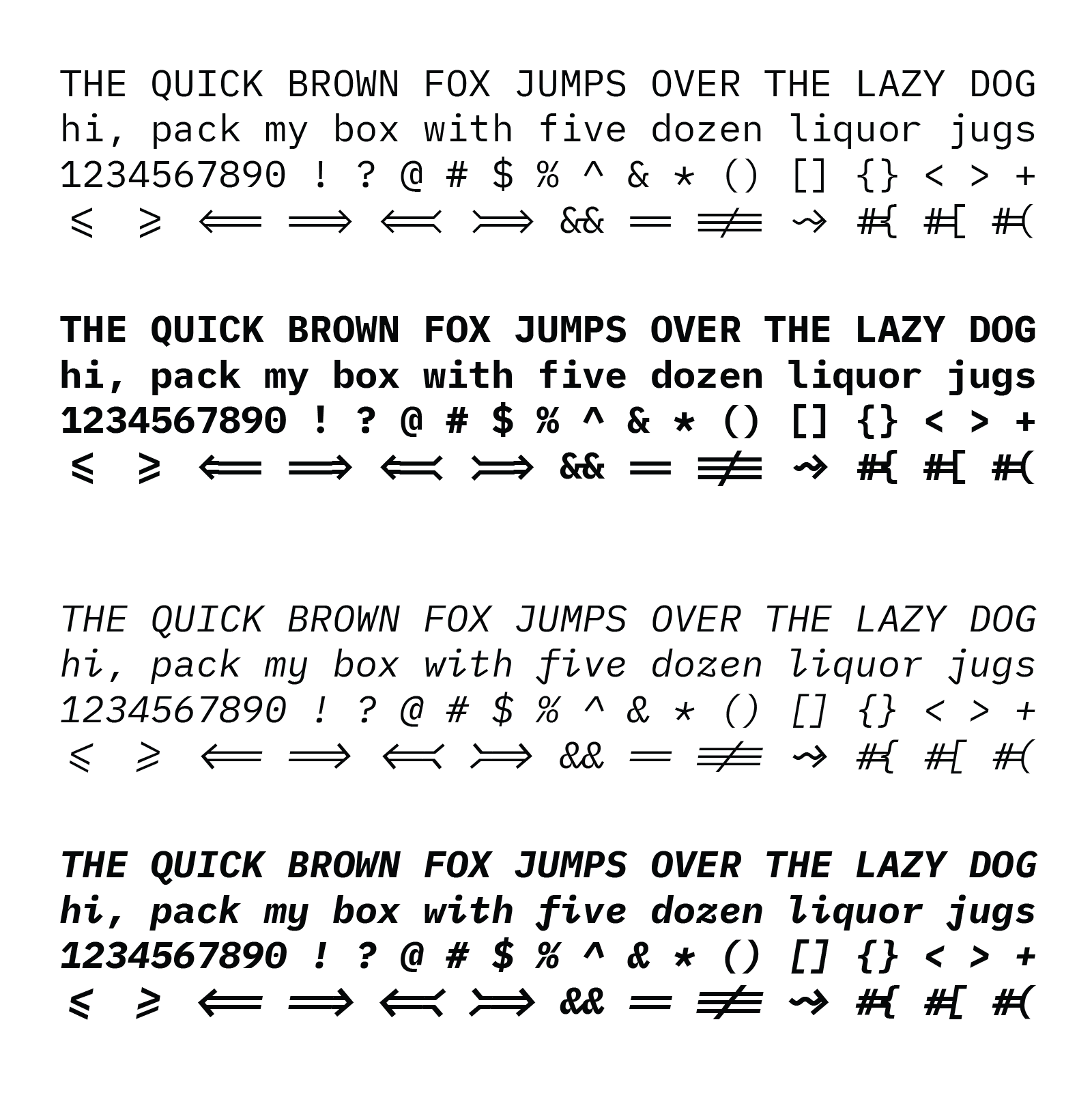
Another thing that I didn't like about `Liga Meslo LG M DZ` were the ligatures combinations for `fi`, `ffi`, `fl`, `ffl`, etc. They get too close together, I don't like how it looks. So I'm not supporting these ligatures.
`Meslo` had almost double the glyphs compared to `Lilex` - which already had more than 1400 glyphs -, and it wouldn't be viable for me to redesign and adjust all these extra characters, so I didn't. They don't affect the overall use, it still supports all `Lilex` ligatures and symbols and some extras I included.
Considering that when this all started I didn't know how to edit a single glyph, all the hustle in between and 3 redesigns later, I would say I liked the final result. Although inspired by `Meslo` and `Lilex`, this turned out to be its own unique font family.
## License
This project is licensed under the SIL Open Font License, Version 1.1. See the [LICENSE](./LICENSE) file for details.
## Credits
- [Meslo LG](https://github.com/andreberg/Meslo-Font)
- Menlo
- Vera Sans Mono
- DejaVu Mono
- [Lilex](https://github.com/mishamyrt/Lilex)
- [IBM Plex Mono](https://github.com/IBM/plex).
The original `Meslo LG` is a customized version of Apple’s `Menlo` font, which on the other hand is based on the open-source font `Bitstream Vera` and the public domain `DejaVu`. `Lilex` is an extended font on top of `IBM Plex Mono`.
## Author
- [@psudo-dev](https://github.com/psudo-dev/)
- If you really liked it, give it a star!
- Would you consider [buying me a coffee](https://buymeacoffee.com/psudodev) to support my work? Thank you!