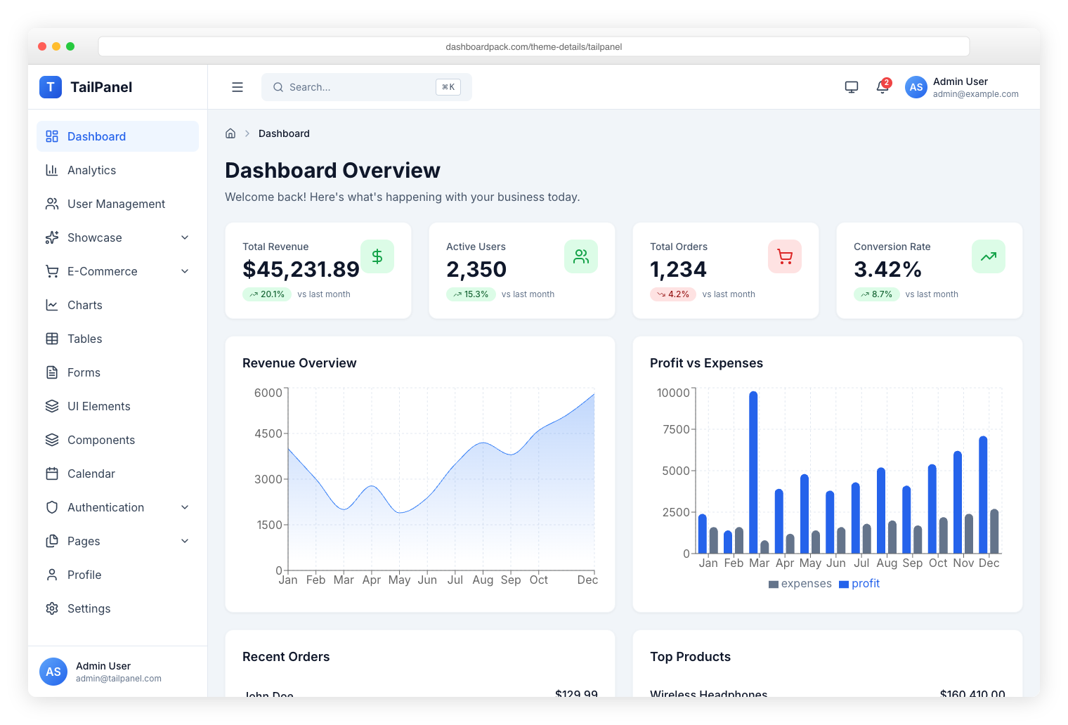
TailPanel
React + TypeScript + Tailwind CSS + Vite. 9 dashboard layouts, theme toggle built in.
|
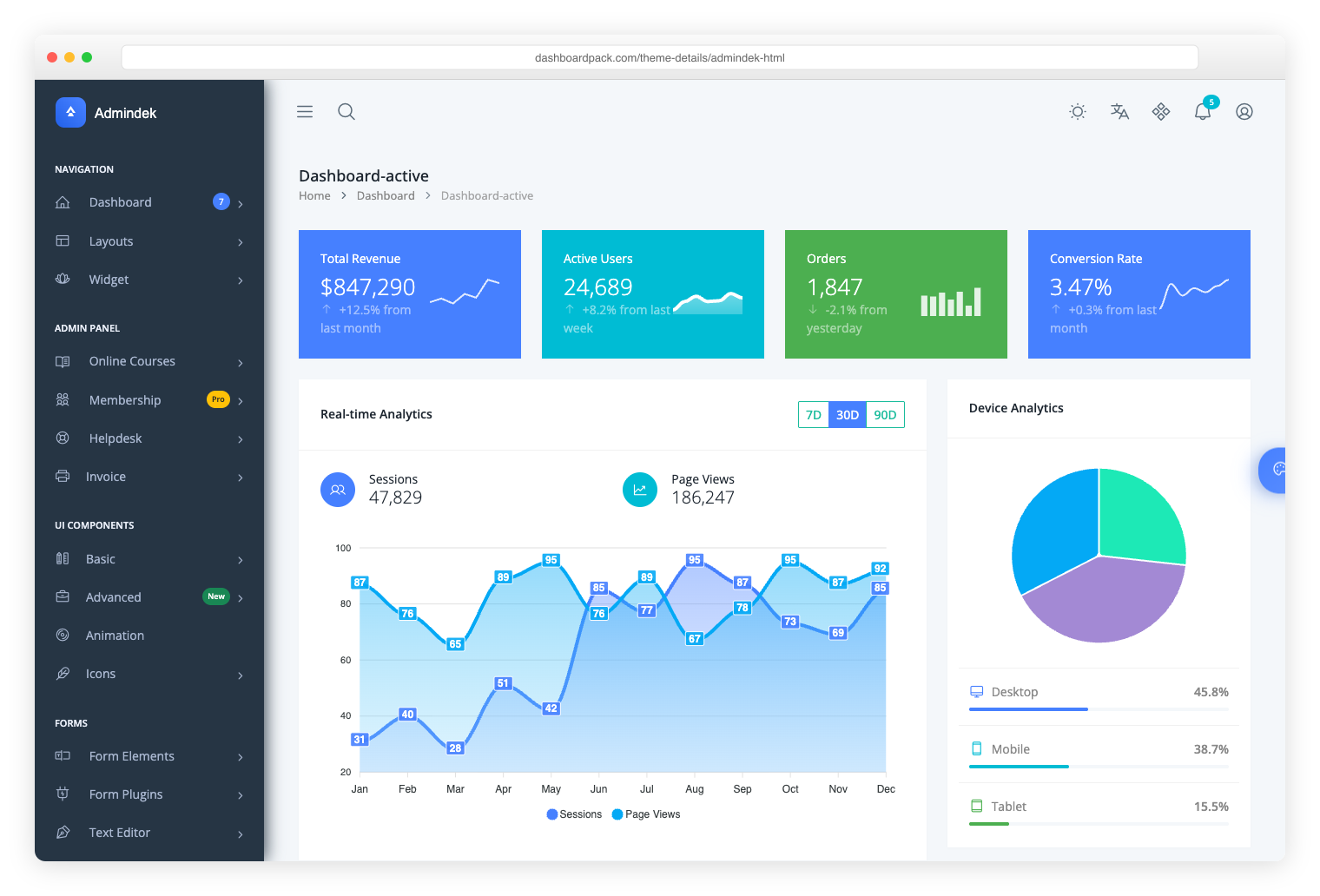
Admindek
Bootstrap 5 + vanilla JS. 100+ components, light/dark modes, RTL, 10 color presets.
|
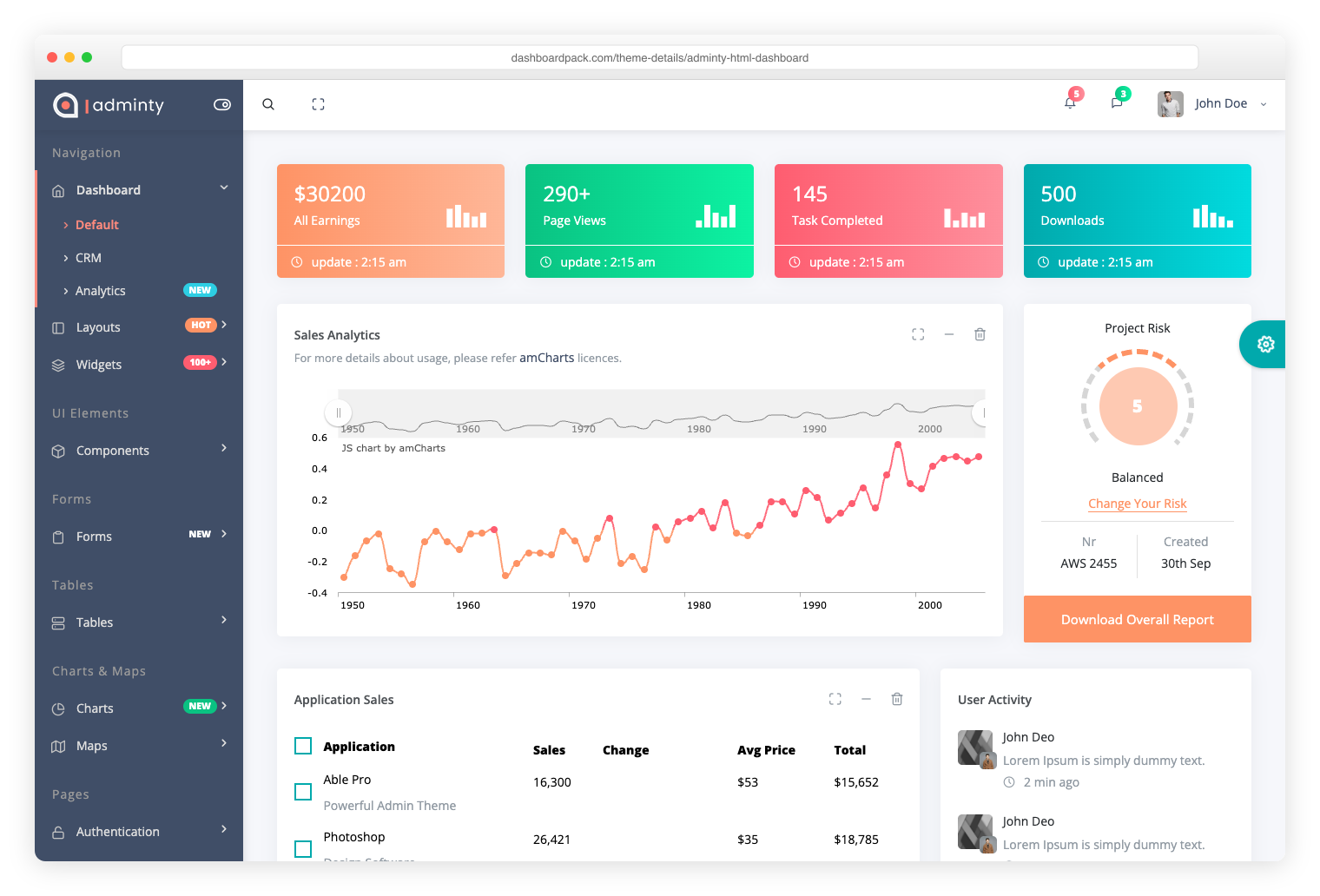
Adminty
Bootstrap 5. 160+ pages with a broad component library for any admin scenario.
|

ArchitectUI
Bootstrap 5. 250+ components, scalable modular design, 9 dashboard views.
|
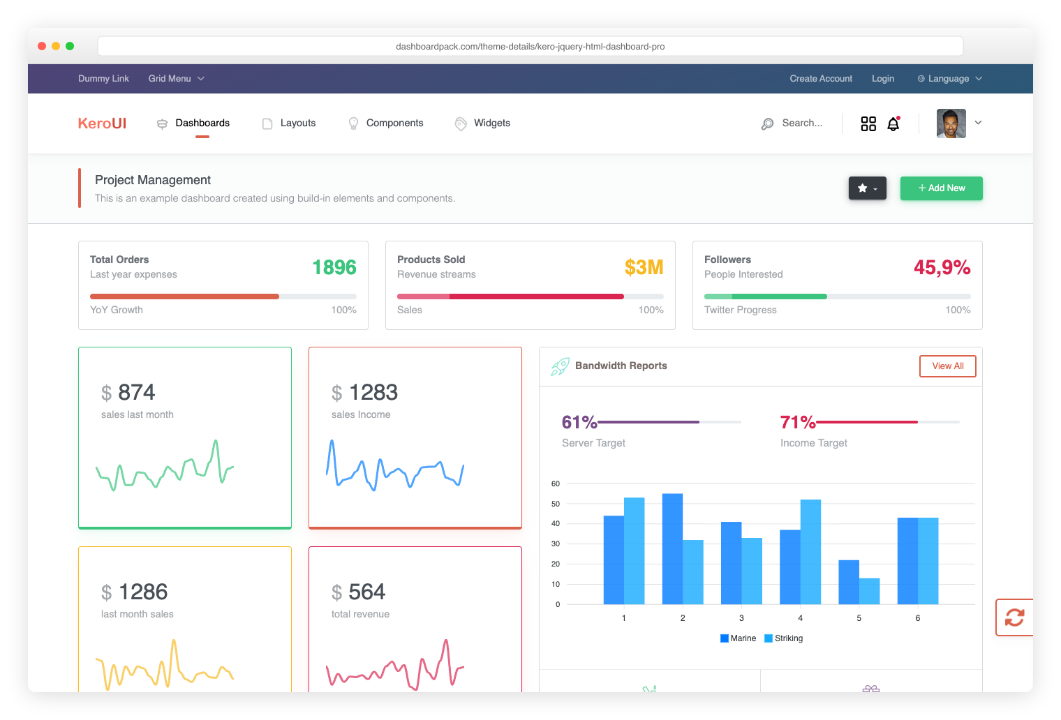
Kero
Bootstrap 5 + Webpack. Switch between horizontal and sidebar layouts, SASS theming.
|
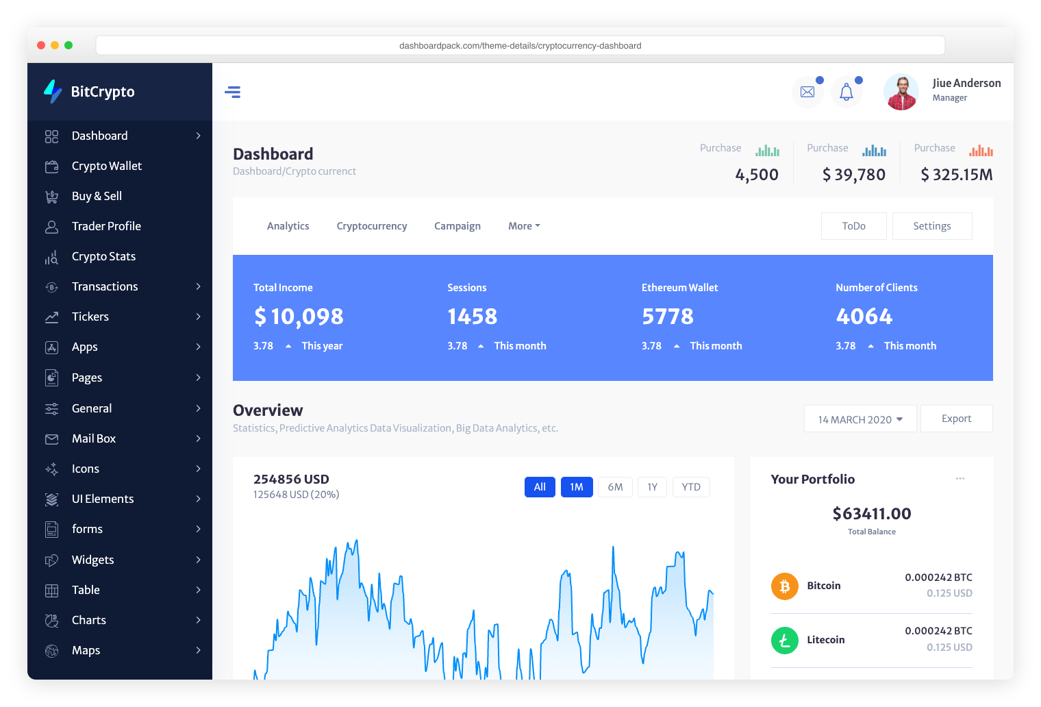
Cryptocurrency Dashboard
Bootstrap. Purpose-built for crypto exchanges, ICO platforms, and token management.
|
` from step 1:
```html
{{> stat-card color="primary" value="10,468" label="Members online" chartId="widgetChart1"
chartValues="65,59,84,84,51,55,40,65,59,84"}} {{> stat-card color="success" value="2,341"
label="Sales today" chartId="widgetChart2" chartValues="12,19,27,43,52,31,48,12,19,27"}}
{{> icon-stat-card color="success" icon="fa-dollar-sign" label="Total Profit" value="1,012"}} {{>
icon-stat-card color="primary" icon="fa-user" label="New Customers" value="961"}}
```
Built-in partials:
| Partial | Props |
| ---------------- | -------------------------------------------------------------------------------------------------------- |
| `stat-card` | `color`, `value`, `label`, `chartId`, `chartValues` (optional, comma-separated numbers) |
| `social-card` | `brand`, `iconClass` _or_ `iconHtml`, `primaryValue`, `primaryLabel`, `secondaryValue`, `secondaryLabel` |
| `icon-stat-card` | `color`, `icon` (Font Awesome class), `label`, `value` |
Adding a new partial: drop `src/components/your-name.html`, then call
`{{> your-name prop1="x" prop2="y"}}`. Use `{{prop}}` for HTML-escaped output, `{{{prop}}}` for raw
HTML (inline SVG, etc.). See the existing partials for examples.
> Prettier mangles multi-line `{{> partial}}` calls. The `.prettierignore` already excludes
> `src/components/` and `src/index.html`; add new templated pages there too.
### 3. Wire interactive components — declarative, not imperative
Components self-register against CSS selectors. If a page contains the selector, the matching JS
module is lazy-loaded automatically — no JS edit, no central switch statement to update.
| Selector | Component |
| --------------------------------------------------- | ------------------------------------- |
| `[data-table]` | DataTable (sort/search/paginate) |
| `[data-chart]` | ChartManager (Chart.js wrappers) |
| `form[data-validate]` | FormValidator |
| `[id^="widgetChart"]`, `#trafficChart`, `#worldMap` | WidgetManager (the dashboard widgets) |
| `[data-gmap]` | GoogleMapsManager (Google Maps page) |
So a sortable table is just:
```html
```
A validated form:
```html
```
Adding a new component: append an entry to `App.COMPONENT_REGISTRY` in
[src/scripts/app.js](src/scripts/app.js).
### 4. Add the page to the sidebar
Edit [src/partials/sidebar.html](src/partials/sidebar.html), add a nav link. The `data-page`
attribute must match the body's `data-page="sales"`:
```html
Sales
```
The active-state highlight is automatic.
### 5. Run
```bash
npm run dev # Vite dev server with HMR
npm run build # Production output to dist/
```
## Customization
### Rebrand the theme palette
Edit [src/styles/variables.scss](src/styles/variables.scss). The SCSS color tokens drive Bootstrap's
`--bs-*` CSS custom properties — change them in one place and every themed component updates:
```scss
$primary: #187ea2; // → --bs-primary, .btn-primary, .text-primary, ...
$success: #4dbd74; // → --bs-success, .alert-success, validation icons, ...
$danger: #c0504d;
$info: #63c2de;
$warning: #ffc107;
```
Reference colors in your own SCSS as `var(--bs-primary)` — never hardcode hex.
### Resize/restyle the layout chrome
Layout tokens are CSS custom properties at the bottom of `variables.scss`:
```scss
:root {
--sidebar-width: 280px;
--sidebar-collapsed-width: 70px;
--sidebar-bg: #272c33;
--sidebar-text: #c8c9ce;
--content-bg: #f1f2f7;
--header-height: 70px;
// ...etc
}
```
### Maps: add your Google Maps key
The Google Maps page (`maps-gmap.html`) ships **without an API key**. Until you add one, each of its
eight examples shows a static preview of the same area, with the same markers and overlays, and this
notice:
> Preview — add your Google Maps API key in `src/config/maps.config.js` to load the interactive map
The previews are SVGs in `src/images/maps/`, drawn from
[Natural Earth](https://www.naturalearthdata.com/) data (public domain), so the demo makes no
requests to Google and exposes no key.
To load interactive Google Maps:
1. In the [Google Cloud console](https://console.cloud.google.com/), create an API key and enable
the **Maps JavaScript API** (and the **Elevation API** for the elevation example). Google Maps
Platform needs a billing account on the project.
2. Restrict the key to your site's HTTP referrers and to those APIs. A browser-side key is always
visible in the page source.
3. Paste it into [src/config/maps.config.js](src/config/maps.config.js):
```js
export default {
googleMapsApiKey: 'YOUR_KEY',
googleMapsMapId: 'DEMO_MAP_ID' // replace with your own Map ID for production
};
```
4. Rebuild (`npm run build`). The key is bundled into the page's JavaScript.
The maps are loaded with Google's official loader,
[`@googlemaps/js-api-loader`](https://github.com/googlemaps/js-api-loader) (Apache-2.0), by
[src/scripts/components/gmaps.js](src/scripts/components/gmaps.js). If Google rejects the key (for
example `RefererNotAllowedMapError` or `BillingNotEnabledMapError` in the console), the previews
come back with a note to check the key. **Never commit a real key to a public repository**: keep
`googleMapsApiKey` empty in version control.
The vector maps page (`maps-vector.html`, Leaflet and OpenStreetMap) needs no key.
### Add a JS component
1. Create the file in [src/scripts/components/](src/scripts/components/) exporting a class.
2. Append to `App.COMPONENT_REGISTRY` in [src/scripts/app.js](src/scripts/app.js) with a CSS
selector. The loader probes the DOM and lazy-imports your module when the selector matches.
3. Add styles in [src/styles/components/](src/styles/components/) and `@import` from
[src/styles/main.scss](src/styles/main.scss).
## Build Configuration
The project uses Vite for building. Configuration is in `vite.config.js`:
- Development server runs on port 3001
- SCSS is compiled with modern-compiler API
- Source maps enabled for debugging
- Legacy browser support available via plugin
## Browser Support
- Chrome (last 2 versions)
- Firefox (last 2 versions)
- Safari (last 2 versions)
- Edge (last 2 versions)
- No Internet Explorer support
## Available Scripts
| Command | Description |
| --------------------- | --------------------------------- |
| `npm run dev` | Start development server with HMR |
| `npm run build` | Build for production |
| `npm run preview` | Preview production build |
| `npm run lint` | Lint and auto-fix JavaScript code |
| `npm run format` | Format all files with Prettier |
| `npm run quality:fix` | Run both linting and formatting |
## Dependencies
Exact ranges live in [package.json](./package.json); the versions below are what this release was
built and tested against.
### Runtime
| Package | Version | Purpose |
| -------------------------------- | ------- | ---------------------------------------- |
| `bootstrap` | 5.3.8 | UI framework (compiled from SCSS source) |
| `chart.js` | 4.5.1 | All charts |
| `@fortawesome/fontawesome-free` | 7.3.1 | Icon set |
| `leaflet` | 1.9.4 | Vector / world maps |
| `@googlemaps/js-api-loader` | 2.1.3 | Loads Google Maps once a key is set |
| `flag-icons` | 7.5.0 | Country flags |
| `@fontsource-variable/open-sans` | 5.3.0 | Self-hosted variable font |
### Build & tooling
| Package | Version | Purpose |
| ------------------------- | ------- | ----------------------------------- |
| `vite` | 8.2.0 | Dev server and production bundler |
| `sass` | 1.102.0 | SCSS compilation |
| `@vitejs/plugin-legacy` | 8.2.2 | Legacy browser bundle |
| `vite-plugin-handlebars` | 2.0.3 | Build-time partials |
| `vite-plugin-static-copy` | 4.1.1 | Copies `src/partials/` into `dist/` |
| `eslint` | 10.8.0 | Linting |
| `prettier` | 3.9.6 | Formatting |
### Not npm dependencies
- **Themify Icons** — served as a static copy from `public/themify-icons/`.
- **DataTables** — not used. `src/scripts/components/datatable.js` is a custom vanilla-JS
sort/search/paginate component with no third-party dependency.
- **Google Maps** — the Maps JavaScript API is loaded from Google at runtime, and only when a key is
set in `src/config/maps.config.js`. See
[Maps: add your Google Maps key](#maps-add-your-google-maps-key).
### Utilities
- NO jQuery - 100% vanilla JavaScript
- Native HTML5 form validation
- Modern ES6+ JavaScript modules
## Migration from v1.x
If upgrading from version 1.x:
1. **Bootstrap Classes**: Update Bootstrap 4 classes to Bootstrap 5
- `.badge-*` → `.bg-*`
- `.font-weight-*` → `.fw-*`
- `.text-left/right` → `.text-start/end`
- Data attributes: `data-toggle` → `data-bs-toggle`
2. **jQuery**: Completely removed in v2.0. All code now uses vanilla JavaScript
3. **Build Process**: Grunt tasks are replaced with NPM scripts
4. **File Structure**: Move custom code to src/ directory
## Contributing
1. Fork the repository
2. Create your feature branch (`git checkout -b feature/amazing-feature`)
3. Commit your changes (`git commit -m 'Add amazing feature'`)
4. Push to the branch (`git push origin feature/amazing-feature`)
5. Open a Pull Request
## License
Sufee is licensed under The MIT License (MIT). You can use, copy, modify, merge, publish,
distribute, sublicense, and/or sell copies of the final products. But you always need to state that
Colorlib is the original author of this template.
## Related Resources
### Colorlib Admin Dashboard Articles
- [42 Free Bootstrap Admin Dashboard Templates 2025](https://colorlib.com/wp/free-bootstrap-admin-dashboard-templates/)
- [42 Best Free HTML5 Admin Dashboard Templates 2025](https://colorlib.com/wp/free-html5-admin-dashboard-templates/)
- [39 Best Free & Responsive Admin Templates 2025](https://colorlib.com/wp/free-admin-templates/)
- [42 Best Free Dashboard Templates For Admins 2025](https://colorlib.com/wp/free-dashboard-templates/)
## Credits
- Original template by [Colorlib](https://colorlib.com)
- Bootstrap 5 migration and modernization by contributors
- Icons by Font Awesome, Themify, and Flag Icons
- Charts powered by Chart.js and various libraries