# Theming
Control the visual identity of your gallery from `content/settings.yaml`. Choose a built-in preset or customize individual properties — no CSS editing required.
## Quick Start
Add a single line to your `settings.yaml`:
```yaml
theme: minimal
```
That's it. Your entire gallery switches to the minimal theme. Leave it out and
you get `studio-modern`, the default.
## Built-in Presets
| Preset | Style | Accent | Fonts | Hero | Frame | Grain |
| ----------------- | ------------------------------ | ------------ | --------------------------------- | ----------- | ------------ | ----- |
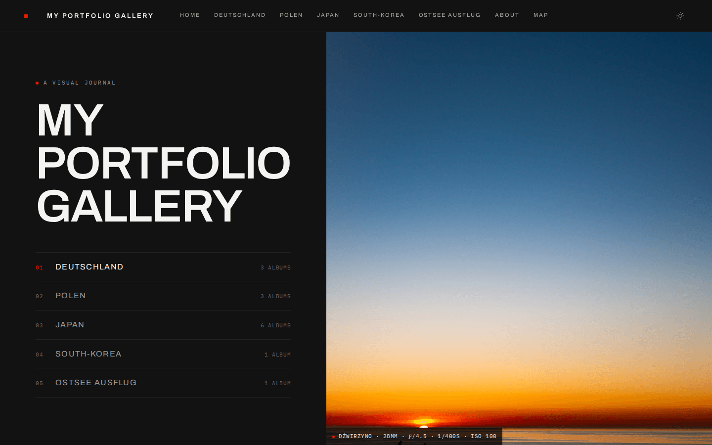
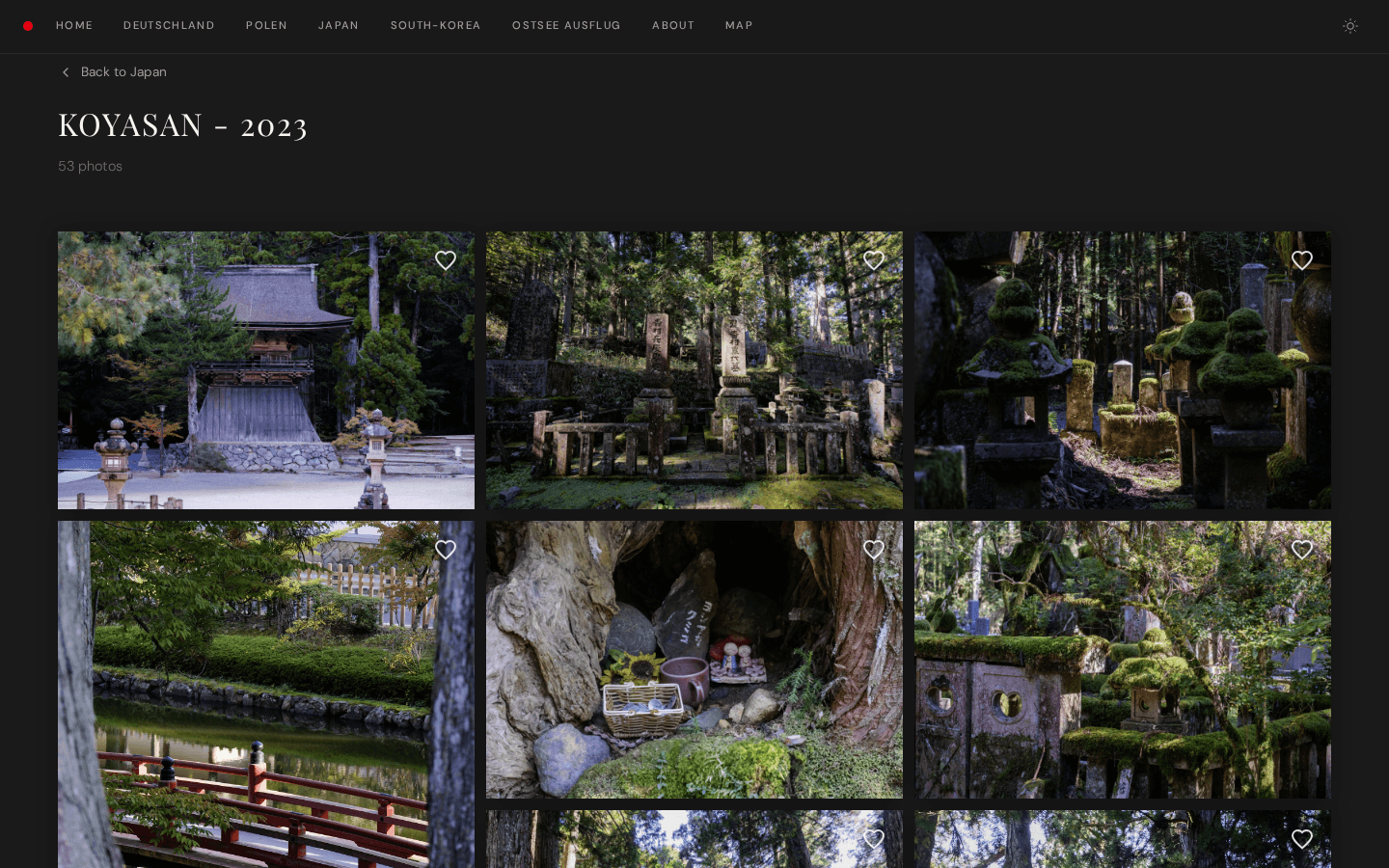
| **studio-modern** | Leica precision, grotesque | 🔴 `#e60012` | Archivo + IBM Plex Mono | Split | None | ✗ |
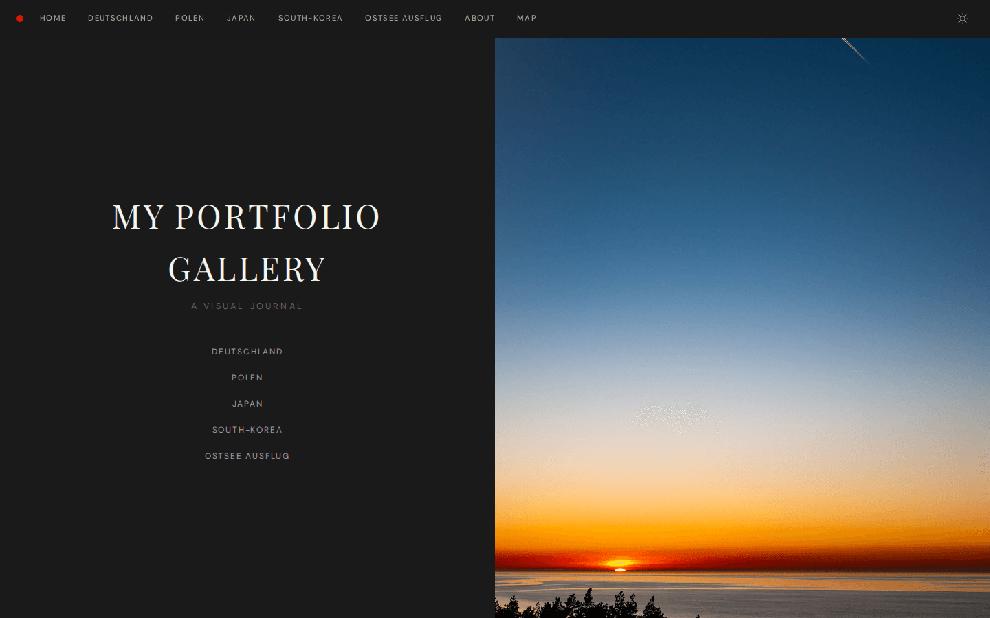
| **studio** | Leica-inspired, editorial | 🔴 `#e60012` | Playfair Display + DM Sans | Split | Passepartout | ✓ |
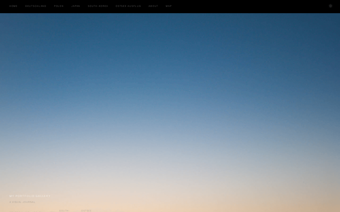
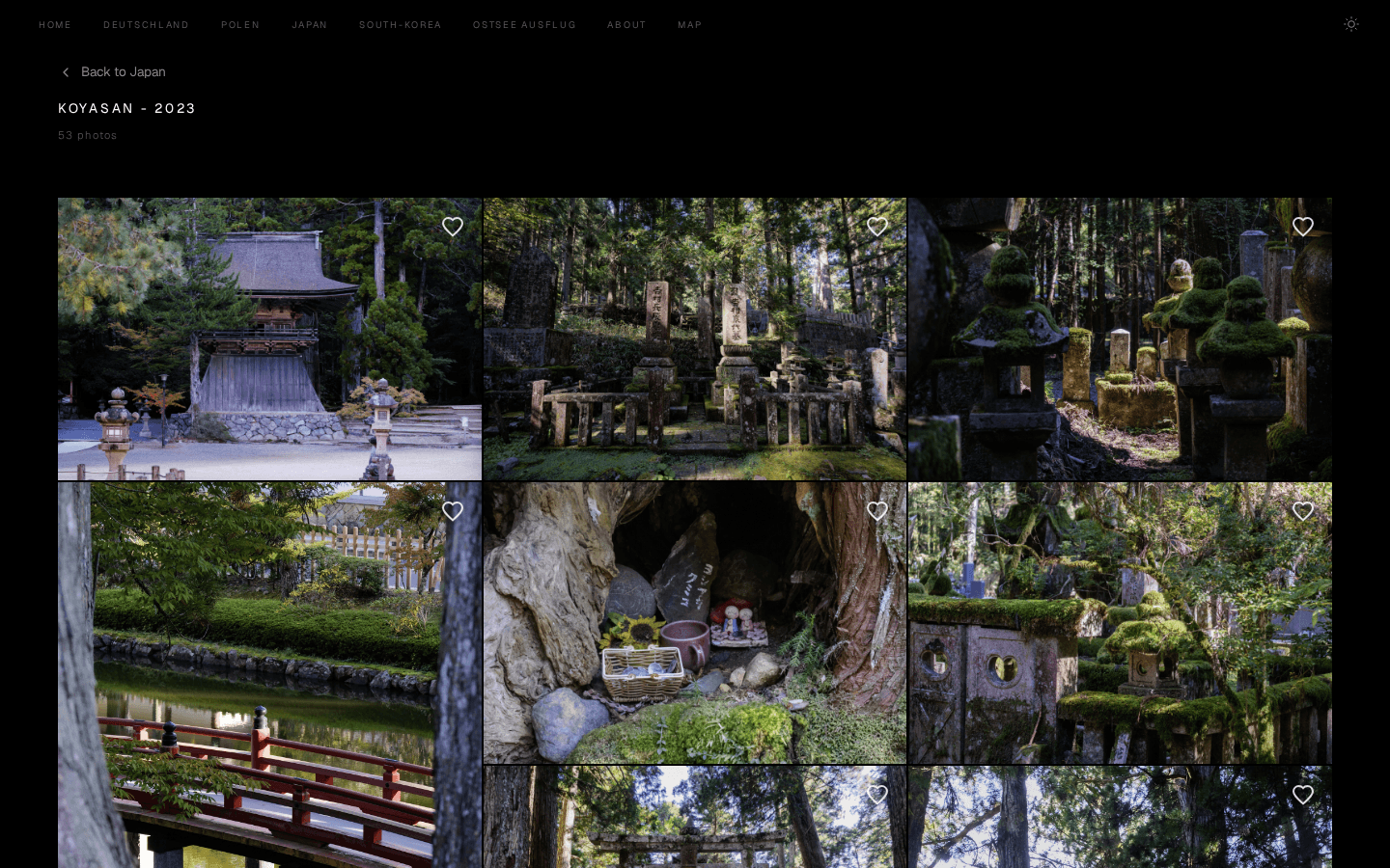
| **minimal** | Swiss brutalist, high contrast | ⚫ `#000000` | Geist + IBM Plex Mono | Fullbleed | None | ✗ |
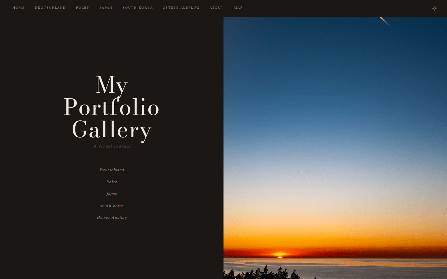
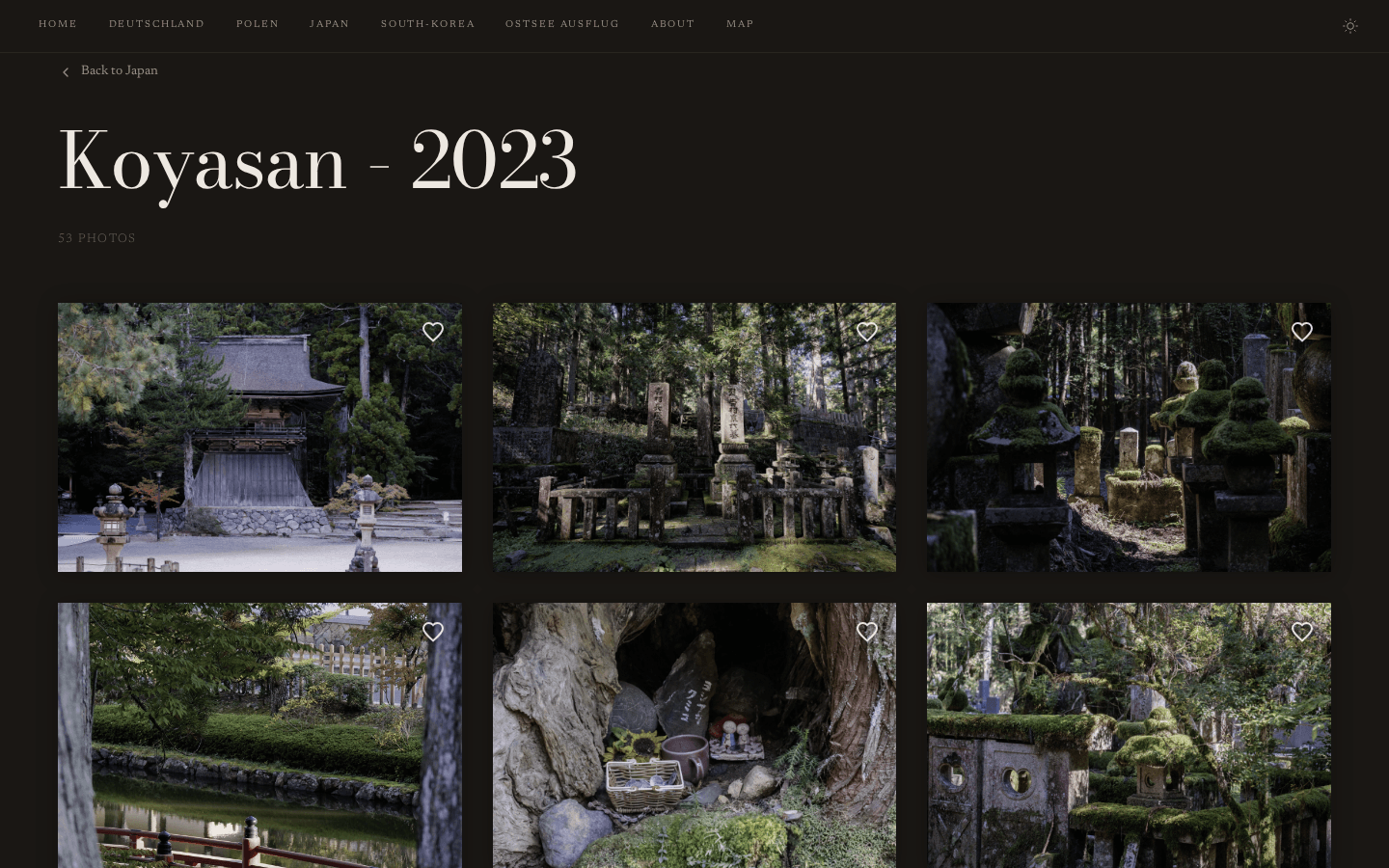
| **editorial** | Cinematic magazine, warm tones | 🟤 `#8B2500` | Bodoni Moda + Newsreader | Split | Shadow | ✗ |
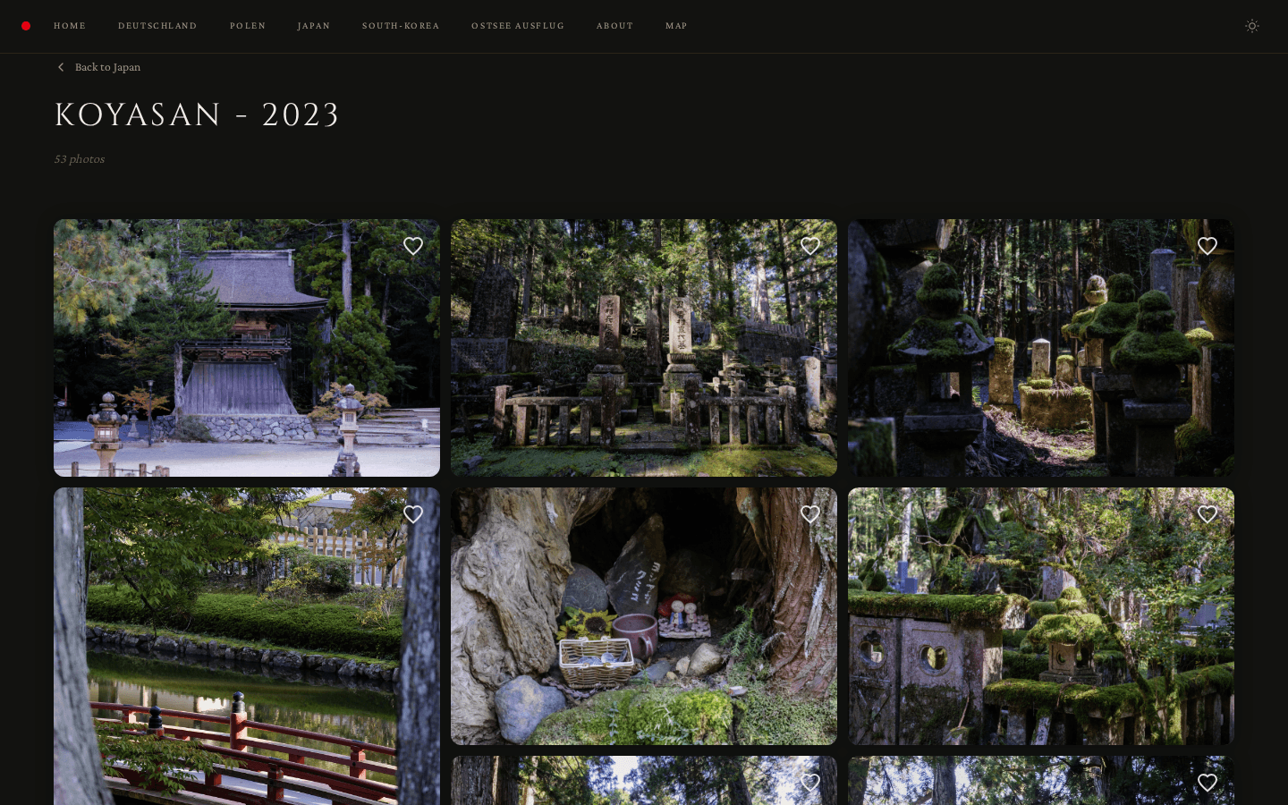
| **classic** | Gilded gallery, warm luxury | 🟡 `#c49a3c` | Cinzel + Crimson Pro | Minimal | Passepartout | ✗ |
| **noir** | Darkroom analog, film noir | 🟠 `#ff6b35` | Libre Baskerville + Source Sans 3 | Fullbleed | Passepartout | ✓ |
| **monograph** | Typographic, book-like | ⬛ `#333333` | Instrument Serif + Inter | Typographic | None | ✗ |
**`studio-modern` is the default** if no theme is specified.
### Theme Gallery
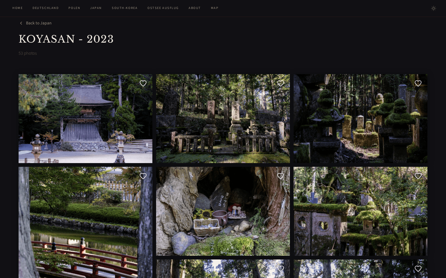
_From left to right, top to bottom: Studio Modern, Studio, Minimal, Editorial, Classic, Noir, Monograph_
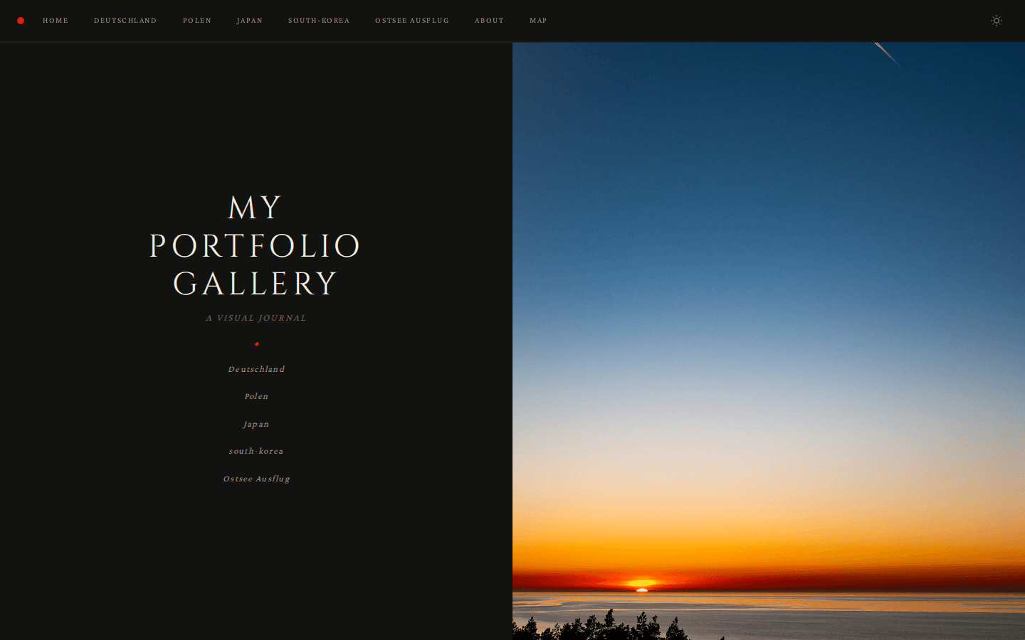
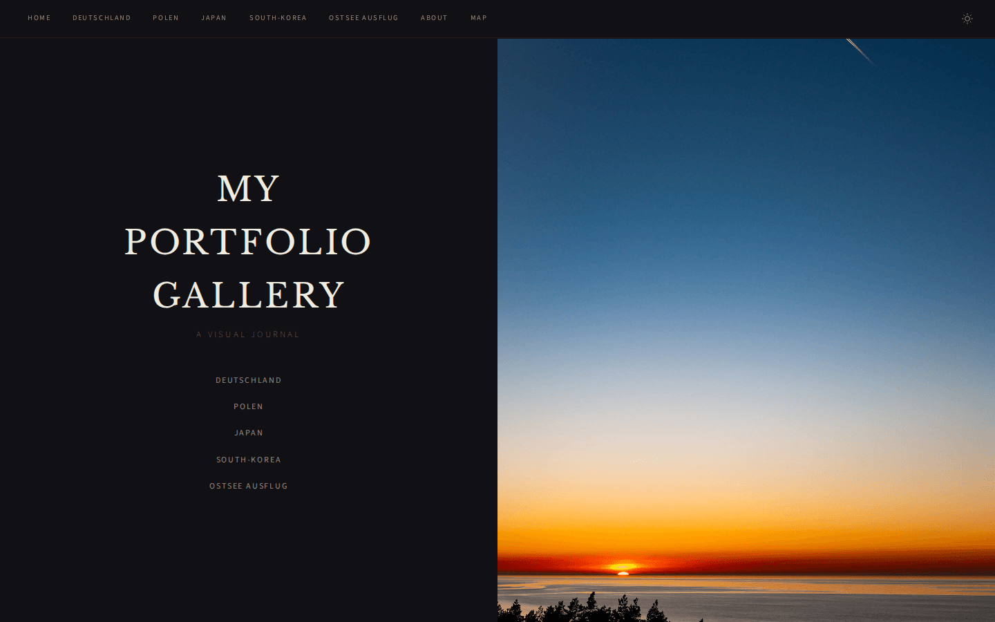
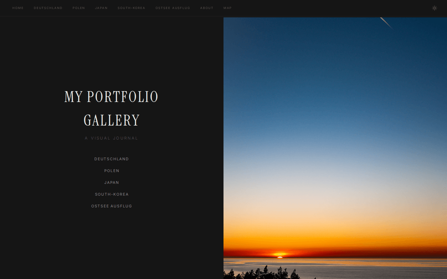
### Grid View Examples
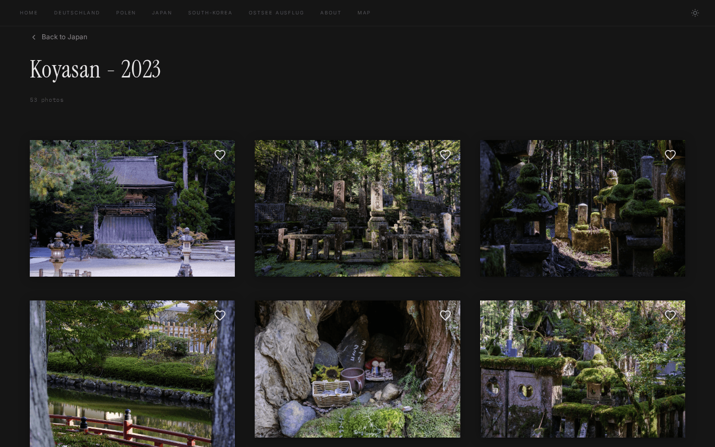
_Same order as above._
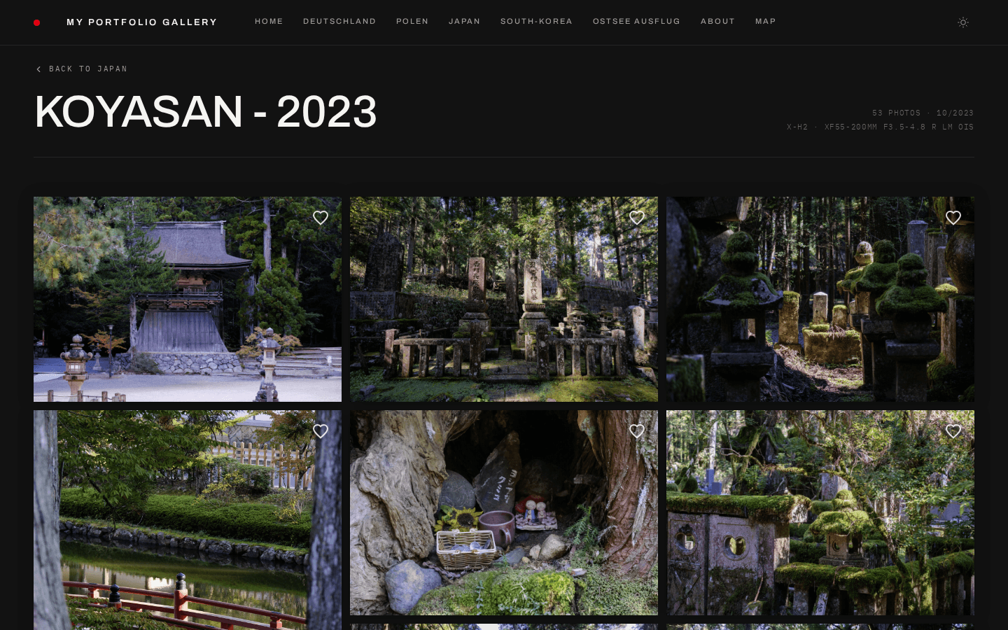
### Light Mode
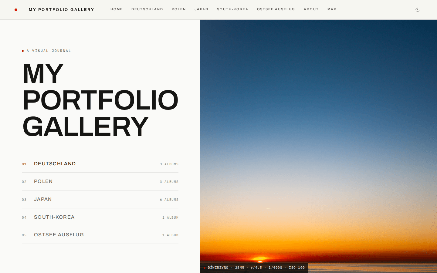
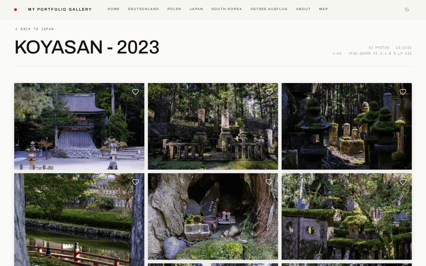
Every preset ships with a light variant. Visitors switch with the toggle in the
navigation bar; the choice is remembered in `localStorage`, and the presets keep
their accent, fonts and framing in both modes.
### What makes each theme unique
**Studio Modern** (default) — The Leica language of `studio` rebuilt around the precision grotesque Archivo, with IBM Plex Mono for every piece of photographic metadata (EXIF chips, counters, indices). Hairline rules at 8% opacity, zero radius, an indexed hero nav with album counts, an always-visible caption bar under album covers, and a film-edge EXIF strip in the lightbox. Red is signal only — nav dot, active state, hover, indices, map markers.
**Studio** — Leica-inspired with a red nav dot, passepartout photo frames, film grain, and a split hero layout. Clean editorial feel with Playfair Display headings.
**Minimal** — Swiss Brutalist aesthetic inspired by Müller-Brockmann and Dieter Rams. Fullbleed hero image, true black/white palette, zero-gap photo grid with no hover effects, ultra-tiny navigation text. Every pixel earns its place.
**Editorial** — Cinematic magazine feel inspired by Aperture and Magnum Photos. Oversized Bodoni Moda serif titles, warm charcoal backgrounds, generous grid spacing, slow cinematic transitions with desaturation-on-idle photos, and pull-quote section labels.
**Classic** — Fine art gallery aesthetic with warm gold accents, Cinzel Roman capitals for headings, decorative ornamental dividers, warm passepartout frames, rounded corners, and an elegant gold header dot. Feels like a luxury exhibition catalog.
**Noir** — Darkroom analog aesthetic with warm amber accents on a deep cool-black base. Sepia-tinted photos with vignette hover effects, film-edge EXIF labels in monospace, and a grain overlay. Inspired by wet-plate photography and film noir cinematography.
**Monograph** — Type-first book design with no hero image. Features an 8rem serif title, numbered photo indices via CSS counters, slide-up EXIF captions, hairline dividers, and generous whitespace. Feels like an artist monograph.
## Custom Theme
Start from any preset and override individual properties:
```yaml
theme:
preset: studio # base preset to extend (default: studio-modern)
accent: '#2563eb' # brand/accent color (any hex)
fonts:
heading: 'Inter' # Google Fonts name for headings
body: 'Inter' # body text
caption: 'JetBrains Mono' # EXIF captions
radius: 8 # border-radius in px (0 = sharp corners)
photoFrame: none # "none" | "passepartout" | "shadow"
grain: false # film grain overlay on photos
headerDot: false # accent-colored dot in the nav bar
heroStyle: split # "split" | "fullbleed" | "minimal" | "stacked" | "typographic" | "mosaic" | "cover"
```
All properties are optional — omitted values fall back to the preset defaults.
## Properties Reference
### `accent`
The brand color used for hover effects, navigation highlights, the header dot, and OG social preview images.
### `fonts`
Google Fonts names. Fonts are loaded automatically — just use the name as it appears on [fonts.google.com](https://fonts.google.com). Three font slots:
- **heading** — album titles, hero title, section labels
- **body** — navigation, descriptions, UI text
- **caption** — EXIF metadata, photo captions
### `radius`
Border radius in pixels applied to photo grid items and album cards:
- `0` — sharp, editorial corners
- `4-8` — subtle rounding
- `12+` — soft, modern feel
### `photoFrame`
How photos are framed in the grid:
- **`none`** — photos fill the grid cell directly
- **`passepartout`** — museum-style mat border around each photo with print-style EXIF captions below
- **`shadow`** — subtle drop shadow behind each photo
### `grain`
When `true`, a subtle film grain texture overlays each photo in the grid. Adds an analog, filmic character.
### `headerDot`
When `true`, shows a small accent-colored dot in the navigation bar (inspired by the Leica red dot).
### `heroStyle`
Controls the homepage hero layout:
- **`split`** — title/nav on the left, hero image on the right (used by Studio, Editorial)
- **`fullbleed`** — hero image fills the entire viewport, title overlaid in the corner (used by Minimal, Noir)
- **`minimal`** — centered title card with decorative ornament, hero image as a banner below (used by Classic)
- **`stacked`** — full-viewport hero image with title gradient-overlaid at the bottom, horizontal thumbnail navigation strip below
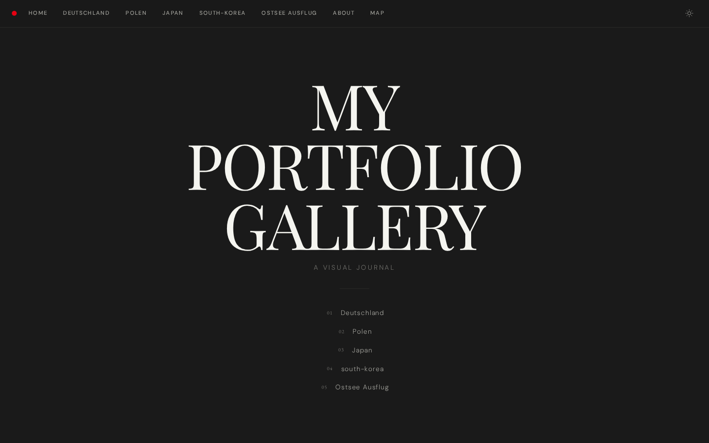
- **`typographic`** — no hero image; massive centered title with numbered album navigation list (used by Monograph)
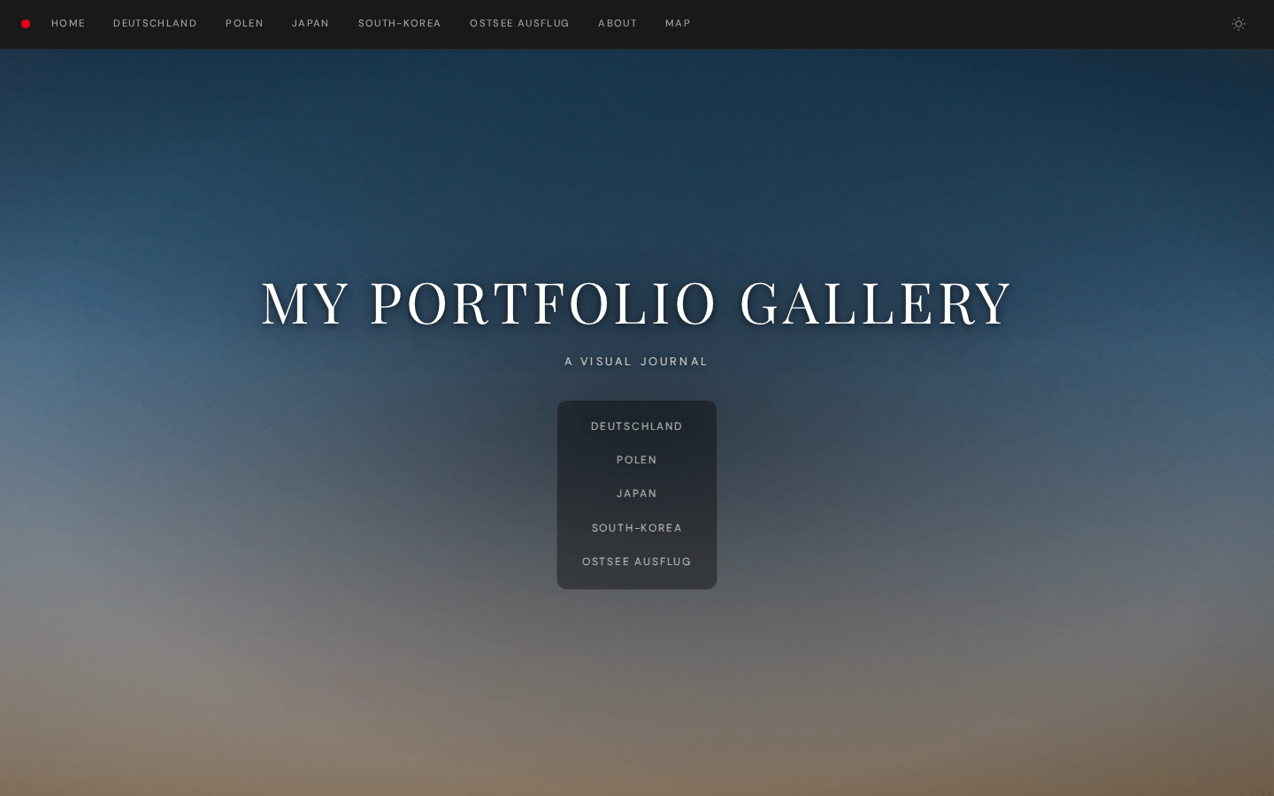
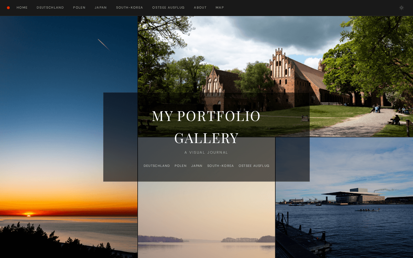
- **`mosaic`** — asymmetric multi-image grid with frosted-glass title overlay centered on top
- **`cover`** _(experimental)_ — a splash screen: one fullscreen image, the site title and subtitle, and a single **Enter** link into the first navigation entry. The rest of the homepage is not rendered — visitors arrive at a title page and click through.
| Split |
Fullbleed |
Minimal |
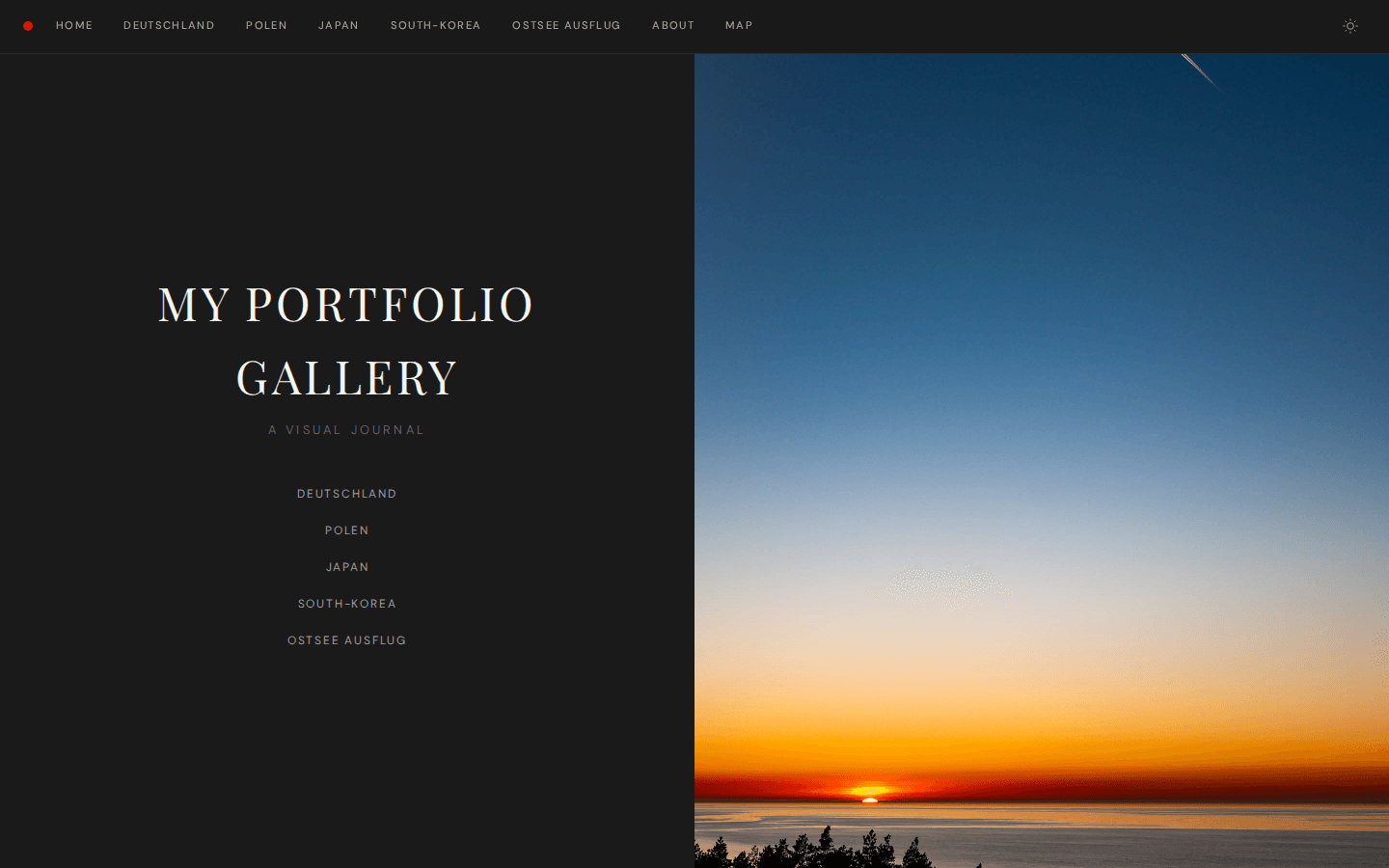 |
 |
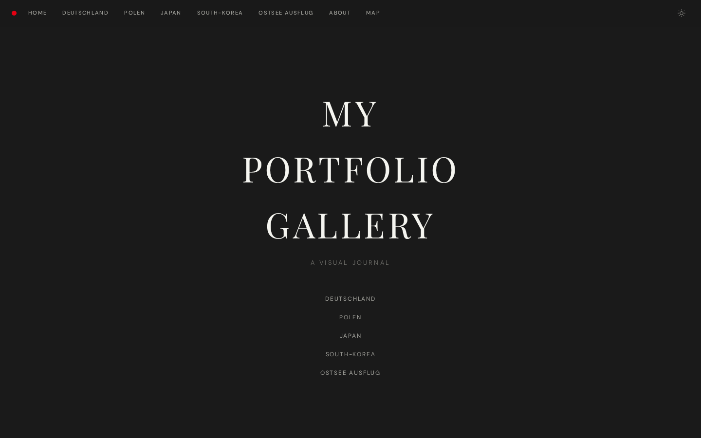 |
| Stacked |
Typographic |
Mosaic |
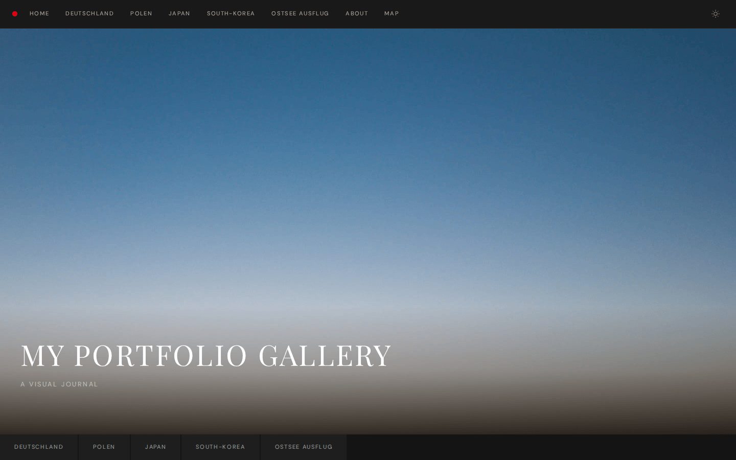 |
 |
 |
### `grid.layout`
Controls the photo grid layout on album pages:
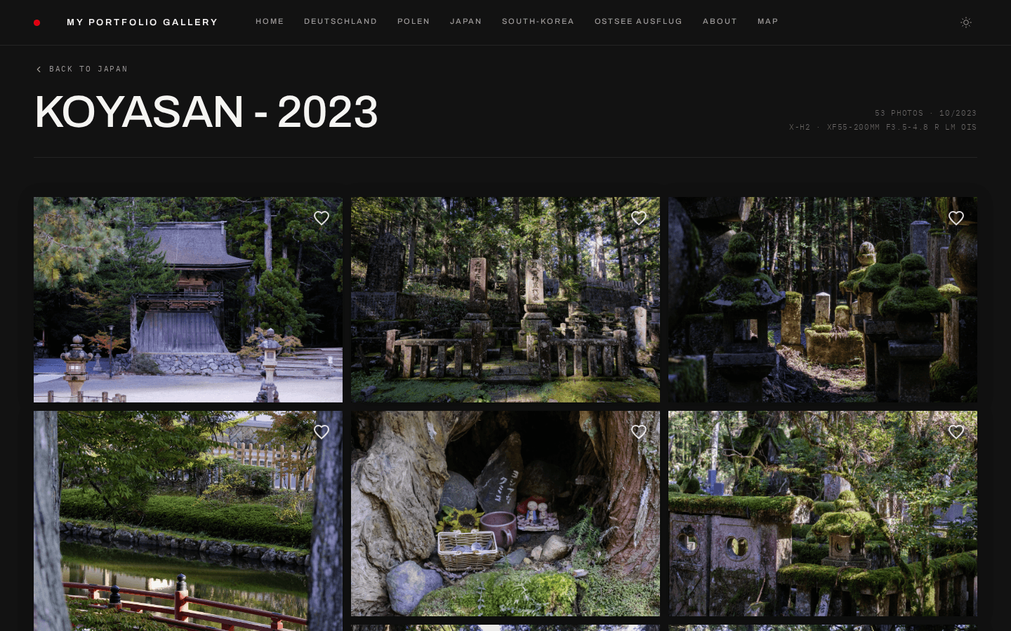
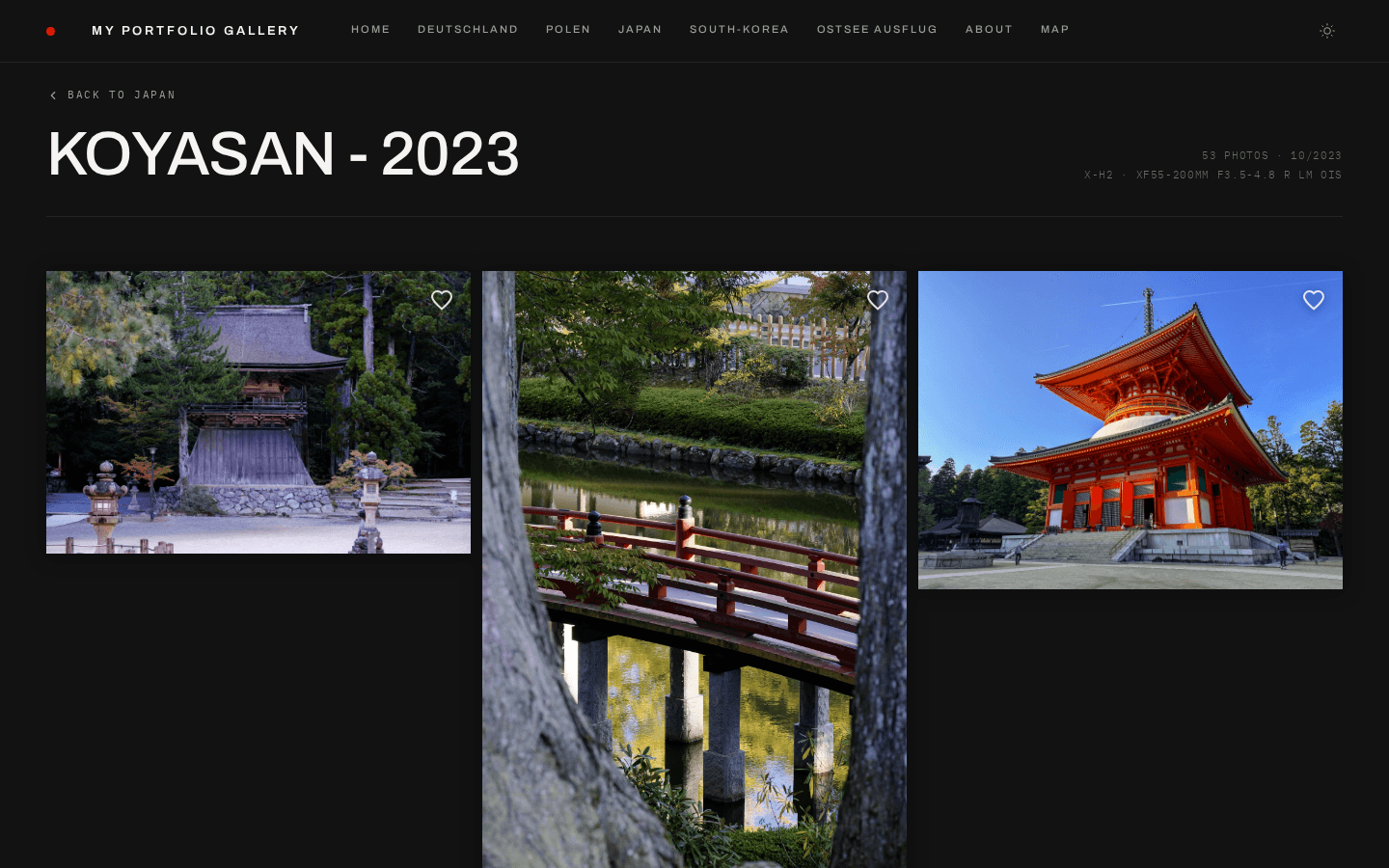
- **`masonry`** — Pinterest-style stacked columns, images shown at natural aspect ratios (default)
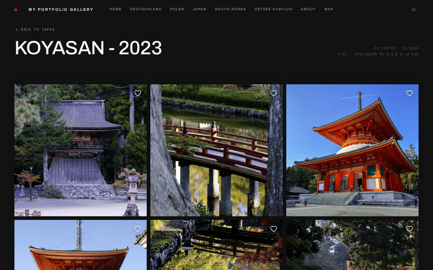
- **`uniform`** — CSS Grid with fixed aspect ratio cells
- **`showcase`** — first image displayed at full width (16:9), rest in standard grid
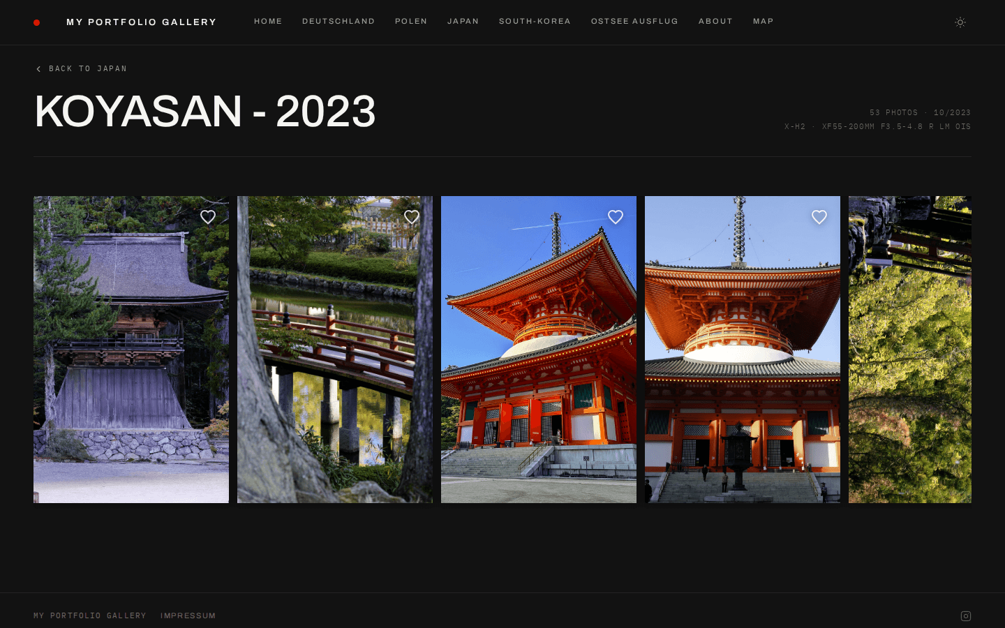
- **`filmstrip`** — horizontal scroll of tall vertical image strips with scroll snapping
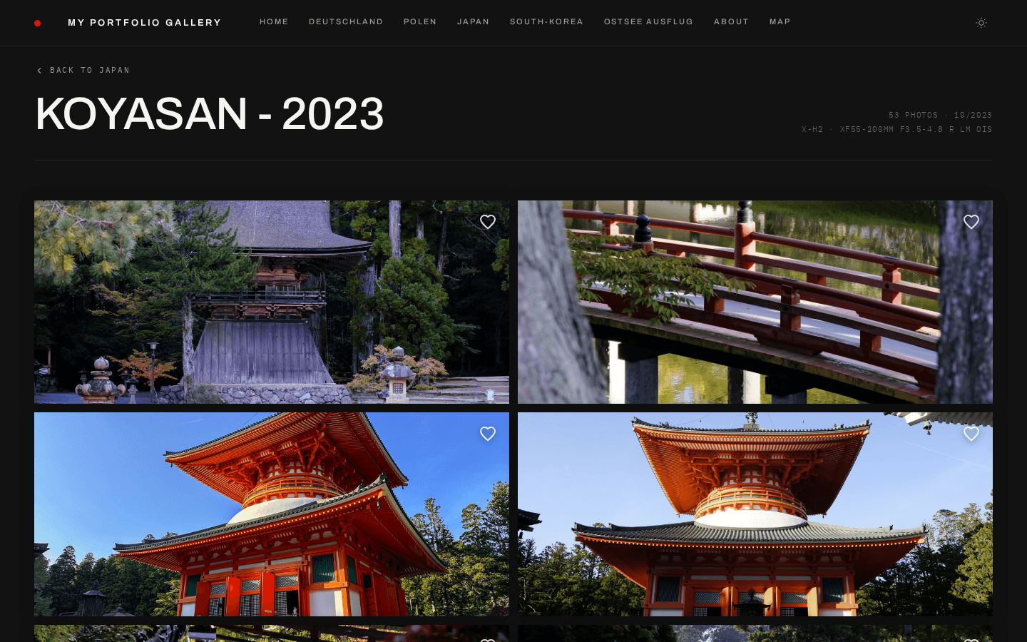
- **`editorial-flow`** — alternating full-width (21:9) and side-by-side (4:3) image pairs
- **`justified`** _(experimental)_ — row-based: every row fills the container width and all images in a row share one height, so aspect ratios stay intact and nothing is cropped. `columns` sets the density — more columns give shorter rows. The last row keeps its natural sizes rather than stretching.
- **`essay`** — not a grid: renders the page as a photo essay. See **[Journal & Photo Essays](journal.md)**.
Set it globally in `settings.yaml`, per subpage in `gallery.yaml`, or on a
single album (experimental) — the three merge, most specific winning:
```yaml
grid:
layout: showcase
```
The same album in five of the grid layouts (theme `studio-modern`):
| Masonry (default) |
Uniform |
 |
 |
| Showcase |
Filmstrip |
 |
 |
| Editorial Flow |
|
### Album cover spacing
The album-cover grid on a subpage is sized by two CSS custom properties on
`.subpage-grid`:
| Property | Set by |
| ------------------- | -------------------------------------------------------------------- |
| `--subpage-columns` | the app, from the resolved `grid.columns` (site-wide or per subpage) |
| `--subpage-gap` | the **theme preset** — a per-subpage `grid.gap` overrides it |
The column count follows the configuration, the spacing belongs to the look.
`monograph` sets 1px, `minimal` and `editorial` 2px, `studio-modern` 20px;
`classic` and `noir` set nothing and get the 4px default from `globals.css`.
A custom preset does the same:
```css
[data-preset='mytheme'] .subpage-grid {
--subpage-gap: 12px;
}
```
Do not set `gap` directly there — an explicit per-page gap is passed as an
inline custom property and would no longer win.
## Examples
### Minimal portfolio
```yaml
theme:
preset: minimal
accent: '#0066cc'
fonts:
heading: 'Outfit'
body: 'Outfit'
```
### Film photography blog
```yaml
theme:
preset: studio
accent: '#d4a017'
grain: true
photoFrame: passepartout
```
### Modern magazine
```yaml
theme:
preset: editorial
radius: 12
fonts:
heading: 'Fraunces'
body: 'Inter'
caption: 'IBM Plex Mono'
```
### Luxury gallery
```yaml
theme:
preset: classic
accent: '#b8860b'
fonts:
heading: 'Playfair Display'
body: 'Lora'
```
### Dark analog portfolio
```yaml
theme:
preset: noir
heroStyle: stacked
```
### Type-forward monograph
```yaml
theme:
preset: monograph
accent: '#444'
fonts:
heading: 'DM Serif Text'
```
### Nature / travel journal
```yaml
theme:
preset: editorial
heroStyle: mosaic
grid:
layout: editorial-flow
```
## Upgrading & rolling back
Adding a preset never requires a migration. Presets are additive, the
`gallery.yaml` / `settings.yaml` schema is unchanged, and existing presets keep
rendering exactly as before — pull the new version and restart.
The one case that needs attention is a **rollback after switching presets**. The
selected preset is stored in `content/settings.yaml`, so if you pick a preset
that was added later and then downgrade to a version that predates it, config
loading fails:
```
Unknown theme preset "studio-modern". Valid presets: studio, minimal, editorial, classic, noir, monograph
```
The message lists the presets the running version accepts. Set `theme.preset` to
one of them:
```yaml
theme:
preset: studio # any preset the older version knows
```
`/admin` stays reachable when this happens, so you can also fix it from the
settings editor after the downgrade rather than beforehand.
The same error appears if you typo a preset name or copy an example for a preset
that does not exist — it is not specific to downgrades.