# @respeak/lucide-motion-vue [![npm](https://img.shields.io/npm/v/@respeak/lucide-motion-vue.svg?color=cb3837&label=npm)](https://www.npmjs.com/package/@respeak/lucide-motion-vue) [![downloads](https://img.shields.io/npm/dm/@respeak/lucide-motion-vue.svg?color=informational)](https://www.npmjs.com/package/@respeak/lucide-motion-vue) [![bundle size](https://img.shields.io/bundlephobia/minzip/@respeak/lucide-motion-vue?label=min%2Bgzip)](https://bundlephobia.com/package/@respeak/lucide-motion-vue) [![Vue 3](https://img.shields.io/badge/Vue-3-42b883.svg)](https://vuejs.org) [![types](https://img.shields.io/npm/types/@respeak/lucide-motion-vue.svg)](https://www.npmjs.com/package/@respeak/lucide-motion-vue) [![live demo](https://img.shields.io/badge/demo-live-7c3aed.svg)](https://respeak-io.github.io/lucide-motion-vue/) **The largest animated icon library for Vue 3.** 546 Lucide icons across 838 named animation variants — drop-in and tree-shakeable, with a live gallery, variant switcher, and copy-paste snippets. [![Animated icon preview](./docs/hero.gif)](https://respeak-io.github.io/lucide-motion-vue/) **▶︎ [Live gallery + docs](https://respeak-io.github.io/lucide-motion-vue/)** — hover any icon to preview; click for variants, props, and copy-paste snippets. Built on [Motion for Vue](https://motion.dev/docs/vue), ships a Nuxt module, SSR-safe, fully tree-shakable per icon. - **546 icons / 838 named variants**, tree-shakable per chunk — one icon, one bundle entry - **Multiple animations per icon.** ``, ``, ``. Variants can carry materially different motion *and* different element graphs under one component name (e.g. `Sun`'s `default` is the animate-ui sunburst, `alt` is the lucide-animated minimal silhouette — same `` import). - Ergonomic triggers: `animateOnHover`, `animateOnTap`, `animateOnView` - Composable `` wrapper drives nested icons via provide/inject - Bind triggers to an ancestor with `triggerTarget="parent"` / `closest:button` — no markup refactor - **Nuxt module** with auto-imports — `` works with no per-file imports - SSR-safe with hydration replay (no flash, no mismatch) - Full TypeScript types, native Motion loops, `currentColor` styling - Works standalone (``) or composed (`` over anything) - **Forge** maintainer tool ([see below](#the-forge--design-new-variants)) generates AI-designed icon animations for review — `pnpm forge` ## Contents - [Install](#install) - [Usage](#usage) - [Collision-safe names](#collision-safe-names) - [Per-icon subpath imports](#per-icon-subpath-imports) - [Nuxt module](#nuxt-module) - [Props](#props) - [Styling](#styling) - [`` wrapper](#animateicon-wrapper) - [Discovering variants (`iconsMeta`)](#discovering-variants-iconsmeta) - [TypeScript](#typescript) - [Accessibility](#accessibility) - [Docs site](#docs-site) - [The Forge — design new variants](#the-forge--design-new-variants) - [Changelog](./CHANGELOG.md) - [Contributing / regenerating icons](#contributing--regenerating-icons) - [License](#license) ## Install ```bash pnpm add @respeak/lucide-motion-vue motion-v ``` Peer deps: `vue ^3.3`, `motion-v ^2`. ## Usage ```vue ``` ### Collision-safe names If you use this library alongside `lucide-vue-next` (static icons), both export `Heart`. Use the `*Animated` alias to disambiguate: ```ts import { Heart as StaticHeart } from 'lucide-vue-next' import { HeartAnimated } from '@respeak/lucide-motion-vue' ``` ### Per-icon subpath imports Every icon is also exposed under `/icons/` for consumers who want guaranteed separate chunks (or whose bundler trips on large barrel files): ```ts import Heart from '@respeak/lucide-motion-vue/icons/heart' import BetweenVerticalStart from '@respeak/lucide-motion-vue/icons/between-vertical-start' ``` Tree-shaking works with either import style (package is ESM + `"sideEffects": false`). ## Nuxt module For Nuxt 3 apps the package ships a module at `@respeak/lucide-motion-vue/nuxt` that auto-registers `` and every icon — no imports needed in your templates. ```ts // nuxt.config.ts export default defineNuxtConfig({ modules: ['@respeak/lucide-motion-vue/nuxt'], }) ``` ```vue ``` The default naming is **suffixed** (``, ``, …) so the module coexists with `lucide-vue-next`'s static ``, `` without collision — keep both installed and pick per-usage. Override the scheme in `nuxt.config` if you want something shorter: ```ts export default defineNuxtConfig({ modules: ['@respeak/lucide-motion-vue/nuxt'], lucideMotion: { prefix: 'M', suffix: '' }, // → , }) ``` Per-icon tree-shaking is preserved — templates that only reference `` ship one chunk, not the whole library. ## Props Every icon accepts: | prop | type | default | description | |-----------------------|--------------------------|----------|---------------------------------------------------------------| | `size` | `number` | `28` | Rendered width/height in px. | | `strokeWidth` | `number` | `2` | SVG stroke width. | | `animate` | `boolean \| string` | `false` | Programmatic trigger. Pass a variant name to select it. | | `animateOnHover` | `boolean \| string` | `false` | Play while hovered. | | `animateOnTap` | `boolean \| string` | `false` | Play while pointer is down. | | `animateOnView` | `boolean \| string` | `false` | Play when the icon enters the viewport. | | `animation` | `string` | `default`| Which named variant group to pull from (e.g. `fill`). | | `persistOnAnimateEnd` | `boolean` | `false` | Keep final state instead of returning to `initial`. | | `initialOnAnimateEnd` | `boolean` | `false` | Force snap to `initial` when animation ends. | | `clip` | `boolean` | `false` | Clip the icon's overflow at its bounding box — see below. | | `triggerTarget` | `'self' \| 'parent' \| \`closest:${string}\`` | `'self'` | Bind hover/tap to an ancestor — see [Migrating existing buttons](#migrating-existing-buttons-triggertarget). | Available `animation` names are icon-specific and mirror upstream animate-ui — e.g. `Heart` supports `default` and `fill`, `BetweenVerticalStart` supports `default` and `default-loop`, `Link2` supports `default`/`apart`/`unlink`/`link`. See [Discovering variants](#discovering-variants-iconsmeta) for a programmatic way to list them, or browse the docs site in `docs/` (`pnpm docs:dev`). A few animations deliberately move parts of the icon outside its viewBox — `send`'s plane flies off before returning; `rocket`'s launch variant lifts off and out. Those read correctly only when the overflow is hidden, so they disappear on exit instead of touring around the rest of the page. That's what `clip` is for: ```vue ``` Off by default because other icons (e.g. `link-2`'s burst particles) are designed to render outside their box and would break with clipping on.


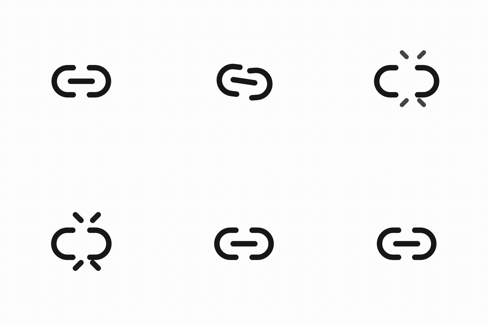
Link2 cycling through its five animation variants
Link2 alone ships five variants — default, apart, unlink, unlink-loop, link.

Icons that are conceptually infinite (`LoaderCircle`, `Loader`, `LoaderPinwheel`, etc.) bake `repeat: Infinity` into their own variant transitions, so they loop as soon as you trigger them — no prop required. One-shot icons play once per trigger. ## Styling Icons use `stroke="currentColor"` (and `fill: 'currentColor'` for fill-based variants), so color is driven by the parent's CSS `color` — same pattern as `lucide-vue-next`. Fill-based animations automatically pick up whatever color you set, so the tween stays on-brand. ```vue
``` Width and height can come from the `size` prop *or* CSS. Utility classes (`w-6 h-6`, `size-8`), scoped styles, and inline `style` all land on the inner `` — whether the icon self-wraps (any trigger prop set) or not. ```vue ``` ### `transform` must be inline (not via class) motion-v writes an inline `style="transform: …"` on the rendered `` to drive its animations, and inline style beats any class-defined `transform`. So if you want to apply your own `transform` to a self-wrapped icon (typically `translateY(-50%)` for the icon-in-input centering idiom), pass it via inline `style=`, not via a CSS class — `mergeProps` flows the inline style through alongside motion-v's transform, and your translation is preserved. ```vue
``` This only matters for `transform` — every other property (`position`, `top`, `width`, `color`, etc.) reaches the svg fine via class. And it doesn't affect flex/grid centering at all (e.g. Vuetify `` works with no CSS). ## `` wrapper ```ts import { AnimateIcon } from '@respeak/lucide-motion-vue' ``` A renderless wrapper that catches trigger events on the slotted icon (or an ancestor) and propagates animation state (via `provide/inject`) to any icon nested inside. No DOM box of its own. Use it when one trigger should drive multiple icons, or when the trigger element should be something other than the icon itself (button, card, link…). ### Props All the trigger/animation props below also work directly on individual icons; the wrapper just lets you share them across a subtree. | prop | type | default | description | |-----------------------|---------------------|-----------|------------------------------------------------------------| | `animate` | `boolean \| string` | `false` | Programmatic trigger. Pass a variant name to select it. | | `animateOnHover` | `boolean \| string` | `false` | Play while hovered. | | `animateOnTap` | `boolean \| string` | `false` | Play while pointer is down. | | `animateOnView` | `boolean \| string` | `false` | Play when the wrapper enters the viewport. | | `animation` | `string` | `default` | Which named variant group to pull from. | | `persistOnAnimateEnd` | `boolean` | `false` | Keep final state instead of returning to `initial`. | | `initialOnAnimateEnd` | `boolean` | `false` | Force snap to `initial` when animation ends. | | `clip` | `boolean` | `false` | Clip overflow at the icon's viewBox — for "exit" animations. | | `as` | `'default' \| 'template'` | `'default'` | Rendering mode — see below. | | `triggerTarget` | `'self' \| 'parent' \| \`closest:${string}\`` | `'self'` | Bind hover/tap to an ancestor instead of the icon — see below. | ### Rendering modes - **Default**: no DOM wrapper. Pointer listeners and the `animateOnView` ref are forwarded onto the slot's first vnode (the icon's ``). Matches `lucide-vue-next`'s bare-svg shape so CSS idioms like `position: absolute` overlays keep working. - **`as="template"`**: renderless — exposes `{ on, viewRef }` via the default scoped slot so you can bind them to any element (e.g. a ``, ``, `Favorite ``` Because default mode forwards events onto the slot's *first* vnode (not its own DOM box), driving multiple icons from one trigger needs a single wrapping element so the trigger area covers them all: ```vue ``` Listing siblings directly under `` would only fire on the first one. Use `as="template"` if you want full control over which element captures events. ### Migrating existing buttons (`triggerTarget`) If you already have `` markup and want hover to fire on the whole button, set `triggerTarget` on the icon itself — no wrapper, no markup refactor: ```vue ``` Which one to reach for: - **`triggerTarget="parent"` / `"closest:…"`** — best for *migrations* and single-icon buttons. Additive (two props), no markup change. - **`as="template"`** — best when one trigger should drive *several* icons, or when the trigger isn't an ancestor of the icon. `triggerTarget` applies in `as="default"` mode only. In `as="template"` mode you already pick the trigger element by binding `on`. ## Discovering variants (`iconsMeta`) Every icon's kebab name, Pascal name, and full list of animation variants is exported as a plain array — handy for building custom pickers, auto-generated docs, or validation. ```ts import { iconsMeta, type IconMeta } from '@respeak/lucide-motion-vue' iconsMeta[0] // → { // kebab: 'accessibility', // pascal: 'Accessibility', // animations: [{ name: 'default', source: 'animate-ui' }], // } // Each variant carries its upstream `source` ('animate-ui' | 'lucide-animated' // | 'hand-written') for attribution — see ATTRIBUTIONS.md. iconsMeta.find(m => m.pascal === 'Heart')?.animations.map(a => a.name) // → ['default', 'fill'] // Some icons ship variants with materially different element graphs // (different path splits, different animated parts) — `Sun`, `AudioLines`, // `Cast`, `MessageSquareMore` and a dozen others. The component name and // the `iconsMeta` row stay the same; only the `animation` prop changes: iconsMeta.find(m => m.pascal === 'Sun')?.animations // → [{ name: 'default', source: 'animate-ui' }, { name: 'alt', source: 'lucide-animated' }] ``` ## TypeScript First-class. The package ships `.d.ts` alongside every chunk: - Every icon has typed props (`size`, `strokeWidth`, `animate`, `animateOnHover`, …). - `AnimateIcon`'s props are typed the same way; `as` is a literal union. - `IconTriggerProps` and `IconMeta` are exported for anyone building a wrapper or registry on top. - No `any` in the public surface. ```ts import type { IconTriggerProps, IconMeta } from '@respeak/lucide-motion-vue' ``` ## Accessibility Icons render as plain `` elements, so standard SVG a11y patterns apply: - **Decorative** (next to text that already says the thing): add `aria-hidden="true"`. - **Meaningful** (icon-only button, status indicator): label it via `aria-label` on the button/parent, or wrap in a `role="img"` element with an accessible name. ```vue ``` Animation is purely visual — it never changes the DOM structure or any `aria-*` state, so screen readers aren't affected by it. Respect `prefers-reduced-motion` by wrapping in a parent that toggles the icon out when the user prefers reduced motion, or falls back to `lucide-vue-next` for those users. ## Docs site **Live:** https://respeak-io.github.io/lucide-motion-vue/ Two views: - **Browse icons** (`/`) — searchable grid, variant picker, copy-paste snippets. - **Read the docs** (`/#/docs`) — usage patterns with live demos: icons in buttons, variants, color, programmatic triggers, and a section for AI agents pointing at `llms.txt`. To run locally: ```bash pnpm docs:dev # serve it on http://localhost:5174 pnpm docs:build # emit static site to docs-dist/ ``` Set `VITE_DOCS_BASE=/repo-name/` when building for a GitHub Pages subpath deploy. ### For AI agents A concise machine-readable API reference is served at `/llms.txt` (and checked into `docs/public/llms.txt`). Point your agent's system prompt or repo rules at it — see the docs site's "For AI agents" section for a drop-in Cursor rule and prompt template. ## The Forge — design new variants Need an animation that doesn't ship out of the box? The repo includes a maintainer-grade Vite app that hands an icon to Claude (Sonnet 4.6 or Opus 4.7) and gets back **3 distinct animation proposals as strict JSON**, side-by-side previewable, exportable as a hand-written SFC into `src/icons/`. ```bash ANTHROPIC_API_KEY=… pnpm forge # → http://localhost:5173 ``` What it does: - **Generate** — pick a Lucide icon (or paste an SVG), optionally enable spawning auxiliary elements (sparks, ripples, motion trails) and silhouette morphing. The model returns 3 proposals titled like `"Wand draws stars"`, each with a 1-2-sentence rationale. - **Review** — live preview each proposal in the same UI; tweak the source SVG and re-run; reject and re-prompt if none clear the bar. - **Ship** — export the chosen proposal as a hand-written SFC matching the library's standard shape. The generated file gets a `// Hand-written` sentinel so the codemod scripts skip it on re-run. The full design-quality bar (multi-element motion, semantic mapping, phase variation, magnitude floors, what won't render) lives in [`forge/style-guide.md`](./forge/style-guide.md). It's hand-authored for LLM consumption — point your own agent workflow at it if you'd rather DIY. ## Contributing / regenerating icons The icons in `src/icons/` are generated from two upstream registries: ```bash node scripts/port-icons.mjs --force # animate-ui variants node scripts/port-pqoqubbw-icons.mjs --force # lucide-animated / pqoqubbw variants ``` Each script clones its upstream into `/tmp/…-upstream` on first run (shallow), then for every icon: 1. Extracts the module prelude (module-level constants, helper Variants, spring configs). 2. Extracts the `const animations = {…}` block. 3. Extracts the `IconComponent` return JSX and rewrites it to a Vue template. 4. Emits `src/icons/.vue` using the standard SFC shape. 5. Regenerates `src/index.ts` with `Name` + `NameAnimated` exports. When upstream adds a new icon, re-run the script — it auto-picks up new directories. Generated files are overwritten on re-run when `--force` is passed; without `--force` they're left alone. Hand-written files (see below) are **always** preserved, even with `--force`, as long as their header comment contains the sentinel string `Hand-written` or `Hand-ported` — that's how the script tells a deliberate in-repo icon apart from an accidental edit to a generated file. ### Adding a hand-written icon Drop a `.vue` file in `src/icons/` matching the pattern of the existing generated files (script + scoped slot + self-wrap branch + `motion.svg` with `:variants=` bindings). Include `// Hand-written` (or `// Hand-ported`) in the header comment so the port scripts know to skip it on re-run. `pnpm build` picks it up via the icon-entry glob in `vite.config.ts`, and re-running the codemod regenerates the barrel to include it. If upstream later ships its own variant of an icon you've already written by hand (e.g. `rocket` gained a `lucide-animated` variant after the initial port), add it as an **additional** variant inside the same SFC and append a new row to the icon's `animations` array in `src/icons-meta.ts` with the correct `source`. Don't rename or remove the hand-written variants — cross-source icons are how this is supposed to look. To do that splice with less guesswork, run: ```bash node scripts/port-pqoqubbw-icons.mjs --augment= [--variant-name=] ``` It parses the upstream `.tsx` and your existing hand-written `.vue`, matches upstream paths to your `pathN` binding keys by comparing `d` attributes (fuzzy on the first 12 chars — small decimal tweaks survive), and prints a ready-to-paste variant block plus the `icons-meta.ts` row addition. The script never writes to the hand-written file — the paste is still a human decision. Default variant name is `lucide-animated`; override with `--variant-name=...` if that would collide with an existing key. ## License & attributions MIT for the framework code in `src/core/`. Icon variants come from several upstream projects — each variant in `iconsMeta` carries a `source` tag for attribution: - **`animate-ui`** — [github.com/imskyleen/animate-ui](https://github.com/imskyleen/animate-ui) (MIT + Commons Clause). Roughly half of the icon variants. - **`lucide-animated`** — [lucide-animated.com](https://lucide-animated.com), ported from [pqoqubbw/icons](https://github.com/pqoqubbw/icons) (MIT). The other large chunk. - **`hand-written`** — designed in-repo (e.g. `rocket`). Underlying SVG paths come from [Lucide](https://lucide.dev) (ISC). See [`ATTRIBUTIONS.md`](./ATTRIBUTIONS.md) for the readable version and [`LICENSE`](./LICENSE) for the full legal text.