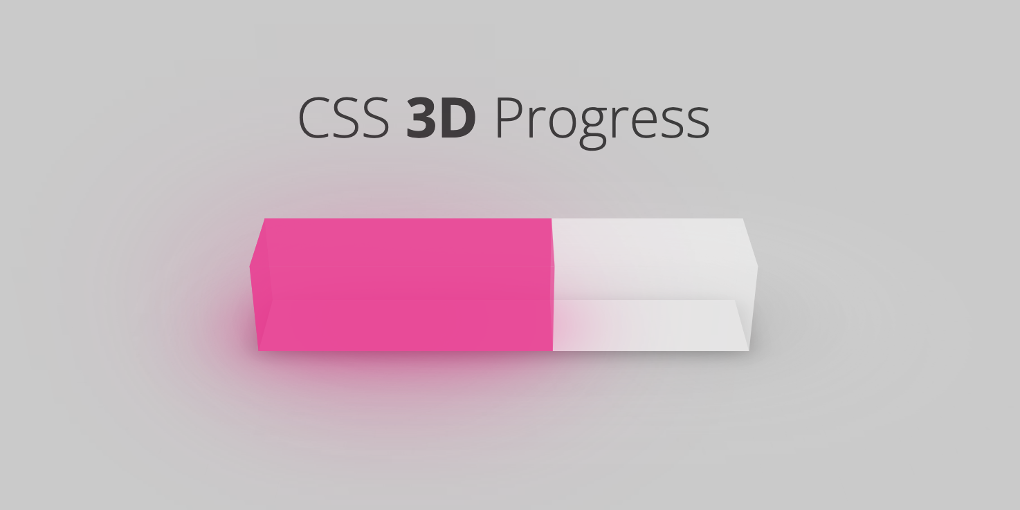
A 3D progress bar component written using web Components, supports Vue, React and Svelte.
## Install
```bash
npm install css-3d-progress
```
## Usage
### Web Components
```html
css-3d-progress
```
### Vue
```vue
```
### React
```jsx
import "css-3d-progress";
import { useState } from "react";
function App() {
const [percent] = useState(60);
const style = { width: "20em" };
return (
<>
);
}
export default App;
```
### Svelte
```svelte
```
## Options
| Name | Type | Default | Description |
| ------------- | ------ | ---------------------------- | -------------------------------- |
| percent | string | 0 | To set the completion percentage |
| is-animation | string | false | Whether to enable flow effects |
| stroke-color | string | \#ec008c99 | The color of progress bar |
| trail-color | string | \#fefefe4d | The color of unfilled part |
| back-shadow | string | -0.5em -1.5em 4em \#ec008ccc | Box-shadow on back |
| bottom-shadow | string | 0em 0em 2em \#ec008ccc | Box-shadow on bottom |
## Badge
[](https://github.com/RichardLitt/standard-readme)
## Related Efforts
* [Pure CSS Progress](https://codepen.io/rgg/pen/QbRyOq)
* [3D Progress Bars [Day 04]](https://codepen.io/dhiisti/pen/JjGMjOQ)
## License
[MIT](LICENSE)