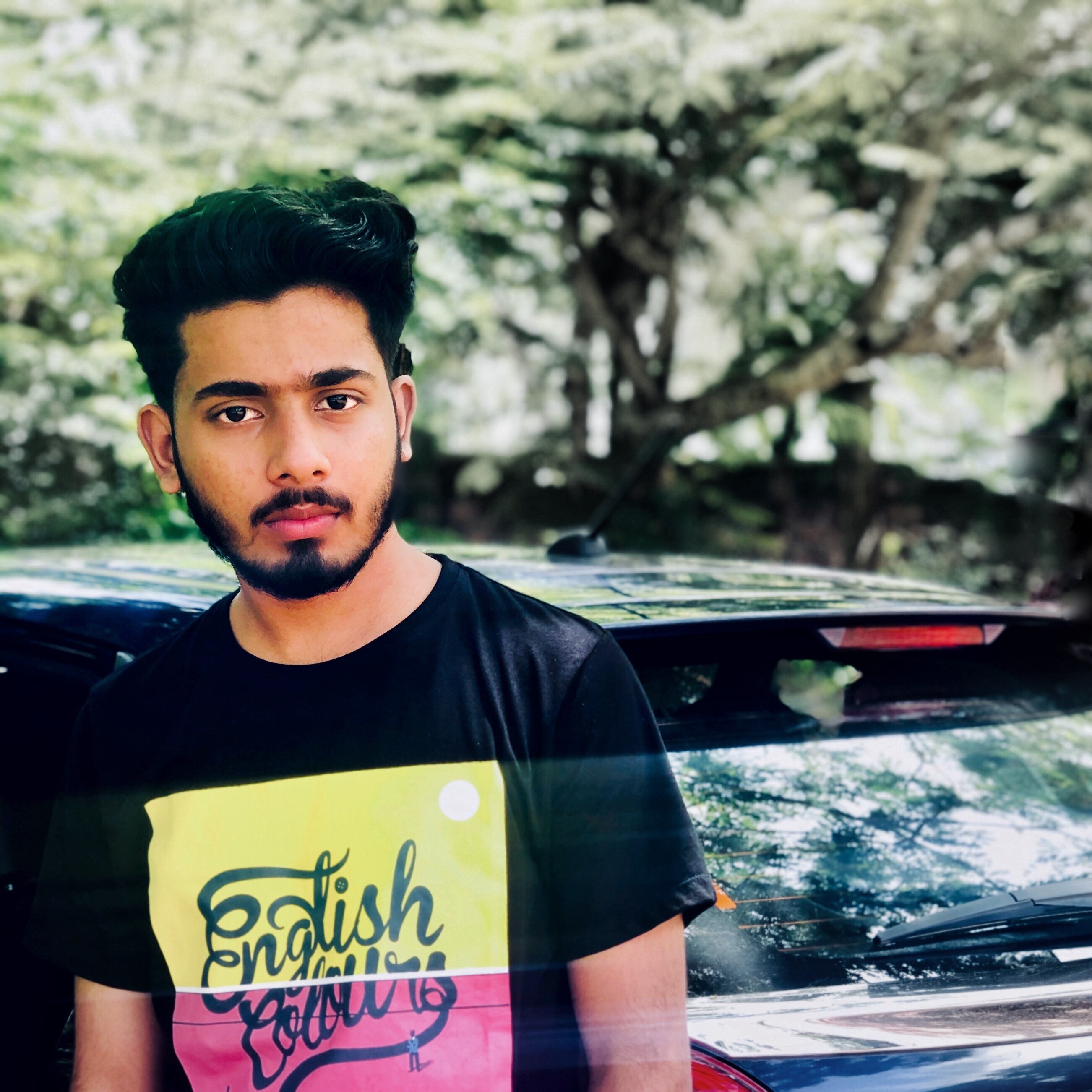
<!doctype html>
<html lang="zxx">

<head>
  <!-- Required meta tags -->
  <meta charset="utf-8">
  <meta name="viewport" content="width=device-width, initial-scale=1, shrink-to-fit=no">
  <title>safwan personal site</title>
  <link rel="icon" href="assets/images/sample.jpg" type="image/gif" size="16x16">
  <!-- Template CSS -->
  <link rel="stylesheet" href="assets/css/style-starter.css">
  <!-- Template CSS -->
  <link href="//fonts.googleapis.com/css?family=Spartan:400,500,600,700,900&display=swap" rel="stylesheet">
  <!-- Template CSS -->

</head>
<body>
<section class="w3l-banner-main w3l-inner-page-main" style="position: fixed; width: 100%; z-index: 2; height: 100px;">
  <div class="breadcrumb-infhny">
    <header id="site-header" class="header-top">
      <nav class="navbar navbar-expand-lg shift " id="header">
        <a class="navbar-brand" href="index.html">
          Safwan<span class="dot-1">.</span>
        </a>
        <button class="navbar-toggler bg-gradient" type="button" data-toggle="collapse"
          data-target="#navbarTogglerDemo02" aria-controls="navbarTogglerDemo02" aria-expanded="false"
          aria-label="Toggle navigation"><span class="navbar-toggler-icon fa fa-bars"> </span>
        </button>

        <div class="collapse navbar-collapse" id="navbarTogglerDemo02">
          <ul class="navbar-nav ml-auto">
            <li class="nav-item">
              <a class="nav-link" href="index.html">Home <span class="sr-only">(current)</span></a>
            </li>
            <li class="nav-item active">
              <a class="nav-link effect-3" href="about.html">About</a>
            </li>
            <li class="nav-item">
              <a class="nav-link effect-3" href="services.html">Services</a>
            </li>
          
            <li class="nav-item">
              <a class="nav-link effect-3" href="contact.html">Contact</a>
            </li>
          </ul>

        </div>
      </nav>
    </header>

  </div>
  <nav id="breadcrumbs" class="breadcrumbs">
    <div class="page-wrapper">
      <a href="#">Home</a> » <span class="breadcrumb_last" aria-current="page">About</span></div>
  </nav>
</section>

<section class="w3l-about-info-6">
	<!-- /content-6-section -->
	  <div class="ab-content-info py-5">
			 <div class="container py-lg-5">
					<div class="inner_sec_top text-left">
							<h3 class="hny-title"><span class="dot-1"></span></h3>
								<img src="assets/images/me.JPG" alt=" " class="img-fluid" >


						<div class="grdis-about-inf">
							<div class="one-left-ab">
									<h3 class="hny-title">About Me<span class="dot-1">.</span></h3>
									<p>Hi, I’m Mohammad Safwan and <b>I am designer &amp; developer</b> who dream making the world better place by creating captivating products. I am also very active for international clients.</p>
									<p>Available for new projects</p>
									<ul class="social-about">
											<li><a href="https://www.instagram.com/_safwan_mohd/"><span class="fa fa-facebook" aria-hidden="true"></span></a>
											</li>
											<li><a href="#linkedin"><span class="fa fa-linkedin" aria-hidden="true"></span></a>
											</li>
											<li><a href="#twitter"><span class="fa fa-twitter" aria-hidden="true"></span></a>
											</li>
											<li><a href="#google"><span class="fa fa-google-plus" aria-hidden="true"></span></a>
											</li>
											<li><a href="https://github.com/"><span class="fa fa-github" aria-hidden="true"></span></a>
											</li>
										</ul>
							</div>
							<div class="one-left-ab biography-para">
									<h3 class="hny-title">Biography<span class="dot-1">.</span></h3>
									<p>03th December 2001</p><p>Born and raised kerala</p><p>malappuram, kerala</p></div>
							</div>
						</div>
					</div>
				 
				 </div>
			 </div>
	 </section>
   <!-- //content-6-section -->

  
<section class="w3l-ab-content-6">
	<div class="work-content">
		<!-- /about-grids-->
		<div class="work-process py-5">
			<div class="container py-lg-5">
				<h3 class="hny-title">My Work Process<span class="dot-1">.</span></h3>
				<!-- /row-->
				<div class="row about-content-grids mt-lg-5 mt-4">
					<div class="col-lg-3 col-md-6 about-gd mt-3">
						<div class="about-gd-inn">
							<span class="fa fa-magic icon-fea1" aria-hidden="true"></span>
							<h5><a href="#URL">Brainstorm</a></h5>
							

						</div>
					</div>
					<div class="col-lg-3 col-md-6 about-gd mt-3">
						<div class="about-gd-inn">
							<span class="fa fa-umbrella icon-fea1" aria-hidden="true"></span>
							<h5><a href="#URL">Design</a></h5>
							

						</div>
					</div>
					<div class="col-lg-3 col-md-6 about-gd mt-3">
						<div class="about-gd-inn">
							<span class="fa fa-pencil-square-o icon-fea1" aria-hidden="true"></span>
							<h5><a href="#URL">Product testing</a></h5>
							

						</div>
					</div>
					<div class="col-lg-3 col-md-6 about-gd mt-3">
						<div class="about-gd-inn">
							<span class="fa fa-laptop icon-fea1" aria-hidden="true"></span>
							<h5><a href="#URL">Fully Responsive</a></h5>
							
						</div>
					</div>

				</div>
				<!-- //row-->
			</div>
		</div>
		<div class="abouthy-img-grids">
			<div class="img-one">
				<img src="assets/images/g5.jpg" alt=" " class="img-fluid">
			</div>
			<div class="img-one content-mid">
				<h3 class="hny-title">
						Motivated by the desire to achieve.
				</h3>
				
			</div>
			<div class="img-one">
				<img src="assets/images/g3.jpg" alt=" " class="img-fluid">
			</div>
		</div>
	</div>
</section>
<!-- //about-grids-->
<!-- /experience-education--->
<section class="w3l-timeline-content-6">
	<div class="timeline-content-6 py-5">
	    <div class="container py-lg-5">
			<h3 class="hny-title">Education<span class="dot-1">.</span></h3>
				<ul class="timeline mt-lg-5 mt-4">
						<!-- Item 1 -->
						<li>
							<div class="direction-r">
								<div class="flag-wrapper">
									<span class="flag">2020 - Present</span>
									<span class="time-wrapper"><span class="time">2019 - present</span></span>
								</div>
								<div class="desc">
										<span class="title">Batchelor
											Degree</span> Bsc Computer Science 2019-present St joseph college Devagiri - Kozhikode .</div>
							</div>
						</li>
				
						<!-- Item 2 -->
						<li>
							<div class="direction-l">
								<div class="flag-wrapper">
									<span class="flag">2017 - 2019</span>
									<span class="time-wrapper"><span class="time">2017 - 2019</span></span>
								</div>
								<div class="desc">
										<span class="title">Associate
											Degree</span> 
											PHSS pallippuram - Palakkad Graduated with 91% marks .</div>
						</li>
				
						<!-- Item 3 -->
						<li>
							<div class="direction-r">
								<div class="flag-wrapper">
									<span class="flag">2015 - 2017</span>
									<span class="time-wrapper"><span class="time">2014 - 2017</span></span>
								</div>
								<div class="desc">
										<span class="title">High school</span> 
										PHSS pallippuram, Palakk . With 9A+ marks</div>
						</li>
				
						<!-- Item 2 -->


					</ul>
		</div>
	</div>
</section>
<!-- //experience-education--->
    <!--/w3l-download-main-->
    <section class="w3l-download-main">
    	<!--/download-->
    	<div class="download-content text-center">
    		<div class="layer-2 py-5">
    			<div class="container py-lg-3">
    				<h3 class="hny-title two">Do you like my work<span class="dot-1">.</span>?</h3>
    				<h6>Let’s work together!</h6>
    				<div class="read-more mt-lg-5 mt-4">
    					<a href="contact.html" class="read-more">
    						<span class="more_icon fa fa-long-arrow-right"></span>
    						<span class="more_text">Get In Touch</span>
    					</a>
    				</div>
    			</div>
    		</div>
    	</div>
    	</div>
    	<!--//download-->
    </section>
    <!--//w3l-download-main-->
<!-- footer -->
<footer class="w3l-footer-16">
    <div class="footer-content py-lg-5 py-4 text-center">
        <div class="container">
            <div class="row copy-right">
                <div class="col-lg-6 footer-left text-lg-left text-center">
                    <h6>© 2020 Freaky.Made with <span class="fa fa-heart" aria-hidden="true"></span><a
                            href="https://w3layouts.com/" target="_blank">
                            W3Layouts</a></h6>
                </div>
               
            </div>
            <button onclick="topFunction()" id="movetop" title="Go to top">
                <span class="fa fa-angle-up"></span>
            </button>
        </div>
    </div>

    <!-- move top -->
    <script>
        // When the user scrolls down 20px from the top of the document, show the button
        window.onscroll = function () {
            scrollFunction()
        };

        function scrollFunction() {
            if (document.body.scrollTop > 20 || document.documentElement.scrollTop > 20) {
                document.getElementById("movetop").style.display = "block";
            } else {
                document.getElementById("movetop").style.display = "none";
            }
        }

        // When the user clicks on the button, scroll to the top of the document
        function topFunction() {
            document.body.scrollTop = 0;
            document.documentElement.scrollTop = 0;
        }
    </script>
    <!-- //move top -->
    <script>
        $(function () {
            $('.navbar-toggler').click(function () {
                $('body').toggleClass('noscroll');
            })
        });
    </script>
</footer>
<!-- //footer -->
</body>

</html>

<script src="assets/js/jquery-3.3.1.min.js"></script>
<!-- disable body scroll which navbar is in active -->
<script>
  $(function () {
    $('.navbar-toggler').click(function () {
      $('body').toggleClass('noscroll');
    })
  });
</script>
<!--/MENU-JS-->
<script>

  $(window).on("scroll", function() {
    var scroll = $(window).scrollTop();

    if (scroll >= 80) {
      $("#site-header").addClass("nav-fixed");
    } else {
      $("#site-header").removeClass("nav-fixed");
    }
  });

  //Main navigation Active Class Add Remove
  $(".navbar-toggler").on("click", function() {
    $("header").toggleClass("active");
  });
  $(document).on("ready", function() {
    if ($(window).width() > 991) {
      $("header").removeClass("active");
    }
    $(window).on("resize", function() {
      if ($(window).width() > 991) {
        $("header").removeClass("active");
      }
    });
  });
</script>
<!--//MENU-JS-->

<!-- disable body scroll which navbar is in active -->
<!-- //jQuery-Photo-filter-lightbox-portfolio-plugin -->
<script src="assets/js/bootstrap.min.js"></script>