<!DOCTYPE html>
<html>

   <head>
   <!--
      New Perspectives on HTML
      Tutorial 2
      Review Assignment


      Filename:         camhome.htm
      Supporting files: camshots.jpg, camstyles.csss, modernizr-1.5.js, rainbow.png
   -->

      <meta charset="UTF-8" />

      <title>CAMshots Home Page</title>
      <script src="modernizr-1.5.js"></script>
      <link href="constyles.css" rel="stylesheet" type="text/css" />
      
   </head>

   <body>

      <header>
         <img src="conlogo.jpg" alt="CAMshots" usemap="#conlogo"/>

         <map name="conlogo">
            <area shape="circle" coords="86,82,80" 
                  href="camhome.htm" alt="home page" />
            <area shape="rect" coords="222,120,310,161" 
                  href="tipweek.htm" alt="tip of the week" />
            <area shape="rect" coords="347,120,510,161" 
                  href="contest.htm" alt="photo contest" />
            <area shape="rect" coords="538,120,719,161" 
                  href="photogloss.htm" alt="photo glossary" />
         </map>

      </header>

      <nav>
         <ul>
            <li><a href="camhome.htm">Home</a></li>
            <li><a href="tipweek.htm" title="View Weekly Tips from CAMshots">Tips</a></li>
            <li><a href="contest.htm" title="Photo Contest">Contest</a></li>
            <li><a href="photogloss.htm">Glossary</a></li>
         </ul>
      </nav>

      <section class="full">

         <h1>Tips of the Week</h1>

         <article>
            <h1>The Rule of Thirds</h1>
            <p>Good composition often results in good photographs, even 
               of the most mundane subjects. There are several rules of 
               thumb with respect to employing good composition. One of 
               the most used is the <em>Rule of Thirds</em>. 
               The Rule of Thirds is based on the observation that 
               compositions in which the topic of interest is placed directly 
               in the center of the frame tend to be static and uninteresting.
            </p>
            <p>A better approach is to imagine a grid drawn over your photograph 
               that divides it into thirds, like a tic-tac-toe grid. Place your 
               point of interest away from the center of the frame and onto one 
               of the intersection points on the grid (see below).
            </p>

            <figure>
               <img src="thirdstip.jpg" alt="photo" />
            </figure>

            <p>
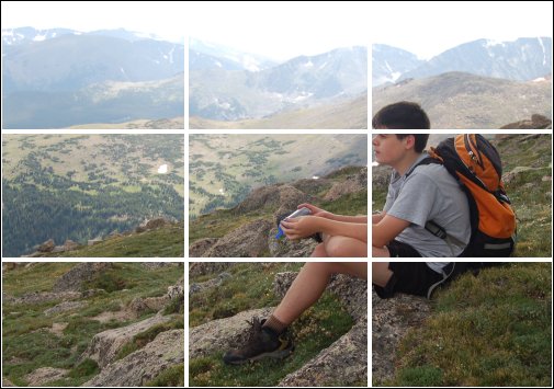
If you place points of interest into the thirds, your photo 
               becomes more balanced and will enable the viewer to interact with 
               it more naturally. Studies have shown that people's eyes are usually 
               drawn to the location of the the intersection points 
               in the grid rather than the center of the frame. The Rule of 
               Thirds works with this natural way of viewing an image rather than 
               against it. Many digital cameras allow the user to display the grid 
               on the preview screen, making it easier to employ the Rule of Thirds 
               directly before the shot is taken.
            </p>
         </article>

      </section>


      <footer>
         <address>
            CAMshots &#8250;&#8250;&#8250; Advice and News from 
            the World of Digital Photography
         </address>
      </footer>

   </body>

</html>