# Customization
## Colors
```kotlin
setBackgroundColor(Color(0xFF785EF0))
setArrowColor(Color.White) // Color.Unspecified inherits the background
setAlpha(0.9f)
```
`setAlpha` applies to the whole balloon in one layer, so overlapping parts do not double blend.
## Border

```kotlin
setBorder(color = Color.White, thickness = 2.dp)
setBalloonStroke(color = Color.White, thickness = 2.dp) // same thing, 1.x name
```
The stroke traces the real silhouette, arrow included, at exactly the thickness you asked for.
Leave `borderColor` at `Color.Unspecified` or `borderThickness` at `0.dp` to disable it.
## Content
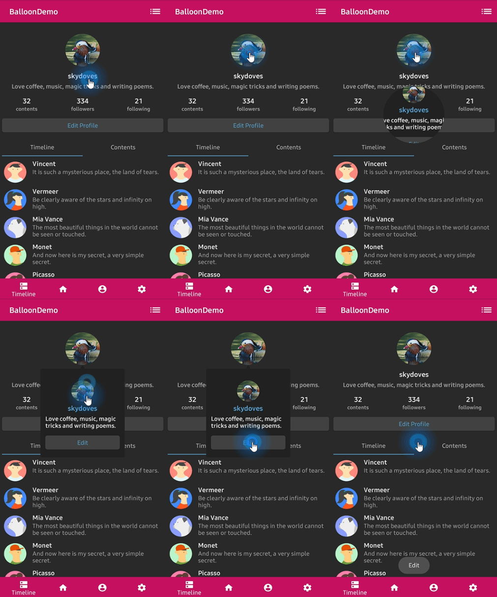
The balloon body is a Compose slot, so there is nothing to configure on the builder. Build it
with the same composables you use everywhere else.
```kotlin
Balloon(
state = balloonState,
balloonContent = {
Column {
Text(
text = "Choose a drink",
color = Color.White,
style = MaterialTheme.typography.titleSmall,
)
Spacer(modifier = Modifier.height(8.dp))
drinks.forEach { drink ->
Row(
modifier = Modifier
.fillMaxWidth()
.clickable { onDrinkSelected(drink) }
.padding(vertical = 6.dp),
verticalAlignment = Alignment.CenterVertically,
) {
Icon(painter = painterResource(drink.icon), contentDescription = null)
Spacer(modifier = Modifier.width(8.dp))
Text(text = drink.name, color = Color.White)
}
}
}
},
) {
Button(onClick = { balloonState.showAlignBottom() }) { Text(text = "Drinks") }
}
```
Interactive content works normally. A tap that a child consumes never reaches the balloon's own
tap handler, so a clickable row inside the body does not accidentally trigger
`setDismissWhenClicked`.
## Reusing a style
`BalloonStyle` is immutable, and `derive` makes a variant that changes only what you name:
```kotlin
val base = rememberBalloonBuilder {
setCornerRadius(8.dp)
setPadding(12.dp)
setBackgroundColor(Color(0xFF785EF0))
}
val warning = base.derive { setBackgroundColor(Color(0xFFFF6F00)) }
val subtle = base.derive {
setAlpha(0.85f)
setArrowSize(8.dp)
}
```
`derive` takes the same builder block as `rememberBalloonBuilder`, starting from an existing
style instead of the defaults. It exists instead of a data class `copy` because a generated
`copy` would name all 43 properties in the published binary interface and make adding a 44th
option a breaking change.
`DefaultBalloonStyle` is the same value the builder produces with no calls, which makes a
convenient starting point.
## Restyling a visible balloon
`rememberBalloonState` re-applies the style on every recomposition, so an animated style updates
a balloon that is already showing without hiding it:
```kotlin
val color by animateColorAsState(if (selected) Color(0xFF785EF0) else Color(0xFF444444))
val balloonState = rememberBalloonState(style.derive { setBackgroundColor(color) })
```
## Behavior
```kotlin
setDismissWhenClicked(true) // tapping the body closes it
setDismissWhenTouchOutside(true) // tapping outside closes it
setDismissWhenBackPressed(true) // back or Escape closes it
setDismissWhenShowAgain(true) // showing a visible balloon closes it instead
setDismissWhenTouchMargin(true) // a tap in the margin band closes it too
setDismissWhenOverlayClicked(true) // tapping the scrim closes it
setAutoDismissDuration(2_000L) // 0L disables
setFocusable(true)
```
Two of these carry side effects, kept from 1.x so ported call sites behave the same:
- `setDismissWhenTouchOutside(false)` also clears focusability, so a balloon that ignores
outside taps does not sit there swallowing them
- `setBalloonAnimation(BalloonAnimation.CIRCULAR)` also clears focusability, so the reveal can
play without the popup stealing input
Call `setFocusable(true)` after either one if you want focus back.
## Accessibility
Balloon content is marked with an unmergeable semantics property, so a screen reader treats it
as its own subtree instead of folding it into a clickable ancestor. Give the content itself
meaningful semantics the way you normally would:
```kotlin
balloonContent = {
Text(
modifier = Modifier.semantics { liveRegion = LiveRegionMode.Polite },
text = "Now you can edit your profile!",
)
}
```