
Vue Select Sides



A component for Vue.js to select double-sided data. The customer can select one or more items and ship them from side to side. Values can be displayed grouped or ungrouped.
**From version v2.0.0 it is only compatible with Vue 3.**
For Vue 2, see version v1.1.6.
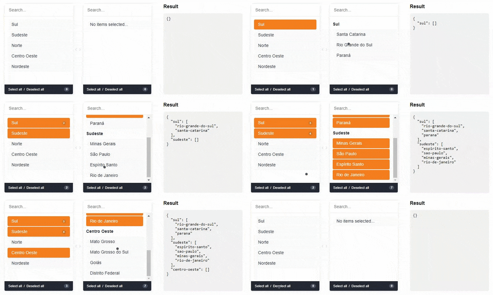
## [Live DEMO](https://soft4ti.github.io/vue-select-sides/index.html?v=20201113113945)
## Installation
First install it using:
```bash
npm install --save vue-select-sides
```
or
```bash
yarn add vue-select-sides
```
## Usage with Vue 3
### Component Registration
**Local component:**
```js
```
Or using Options API:
```js
import vueSelectSides from "vue-select-sides";
export default {
components: {
vueSelectSides,
},
};
```
**Global component:**
```javascript
// main.js
import { createApp } from "vue";
import App from "./App.vue";
import vueSelectSides from "vue-select-sides";
const app = createApp(App);
// Optional: Set global locale
app.use(vueSelectSides, {
locale: "en_US", // Default locale
});
app.component("vue-select-sides", vueSelectSides);
app.mount("#app");
```
**Script tag (UMD):**
```html
```
### Import a Theme
You have three pre-built themes available:
**Using SCSS (recommended):**
```scss
// Soft theme (default - orange accent)
@use "vue-select-sides/styles/themes/soft.scss" as *;
// Dark theme
@use "vue-select-sides/styles/themes/dark.scss" as *;
// Light theme
@use "vue-select-sides/styles/themes/light.scss" as *;
```
**Customizing the Soft theme:**
```scss
// Override default variables
@use "vue-select-sides/styles/themes/soft.scss" with (
$selected-color: #ff0000,
$default-item-background: #f0f0f0,
$border-radius-base: 0.5rem
) as *;
```
**Using CSS (pre-compiled):**
```js
// In your main.js or component
import "vue-select-sides/dist/css/soft.css";
// or
import "vue-select-sides/dist/css/dark.css";
// or
import "vue-select-sides/dist/css/light.css";
```
## Component Types
The component has support for two types: `mirror` and `grouped`.
### Grouped
Warning: `v-model` must be of type `Object`
```js
```
### Mirror
Warning: `v-model` must be of type `Array`
```js
```
## Language/Locales
List of locales available for the plugin:
- `en_US` - [English] - Default
- `pt_BR` - [Portuguese] - Contributed by @juliorosseti
- `es_ES` - [Spanish] - Contributed by @etrepat
- `fr_FR` - [French] - Contributed by @MajuTo
- `tr_TR` - [Turkish] - Contributed by @Abdulsametileri
- `pl_PL` - [Polish] - Contributed by @jzapal
- `cz_CZ` - [Czech] - Contributed by @DuchVladimir
- `sk_SK` - [Slovak] - Contributed by @DuchVladimir
### Set Global Locale
```javascript
// main.js
import { createApp } from "vue";
import vueSelectSides from "vue-select-sides";
const app = createApp(App);
app.use(vueSelectSides, {
locale: "pt_BR",
});
app.component("vue-select-sides", vueSelectSides);
```
## Props
These are all the props you can pass to the component:
| name | type | example | notes |
| ----------------------------- | ------------------- | ----------------------------------------------------------------- | -------------------------------------------------------------------------------------------- |
| v-model | `Array` or `Object` | `["xyz"]` or `{xyz: ["abc", "def"]}` | Use **Object** if type is grouped else uses **Array** |
| type | `String` | `grouped` or `mirror` | |
| list | `Array` | `[{ value: "xyz", label: "Label xyz 01", disabled: true/false }]` | You can add the `children` key to type `grouped` |
| search | `Boolean` | `true` or `false` | To show/hide search input. Default is visible (true) |
| total | `Boolean` | `true` or `false` | To show/hide total selected in footer. Default is visible (true) |
| toggle-all | `Boolean` | `true` or `false` | To show/hide toggle in footer. Default is visible (true) |
| sort-selected-up | `Boolean` | `true` or `false` | Show first the pre-selected. Default does not visible (false). _Available only grouped type_ |
| order-by | `String` | `asc` or `desc` | Show first the pre-selected. Default is natural order |
| ~~lang~~ (deprecated in v1.1) | ~~`String`~~ | ~~`en_US`, `pt_BR`, `es_ES` or `fr_FR`~~ | ~~Language default. Default is en_US~~
Use `Set Global Locale` |
| placeholder-search-left | `String` | "Yay! Search items..." | Placeholder on the left search field. Default is "" |
| placeholder-search-right | `String` | "Or search children items..." | Placeholder on the right search field. Default is "" |
## Available SCSS Variables for Customization
When using `@use` with the soft theme, you can override these variables:
```scss
$font-size-base: 0.9rem;
$border-radius-base: 0.25rem;
$selected-color: #f57f1e;
$white: #fff;
$gray: #e1e1e1;
$dark: #242934;
$default-item-background: #fafafa;
$default-item-color-selected: $white;
$default-item-background-selected: $selected-color;
$default-text-color: $dark;
$default-footer-text-color: $white;
$default-footer-background: $dark;
$badge-background: rgba($dark, 0.15);
```
Example:
```scss
@use "vue-select-sides/styles/themes/soft.scss" with (
$selected-color: #3498db,
$border-radius-base: 8px,
$font-size-base: 1rem
) as *;
```
## Bugs and Feature Requests
If your problem or idea is not addressed yet, please open a new issue.
## Sponsor / Creator
 ## Contribution / Development
### Install Dependencies
```bash
yarn install
```
### Dev Server
```bash
yarn run serve
```
### Build
```bash
yarn run build
```
### Run Tests
```bash
yarn test
```
## Donate
You can help with a donation on Paypal
## License
Vue select sides is open-sourced software licensed under the MIT license.
## Contribution / Development
### Install Dependencies
```bash
yarn install
```
### Dev Server
```bash
yarn run serve
```
### Build
```bash
yarn run build
```
### Run Tests
```bash
yarn test
```
## Donate
You can help with a donation on Paypal
## License
Vue select sides is open-sourced software licensed under the MIT license.