---
title: "Introduction to Data Visualization"
author: "ENS-215"
date: "30-Jan-2019"
output:
html_document:
theme: spacelab
df_print: paged
toc: TRUE
toc_float: TRUE
---
## Intro to data visualization
As you've already learned in today's lecture one of the best tools you have to interpreting/understanding your data are your own eyes! A visual representation of your data can reveal patterns and interesting features that would have been difficult or impossible to identify by looking at a data table.
Plots are not only the most effective way for you to understand your data, they are also the most effective way for you to convey your message to an audience.
For a more in-depth look into the motivations and goals of data visualization, refer back to [today's lecture slides](https://stahlm.github.io/ENS_215/Lectures/2019_01_28_slides.html).
Before jumping into the `ggplot2` package, let's become familiar with some of the most common types of graphics that you will make and encounter in you work.
**IMPORTANT NOTE:** Don't get hung up on how "pretty" (or not pretty) the graphics look in today's lecture. We are just going over the basics and later this week we will cover how to make attractive, presentation-quality graphics.
## Common types of plots
**Scatter plots** useful for displaying the relationship between two variables (e.g. height vs. weight). If one variable is the independent (controlling variable) it is generally plotted along the x-axis, while the dependant variable is on the y-axis. For example if you were looking out how precipitation affects streamflow you would plot precipitation on the x-axis and streamflow on the y-axis. A third variable can be displayed by scaling or color coding the plotted symbols.
**Line graph** are useful for displaying the relationship between two variables, where each x-value corresponds to a single y-value. Line graphs are typically used to display time-series data (e.g. streamflow vs. time, temperature vs. time) where there is a single measurement at each time-point.
**Column and bar charts** useful for displaying number of items or values in different classes/groups, where the height of the bar represents the value. For instance, you could display the water usage by US state using a bar chart, where each state would have its own bar and the height of the bar would be proportional to the amount of water used in that state.
**Histograms** are similar to a bar chart, but they are used to display the frequency distribution of the data. For example you could display temperature data for a location using a histogram to understand how the data is distributed.
**Rose diagrams** similar to a histogram but used for displaying data that has a directional component (e.g. wind).
**Pie charts** useful for displaying proportions of a whole. For instance you might display the land cover (e.g. forested, developed, grasslands,...) of a given region using a pie chart. Stacked bar charts can also be used to display this type of information and they are generally easier to read and more compact than pie charts.
**Ternary diagrams** Used to show proportions when the three components sum to 100%. Commonly used to display grain size information.
**Box plots** also called box and whisker plots, they are useful at displaying the statistical distribution of catagorical data.
**Contour and surface plots** are used to display three variables. Typically the x and y variable is the spatial position and the color (or contoured) variable is some value that varies in space (e.g. concentration).
**Maps** are excellent at displaying spatial data. There are tons of different styles and types of maps and this is a whole subject on its own. We will cover some basic mapping techniques in R later in the term.
## `ggplot2` package
The `ggplot2` package designed around the idea that a graphic can be decomposed into its fundamental parts and thus we can build them much like a sentence, by combining these parts according to _grammatical rules_.
**IMPORTANT CLARIFICATION:** the package is called `ggplot2` however when you create a figure you use the `ggplot()` (note that there is no `2` in the function call). Also note that the `ggplot2` library is loaded in when you load in `tidyverse`. If you want to load in `ggplot2` by itself, you can simply type `library(ggplot2)`.
Recall that when construction a graphin in `ggplot2` the three essential components of a graphic are:
1. `data`: dataset containing the mapped variables
2. `geom`: geometric object that the data is mapped to (_e.g._ point, lines, bars, ...)
3. `aes`: aesthetic attributes of the geometric object. The aesthetics control how the data variables are mapped to the geometric objects (e.g. x/y position, size, shape, color, ...)
The basic template for creating a graphic in `ggplot2` is
```{r eval = FALSE}
ggplot(data = DATASET) + GEOM_FUNCTION(mapping = aes(MAPPINGS) )
```
- Where:
- **DATASET** is the name of the data object where your data is stored
- **GEOM_FUNCTION** is the `geom` function you want to use (_e.g._ `geom_point()`)
- **MAPPINGS** are the specifications for how you want to map your data to the `geom` (_e.g._ `x = gdpPercap, y = lifeExp, color = continent`)
You can also set the `aes`thetic to be **global** (_i.e._ will apply to all of the `geoms` associated with that `ggplot` call) by defining the `aes` right in the `ggplot` call. For instance
```{r eval = FALSE}
ggplot(data = DATASET, mapping = aes(MAPPINGS)) + GEOM_FUNCTION()
```
## `ggplot2` geometries
Let's first become familiar with some of the most common `geom`etries that you will encounter in the `ggplot2` package.
Some of these `geoms` you are already familiar with, and others you will likely be seeing for the first time. The goal in today's lecture is to learn about the `geom`s that are available and to become aware how they look/what they do. In upcoming lectures we are going to delve more deeply into the different types of data that exist and the data visualization methods that are most effective with these data types.
let's first load in the packages we need for today's work. We will load in `tidyverse` (which includes `ggplot2`) and `gapminder` so that we have a nice dataset to work with.
```{r message = FALSE, warning=FALSE}
library(tidyverse)
library(gapminder)
my_gap <- gapminder # assign the gapminder data to our own data object called my_gap
```
#### INSTRUCTIONS: As you work throught the `geom` sections below, you should try creating you own graphic for the `geom`s. You can copy/paste/tweak the provided code to create your own versions.
### Scatter plots with `geom_point()`
`geom_point` creates a scatter plot. Scatter plots require x and y data. Other aesthetics can be specified but are not necessary.
We'll create a scatter plot of life expectancy vs. per capita GDP
```{r}
ggplot(data = my_gap, mapping = aes(x = gdpPercap, y = lifeExp)) + geom_point()
```
I want you to notice a few things in the above code. First you'll see that we typed `data = my_gap`. You can actually omit the `data = `, since the `ggplot()` function is smart it assumes that the first input is the dataset.
Similarly, you can omit the `mapping = ` since the `aes()` always defines a mapping, and thus specifying `mapping = ` is not required.
Also note that we defined the `aes`thetic within the `ggplot()` function call as oppossed to within the `geom_point()` call. Either works fine here. However, the code above makes the `aes()` global and thus it will apply to all of the `geom`s that follow the `ggplot()` call. This is very useful when you plot multiple `geom`s on the same graphic (you'll do this soon).
In the above code we only specified two aesthetic mappings (_i.e._ the x and y positions). We can specify additional mappings if we want. This will allow us to represent additional dimensions (variables) of the data on the same graphic. Since we have already specified the x and y positions (spatial mapping) we have to rely on other features, such as color, symbol size, or symbol shape to convey additional dimensions (variables). Note that the concept of adding additional mappings applies to `geom`s in general and not just the `geom_point()`
Let's represent the **continent** through the symbol colors.
```{r}
ggplot(data = my_gap, mapping = aes(x = gdpPercap, y = lifeExp, color = continent)) + geom_point()
```
Notice how the `color = continent` is inside of the `aes()` function. This is because we are **mapping** data from the **continent** variable to the color of whatever `geom` is to be used (which in this case is `geom_point`).
If we wanted to specify a single color for the points -- i.e. not based on any of the data variables -- then we would make that specification OUTSIDE of the `aes()` function. This is because, in that case we are NOT mapping data to the color, but instead are simply specifying a single fixed color. For example
```{r}
ggplot(data = my_gap, mapping = aes(x = gdpPercap, y = lifeExp)) + geom_point(color = "blue")
```
Make sure you understand the difference between the two graphics above and how/why their code differs.
### Line graphs with `geom_line()`
Line graphs are useful for displaying the relationship between two variables, where the points are connected by a line. This plots work with data that has a logical ordering according and progression according to the x variable. They are frequently used to represent time-series data.
Let's create a line plot of per capita GDP vs. time using just the data for China
```{r}
china_data <- filter(my_gap, country == "China") # filter rows with data for China
ggplot(china_data, aes(x = year, y = gdpPercap)) + geom_line()
```
We could have avoided creating the new data object `china_data` by simply piping our filtered data directly to the `ggplot()` function call. This is often a good idea, since it allows us to avoid creating tons of additional data objects (which can create a more cluttered environment and increase the possibility of mistakenly using the wrong data object later).
```{r}
filter(my_gap, country == "China") %>% ggplot(aes(x = year, y = gdpPercap)) + geom_line()
```
### Box-plots with `geom_boxplot()`
We can summarize the distribution of the values of a variable using a box-plot.
Let's use a box-plot to examine the distribution of life expectancy data within Europe
```{r}
euro_data <- filter(my_gap, continent == "Europe") # get data just for Europe
ggplot(euro_data, aes(x = continent, y = lifeExp)) + geom_boxplot()
```
We can (and often do) plot multiple box-plots on the same graphic. This allows us to compare distributions of a variable across categories. Let's see how the distributions of life expectancy vary between continents
```{r}
ggplot(my_gap, aes(x = continent, y = lifeExp)) + geom_boxplot()
```
### Violin plots `geom_violin()`
Another nice way to display a variable's distribution is with a violin plot. Let's look at the distribution of life expectancies by continent
```{r}
ggplot(my_gap,aes(x = continent, y = lifeExp)) + geom_violin()
```
Interesting side-note, while the plots do look like violins, contrary to popular belief this is not how they get the name violin plot. They are in-fact named after their creator, Johann deViolin an Austrian statistician from the 19^th^ century ([before moving on you should absolutely read more about him here](https://stahlm.github.io/ENS_215/Lectures/Johann_deViolin.html))
### Histograms with `geom_histogram()`
Histograms are another type of graphic that is useful for visualizing the distribution of a single variable.
Let's examine the distribution of life expectancies in the gapminder data
```{r}
ggplot(my_gap, aes(x = lifeExp)) + geom_histogram()
```
There are a number of additional features of histograms that we will learn later in the term when we discuss _univariate data_ in greater depth.
### Bar plots with `geom_bar()`
Bar plots are great for displaying summaries of the counts within a categorical variable. For instance the number of countries in each continent. Let's see how many countries are recorded for each continent the `gapminder` data for year 2007.
We'll first filter the data to include just data for year 2007. Then we'll make the bar plot
```{r}
data_2007 <- filter(my_gap, year == 2007) # get data for year 2007
ggplot(data_2007, aes(continent)) + geom_bar()
```
### Jitter points with `geom_jitter()`
In some situations, a scatter plot can suffer from what is called **over plotting**. This is where many of the data points are hidden, because they are buried under another data point. This commonly occurs when one of the variables plotted, only takes on a discrete set of values (e.g. `year` or `continent` in the gapminder data). Let's illustrate this issue by creating a scatter plot of life expectancy vs years.
```{r}
ggplot(my_gap, aes(x = year, y = lifeExp)) + geom_point()
```
You can clearly see the issue with the above graphic. Namely, `year` takes on discrete values, and as a result the points are clustered in a vertical line with many points over plotting. It is not possible to tell how many points there are at a given life expectancy for a given year (e.g. in 1952 is there 1 country or 20 countries with a life expectancy of 40 yrs?).
To solve this problem we can `jitter` our points. Jittering the points adds a little random shift to the data so that the points do not all sit on top of one another. See the example below.
```{r}
ggplot(my_gap, aes(x = year, y = lifeExp)) + geom_jitter()
```
By jittering the points, we can see all of the points much better and we don't lose information as we did when the points were over plotting.
### Combining geometries
Geometries can be layered. To layer geometries, you simply include additional `geom` functions with your `ggplot()` call. For instance you may want to add points to a line plot. Let's re-visit our earlier line plot of GDP per capita vs. time for China
```{r}
ggplot(china_data, aes(x = year, y = gdpPercap)) + geom_line()
```
Now let's add points representing the same data on top of the line
```{r}
ggplot(china_data, aes(x = year, y = gdpPercap)) + geom_line() + geom_point()
```
We simply added `geom_point()` to our code and the points were added. As you can see, we did not need to specify the `aes`thetic mappings for our `geom_point()` function call. This is because we set our `aes` in the `ggplot()` function and thus it is a global aesthetic. Therefore any additional `geom`s that we add to this `ggplot()` function call will inherit the same `aes`thetic.
If we needed to change the aesthetic for one of the `geom`s then we could specify the desired `aes` within that `geom`s function and the global aesthetic would be overridden for just that `geom`.
**PLEASE LET ME KNOW WHEN YOU GET TO THIS SECTION, BEFORE YOU PROCEED ONWARDS**
## Additional aesthetics
We've already seen how position (e.g. `x` and `y` location) and `color` are used as aesthetics. Now we'll introduce a few more.
- `size` controls the size of the geometry
- `shape` controls the shape of the geometry
- `fill` controls the fill color of a shape (only applies to some shape options).
- `alpha` controls the transparency of the geometry
We can map a variable to these aesthetic properties, in which case we define it within the `aes()` function. We can also set a single value for these aesthetics, in which case it is defined within the `geom()` function but OUTSIDE of the `aes()`.
Let's see some examples.
### `size`
Let's create a scatter plot of life expectancy and GDP per capita (just for year 2007) and map the population to the size of the points.
```{r}
ggplot(data_2007, aes(x = gdpPercap, y = lifeExp, size = pop)) + geom_point()
```
If you want to set a single uniform size you do this outside of the `aes` function and within the `geom()` function that you want the size to apply to.
```{r}
ggplot(data_2007, aes(x = gdpPercap, y = lifeExp)) + geom_point(size = 2.5)
```
### `alpha`
We can map a variable to the `alpha` aesthetic. Let's differentiate the data points by continent using the alpha aesthetic.
```{r}
ggplot(data_2007, aes(x = gdpPercap, y = lifeExp, alpha = continent)) + geom_point()
```
You can see that each continent has a different level of transparency. I would probably use another aesthetic to represent the continents (e.g. color) but this nonetheless highlights how to use this feature.
A more common applicaton of aesthetic is to help with over plotting. In this case we will not map a variable to `alpha` but instead set a single value outside of the `aes()` function. Since in this case it is not a mapping we need to specify the `alpha` within the `geom` we want it to apply to.
```{r}
ggplot(my_gap, aes(x = gdpPercap, y = lifeExp)) + geom_point(alpha = 0.2)
```
By making the points semi-transparent we can see points that plot on top of one another. Thus, areas that appear darker have more points and lighter areas less point. This helps us to identify areas where the data is clustered.
### `shape`
We can map a variable to the `shape` aesthetic. Let's map the continent variable to the shape aesthetic.
```{r}
ggplot(my_gap, aes(x = gdpPercap, y = lifeExp, shape = continent)) + geom_point()
```
Or we can specify a single shape to apply across all points.
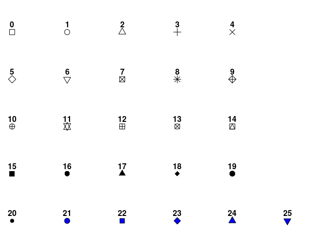
The available shapes are shown below. We can use the number corresponding to specify the point.
```{r}
ggplot(my_gap, aes(x = gdpPercap, y = lifeExp)) + geom_point(shape = 24)
```
### `fill`
The `fill` aesthetic specifies the fill color of a symbol. Fill only applies to symbols that allow you to specify the `color` and `fill` independently. For these symbols `fill` determines the fill color and `color` determines the color of the symbol border.
We can map a variable to the `fill` aesthetic. However, only shapes 15-25 allow you to specify the fill. We'll use shape 21.
Let's map the continent to the `fill` aesthetic.
```{r}
ggplot(my_gap, aes(x = gdpPercap, y = lifeExp, fill = continent)) + geom_point(shape = 24)
```
We can also adjust the `color` aesthetic together with the fill. Let's recreate our figure above, but set the symbol borders to all be gray by using the `color` aesthetic.
```{r}
ggplot(my_gap, aes(x = gdpPercap, y = lifeExp, fill = continent)) + geom_point(shape = 24, color = "gray")
```
We could have also mapped population to the `fill` aesthetic. In this case the fill is represented by a continuous color gradient, since unlike continent the population variable does not take discrete values
```{r}
ggplot(my_gap, aes(x = gdpPercap, y = lifeExp, fill = pop)) + geom_point(shape = 24)
```
This works, but the example doesn't look so great. The issue is that many of the countries are at the low end of the population scale, which is heavily skewed by a few very large countries (e.g. China, India)
We could assign the fill according to the population ranking (relative to the other countries) as this will be uniform (non-skewed) range.
```{r}
ggplot(my_gap, aes(x = gdpPercap, y = lifeExp, fill = percent_rank(pop))) + geom_point(shape = 24)
```
Looks a bit better. We will learn how to improve this even more in upcoming lectures.
## Exercises
1. Create a graphic with the following features
i) a jittered plot of life expectancy vs. time (i.e. time on the x-axis)
ii) color the points according to the continent
iii) scale the point size by the population
```{r echo =FALSE, eval=FALSE}
my_gap %>%
ggplot(aes(x = year, y = lifeExp, color = continent, size = pop)) + geom_jitter()
```
Note: You will need to use your `dplyr` tools in addition to `ggplot`
2. Create graphic with the following features
i) a box plot showing the life expectancy distribution by continent, just for year 2007 data
ii) The box plot should have a fill color = "lightblue"
iii) On top of the box plot, plot the jittered points
iv) The jittered points should be 50% transparent
```{r echo=FALSE, eval=FALSE}
filter(my_gap, year == 2007) %>%
ggplot(aes(x = continent, y = lifeExp)) +
geom_boxplot(fill = "lightblue") +
geom_jitter(alpha = 0.5)
```
3. Create a single graphic with the following
i) Plot of life expectancy vs. time for the top two and bottom two countries (as determined by their life expectancies in 2007)
ii) Color the points by country
Rely on `dplyr` and try to do this in the most elegant way possible (Can you do it in just three lines of code??).
```{r echo = FALSE, eval=FALSE}
top_2 <- my_gap %>% filter(year == 2007) %>% top_n(2, lifeExp) %>% select(country)
bottom_2 <- my_gap %>% filter(year == 2007) %>% top_n(-2, lifeExp) %>% select(country)
my_gap %>%
filter(country %in% top_2$country | country %in% bottom_2$country) %>%
ggplot(aes(x = year, y = lifeExp, color = country)) + geom_point() + geom_line()
```
4. Recreate, with modifications, any of the graphics we made in today's class. For instance you may want to modify the shape or size aesthetic, adjust the alpha, or layer on additional `geom`s. [You can also explore additional `geom`s that you might want to try out by visiting this site](http://r-statistics.co/Top50-Ggplot2-Visualizations-MasterList-R-Code.html)