---
title: "Descriptive statistics and univariate data"
author: "ENS-215"
date: "19-Feb-2025"
output:
html_document:
df_print: paged
theme: journal
toc: TRUE
toc_float: TRUE
---
At this point in the term, you've
+ Established a foundation in programming and basic computer science concepts
+ Learned key concepts and tools in data wrangling/manipulation
+ Learned key concepts and tools in data visualization
+ Manipulated, analyzed, visualized, and interpret many large datasets (often containing > 10,000 rows and tens of columns!)
+ Learned some key concepts and tools in data acquisition
+ Learned some key concepts and tools in map making
Today and in upcoming lectures you will learn some foundational concepts and technical aspects related to the interpretation and statistical components of exploratory data analysis. These tools and concepts will allow you extract greater information and understanding from your data and to make more rigorous and defensible statements related to your analysis.
We will begin this stage of the class with a refresher/introduction to basic statistics and deeper dive into univariate data.
## Univariate data
**Univariate data** is data that consists of observations of a single _quantitative_ variable. For instance when we examine a a set of temperature data we are dealing with univariate data (i.e. the single characteristic in this case is temperature). Often we will break univariate data into categories (e.g. temperatures before year 1950 and temperatures after 1950) to see how the statistics and distributions of these groups differ.
When we compare two _quantitative_ variables (e.g. temperature and precipitation) together we are dealing with **bivariate data**, which we will dive into in a greater detail in upcoming lectures. However, for today we will just focus on **univariate data**.
Before we move on, let's load in a univariate dataset that we can work with in today's lecture. We'll load in the NOAA monthly precipitation dataset that we've worked with prior
```{r message=FALSE, warning=FALSE}
library(tidyverse)
```
```{r warning=FALSE, message=FALSE}
precip_data <- read_csv("https://stahlm.github.io/ENS_215/Data/NOAA_State_Precip_LabData.csv")
```
Take a quick look at the data to re-familiarize yourself with it.
Now let's create a new dataset that just has the precipitation data for NY.
```{r}
ny_precip <- filter(precip_data, state_cd == "NY")
```
### Basic statistics refresher
#### Kinds of data
##### Nominal (categorical)
Nominal variables are categorical data that have no inherent ordering/ranking. For example:
+ Country (US, Canada, China,...)
+ Rock type (limestone, shale, basalt,...)
+ Land use (agricultural, residential, forested,...)
+ Species
##### Ordinal
Ordinal data is similar to categorical except that there is an inherent ordering/ranking to the data. For example:
+ Concentration categories (e.g. very low, low, medium, high, very high)
+ Storm intensity categories (e.g. Category 1, Category 2, Category 3,...)
##### Continuous and discrete
Measurements can be described as either continuous or discrete.
**Continuous** variables have values that can take all possible intermediate values. For example temperature, concentration, flow are all continuous variables.
**Discrete** variables can only take a certain set of values. For example number of individuals is reported as integers and can only take integer values (e.g. number of individuals could be 500 people or 501 people but not 500.02524 people).
#### Population vs. sample
A **population** (in statistics) refers to a the whole group of objects or values that exist. Typically is it not possible to measure all possible objects, and thus a **sample**, which is a subset of the population is measured.
For instance, imagine you are a fisheries biologist and you would like to know the average mass of salmon in a river. It is not feasible to capture and weigh every salmon (_i.e._ the population), so instead you collect measurements on a subset of the population (_i.e._ a sample) and make inferences based on this sample.
In the vast majority of cases where you deal with data, you will be dealing with samples and not populations. In later lectures we will discuss how we can mathematically evaluate our degree of confidence for an estimate derived from a sample.
#### Measures of location
##### Mean
The mean is simply the sum of the all of the values in a sample divided by the sample size (number of values). The mean of a population is typically denoted by the Greek letter $\mu$ (pronounced "mu") and the sample mean is denoted by $\bar x$ (pronounced "x bar").
> $\mu = \frac{\sum_{i=1}^n x_i}{n}$
As you are already well aware and have done hundreds of times by now, the mean is computed in R using the `mean()` function.
+ What is the monthly mean precipitation in New York? Before taking the means you should first add a new column to `ny_precip` whose values are "Pre-1950" if the year is before 1950 and "Post-1950" if the year is 1950 or later. Then compute the following means.
+ For all years
+ For years before 1950
+ For years $\ge$ 1950
```{r}
# Your code here
```
```{r eval=TRUE, echo=FALSE}
ny_precip <- ny_precip %>%
mutate(time_period = if_else(Year >= 1950,"Post-1950","Pre-1950"))
```
```{r eval=FALSE, echo=FALSE}
ny_precip %>% group_by(time_period) %>%
summarize(avg_precip = mean(Precip_inches))
mean(ny_precip$Precip_inches)
```
+ Are the means between the two periods different?
##### Quantiles
Quantiles are an important way of describing a dataset. The $f$ quantile, $q(f)$, of a set of data is the **value** in a dataset such that a fraction $f$ of the data are less than or equal to that value (_Cleveland, 1994_)[^1]. For example, the 0.25 quantile (also referred to as the 25^th^ percentile) is the value in a given dataset where 25% of the data are less than that value.
To compute a quantile $q(f)$ for a given dataset, you first need to compute the percentile ranking of each value in a dataset. Once the data have been ordered from smallest to largest, the percentile $f_i$ for the i^th^ value, $x_i$ is computed as follows:
> $f_i = \frac{i-0.5}{n}$
$q(f)$ is then the value of $x$ that has corresponds to $f$.
It is worth noting that there are other methods (_algorithms_) for computing quantiles, they are all generally similar though may differ in some of the finer detail (e.g. how tied values are treated,...)
You are all likely familiar with quantiles as you have dealt with **medians** before. The **median** of a dataset is the 0.50 quantile (50^th^ percentile). The median, like the mean, is a measure of location. However, the **median** is not skewed by outlier values like the **mean**.
You can use the `quantile()` function from the `stats` package to compute the value at specified quantiles for a given dataset. In the example below, we compute the 5^th^, 25^th^, 50^th^, 75^th^, and 95^th^ percentiles for monthly rainfall in NY.
```{r}
quantile(ny_precip$Precip_inches, probs = c(0.05, 0.25, 0.50, 0.75, 0.95))
```
**Exercise**
+ Add a column called `frac` to the `ny_precip` data frame, which has the fraction $f$ (i.e. the percentile ranking) for each precipitation value in the dataset. **Note**: you can compute it relatively easily using the equation shown above or you can rely on a function in `dplyr` that will do it for you.
You table should look similar the one below
```{r echo=FALSE, eval=TRUE}
ny_precip %>%
mutate(frac = round(cume_dist(Precip_inches), 3))
#arrange(Precip_inches) %>%
#mutate(quant = (seq(1,nrow(ny_precip)) - 0.5)/nrow(ny_precip))
```
#### Measures of spread
The spread (or variability) of a variable is an important property to consider when analyzing a dataset. Among other things, the spread of a dataset gives us an idea of the range of possible values a variable can take as well as how confident we can be when making statements regarding the data when we have only a limited sample.
##### Variance and standard deviation
The variance is the average of the of squared deviations from the mean for all of the observations. The population variance is denoted by $\sigma^2$ and the sample variance is denoted by $s^2$.
> $\sigma^2 = \frac{1}{n}\sum_{i=1}^n (x_i-\mu)^2$
The **standard deviation**, $\sigma$ (population) and $s$ (sample), is simply the square root of the the variance. The **standard deviation** has the same units as the measurements.
So essentially, the variance and standard deviation are telling us on average how much the sample values deviate from the sample mean. A sample with a variance of zero, implies that all of the measured values are equal to the mean (i.e. there is no sample variation). As the variance grows it indicates that there is greater deviation from the mean (i.e. the samples are not tightly clustered about the mean).
In the graphic below I've created two samples (A and B) that have the exact same mean (mean = 5.0), though the variances differ. The variance of Group A = 0.01, and the variance of Group B = 0.56.
```{r echo=FALSE, fig.width= 2.75, fig.height= 2, dpi = 700}
var_example <- tibble(A = rnorm(200, 5, 0.10), B = rnorm(200, 5, 0.75)) %>%
gather(`A`,`B`, key = "Group", value = "Measurement")
var_example %>% ggplot(aes(x = Group, y = Measurement, fill = Group)) +
geom_jitter(height = 0, width = 0.2, shape = 21, size = 1.5, color = "grey") +
scale_fill_manual(values = c("red2","blue3")) +
theme_classic() +
theme(axis.text = element_text(size = 8), axis.title = element_text(size = 10))
```
You can easily compute the variance using the `var()` function and the standard deviation using the `sd()` function.
**Exercise**
+ Compute the variance and standard deviation of the NY precipitation data:
+ For all years
+ For years before 1950
+ For years $\ge$ 1950
Has the variance (and standard deviation) changed over time? Conceptually what does this mean.
```{r echo=FALSE, eval=FALSE}
ny_precip %>%
group_by(time_period) %>%
summarise(var_precip = var(Precip_inches),
sd_precip = sd(Precip_inches))
```
##### Range and interquartile range
The **range** is the difference between the largest and smallest value in a dataset. One thing to note is that the range tends to increase as your sample size increases (due to the fact that you are more likely to eventually sample extreme values as you sample size grows).
The **interquartile range** (also denoted **IQR**) is the difference between the 25^th^ percentile and 75^th^ percentile values in a datset. The **IQR** is useful in that it tells us the range in which we can expect to find the middle 50% of the sample.
You can compute the interquartile range either by using the `quartile()` function and taking the difference between the 75^th^ and 25^th^ percentile or by using the `IQR()` function
```{r}
quantile(ny_precip$Precip_inches, probs = 0.75) - quantile(ny_precip$Precip_inches, probs = 0.25) # using quantile
IQR(ny_precip$Precip_inches) # using IQR function
```
##### Coefficient of variation
The coefficient of variation is a measure of spread and is defined as the ratio of the standard deviation to the mean.
> $CV =\frac{\sigma}{\mu}$
The CV is widely used in chemistry and engineering (to characterize the precision/repeatability of a process or measurement).
The CV is particularly useful when comparing how meaningful the degree of variation (i.e., $\sigma$) is as compared against the central value (i.e., $\mu$) of a given dataset. For instance consider a two different manufacturing process, where process A is making a part that should be 100 m in length and process B is making a part that should be 0.01 m in length. As in any manufacturing process there is not perfect precision and thus there is some variation of the length of the parts made within each process. Below are some statistics regarding the manufacture of 5000 parts from both Process A and B.
Process A has a mean of 100.00 m and a standard deviation of 0.100 m.
Process B has a mean of 0.010 m and a standard deviation of 0.001 m.
As you can see the standard deviation is much lower in process B as compared to A. However, this does not tell the whole story. Let's take a look at the coefficient of variation for the two processes.
Process A has a $CV = \frac{0.100\, m}{100.00\, m} = 0.001$
Process B has a $CV = \frac{0.001\, m}{0.010\, m} = 0.1$
Thus, we can see that since the mean is also much smaller in process B, the standard deviation of B is a much greater proportion of the mean part length. The CV helps to highlight that Process B has much greater variation in the part sizes relative to the average part size. Thus, the manufacturer would see that the Process B parts are not particularly well manufactured since the variation amounts to 10% of the mean size.
**Important note:** The CV should only be calculated for data that is measured on measurement scales that have a meaningful zero value (i.e., ratio scale). For instance, you would not want to compute CVs on temperature data that is measured in C or F, since their zero values do not actually represent a true physical minimum value. Thus the computed CV would be dependent on the scale (units) used. The example, I presented above makes sense since length does indeed have a true physical minimum of zero and thus our CV is independent of the units used (i.e., we could have used units of feet and we would get the same answer for the CV).
#### Shape
The shape of distribution helps us in part describe how symmetric (or asymmetric) the data distribution is as well as which portions of the distribution have the greatest density.
##### Modes
The **modes**, which are the most common values, are frequently used to describe a distribution. The graphic below shows the distribution of a **unimodal** sample - one that has a single peak in its distribution.
```{r echo=FALSE}
shape_symm <- tibble(x= rnorm(5*10^5, mean = 0, sd = 1))
shape_symm %>% ggplot(aes(x)) +
geom_density(fill = "gray") +
theme_classic() +
labs(title = "Unimodal distribution",
x = "",
y = ""
)
```
The distribution below has two peaks and thus is described as **bimodal**
```{r echo=FALSE}
shape_symm <- tibble(x= c(rnorm(5*10^5, mean = -2, sd = 0.75), rnorm(5*10^5, mean = 2, sd = 0.75)) )
shape_symm %>% ggplot(aes(x)) +
geom_density(fill = "gray") +
theme_classic() +
labs(title = "Bimodal distribution",
x = "",
y = ""
)
```
##### Skewness
The **skewness** of a distribution describes its symmetry (or asymmetry). The graphic below shows a **symmetric** distribution.
```{r echo=FALSE, message=FALSE}
shape_symm <- tibble(x= rnorm(5*10^5, mean = 0, sd = 1))
shape_symm %>% ggplot(aes(x)) +
geom_density(fill = "gray") +
theme_classic() +
labs(title = "Symmetric distribution",
x = "",
y = ""
)
```
**Asymmetric** distributions are described as skewed.
A **right-skewed** distribution has a long-tail to the right. These distributions are positively skewed, as they have extreme positive values that occur with low probability.
```{r echo=FALSE}
shape_right <- tibble(x = rgamma(5*10^5, shape = 2, rate = 10))
shape_right %>% ggplot(aes(x)) +
geom_density(fill = "gray") +
theme_classic() +
labs(title = "Right-skewed",
x = "",
y = ""
)
```
A **left-skewed** distribution has a long-tail to the left. These distributions are negatively skewed, as they have extreme negative values that occur with low probability.
```{r echo=FALSE}
shape_left <- tibble(x = rgamma(5*10^5, shape = 2, rate = 10))
shape_left %>% ggplot(aes(-x)) +
geom_density(fill = "gray") +
theme_classic() +
labs(title = "Left-skewed",
x = "",
y = ""
)
```
### Visualizing and interpreting univariate distributions
You've already been visualizing and also interpreting univariate distributions, however previously you were more focused on the programming and generating visuals as opposed to rigorously describing the data. Now that you have a basic framework and language to begin characterizing data distributions, we will further expand your understanding by going into the technical details and approches to interpreting data distributions.
#### Box plots
Box plots provide a nice visual summary of a sample's distribution. The box plot does not show all of the data points, but rather displays some key summary statistics that describe the distribution of the data.
The graphic below shows an example box plot, with the features of the graphic nicely annotated.
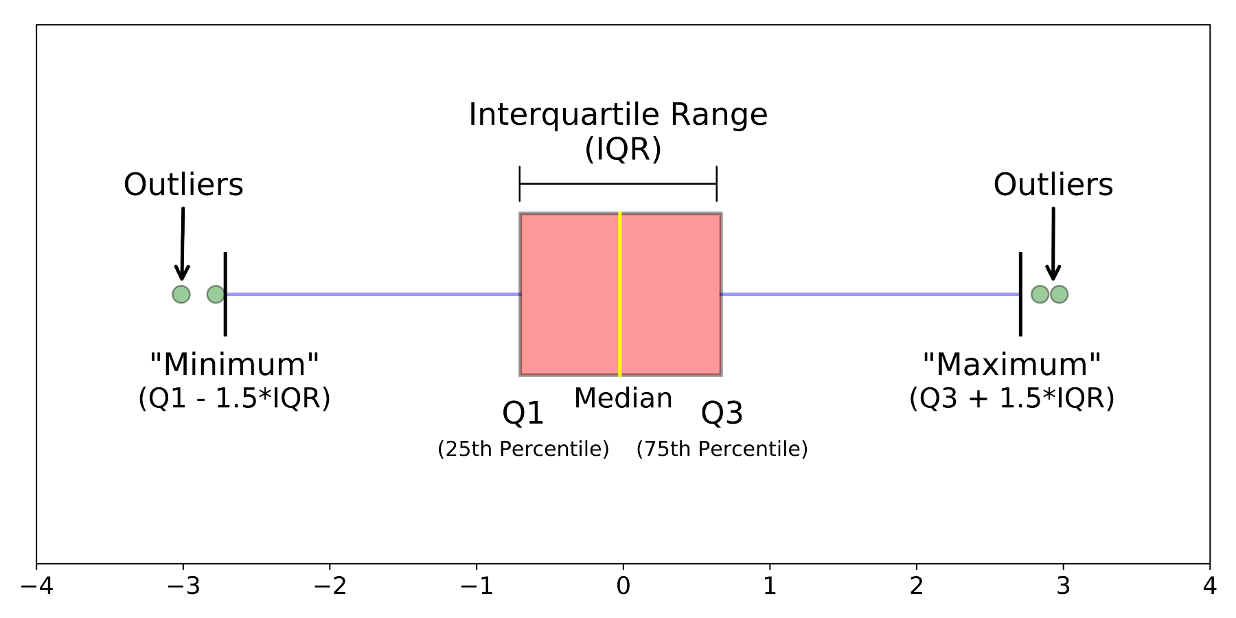{width=550}
The `geom_boxplot()` function from the `ggplot2` package generates a box plot with the features shown above.
```{r fig.width = 2.5*1.25, fig.height = 3.5*1.25}
ny_precip %>%
ggplot(aes(x = state_cd, y = Precip_inches)) +
geom_boxplot(fill = "grey") +
labs(y = "Precip (inches)",
x = ""
) +
theme_classic()
```
the box plot is helpful in that it succinctly displays the summary statistics related to the distribution of a given variable. However, it does not display the data points themselves (_except for the outliers_), while this is often desired when summarizing data, we sometimes would like to see all of the data in addition to the box plot. To do this we can simply add a `geom_jitter()` layer on top of our box plot.
```{r fig.width = 2.5*1.25, fig.height = 3.5*1.25}
ny_precip %>%
ggplot(aes(x = state_cd, y = Precip_inches)) +
geom_boxplot(fill = "grey") +
geom_jitter(alpha = 0.1, width = 0.15, height = 0) +
labs(y = "Precip (inches)",
x = ""
) +
theme_classic()
```
+ Based on the graphic above:
+ Does the distribution of precipitation in NY appear symmetric or skewed?
+ Does the distribution appear unimodal or multimodal?
+ What is range of monthly precipitation values within which the middle 50% of samples fall?
+ What is the maximum monthly precipitation ever recorded in NY?
Note, that we specified `height = 0` in the `geom_jitter()` function to prevent jittering in the y-direction (since this would jitter the y-values which is the variable of interest).
Box plots (and other graphics showing a variables distribution) are particularly useful when comparing univariate distributions between groups (e.g. precipitation pre-1950 and post-1950).
In past labs have used box plots to visualize distributions, however we hadn't gone into the the technical details of comparing distributions. Let's look at the pre-1950 and post-1950 precipitation in NY and examine how the distributions compare with one another.
```{r fig.width = 3*1.25, fig.height = 3.5*1.25}
ny_precip %>%
ggplot(aes(x = time_period, y = Precip_inches)) +
geom_boxplot(fill = "grey", notch = TRUE) +
labs(y = "Precip (inches)",
x = ""
) +
theme_classic()
```
Notice how we specified `notch = TRUE` in the `geom_boxplot()` function. The notches around the median values display _confidence intervals_ around the median. Since we can't know the "true" median based on any given sample, these confidence intervals essentially tell us the range of plausible values that the "true" median is likely to fall within.
If the notches overlap between two groups then we do not have statistical confidence that the medians are truly different between the groups (_i.e._ difference may simply be due to chance based on limited sample sizes). If the notches do not overlap then we can have statistical confidence that the medians differ.
We will cover confidence intervals in later lectures, though I am introducing them now so that are aware of the concept and can start to employ the concept in your project/lab work if you want.
**Exercise**
1. Create a box plot comparing the precipitation distribution between months (just using the NY data)
i) Try adding additional features that help you interpret the data (e.g. jittered points, notches,...)
ii) Think about the features of the monthly distributions. How do the distributions vary between months (with respect to medians, IQR, skewness,...)
```{r echo=FALSE, eval=FALSE}
ny_precip %>%
ggplot(aes(x = factor(Month), y = Precip_inches)) +
geom_boxplot(fill = "lightblue", notch = TRUE) +
geom_jitter(alpha = 0.25, height = 0, width = 0.2) +
theme_classic()
```
2. Like we did with NY, use a box plot to compare the pre and post-1950 precipitation for another state of your choosing. Examine the distributions and discuss how they compare and how they differ between time periods.
3. Choose a subset of 4 states from the full precipitation dataset `precip_data`. Using this subset of states generate a box plot that compares the precipitation between the states. Think about how the precipitation distribution varies across the states and discuss these features with your classmates.
4. Practice with the statistics functions. Using the full precipitation dataset `precip_data` you should
i) Generate a summary table that has the 25^th^, 50^th^, and 75^th^ percentile monthly precipitation values and the standard deviation for each state.
ii) Generate a dot plot showing these values
Your graphic will look similar to the one below
```{r echo=FALSE, fig.height= 6.75, fig.width= 4.75}
precip_data %>%
group_by(state_cd) %>%
summarize(p_25 = quantile(Precip_inches, probs = 0.25),
p_50 = median(Precip_inches),
p_75 = quantile(Precip_inches, probs = 0.75)) %>%
ggplot() +
geom_point(aes(y = reorder(state_cd, p_50), x = p_50 ), size = 2) +
geom_point(aes(y = state_cd, x = p_25), shape = 21, fill = "red", size = 2) +
geom_point(aes(y = state_cd, x = p_75), shape = 21, fill = "blue", size = 2) +
theme_classic() +
xlim(0,7) +
labs(title = "Monthly Precipition Quartiles",
subtitle = "US States",
y = "",
x = "Monthly precipitation (inches)",
caption = "25th (red), 50th (black), 75th (blue)")
```
[^1]: _Visualizing Data_ (William S. Cleveland, 1993)