---
title: "Statistical Learning"
subtitle: "Biostat 203B"
author: "Dr. Hua Zhou @ UCLA"
date: "`r format(Sys.time(), '%d %B, %Y')`"
format:
html:
theme: cosmo
number-sections: true
toc: true
toc-depth: 4
toc-location: left
code-fold: false
engine: knitr
knitr:
opts_chunk:
fig.align: 'center'
# fig.width: 6
# fig.height: 4
message: FALSE
cache: false
---
In the next few lectures, we focus on the modeling step. We take the narrow sense of statistical/machine learning for the model step.
# Overview of statistical/machine learning
In this class, we use the phrases **statistical learning**, **machine learning**, or simply **learning** interchangeably.
## Supervised vs unsupervised learning
- **Supervised learning**: input(s) -> output.
- Prediction: the output is continuous (income, weight, bmi, ...).
- Classification: the output is categorical (disease or not, pattern recognition, ...).
- **Unsupervised learning**: no output. We learn relationships and structure in the data.
- Clustering.
- Dimension reduction.
## Supervised learning
- **Predictors**
$$
X = \begin{pmatrix} X_1 \\ \vdots \\ X_p \end{pmatrix}.
$$
Also called **inputs**, **covariates**, **regressors**, **features**, **independent variables**.
- **Outcome** $Y$ (also called **output**, **response variable**, **dependent variable**, **target**).
- In the **regression problem**, $Y$ is quantitative (price, weight, bmi).
- In the **classification problem**, $Y$ is categorical. That is $Y$ takes values in a finite, unordered set (survived/died, customer buy product or not, digit 0-9, object in image, cancer class of tissue sample).
- We have training data $(\mathbf{x}_1, y_1), \ldots, (\mathbf{x}_n, y_n)$. These are observations (also called samples, instances, cases). Training data is often represented by a predictor matrix
$$
\mathbf{X} = \begin{pmatrix}
x_{11} & \cdots & x_{1p} \\
\vdots & \ddots & \vdots \\
x_{n1} & \cdots & x_{np}
\end{pmatrix} = \begin{pmatrix} \mathbf{x}_1^T \\ \vdots \\ \mathbf{x}_n^T \end{pmatrix}
$$ {#eq-predictor-matrix}
and a response vector
$$
\mathbf{y} = \begin{pmatrix} y_1 \\ \vdots \\ y_n \end{pmatrix}
$$
- Based on the training data, our goal is to
- Accurately predict unseen outcome of test cases based on their predictors.
- Understand which predictors affect the outcome, and how.
- Assess the quality of our predictions and inferences.
### Example: salary
- The `Wage` data set collects the wage and other data for a group of 3000 male workers in the Mid-Atlantic region in 2003-2009.
- Our goal is to establish the relationship between salary and demographic variables in population survey data.
- Since wage is a quantitative variable, it is a regression problem.
::: {.panel-tabset}
#### R
```{r}
#| message: false
library(gtsummary)
library(ISLR2)
library(tidyverse)
# Convert to tibble
Wage <- as_tibble(Wage) %>% print(width = Inf)
# Summary statistics
Wage %>% tbl_summary()
# Plot wage ~ age
Wage %>%
ggplot(mapping = aes(x = age, y = wage)) +
geom_point() +
geom_smooth() +
labs(title = "Wage changes nonlinearly with age",
x = "Age",
y = "Wage (k$)")
# Plot wage ~ year
Wage %>%
ggplot(mapping = aes(x = year, y = wage)) +
geom_point() +
geom_smooth(method = "lm") +
labs(title = "Average wage increases by $10k in 2003-2009",
x = "Year",
y = "Wage (k$)")
# Plot wage ~ education
Wage %>%
ggplot(mapping = aes(x = education, y = wage)) +
geom_point() +
geom_boxplot() +
labs(title = "Wage increases with education level",
x = "Year",
y = "Wage (k$)")
```
#### Python
Summary statistics:
```{python}
# Load the pandas library
import pandas as pd
# Load numpy for array manipulation
import numpy as np
# Load seaborn plotting library
import seaborn as sns
import matplotlib.pyplot as plt
# Set font size in plots
sns.set(font_scale = 2)
# Display all columns
pd.set_option('display.max_columns', None)
# Import Wage data
Wage = pd.read_csv(
"../data/Wage.csv",
dtype = {
'maritl':'category',
'race':'category',
'education':'category',
'region':'category',
'jobclass':'category',
'health':'category',
'health_ins':'category'
}
)
Wage
Wage.info()
```
```{python}
#| eval: false
# summary statistics
Wage.describe(include = "all")
```
```{python}
#| label: fig-wage-age
#| fig-cap: "Wage changes nonlinearly with age."
# Plot wage ~ age
sns.lmplot(
data = Wage,
x = "age",
y = "wage",
lowess = True,
scatter_kws = {'alpha' : 0.1},
height = 8
).set(
xlabel = 'Age',
ylabel = 'Wage (k$)'
)
```
```{python}
#| label: fig-wage-year
#| fig-cap: "Average wage increases by $10k in 2003-2009."
# Plot wage ~ year
sns.lmplot(
data = Wage,
x = "year",
y = "wage",
scatter_kws = {'alpha' : 0.1},
height = 8
).set(
xlabel = 'Year',
ylabel = 'Wage (k$)'
)
```
```{python}
#| label: fig-wage-edu
#| fig-cap: "Wage increases with education level."
# Plot wage ~ education
ax = sns.boxplot(
data = Wage,
x = "education",
y = "wage"
)
ax.set(
xlabel = 'Education',
ylabel = 'Wage (k$)'
)
ax.set_xticklabels(ax.get_xticklabels(), rotation = 15)
```
```{python}
#| label: fig-wage-race
#| fig-cap: "Any income inequality?"
# Plot wage ~ race
ax = sns.boxplot(
data = Wage,
x = "race",
y = "wage"
)
ax.set(
xlabel = 'Race',
ylabel = 'Wage (k$)'
)
ax.set_xticklabels(ax.get_xticklabels(), rotation = 15)
```
#### Julia
```{julia}
#| eval: false
using AlgebraOfGraphics, CairoMakie, CSV, DataFrames
ENV["DATAFRAMES_COLUMNS"] = 1000
CairoMakie.activate!(type = "png")
# Import Wage data
Wage = DataFrame(CSV.File("../data/Wage.csv"))
# Summary statistics
describe(Wage)
# Plot Wage ~ age
data(Wage) * mapping(:age, :wage) * (smooth() + visual(Scatter)) |> draw
```
:::
### Example: stock market
```{r}
#| code-fold: true
library(quantmod)
SP500 <- getSymbols(
"^GSPC",
src = "yahoo",
auto.assign = FALSE,
from = "2022-01-01",
to = "2022-12-31")
chartSeries(SP500, theme = chartTheme("white"),
type = "line", log.scale = FALSE, TA = NULL)
```
- The `Smarket` data set contains daily percentage returns for the S&P 500 stock index between 2001 and 2005.
- Our goal is to predict whether the index will _increase_ or _decrease_ on a given day, using the past 5 days' percentage changes in the index.
- Since the outcome is binary (_increase_ or _decrease_), it is a classification problem.
- From the boxplots in @fig-sp500-lag, it seems that the previous 5 days percentage returns do not discriminate whether today's return is positive or negative.
::: {.panel-tabset}
#### R
```{r}
# Data information
help(Smarket)
# Convert to tibble
Smarket <- as_tibble(Smarket) %>% print(width = Inf)
# Summary statistics
summary(Smarket)
# Plot Direction ~ Lag1, Direction ~ Lag2, ...
Smarket %>%
pivot_longer(cols = Lag1:Lag5, names_to = "Lag", values_to = "Perc") %>%
ggplot() +
geom_boxplot(mapping = aes(x = Direction, y = Perc)) +
labs(
x = "Today's Direction",
y = "Percentage change in S&P",
title = "Up and down of S&P doesn't depend on previous day(s)'s percentage of change."
) +
facet_wrap(~ Lag)
```
#### Python
```{python}
# Import S&P500 data
Smarket = pd.read_csv("../data/Smarket.csv")
Smarket
Smarket.info()
```
```{python}
#| eval: false
# summary statistics
Smarket.describe(include = "all")
```
```{python}
#| label: fig-sp500-lag
#| fig-cap: "LagX is the percentage return for the previous X days."
# Pivot to long format for facet plotting
Smarket_long = pd.melt(
Smarket,
id_vars = ['Year', 'Volume', 'Today', 'Direction'],
value_vars = ['Lag1', 'Lag2', 'Lag3', 'Lag4', 'Lag5'],
var_name = 'Lag',
value_name = 'Perc'
)
Smarket_long
g = sns.FacetGrid(Smarket_long, col = "Lag", col_wrap = 3, height = 10)
g.map_dataframe(sns.boxplot, x = "Direction", y = "Perc")
plt.clf()
```
#### Julia
:::
### Example: handwritten digit recognition
::: {#fig-handwritten-digits}
{width=600px height=300px}
{width=600px height=250px}
Examples of handwritten digits from the MNIST corpus (ISL Figure 10.3).
:::
- Input: 784 pixel values from $28 \times 28$ grayscale images. Output: 0, 1, ..., 9, 10 class-classification.
- On the [MNIST](https://en.wikipedia.org/wiki/MNIST_database) data set (60,000 training images, 10,000 testing images), accuracies of following methods were reported:
| Method | Error rate |
|--------|----------|
| tangent distance with 1-nearest neighbor classifier | 1.1% |
| degree-9 polynomial SVM | 0.8% |
| LeNet-5 | 0.8% |
| boosted LeNet-4 | 0.7% |
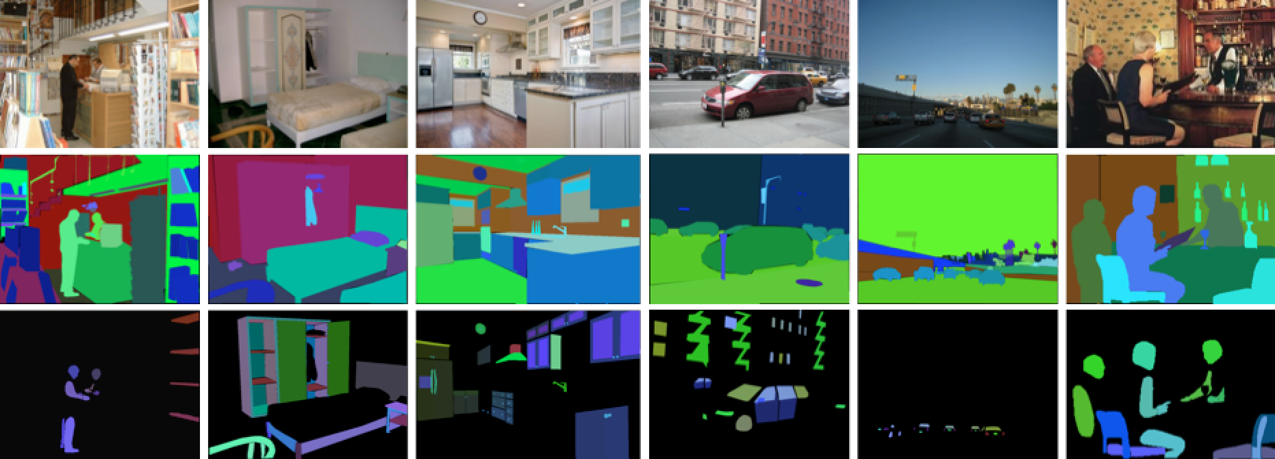
### Example: more computer vision tasks
Some popular data sets from computer vision.
- [Fashion MNIST](https://github.com/zalandoresearch/fashion-mnist#fashion-mnist): 10-category classification.
{width=500px}
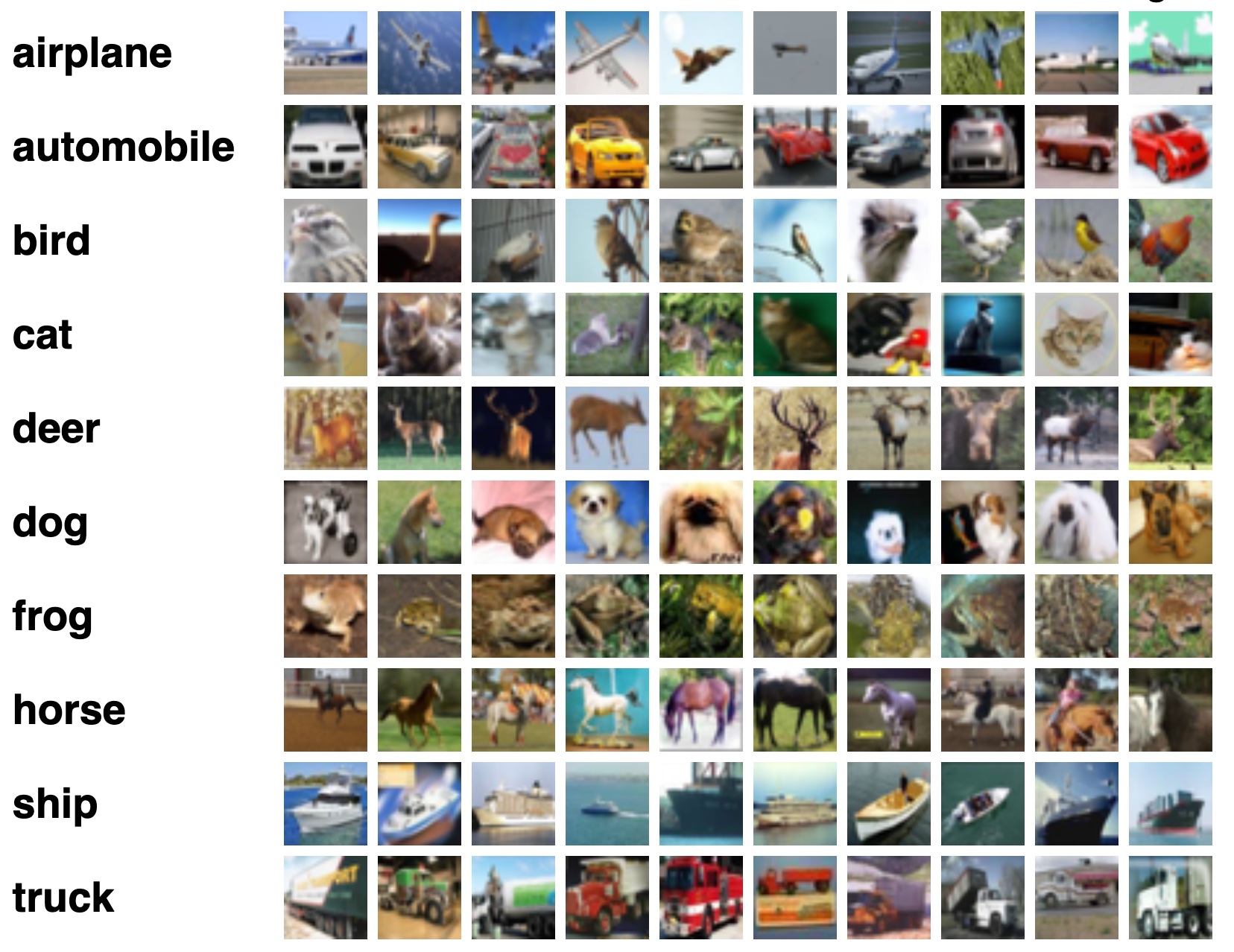
- [CIFAR-10 and CIFAR-100](https://www.cs.toronto.edu/~kriz/cifar.html)
{width=500px}
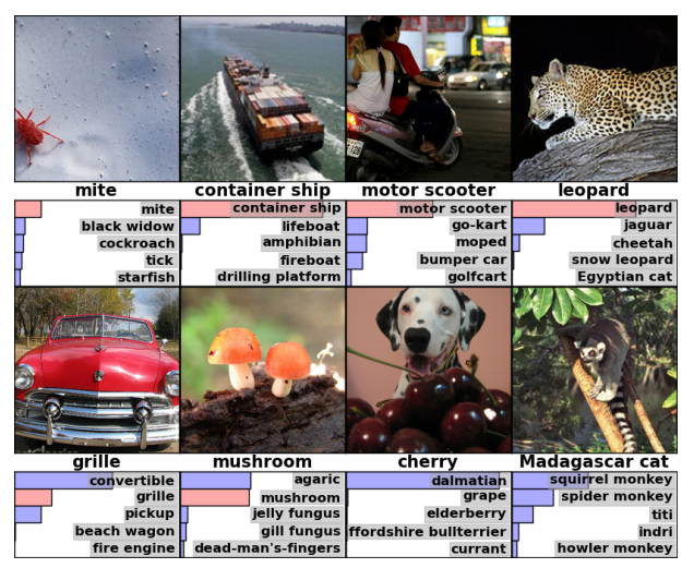
- [ImageNet](https://www.image-net.org/)
{width=500px}
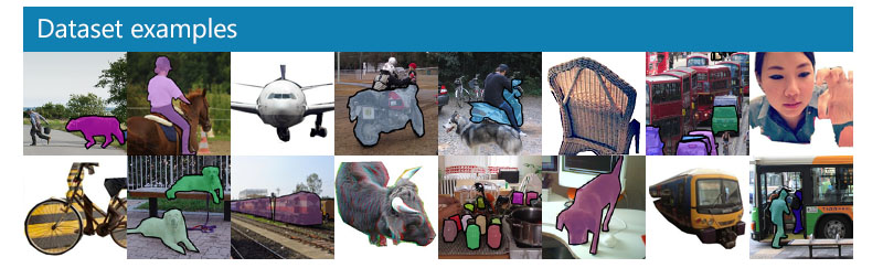
- [Microsoft COCO](https://cocodataset.org/#home) (object detection, segmentation, and captioning)
{width=500px}
- [ADE20K](http://groups.csail.mit.edu/vision/datasets/ADE20K/) (scene parsing)
{width=500px}
## Unsupervised learning
- No outcome variable, just predictors.
- Objective is more fuzzy: find groups that behave similarly, find features that behave similarly, find linear combinations of features with the most variations, generative models (transformers).
- Difficult to know how well you are doing.
- Can be useful in exploratory data analysis (EDA) or as a pre-processing step for supervised learning.
### Example: gene expression
- The `NCI60` data set consists of 6,830 gene expression measurements for each of 64 cancer cell lines.
::: {.panel-tabset}
#### R
```{r}
# NCI60 data and cancel labels
str(NCI60)
# Cancer type of each cell line
table(NCI60$labs)
# Apply PCA using prcomp function
# Need to scale / Normalize as
# PCA depends on distance measure
prcomp(NCI60$data, scale = TRUE, center = TRUE, retx = T)$x %>%
as_tibble() %>%
add_column(cancer_type = NCI60$labs) %>%
# Plot PC2 vs PC1
ggplot() +
geom_point(mapping = aes(x = PC1, y = PC2, color = cancer_type)) +
labs(title = "Gene expression profiles cluster according to cancer types")
```
#### Python
```{python}
# Import NCI60 data
nci60_data = pd.read_csv('../data/NCI60_data.csv')
nci60_labs = pd.read_csv('../data/NCI60_labs.csv')
nci60_data.info()
```
```{python}
from sklearn.decomposition import PCA
from sklearn.preprocessing import scale
# Obtain the first 2 principal components
nci60_tr = scale(nci60_data, with_mean = True, with_std = True)
nci60_pc = pd.DataFrame(
PCA(n_components = 2).fit(nci60_tr).transform(nci60_tr),
columns = ['PC1', 'PC2']
)
nci60_pc['PC2'] *= -1 # for easier comparison with R
nci60_pc['cancer_type'] = nci60_labs
nci60_pc
```
```{python}
# Plot PC2 vs PC1
sns.relplot(
kind = 'scatter',
data = nci60_pc,
x = 'PC1',
y = 'PC2',
hue = 'cancer_type',
height = 10
)
```
#### Julia
:::
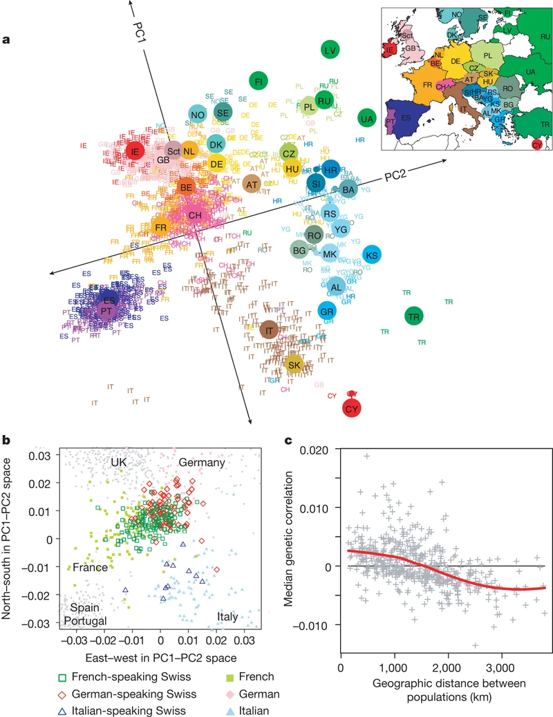
### Example: mapping people from their genomes
- The genetic makeup of $n$ individuals can be represented by a matrix @eq-predictor-matrix, where $x_{ij} \in \{0, 1, 2\}$ is the $j$-th genetic marker of the $i$-th individual.
Is that possible to visualize the geographic relationship of these individuals?
- Following picture is from the article [_Genes mirror geography within Europe_](http://www.nature.com/nature/journal/v456/n7218/full/nature07331.html) by Novembre et al (2008) published in Nature.
### Ancestry estimation
::: {#fig-open-admixture}
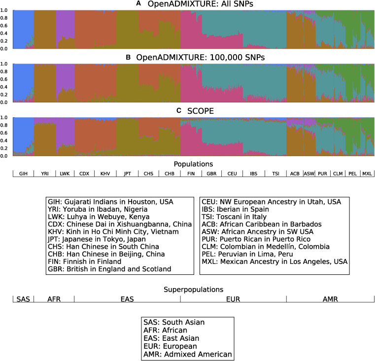{width=750px height=750px}
Unsupervised discovery of ancestry-informative markers and genetic admixture proportions. [Paper](https://doi.org/10.1016/j.ajhg.2022.12.008).
:::
## No easy answer
In modern applications, the line between supervised and unsupervised learning is blurred.
### Example: the Netflix prize
::: {#fig-netflix fig-ncols=1}
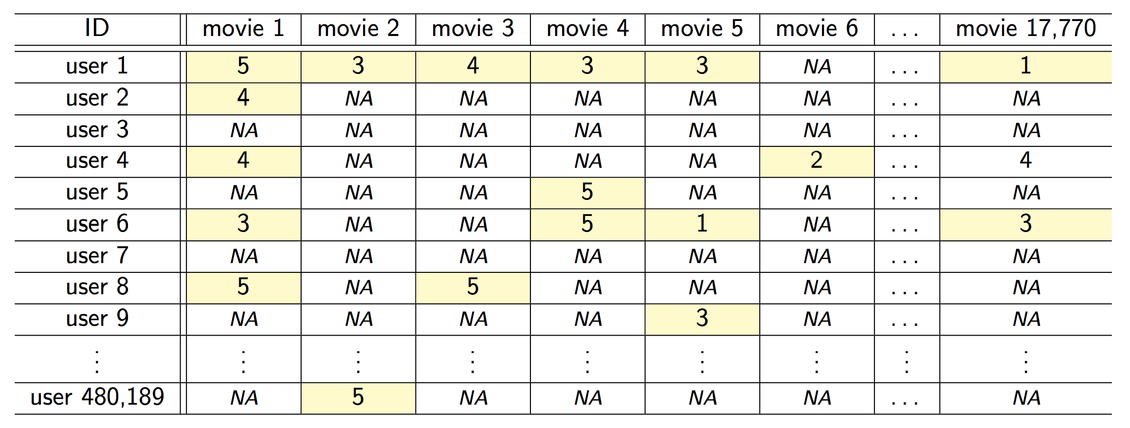{fig-align="center"}
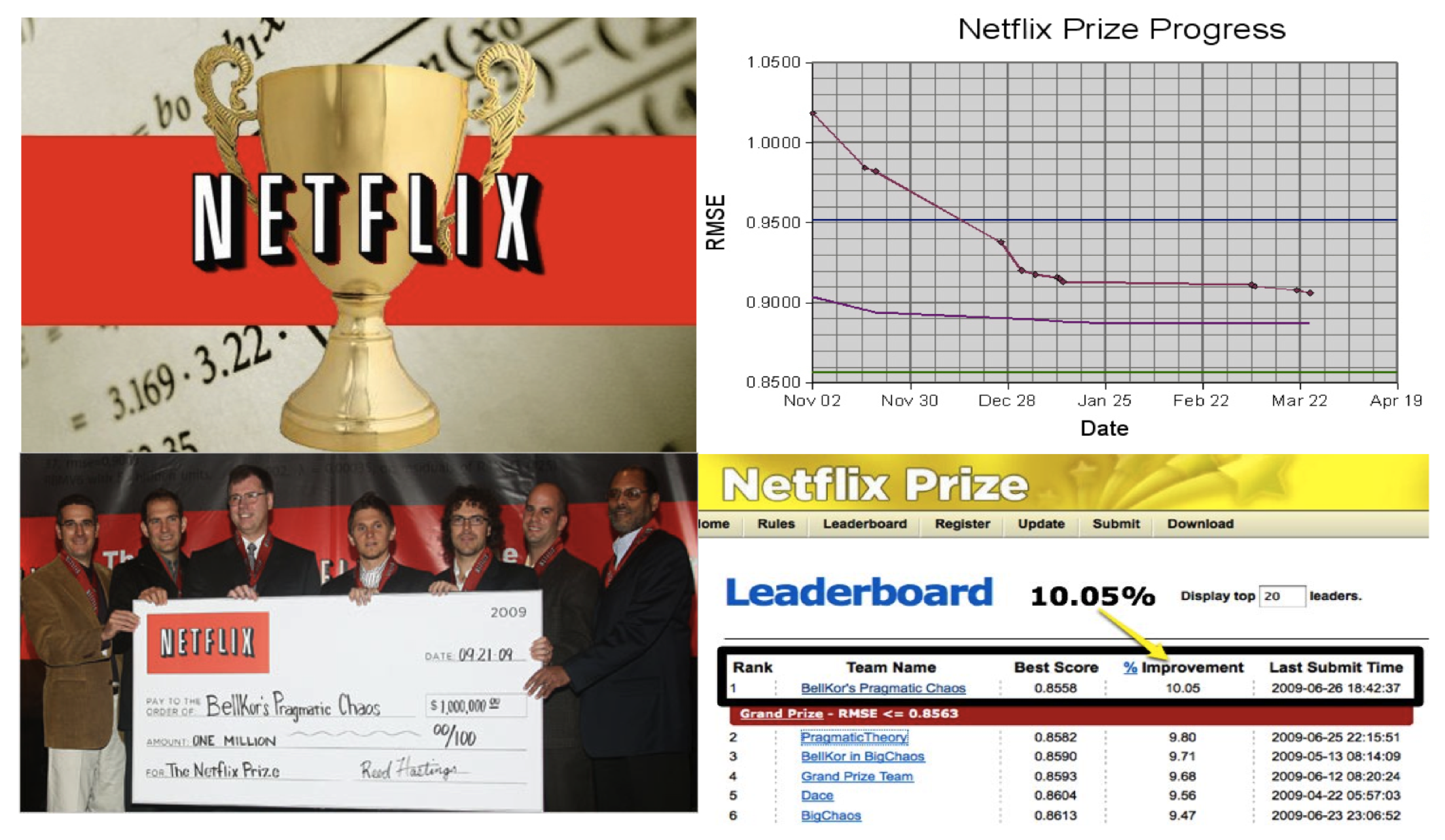{fig-align="center"}
The Netflix challenge.
:::
- Competition started in Oct 2006. Training data is ratings for 480,189 Netflix customers $\times$ 17,770 movies, each rating between 1 and 5.
- Training data is very sparse, about 98\% sparse.
- The objective is to predict the rating for a set of 1 million customer-movie pairs that are missing in the training data.
- Netflix's in-house algorithm achieved a root MSE of 0.953. The first team to achieve a 10\% improvement wins one million dollars.
- Is this a supervised or unsupervised problem?
- We can treat `rating` as outcome and user-movie combinations as predictors. Then it is a supervised learning problem.
- Or we can treat it as a matrix factorization or low rank approximation problem. Then it is more of a unsupervised learning problem, similar to PCA.
### Example: large language models (LLMs)
Modern large language models, such as [ChatGPT3](https://chat.openai.com), combine both supervised learning and reinforcement learning.
## Statistical learning vs machine learning
- Machine learning arose as a subfield of Artificial Intelligence.
- Statistical learning arose as a subfield of Statistics.
- There is much overlap. Both fields focus on supervised and unsupervised problems.
- Machine learning has a greater emphasis on large scale applications and prediction accuracy.
- Statistical learning emphasizes models and their interpretability, and precision and uncertainty.
- But the distinction has become more and more blurred, and there is a great deal of "cross-fertilization".
- Machine learning has the upper hand in Marketing!
## A Brief History of Statistical Learning
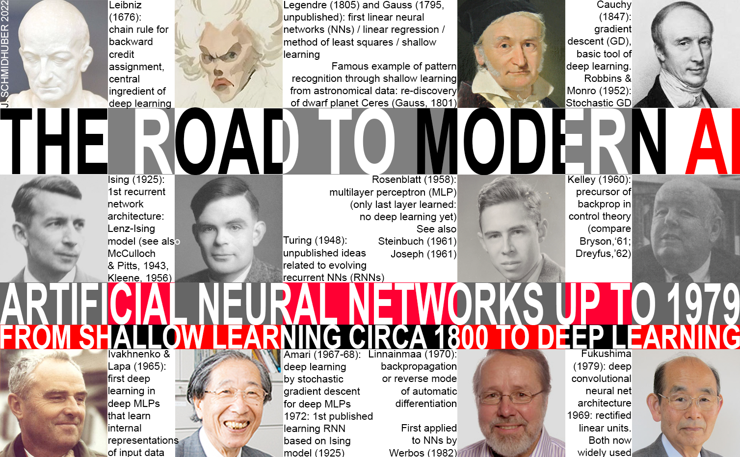
Image source:
- 1676, chain rule by Leibniz.
- 1805, least squares / linear regression / shallow learning by Gauss.
- 1936, classification by linear discriminant analysis by Fisher.
- 1940s, logistic regression.
- Early 1970s, generalized linear models (GLMs).
- Mid 1980s, classification and regression trees.
- 1980s, generalized additive models (GAMs).
- 1980s, neural networks gained popularity.
- 1990s, support vector machines.
- 2010s, deep learning.
## Commonly used learning methods
- Regression problems: linear regression (possibly with regularization and nonlinear features), linear mixed models, generalized additive model, KNN regression, regression tree, random forest, boosting, BART, neural network.
- Classification problems: logistic regression (possibly with regularization and nonlinear features), discriminant analysis (LDA, QDA, NB), KNN classifier, classification tree, random forest, SVM, boosting, neural network.
- Unsupervised learning: clustering, PCA, CCA, ICA, neural network (auto encoder).