# Text input
> `TextInput` is used for entering any single-line input with an optional autocomplete.
[Theme](../source/components/text-input/theme.ts) | [Example code](../examples/text-input.tsx)
## Usage
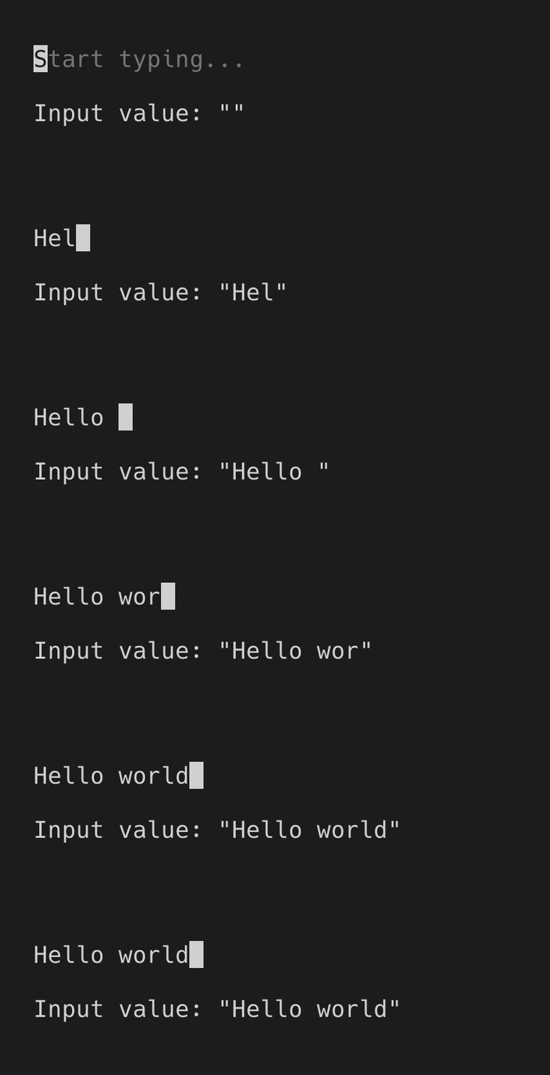
`TextInput` is an uncontrolled component. You can listen to value changes via `onChange` prop.
```tsx
import React, {useState} from 'react';
import {render, Box, Text} from 'ink';
import {TextInput} from '@inkjs/ui';
function Example() {
const [value, setValue] = useState('');
return (
Input value: "{value}"
);
}
render();
```
 ### Default value
Default value can be set via `defaultValue` prop.
```tsx
import React, {useState} from 'react';
import {render, Box, Text} from 'ink';
import {TextInput} from '@inkjs/ui';
function Example() {
const [value, setValue] = useState('Jane');
return (
Input value: "{value}"
);
}
render();
```
### Default value
Default value can be set via `defaultValue` prop.
```tsx
import React, {useState} from 'react';
import {render, Box, Text} from 'ink';
import {TextInput} from '@inkjs/ui';
function Example() {
const [value, setValue] = useState('Jane');
return (
Input value: "{value}"
);
}
render();
```
 ### Autocomplete
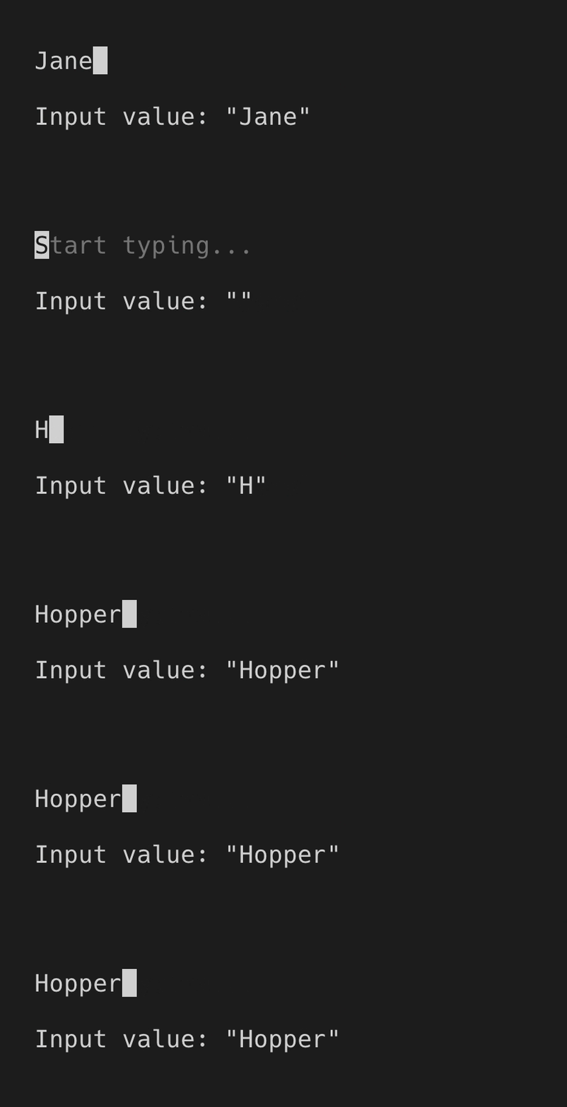
`TextInput` can suggest values to autocomplete input with via `suggestions` prop, which contains an array of strings.
As user is typing, `TextInput` finds the first item in `suggestions` array that begins with an input string that user has already entered. Matching of items in `suggestions` is case-sensitive.
When user presses enter, current suggestion will replace the input value.
```tsx
import React, {useState} from 'react';
import {render, Box, Text} from 'ink';
import {TextInput} from '@inkjs/ui';
function Example() {
const [value, setValue] = useState('');
return (
Input value: "{value}"
);
}
render();
```
### Autocomplete
`TextInput` can suggest values to autocomplete input with via `suggestions` prop, which contains an array of strings.
As user is typing, `TextInput` finds the first item in `suggestions` array that begins with an input string that user has already entered. Matching of items in `suggestions` is case-sensitive.
When user presses enter, current suggestion will replace the input value.
```tsx
import React, {useState} from 'react';
import {render, Box, Text} from 'ink';
import {TextInput} from '@inkjs/ui';
function Example() {
const [value, setValue] = useState('');
return (
Input value: "{value}"
);
}
render();
```
 ### Submit on enter
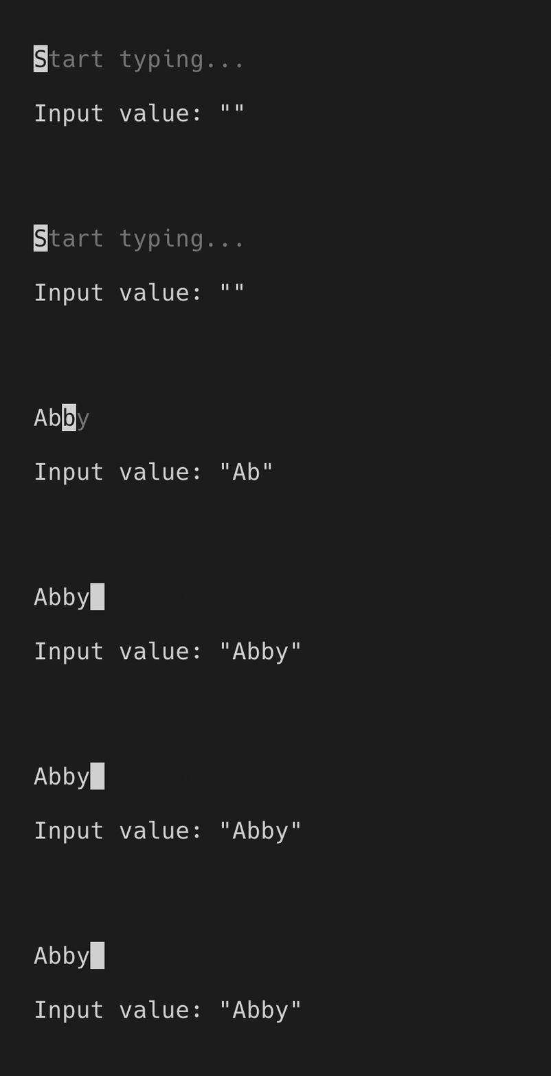
When you're only looking for the final value when user presses enter, you can use `onSubmit` instead of `onChange` prop.
```tsx
import React, {useState} from 'react';
import {render, Box, Text} from 'ink';
import {TextInput} from '@inkjs/ui';
function Example() {
const [value, setValue] = useState('');
return (
Input value: "{value}"
);
}
render();
```
### Submit on enter
When you're only looking for the final value when user presses enter, you can use `onSubmit` instead of `onChange` prop.
```tsx
import React, {useState} from 'react';
import {render, Box, Text} from 'ink';
import {TextInput} from '@inkjs/ui';
function Example() {
const [value, setValue] = useState('');
return (
Input value: "{value}"
);
}
render();
```
 ### Disabled
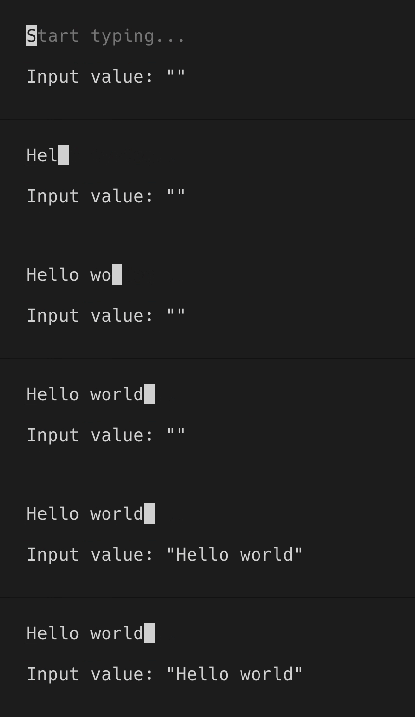
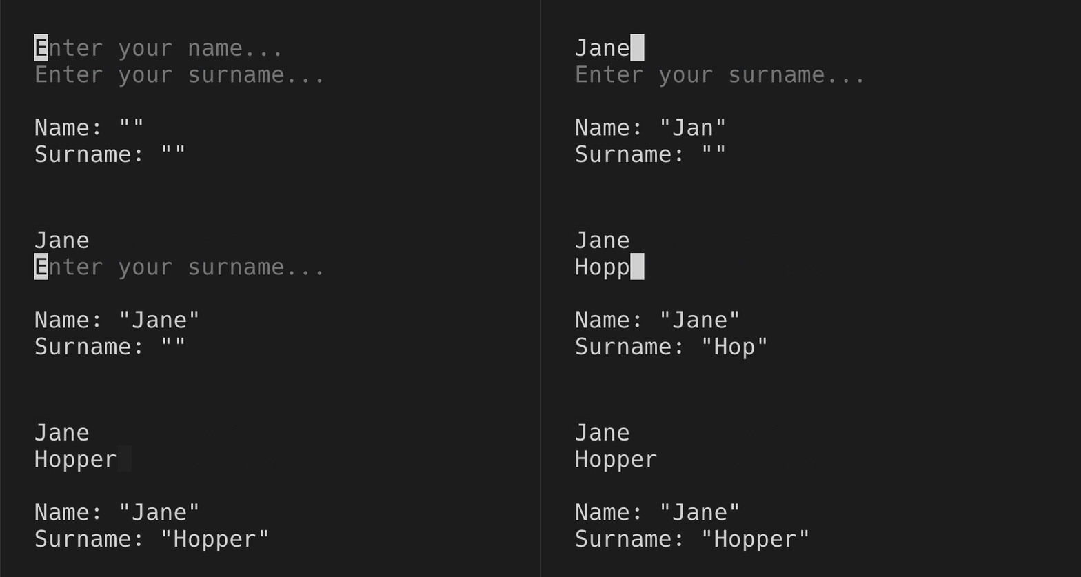
When there are two or more text inputs, only one should be receiving user input at a time, while others should be disabled via `isDisabled` prop.
```tsx
import React, {useState} from 'react';
import {render, Box, Text} from 'ink';
import {TextInput} from '@inkjs/ui';
function Example() {
const [activeInput, setActiveInput] = useState('name');
const [name, setName] = useState('');
const [surname, setSurname] = useState('');
return (
{
setActiveInput('surname');
}}
/>
{
setActiveInput('none');
}}
/>
Name: "{name}"
Surname: "{surname}"
);
}
render();
```
### Disabled
When there are two or more text inputs, only one should be receiving user input at a time, while others should be disabled via `isDisabled` prop.
```tsx
import React, {useState} from 'react';
import {render, Box, Text} from 'ink';
import {TextInput} from '@inkjs/ui';
function Example() {
const [activeInput, setActiveInput] = useState('name');
const [name, setName] = useState('');
const [surname, setSurname] = useState('');
return (
{
setActiveInput('surname');
}}
/>
{
setActiveInput('none');
}}
/>
Name: "{name}"
Surname: "{surname}"
);
}
render();
```
 ## Props
### isDisabled
Type: `boolean`\
Default: `false`
When disabled, user input is ignored.
### placeholder
Type: `string`
Text to display when input is empty.
### defaultValue
Type: `string`
Default input value.
### suggestions
Type: `string[]`
Suggestions to autocomplete the input value.
### onChange(value)
Type: `Function`
Callback when input value changes.
#### value
Type: `string`
Input value.
### onSubmit(value)
Type: `Function`
Callback when enter is pressed.
#### value
Type: `string`
Input value.
## Props
### isDisabled
Type: `boolean`\
Default: `false`
When disabled, user input is ignored.
### placeholder
Type: `string`
Text to display when input is empty.
### defaultValue
Type: `string`
Default input value.
### suggestions
Type: `string[]`
Suggestions to autocomplete the input value.
### onChange(value)
Type: `Function`
Callback when input value changes.
#### value
Type: `string`
Input value.
### onSubmit(value)
Type: `Function`
Callback when enter is pressed.
#### value
Type: `string`
Input value.