` in the browser.
```jsx
import {render, Box, Text} from 'ink';
const Example = () => (
This is a box with margin
);
render(
);
```
#### Dimensions
##### width
Type: `number` `string`
Width of the element in spaces.
You can also set it as a percentage, which will calculate the width based on the width of the parent element.
```jsx
X
//=> 'X '
```
```jsx
X
Y
//=> 'X Y'
```
##### height
Type: `number` `string`
Height of the element in lines (rows).
You can also set it as a percentage, which will calculate the height based on the height of the parent element.
```jsx
X
//=> 'X\n\n\n'
```
```jsx
X
Y
//=> 'X\n\n\nY\n\n'
```
##### minWidth
Type: `number`
Sets a minimum width of the element.
Percentages aren't supported yet; see https://github.com/facebook/yoga/issues/872.
##### minHeight
Type: `number` `string`
Sets a minimum height of the element in lines (rows).
You can also set it as a percentage, which will calculate the minimum height based on the height of the parent element.
##### maxWidth
Type: `number`
Sets a maximum width of the element.
Percentages aren't supported yet; see https://github.com/facebook/yoga/issues/872.
##### maxHeight
Type: `number` `string`
Sets a maximum height of the element in lines (rows).
You can also set it as a percentage, which will calculate the maximum height based on the height of the parent element.
##### aspectRatio
Type: `number`
Defines the aspect ratio (width/height) for the element.
Use it with at least one size constraint (`width`, `height`, `minHeight`, or `maxHeight`) so Ink can derive the missing dimension.
#### Padding
##### paddingTop
Type: `number`\
Default: `0`
Top padding.
##### paddingBottom
Type: `number`\
Default: `0`
Bottom padding.
##### paddingLeft
Type: `number`\
Default: `0`
Left padding.
##### paddingRight
Type: `number`\
Default: `0`
Right padding.
##### paddingX
Type: `number`\
Default: `0`
Horizontal padding. Equivalent to setting `paddingLeft` and `paddingRight`.
##### paddingY
Type: `number`\
Default: `0`
Vertical padding. Equivalent to setting `paddingTop` and `paddingBottom`.
##### padding
Type: `number`\
Default: `0`
Padding on all sides. Equivalent to setting `paddingTop`, `paddingBottom`, `paddingLeft` and `paddingRight`.
```jsx
Top
Bottom
Left
Right
Left and right
Top and bottom
Top, bottom, left and right
```
#### Margin
##### marginTop
Type: `number`\
Default: `0`
Top margin.
##### marginBottom
Type: `number`\
Default: `0`
Bottom margin.
##### marginLeft
Type: `number`\
Default: `0`
Left margin.
##### marginRight
Type: `number`\
Default: `0`
Right margin.
##### marginX
Type: `number`\
Default: `0`
Horizontal margin. Equivalent to setting `marginLeft` and `marginRight`.
##### marginY
Type: `number`\
Default: `0`
Vertical margin. Equivalent to setting `marginTop` and `marginBottom`.
##### margin
Type: `number`\
Default: `0`
Margin on all sides. Equivalent to setting `marginTop`, `marginBottom`, `marginLeft` and `marginRight`.
```jsx
Top
Bottom
Left
Right
Left and right
Top and bottom
Top, bottom, left and right
```
#### Gap
#### gap
Type: `number`\
Default: `0`
Size of the gap between an element's columns and rows. A shorthand for `columnGap` and `rowGap`.
```jsx
A
B
C
// A B
//
// C
```
#### columnGap
Type: `number`\
Default: `0`
Size of the gap between an element's columns.
```jsx
A
B
// A B
```
#### rowGap
Type: `number`\
Default: `0`
Size of the gap between an element's rows.
```jsx
A
B
// A
//
// B
```
#### Flex
##### flexGrow
Type: `number`\
Default: `0`
See [flex-grow](https://css-tricks.com/almanac/properties/f/flex-grow/).
```jsx
Label:
Fills all remaining space
```
##### flexShrink
Type: `number`\
Default: `1`
See [flex-shrink](https://css-tricks.com/almanac/properties/f/flex-shrink/).
```jsx
Will be 1/4
Will be 3/4
```
##### flexBasis
Type: `number` `string`
See [flex-basis](https://css-tricks.com/almanac/properties/f/flex-basis/).
```jsx
X
Y
//=> 'X Y'
```
```jsx
X
Y
//=> 'X Y'
```
##### flexDirection
Type: `string`\
Allowed values: `row` `row-reverse` `column` `column-reverse`
See [flex-direction](https://css-tricks.com/almanac/properties/f/flex-direction/).
```jsx
X
Y
// X Y
X
Y
// Y X
X
Y
// X
// Y
X
Y
// Y
// X
```
##### flexWrap
Type: `string`\
Allowed values: `nowrap` `wrap` `wrap-reverse`
See [flex-wrap](https://css-tricks.com/almanac/properties/f/flex-wrap/).
```jsx
A
BC
// A
// B C
```
```jsx
A
B
C
// A C
// B
```
##### alignItems
Type: `string`\
Allowed values: `flex-start` `center` `flex-end` `stretch` `baseline`
See [align-items](https://css-tricks.com/almanac/properties/a/align-items/).
```jsx
X
A
B
C
// X A
// B
// C
X
A
B
C
// A
// X B
// C
X
A
B
C
// A
// B
// X C
```
##### alignSelf
Type: `string`\
Default: `auto`\
Allowed values: `auto` `flex-start` `center` `flex-end` `stretch` `baseline`
See [align-self](https://css-tricks.com/almanac/properties/a/align-self/).
```jsx
X
// X
//
//
X
//
// X
//
X
//
//
// X
```
##### alignContent
Type: `string`\
Default: `flex-start`\
Allowed values: `flex-start` `flex-end` `center` `stretch` `space-between` `space-around` `space-evenly`
Defines alignment between flex lines on the cross axis when `flexWrap` creates multiple lines.
See [align-content](https://css-tricks.com/almanac/properties/a/align-content/).
Unlike CSS (`stretch`), Ink defaults to `flex-start` so wrapped lines stay compact and fixed-height boxes don't gain unexpected empty rows unless you opt in to stretching.
##### justifyContent
Type: `string`\
Allowed values: `flex-start` `center` `flex-end` `space-between` `space-around` `space-evenly`
See [justify-content](https://css-tricks.com/almanac/properties/j/justify-content/).
```jsx
X
// [X ]
X
// [ X ]
X
// [ X]
X
Y
// [X Y]
X
Y
// [ X Y ]
X
Y
// [ X Y ]
```
#### Position
##### position
Type: `string`\
Allowed values: `relative` `absolute` `static`\
Default: `relative`
Controls how the element is positioned.
When `position` is `static`, `top`, `right`, `bottom`, and `left` are ignored.
##### top
Type: `number` `string`
Top offset for positioned elements.
You can also set it as a percentage of the parent size.
##### right
Type: `number` `string`
Right offset for positioned elements.
You can also set it as a percentage of the parent size.
##### bottom
Type: `number` `string`
Bottom offset for positioned elements.
You can also set it as a percentage of the parent size.
##### left
Type: `number` `string`
Left offset for positioned elements.
You can also set it as a percentage of the parent size.
#### Visibility
##### display
Type: `string`\
Allowed values: `flex` `none`\
Default: `flex`
Set this property to `none` to hide the element.
##### overflowX
Type: `string`\
Allowed values: `visible` `hidden`\
Default: `visible`
Behavior for an element's overflow in the horizontal direction.
##### overflowY
Type: `string`\
Allowed values: `visible` `hidden`\
Default: `visible`
Behavior for an element's overflow in the vertical direction.
##### overflow
Type: `string`\
Allowed values: `visible` `hidden`\
Default: `visible`
A shortcut for setting `overflowX` and `overflowY` at the same time.
##### contentOffsetX
Type: `number`\
Default: `0`
Horizontal offset applied to the element's children, in columns. Children are shifted left by this amount. Combine with `overflow="hidden"` to build scrollable views.
Offsets are terminal cell coordinates, so fractional values are truncated toward zero and non-finite values are treated as `0`.
##### contentOffsetY
Type: `number`\
Default: `0`
Vertical offset applied to the element's children, in rows. Children are shifted up by this amount. Combine with `overflow="hidden"` to build scrollable views.
Offsets are terminal cell coordinates, so fractional values are truncated toward zero and non-finite values are treated as `0`.
When an offset splits a wide character, such as CJK, the hidden half still owns a terminal cell and is rendered as a blank so the columns after it stay aligned. Styling of that blank is best-effort: the split character's inline background or color is not carried over to it.
```jsx
import {useState, useRef} from 'react';
import {Box, useInput, useBoxMetrics} from 'ink';
const ScrollView = ({height, children}) => {
const ref = useRef(null);
const contentRef = useRef(null);
const {clientHeight} = useBoxMetrics(ref);
const content = useBoxMetrics(contentRef);
const [requestedScrollTop, setRequestedScrollTop] = useState(0);
const maxScrollTop = Math.max(0, content.height - clientHeight);
// Clamp on every render, since the maximum shrinks when the content gets
// shorter or the terminal gets taller.
const scrollTop = Math.min(requestedScrollTop, maxScrollTop);
useInput((input, key) => {
if (key.upArrow) {
setRequestedScrollTop(Math.max(0, scrollTop - 1));
}
if (key.downArrow) {
setRequestedScrollTop(Math.min(maxScrollTop, scrollTop + 1));
}
});
return (
{children}
);
};
```
Note: put any padding on the content wrapper rather than the viewport. `clientHeight` excludes borders but not padding, so a padded viewport reports more room than its content actually gets and `content.height - clientHeight` comes out one row short per padded edge, leaving the last row unreachable.
Note: wrap the content in a `flexShrink={0}` container so it keeps its natural height. Without it, Yoga squeezes the children into the fixed-height viewport and the content is never taller than the viewport, leaving nothing to scroll. Measuring that wrapper with its own `useBoxMetrics` ref is what gives you the scroll bounds, since the viewport only knows its own size.
#### Borders
##### borderStyle
Type: `string`\
Allowed values: `single` `double` `round` `bold` `singleDouble` `doubleSingle` `classic` | `BoxStyle`
Add a border with a specified style.
If `borderStyle` is `undefined` (the default), no border will be added.
Ink uses border styles from the [`cli-boxes`](https://github.com/sindresorhus/cli-boxes) module.
```jsx
single
double
round
bold
singleDouble
doubleSingle
classic
```
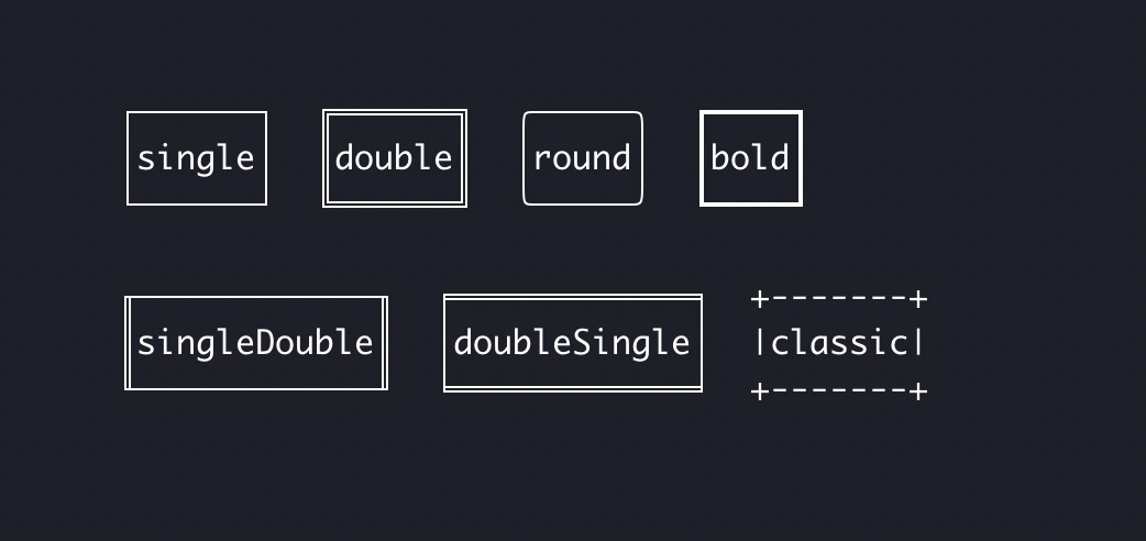
Alternatively, pass a custom border style like so:
```jsx
Custom
```
See example in [examples/borders](examples/borders/borders.tsx).
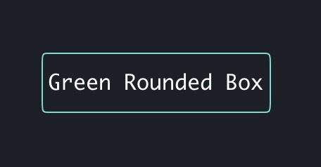
##### borderColor
Type: `string`
Change border color.
A shorthand for setting `borderTopColor`, `borderRightColor`, `borderBottomColor`, and `borderLeftColor`.
```jsx
Green Rounded Box
```
##### borderTopColor
Type: `string`
Change top border color.
Accepts the same values as [`color`](#color) in `
` component.
```jsx
Hello world
```
##### borderRightColor
Type: `string`
Change the right border color.
Accepts the same values as [`color`](#color) in `` component.
```jsx
Hello world
```
##### borderBottomColor
Type: `string`
Change the bottom border color.
Accepts the same values as [`color`](#color) in `` component.
```jsx
Hello world
```
##### borderLeftColor
Type: `string`
Change the left border color.
Accepts the same values as [`color`](#color) in `` component.
```jsx
Hello world
```
##### borderDimColor
Type: `boolean`\
Default: `false`
Dim the border color.
A shorthand for setting `borderTopDimColor`, `borderBottomDimColor`, `borderLeftDimColor`, and `borderRightDimColor`.
```jsx
Hello world
```
##### borderTopDimColor
Type: `boolean`\
Default: `false`
Dim the top border color.
```jsx
Hello world
```
##### borderBottomDimColor
Type: `boolean`\
Default: `false`
Dim the bottom border color.
```jsx
Hello world
```
##### borderLeftDimColor
Type: `boolean`\
Default: `false`
Dim the left border color.
```jsx
Hello world
```
##### borderRightDimColor
Type: `boolean`\
Default: `false`
Dim the right border color.
```jsx
Hello world
```
##### borderBackgroundColor
Type: `string`
Change border background color.
Accepts the same values as [`backgroundColor`](#backgroundcolor) in `` component.
A shorthand for setting `borderTopBackgroundColor`, `borderRightBackgroundColor`, `borderBottomBackgroundColor`, and `borderLeftBackgroundColor`.
```jsx
Hello world
```
##### borderTopBackgroundColor
Type: `string`
Change top border background color.
Accepts the same values as [`backgroundColor`](#backgroundcolor) in `` component.
Falls back to `borderBackgroundColor` if not specified.
```jsx
Hello world
```
##### borderBottomBackgroundColor
Type: `string`
Change bottom border background color.
Accepts the same values as [`backgroundColor`](#backgroundcolor) in `` component.
Falls back to `borderBackgroundColor` if not specified.
```jsx
Hello world
```
##### borderRightBackgroundColor
Type: `string`
Change right border background color.
Accepts the same values as [`backgroundColor`](#backgroundcolor) in `` component.
Falls back to `borderBackgroundColor` if not specified.
```jsx
Hello world
```
##### borderLeftBackgroundColor
Type: `string`
Change left border background color.
Accepts the same values as [`backgroundColor`](#backgroundcolor) in `` component.
Falls back to `borderBackgroundColor` if not specified.
```jsx
Hello world
```
##### borderTop
Type: `boolean`\
Default: `true`
Determines whether the top border is visible.
##### borderRight
Type: `boolean`\
Default: `true`
Determines whether the right border is visible.
##### borderBottom
Type: `boolean`\
Default: `true`
Determines whether the bottom border is visible.
##### borderLeft
Type: `boolean`\
Default: `true`
Determines whether the left border is visible.
#### Background
##### backgroundColor
Type: `string`
Background color for the element.
Accepts the same values as [`color`](#color) in the `` component.
```jsx
Red background
Orange background
Green background
```
The background color fills the entire `` area and is inherited by child `` components unless they specify their own `backgroundColor`.
```jsx
Blue inherited
Yellow override
Blue inherited again
```
Background colors work with borders and padding:
```jsx
Background with border and padding
```
See example in [examples/box-backgrounds](examples/box-backgrounds/box-backgrounds.tsx).
### ``
Adds one or more newline (`\n`) characters.
Must be used within `` components.
#### count
Type: `number`\
Default: `1`
Number of newlines to insert.
```jsx
import {render, Text, Newline} from 'ink';
const Example = () => (
Hello
World
);
render();
```
Output:
```
Hello
World
```
### ``
A flexible space that expands along the major axis of its containing layout.
It's useful as a shortcut for filling all the available space between elements.
For example, using `` in a `` with default flex direction (`row`) will position "Left" on the left side and will push "Right" to the right side.
```jsx
import {render, Box, Text, Spacer} from 'ink';
const Example = () => (
Left
Right
);
render();
```
In a vertical flex direction (`column`), it will position "Top" at the top of the container and push "Bottom" to the bottom.
Note that the container needs to be tall enough to see this in effect.
```jsx
import {render, Box, Text, Spacer} from 'ink';
const Example = () => (
Top
Bottom
);
render();
```
### ``
`` component permanently renders its output above everything else.
It's useful for displaying activity like completed tasks or logs - things that
don't change after they're rendered (hence the name "Static").
It's preferred to use `` for use cases like these when you can't know
or control the number of items that need to be rendered.
For example, [Tap](https://github.com/tapjs/node-tap) uses `` to display
a list of completed tests. [Gatsby](https://github.com/gatsbyjs/gatsby) uses it
to display a list of generated pages while still displaying a live progress bar.
```jsx
import React, {useState, useEffect} from 'react';
import {render, Static, Box, Text} from 'ink';
const Example = () => {
const [tests, setTests] = useState([]);
useEffect(() => {
let completedTests = 0;
let timer;
const run = () => {
// Fake 10 completed tests
if (completedTests++ < 10) {
setTests(previousTests => [
...previousTests,
{
id: previousTests.length,
title: `Test #${previousTests.length + 1}`,
},
]);
timer = setTimeout(run, 100);
}
};
run();
return () => {
clearTimeout(timer);
};
}, []);
return (
<>
{/* This part will be rendered once to the terminal */}
{test => (
✔ {test.title}
)}
{/* This part keeps updating as state changes */}
Completed tests: {tests.length}
);
};
render();
```
> [!NOTE]
> `` only renders new items in the `items` prop and ignores items that were previously rendered. This means that when you add new items to the `items` array, changes you make to previous items will not trigger a rerender.
See [examples/static](examples/static/static.tsx) for an example usage of `` component.
#### items
Type: `Array`
Array of items of any type to render using the function you pass as a component child.
#### style
Type: `object`
Styles to apply to a container of child elements.
See [``](#box) for supported properties.
```jsx
{...}
```
#### children(item)
Type: `Function`
Function that is called to render every item in the `items` array.
The first argument is the item itself, and the second argument is the index of that item in the
`items` array.
Note that a `key` must be assigned to the root component.
```jsx
{(item, index) => {
// This function is called for every item in ['a', 'b', 'c']
// `item` is 'a', 'b', 'c'
// `index` is 0, 1, 2
return (
Item: {item}
);
}}
```
### ``
Transform a string representation of React components before they're written to output.
For example, you might want to apply a [gradient to text](https://github.com/sindresorhus/ink-gradient), [add a clickable link](https://github.com/sindresorhus/ink-link), or [create some text effects](https://github.com/sindresorhus/ink-big-text).
These use cases can't accept React nodes as input; they expect a string.
That's what the `` component does: it gives you an output string of its child components and lets you transform it in any way.
> [!NOTE]
> `` must be applied only to `` children components and shouldn't change the dimensions of the output; otherwise, the layout will be incorrect.
> [!IMPORTANT]
> When children use `` styling props (e.g. `color`, `bold`), the string passed to `transform` will contain [ANSI escape codes](https://en.wikipedia.org/wiki/ANSI_escape_code). If your transform manipulates whitespace or does string operations like `.trim()`, you may need to use ANSI-aware methods (e.g. from [`slice-ansi`](https://github.com/chalk/slice-ansi) or [`strip-ansi`](https://github.com/chalk/strip-ansi)).
```jsx
import {render, Transform} from 'ink';
const Example = () => (
output.toUpperCase()}>
Hello World
);
render();
```
Since the `transform` function converts all characters to uppercase, the final output rendered to the terminal will be "HELLO WORLD", not "Hello World".
When the output wraps to multiple lines, it can be helpful to know which line is being processed.
For example, to implement a hanging indent component, you can indent all the lines except for the first.
```jsx
import {render, Transform} from 'ink';
const HangingIndent = ({indent = 4, children}) => (
index === 0 ? line : ' '.repeat(indent) + line
}
>
{children}
);
const text =
'WHEN I WROTE the following pages, or rather the bulk of them, ' +
'I lived alone, in the woods, a mile from any neighbor, in a ' +
'house which I had built myself, on the shore of Walden Pond, ' +
'in Concord, Massachusetts, and earned my living by the labor ' +
'of my hands only. I lived there two years and two months. At ' +
'present I am a sojourner in civilized life again.';
render({text});
```
#### transform(outputLine, index)
Type: `Function`
Function that transforms children output.
It accepts children and must return transformed children as well.
##### children
Type: `string`
Output of child components.
##### index
Type: `number`
The zero-indexed line number of the line that's currently being transformed.
## Hooks
### useInput(inputHandler, options?)
A React hook that returns `void` and handles user input.
It's a more convenient alternative to using `useStdin` and listening for `data` events.
The callback you pass to `useInput` is called for each character when the user enters any input.
However, if the user pastes text and it's more than one character, the callback will be called only once, and the whole string will be passed as `input`.
You can find a full example of using `useInput` at [examples/use-input](examples/use-input/use-input.tsx).
```jsx
import {useInput} from 'ink';
const UserInput = () => {
useInput((input, key) => {
if (input === 'q') {
// Exit program
}
if (key.leftArrow) {
// Left arrow key pressed
}
});
return …
};
```
#### inputHandler(input, key)
Type: `Function`
The handler function that you pass to `useInput` receives two arguments:
##### input
Type: `string`
The input that the program received.
##### key
Type: `object`
Handy information about a key that was pressed.
###### key.leftArrow
###### key.rightArrow
###### key.upArrow
###### key.downArrow
Type: `boolean`\
Default: `false`
If an arrow key was pressed, the corresponding property will be `true`.
For example, if the user presses the left arrow key, `key.leftArrow` equals `true`.
###### key.return
Type: `boolean`\
Default: `false`
Return (Enter) key was pressed.
###### key.escape
Type: `boolean`\
Default: `false`
Escape key was pressed.
###### key.ctrl
Type: `boolean`\
Default: `false`
Ctrl key was pressed.
###### key.shift
Type: `boolean`\
Default: `false`
Shift key was pressed.
###### key.tab
Type: `boolean`\
Default: `false`
Tab key was pressed.
###### key.backspace
Type: `boolean`\
Default: `false`
Backspace key was pressed.
###### key.delete
Type: `boolean`\
Default: `false`
Delete key was pressed.
###### key.pageDown
###### key.pageUp
Type: `boolean`\
Default: `false`
If the Page Up or Page Down key was pressed, the corresponding property will be `true`.
For example, if the user presses Page Down, `key.pageDown` equals `true`.
###### key.home
###### key.end
Type: `boolean`\
Default: `false`
If the Home or End key was pressed, the corresponding property will be `true`.
For example, if the user presses End, `key.end` equals `true`.
###### key.meta
Type: `boolean`\
Default: `false`
[Meta key](https://en.wikipedia.org/wiki/Meta_key) was pressed.
###### key.super
Type: `boolean`\
Default: `false`
Super key (Cmd on macOS, Win on Windows) was pressed. Requires [kitty keyboard protocol](#kittykeyboard).
###### key.hyper
Type: `boolean`\
Default: `false`
Hyper key was pressed. Requires [kitty keyboard protocol](#kittykeyboard).
###### key.capsLock
Type: `boolean`\
Default: `false`
Caps Lock was active. Requires [kitty keyboard protocol](#kittykeyboard).
###### key.numLock
Type: `boolean`\
Default: `false`
Num Lock was active. Requires [kitty keyboard protocol](#kittykeyboard).
###### key.eventType
Type: `'press' | 'repeat' | 'release'`\
Default: `undefined`
The type of key event. Only available with [kitty keyboard protocol](#kittykeyboard). Without the protocol, this property is `undefined`.
#### options
Type: `object`
##### isActive
Type: `boolean`\
Default: `true`
Enable or disable capturing of user input.
Useful when there are multiple `useInput` hooks used at once to avoid handling the same input several times.
### usePaste(handler, options?)
A React hook that calls `handler` whenever the user pastes text. Bracketed paste mode (`\x1b[?2004h`) is automatically enabled while the hook is active, so pasted text arrives as a single string rather than being misinterpreted as individual key presses.
`usePaste` and `useInput` can be used together in the same component. They operate on separate event channels, so paste content is never forwarded to `useInput` handlers when `usePaste` is active.
```jsx
import {useInput, usePaste} from 'ink';
const MyInput = () => {
useInput((input, key) => {
// Only receives typed characters and key events, not pasted text.
if (key.return) {
// Submit
}
});
usePaste((text) => {
// Receives the full pasted string, including newlines.
console.log('Pasted:', text);
});
return …
};
```
#### handler(text)
Type: `Function`
Called with the full pasted string whenever the user pastes text. The string is delivered verbatim — newlines, escape sequences, and other special characters are preserved exactly as pasted.
##### text
Type: `string`
The pasted text.
#### options
Type: `object`
##### isActive
Type: `boolean`\
Default: `true`
Enable or disable the paste handler. Useful when multiple components use `usePaste` and only one should be active at a time.
### useApp()
A React hook that returns app lifecycle methods.
#### exit(errorOrResult?)
Type: `Function`
Exit (unmount) the whole Ink app.
##### errorOrResult
Type: `Error | unknown`
Optional value that controls how [`waitUntilExit`](#waituntilexit) settles:
- `exit()` resolves with `undefined`.
- `exit(error)` rejects when `error` is an `Error`.
- `exit(value)` resolves with `value`.
```js
import {useEffect} from 'react';
import {useApp} from 'ink';
const Example = () => {
const {exit} = useApp();
// Exit the app after 5 seconds
useEffect(() => {
setTimeout(() => {
exit();
}, 5000);
}, [exit]);
return …
};
```
#### waitUntilRenderFlush()
Type: `Function`
Returns a promise that settles after pending render output is flushed to stdout.
```js
import {useEffect} from 'react';
import {useApp} from 'ink';
const Example = () => {
const {waitUntilRenderFlush} = useApp();
useEffect(() => {
void (async () => {
await waitUntilRenderFlush();
runNextCommand();
})();
}, [waitUntilRenderFlush]);
return …;
};
```
#### suspendTerminal(callback?)
Type: `Function`
Temporarily hands the terminal over to a child process (such as `$EDITOR`, `less`, or `fzf`), then restores Ink's terminal state and forces a full redraw.
While suspended, Ink stops writing output, stops consuming input, and restores the terminal modes the child expects (raw mode off, cursor visible, bracketed paste off, alternate screen exited, kitty keyboard protocol off). When the suspension ends, Ink reapplies its own terminal state and repaints from scratch.
##### callback
Type: `Function`
When a callback is provided, Ink suspends, runs the callback, and restores the terminal once it settles, even if the callback throws.
```js
import {useApp} from 'ink';
const {suspendTerminal} = useApp();
await suspendTerminal(async () => {
await runEditor();
});
```
When called without a callback, it returns a suspension you resume yourself. `resume()` is async because restoring the terminal may need to wait for ordered writes and a full redraw.
```js
const suspension = await suspendTerminal();
try {
await runEditor();
} finally {
await suspension.resume();
}
```
The suspension is also a disposable, so it can be resumed automatically with `await using`:
```js
await using suspension = await suspendTerminal();
await runEditor();
```
Suspending while a suspension is already active throws. This is supported only in interactive TTY mode; in non-interactive output the callback still runs but Ink performs no terminal handoff.
### useStdin()
A React hook that returns the stdin stream and stdin-related utilities.
#### stdin
Type: `stream.Readable`\
Default: `process.stdin`
The stdin stream passed to `render()` in `options.stdin`, or `process.stdin` by default.
Useful if your app needs to handle user input.
```js
import {useStdin} from 'ink';
const Example = () => {
const {stdin} = useStdin();
return …
};
```
#### isRawModeSupported
Type: `boolean`
A boolean flag determining if the current `stdin` supports `setRawMode`.
A component using `setRawMode` might want to use `isRawModeSupported` to nicely fall back in environments where raw mode is not supported.
```jsx
import {useStdin} from 'ink';
const Example = () => {
const {isRawModeSupported} = useStdin();
return isRawModeSupported ? (
) : (
);
};
```
#### setRawMode(isRawModeEnabled)
Type: `function`
##### isRawModeEnabled
Type: `boolean`
See [`setRawMode`](https://nodejs.org/api/tty.html#tty_readstream_setrawmode_mode).
Ink exposes this function to be able to handle Ctrl+C, that's why you should use Ink's `setRawMode` instead of `process.stdin.setRawMode`.
**Warning:** This function will throw unless the current `stdin` supports `setRawMode`. Use [`isRawModeSupported`](#israwmodesupported) to detect `setRawMode` support.
```js
import {useStdin} from 'ink';
const Example = () => {
const {setRawMode} = useStdin();
useEffect(() => {
setRawMode(true);
return () => {
setRawMode(false);
};
});
return …
};
```
### useStdout()
A React hook that returns the stdout stream where Ink renders your app and stdout-related utilities.
#### stdout
Type: `stream.Writable`\
Default: `process.stdout`
```js
import {useStdout} from 'ink';
const Example = () => {
const {stdout} = useStdout();
return …
};
```
#### write(data)
Write any string to stdout while preserving Ink's output.
It's useful when you want to display external information outside of Ink's rendering and ensure there's no conflict between the two.
It's similar to ``, except it can't accept components; it only works with strings.
##### data
Type: `string`
Data to write to stdout.
```js
import {useStdout} from 'ink';
const Example = () => {
const {write} = useStdout();
useEffect(() => {
// Write a single message to stdout, above Ink's output
write('Hello from Ink to stdout\n');
}, []);
return …
};
```
See additional usage example in [examples/use-stdout](examples/use-stdout/use-stdout.tsx).
### useBoxMetrics(ref)
A React hook that returns the current layout metrics for a tracked box element.
It updates when layout changes (for example terminal resize, sibling/content changes, or position changes).
Use `hasMeasured` to detect when the currently tracked element has been measured.
#### ref
Type: `React.RefObject`
A ref to the `` element to track.
```jsx
import {useRef} from 'react';
import {Box, Text, useBoxMetrics} from 'ink';
const Example = () => {
const ref = useRef(null);
const {width, height, left, top, hasMeasured} = useBoxMetrics(ref);
return (
{hasMeasured ? `${width}x${height} at ${left},${top}` : 'Measuring...'}
);
};
```
#### width
Type: `number`
Element width.
#### height
Type: `number`
Element height.
#### left
Type: `number`
Distance from the left edge of the parent. These are layout coordinates and do not include any `contentOffsetX`/`contentOffsetY` applied by an ancestor, so hit-testing inside a scrolled container has to subtract those offsets too.
#### top
Type: `number`
Distance from the top edge of the parent. These are layout coordinates and do not include any `contentOffsetX`/`contentOffsetY` applied by an ancestor, so hit-testing inside a scrolled container has to subtract those offsets too.
#### clientWidth
Type: `number`
Element width excluding borders.
#### clientHeight
Type: `number`
Element height excluding borders.
#### hasMeasured
Type: `boolean`
Whether the currently tracked element has been measured.
> [!NOTE]
> The hook returns zeros for all metrics until the first layout pass completes. It also returns zeros when the tracked ref is detached.
### useStderr()
A React hook that returns the stderr stream and stderr-related utilities.
#### stderr
Type: `stream.Writable`\
Default: `process.stderr`
Stderr stream.
```js
import {useStderr} from 'ink';
const Example = () => {
const {stderr} = useStderr();
return …
};
```
#### write(data)
Write any string to stderr while preserving Ink's output.
It's useful when you want to display external information outside of Ink's rendering and ensure there's no conflict between the two.
It's similar to ``, except it can't accept components; it only works with strings.
##### data
Type: `string`
Data to write to stderr.
```js
import {useStderr} from 'ink';
const Example = () => {
const {write} = useStderr();
useEffect(() => {
// Write a single message to stderr, above Ink's output
write('Hello from Ink to stderr\n');
}, []);
return …
};
```
### useWindowSize()
A React hook that returns the current terminal dimensions and re-renders the component whenever the terminal is resized.
```js
import {Text, useWindowSize} from 'ink';
const Example = () => {
const {columns, rows} = useWindowSize();
return (
{columns}x{rows}
);
};
```
#### columns
Type: `number`
Number of columns (horizontal character cells).
#### rows
Type: `number`
Number of rows (vertical character cells).
> [!NOTE]
> When the terminal is resized narrower, ghost lines may briefly appear depending on the terminal emulator's reflow behavior.
### useFocus(options?)
A React hook that returns focus state and focus controls for the current component.
A component that uses the `useFocus` hook becomes "focusable" to Ink, so when the user presses Tab, Ink will switch focus to this component.
If there are multiple components that execute the `useFocus` hook, focus will be given to them in the order in which these components are rendered.
This hook returns an object with an `isFocused` boolean property, which determines whether this component is focused.
#### options
##### autoFocus
Type: `boolean`\
Default: `false`
Auto-focus this component if there's no active (focused) component right now.
##### isActive
Type: `boolean`\
Default: `true`
Enable or disable this component's focus, while still maintaining its position in the list of focusable components.
This is useful for inputs that are temporarily disabled.
##### id
Type: `string`\
Required: `false`
Set a component's focus ID, which can be used to programmatically focus the component. This is useful for large interfaces with many focusable elements to avoid having to cycle through all of them.
```jsx
import {render, useFocus, Text} from 'ink';
const Example = () => {
const {isFocused} = useFocus();
return {isFocused ? 'I am focused' : 'I am not focused'};
};
render();
```
See example in [examples/use-focus](examples/use-focus/use-focus.tsx) and [examples/use-focus-with-id](examples/use-focus-with-id/use-focus-with-id.tsx).
### useFocusManager()
A React hook that returns methods to manage focus across focusable components.
#### enableFocus()
Enable focus management for all components.
> [!NOTE]
> You don't need to call this method manually unless you've disabled focus management. Focus management is enabled by default.
```js
import {useFocusManager} from 'ink';
const Example = () => {
const {enableFocus} = useFocusManager();
useEffect(() => {
enableFocus();
}, []);
return …
};
```
#### disableFocus()
Disable focus management for all components.
The currently active component (if there's one) will lose its focus.
```js
import {useFocusManager} from 'ink';
const Example = () => {
const {disableFocus} = useFocusManager();
useEffect(() => {
disableFocus();
}, []);
return …
};
```
#### focusNext()
Switch focus to the next focusable component.
If there's no active component right now, focus will be given to the first focusable component.
If the active component is the last in the list of focusable components, focus will be switched to the first focusable component.
> [!NOTE]
> Ink calls this method when user presses Tab.
```js
import {useFocusManager} from 'ink';
const Example = () => {
const {focusNext} = useFocusManager();
useEffect(() => {
focusNext();
}, []);
return …
};
```
#### focusPrevious()
Switch focus to the previous focusable component.
If there's no active component right now, focus will be given to the first focusable component.
If the active component is the first in the list of focusable components, focus will be switched to the last focusable component.
> [!NOTE]
> Ink calls this method when user presses Shift+Tab.
```js
import {useFocusManager} from 'ink';
const Example = () => {
const {focusPrevious} = useFocusManager();
useEffect(() => {
focusPrevious();
}, []);
return …
};
```
#### focus(id)
##### id
Type: `string`
Switch focus to the component with the given [`id`](#id).
If there's no component with that ID, focus is not changed.
```js
import {useFocusManager, useInput} from 'ink';
const Example = () => {
const {focus} = useFocusManager();
useInput(input => {
if (input === 's') {
// Focus the component with focus ID 'someId'
focus('someId');
}
});
return …
};
```
#### activeId
Type: `string | undefined`
The ID of the currently focused component, or `undefined` if no component is focused.
```js
import {Text, useFocusManager} from 'ink';
const Example = () => {
const {activeId} = useFocusManager();
return Focused: {activeId ?? 'none'};
};
```
### useCursor()
A React hook that returns methods to control the terminal cursor position after each render.
This is essential for IME (Input Method Editor) support, where the composing character is displayed at the cursor location.
```jsx
import {useState} from 'react';
import {Box, Text, useCursor} from 'ink';
import stringWidth from 'string-width';
const TextInput = () => {
const [text, setText] = useState('');
const {setCursorPosition} = useCursor();
const prompt = '> ';
setCursorPosition({x: stringWidth(prompt + text), y: 1});
return (
Type here:
{prompt}
{text}
);
};
```
#### setCursorPosition(position)
Set the cursor position relative to the Ink output. Pass `undefined` to hide the cursor.
##### position
Type: `object | undefined`
Use [`string-width`](https://github.com/sindresorhus/string-width) to calculate `x` for strings containing wide characters (CJK, emoji).
See a full example at [examples/cursor-ime](examples/cursor-ime/cursor-ime.tsx).
###### x
Type: `number`
Column position (0-based).
###### y
Type: `number`
Row position from the top of the Ink output (0 = first line).
### useIsScreenReaderEnabled()
A React hook that returns whether a screen reader is enabled.
This is useful when you want to render different output for screen readers.
```jsx
import {useIsScreenReaderEnabled, Text} from 'ink';
const Example = () => {
const isScreenReaderEnabled = useIsScreenReaderEnabled();
return (
{isScreenReaderEnabled
? 'Screen reader is enabled'
: 'Screen reader is disabled'}
);
};
```
### useAnimation(options?)
A React hook that drives animations. Returns a frame counter, elapsed time, frame delta, and a reset function. All animations share a single timer internally, so multiple animated components consolidate into one render cycle.
```jsx
import {Text, useAnimation} from 'ink';
const Spinner = () => {
const {frame} = useAnimation({interval: 80});
const characters = ['⠋', '⠙', '⠹', '⠸', '⠼', '⠴', '⠦', '⠧', '⠇', '⠏'];
return {characters[frame % characters.length]};
};
```
#### options
Type: `object`
##### interval
Type: `number`\
Default: `100`
Time between ticks in milliseconds.
##### isActive
Type: `boolean`\
Default: `true`
Whether the animation is running. When set to `false`, the animation stops. When toggled back to `true`, all values reset to `0`.
#### Return value
##### frame
Type: `number`
Discrete counter that increments by 1 each interval. Useful for indexed sequences like spinner frames.
##### time
Type: `number`
Total elapsed time in milliseconds since the animation started or was last reset. Useful for continuous math-based animations like sine waves: `Math.sin(time / 1000 * Math.PI * 2)`.
##### delta
Type: `number`
Time in milliseconds since the previous rendered tick. Accounts for throttled renders. Useful for physics-based or velocity-driven motion: `position += speed * delta`.
##### reset
Type: `() => void`
Resets `frame`, `time`, and `delta` to `0` and restarts timing from the current moment. Useful for one-shot animations triggered by events.
## API
#### render(tree, options?)
Returns: [`Instance`](#instance)
Mount a component and render the output.
##### tree
Type: `ReactNode`
##### options
Type: `object`
###### stdout
Type: `stream.Writable`\
Default: `process.stdout`
Output stream where the app will be rendered.
###### stdin
Type: `stream.Readable`\
Default: `process.stdin`
Input stream where app will listen for input.
###### stderr
Type: `stream.Writable`\
Default: `process.stderr`
Error stream.
###### exitOnCtrlC
Type: `boolean`\
Default: `true`
Configure whether Ink should listen for Ctrl+C keyboard input and exit the app.
This is needed in case `process.stdin` is in [raw mode](https://nodejs.org/api/tty.html#tty_readstream_setrawmode_mode), because then Ctrl+C is ignored by default and the process is expected to handle it manually.
###### patchConsole
Type: `boolean`\
Default: `true`
Patch console methods to ensure console output doesn't mix with Ink's output.
When any of the `console.*` methods are called (like `console.log()`), Ink intercepts their output, clears the main output, renders output from the console method, and then rerenders the main output again.
That way, both are visible and don't overlap each other.
Once unmount starts, Ink restores the native console before React cleanup runs. Teardown-time `console.*` output then follows the normal console behavior instead of being rerouted through Ink.
This functionality is powered by [patch-console](https://github.com/vadimdemedes/patch-console), so if you need to disable Ink's interception of output but want to build something custom, you can use that.
###### onRender
Type: `({renderTime: number}) => void`\
Default: `undefined`
Runs the given callback after each render and re-render with render metrics.
This callback runs after Ink commits a frame, but it does not wait for `stdout`/`stderr` stream callbacks.
To run code after output is flushed, use [`waitUntilRenderFlush()`](#waituntilrenderflush).
###### isScreenReaderEnabled
Type: `boolean`\
Default: `process.env['INK_SCREEN_READER'] === 'true'`
Enable screen reader support. See [Screen Reader Support](#screen-reader-support).
###### debug
Type: `boolean`\
Default: `false`
If `true`, each update will be rendered as separate output, without replacing the previous one.
###### maxFps
Type: `number`\
Default: `30`
Maximum frames per second for render updates.
This controls how frequently the UI can update to prevent excessive re-rendering.
Higher values allow more frequent updates but may impact performance.
Setting it to a lower value may be useful for components that update very frequently, to reduce CPU usage.
###### incrementalRendering
Type: `boolean`\
Default: `false`
Enable incremental rendering mode which only updates changed lines instead of redrawing the entire output.
This can reduce flickering and improve performance for frequently updating UIs.
###### concurrent
Type: `boolean`\
Default: `false`
Enable React Concurrent Rendering mode.
When enabled:
- Suspense boundaries work correctly with async data fetching
- `useTransition` and `useDeferredValue` hooks are fully functional
- Updates can be interrupted for higher priority work
```jsx
render(, {concurrent: true});
```
> [!NOTE]
> Concurrent mode changes the timing of renders. Some tests may need to use `act()` to properly await updates. Reusing the same stdout across multiple `render()` calls without unmounting is unsupported. Call `unmount()` first if you need to change the rendering mode or create a fresh instance.
###### interactive
Type: `boolean`\
Default: `true` (`false` if in CI (detected via [`is-in-ci`](https://github.com/sindresorhus/is-in-ci)) or `stdout.isTTY` is falsy)
Override automatic interactive mode detection.
By default, Ink detects whether the environment is interactive based on CI detection and `stdout.isTTY`. When non-interactive, Ink skips terminal-specific features like ANSI erase sequences, cursor manipulation, synchronized output, resize handling, and kitty keyboard auto-detection. Only the final frame of non-static output is written at unmount.
Most users should not need to set this option. Use it when you have your own "interactive" detection logic that differs from the built-in behavior.
> [!NOTE]
> Reusing the same stdout across multiple `render()` calls without unmounting is unsupported. Call `unmount()` first if you need to change this option or create a fresh instance.
```jsx
// Use your own detection logic
const isInteractive = myCustomDetection();
render(, {interactive: isInteractive});
```
###### alternateScreen
Type: `boolean`\
Default: `false`
Render the app in the terminal's alternate screen buffer. When enabled, the app renders on a separate screen, and the original terminal content is restored when the app exits. This is the same mechanism used by programs like vim, htop, and less.
Note: The terminal's scrollback buffer is not available while in the alternate screen. This is standard terminal behavior; programs like vim use the alternate screen specifically to avoid polluting the user's scrollback history.
Ink intentionally treats alternate-screen teardown output as disposable. It does not preserve or replay teardown-time frames, hook writes, or `console.*` output after restoring the primary screen.
Only works in interactive mode. Ignored when `interactive` is `false` or in a non-interactive environment (CI, piped stdout).
> [!NOTE]
> Reusing the same stdout across multiple `render()` calls without unmounting is unsupported. Call `unmount()` first if you need to change this option or create a fresh instance.
```jsx
render(, {alternateScreen: true});
```
###### kittyKeyboard
Type: `object`\
Default: `undefined`
Enable the [kitty keyboard protocol](https://sw.kovidgoyal.net/kitty/keyboard-protocol/) for enhanced keyboard input handling. When enabled, terminals that support the protocol will report additional key information including `super`, `hyper`, `capsLock`, `numLock` modifiers and `eventType` (press/repeat/release).
```jsx
import {render} from 'ink';
render(, {kittyKeyboard: {mode: 'auto'}});
```
```jsx
import {render} from 'ink';
render(, {
kittyKeyboard: {
mode: 'enabled',
flags: ['disambiguateEscapeCodes', 'reportEventTypes'],
},
});
```
**kittyKeyboard.mode**
Type: `'auto' | 'enabled' | 'disabled'`\
Default: `'auto'`
- `'auto'`: Query interactive TTY terminals for support (`CSI ? u`). The protocol is enabled when Ink's input handler receives a response within 200 milliseconds. Pending detection is canceled when the terminal is suspended.
- `'enabled'`: Force enable the protocol. Both stdin and stdout must be TTYs.
- `'disabled'`: Never enable the protocol.
**kittyKeyboard.flags**
Type: `string[]`\
Default: `['disambiguateEscapeCodes']`
Protocol flags to request from the terminal. Pass an array of flag name strings.
Available flags:
- `'disambiguateEscapeCodes'` - Disambiguate escape codes
- `'reportEventTypes'` - Report key press, repeat, and release events
- `'reportAlternateKeys'` - Report alternate key encodings. Ink accepts these sequences but does not expose alternate keys. Without associated text, `useInput` uses the primary key as its input fallback.
- `'reportAllKeysAsEscapeCodes'` - Report all keys as escape codes
- `'reportAssociatedText'` - Report associated text with key events. Automatically enables `reportAllKeysAsEscapeCodes`.
**Behavior notes**
When the kitty keyboard protocol is enabled, input handling changes in several ways:
- **Non-printable keys produce empty input.** Navigation and editing keys retain their supported `key` properties, such as `key.upArrow` and `key.delete`. Other functional keys, including F1-F35, modifier-only keys, media keys, Caps Lock, and Print Screen, are not individually exposed through the `key` object.
- **Ctrl+letter shortcuts work as expected.** The terminal sends the unshifted letter codepoint with the Ctrl modifier. For example, `Ctrl+C` produces `input === 'c'` and `key.ctrl === true`.
- **Text and key identity differ.** Enable `reportAssociatedText` when using `reportAllKeysAsEscapeCodes` to receive composed and shifted text in `input`. Without associated text, `input` falls back to the primary unshifted key. Alternate shifted and base-layout keys are not exposed or used for shortcut matching.
- **Key disambiguation.** The protocol allows the terminal to distinguish between keys that normally produce the same escape sequence. For example:
- `Ctrl+I` vs `Tab` - without the protocol, both produce the same byte (`\x09`). With the protocol, they are reported as distinct keys.
- `Shift+Enter` vs `Enter` - the shift modifier is correctly reported.
- `Escape` key vs `Ctrl+[` - these are disambiguated.
- **Event types.** With the `reportEventTypes` flag, key press, repeat, and release events are distinguished via `key.eventType`.
#### renderToString(tree, options?)
Returns: `string`
Render a React element to a string synchronously. Unlike `render()`, this function does not write to stdout, does not set up any terminal event listeners, and returns the rendered output as a string.
Useful for generating documentation, writing output to files, testing, or any scenario where you need the rendered output as a string without starting a persistent terminal application.
```jsx
import {renderToString, Text, Box} from 'ink';
const output = renderToString(
Hello World
,
);
console.log(output);
```
**Notes:**
- Terminal-specific hooks (`useInput`, `useStdin`, `useStdout`, `useStderr`, `useWindowSize`, `useApp`, `useFocus`, `useFocusManager`) return default no-op values since there is no terminal session. They will not throw, but they will not function as in a live terminal.
- `useEffect` callbacks will execute during rendering (due to synchronous rendering mode), but state updates they trigger will not affect the returned output, which reflects the initial render.
- `useLayoutEffect` callbacks fire synchronously during commit, so state updates they trigger **will** be reflected in the output.
- The `` component is supported — its output is prepended to the dynamic output.
- If a component throws during rendering, the error is propagated to the caller after cleanup.
##### tree
Type: `ReactNode`
##### options
Type: `object`
###### columns
Type: `number`\
Default: `80`
Width of the virtual terminal in columns. Controls where text wrapping occurs.
```jsx
const output = renderToString({'A'.repeat(100)}, {
columns: 40,
});
// Text wraps at 40 columns
```
#### Instance
This is the object that `render()` returns.
##### rerender(tree)
Replace the previous root node with a new one or update the props of the current root node.
###### tree
Type: `ReactNode`
```jsx
// Update props of the root node
const {rerender} = render();
rerender();
// Replace root node
const {rerender} = render();
rerender();
```
##### unmount()
Manually unmount the whole Ink app.
```jsx
const {unmount} = render();
unmount();
```
##### waitUntilExit()
Returns a promise that settles when the app is unmounted.
It resolves with the value passed to `exit(value)` and rejects with the error passed to `exit(error)`.
When `unmount()` is called manually, it settles after unmount-related stdout writes complete.
```jsx
const {unmount, waitUntilExit} = render();
setTimeout(unmount, 1000);
await waitUntilExit(); // resolves after `unmount()` is called
```
##### waitUntilRenderFlush()
Returns a promise that settles after pending render output is flushed to stdout.
Useful when you need to run code only after a frame is written:
```jsx
const {rerender, waitUntilRenderFlush} = render();
rerender();
await waitUntilRenderFlush(); // output for "ready" is flushed
runNextCommand();
```
##### cleanup()
Unmount the current app and delete the internal Ink instance associated with the current `stdout`.
This is mostly useful for advanced cases (for example, tests) where you need `render()` to create a fresh instance for the same stream.
Unlike deleting the internal instance directly, this also tears down terminal state such as the alternate screen.
##### clear()
Clear output.
```jsx
const {clear} = render();
clear();
```
#### measureElement(ref)
Measure the layout metrics of a particular `` element.
Returns an object with `x`, `y`, `width`, `height`, `clientWidth` and `clientHeight` properties.
`x` and `y` are the element's position within the live layout region, computed by walking up the layout tree. These are layout-tree coordinates, not terminal viewport coordinates. To compare them with mouse events, convert the event coordinates using the live region's viewport position. This is necessary even in alternate-screen mode when output, such as `` content, appears above the live region. These are layout coordinates and do not include any `contentOffsetX`/`contentOffsetY` applied by an ancestor, so hit-testing inside a scrolled container has to subtract those offsets too.
`clientWidth` and `clientHeight` are the element's dimensions excluding borders, which is the amount of space its content can occupy. To build a scrollable view, measure the content wrapper separately and clamp the offset with `content.height - viewport.clientHeight`, together with the `contentOffsetX`/`contentOffsetY` props. That bound assumes an unpadded viewport, since `clientWidth`/`clientHeight` exclude borders but not padding; put padding on the content wrapper instead.
> [!NOTE]
> `measureElement()` returns zeros for all properties when called during render (before layout is calculated). Call it from post-render code, such as `useEffect`, `useLayoutEffect`, input handlers, or timer callbacks. When content changes, pass the relevant dependency to your effect so it re-measures after each update.
##### ref
Type: `MutableRef`
A reference to a `` element captured with the `ref` property.
See [Refs](https://reactjs.org/docs/refs-and-the-dom.html) for more information on how to capture references.
```jsx
import {render, measureElement, Box, Text} from 'ink';
const Example = () => {
const ref = useRef();
useEffect(() => {
const {x, y, width, height} = measureElement(ref.current);
// x = 0, y = 0, width = 100, height = 1
}, []);
return (
This box will stretch to 100 width
);
};
render();
```
## Testing
Ink components are simple to test with [ink-testing-library](https://github.com/vadimdemedes/ink-testing-library).
Here's a simple example that checks how the component is rendered:
```jsx
import React from 'react';
import {Text} from 'ink';
import {render} from 'ink-testing-library';
const Test = () => Hello World;
const {lastFrame} = render();
lastFrame() === 'Hello World'; //=> true
```
Check out [ink-testing-library](https://github.com/vadimdemedes/ink-testing-library) for more examples and full documentation.
## Using React Devtools
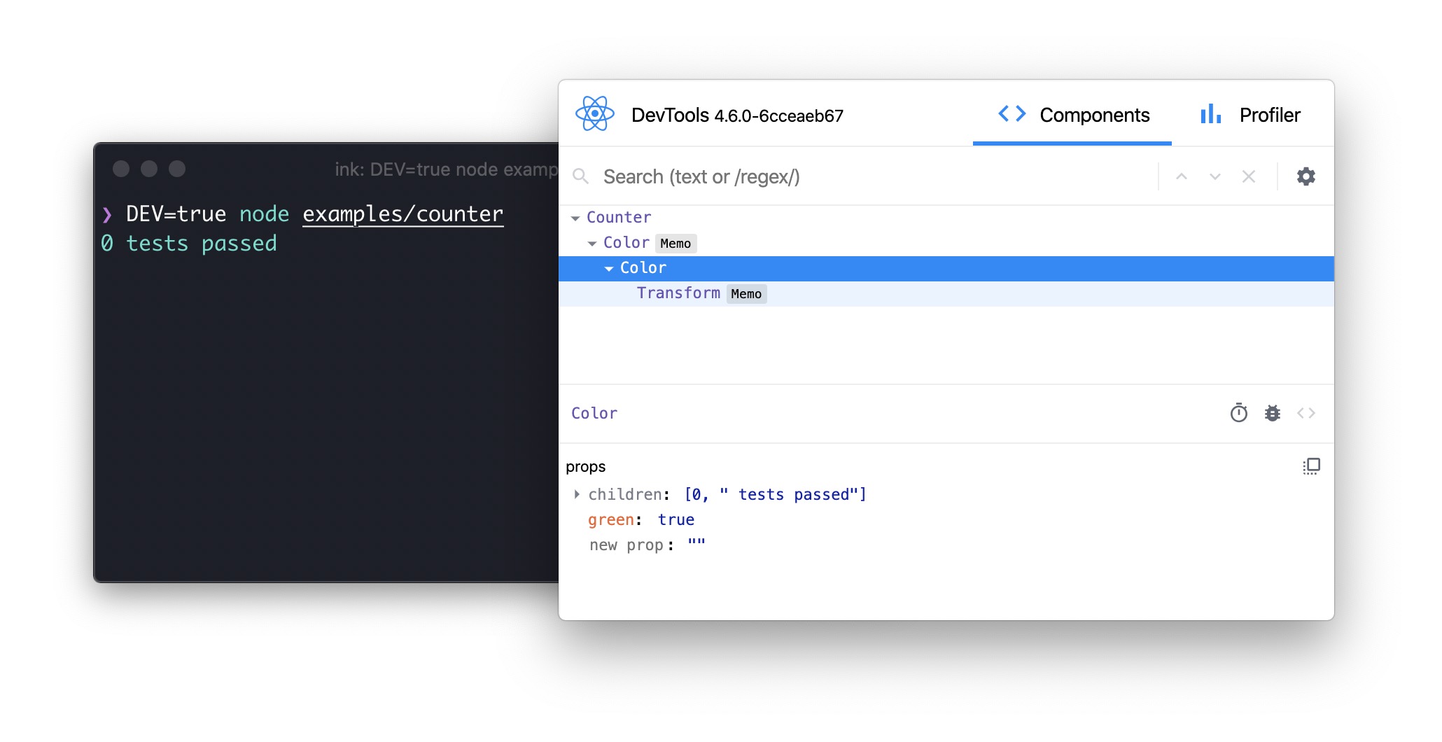
Ink supports [React Devtools](https://github.com/facebook/react/tree/master/packages/react-devtools) out of the box. To enable integration with React Devtools in your Ink-based CLI, first ensure you have installed the optional `react-devtools-core` dependency, and then run your app with the `DEV=true` environment variable:
```sh
DEV=true my-cli
```
Then, start React Devtools itself:
```sh
npx react-devtools
```
After it starts, you should see the component tree of your CLI.
You can even inspect and change the props of components, and see the results immediately in the CLI, without restarting it.
> [!NOTE]
> You must manually quit your CLI via Ctrl+C after you're done testing.
## Screen Reader Support
Ink has basic support for screen readers.
To enable it, you can either pass the `isScreenReaderEnabled` option to the `render` function or set the `INK_SCREEN_READER` environment variable to `true`.
Ink implements a small subset of functionality from the [ARIA specification](https://developer.mozilla.org/en-US/docs/Web/Accessibility/ARIA).
```jsx
render(, {isScreenReaderEnabled: true});
```
When screen reader support is enabled, Ink will try its best to generate a screen-reader-friendly output.
For example, for this code:
```jsx
Accept terms and conditions
```
Ink will generate the following output for screen readers:
```
(checked) checkbox: Accept terms and conditions
```
You can also provide a custom label for screen readers if you want to render something different for them.
For example, if you are building a progress bar, you can use `aria-label` to provide a more descriptive label for screen readers.
```jsx
50%
```
In the example above, the screen reader will read "Progress: 50%" instead of "50%".
### `aria-label`
Type: `string`
A label for the element for screen readers.
### `aria-hidden`
Type: `boolean`\
Default: `false`
Hide the element from screen readers.
### `aria-role`
Type: `string`
The role of the element.
Supported values:
- `button`
- `checkbox`
- `combobox`
- `list`
- `listbox`
- `listitem`
- `menu`
- `menuitem`
- `option`
- `progressbar`
- `radio`
- `radiogroup`
- `tab`
- `tablist`
- `table`
- `textbox`
- `timer`
- `toolbar`
### `aria-state`
Type: `object`
The state of the element.
Supported values:
- `busy` (boolean)
- `checked` (boolean)
- `disabled` (boolean)
- `expanded` (boolean)
- `multiline` (boolean)
- `multiselectable` (boolean)
- `readonly` (boolean)
- `required` (boolean)
- `selected` (boolean)
## Creating Components
When building custom components, it's important to keep accessibility in mind. While Ink provides the building blocks, ensuring your components are accessible will make your CLIs usable by a wider audience.
### General Principles
- **Provide screen reader-friendly output:** Use the `useIsScreenReaderEnabled` hook to detect if a screen reader is active. You can then render more descriptive output for screen reader users.
- **Leverage ARIA props:** For components that have a specific role (e.g., a checkbox or button), use the `aria-role`, `aria-state`, and `aria-label` props on `` and `` to provide semantic meaning to screen readers.
For a practical example of building an accessible component, see the [ARIA example](/examples/aria/aria.tsx).
## Useful Components
- [ink-text-input](https://github.com/vadimdemedes/ink-text-input) - Text input.
- [ink-spinner](https://github.com/vadimdemedes/ink-spinner) - Spinner.
- [ink-select-input](https://github.com/vadimdemedes/ink-select-input) - Select (dropdown) input.
- [ink-link](https://github.com/sindresorhus/ink-link) - Link.
- [ink-gradient](https://github.com/sindresorhus/ink-gradient) - Gradient color.
- [ink-big-text](https://github.com/sindresorhus/ink-big-text) - Awesome text.
- [ink-picture](https://github.com/endernoke/ink-picture) - Display images.
- [ink-tab](https://github.com/jdeniau/ink-tab) - Tab.
- [ink-color-pipe](https://github.com/LitoMore/ink-color-pipe) - Create color text with simpler style strings.
- [ink-multi-select](https://github.com/karaggeorge/ink-multi-select) - Select one or more values from a list
- [ink-divider](https://github.com/JureSotosek/ink-divider) - A divider.
- [ink-progress-bar](https://github.com/brigand/ink-progress-bar) - Progress bar.
- [ink-table](https://github.com/maticzav/ink-table) - Table.
- [ink-ascii](https://github.com/hexrcs/ink-ascii) - Awesome text component with more font choices, based on Figlet.
- [ink-markdown](https://github.com/cameronhunter/ink-markdown) - Render syntax highlighted Markdown.
- [ink-quicksearch-input](https://github.com/Eximchain/ink-quicksearch-input) - Select component with fast, quicksearch-like navigation.
- [ink-confirm-input](https://github.com/kevva/ink-confirm-input) - Yes/No confirmation input.
- [ink-syntax-highlight](https://github.com/vsashyn/ink-syntax-highlight) - Code syntax highlighting.
- [ink-form](https://github.com/lukasbach/ink-form) - Form.
- [ink-task-list](https://github.com/privatenumber/ink-task-list) - Task list.
- [ink-spawn](https://github.com/kraenhansen/ink-spawn) - Spawn child processes.
- [ink-titled-box](https://github.com/mishieck/ink-titled-box) - Box with a title.
- [ink-chart](https://github.com/pppp606/ink-chart) - Sparkline and bar chart.
- [ink-scroll-view](https://github.com/ByteLandTechnology/ink-scroll-view) - Scroll container.
- [ink-scroll-list](https://github.com/ByteLandTechnology/ink-scroll-list) - Scrollable list.
- [ink-stepper](https://github.com/archcorsair/ink-stepper) - Step-by-step wizard.
- [ink-virtual-list](https://github.com/archcorsair/ink-virtual-list) - Virtualized list that renders only visible items for performance.
- [ink-color-picker](https://github.com/sina-byn/ink-color-picker) - Color picker.
## Useful Hooks
- [ink-use-stdout-dimensions](https://github.com/cameronhunter/ink-monorepo/tree/master/packages/ink-use-stdout-dimensions) - Subscribe to stdout dimensions.
## Recipes
- [Routing with React Router](recipes/routing.md) - Navigate between routes using `MemoryRouter`.
## Examples
The [`examples`](/examples) directory contains a set of real examples. You can run them with:
```bash
npm run example examples/[example name]
# e.g. npm run example examples/borders
```
- [Jest](examples/jest/jest.tsx) - Implementation of basic Jest UI.
- [Counter](examples/counter/counter.tsx) - A simple counter that increments every 100ms.
- [Form with validation](https://github.com/final-form/rff-cli-example) - Manage form state using [Final Form](https://github.com/final-form/final-form#-final-form).
- [Borders](examples/borders/borders.tsx) - Add borders to the `` component.
- [Suspense](examples/suspense/suspense.tsx) - Use React Suspense.
- [Table](examples/table/table.tsx) - Renders a table with multiple columns and rows.
- [Focus management](examples/use-focus/use-focus.tsx) - Use the `useFocus` hook to manage focus between components.
- [User input](examples/use-input/use-input.tsx) - Listen for user input.
- [Write to stdout](examples/use-stdout/use-stdout.tsx) - Write to stdout, bypassing main Ink output.
- [Write to stderr](examples/use-stderr/use-stderr.tsx) - Write to stderr, bypassing main Ink output.
- [Static](examples/static/static.tsx) - Use the `` component to render permanent output.
- [Child process](examples/subprocess-output) - Renders output from a child process.
- [Router](examples/router/router.tsx) - Navigate between routes using React Router's `MemoryRouter`.
## Continuous Integration
When running on CI (detected via the `CI` environment variable), Ink adapts its rendering:
- Only the last frame is rendered on exit, instead of continuously updating the terminal. This is because most CI environments don't support the ANSI escape sequences used to overwrite previous output.
- Terminal resize events are not listened to.
If your CI environment supports full terminal rendering and you want to opt out of this behavior, set `CI=false`:
```sh
CI=false node my-cli.js
```
## Maintainers
- [Vadim Demedes](https://github.com/vadimdemedes)
- [Sindre Sorhus](https://github.com/sindresorhus)

 ## Who's Using Ink?
- [Claude Code](https://github.com/anthropics/claude-code) - An agentic coding tool made by Anthropic.
- [Gemini CLI](https://github.com/google-gemini/gemini-cli) - An agentic coding tool made by Google.
- [GitHub Copilot CLI](https://github.com/features/copilot/cli) - Just say what you want the shell to do.
- [Canva CLI](https://www.canva.dev/docs/apps/canva-cli/) - CLI for creating and managing Canva Apps.
- [Cloudflare's Wrangler](https://github.com/cloudflare/wrangler2) - The CLI for Cloudflare Workers.
- [Linear](https://linear.app) - Linear built an internal CLI for managing deployments, configs, and other housekeeping tasks.
- [Gatsby](https://www.gatsbyjs.org) - Gatsby is a modern web framework for blazing-fast websites.
- [tap](https://node-tap.org) - A Test-Anything-Protocol library for JavaScript.
- [Terraform CDK](https://github.com/hashicorp/terraform-cdk) - Cloud Development Kit (CDK) for HashiCorp Terraform.
- [Specify CLI](https://specifyapp.com) - Automate the distribution of your design tokens.
- [Twilio's SIGNAL](https://github.com/twilio-labs/plugin-signal2020) - CLI for Twilio's SIGNAL conference. [Blog post](https://www.twilio.com/blog/building-conference-cli-in-react).
- [Typewriter](https://github.com/segmentio/typewriter) - Generates strongly-typed [Segment](https://segment.com) analytics clients from arbitrary JSON Schema.
- [Prisma](https://www.prisma.io) - The unified data layer for modern applications.
- [Blitz](https://blitzjs.com) - The Fullstack React Framework.
- [New York Times](https://github.com/nytimes/kyt) - NYT uses Ink's `kyt` - a toolkit that encapsulates and manages the configuration for web apps.
- [tink](https://github.com/npm/tink) - A next-generation runtime and package manager.
- [Inkle](https://github.com/jrr/inkle) - A Wordle game.
- [loki](https://github.com/oblador/loki) - Visual regression testing tool for Storybook.
- [Bit](https://github.com/teambit/bit) - Build, distribute, and collaborate on components.
- [Remirror](https://github.com/remirror/remirror) - Your friendly, world-class editor toolkit.
- [Prime](https://github.com/birkir/prime) - Open-source GraphQL CMS.
- [emoj](https://github.com/sindresorhus/emoj) - Find relevant emojis.
- [emma](https://github.com/maticzav/emma-cli) - Find and install npm packages easily.
- [npm-check-extras](https://github.com/akgondber/npm-check-extras) - Check for outdated and unused dependencies, and run update/delete actions on selected ones.
- [swiff](https://github.com/simple-integrated-marketing/swiff) - Multi-environment command-line tools for time-saving web developers.
- [share](https://github.com/marionebl/share-cli) - Share files quickly.
- [Kubelive](https://github.com/ameerthehacker/kubelive) - A CLI for Kubernetes that provides live data about the cluster and its resources.
- [changelog-view](https://github.com/jdeniau/changelog-view) - View changelogs.
- [cfpush](https://github.com/mamachanko/cfpush) - Interactive Cloud Foundry tutorial.
- [startd](https://github.com/mgrip/startd) - Turn your React component into a web app.
- [wiki-cli](https://github.com/hexrcs/wiki-cli) - Search Wikipedia and read article summaries.
- [garson](https://github.com/goliney/garson) - Build interactive, config-based command-line interfaces.
- [git-contrib-calendar](https://github.com/giannisp/git-contrib-calendar) - Display a contributions calendar for any Git repository.
- [gitgud](https://github.com/GitGud-org/GitGud) - Interactive command-line GUI for Git.
- [Autarky](https://github.com/pranshuchittora/autarky) - Find and delete old `node_modules` directories to free up disk space.
- [fast-cli](https://github.com/sindresorhus/fast-cli) - Test your download and upload speeds.
- [tasuku](https://github.com/privatenumber/tasuku) - Minimal task runner.
- [mnswpr](https://github.com/mordv/mnswpr) - A Minesweeper game.
- [lrn](https://github.com/krychu/lrn) - Learning by repetition.
- [turdle](https://github.com/mynameisankit/turdle) - A Wordle game.
- [Shopify CLI](https://github.com/Shopify/cli) - Build apps, themes, and storefronts for the Shopify platform.
- [ToDesktop CLI](https://www.todesktop.com/electron) - All-in-one platform for building Electron apps.
- [Walle](https://github.com/Pobepto/walle) - A full-featured crypto wallet for EVM networks.
- [Sudoku](https://github.com/mrozio13pl/sudoku-in-terminal) - A Sudoku game.
- [Sea Trader](https://github.com/zyishai/sea-trader) - A Taipan!-inspired trading simulator game.
- [srtd](https://github.com/t1mmen/srtd) - Live-reloading SQL templates for Supabase projects.
- [tweakcc](https://github.com/Piebald-AI/tweakcc) - Customize your Claude Code styling.
- [argonaut](https://github.com/darksworm/argonaut) - Manage Argo CD resources.
- [Qodo Command](https://github.com/qodo-ai/command) - Build, run, and manage AI agents.
- [Nanocoder](https://github.com/nano-collective/nanocoder) - A community-built, local-first AI coding agent with multi-provider support.
- [dev3000](https://github.com/vercel-labs/dev3000) - An AI agent MCP orchestrator and developer browser.
- [Neovate Code](https://github.com/neovateai/neovate-code) - An agentic coding tool made by AntGroup.
- [instagram-cli](https://github.com/supreme-gg-gg/instagram-cli) - Instagram client.
- [ElevenLabs CLI](https://github.com/elevenlabs/cli) - ElevenLabs agents client.
- [SSH AI Chat](https://github.com/miantiao-me/ssh-ai-chat) - Chat with AI over SSH.
- [Deep Code CLI](https://github.com/lessweb/deepcode-cli) - AI coding assistant optimized for the DeepSeek model.
_(PRs welcome. Append new entries at the end. Repos must have 100+ stars and showcase Ink beyond a basic list picker.)_
## Contents
- [Getting Started](#getting-started)
- [App Lifecycle](#app-lifecycle)
- [Components](#components)
- [`
## Who's Using Ink?
- [Claude Code](https://github.com/anthropics/claude-code) - An agentic coding tool made by Anthropic.
- [Gemini CLI](https://github.com/google-gemini/gemini-cli) - An agentic coding tool made by Google.
- [GitHub Copilot CLI](https://github.com/features/copilot/cli) - Just say what you want the shell to do.
- [Canva CLI](https://www.canva.dev/docs/apps/canva-cli/) - CLI for creating and managing Canva Apps.
- [Cloudflare's Wrangler](https://github.com/cloudflare/wrangler2) - The CLI for Cloudflare Workers.
- [Linear](https://linear.app) - Linear built an internal CLI for managing deployments, configs, and other housekeeping tasks.
- [Gatsby](https://www.gatsbyjs.org) - Gatsby is a modern web framework for blazing-fast websites.
- [tap](https://node-tap.org) - A Test-Anything-Protocol library for JavaScript.
- [Terraform CDK](https://github.com/hashicorp/terraform-cdk) - Cloud Development Kit (CDK) for HashiCorp Terraform.
- [Specify CLI](https://specifyapp.com) - Automate the distribution of your design tokens.
- [Twilio's SIGNAL](https://github.com/twilio-labs/plugin-signal2020) - CLI for Twilio's SIGNAL conference. [Blog post](https://www.twilio.com/blog/building-conference-cli-in-react).
- [Typewriter](https://github.com/segmentio/typewriter) - Generates strongly-typed [Segment](https://segment.com) analytics clients from arbitrary JSON Schema.
- [Prisma](https://www.prisma.io) - The unified data layer for modern applications.
- [Blitz](https://blitzjs.com) - The Fullstack React Framework.
- [New York Times](https://github.com/nytimes/kyt) - NYT uses Ink's `kyt` - a toolkit that encapsulates and manages the configuration for web apps.
- [tink](https://github.com/npm/tink) - A next-generation runtime and package manager.
- [Inkle](https://github.com/jrr/inkle) - A Wordle game.
- [loki](https://github.com/oblador/loki) - Visual regression testing tool for Storybook.
- [Bit](https://github.com/teambit/bit) - Build, distribute, and collaborate on components.
- [Remirror](https://github.com/remirror/remirror) - Your friendly, world-class editor toolkit.
- [Prime](https://github.com/birkir/prime) - Open-source GraphQL CMS.
- [emoj](https://github.com/sindresorhus/emoj) - Find relevant emojis.
- [emma](https://github.com/maticzav/emma-cli) - Find and install npm packages easily.
- [npm-check-extras](https://github.com/akgondber/npm-check-extras) - Check for outdated and unused dependencies, and run update/delete actions on selected ones.
- [swiff](https://github.com/simple-integrated-marketing/swiff) - Multi-environment command-line tools for time-saving web developers.
- [share](https://github.com/marionebl/share-cli) - Share files quickly.
- [Kubelive](https://github.com/ameerthehacker/kubelive) - A CLI for Kubernetes that provides live data about the cluster and its resources.
- [changelog-view](https://github.com/jdeniau/changelog-view) - View changelogs.
- [cfpush](https://github.com/mamachanko/cfpush) - Interactive Cloud Foundry tutorial.
- [startd](https://github.com/mgrip/startd) - Turn your React component into a web app.
- [wiki-cli](https://github.com/hexrcs/wiki-cli) - Search Wikipedia and read article summaries.
- [garson](https://github.com/goliney/garson) - Build interactive, config-based command-line interfaces.
- [git-contrib-calendar](https://github.com/giannisp/git-contrib-calendar) - Display a contributions calendar for any Git repository.
- [gitgud](https://github.com/GitGud-org/GitGud) - Interactive command-line GUI for Git.
- [Autarky](https://github.com/pranshuchittora/autarky) - Find and delete old `node_modules` directories to free up disk space.
- [fast-cli](https://github.com/sindresorhus/fast-cli) - Test your download and upload speeds.
- [tasuku](https://github.com/privatenumber/tasuku) - Minimal task runner.
- [mnswpr](https://github.com/mordv/mnswpr) - A Minesweeper game.
- [lrn](https://github.com/krychu/lrn) - Learning by repetition.
- [turdle](https://github.com/mynameisankit/turdle) - A Wordle game.
- [Shopify CLI](https://github.com/Shopify/cli) - Build apps, themes, and storefronts for the Shopify platform.
- [ToDesktop CLI](https://www.todesktop.com/electron) - All-in-one platform for building Electron apps.
- [Walle](https://github.com/Pobepto/walle) - A full-featured crypto wallet for EVM networks.
- [Sudoku](https://github.com/mrozio13pl/sudoku-in-terminal) - A Sudoku game.
- [Sea Trader](https://github.com/zyishai/sea-trader) - A Taipan!-inspired trading simulator game.
- [srtd](https://github.com/t1mmen/srtd) - Live-reloading SQL templates for Supabase projects.
- [tweakcc](https://github.com/Piebald-AI/tweakcc) - Customize your Claude Code styling.
- [argonaut](https://github.com/darksworm/argonaut) - Manage Argo CD resources.
- [Qodo Command](https://github.com/qodo-ai/command) - Build, run, and manage AI agents.
- [Nanocoder](https://github.com/nano-collective/nanocoder) - A community-built, local-first AI coding agent with multi-provider support.
- [dev3000](https://github.com/vercel-labs/dev3000) - An AI agent MCP orchestrator and developer browser.
- [Neovate Code](https://github.com/neovateai/neovate-code) - An agentic coding tool made by AntGroup.
- [instagram-cli](https://github.com/supreme-gg-gg/instagram-cli) - Instagram client.
- [ElevenLabs CLI](https://github.com/elevenlabs/cli) - ElevenLabs agents client.
- [SSH AI Chat](https://github.com/miantiao-me/ssh-ai-chat) - Chat with AI over SSH.
- [Deep Code CLI](https://github.com/lessweb/deepcode-cli) - AI coding assistant optimized for the DeepSeek model.
_(PRs welcome. Append new entries at the end. Repos must have 100+ stars and showcase Ink beyond a basic list picker.)_
## Contents
- [Getting Started](#getting-started)
- [App Lifecycle](#app-lifecycle)
- [Components](#components)
- [`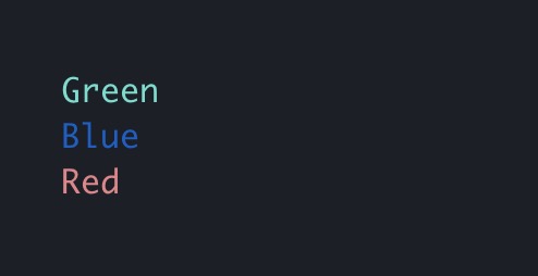 #### backgroundColor
Type: `string`
Same as `color` above, but for background.
```jsx
#### backgroundColor
Type: `string`
Same as `color` above, but for background.
```jsx
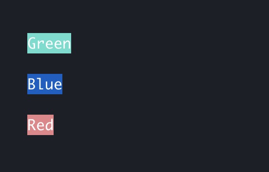 #### dimColor
Type: `boolean`\
Default: `false`
Dim the color (make it less bright).
```jsx
#### dimColor
Type: `boolean`\
Default: `false`
Dim the color (make it less bright).
```jsx
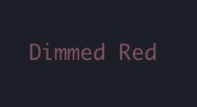 #### bold
Type: `boolean`\
Default: `false`
Make the text bold.
#### italic
Type: `boolean`\
Default: `false`
Make the text italic.
#### underline
Type: `boolean`\
Default: `false`
Make the text underlined.
#### strikethrough
Type: `boolean`\
Default: `false`
Make the text crossed with a line.
#### inverse
Type: `boolean`\
Default: `false`
Invert background and foreground colors.
```jsx
#### bold
Type: `boolean`\
Default: `false`
Make the text bold.
#### italic
Type: `boolean`\
Default: `false`
Make the text italic.
#### underline
Type: `boolean`\
Default: `false`
Make the text underlined.
#### strikethrough
Type: `boolean`\
Default: `false`
Make the text crossed with a line.
#### inverse
Type: `boolean`\
Default: `false`
Invert background and foreground colors.
```jsx
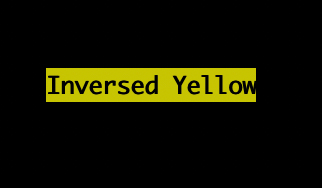 #### wrap
Type: `string`\
Allowed values: `wrap` `hard` `truncate` `truncate-start` `truncate-middle` `truncate-end`\
Default: `wrap`
This property tells Ink to wrap or truncate text if its width is larger than the container.
If `wrap` is passed (the default), Ink will wrap text and split it into multiple lines.
If `hard` is passed, Ink will fill each line to the full column width, breaking words as necessary.
If `truncate-*` is passed, Ink will truncate text instead, resulting in one line of text with the rest cut off.
```jsx
#### wrap
Type: `string`\
Allowed values: `wrap` `hard` `truncate` `truncate-start` `truncate-middle` `truncate-end`\
Default: `wrap`
This property tells Ink to wrap or truncate text if its width is larger than the container.
If `wrap` is passed (the default), Ink will wrap text and split it into multiple lines.
If `hard` is passed, Ink will fill each line to the full column width, breaking words as necessary.
If `truncate-*` is passed, Ink will truncate text instead, resulting in one line of text with the rest cut off.
```jsx