---
execute:
echo: true
message: false
warning: false
fig-format: "svg"
format:
revealjs:
highlight-style: a11y-dark
reference-location: margin
theme: lecture_styles.scss
controls: true
controls-tutorial: true
slide-number: true
code-link: true
chalkboard: true
incremental: false
smaller: true
preview-links: true
code-line-numbers: true
history: false
progress: true
link-external-icon: true
code-annotations: hover
pointer:
color: "#b18eb1"
revealjs-plugins:
- pointer
---
```{r}
#| echo = FALSE
require(downlit)
require(xml2)
```
## {#title-slide data-menu-title="Visualizing Data" background="#1e4655" background-image="../../images/csss-logo.png" background-position="center top 5%" background-size="50%"}
[Visualizing Data]{.custom-title}
[CS&SS 508 • Lecture 2]{.custom-subtitle}
[{{< var lectures.two >}}]{.custom-subtitle2}
[Victoria Sass]{.custom-subtitle3}
# Roadmap{.section-title background-color="#99a486"}
---
:::: {.columns}
::: {.column width="50%"}
### Last time, we learned:
* R and RStudio
* Quarto headers, syntax, and chunks
* Basics of functions, objects, and vectors
* Base `R` and packages
:::
::: {.column width="50%"}
::: {.fragment}
### Today, we will cover:
* Introducing the `tidyverse`!
* Basics of `ggplot2`
* Advanced features of `ggplot2`
* `ggplot2` extensions
:::
:::
::::
## File Types
We mainly work with three types of files in this class:
:::{.incremental}
* `.qmd`^[Quarto builds on a decade of developments with R Markdown documents. .Rmd files operate **very** similarly to Quarto documents but there are minor differences that you can read more about [here](https://quarto.org/docs/computations/r.html#:~:text=Another%20difference%20between%20R%20Markdown,than%20relying%20on%20external%20packages).]: These are **markdown** *syntax* files, where you write code and plain or formatted text to *make documents*.
* `.R`: These are **R** *syntax* files, where you write code to process and analyze data *without making an output document* ^[You can use the `source()` function to run a `.R` script file inside a `.qmd` or `.R` file. Using this you can break a large project up into multiple files but still run it all at once!].
* `.html` (or `.pdf`, `.docx`, etc.): These are the output documents created when you *Render* a quarto markdown document.
:::
. . .
Make sure you understand the difference between the uses of these file types! Please ask for clarification if needed!
# Introducing the `tidyverse` {.section-title background-color="#99a486"}
## Packages
Last week we discussed Base `R` and the fact that what makes `R` extremely powerful and flexible is the large number of diverse user-created packages.
. . .
::: {.callout-note icon=false}
## {{< fa hand >}} What are packages again?
Recall that packages are simply **collections of functions and code**^[Oftentimes packages will include sample datasets for instructive purposes.] others have already created, that will make your life easier!
:::
. . .
::: {.callout-caution icon=false}
## {{< fa triangle-exclamation >}} The package 2-step
Remember that to **install** a new package you use `install.packages("package_name")` in the **console**. You only need to do this once per machine (unless you want to update to a newer version of a package).
To **load** a package into your current session of `R` you use `library(package_name)`, preferably at the beginning of your `R` script or Quarto document. Every time you open RStudio it's a new session and you'll have to call `library()` on the packages you want to use.
:::
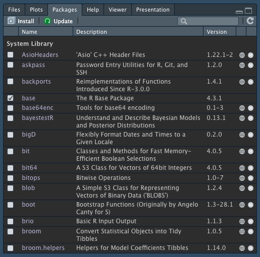
## Packages
The `Packages` tab in the bottom-right pane of RStudio lists your installed packages.
{fig-align="center"}
## The `tidyverse`
The `tidyverse` refers to two things:
:::{.incremental}
1. a specific package in `R` that loads several core packages within the `tidyverse`.
2. a specific design philosophy, grammar, and focus on "tidy" data structures developed by Hadley Wickham^[You can read the official manifesto [here](https://tidyverse.tidyverse.org/articles/manifesto.html).] and his team at RStudio (now named [Posit](https://posit.co/)).
:::
## The `tidyverse` package
:::: {.columns}
::: {.column width="50%"}
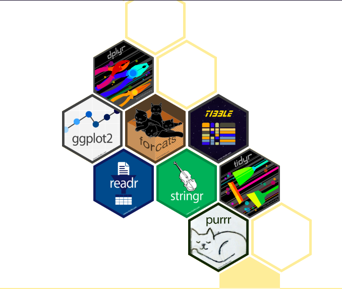
The core packages within the `tidyverse` include:
:::{.incremental}
* `ggplot2` (visualizations)
* `dplyr` (data manipulation)
* `tidyr` (data reshaping)
* `readr` (data import/export)
* `purrr` (iteration)
* `tibble` (modern dataframe)
* `stringr` (text data)
* `forcats` (factors)
:::
:::
::: {.column width="50%"}
:::
::::
## The `tidyverse` philosophy
:::: {.columns}
::: {.column width="50%"}
The principles underlying the tidyverse are:
:::{.incremental}
1. Reuse existing data structures.
2. Compose simple functions with the pipe.
3. Embrace functional programming.
4. Design for humans.
:::
:::
::: {.column width="50%"}
:::
::::
## {data-menu-title="Research process" background-image="images/research_process.png" background-position="center" background-size="90%"}
## {data-menu-title="Research process - visualization" background-image="images/research_process_visualize.png" background-position="center" background-size="90%"}
## {data-menu-title="Research process - communication" background-image="images/research_process_communicate.png" background-position="center" background-size="90%"}
## Gapminder Data
::: {style="font-size: 85%;"}
We'll be working with data from Hans Rosling's [Gapminder](http://www.gapminder.org) project. An excerpt of these data can be accessed through an R package called `gapminder`^[Cleaned and assembled by Jenny Bryan at UBC.]. Check the packages tab to see if `gapminder` appears (unchecked) in your computer's list of downloaded packages.
::: {.fragment}
If it doesn't, run `install.packages("gapminder")` in the console.
:::
::: {.fragment}
Now, load the `gapminder` package as well as the `tidyverse` package:
```{r}
#| message: true
library(gapminder)
library(tidyverse) # <1>
```
1. Every time you `library` (i.e. load) `tidyverse` it will tell you which individual packages it is loading, as well as all function conflicts it has with other packages loaded in the current session. This is useful information but you can suppress seeing/printing this output by adding the `message: false` chunk option to your code chunk.
:::
:::
## Check Out Gapminder {{< fa scroll >}} {.scrollable}
The data frame we will work with is called `gapminder`, available once you have loaded the package. Let's see its structure:
```{r}
str(gapminder)
```
. . .
#### What's Notable Here?
::: {.incremental}
* **Factor** variables `country` and `continent`
* Factors are categorical data with an underlying numeric representation
* We'll spend a lot of time on factors later!
* Many observations: $n=`r nrow(gapminder)`$ rows
* For each observation, a few variables: $p=`r ncol(gapminder)`$ columns
* A nested/hierarchical structure: `year` in `country` in `continent`
* These are panel data!
:::
## Base `R` plot
:::: {.columns}
::: {.column width="60%"}
```{r}
#| eval=FALSE
China <- gapminder |>
filter(country == "China")
plot(lifeExp ~ year,
data = China,
xlab = "Year",
ylab = "Life expectancy",
main = "Life expectancy in China",
col = "red",
pch = 16)
```
This plot is made with *one function* and *many arguments.*
:::
::: {.column width="40%"}
```{r}
#| echo: false
#| fig-width: 6
#| fig-height: 6
China <- subset(gapminder,gapminder$country == "China")
plot(lifeExp ~ year, data = China, xlab = "Year", ylab = "Life expectancy",
main = "Life expectancy in China", col = "red", pch = 16)
```
:::
::::
::: aside
Note: Don't worry about the code used to create the object `China`. We'll explore data manipulation in a couple weeks!
:::
## Fancier: `ggplot`
:::: {.columns}
::: {.column width="60%"}
```{r}
#| eval: false
ggplot(data = China,
mapping = aes(x = year, y = lifeExp)) +
geom_point(color = "red", size = 3) +
labs(title = "Life expectancy in China",
x = "Year",
y = "Life expectancy") +
theme_minimal(base_size = 18)
```
This `ggplot` is made with *many functions* and *fewer arguments* in each.
:::
::: {.column width="40%"}
```{r}
#| warning: false
#| message: false
#| echo: false
#| fig-width: 6
#| fig-height: 6
ggplot(data = China,
mapping = aes(x = year, y = lifeExp)) +
geom_point(color = "red", size = 3) +
labs(title = "Life expectancy in China",
x = "Year",
y = "Life expectancy") +
theme_minimal(base_size = 18)
```
:::
::::
# {data-menu-title="`ggplot`" background-image="images/ggplot2.png" background-size="contain" background-position="center" .section-title background-color="#1e4655"}
## `ggplot2`
The `ggplot2` package provides an alternative toolbox for plotting.
. . .
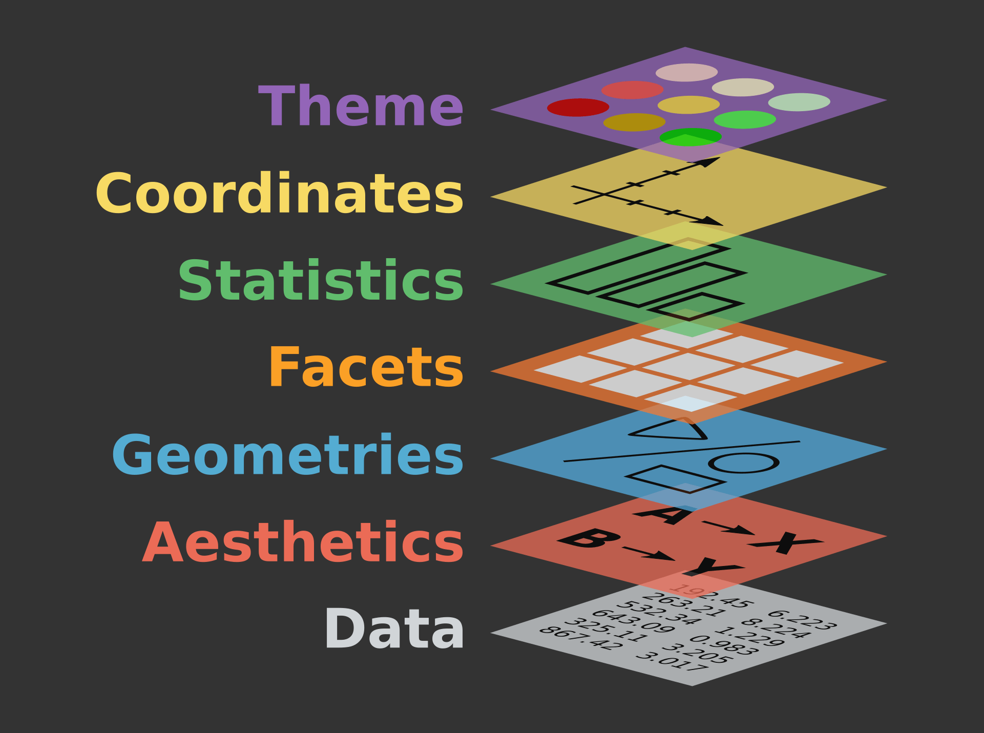
The core idea underlying this package is the [**layered grammar of graphics**](https://vita.had.co.nz/papers/layered-grammar.pdf): i.e. that we can break up elements of a plot into pieces and combine them.
. . .
`ggplot`s take a *bit* more work to create than Base `R` plots, but are usually:
* prettier
* more professional
* **much** more customizable
## Layered grammar of graphics
::: {.column-screen}
{fig-align="center" width=65%}
:::
::: {style="font-size: 85%;"}
::: aside
This is based on Leland Wilkinson's book [*The Grammar of Graphics*](https://orbiscascade-washington.primo.exlibrisgroup.com/permalink/01ALLIANCE_UW/1juclfo/alma99145336560001452) and extended by Hadley Wickham in his paper ["A layered grammar of graphics"](https://vita.had.co.nz/papers/layered-grammar.html).
:::
:::
## Structure of a ggplot
`ggplot` graphics objects consist of two primary components:
. . .
1. **Layers**, the components of a graph.
* We *add* layers to a `ggplot` object using `+`.
* This includes adding lines, shapes, and text to a plot.
. . .
2. **Aesthetics**, which determine how the layers appear.
* We *set* aesthetics using *arguments* (e.g. `color = "red"`) inside layer functions.
* This includes modifying locations, colors, and sizes of the layers.
::: {.callout-tip icon=false}
## {{< fa hand-point-up >}} Aesthetic Vignette
Learn more about all possible aesthetic mappings [here](https://ggplot2.tidyverse.org/articles/ggplot2-specs.html).
:::
## Layers
**Layers** are the components of the graph, such as:
::: {.incremental}
* `ggplot()`: initializes basic plotting object, specifies input data
* `geom_point()`: layer of scatterplot points
* `geom_line()`: layer of lines
* `geom_histogram()`: layer of a histogram
* `labs` (or to specify individually: `ggtitle()`, `xlab()`, `ylab()`): layers of labels
* `facet_wrap()`: layer creating multiple plot panels
* `theme_bw()`: layer replacing default gray background with black-and-white
:::
. . .
Layers are separated by a `+` sign. For clarity, I usually put each layer on a new line.
::: {.callout-important icon=false}
## {{< fa circle-exclamation >}} Syntax Warning
Be sure to **end** each line with the `+`. The code will not run if a new line *begins* with a `+`.
:::
## Aesthetics
**Aesthetics** control the appearance of the layers:
* `x`, `y`: $x$ and $y$ coordinate values to use
* `color`: set color of elements based on some data value
* `group`: describe which points are conceptually grouped together for the plot (often used with lines)
* `size`: set size of points/lines based on some data value (greater than 0)
* `alpha`: set transparency based on some data value (between 0 and 1)
::: {.callout-warning icon=false}
## {{< fa triangle-exclamation >}} Mapping data inside `aes()` vs. creating plot-wise settings outside `aes()`
When aesthetic arguments are called within `aes()` they specify a variable of the data and therefore map said value of the data by that aesthetic. Called outside `aes()`, these are only settings that can be given a specific value but will not display a dimension of the data.
:::
## `ggplot` Templates
. . .
#### All layers have:
an initializing `ggplot` call and at least one `geom` function.
::: {.fragment}
::: {.panel-tabset}
### same data & aesthetics
```{r}
#| eval: false
ggplot(data = [dataset],
mapping = aes(x = [x_variable], y = [y_variable])) +
geom_xxx() +
other options
```
### same data, diff aesthetics
```{r}
#| eval: false
ggplot(data = [dataset],
mapping = aes(x = [x_variable], y = [y_variable])) +
geom_xxx() +
geom_yyy(mapping = aes(x = [x_variable], y = [y_variable])) +
other options
```
### diff data & aesthetics
```{r}
#| eval: false
ggplot() +
geom_xxx(data = [dataset1],
mapping = aes(x = [x_variable], y = [y_variable])) +
geom_yyy(data = [dataset2],
mapping = aes(x = [x_variable], y = [y_variable])) +
other options
```
:::
:::
# Example: Basic Jargon in Action!{.section-title background-color="#99a486"}
## Axis Labels, Points, No Background{auto-animate="true"}
### Base `ggplot`
:::: {.columns}
:::{.column width="50%"}
```{r}
#| eval: FALSE
#| code-line-numbers: "1-2"
ggplot(data = China,
aes(x = year, y = lifeExp))
```
:::
:::{.column width="50%"}
```{r}
#| echo: false
#| fig-height: 6
#| fig-width: 6
ggplot(data = China,
aes(x = year, y = lifeExp))
```
:::
::::
::: aside
Initialize the plot with `ggplot()` and `x` and `y` aesthetics **mapped** to variables. These aesthetics will be accessible to any future layers since they're in the primary layer.
:::
## Axis Labels, Points, No Background{auto-animate="true"}
### Scatterplot
:::: {.columns}
:::{.column width="50%"}
```{r}
#| eval: false
#| code-line-numbers: "3"
ggplot(data = China,
aes(x = year, y = lifeExp)) +
geom_point()
```
:::
:::{.column width="50%"}
```{r}
#| echo: false
#| fig-height: 6
#| fig-width: 6
ggplot(data = China,
aes(x = year, y = lifeExp)) +
geom_point()
```
:::
::::
::: aside
Add a scatterplot **layer**.
:::
## Axis Labels, Points, No Background{auto-animate="true"}
### Point Color and Size
:::: {.columns}
:::{.column width="50%"}
```{r}
#| eval: false
#| code-line-numbers: "3"
ggplot(data = China,
aes(x = year, y = lifeExp)) +
geom_point(color = "red", size = 3)
```
:::
:::{.column width="50%"}
```{r}
#| echo: false
#| fig-height: 6
#| fig-width: 6
ggplot(data = China,
aes(x = year, y = lifeExp)) +
geom_point(color = "red", size = 3)
```
:::
::::
::: aside
**Set** aesthetics to make the points larger and red. Notice that these "aesthetics" are not inside the `aes` call the way `x` and `y` are on line 2. These are therefore global settings rather than mapping aesthetics.
:::
## Axis Labels, Points, No Background{auto-animate="true"}
### X-Axis Label
:::: {.columns}
:::{.column width="50%"}
```{r}
#| eval: false
#| code-line-numbers: "4"
ggplot(data = China,
aes(x = year, y = lifeExp)) +
geom_point(color = "red", size = 3) +
labs(x = "Year")
```
:::
:::{.column width="50%"}
```{r}
#| echo: false
#| fig-height: 6
#| fig-width: 6
ggplot(data = China,
aes(x = year, y = lifeExp)) +
geom_point(color = "red", size = 3) +
labs(x = "Year")
```
:::
::::
::: aside
Add a layer to capitalize the x-axis label.
:::
## Axis Labels, Points, No Background{auto-animate="true"}
### Y-Axis Label
:::: {.columns}
:::{.column width="50%"}
```{r}
#| eval: false
#| code-line-numbers: "5"
ggplot(data = China,
aes(x = year, y = lifeExp)) +
geom_point(color = "red", size = 3) +
labs(x = "Year",
y = "Life expectancy")
```
:::
:::{.column width="50%"}
```{r}
#| echo: false
#| fig-height: 6
#| fig-width: 6
ggplot(data = China,
aes(x = year, y = lifeExp)) +
geom_point(color = "red", size = 3) +
labs(x = "Year",
y = "Life expectancy")
```
:::
::::
::: aside
Add a layer to clean up the y-axis label.
:::
## Axis Labels, Points, No Background{auto-animate="true"}
### Title
:::: {.columns}
:::{.column width="50%"}
```{r}
#| eval: false
#| code-line-numbers: "6"
ggplot(data = China,
aes(x = year, y = lifeExp)) +
geom_point(color = "red", size = 3) +
labs(x = "Year",
y = "Life expectancy",
title = "Life expectancy in China")
```
:::
:::{.column width="50%"}
```{r}
#| echo: false
#| fig-height: 6
#| fig-width: 6
ggplot(data = China,
aes(x = year, y = lifeExp)) +
geom_point(color = "red", size = 3) +
labs(x = "Year",
y = "Life expectancy",
title = "Life expectancy in China")
```
:::
::::
::: aside
Add a title layer.
:::
## Axis Labels, Points, No Background{auto-animate="true"}
### Theme
:::: {.columns}
:::{.column width="50%"}
```{r}
#| eval: false
#| code-line-numbers: "7"
ggplot(data = China,
aes(x = year, y = lifeExp)) +
geom_point(color = "red", size = 3) +
labs(x = "Year",
y = "Life expectancy",
title = "Life expectancy in China") +
theme_minimal()
```
:::
:::{.column width="50%"}
```{r}
#| echo: false
#| fig-height: 6
#| fig-width: 6
ggplot(data = China,
aes(x = year, y = lifeExp)) +
geom_point(color = "red", size = 3) +
labs(x = "Year",
y = "Life expectancy",
title = "Life expectancy in China") +
theme_minimal()
```
:::
::::
::: aside
Pick a nicer theme with a new layer.
:::
## Axis Labels, Points, No Background{auto-animate="true"}
### Text Size
:::: {.columns}
:::{.column width="50%"}
```{r}
#| eval: false
#| code-line-numbers: "7"
ggplot(data = China,
aes(x = year, y = lifeExp)) +
geom_point(color = "red", size = 3) +
labs(x = "Year",
y = "Life expectancy",
title = "Life expectancy in China") +
theme_minimal(base_size = 18)
```
:::
:::{.column width="50%"}
```{r}
#| echo: false
#| fig-height: 6
#| fig-width: 6
ggplot(data = China,
aes(x = year, y = lifeExp)) +
geom_point(color = "red", size = 3) +
labs(x = "Year",
y = "Life expectancy",
title = "Life expectancy in China") +
theme_minimal(base_size = 18)
```
:::
::::
::: aside
Increase the base text size.
:::
## Plotting All Countries
We have a plot we like for China...
. . .
... but what if we want *all the countries*?
## Plotting All Countries{auto-animate="true"}
### A Mess!
:::: {.columns}
:::{.column width="50%"}
```{r}
#| eval: false
#| code-line-numbers: "|1|3"
ggplot(data = gapminder,
aes(x = year, y = lifeExp)) +
geom_point(color = "red", size = 3) +
labs(x = "Year",
y = "Life expectancy",
title = "Life expectancy over time") +
theme_minimal(base_size = 18)
```
:::
:::{.column width="50%"}
```{r}
#| echo: false
#| fig-height: 6
#| fig-width: 6
ggplot(data = gapminder,
aes(x = year, y = lifeExp)) +
geom_point(color = "red", size = 3) +
labs(x = "Year",
y = "Life expectancy",
title = "Life expectancy over time") +
theme_minimal(base_size = 18)
```
:::
::::
::: aside
We can't tell countries apart! Maybe we could follow *lines*?
:::
## Plotting All Countries{auto-animate="true"}
### Lines
:::: {.columns}
:::{.column width="50%"}
```{r}
#| eval: false
#| code-line-numbers: "3"
ggplot(data = gapminder,
aes(x = year, y = lifeExp)) +
geom_line(color = "red", size = 3) +
labs(x = "Year",
y = "Life expectancy",
title = "Life expectancy over time") +
theme_minimal(base_size = 18)
```
:::
:::{.column width="50%"}
```{r}
#| echo: false
#| fig-height: 6
#| fig-width: 6
ggplot(data = gapminder,
aes(x = year, y = lifeExp)) +
geom_line(color = "red", size = 3) +
labs(x = "Year",
y = "Life expectancy",
title = "Life expectancy over time") +
theme_minimal(base_size = 18)
```
:::
::::
::: aside
`ggplot2` doesn't know how to connect the lines!
:::
## Plotting All Countries{auto-animate="true"}
### Grouping
:::: {.columns}
:::{.column width="50%"}
```{r}
#| eval: false
#| code-line-numbers: "3"
ggplot(data = gapminder,
aes(x = year, y = lifeExp,
group = country)) +
geom_line(color = "red", size = 3) +
labs(x = "Year",
y = "Life expectancy",
title = "Life expectancy over time") +
theme_minimal(base_size = 18)
```
:::
:::{.column width="50%"}
```{r}
#| echo: false
#| fig-height: 6
#| fig-width: 6
ggplot(data = gapminder,
aes(x = year, y = lifeExp,
group = country)) +
geom_line(color = "red", size = 3) +
labs(x = "Year",
y = "Life expectancy",
title = "Life expectancy over time") +
theme_minimal(base_size = 18)
```
:::
::::
::: aside
That looks more reasonable... but the lines are too thick!
:::
## Plotting All Countries{auto-animate="true"}
### Size
:::: {.columns}
:::{.column width="50%"}
```{r}
#| eval: false
#| code-line-numbers: "4"
ggplot(data = gapminder,
aes(x = year, y = lifeExp,
group = country)) +
geom_line(color = "red") +
labs(x = "Year",
y = "Life expectancy",
title = "Life expectancy over time") +
theme_minimal(base_size = 18)
```
:::
:::{.column width="50%"}
```{r}
#| echo: false
#| fig-height: 6
#| fig-width: 6
ggplot(data = gapminder,
aes(x = year, y = lifeExp,
group = country)) +
geom_line(color = "red") +
labs(x = "Year",
y = "Life expectancy",
title = "Life expectancy over time") +
theme_minimal(base_size = 18)
```
:::
::::
::: aside
Much better... but what if we highlight regional differences?
:::
## Plotting All Countries{auto-animate="true"}
### Color
:::: {.columns}
:::{.column width="50%"}
```{r}
#| eval: false
#| code-line-numbers: "4-5"
ggplot(data = gapminder,
aes(x = year, y = lifeExp,
group = country,
color = continent)) +
geom_line() +
labs(x = "Year",
y = "Life expectancy",
title = "Life expectancy over time") +
theme_minimal(base_size = 18)
```
:::
:::{.column width="50%"}
```{r}
#| echo: false
#| fig-height: 6
#| fig-width: 6
ggplot(data = gapminder,
aes(x = year, y = lifeExp,
group = country,
color = continent)) +
geom_line() +
labs(x = "Year",
y = "Life expectancy",
title = "Life expectancy over time") +
theme_minimal(base_size = 18)
```
:::
::::
::: aside
Patterns are obvious... but it might be even more impactful if we separate continents completely.
:::
## Plotting All Countries{auto-animate="true"}
### Facets
:::: {.columns}
:::{.column width="50%"}
```{r}
#| eval: false
#| code-line-numbers: "10"
ggplot(data = gapminder,
aes(x = year, y = lifeExp,
group = country,
color = continent)) +
geom_line() +
labs(x = "Year",
y = "Life expectancy",
title = "Life expectancy over time") +
theme_minimal(base_size = 18) +
facet_wrap(vars(continent))
```
:::
:::{.column width="50%"}
```{r}
#| echo: false
#| fig-height: 6
#| fig-width: 6
ggplot(data = gapminder,
aes(x = year, y = lifeExp,
group = country,
color = continent)) +
geom_line() +
labs(x = "Year",
y = "Life expectancy",
title = "Life expectancy over time") +
theme_minimal(base_size = 18) +
facet_wrap(vars(continent))
```
:::
::::
::: aside
Now the text is too big!
:::
## Plotting All Countries{auto-animate="true"}
### Text Size
:::: {.columns}
:::{.column width="50%"}
```{r}
#| eval: false
#| code-line-numbers: "9"
ggplot(data = gapminder,
aes(x = year, y = lifeExp,
group = country,
color = continent)) +
geom_line() +
labs(x = "Year",
y = "Life expectancy",
title = "Life expectancy over time") +
theme_minimal() +
facet_wrap(vars(continent))
```
:::
:::{.column width="50%"}
```{r}
#| echo: false
#| fig-height: 6
#| fig-width: 6
ggplot(data = gapminder,
aes(x = year, y = lifeExp,
group = country,
color = continent)) +
geom_line() +
labs(x = "Year",
y = "Life expectancy",
title = "Life expectancy over time") +
theme_minimal() +
facet_wrap(vars(continent))
```
:::
::::
::: aside
Better. Do we even need the legend anymore?
:::
## Plotting All Countries{auto-animate="true"}
### No Legend
:::: {.columns}
:::{.column width="50%"}
```{r}
#| eval: false
#| code-line-numbers: "11"
ggplot(data = gapminder,
aes(x = year, y = lifeExp,
group = country,
color = continent)) +
geom_line() +
labs(x = "Year",
y = "Life expectancy",
title = "Life expectancy over time") +
theme_minimal() +
facet_wrap(vars(continent)) +
theme(legend.position = "none")
```
:::
:::{.column width="50%"}
```{r}
#| echo: false
#| fig-height: 6
#| fig-width: 6
ggplot(data = gapminder,
aes(x = year, y = lifeExp,
group = country,
color = continent)) +
geom_line() +
labs(x = "Year",
y = "Life expectancy",
title = "Life expectancy over time") +
theme_minimal() +
facet_wrap(vars(continent)) +
theme(legend.position = "none")
```
:::
::::
::: aside
Looking pretty good!
:::
# Lab 2 {.section-title background-color="#99a486"}
## Make a histogram
In pairs, create a histogram of life expectancy observations in the complete Gapminder dataset.
::: {.incremental}
1. Set the base layer by specifying the data as `gapminder` and the x variable as `lifeExp`
2. Add a second layer to create a histogram using the function `geom_histogram()`
3. Customize your plot with nice axis labels and a title.
4. Add the color "salmon" to the entire plot (hint: use the `fill` argument, not `color`).
5. Change this fill setting to an aesthetic and map continent onto it.
6. Change the `geom` to `geom_freqpoly`. What happened and how might you fix it?
7. Add facets for `continent` (create only 1 column).
8. Add one of the [built-in themes](https://ggplot2.tidyverse.org/reference/ggtheme.html) from `ggplot2`.
9. Remove the legend from the plot.
:::
## Solution: 1. Set Base Layer {auto-animate="true"}
```{r}
#| eval: true
#| fig-align: center
#| fig-width: 10
#| fig-height: 5
#| code-line-numbers: "1"
ggplot(gapminder, aes(x = lifeExp))
```
## Solution: 2. Add Histogram Layer {auto-animate="true"}
```{r}
#| eval: true
#| fig-align: center
#| fig-width: 10
#| fig-height: 5
#| code-line-numbers: "2"
ggplot(gapminder, aes(x = lifeExp)) +
geom_histogram(bins = 30)
```
::: aside
Setting the `bins` aesthetic tells ggplot how many values to bin by (lower is more fine-grained, higher is less descriptive).
:::
## Solution: 3. Add Label Layers {auto-animate="true"}
```{r}
#| eval: true
#| fig-align: center
#| fig-width: 10
#| fig-height: 5
#| code-line-numbers: "3-5"
ggplot(gapminder, aes(x = lifeExp)) +
geom_histogram(bins = 30) +
xlab("Life Expectancy") +
ylab("Count") +
ggtitle("Histogram of Life Expectancy in Gapminder Data")
```
## Solution: 4. Add fill setting {auto-animate="true"}
```{r}
#| eval: true
#| fig-align: center
#| fig-width: 10
#| fig-height: 5
#| code-line-numbers: "2"
ggplot(gapminder, aes(x = lifeExp)) +
geom_histogram(bins = 30, fill = "salmon") +
xlab("Life Expectancy") +
ylab("Count") +
ggtitle("Histogram of Life Expectancy in Gapminder Data")
```
## Solution: 5. Add fill aesthetic {auto-animate="true"}
```{r}
#| eval: true
#| fig-align: center
#| fig-width: 10
#| fig-height: 5
#| code-line-numbers: "1"
ggplot(gapminder, aes(x = lifeExp, fill = continent)) +
geom_histogram(bins = 30) +
xlab("Life Expectancy") +
ylab("Count") +
ggtitle("Histogram of Life Expectancy in Gapminder Data")
```
## Solution: 6. Change geometry {auto-animate="true"}
```{r}
#| eval: true
#| fig-align: center
#| fig-width: 10
#| fig-height: 5
#| code-line-numbers: "2"
ggplot(gapminder, aes(x = lifeExp, fill = continent)) +
geom_freqpoly(bins = 30) +
xlab("Life Expectancy") +
ylab("Count") +
ggtitle("Histogram of Life Expectancy in Gapminder Data")
```
## Solution: 6. Change geometry {auto-animate="true"}
```{r}
#| eval: true
#| fig-align: center
#| fig-width: 10
#| fig-height: 5
#| code-line-numbers: "2|1"
ggplot(gapminder, aes(x = lifeExp, color = continent)) +
geom_freqpoly(bins = 30) +
xlab("Life Expectancy") +
ylab("Count") +
ggtitle("Histogram of Life Expectancy in Gapminder Data")
```
## Solution: 7. Add facets {auto-animate="true"}
```{r}
#| eval: true
#| fig-align: center
#| fig-width: 10
#| fig-height: 5
#| code-line-numbers: "3"
ggplot(gapminder, aes(x = lifeExp, color = continent)) +
geom_freqpoly(bins = 30) +
facet_wrap(vars(continent), ncol = 1) +
xlab("Life Expectancy") +
ylab("Count") +
ggtitle("Histogram of Life Expectancy in Gapminder Data")
```
## Solution: 8. Add nicer theme {auto-animate="true"}
```{r}
#| eval: true
#| fig-align: center
#| fig-width: 10
#| fig-height: 5
#| code-line-numbers: "7"
ggplot(gapminder, aes(x = lifeExp, color = continent)) +
geom_freqpoly(bins = 30) +
facet_wrap(vars(continent), ncol = 1) +
xlab("Life Expectancy") +
ylab("Count") +
ggtitle("Histogram of Life Expectancy in Gapminder Data") +
theme_minimal()
```
## Solution: 9. Remove legend {auto-animate="true"}
```{r}
#| eval: true
#| fig-align: center
#| fig-width: 10
#| fig-height: 5
#| code-line-numbers: "8"
ggplot(gapminder, aes(x = lifeExp, color = continent)) +
geom_freqpoly(bins = 30) +
facet_wrap(vars(continent), ncol = 1) +
xlab("Life Expectancy") +
ylab("Count") +
ggtitle("Histogram of Life Expectancy in Gapminder Data") +
theme_minimal() +
theme(legend.position = "none")
```
# Break!{.section-title background-color="#1e4655"}
# Advanced ggplot tools{.section-title background-color="#99a486"}
## Further customization
Next, we'll discuss:
* Storing, modifying, and saving ggplots
* Advanced axis changes (scales, text, ticks)
* Legend changes (scales, colors, locations)
* Using multiple `geoms`
* Adding annotation for emphasis
## Storing Plots
We can assign a `ggplot` object to a name:
```{r}
lifeExp_by_year <-
ggplot(data = gapminder,
aes(x = year, y = lifeExp,
group = country,
color = continent)) +
geom_line() +
labs(x = "Year",
y = "Life expectancy",
title = "Life expectancy over time") +
theme_minimal() +
facet_wrap(vars(continent)) +
theme(legend.position = "none")
```
Afterwards, you can display or modify `ggplot`s...
## Showing a Stored Graph
```{r}
#| fig-width: 10
#| fig-height: 6
lifeExp_by_year
```
## Overriding previous specifications
```{r}
#| fig-width: 12
#| fig-height: 3
#| code-line-numbers: "2"
lifeExp_by_year +
facet_grid(cols = vars(continent))
```
## Adding More Layers
```{r}
#| fig-height: 3.5
#| fig-width: 12
#| code-line-numbers: "3"
lifeExp_by_year +
facet_grid(cols = vars(continent)) +
theme(legend.position = "bottom")
```
## Saving `ggplot` Plots
If you want to save a ggplot, use `ggsave()`:
```{r}
#| eval: false
ggsave(filename = "I_saved_a_file.pdf",
plot = lifeExp_by_year,
height = 3, width = 5, units = "in")
```
If you didn't manually set font sizes, these will usually come out at a reasonable size given the dimensions of your output file.
## Changing the Axes
We can modify the axes in a variety of ways, such as:
* Change the $x$ or $y$ range using `xlim()` or `ylim()` layers
* Change to a logarithmic or square-root scale on either axis: `scale_x_log10()`, `scale_y_sqrt()`
* Change where the major/minor breaks are: `scale_x_continuous(breaks = value(s), minor_breaks = value(s))`
## Axis Changes
```{r}
#| fig-height: 6
#| fig-width: 10
#| fig-align: center
#| code-line-numbers: "3|4"
ggplot(data = China, aes(x = year, y = gdpPercap)) +
geom_line() +
xlim(1940, 2010) +
scale_y_log10(breaks = c(1000, 2000, 3000, 4000, 5000)) +
ggtitle("Chinese GDP per capita")
```
## Precise Legend Position
```{r}
#| fig-height: 6
#| fig-width: 10
#| fig-align: center
#| code-line-numbers: "2"
lifeExp_by_year +
theme(legend.position = "inside", legend.position.inside = c(0.8, 0.2)) # <1>
```
1. If you choose position the legend `inside` the plot pane itself, you need to provide the coordinates (between `c(1, 1)`) for where it should be placed.
Instead of plot-pane coordinates, you could also use `top`, `bottom`, `left`, or `right.`
## Scales for Color, Shape, etc.
**Scales** are layers that control how the mapped aesthetics appear.
You can modify these with a `scale_[aesthetic]_[option]()` layer:
:::{.incremental}
* `[aesthetic]` is `x`, `y`, `color`, `shape`, `linetype`, `alpha`, `size`, `fill`, etc.
* `[option]` is something like `manual`, `continuous`, `binned` or `discrete` (depending on nature of the variable).
:::
. . .
**Examples:**
* `scale_alpha_ordinal()`: scales alpha transparency for ordinal categorical variable
* `scale_x_log10()`: maps a log10 transformation of the x-axis variable
* `scale_color_manual()`: allows manual specification of color aesthetic
## Legend Name and Manual Colors
```{r}
#| fig-height: 6
#| fig-width: 10
#| fig-align: center
#| code-line-numbers: "3-6"
#| eval: false
lifeExp_by_year +
theme(legend.position = "inside", legend.position.inside = c(0.8, 0.2)) +
scale_color_manual( # <1>
name = "Which continent are\nwe looking at?", # <2>
values = c("Africa" = "#80719e", "Americas" = "#fdc57e",
"Asia" = "#c55347", "Europe" = "#007190", "Oceania" = "#648f7b"))
```
1. This scale argument knows to "map" onto `continent` because it is specified as the aesthetic for `color` in our original ggplot object.
2. `\n` adds a line break
```{r}
#| fig-height: 6
#| fig-width: 10
#| fig-align: center
#| eval: true
#| echo: false
lifeExp_by_year +
theme(legend.position = "inside", legend.position.inside = c(0.8, 0.2)) +
scale_color_manual(
name = "Which continent are\nwe looking at?",
values = c("Africa" = "#80719e", "Americas" = "#fdc57e",
"Asia" = "#c55347", "Europe" = "#007190", "Oceania" = "#648f7b"))
```
## Fixed versus Free Scales {{< fa scroll >}} {.scrollable}
::: {.panel-tabset}
### Untransformed
```{r}
#| fig-align: center
#| code-fold: true
#| fig-width: 16
#| fig-height: 8
gapminder_sub <- gapminder |>
filter(year %in% c(1952, 1982, 2002)) # <1>
scales_plot <- ggplot(data = gapminder_sub,
aes(x = lifeExp, y = gdpPercap, fill = continent)) +
geom_jitter(alpha = 0.5, # <2>
pch = 21, # <3>
size = 3, # <4>
color = "black") + # <5>
scale_fill_viridis_d(option = "D") + # <6>
facet_grid(rows = vars(year), # <7>
cols = vars(continent)) + # <7>
ggthemes::theme_tufte(base_size = 20) # <8>
scales_plot
```
1. Create subset with only 3 years of the data
2. `alpha` controls transparency and ranges from 0 (completely opaque) to 1 (completely solid)
3. This shape is a circle with fill (therefore it can take different colors for its outline, via `color`, and its interior, via `fill`)
4. Increase size of points
5. Outline of circle is black
6. Circle is filled by colors perceptable for various forms of color-blindness
7. Facet by years in the row and by continent in the columns
8. Use a nice theme from the `ggthemes` package and increase text size throughout the plot
### Fixed
```{r}
#| fig-align: center
#| code-fold: true
#| fig-width: 16
#| fig-height: 8
scales_plot +
scale_y_log10(breaks = c(250, 1000, 10000, 50000, 115000)) # <9>
```
9. Transform the y axis to the logarithm to gain better visualization
### Free x
```{r}
#| code-fold: true
#| fig-align: center
#| fig-width: 16
#| fig-height: 8
scales_plot +
scale_y_log10(breaks = c(250, 1000, 10000, 50000, 115000)) +
facet_grid(rows = vars(year),
cols = vars(continent),
scales = "free_x") # <10>
```
10. Make the x-axis vary by data
### Free y
```{r}
#| code-fold: true
#| fig-align: center
#| fig-width: 16
#| fig-height: 8
scales_plot +
scale_y_log10(breaks = c(250, 1000, 10000, 50000, 115000)) +
facet_grid(rows = vars(year),
cols = vars(continent),
scales = "free_y") # <11>
```
11. Make the y-axis vary by data
### Free x & y
```{r}
#| code-fold: true
#| fig-align: center
#| fig-width: 16
#| fig-height: 8
scales_plot +
scale_y_log10(breaks = c(250, 1000, 10000, 50000, 115000)) +
facet_grid(rows = vars(year),
cols = vars(continent),
scales = "free") # <12>
```
12. Make both axes vary by data
:::
## Using multiple `geoms` {auto-animate="true"}
```{r}
#| fig-align: center
#| code-line-numbers: "|2"
ggplot(gapminder, aes(x = continent, y = lifeExp)) +
geom_boxplot(outlier.colour = "maroon")
```
## Using multiple `geoms` {auto-animate="true"}
```{r}
#| fig-align: center
#| code-line-numbers: "3"
ggplot(gapminder, aes(x = continent, y = lifeExp)) +
geom_boxplot(outlier.colour = "maroon") +
geom_point(alpha = 0.25)
```
## Using multiple `geoms` {auto-animate="true"}
```{r}
#| fig-align: center
#| code-line-numbers: "3"
ggplot(gapminder, aes(x = continent, y = lifeExp)) +
geom_boxplot(outlier.colour = "maroon") +
geom_jitter(alpha = 0.25)
```
## Using multiple `geoms` {auto-animate="true"}
```{r}
#| fig-align: center
#| code-line-numbers: "3"
ggplot(gapminder, aes(x = continent, y = lifeExp)) +
geom_boxplot(outlier.colour = "maroon") +
geom_jitter(position = position_jitter(width = 0.1, height = 0), # <1>
alpha = 0.25) # <1>
```
1. You'll notice our outliers are repeated here since we've mapped them with both geoms. We'll clean that up in the next slide...
## {.scrollable}
### Annotating specific datapoints for emphasis {{< fa scroll >}}
```{r}
#| echo: false
outliers <- gapminder |>
group_by(continent) |>
mutate(outlier = case_when(quantile(lifeExp, probs = 0.25) - (IQR(lifeExp) * 1.5) > lifeExp ~ "outlier",
quantile(lifeExp, probs = 0.75) + (IQR(lifeExp) * 1.5) < lifeExp ~ "outlier",
.default = NA)) |>
filter(!is.na(outlier)) |>
ungroup() |>
group_by(country) |>
filter(lifeExp == min(lifeExp))
no_outliers <- gapminder |>
group_by(continent) |>
mutate(outlier = case_when(quantile(lifeExp, probs = 0.25) - (IQR(lifeExp) * 1.5) > lifeExp ~ "outlier",
quantile(lifeExp, probs = 0.75) + (IQR(lifeExp) * 1.5) < lifeExp ~ "outlier",
.default = NA)) |>
filter(is.na(outlier))
```
::: {.panel-tabset}
### Specify outliers
```{r}
#| code-fold: true
outliers <- gapminder |>
group_by(continent) |>
mutate(outlier = case_when(
quantile(lifeExp, probs = 0.25) - (IQR(lifeExp) * 1.5) > lifeExp ~ "outlier", # <1>
quantile(lifeExp, probs = 0.75) + (IQR(lifeExp) * 1.5) < lifeExp ~ "outlier", # <2>
.default = NA)
) |>
filter(!is.na(outlier)) |> # <3>
ungroup() |> group_by(country) |> # <4>
filter(lifeExp == min(lifeExp)) # <5>
outliers
```
1. Anything lower than the 1st quartile - 1.5*IQR
2. Anything higher than the 3rd quartile + 1.5*IQR
3. Remove non-outliers (coded as missing in previous step)
4. Regroup by country
5. Filter for just the minimum life expectancy for each country
### Remove outliers
```{r}
#| code-fold: true
no_outliers <- gapminder |>
group_by(continent) |>
mutate(outlier = case_when(
quantile(lifeExp, probs = 0.25) - (IQR(lifeExp) * 1.5) > lifeExp ~ "outlier",
quantile(lifeExp, probs = 0.75) + (IQR(lifeExp) * 1.5) < lifeExp ~ "outlier",
.default = NA)) |>
filter(is.na(outlier)) # <6>
no_outliers
```
6. Remove outliers from original data
### Basic annotation
```{r}
#| warning: false
#| fig-align: center
#| code-fold: true
#| fig-width: 16
#| fig-height: 8
ggplot(gapminder, aes(x = continent, y = lifeExp)) +
geom_boxplot(outlier.shape = NA) + # <7>
geom_jitter(data = no_outliers, # <8>
position = position_jitter(width = 0.1, height = 0),
alpha = 0.25,
size = 3) +
geom_jitter(data = outliers, # <9>
color = "maroon", # <9>
position = position_jitter(width = 0.1, height = 0),
alpha = 0.7,
size = 3) +
geom_text(data = outliers, # <10>
aes(label = country), # <10>
color = "maroon",
size = 8) +
theme_minimal(base_size = 18)
```
7. Remove outliers from boxplot geom
8. Plot points that are not categorized as outliers *without* color
9. Plot points that are categorized as outliers *with* color
10. Only add identifying text to outlier points
### Offset annotation
```{r}
#| warning: false
#| fig-align: center
#| code-fold: true
#| fig-width: 16
#| fig-height: 8
library(ggrepel) # <11>
ggplot(gapminder, aes(x = continent, y = lifeExp)) +
geom_boxplot(outlier.shape = NA) +
geom_jitter(data = no_outliers,
position = position_jitter(width = 0.1, height = 0),
alpha = 0.25,
size = 3) +
geom_jitter(data = outliers,
color = "maroon",
position = position_jitter(width = 0.1, height = 0),
alpha = 0.7,
size = 3) +
geom_label_repel(data = outliers,
aes(label = country),
color = "maroon",
alpha = 0.7, # <12>
size = 8,
max.overlaps = 13) + # <13>
theme_minimal(base_size = 18)
```
11. A package that provides additional geoms for `ggplot2` to repel overlapping text labels
12. Allow points to be somewhat visible through text labels
13. Tolerance for permissible overlapping labels (default is 10; I chose 13 so none of the outliers would be removed)
:::
# Bonus: Advanced Example!{.section-title background-color="#99a486"}
## End Result
We're going to *slowly* build up a *really detailed plot* now!
```{r}
#| echo: false
#| fig-height: 6
#| fig-width: 10
ggplot(data = gapminder, aes(x = year, y = lifeExp, group = country)) +
geom_line(alpha = 0.5, aes(color = "Country", size = "Country")) +
geom_line(stat = "smooth", method = "loess",
aes(group = continent, color = "Continent", size = "Continent"), alpha = 0.5) +
facet_wrap(~ continent, nrow = 2) +
scale_color_manual(name = "Life Exp. for:", values = c("Country" = "black", "Continent" = "blue")) +
scale_size_manual(name = "Life Exp. for:", values = c("Country" = 0.25, "Continent" = 3)) +
theme_minimal(base_size = 14) + ylab("Years") + xlab("") +
ggtitle("Life Expectancy, 1952-2007", subtitle = "By continent and country") +
theme(legend.position = "inside", legend.position.inside = c(0.8, 0.2), axis.text.x = element_text(angle = 45))
```
## Base `ggplot`
::: {.panel-tabset}
### Code
```{r}
#| eval: false
ggplot(data = gapminder,
aes(x = year, y = lifeExp, group = country))
```
### Plot
```{r}
#| echo: false
#| eval: true
#| fig-height: 6
#| fig-width: 10
#| fig-align: center
#| fig-cap: What might be a good `geom` layer for this data?
#| fig-cap-location: bottom
ggplot(data = gapminder,
aes(x = year, y = lifeExp, group = country))
```
:::
## Lines
::: {.panel-tabset}
### Code
```{r}
#| eval: false
#| code-line-numbers: "3"
ggplot(data = gapminder,
aes(x = year, y = lifeExp, group = country)) +
geom_line()
```
### Plot
```{r}
#| echo: false
#| eval: true
#| fig-height: 6
#| fig-width: 10
#| fig-align: center
#| fig-cap: Let's also add a continent-specific average so we can visualize country-deviations from the regional average.
#| fig-cap-location: bottom
ggplot(data = gapminder,
aes(x = year, y = lifeExp, group = country)) +
geom_line()
```
:::
## Continent Average
::: {.panel-tabset}
### Code
```{r}
#| eval: false
#| code-line-numbers: "4-6"
ggplot(data = gapminder,
aes(x = year, y = lifeExp, group = country)) +
geom_line() +
geom_line(stat = "smooth",
method = "loess", # <1>
aes(group = continent))
```
1. A [*loess* curve](https://en.wikipedia.org/wiki/Local_regression) is something like a moving average.
### Plot
```{r}
#| echo: false
#| eval: true
#| fig-height: 6
#| fig-width: 10
#| fig-align: center
#| fig-cap: We can't quite distinguish the averages from everything else yet. Let's facet by continent and start mapping aesthetics to our data to visualize things more clearly.
#| fig-cap-location: bottom
ggplot(data = gapminder,
aes(x = year, y = lifeExp, group = country)) +
geom_line() +
geom_line(stat = "smooth",
method = "loess",
aes(group = continent))
```
:::
## Facets
::: {.panel-tabset}
### Code
```{r}
#| eval: false
#| code-line-numbers: "7-8"
ggplot(data = gapminder,
aes(x = year, y = lifeExp, group = country)) +
geom_line() +
geom_line(stat = "smooth",
method = "loess",
aes(group = continent)) +
facet_wrap(vars(continent), # <1>
nrow = 2)
```
1. You can specify the faceting variable by wrapping the variable name in `vars()` (preferred), using `~ variable_name` notation, or quoting variable name(s) as a character vector.
### Plot
```{r}
#| echo: false
#| eval: true
#| fig-height: 6
#| fig-width: 10
#| fig-align: center
#| fig-cap: Facets allow us to gain a clearer understanding of the regional patterns. We want to differentiate the continent-average line from the country-specific lines though so let's change it's color.
#| fig-cap-location: bottom
ggplot(data = gapminder,
aes(x = year, y = lifeExp, group = country)) +
geom_line() +
geom_line(stat = "smooth",
method = "loess",
aes(group = continent)) +
facet_wrap(~ continent, nrow = 2)
```
:::
## Color Scale
::: {.panel-tabset}
### Code
```{r}
#| eval: false
#| code-line-numbers: "9-10"
ggplot(data = gapminder,
aes(x = year, y = lifeExp, group = country)) +
geom_line() +
geom_line(stat = "smooth",
method = "loess",
aes(group = continent)) +
facet_wrap(~ continent,
nrow = 2) +
scale_color_manual(name = "Life Exp. for:", # <1>
values = c("Country" = "black", "Continent" = "blue")) # <2>
```
1. Create informative legend title
2. Specify mapping variables and their respective color values
### Plot
```{r}
#| echo: false
#| eval: true
#| fig-height: 6
#| fig-width: 10
#| fig-align: center
#| fig-cap: Hmm, can't quite see the blue line yet. Let's make it bigger?
#| fig-cap-location: bottom
ggplot(data = gapminder,
aes(x = year, y = lifeExp, group = country)) +
geom_line() +
geom_line(stat = "smooth",
method = "loess",
aes(group = continent)) +
facet_wrap(~ continent, nrow = 2) +
scale_color_manual(name = "Life Exp. for:",
values = c("Country" = "black", "Continent" = "blue"))
```
:::
## Size Scale
::: {.panel-tabset}
### Code
```{r}
#| eval: false
#| code-line-numbers: "11-12"
ggplot(data = gapminder,
aes(x = year, y = lifeExp, group = country)) +
geom_line() +
geom_line(stat = "smooth",
method = "loess",
aes(group = continent)) +
facet_wrap(~ continent,
nrow = 2) +
scale_color_manual(name = "Life Exp. for:",
values = c("Country" = "black", "Continent" = "blue")) +
scale_size_manual(name = "Life Exp. for:", # <1>
values = c("Country" = 0.25, "Continent" = 3)) # <2>
```
1. Use same legend title as previous scale to combine separate aesthetics into one legend
2. Specify mapping variables and their respective size values
### Plot
```{r}
#| echo: false
#| eval: true
#| fig-height: 6
#| fig-width: 10
#| fig-align: center
#| fig-cap: It doesn't look like our color and size scales are actually mapping onto our variables. Why is that?
#| fig-cap-location: bottom
ggplot(data = gapminder,
aes(x = year, y = lifeExp, group = country)) +
geom_line() +
geom_line(stat = "smooth",
method = "loess",
aes(group = continent)) +
facet_wrap(~ continent,
nrow = 2) +
scale_color_manual(name = "Life Exp. for:",
values = c("Country" = "black", "Continent" = "blue")) +
scale_size_manual(name = "Life Exp. for:",
values = c("Country" = 0.25, "Continent" = 3))
```
:::
## Mapping Color & Size
::: {.panel-tabset}
### Code
```{r}
#| eval: false
#| code-line-numbers: "3,5"
ggplot(data = gapminder,
aes(x = year, y = lifeExp, group = country)) +
geom_line(aes(color = "Country", size = "Country")) + # <1>
geom_line(stat = "smooth", method = "loess",
aes(group = continent, color = "Continent", size = "Continent")) + # <1>
facet_wrap(~ continent,
nrow = 2) +
scale_color_manual(name = "Life Exp. for:",
values = c("Country" = "black", "Continent" = "blue")) +
scale_size_manual(name = "Life Exp. for:",
values = c("Country" = 0.25, "Continent" = 3))
```
1. Add mapping aesthetics for color and size for both `Country`- and `Continent`-specific line geoms
### Plot
```{r}
#| echo: false
#| eval: true
#| fig-height: 6
#| fig-width: 10
#| fig-align: center
#| fig-cap: Huzzah! Let's change the transparency on these lines a touch so we can see all our data more easily.
#| fig-cap-location: bottom
ggplot(data = gapminder,
aes(x = year, y = lifeExp, group = country)) +
geom_line(aes(color = "Country", size = "Country")) +
geom_line(stat = "smooth", method = "loess",
aes(group = continent, color = "Continent", size = "Continent")) +
facet_wrap(~ continent,
nrow = 2) +
scale_color_manual(name = "Life Exp. for:",
values = c("Country" = "black", "Continent" = "blue")) +
scale_size_manual(name = "Life Exp. for:",
values = c("Country" = 0.25, "Continent" = 3))
```
:::
## Alpha (Transparency)
::: {.panel-tabset}
### Code
```{r}
#| eval: false
#| code-line-numbers: "3,7"
ggplot(data = gapminder,
aes(x = year, y = lifeExp, group = country)) +
geom_line(alpha = 0.5,
aes(color = "Country", size = "Country")) +
geom_line(stat = "smooth", method = "loess",
aes(group = continent, color = "Continent", size = "Continent"),
alpha = 0.5) +
facet_wrap(~ continent,
nrow = 2) +
scale_color_manual(name = "Life Exp. for:",
values = c("Country" = "black", "Continent" = "blue")) +
scale_size_manual(name = "Life Exp. for:",
values = c("Country" = 0.25, "Continent" = 3))
```
### Plot
```{r}
#| echo: false
#| eval: true
#| fig-height: 6
#| fig-width: 10
#| fig-align: center
#| fig-cap: Now we're getting somewhere! We can also add useful labels and clean up the theme.
#| fig-cap-location: bottom
ggplot(data = gapminder,
aes(x = year, y = lifeExp, group = country)) +
geom_line(alpha = 0.5,
aes(color = "Country", size = "Country")) +
geom_line(stat = "smooth",
method = "loess",
aes(group = continent, color = "Continent", size = "Continent"),
alpha = 0.5) +
facet_wrap(~ continent,
nrow = 2) +
scale_color_manual(name = "Life Exp. for:",
values = c("Country" = "black", "Continent" = "blue")) +
scale_size_manual(name = "Life Exp. for:",
values = c("Country" = 0.25, "Continent" = 3))
```
:::
## Theme and Labels
::: {.panel-tabset}
### Code
```{r}
#| eval: false
#| code-line-numbers: "13-15"
ggplot(data = gapminder,
aes(x = year, y = lifeExp, group = country)) +
geom_line() +
geom_line(stat = "smooth",
method = "loess",
aes(group = continent)) +
facet_wrap(~ continent,
nrow = 2) +
scale_color_manual(name = "Life Exp. for:",
values = c("Country" = "black", "Continent" = "blue")) +
scale_size_manual(name = "Life Exp. for:",
values = c("Country" = 0.25, "Continent" = 3)) +
theme_minimal(base_size = 14) + # <1>
labs(y = "Years", # <2>
x = "") #<2>
```
1. Add a nicer theme and increase relative font size throughout plot
2. Since our x-axis is calendar year and our y-axis is years of life expectancy, let's avoid confusion by assigning `Years` to the y-axis and removing the x-axis label (which can be inferred from the plot title we'll add next)
### Plot
```{r}
#| echo: false
#| eval: true
#| fig-height: 6
#| fig-width: 10
#| fig-align: center
#| fig-cap: What's our plot showing? We should be explicit about that.
#| fig-cap-location: bottom
ggplot(data = gapminder,
aes(x = year, y = lifeExp, group = country)) +
geom_line(alpha = 0.5,
aes(color = "Country", size = "Country")) +
geom_line(stat = "smooth",
method = "loess",
aes(group = continent, color = "Continent", size = "Continent"),
alpha = 0.5) +
facet_wrap(~ continent,
nrow = 2) +
scale_color_manual(name = "Life Exp. for:",
values = c("Country" = "black", "Continent" = "blue")) +
scale_size_manual(name = "Life Exp. for:",
values = c("Country" = 0.25, "Continent" = 3)) +
theme_minimal(base_size = 14) +
labs(y = "Years",
x = "")
```
:::
## Title and Subtitle
::: {.panel-tabset}
### Code
```{r}
#| eval: false
#| code-line-numbers: "16-17"
ggplot(data = gapminder,
aes(x = year, y = lifeExp, group = country)) +
geom_line() +
geom_line(stat = "smooth",
method = "loess",
aes(group = continent)) +
facet_wrap(~ continent,
nrow = 2) +
scale_color_manual(name = "Life Exp. for:",
values = c("Country" = "black", "Continent" = "blue")) +
scale_size_manual(name = "Life Exp. for:",
values = c("Country" = 0.25, "Continent" = 3)) +
theme_minimal(base_size = 14) +
labs(y = "Years",
x = "",
title = "Life Expectancy, 1952-2007",
subtitle = "By continent and country")
```
### Plot
```{r}
#| echo: false
#| eval: true
#| fig-height: 6
#| fig-width: 10
#| fig-align: center
#| fig-cap: The x-axis feels a little busy right now...
#| fig-cap-location: bottom
ggplot(data = gapminder,
aes(x = year, y = lifeExp, group = country)) +
geom_line(alpha = 0.5,
aes(color = "Country", size = "Country")) +
geom_line(stat = "smooth",
method = "loess",
aes(group = continent, color = "Continent", size = "Continent"),
alpha = 0.5) +
facet_wrap(~ continent,
nrow = 2) +
scale_color_manual(name = "Life Exp. for:",
values = c("Country" = "black", "Continent" = "blue")) +
scale_size_manual(name = "Life Exp. for:",
values = c("Country" = 0.25, "Continent" = 3)) +
theme_minimal(base_size = 14) +
labs(y = "Years",
x = "",
title = "Life Expectancy, 1952-2007",
subtitle = "By continent and country")
```
:::
## Angled Tick Values
::: {.panel-tabset}
### Code
```{r}
#| eval: false
#| code-line-numbers: "18"
ggplot(data = gapminder,
aes(x = year, y = lifeExp, group = country)) +
geom_line() +
geom_line(stat = "smooth",
method = "loess",
aes(group = continent)) +
facet_wrap(~ continent,
nrow = 2) +
scale_color_manual(name = "Life Exp. for:",
values = c("Country" = "black", "Continent" = "blue")) +
scale_size_manual(name = "Life Exp. for:",
values = c("Country" = 0.25, "Continent" = 3)) +
theme_minimal(base_size = 14) +
labs(y = "Years",
x = "",
title = "Life Expectancy, 1952-2007",
subtitle = "By continent and country") +
theme(axis.text.x = element_text(angle = 45)) # <1>
```
1. The `theme()` function has **many** arguments that allow you to provide more granular, non-data, aesthetic customizations, such as rotating the x-axis text in this example.
### Plot
```{r}
#| echo: false
#| eval: true
#| fig-height: 6
#| fig-width: 10
#| fig-align: center
#| fig-cap: Note - fewer values might be better than angled labels! Finally, let's move our legend so it isn't wasting space.
#| fig-cap-location: bottom
ggplot(data = gapminder,
aes(x = year, y = lifeExp, group = country)) +
geom_line(alpha = 0.5,
aes(color = "Country", size = "Country")) +
geom_line(stat = "smooth",
method = "loess",
aes(group = continent, color = "Continent", size = "Continent"),
alpha = 0.5) +
facet_wrap(~ continent,
nrow = 2) +
scale_color_manual(name = "Life Exp. for:",
values = c("Country" = "black", "Continent" = "blue")) +
scale_size_manual(name = "Life Exp. for:",
values = c("Country" = 0.25, "Continent" = 3)) +
theme_minimal(base_size = 14) +
labs(y = "Years",
x = "",
title = "Life Expectancy, 1952-2007",
subtitle = "By continent and country") +
theme(axis.text.x = element_text(angle = 45))
```
:::
## Legend Position
::: {.panel-tabset}
### Code
```{r}
#| eval: false
#| code-line-numbers: "18"
ggplot(data = gapminder,
aes(x = year, y = lifeExp, group = country)) +
geom_line() +
geom_line(stat = "smooth",
method = "loess",
aes(group = continent)) +
facet_wrap(~ continent,
nrow = 2) +
scale_color_manual(name = "Life Exp. for:",
values = c("Country" = "black", "Continent" = "blue")) +
scale_size_manual(name = "Life Exp. for:",
values = c("Country" = 0.25, "Continent" = 3)) +
theme_minimal(base_size = 14) +
labs(y = "Years",
x = "",
title = "Life Expectancy, 1952-2007",
subtitle = "By continent and country") +
theme(legend.position = "inside", legend.position.inside = c(0.82, 0.15),
axis.text.x = element_text(angle = 45))
```
### Plot
```{r}
#| echo: false
#| eval: true
#| fig-height: 6
#| fig-width: 10
#| fig-align: center
#| fig-cap: Voilà!
#| fig-cap-location: bottom
ggplot(data = gapminder,
aes(x = year, y = lifeExp, group = country)) +
geom_line(alpha = 0.5,
aes(color = "Country", size = "Country")) +
geom_line(stat = "smooth",
method = "loess",
aes(group = continent, color = "Continent", size = "Continent"),
alpha = 0.5) +
facet_wrap(~ continent,
nrow = 2) +
scale_color_manual(name = "Life Exp. for:",
values = c("Country" = "black", "Continent" = "blue")) +
scale_size_manual(name = "Life Exp. for:",
values = c("Country" = 0.25, "Continent" = 3)) +
theme_minimal(base_size = 14) +
labs(y = "Years",
x = "",
title = "Life Expectancy, 1952-2007",
subtitle = "By continent and country") +
theme(legend.position = "inside", legend.position.inside = c(0.8, 0.2),
axis.text.x = element_text(angle = 45))
```
:::
# `ggplot` Extensions!{.section-title background-color="#99a486"}
## `tidyverse` extended universe
`ggplot2` can obviously do a lot on its own. But because `R` allows for anyone and everyone to expand the functionality of what already exists, numerous extensions^[The full list can be found [here](https://exts.ggplot2.tidyverse.org/gallery/).] to `ggplot2` have been created.
. . .
We've already seen one example with `ggrepel`. But let's look at a few others...
## `geomtextpath` {{< fa scroll >}} {.scrollable}
If you want your labels to follow along the path of your plot (and maintain proper angles and spacing) try using [`geomtextpath`](https://allancameron.github.io/geomtextpath/index.html).
```{r}
#| code-fold: true
#| fig-align: center
library(geomtextpath) # <1>
gapminder |>
filter(country %in% c("Cuba", "Haiti", "Dominican Republic")) |> # <2>
ggplot(aes(x = year,
y = lifeExp,
color = country,
label = country)) + # <3>
geom_textpath() + # <4>
theme(legend.position = "none") # <5>
```
1. Run `install.packages("geomtextpath")` in console first
2. Restricting data to 3 regionally-specific countries
3. Specify label with text to appear
4. Adding textpath geom to put labels within lines
5. Removing legend
## `ggridges` {{< fa scroll >}} {.scrollable}
We can visualize the differing distributions of a continuous variable by levels of a categorical variable with [`ggridges`](https://wilkelab.org/ggridges/)!
```{r}
#| code-fold: true
#| fig-align: center
library(ggridges) # <1>
ggplot(gapminder,
aes(x = lifeExp,
y = continent,
fill = continent,
color = continent)) +
geom_density_ridges(alpha = 0.5, # <2>
show.legend = FALSE) # <2>
```
1. Run `install.packages("ggridges")` in console first
2. Add ridges, make all ridges a bit transparent, remove legend
## `ggwordcloud` {{< fa scroll >}} {.scrollable}
If you are working with text data, you may want to visualize the sentiment of words in your documents. You can use [`ggwordcloud`](https://lepennec.github.io/ggwordcloud/) for that.
```{r}
#| code-fold: true
#| fig-align: center
#| fig-cap: "Feelings about taking Introduction to R (Fall 2025)"
#| fig-cap-location: margin
library(ggwordcloud) # <1>
library(tidytext) # <2>
library(textdata) # <3>
library(janitor) # <4>
CSSS_508_Introductions <- read_csv( # <5>
"CSSS 508 Introductions.csv", # <5>
col_select = `What is one word that best describes your feelings about taking this class?` # <5>
) # <5>
feelings <- CSSS_508_Introductions |>
rename(text = `What is one word that best describes your feelings about taking this class?`) |>
mutate(text = str_to_lower(text)) |> # <6>
unnest_tokens(word, text) |> # <7>
filter(!word %in% stop_words$word) |> # <8>
mutate(word = str_replace_all(word, "[[:punct:]]", "")) |> # <9>
filter(!word %in% c("", "bit", "audit", "level", "understanding", "rr")) # <10>
bing <- get_sentiments("bing") # <11>
word_sentiments <- feelings |>
inner_join(bing, by = "word") |> # <12>
count(word, sentiment, sort = TRUE) # <13>
ggplot(word_sentiments,
aes(label = word, size = n, color = sentiment)) + # <14>
geom_text_wordcloud() + # <14>
scale_size_area(max_size = 30) +
scale_color_manual(values = c("positive" = "#007190", "negative" = "#c56127")) +
theme_minimal() +
theme(legend.position = "bottom")
```
1. Run `install.packages("ggwordcloud")` in console first
2. A package that provides functions to transform text to enable various types of text analyses
3. Provides various dictionaries to categorize words for sentiment analysis (i.e. bing)
4. Allows us to standardize text format (i.e. make all words lowercase)
5. Reads in the responses to a specific question from last week's introductory survey
6. Makes all letters lowercase
7. Takes character strings with any number of words and splits them into individual-word-strings (each row of new `word` variable is one word)
8. Removes "stop words" (i.e. and, the, it, etc.) from `word`
9. Removes any punctuation
10. Explicitly removes non-feeling related words
11. Loads basic positive/negative sentiment dictionary (bing)
12. Adds `sentiment` column (with values `positive`/`negative`) for the words in `word` variable
13. Gets a count of the words (new variable `n`) to allow us to map by frequency
14. For `geom_wordcloud` we want to map onto aesthetics `label`, `size`, and `color` and then we can use familiar ggplot functions to add further specifications (i.e. custom colors, themes. etc.)
## Correlation Matricies {{< fa scroll >}} {.scrollable}
Make visually appealing & informative correlation plots in [`GGally`]() or [`ggcorrplot`]().
::: {.panel-tabset}
### `GGally`
```{r}
#| code-fold: true
#| fig-align: center
#| fig-width: 6
#| fig-height: 6
library(GGally) # <1>
ggcorr(swiss,
geom = "circle",
min_size = 25, # <2>
max_size = 25, # <3>
label = TRUE, # <4>
label_alpha = TRUE, # <5>
label_round = 2, # <6>
legend.position = c(0.2, 0.75),
legend.size = 12)
```
1. Run `install.packages("GGally")` in console first
2. Specify minimum size of shape
3. Specify maximum size of shape
4. Label circles with correlation coefficient
5. Weaker correlations have lower alpha
6. Round correlations coefficients to 2 decimal points
### `ggcorrplot`
```{r}
#| code-fold: true
#| fig-align: center
#| #| fig-width: 6
#| fig-height: 6
library(ggcorrplot) # <1>
corr <- round(cor(swiss), 1) # <2>
p_mat <- cor_pmat(swiss) # <3>
ggcorrplot(corr,
hc.order = TRUE, # <4>
type = "lower", # <5>
p.mat = p_mat, # <6>
insig = "pch", # <7>
outline.color = "black", # <8>
ggtheme = ggthemes::theme_tufte(), # <9>
colors = c("#4e79a7", "white", "#e15759")) + # <10>
theme(legend.position = "inside", legend.position.inside = c(0.15, 0.67))
```
1. Run `install.packages("ggcorrplot")` in console first
2. Compute correlation matrix
3. Compute matrix of correlation p-values
4. Use hierarchical clustering to group like-correlations together
5. Only show lower half of correlation matrix
6. Give corresponding p-values for correlation matrix
7. Add default shape (an `X`) to correlations that are insignificant
8. Outline cells in white
9. Using a specific theme I like from `ggthemes` package
10. Specify custom colors
### Bonus: `ggpairs()` from `GGally`
```{r}
#| code-fold: true
#| fig-align: center
ggpairs(swiss,
lower = list(continuous = wrap("smooth", # <1>
alpha = 0.5,
size=0.2))) +
ggthemes::theme_tufte() # <2>
```
1. Specify a smoothing line added to scatterplots
2. Add nice theme from `ggthemes`
:::
## `patchwork` {{< fa scroll >}} {.scrollable}
Combine separate plots into the same graphic using [`patchwork`]().
```{r}
#| code-fold: true
#| fig-align: center
library(patchwork) # <1>
plot_lifeExp <- ggplot(gapminder, # <2>
aes(x = lifeExp,
y = continent,
fill = continent,
color = continent)) +
geom_density_ridges(alpha = 0.5, show.legend = FALSE) # <2>
plot_boxplot <- ggplot(gapminder, # <3>
aes(x = continent,
y = lifeExp,
color = continent),
alpha = 0.5) +
ggplot2::geom_boxplot(outlier.shape = NA, varwidth = TRUE) + # <4>
coord_flip() + # <5>
geom_jitter(data = outliers, # <6>
color = "black",
position = position_jitter(width = 0.1, height = 0),
alpha = 0.6) +
geom_jitter(data = no_outliers, # <7>
position = position_jitter(width = 0.1, height = 0),
alpha = 0.25) +
geom_label_repel(data = outliers, # <8>
aes(label = country),
color = "black",
alpha = 0.6,
max.overlaps = 13) +
theme(axis.text.y = element_blank(), # <9>
axis.ticks.y = element_blank(), # <10>
axis.title.y = element_blank(), # <11>
legend.position = "none")
plot_lifeExp + plot_boxplot # <12>
```
1. Run `install.packages("patchwork")` in console first
2. Create first plot object
3. Create second plot object
4. Remove `geom_boxplot` outliers and make width of boxes relative to N
5. Flip the coordinates (`x` & `y`) to align with first plot
6. Add outlier datapoints
7. Add non-outlier datapoints
8. Mapping new dataset with the outliers
9. Remove y-axis text
10. Remove y-axis ticks
11. Remove y-axis title
12. Adding both objects together places them side by side
## themes in `ggplot2` {{< fa scroll >}} {.scrollable}
There are several built-in themes within `ggplot2`.
::: {.panel-tabset}
### bw
```{r}
#| code-fold: true
#| fig-align: center
plot_lifeExp + theme_bw() # <1>
```
1. Reusing `plot_lifeExp` from previous slide and changing theme
### light
```{r}
#| code-fold: true
#| fig-align: center
plot_lifeExp + theme_light()
```
### classic
```{r}
#| code-fold: true
#| fig-align: center
plot_lifeExp + theme_classic()
```
### linedraw
```{r}
#| code-fold: true
#| fig-align: center
plot_lifeExp + theme_linedraw()
```
### dark
```{r}
#| code-fold: true
#| fig-align: center
plot_lifeExp + theme_dark()
```
### minimal
```{r}
#| code-fold: true
#| fig-align: center
plot_lifeExp + theme_minimal()
```
### gray
```{r}
#| code-fold: true
#| fig-align: center
plot_lifeExp + theme_gray()
```
### void
```{r}
#| code-fold: true
#| fig-align: center
plot_lifeExp + theme_void()
```
:::
## [`ggthemes`](https://jrnold.github.io/ggthemes/) {{< fa scroll >}} {.scrollable}
::: {.panel-tabset}
### excel
```{r}
#| code-fold: true
#| fig-align: center
library(ggthemes)
plot_lifeExp + theme_excel()
```
### economist
```{r}
#| code-fold: true
#| fig-align: center
plot_lifeExp + theme_economist()
```
### few
```{r}
#| code-fold: true
#| fig-align: center
plot_lifeExp + theme_few()
```
### fivethirtyeight
```{r}
#| code-fold: true
#| fig-align: center
plot_lifeExp + theme_fivethirtyeight()
```
### gdocs
```{r}
#| code-fold: true
#| fig-align: center
plot_lifeExp + theme_gdocs()
```
### stata
```{r}
#| code-fold: true
#| fig-align: center
plot_lifeExp + theme_stata()
```
### tufte
```{r}
#| code-fold: true
#| fig-align: center
plot_lifeExp + theme_tufte()
```
### wsj
```{r}
#| code-fold: true
#| fig-align: center
plot_lifeExp + theme_wsj()
```
:::
## Other theme packages and making your own!
These are just a handful of all the ready-made theme options available out there. Some other packages that might be useful/fun to check out:
:::{.incremental}
* [`hrbrthemes`](https://hrbrmstr.github.io/hrbrthemes/index.html) - *provides typography-centric themes and theme components for ggplot2*
* [`urbnthemes`](https://urbaninstitute.github.io/urbnthemes/index.html) *a set of tools for creating Urban Institute-themed plots and maps in R*
* [`bbplot`](https://github.com/bbc/bbplot/) - *provides helpful functions for creating and exporting graphics made in ggplot in the style used by the BBC News data team*
* [`ggpomological`](https://www.garrickadenbuie.com/project/ggpomological/) - *A ggplot2 theme based on the USDA Pomological Watercolor Collection*
:::
. . .
You are also able to design your own theme using the `theme()` function and really [getting into the weeds](https://ggplot2.tidyverse.org/reference/theme.html) with how to specify all the non-data ink in your plot. Once you come up with a theme you like you can save it as an object (i.e. `my_theme`) and add it to any `ggplot` you create to maintain your own unique and consistent style.
# Summary{.section-title background-color="#99a486"}
## Summary
`ggplot2` can do a LOT! I don't expect you to memorize all these tools, and neither should you! With time and practice, you'll start to remember the key tools.
::::{.columns}
:::{.column width="55%"}
* When in doubt, Google it! (i.e. "*R ggplot 'whatever issue you need help with'*")
* There are lots of great resources out there:
+ The [ggplot2 reference page](https://ggplot2.tidyverse.org/reference/index.html)
+ The [Cookbook for R website](http://www.cookbook-r.com/)
+ The [RStudio ggplot Cheatsheets](https://rstudio.github.io/cheatsheets/data-visualization.pdf).
+ Kieran Healy's book [Data Visualization: A Practical Introduction](https://socviz.co/) (right) is targeted at social scientists without technical backgrounds and uses the same tools we'll be learning in this class.
:::
:::{.column width="45%"}
:::
::::
# Homework{.section-title background-color="#1e4655"}
## {data-menu-title="Homework 2" background-iframe="https://vsass.github.io/CSSS508/Homework/HW2/homework2.html" background-interactive=TRUE}