# 📊 Data Visualization
Range: No. 107–111 · Count: 5
Load this file only when the request matches this category. For cross-cutting writing rules, pair it with `craft.md`.
### No. 107 · Small Multiples Climate Grid
- Image: `docs/data-visualization/small-multiples-climate-grid.png`
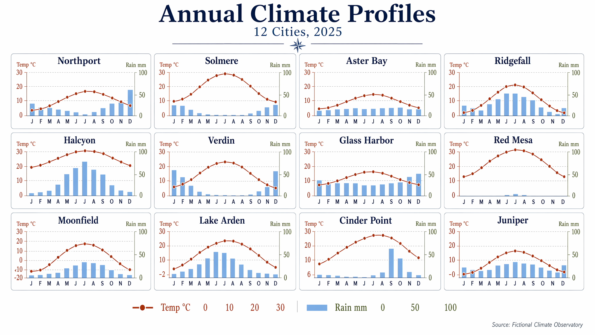 - Metadata: Data Visualization · `wide` · `2048x1152` · Curated
```text
Produce a clean editorial data visualization poster showing a 4x3 small-multiples grid of monthly climate charts for 12 fictional cities. Use a white background, generous margins, and a restrained palette of navy, rust, sky blue, olive, and charcoal. Each mini-panel should contain a temperature line and precipitation bars with consistent axes and ultra-legible labels. Include a title block with the in-image text "Annual Climate Profiles" and subtitle "12 Cities, 2025". Label panels "Northport", "Solmere", "Aster Bay", "Ridgefall", "Halcyon", "Verdin", "Glass Harbor", "Red Mesa", "Moonfield", "Lake Arden", "Cinder Point", and "Juniper". Use month labels "J F M A M J J A S O N D" and axis labels "Temp °C" and "Rain mm". Add numeric legend values "0", "10", "20", "30", and "100". Keep the composition highly structured, scientifically clear, and visually elegant, with crisp typography, aligned scales, and publication-grade chart rendering.
```
### No. 108 · Network Graph Collaboration Map
- Image: `docs/data-visualization/network-graph-collaboration-map.png`
- Metadata: Data Visualization · `wide` · `2048x1152` · Curated
```text
Produce a clean editorial data visualization poster showing a 4x3 small-multiples grid of monthly climate charts for 12 fictional cities. Use a white background, generous margins, and a restrained palette of navy, rust, sky blue, olive, and charcoal. Each mini-panel should contain a temperature line and precipitation bars with consistent axes and ultra-legible labels. Include a title block with the in-image text "Annual Climate Profiles" and subtitle "12 Cities, 2025". Label panels "Northport", "Solmere", "Aster Bay", "Ridgefall", "Halcyon", "Verdin", "Glass Harbor", "Red Mesa", "Moonfield", "Lake Arden", "Cinder Point", and "Juniper". Use month labels "J F M A M J J A S O N D" and axis labels "Temp °C" and "Rain mm". Add numeric legend values "0", "10", "20", "30", and "100". Keep the composition highly structured, scientifically clear, and visually elegant, with crisp typography, aligned scales, and publication-grade chart rendering.
```
### No. 108 · Network Graph Collaboration Map
- Image: `docs/data-visualization/network-graph-collaboration-map.png`
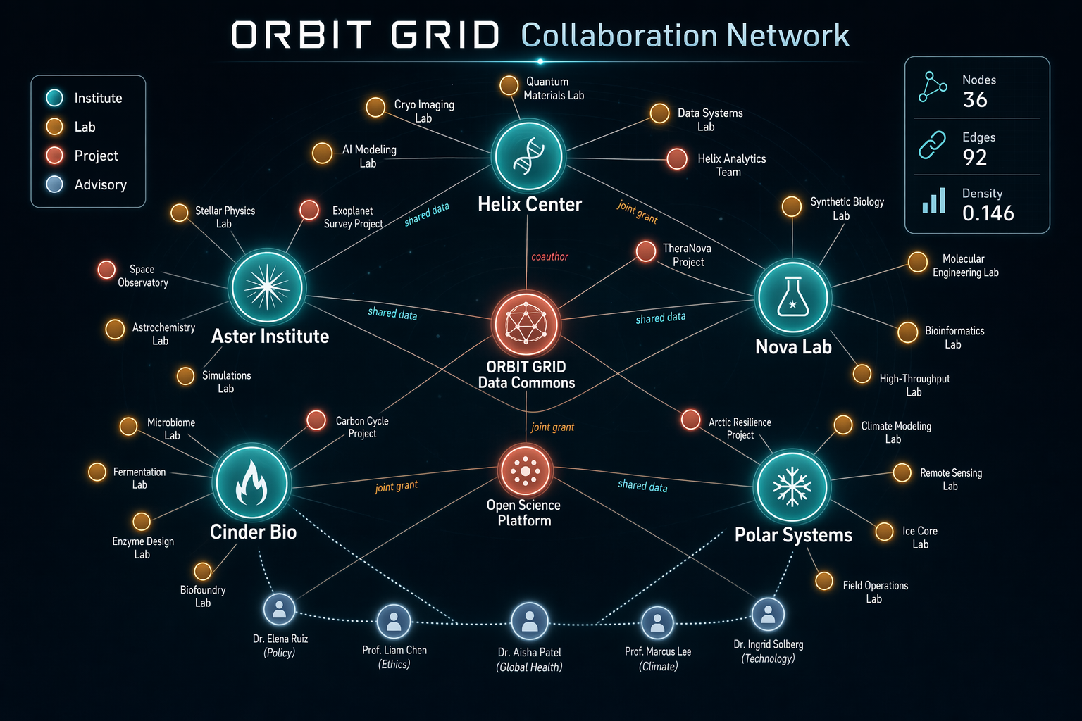 - Metadata: Data Visualization · `landscape` · `1536x1024` · Curated
```text
Generate a sophisticated network graph visualization on a dark charcoal canvas showing collaborations across a fictional research consortium called ORBIT GRID. Use glowing node colors in teal, amber, coral, pale blue, and white, with fine connecting lines and clean labels. The composition should be balanced, readable, and intentionally designed rather than random. Include a title in crisp text reading "ORBIT GRID Collaboration Network" and a legend with "Institute", "Lab", "Project", and "Advisory". Show approximately 36 nodes, with larger hubs labeled "Helix Center", "Nova Lab", "Aster Institute", "Cinder Bio", and "Polar Systems". Add edge labels sparingly, such as "shared data", "joint grant", and "coauthor". Include a right-side stats card reading "Nodes 36", "Edges 92", and "Density 0.146". Emphasize clean hierarchy, accurate node-label placement, anti-overlap spacing, subtle depth, and crisp typography suited for a polished technical visualization generated by gpt-image-2.
```
### No. 109 · Chord Diagram of Energy Flows
- Image: `docs/data-visualization/chord-diagram-energy-flows.png`
- Metadata: Data Visualization · `landscape` · `1536x1024` · Curated
```text
Generate a sophisticated network graph visualization on a dark charcoal canvas showing collaborations across a fictional research consortium called ORBIT GRID. Use glowing node colors in teal, amber, coral, pale blue, and white, with fine connecting lines and clean labels. The composition should be balanced, readable, and intentionally designed rather than random. Include a title in crisp text reading "ORBIT GRID Collaboration Network" and a legend with "Institute", "Lab", "Project", and "Advisory". Show approximately 36 nodes, with larger hubs labeled "Helix Center", "Nova Lab", "Aster Institute", "Cinder Bio", and "Polar Systems". Add edge labels sparingly, such as "shared data", "joint grant", and "coauthor". Include a right-side stats card reading "Nodes 36", "Edges 92", and "Density 0.146". Emphasize clean hierarchy, accurate node-label placement, anti-overlap spacing, subtle depth, and crisp typography suited for a polished technical visualization generated by gpt-image-2.
```
### No. 109 · Chord Diagram of Energy Flows
- Image: `docs/data-visualization/chord-diagram-energy-flows.png`
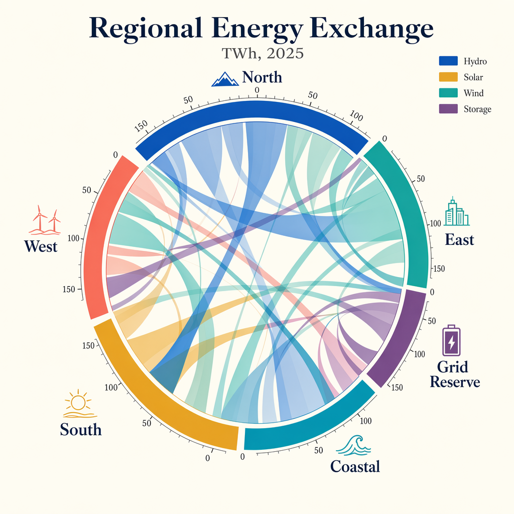 - Metadata: Data Visualization · `square` · `1024x1024` · Curated
```text
Create a publication-quality chord diagram visualizing fictional regional energy flows in 2025. Use a bright ivory background with a centered circular composition and a harmonious palette of cobalt, teal, ochre, coral, plum, and graphite. The diagram should feel mathematically precise, with clean arcs, semi-transparent ribbons, and highly legible labels. Add a title block with the in-image text "Regional Energy Exchange" and subtitle "TWh, 2025". Label outer segments "North", "South", "East", "West", "Coastal", and "Grid Reserve". Include a small legend reading "Hydro", "Solar", "Wind", and "Storage". Place tiny numeric ticks around the ring at "0", "50", "100", and "150". Use ribbon thickness to imply volume, but keep the composition readable and elegant. Prioritize crisp labels, clear hierarchy, accurate geometry, balanced white space, and a refined data-journalism aesthetic rather than generic infographic styling.
```
### No. 110 · Treemap Budget Allocation
- Image: `docs/data-visualization/treemap-startup-budget-allocation.png`
- Metadata: Data Visualization · `square` · `1024x1024` · Curated
```text
Create a publication-quality chord diagram visualizing fictional regional energy flows in 2025. Use a bright ivory background with a centered circular composition and a harmonious palette of cobalt, teal, ochre, coral, plum, and graphite. The diagram should feel mathematically precise, with clean arcs, semi-transparent ribbons, and highly legible labels. Add a title block with the in-image text "Regional Energy Exchange" and subtitle "TWh, 2025". Label outer segments "North", "South", "East", "West", "Coastal", and "Grid Reserve". Include a small legend reading "Hydro", "Solar", "Wind", and "Storage". Place tiny numeric ticks around the ring at "0", "50", "100", and "150". Use ribbon thickness to imply volume, but keep the composition readable and elegant. Prioritize crisp labels, clear hierarchy, accurate geometry, balanced white space, and a refined data-journalism aesthetic rather than generic infographic styling.
```
### No. 110 · Treemap Budget Allocation
- Image: `docs/data-visualization/treemap-startup-budget-allocation.png`
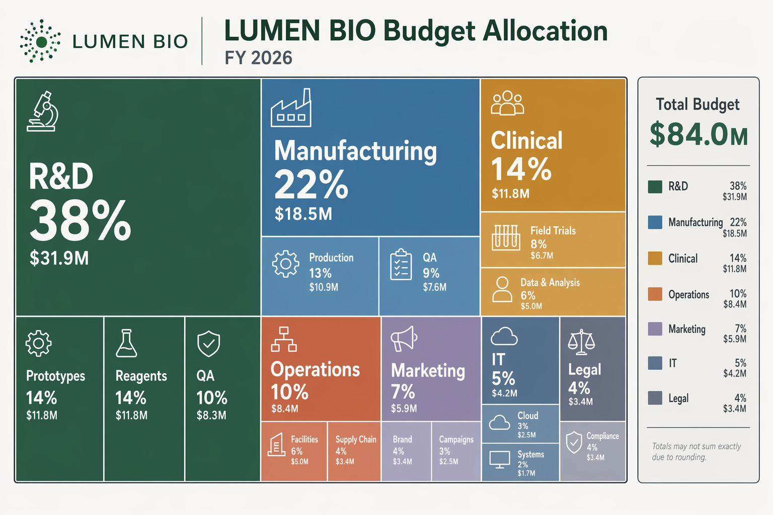 - Metadata: Data Visualization · `landscape` · `1536x1024` · Curated
```text
Design a modern treemap infographic showing a fictional company budget allocation for LUMEN BIO in fiscal year 2026. Use a light neutral background and a controlled palette of forest green, desaturated blue, amber, terracotta, lavender-gray, and charcoal outlines. The composition should be a clean rectangular treemap with strong visual grouping and crisp typography. Include a header with the in-image text "LUMEN BIO Budget Allocation" and "FY 2026". Major blocks should be labeled "R&D 38%", "Manufacturing 22%", "Clinical 14%", "Operations 10%", "Marketing 7%", "IT 5%", and "Legal 4%". Within some blocks, add smaller labels like "Prototypes", "Reagents", "QA", "Cloud", and "Field Trials". Include a compact side legend reading "Total Budget $84.0M". Ensure the chart has precise edges, balanced annotation density, clean hierarchy, and sharp text rendering suitable for a technical gallery prompt.
```
### No. 111 · Geographic Choropleth Yield Map
- Image: `docs/data-visualization/geographic-choropleth-harvest-yield.png`
- Metadata: Data Visualization · `landscape` · `1536x1024` · Curated
```text
Design a modern treemap infographic showing a fictional company budget allocation for LUMEN BIO in fiscal year 2026. Use a light neutral background and a controlled palette of forest green, desaturated blue, amber, terracotta, lavender-gray, and charcoal outlines. The composition should be a clean rectangular treemap with strong visual grouping and crisp typography. Include a header with the in-image text "LUMEN BIO Budget Allocation" and "FY 2026". Major blocks should be labeled "R&D 38%", "Manufacturing 22%", "Clinical 14%", "Operations 10%", "Marketing 7%", "IT 5%", and "Legal 4%". Within some blocks, add smaller labels like "Prototypes", "Reagents", "QA", "Cloud", and "Field Trials". Include a compact side legend reading "Total Budget $84.0M". Ensure the chart has precise edges, balanced annotation density, clean hierarchy, and sharp text rendering suitable for a technical gallery prompt.
```
### No. 111 · Geographic Choropleth Yield Map
- Image: `docs/data-visualization/geographic-choropleth-harvest-yield.png`
 - Metadata: Data Visualization · `wide` · `2048x1152` · Curated
```text
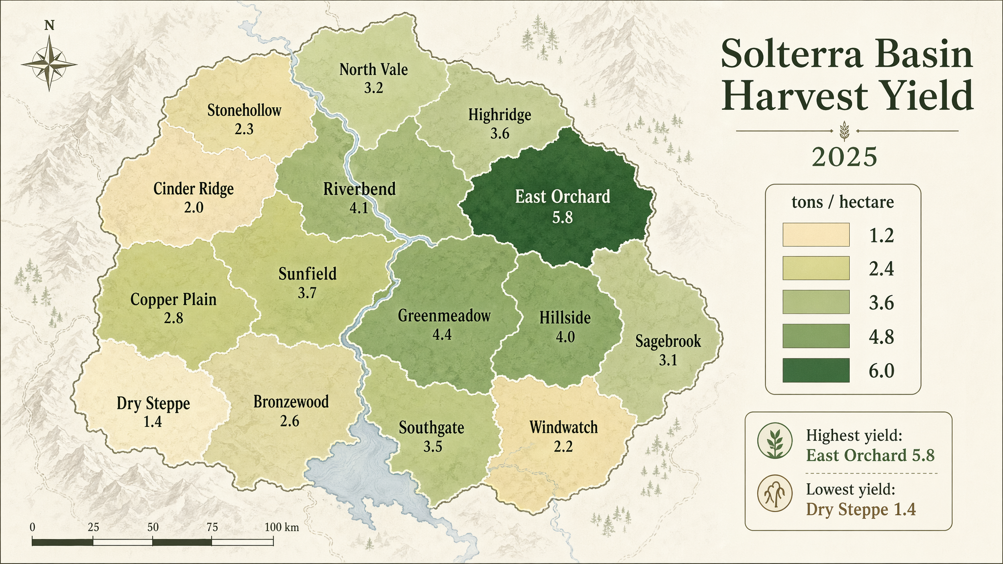
Produce a polished geographic choropleth map infographic of a fictional agricultural region called the Solterra Basin, showing harvest yield by district. Use a minimalist cartographic style on an off-white background with muted terrain hints and a sequential palette from pale sand to deep green. The map should include 14 clearly separated districts with clean borders, crisp labels, and a right-side legend. Include in-image text: "Solterra Basin Harvest Yield", "2025", and legend title "tons / hectare". Label districts with names such as "North Vale", "Riverbend", "Copper Plain", "East Orchard", and "Cinder Ridge". Include legend values "1.2", "2.4", "3.6", "4.8", and "6.0". Add a compact annotation box reading "Highest yield: East Orchard 5.8" and "Lowest yield: Dry Steppe 1.4". Prioritize clean typography, accurate map-like geometry, balanced composition, subtle cartographic detail, and publication-grade infographic clarity.
```
- Metadata: Data Visualization · `wide` · `2048x1152` · Curated
```text
Produce a polished geographic choropleth map infographic of a fictional agricultural region called the Solterra Basin, showing harvest yield by district. Use a minimalist cartographic style on an off-white background with muted terrain hints and a sequential palette from pale sand to deep green. The map should include 14 clearly separated districts with clean borders, crisp labels, and a right-side legend. Include in-image text: "Solterra Basin Harvest Yield", "2025", and legend title "tons / hectare". Label districts with names such as "North Vale", "Riverbend", "Copper Plain", "East Orchard", and "Cinder Ridge". Include legend values "1.2", "2.4", "3.6", "4.8", and "6.0". Add a compact annotation box reading "Highest yield: East Orchard 5.8" and "Lowest yield: Dry Steppe 1.4". Prioritize clean typography, accurate map-like geometry, balanced composition, subtle cartographic detail, and publication-grade infographic clarity.
```