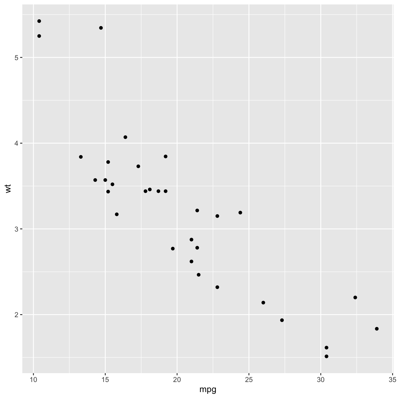
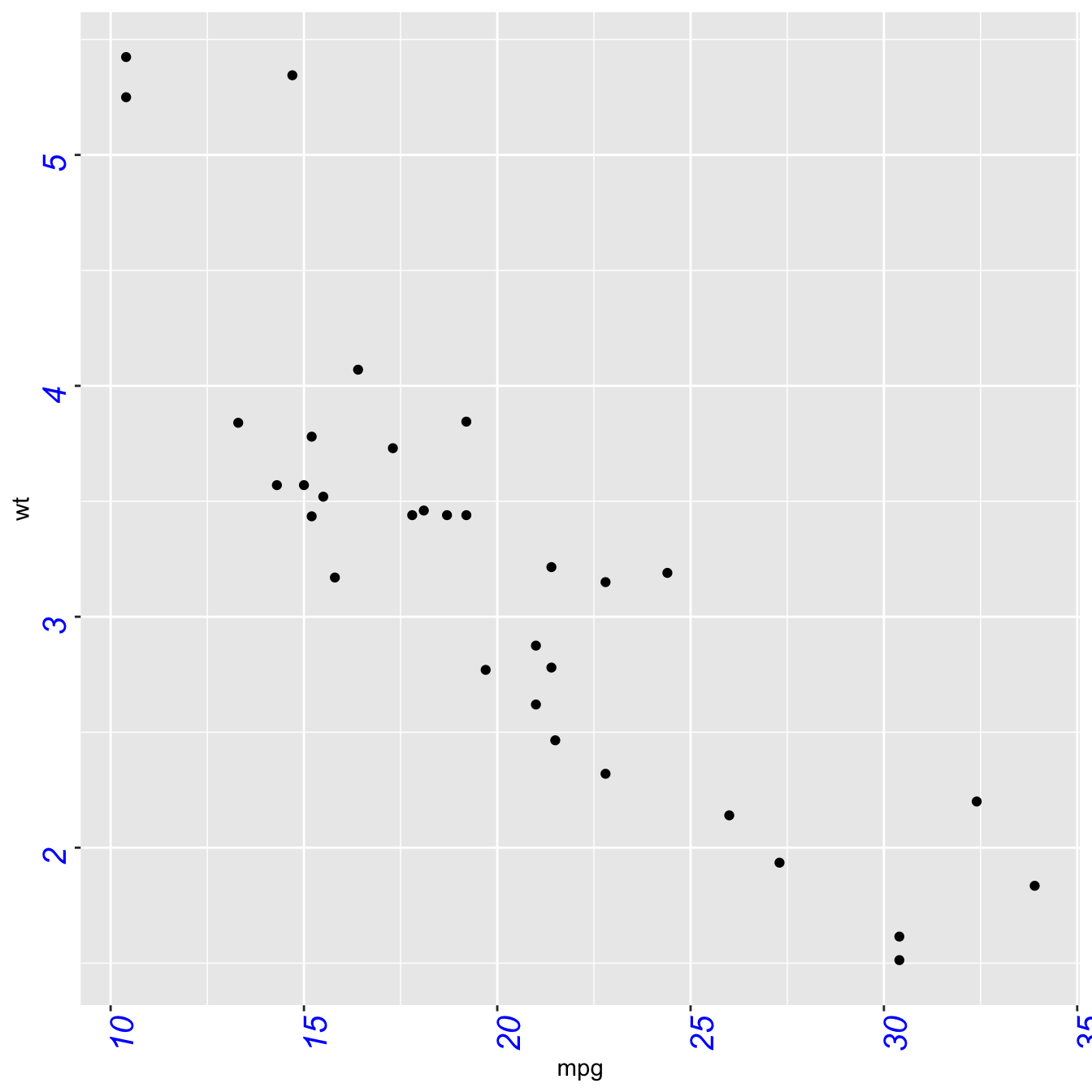
Default ggplot2 axis
Let’s start with a very basic ggplot2 scatterplot. The axis usually looks very good with default option as you can see here.
Basically two main functions will allow to customize it:
theme()to change the axis appearancescale_x_andscale_y_to change the axis type
Let’s see how to use them
# Load ggplot2
library(ggplot2)
# Very basic chart
basic <- ggplot( mtcars , aes(x=mpg, y=wt)) +
geom_point()
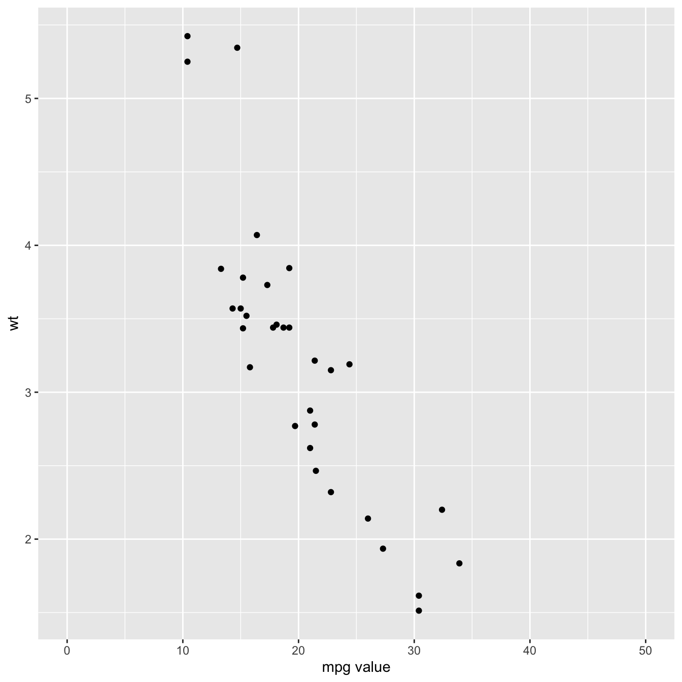
basicSet axis title and limits with xlab() and xlim()
Two basic options that are used in almost every charts are xlab() and xlim() to control the axis title and the axis limits respectively.
Note : it is possible to specify only the lower or upper bound of a limit. For instance, try xlim(0,NA)
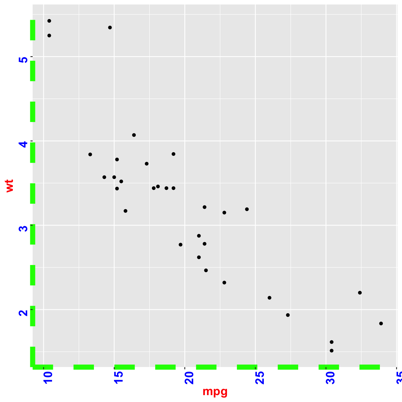
Customize axis title appearance: axis.title
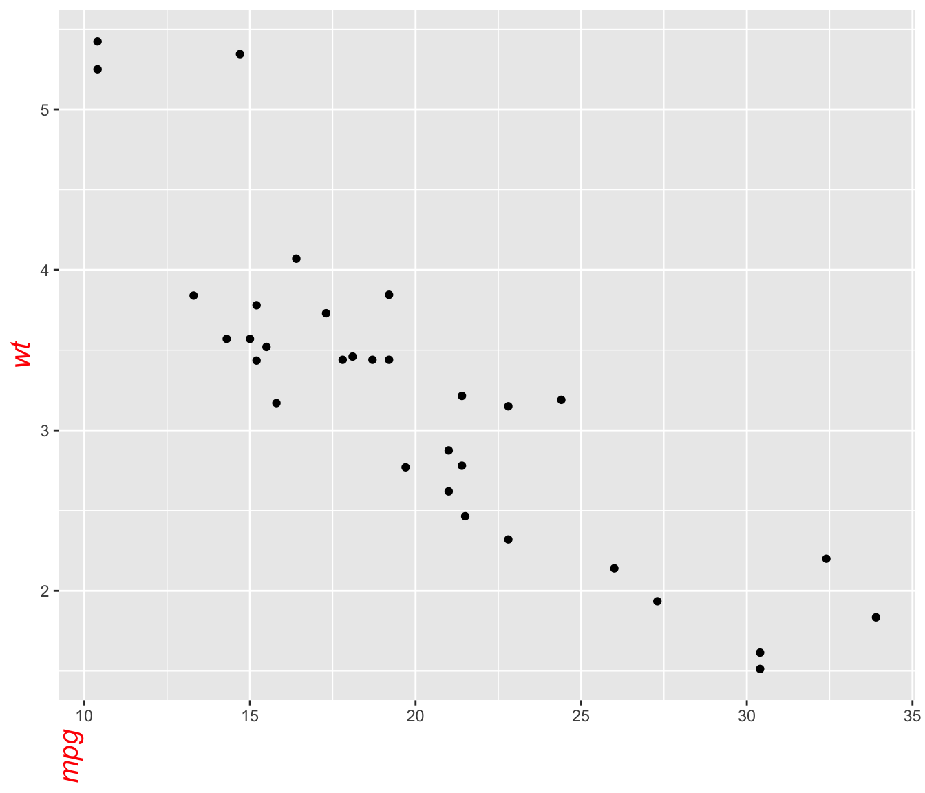
The theme() function allows to customize all parts of the ggplot2 chart. The axis.title. controls the axis title appearance. Since it is text, features are wrapped in a element_text() function. The code below shows how to change the most common features:
# Left -> both axis are modified
basic + theme(axis.title = element_text( angle = 90, color="red", size=15, face=3)) # face = title location
# Right -> only the x axis is modified
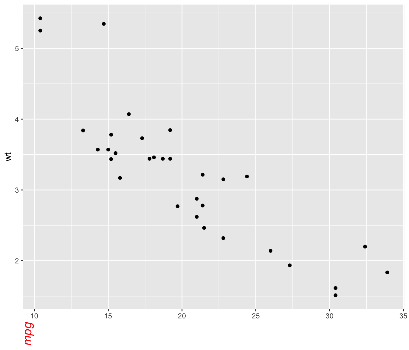
basic + theme(axis.title.x = element_text( angle = 90, color="red", size=15, face=3))Customize axis labels: axis.text
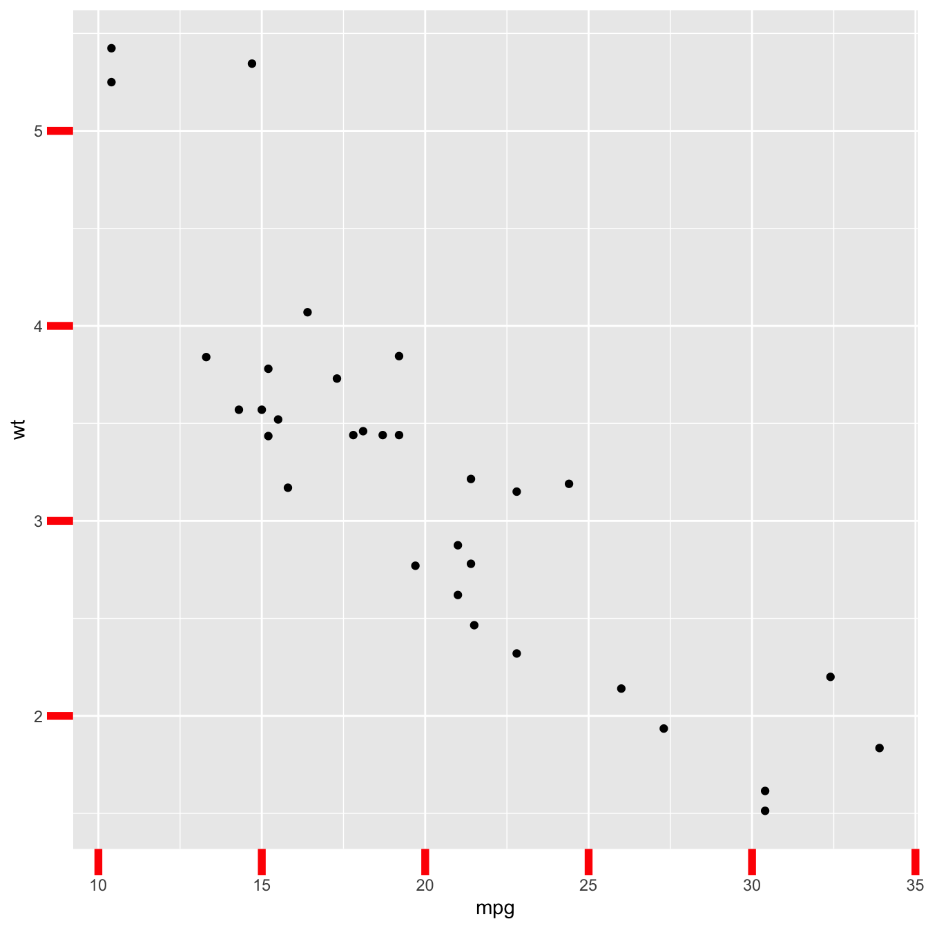
Using pretty much the same process, the axis.text() function allows to control text label features. Once more, using axis.text.x() would modify the x axis only.
Customize axis ticks and axis line with axis.ticks and axis.line
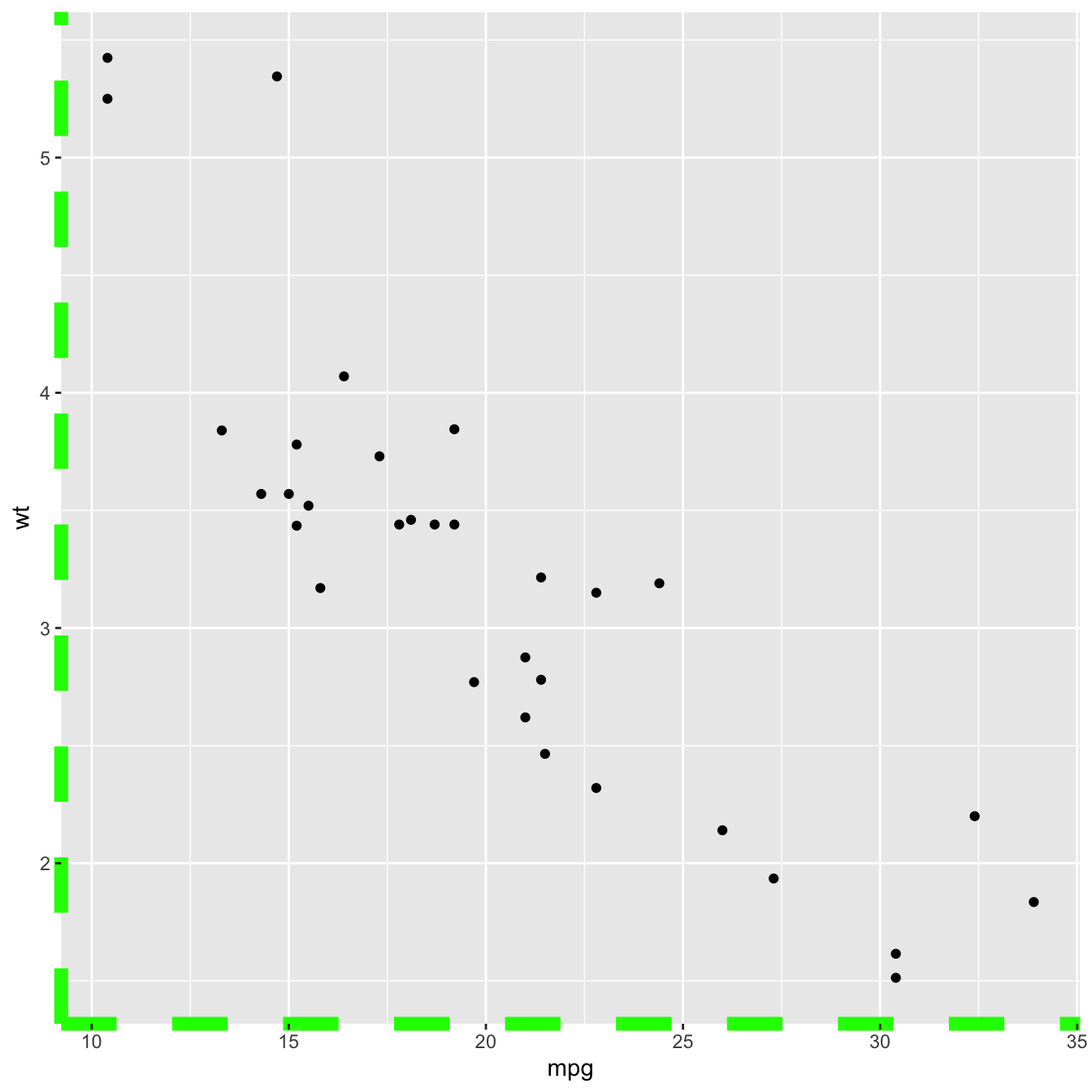
The axis.ticks() function controls the ticks appearance. axis.line() controles the axis line. Both of them are lines, so options are wrapped in a element_line() statement.
linetype controls the type of line in use, see the ggplot2 section for more.
# chart 1: ticks
basic + theme(
   axis.ticks = element_line(size = 2, color="red") ,
   axis.ticks.length = unit(.5, "cm")
)