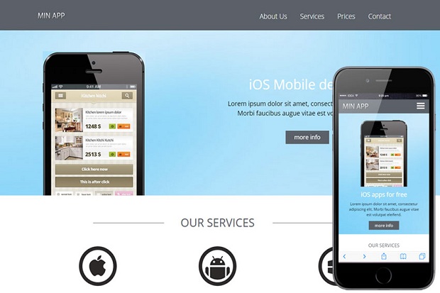
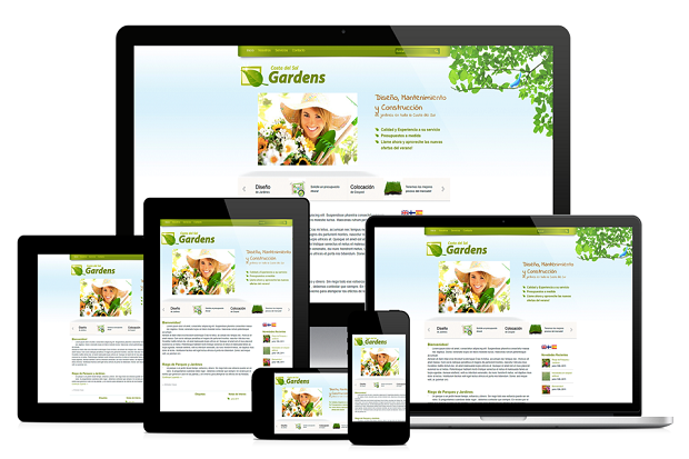
AMV APPLICTION SOLUTION,Responsive web design (RWD) is an approach to web design which makes web pages render well on a variety of devices and window or screen sizes. Recent work also considers the viewer proximity as part of the viewing context as an extension for RWD. Content, design and performance are necessary across all devices ....
Responsive web design, originally defined by Ethan Marcotte in A List Apart, responds to the needs of the users and the devices they're using. The layout changes based on the size and capabilities of the device. For example, on a phone users would see content shown in a single column view; a tablet ...
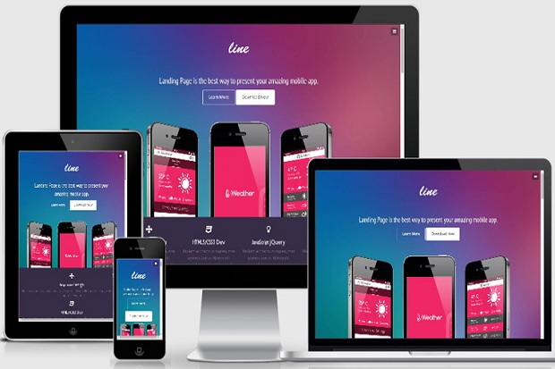
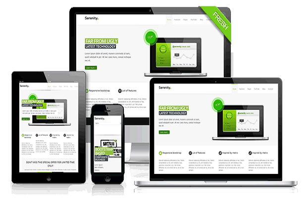
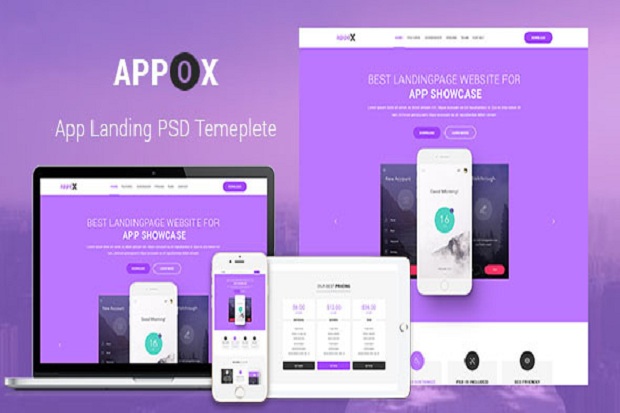
Users can easily access the application from any computer connected to the Internet using a standard browser. ... On the other hand, Google Docs is also a word-processing application but users perform all the functions using a web browser instead of using software installed on their computer.....
Web-based applications offer a range of business advantages over traditional desktop applications. What is a web-based application? A web-based application is any application that uses a website as the interface or front-end. Users can easily access the application from any computer connected to the Internet using ...