About
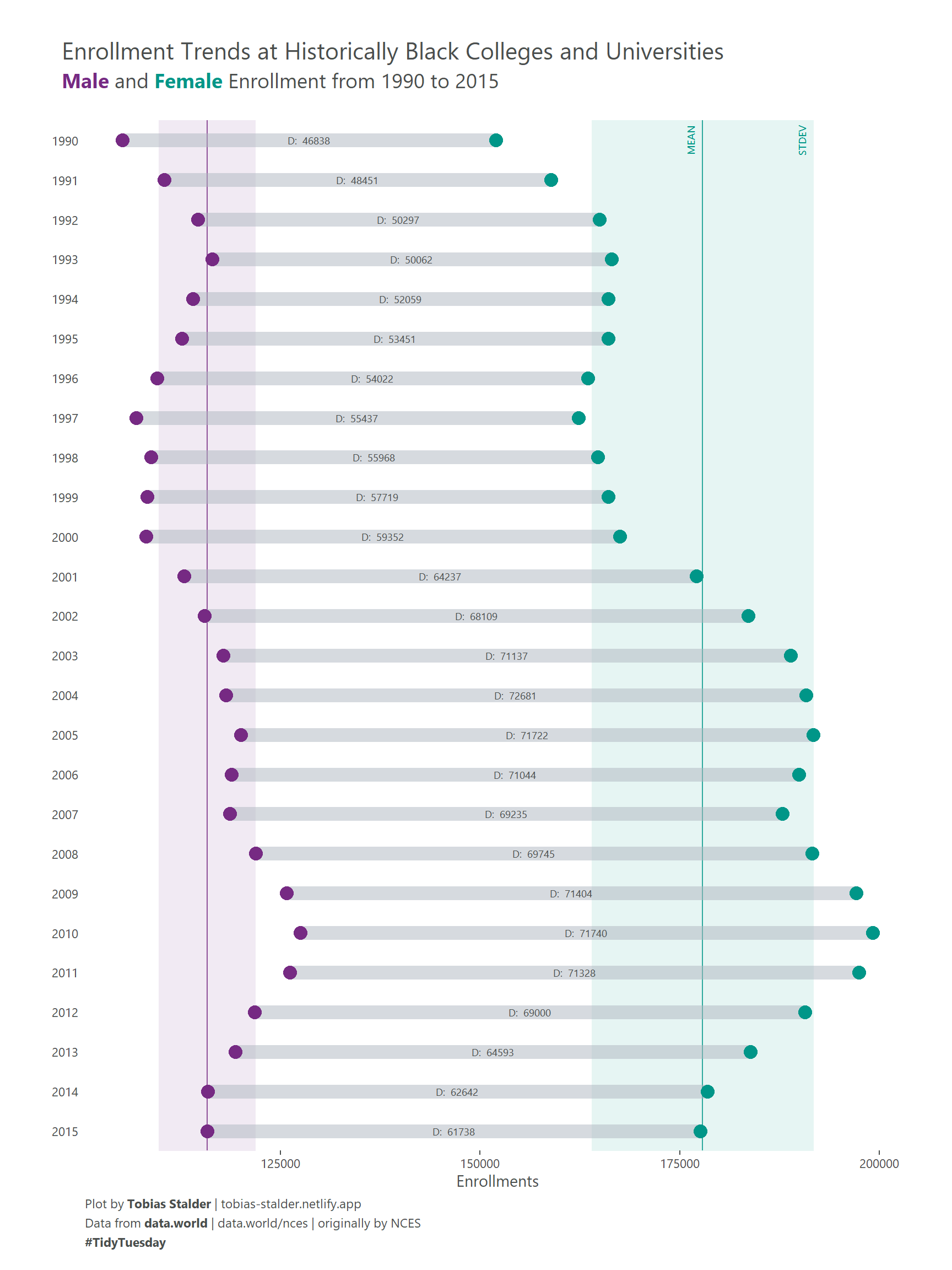
This article showcases a novel approach to the dumbbell plot created by Tobias Stalder, a geographer and datavisualization specialist based in Switzerland. You can find updates on his recent work on Twitter, LinkedIn and github.
Note that you can find the original R script in this TidyTuesday github repository.
Suggested citation:
Stalder, T., Holtz, Y. (2021): Extended Dumbbell Plot in R with ggplot2. R graph gallery. Access: r-graph-gallery.com/web-extended-dumbbell-plot-ggplot2.html. Date: DD-MM-YYYY.
Libraries
The extrafont package is used to import additional fonts. If you are unfamiliar with this package, you need to run the following commands to load and import the fonts (Takes a while!)
Dataset
The data for this plot was retrieved from TidyTuesday, a weekly datavisualisation challenge on twitter. You can read more about the data here and visit this github repository to learn more about TidyTuesday. The dataset is about enrollments in historically black colleges and universities (HBCUs).
You can load the data by running the following line:
hbcu_all <- readr::read_csv('https://raw.githubusercontent.com/rfordatascience/tidytuesday/master/data/2021/2021-02-02/hbcu_all.csv')Next, we will look at the data. We see a yearly resolution of enrollments in different categories.
Console output:
# A tibble: 6 x 12
   Year `Total enrollme~  Males Females `4-year` `2-year` `Total - Public`
  <dbl>            <dbl>  <dbl>   <dbl>    <dbl>    <dbl>            <dbl>
1  1976           222613 104669  117944   206676    15937           156836
2  1980           233557 106387  127170   218009    15548           168217
3  1982           228371 104897  123474   212017    16354           165871
4  1984           227519 102823  124696   212844    14675           164116
5  1986           223275  97523  125752   207231    16044           162048
6  1988           239755 100561  139194   223250    16505           173672
# ... with 5 more variables: `4-year - Public` <dbl>, `2-year - Public` <dbl>,
#   `Total - Private` <dbl>, `4-year - Private` <dbl>, `2-year - Private` <dbl>
Data wrangling I
For the example plot, I focused on the enrollment between two genders from 1990 onwards. So we use the dplyr package to conduct a first data wrangling step, getting a small dataset which contains data on male and female enrollments per year and the numeric difference between them.
hbcu_all %>%
  filter(Year >= 1990) %>% #filter the year
  select(Year, Males, Females)%>% #select columns of interest
  mutate(diff = Females - Males) %>% #calculate difference
  pivot_longer(cols = c(Males, Females)) %>% #get into long format
  rename(Gender = name, #rename columns
         Enrollments = value)-> dat_gender
head(dat_gender)
Console output:
# A tibble: 6 x 4
   Year  diff Gender  Enrollments
  <dbl> <dbl> <chr>         <dbl>
1  1990 46838 Males        105157
2  1990 46838 Females      151995
3  1991 48451 Males        110442
4  1991 48451 Females      158893
5  1992 50297 Males        114622
6  1992 50297 Females      164919
In order to plot the range between the two groups later on, we need two tibbles which are only holding the data of 1 gender each.
Males <- dat_gender %>%
  filter(Gender == "Males")
Females <- dat_gender %>%
  filter(Gender == "Females")
head(Females)
Console output:
# A tibble: 6 x 4
   Year  diff Gender  Enrollments
  <dbl> <dbl> <chr>         <dbl>
1  1990 46838 Females      151995
2  1991 48451 Females      158893
3  1992 50297 Females      164919
4  1993 50062 Females      166459
5  1994 52059 Females      166065
6  1995 53451 Females      166088
This data is all we need to create a basic dummbell plot.
The basic dumbbell plot
Now we can use the ggplot2 package to plot a basic dumbbell plot. The geoms that we are going to use are geom_point() for the groupwise points and geom_segment() to create a visible connection between the two group entries per year.
p <- ggplot(dat_gender)+

 geom_segment(data = Males,
              aes(x = Enrollments, y = Year,
                  yend = Females$Year, xend = Females$Enrollments), #use the $ operator to fetch data from our "Females" tibble
              color = "#aeb6bf",
              size = 4.5, #Note that I sized the segment to fit the points
              alpha = .5) +

  geom_point(aes(x = Enrollments, y = Year, color = Gender), size = 4, show.legend = TRUE)+

ggtitle("Enrollment Trends at Historically Black Colleges and Universities")
p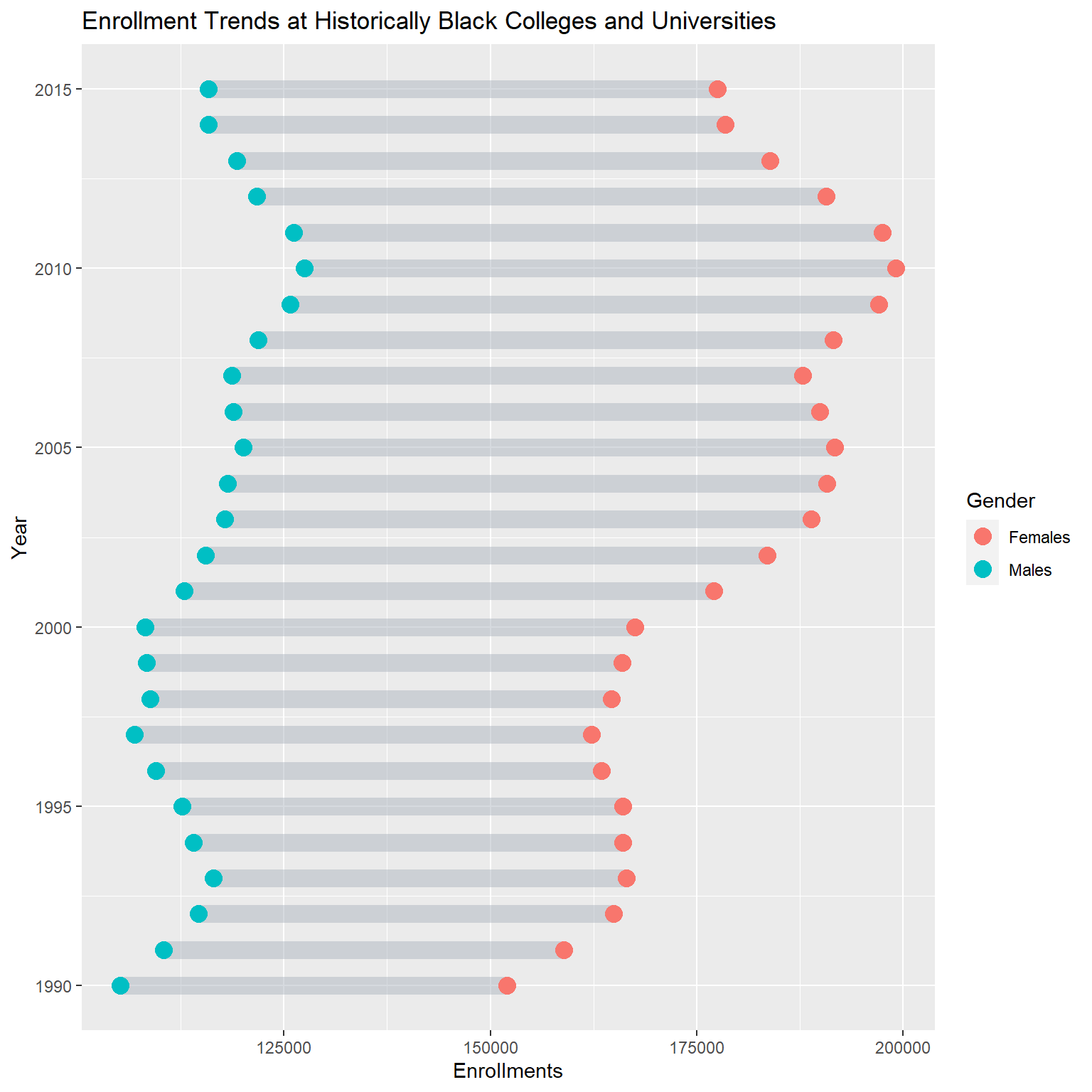
Data wrangling II for extension
To plot the extended version of this viz, we need to add the labels on the range and the line and shading for mean and standard deviation per group. So first, we further wrangle the data to calculate the mean +/- 1 standard deviation per group over all years and then create 2 separate tibbles, 1 for each group.
dat_gender %>%
  group_by(Gender) %>%
  summarise(mean = mean(Enrollments),
            SE = sd(Enrollments)) %>%
  mutate(meanpos = mean + 1 *SE,
         meanneg = mean - 1 *SE)-> stats
stats_males <- stats %>%
  filter(Gender == "Males")
stats_females <- stats %>%
  filter(Gender == "Females")
head(stats)
Console output:
# A tibble: 2 x 5
  Gender     mean     SE meanpos meanneg
  <chr>     <dbl>  <dbl>   <dbl>   <dbl>
1 Females 177866. 13908. 191774. 163958.
2 Males   115789.  6065. 121854. 109724.
As for the labels on the range, we need a tibble that holds the difference between the groups per year and a column indicating the position of the label.
diff <- dat_gender %>%
  filter(Gender == "Males") %>% #you can chose Males of Females, doesn't matter
  mutate(x_pos = Enrollments + (diff/2)) #x position of label (Enrollment value of Males + diff/2)
head(diff)
Console output:
# A tibble: 6 x 5
   Year  diff Gender Enrollments   x_pos
  <dbl> <dbl> <chr>        <dbl>   <dbl>
1  1990 46838 Males       105157 128576
2  1991 48451 Males       110442 134668.
3  1992 50297 Males       114622 139770.
4  1993 50062 Males       116397 141428
5  1994 52059 Males       114006 140036.
6  1995 53451 Males       112637 139362.
I’m pretty sure that the data wrangling can be improved at this point, so feel free to create a pull request in my github repository if you feel like contributing.
Building up the extension
Add labels on point range
In a first step, we add the labels on the ranges using our diff tibble and geom_text().
p +
   geom_text(data = diff,
             aes(label = paste("D: ",diff), x = x_pos, y = Year), #note thatI changed the greek letter Delta to "D:" because of encoding reasons
             fill = "white",
             color = "#4a4e4d",
             size = 2.5,
             family = "Segoe UI Semibold") -> p_labelled
p_labelled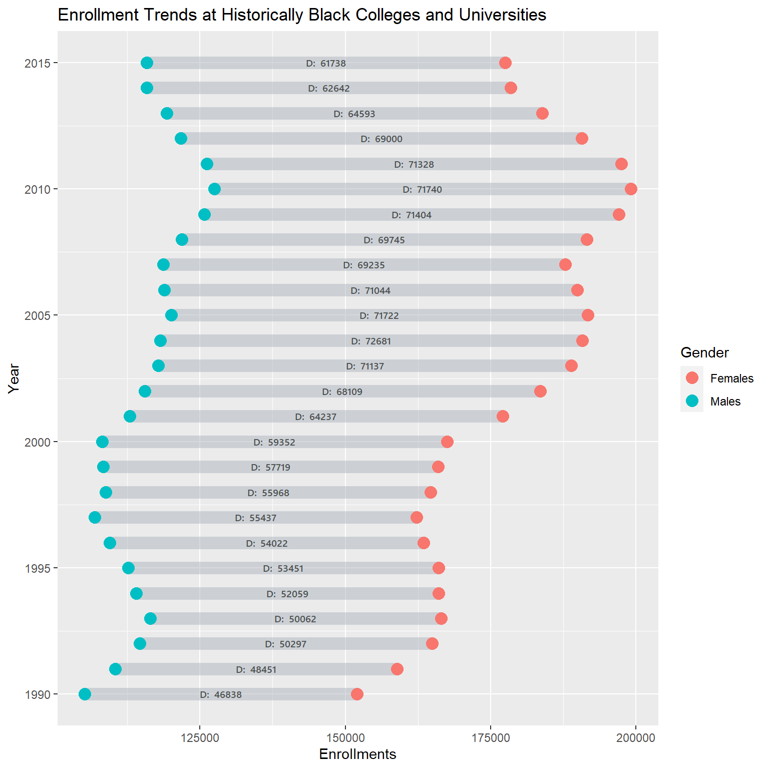
Add facet & theme
To have more control over the spacing between the line-ranges we add a facet on the y axis. Since this will look horrible, we add some theme() specifications to set the angle of the facet strip texts and add some styling.
p_labelled +

  #add facet for more control
  facet_grid(Year ~ ., scales = "free", switch = "y") +

  #theming
  theme_minimal()+
  theme(panel.grid.major.y = element_blank(),
        panel.grid.minor.y = element_blank(),
        panel.grid.major.x = element_blank(),
        panel.grid.minor.x = element_blank(),
        axis.title.y = element_blank(),
        axis.text.y = element_blank(),
        axis.ticks.y = element_blank(),
        axis.ticks.x = element_line(color = "#4a4e4d"),
        text = element_text(family = "Segoe UI Semibold", color = "#4a4e4d"),
        strip.text.y.left  = element_text(angle = 0),
        panel.background = element_rect(fill = "white", color = "white"),
        strip.background = element_rect(fill = "white", color = "white"),
        strip.text = element_text(color = "#4a4e4d", family = "Segoe UI"),
        plot.background = element_rect(fill = "white", color = "white"),
        panel.spacing = unit(0, "lines"),
        plot.margin = margin(1,1,.5,1, "cm"))-> p_ext_facetted
p_ext_facetted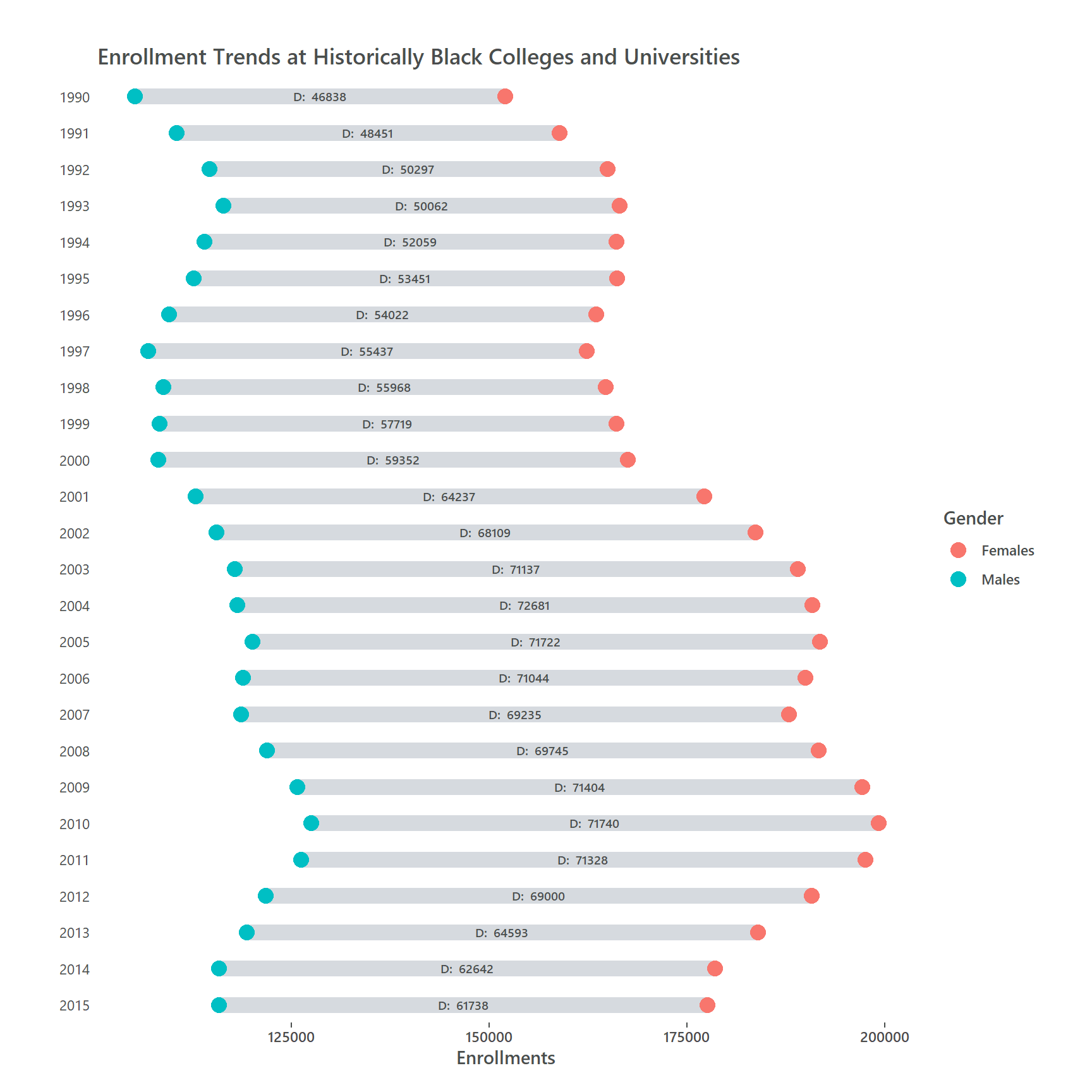
Next, we place two small text annotations for mean and standard deviation so the reader knows what this is about. In the same step, we can define the point colors with `scale_color_manual(). We add the mean and standard deviation per gender group using geom_vline() and geom_rect() We add this before the rest of the plot because we want the point-ranges to be on top of it. We also add 2 text annotations for mean and standard deviations with annotate().
Add mean and standard deviation
ggplot(dat_gender)+

  #add mean and standard deviation for both groups
  geom_rect(xmin = stats_males$meanneg, xmax = stats_males$meanpos,
            ymin = 2016, ymax = 1989, fill = "#762a83", alpha = .05)+
  geom_vline(xintercept = stats_males$mean, linetype = "solid", size = .5, alpha = .8, color = "#762a83")+

  geom_rect(xmin = stats_females$meanneg, xmax = stats_females$meanpos,
            ymin = 2016, ymax = 1989, fill = "#009688", alpha = .05)+
  geom_vline(xintercept = stats_females$mean, color = "#009688", linetype = "solid",  size = .5, alpha = .8) +

  #add point range
  geom_segment(data = Males, aes(x = Enrollments, y = Year, yend = Females$Year, , xend = Females$Enrollments),
               color = "#aeb6bf", size = 4.5, alpha = .5) +

  #add points
  geom_point(aes(x = Enrollments, y = Year, color = Gender), size = 4, show.legend = FALSE) +

  #color points
  scale_color_manual(values = c("#009688","#762a83"))+
  #add point-range labels
  geom_text(data = diff, aes(label = paste("D: ",diff), x = x_pos, y = Year), fill = "white", color = "#4a4e4d", size = 2.5, family = "Segoe UI") +

  #add annotations for mean and standard deviations
  geom_text(x = stats_females$mean - 1500, y = 1990, label = "MEAN", angle = 90, size = 2.5, color = "#009688", family = "Segoe UI")+
  geom_text(x = stats_females$meanpos -1500, y = 1990, label = "STDEV", angle = 90, size = 2.5, color = "#009688", family = "Segoe UI")+

  #add facets for more control
  facet_grid(Year ~ ., scales = "free", switch = "y") +
  #add title
  ggtitle("Enrollment Trends at Historically Black Colleges and Universities")+
  #theming
  theme_minimal()+
  theme(panel.grid.major.y = element_blank(),
        panel.grid.minor.y = element_blank(),
        panel.grid.major.x = element_blank(),
        panel.grid.minor.x = element_blank(),
        axis.title.y = element_blank(),
        axis.text.y = element_blank(),
        axis.ticks.y = element_blank(),
        axis.ticks.x = element_line(color = "#4a4e4d"),
        text = element_text(family = "Segoe UI", color = "#4a4e4d"),
        strip.text.y.left  = element_text(angle = 0),
        panel.background = element_rect(fill = "white", color = "white"),
        strip.background = element_rect(fill = "white", color = "white"),
        strip.text = element_text(color = "#4a4e4d", family = "Segoe UI"),
        plot.background = element_rect(fill = "white", color = "white"),
        panel.spacing = unit(0, "lines"),
        plot.margin = margin(1,1,.5,1, "cm")) -> p_styled
p_styled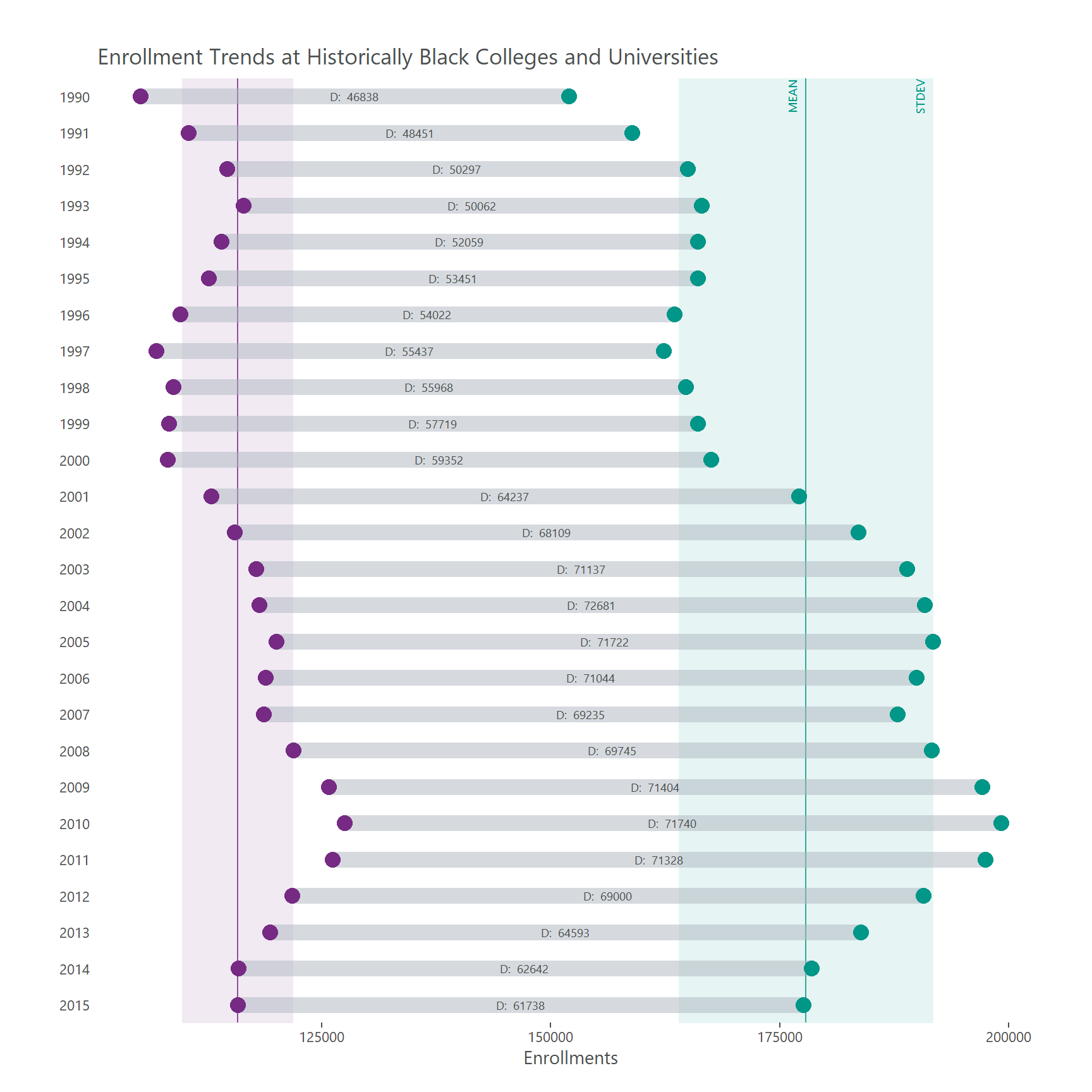
Finish plot with ggtext
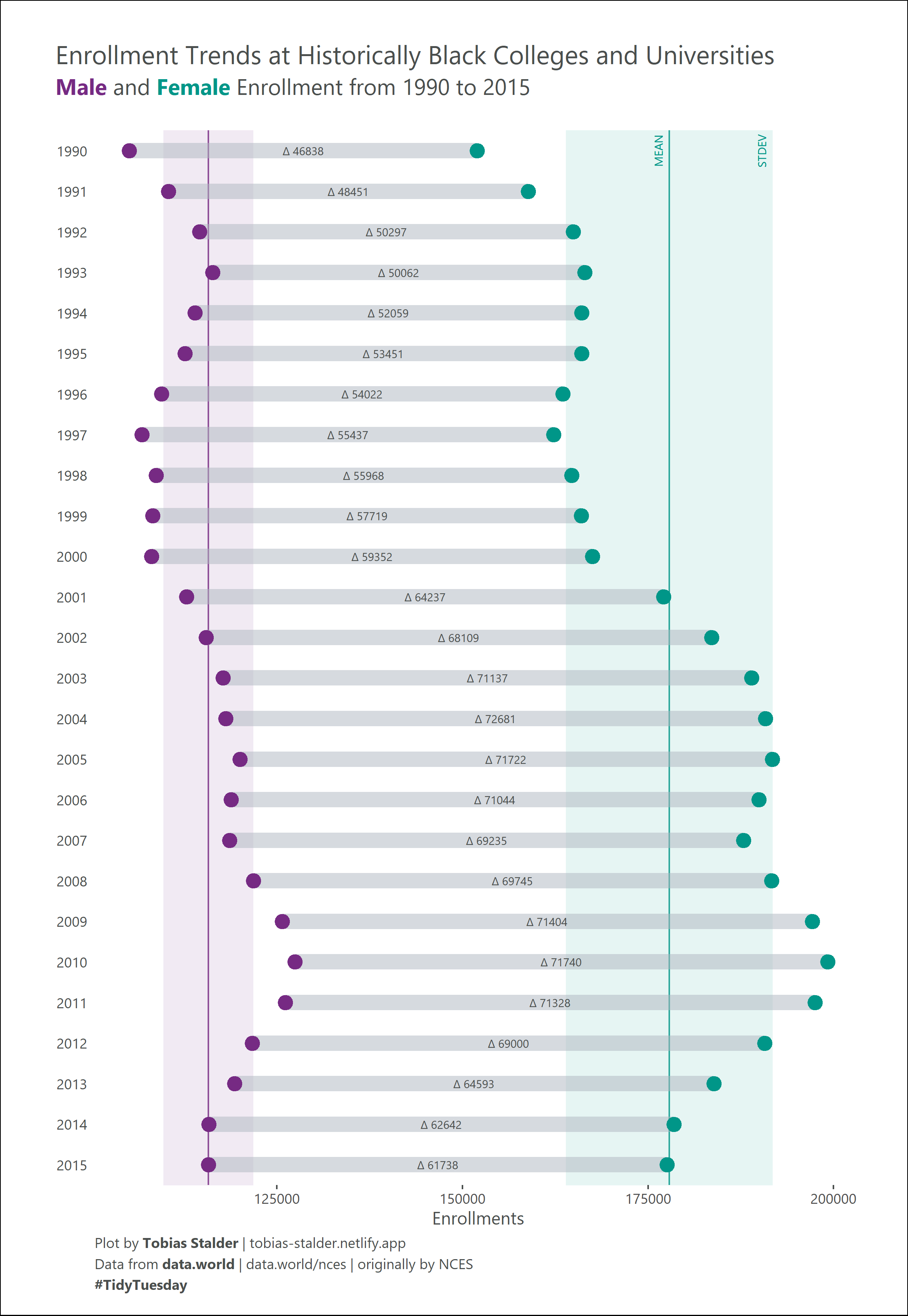
In a final step we the subtitle and caption using element_markdown() from the ggtext package. This is the final code which will produce the extended dumbbell plot:
p_styled +

  #add subtitle and caption
  labs(subtitle = "<span style = 'color: #762a83;'>**Male**</span> and <span style = 'color: #009688;'>**Female**</span> Enrollment from 1990 to 2015<br>",
       caption = "Plot by **Tobias Stalder** | tobias-stalder.netlify.app<br>Data from **data.world** | data.world/nces | originally by NCES<br>**#TidyTuesday**")+

  #add theming for title, subtitle, caption
  theme(plot.caption = element_markdown(hjust = 0, lineheight = 1.5),
        plot.subtitle = element_markdown(size = 14, hjust = -.06),
        plot.title = element_text(size = 16, hjust = -.14)) -> p_fin #Note that hjust of title and subtitle depend on the export dimensions
p_fin