Principle of front doors
Read time: 11.5 minutes
On this page
Overview
Definition: Assume that at least half of the website’s visitors arrive at a page through a path other than what you expected.
In practice: Users can arrive on a page via the parent page, a search engine, or any other page that directly links to it. Therefore, each page needs to independently address the questions "where am I?" and "what can I do here?" Additionally, each page title needs to be descriptive. This is particularly important because each title often becomes the link text used by other pages to take the user to that page (search engine included). Without a clear title, users won't know what to expect if they select that link.
Examples
Passing examples
-
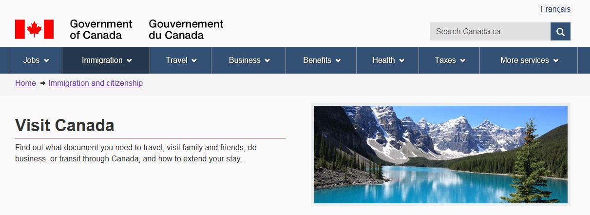
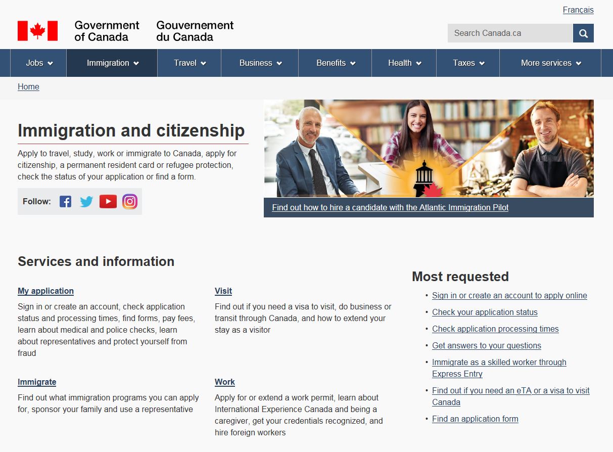
Passes: Since the headings are descriptive, a user would know what to expect if they saw these as links on a search results page.
Heading: "My immigration or citizenship application"
Heading: "Visit Canada"
Heading: "Immigrate to Canada"
Heading: "Work in Canada"
Note: The above screenshots are all children pages of the main "Immigration and citizenship" page. However, this parent page chose not to match the exact title on the child page:
- Heading: "My immigration or citizenship application"
Link: "My application" - Heading: "Visit Canada"
Link: "Visit" - Heading: "Immigrate to Canada"
Link: "Immigrate" - Heading: "Work in Canada"
Link: "Work"
The "Immigration and citizenship" page only features the necessary keyword(s) in the link text, as its page heading already informs users what the context is. This creates a cleaner design of the parent page and allows for quick scanning, while still making sure the headings on the child pages meet the principle of front doors, should they be linked to from outside sources.
This can be a good technique that maintains integrity of page titles, while not having to exactly match the link text on referring pages. That said, be careful not to strip too much out of the link text and verify that this approach works with your specific content and audience. The link must still be meaningful in order to pass the principle of choices.
There is another point worth making in relation to the "Immigration and citizenship" page. While the link text and the uniqueness of categories make this an effective IA example, it's important to always consider whether the information provided on this page aligns with the mental model of its users. Would someone wanting to visit, study or work in Canada look for that information under "Immigration and citizenship" topic? If the answer is no, then this IA completely fails.
Remember: Each page needs to have a unique and descriptive page title, but the pages that point to it can adjust their link text, as appropriate. More importantly, always make sure the content reflects the needs and assumptions of your users.
- Heading: "My immigration or citizenship application"
-
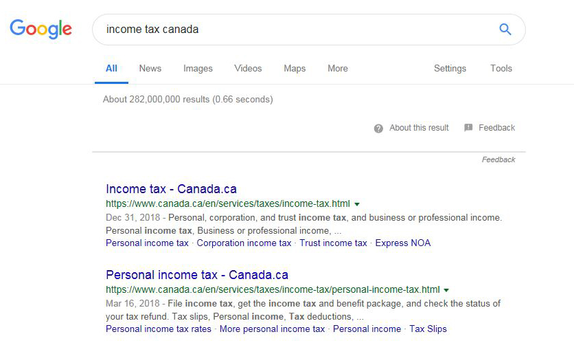
Passes: Here is the Google search result for the keywords "income tax Canada". The first two links are very descriptive, which is excellent.
Search engines don't actually determine the page name from the page's title (heading 1 or H1) as it appears to the page visitors. They get it from the page’s metadata tag - a line of invisible code near the top of the page, the
<title>. In this case, the titles of the above two search results are:<title>Income tax - Canada.ca</title><title>Personal income tax - Canada.ca</title>
Despite the " - Canada.ca" appearing in the links to these two pages, it's not in the
H1of either page. This is because thetitletag and theH1of the actual page strategically don't match. There is no need to add " - Canada.ca" to each page title, as it's already apparent you are on the Canada.ca site, given the "Government of Canada" graphic in the banner. Adding more content to thetitletag helps the search engine users make informed choices to get to the Canada.ca site, while ensuring that users on the Canada.ca site don't get overloaded with unnecessary information. The differences are demonstrated below:- Title: Income tax - Canada.ca
- H1: Income tax
- Title: Personal income tax - Canada.ca
- H1: Personal income tax
You can view metadata of any page by right-clicking on a page and selecting "View page source".
Remember: Search engines use the
<title>metadata tag of a page to generate the link in search results. This allows you to add more or less information than what is in the<H1>of the actual page. This can be a benefit to maximizing the user experience, if done correctly.
Failing examples
Disclaimer: Examples below are used for learning purposes to illustrate broken principles and their potential consequences, not to judge the organizations or people designing these interfaces.
-
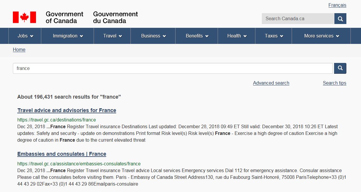
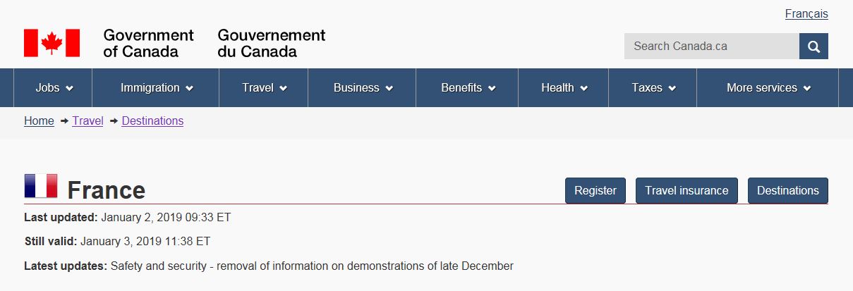
Fails: Here is the Canada.ca search result for the keyword "France". The first two links are very descriptive, which is excellent.
As mentioned above, search engines use a page's
<title>metadata tag to generate the link in search results. In this case, the titles of the above two search results are:<title>Travel Advice and Advisories for France</title><title>Embassies and consulates | France</title>
The problem arises when you go to each of those two pages. Their page title (
H1) doesn't match the title displayed in search results (title). While page title and links to it don’t always have to match (as demonstrated in earlier example), it's usually safer to follow the general rule of having an exact match.When you allow for modifications, you can run into problems where both page titles (
H1s) are the same. This risks confusing the user, especially because neither one of these pages is the mainpage for everything Canada.ca has to say about France.- Title: Travel Advice and Advisories for France
- H1: France
- Title: Embassies and consulates | France
- H1: France
Lastly, any other page wanting to create a link to these pages may misinterpret the scope of the page. If they create a link on their site called "France", it would give their users the impression that this is the Government of Canada's main page about France.
Remember: Anytime you mismatch the
titlemetadata and the page title (H1), you could create problems. Problems that become evident in search as well as on sites or pages that choose to directly link to your pages. -
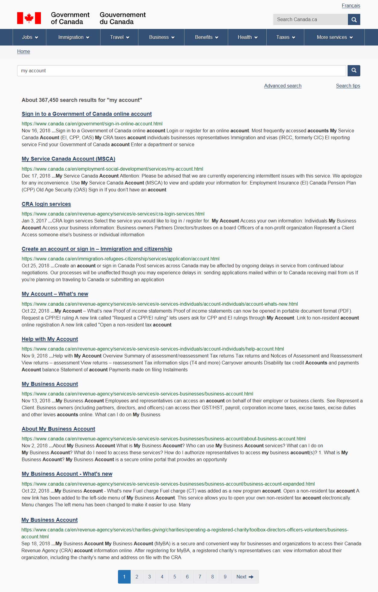
Fails: Branded products often lose context when detached from a pre-dermined flow of information.
For example, the primary application to view your personal taxes is "My Account". This broadly-named branded approach means a search for "my account" on Canada.ca produces undesirable results, as lots of pages have the words "my" and "account".
- English search result: Although the "My Account - Help" and "My Account - What's new" pages make it into the top 10 search results, the main "My Account" page isn't there. "My account" is found on the second page of search results, as the third result.
- French search result: The French branded term has better success in surfacing the link. "Mon dossier" is found on the first page of search results, as the third result.
This means a user would have to go into a child page of "My Account" and then double back to the main page.
Even if a user has more expert search skills and puts "my account" in quotation marks, which will search for the exact term, rather than 2 words separately, it won't retrieve only the CRA "My Account" as it also retrieves "My CFIA" account, creating opportunity for confusion.
Always be careful of branding products. If it's absolutely necessary, make sure it's descriptive and logical so it makes sense when accessed from different points of discovery.
Remember: Branded products may not resonate with the user, especially when they are featured out-of-context. Additionally, it can be hard to locate services and resources that have a made-up or generic name. -
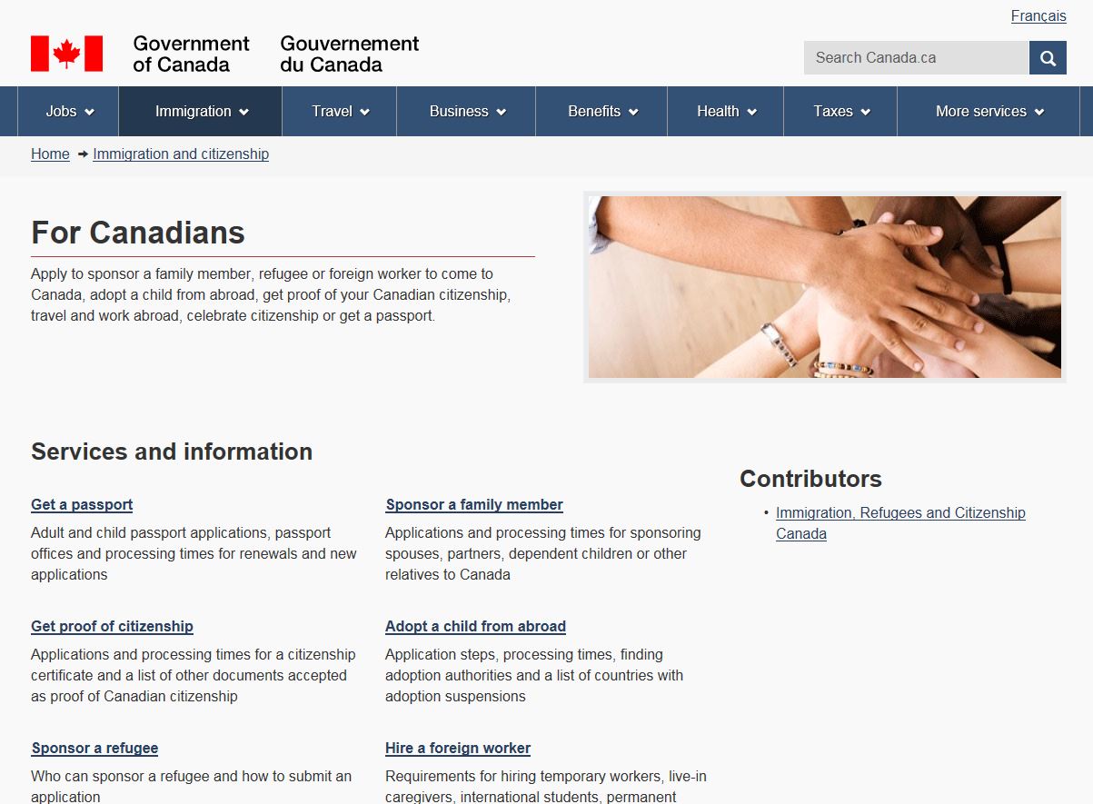
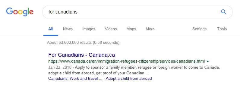
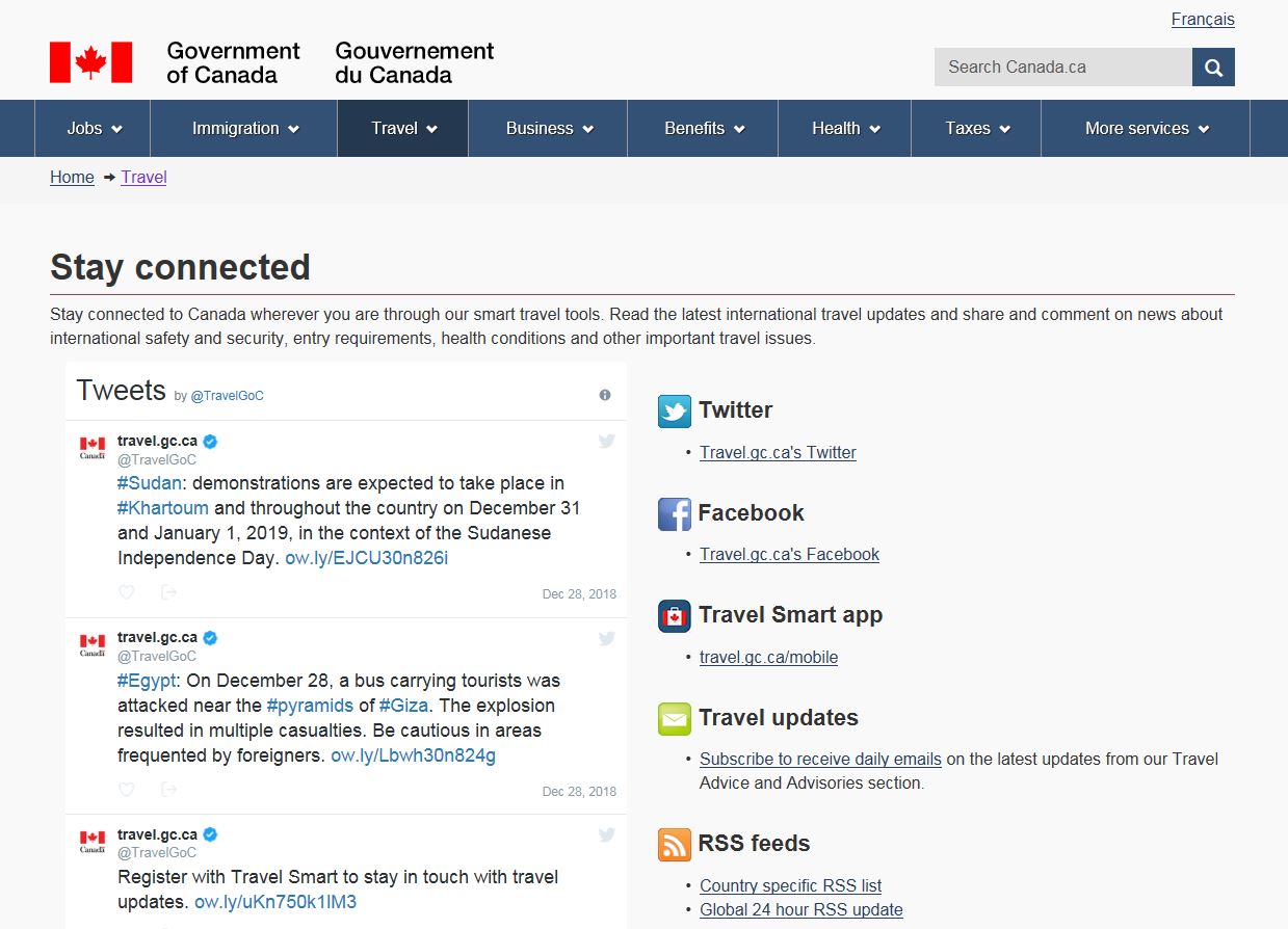
Fails: Although the title says "For Canadians", it's actually just immigration and citizenship information for Canadians.
Of course, this isn't a problem if the user arrived on this page from its parent "Immigration and citizenship" page, but from Google's perspective, it looks like the Canada.ca's main page for everything a Canadian would need to know:
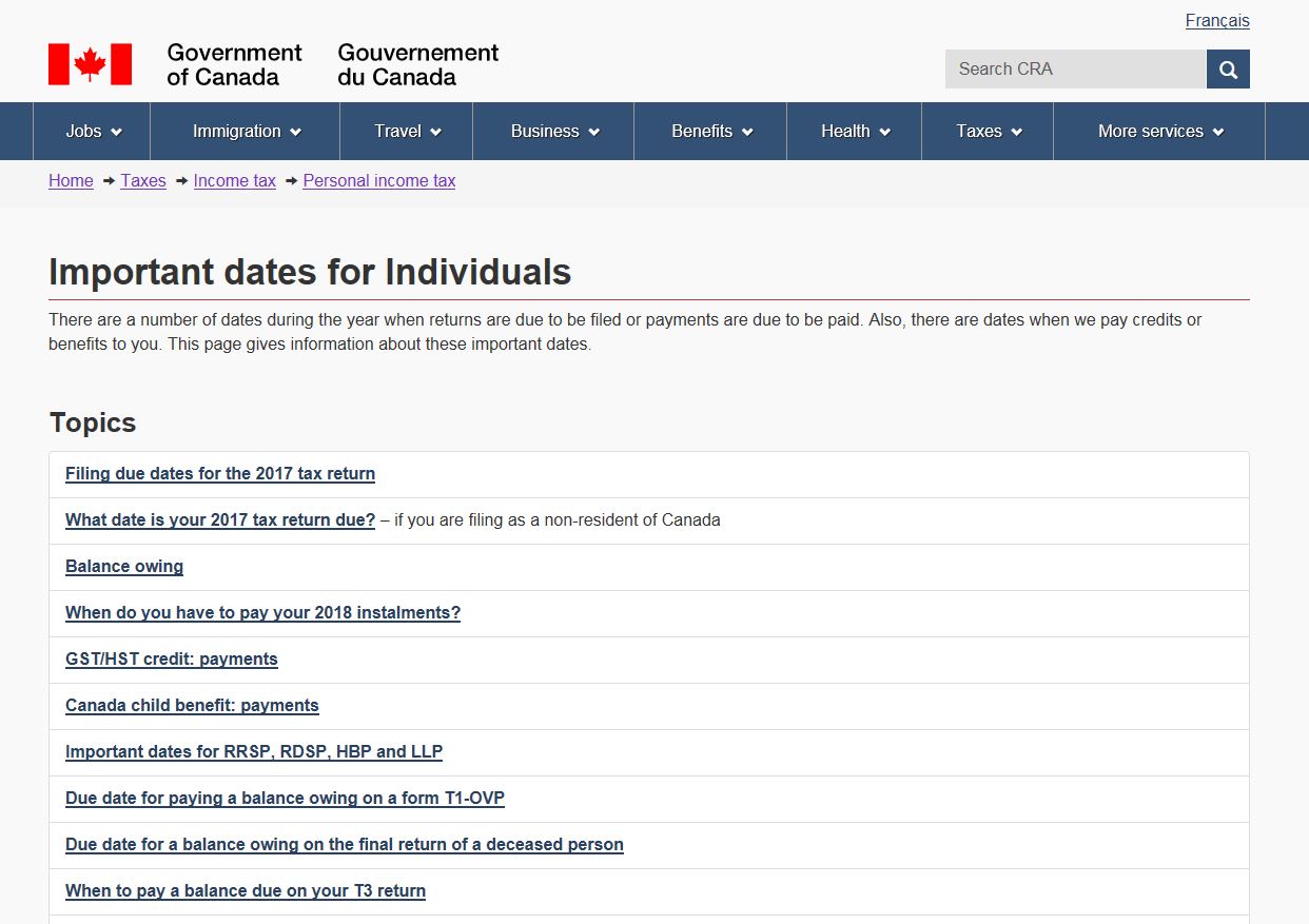
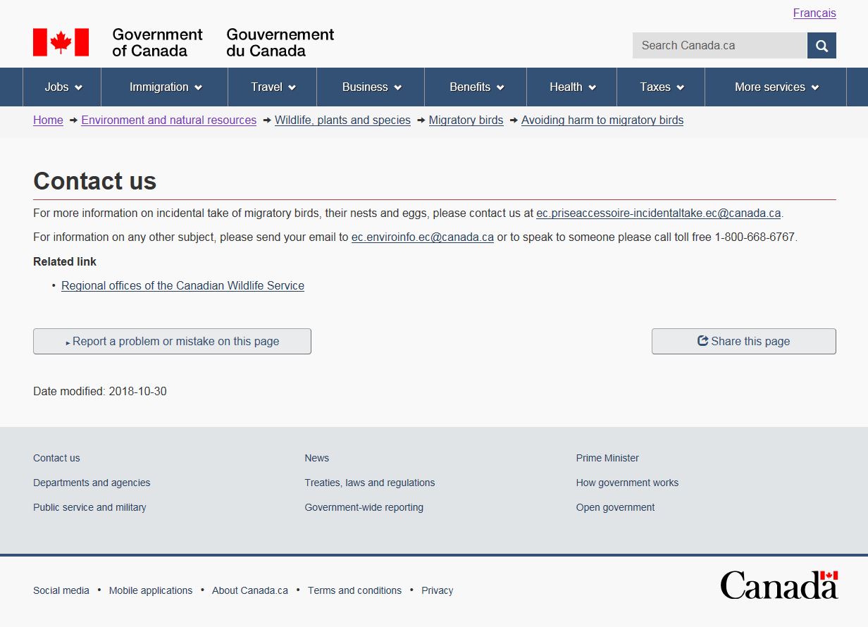
Examples of other non-descriptive headings that will cause problems:
- Current title
- "Important dates for individuals"
- Better title
- "Personal tax due dates and benefits payment issue dates"
- Current title
- "Contact us"
- Better title
- "Contact us about migratory birds"
Note: Prior to deciding on a title improvement for this page, it requires further investigation into the intention of the page. Is it meant for people to report a situation where migratory birds are likely to be harmed? The purpose of the contact information is unclear and could result in unwanted or irrelevant emails.
Remember: IA is about findability, which also includes search engine findability, not just links from pages you expected the user to navigate from.
-
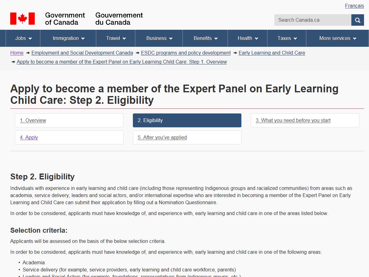
Fails: When navigating through a process, where users can enter from any point, including step numbers in the page title could confuse users.
If a user arrives on this page after completing Step 1, it makes sense that "Step 2" is in the title. However, if the search engine or another page took them here, the user may think: "This is Step 2 Eligibility. Does that mean there is also a Step 1 Eligibility? Am I missing a section of information or is this the starting point for eligibility?"
You can put step numbers in a process where the user has to go through the entire flow, one step at time, with no jumping ahead or having access to only parts of the entire process. This would be a sequential journey and it would have no 'front doors' (the only way to get to step 2 is to complete step 1). An example of this type of process would be online checkout, or account registration, etc.
If this type of process is the right fit for your context and users, you would only index (let the search engine find) one page of the whole process - the landing page which starts with Step 1. This way, users will always start their journey at the beginning.
Remember: When a process can be entered from multiple points, including the search engine, then showing the step number in the page title could confuse users.
-
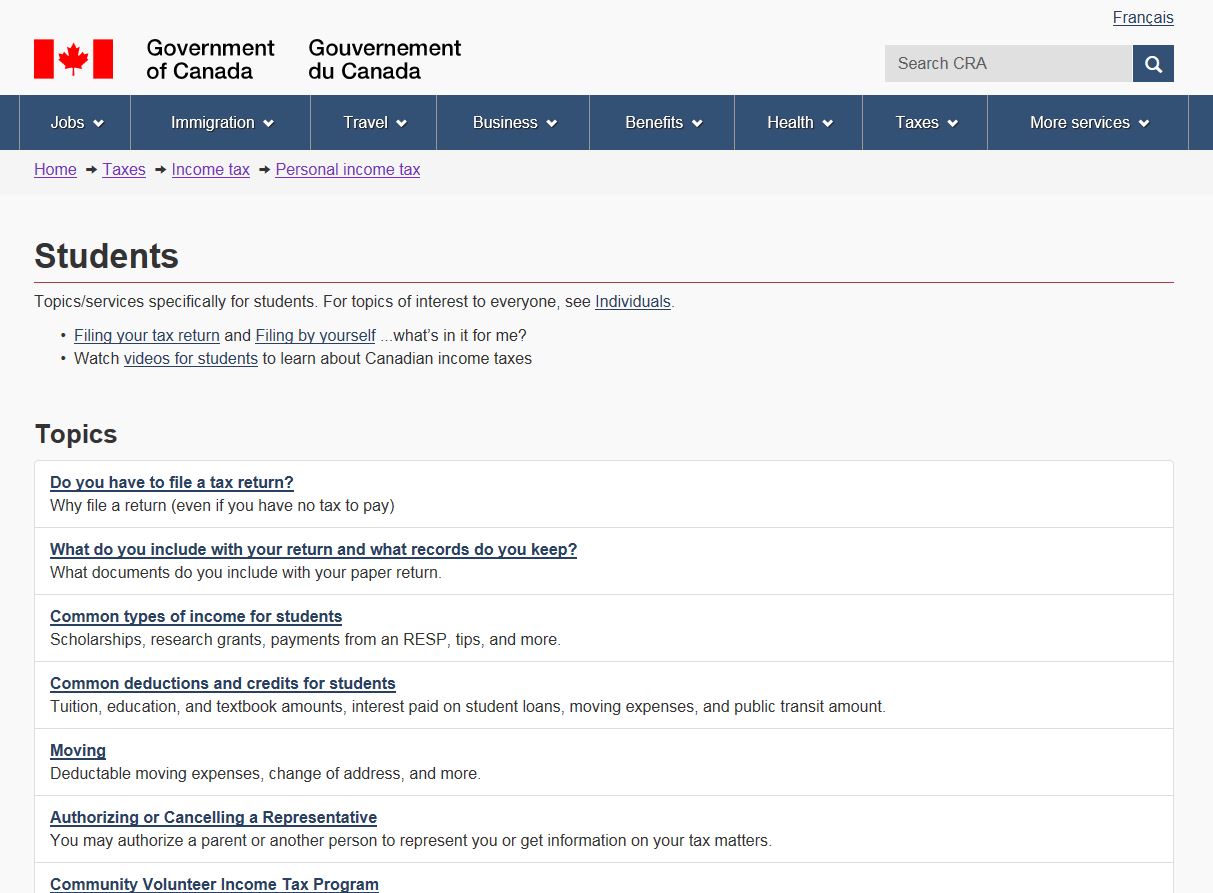
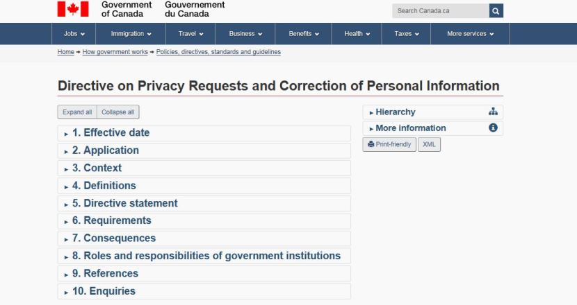
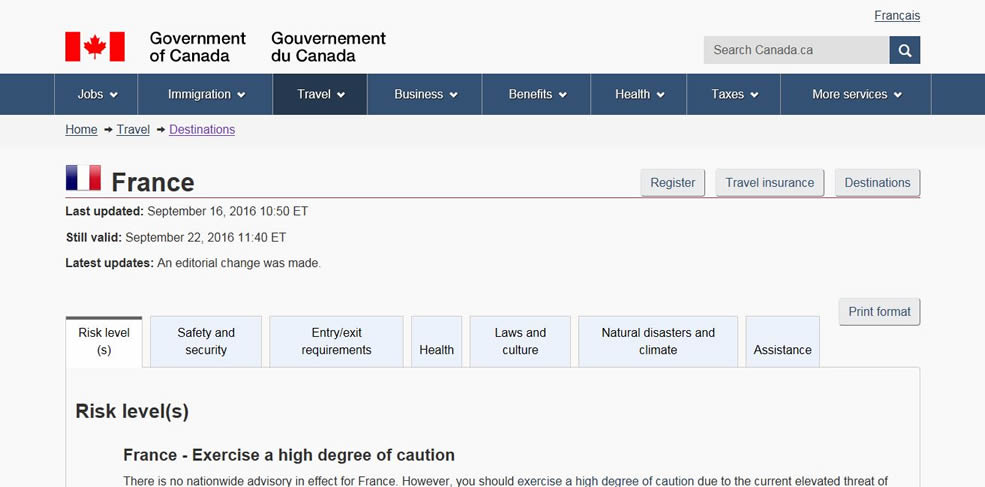
Fails:The principle of front doors isn't just about page titles. Here are two pages where the design treatment creates problems.
Although features like expand/hide and tabs are an easy way to create a clean-looking page, it also means that content doesn't meet the principle of front doors because:
- Users cannot link to specific content via email
- Users might have landed on this page because the search engine found their keywords on the page, but they don't see their keywords as most of the information is hidden
- Other pages cannot link to content within the expand/hide
Hiding information prevents users from finding it. Features like expand/hide and tabs are best used for peripheral content that you are OK with the user never noticing or finding.
Remember: The page design should not create barriers for content.
Take aways
The goal of this principle is to ensure the content can be easily accessed by means other than navigating through the IA. In order to achieve this, you must ensure that:
- page title is clear, unique and descriptive
- page content is easily discoverable once the user lands on the page
- page content can be linked to and shared with ease
All course sections
- Date modified:


