Principle of focused navigation
Read time: 4 minutes
On this page
Overview
Definition: Keep navigation menus simple.
In practice: Design each navigation item with a singular purpose. More than one model can be combined, but each item should be focused on only one way to navigate.
Examples
Passing examples
-
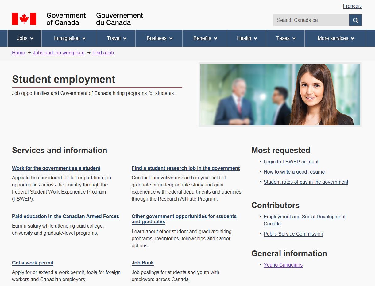
Passes: The primary navigation occupies the main content area and supporting navigation is given less prominence (in this case, the right menu).
Remember: The font size, placement, width, white space and other design elements all influence user perception and ability to distinguish primary vs secondary information, similar vs different.
-
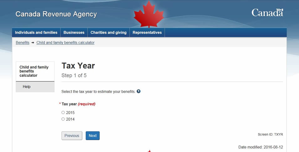
Passes: The multi-step process makes it clear to the user that each step must be completed before moving on.
Remember: A complex process can be simplified by breaking it down into smaller components and adding clear navigation along with progress indicators.
Failing examples
Disclaimer: Examples below are used for learning purposes to illustrate broken principles and their potential consequences, not to judge the organizations or people designing these interfaces.
-
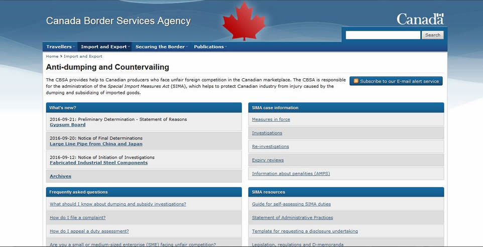
Fails: The navigation elements are all given the same design and visual weight, resulting in lack of focus, prioritization and flow on the page.
Remember: When everything is the same, nothing stands out.
-
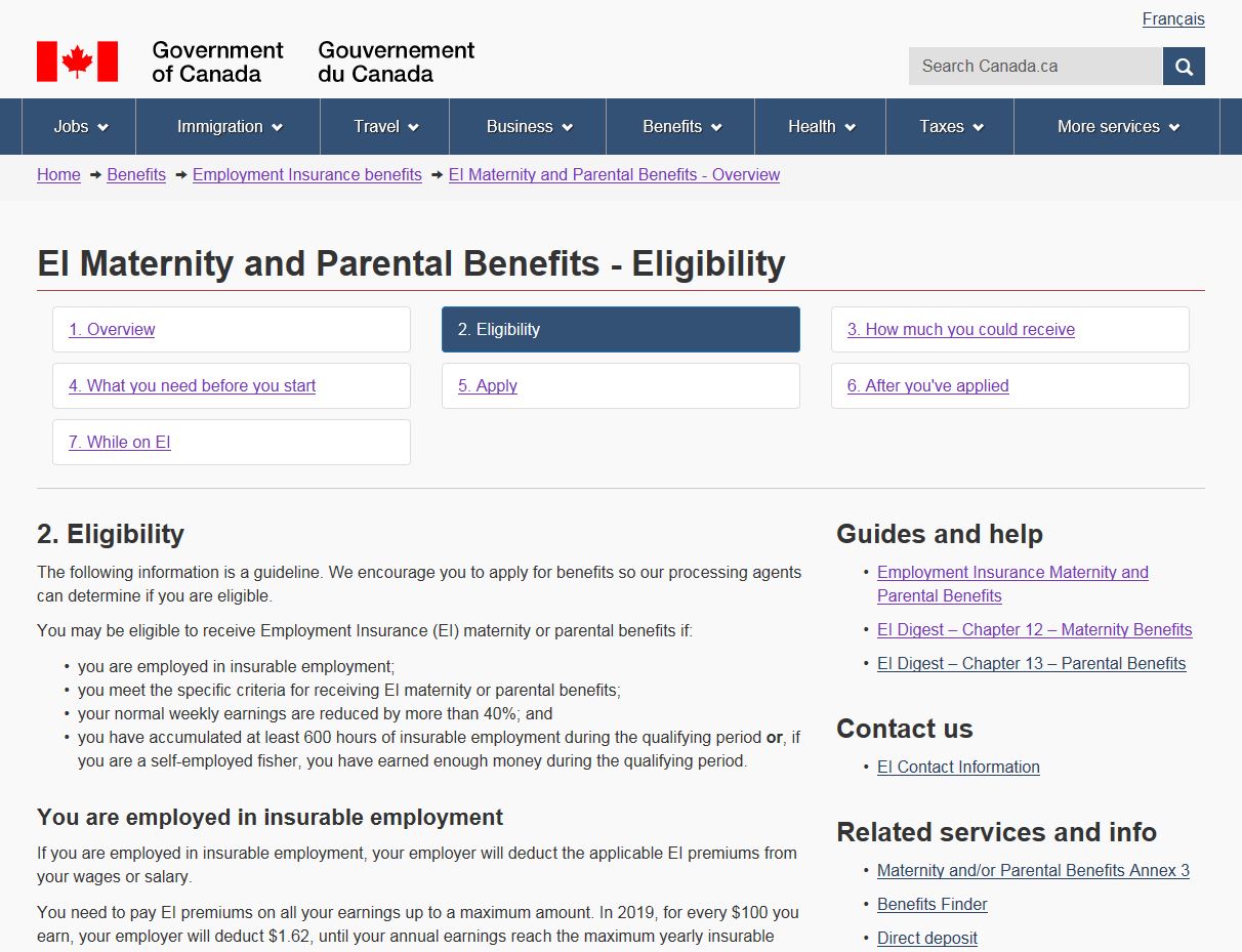
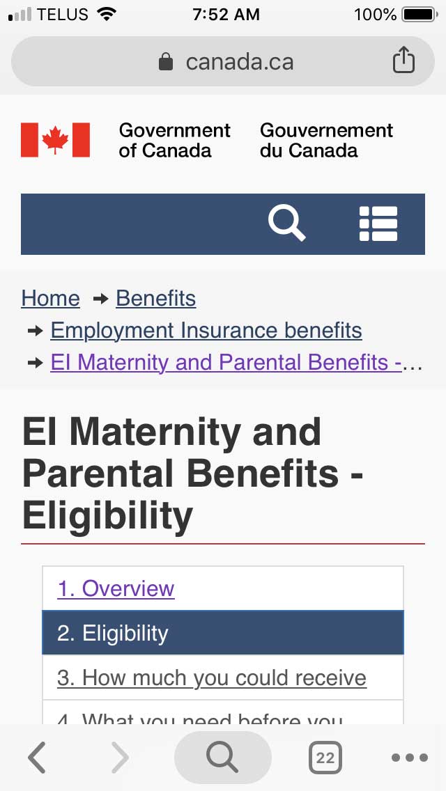
Fails: Immediately following the heading on a content page, you should be able to find the content related to that heading, not a menu system which makes you leave the page and go to related pages. The only way for a user to get to the content on the page, is to ignore the process-wide navigation by scrolling past it.
This design becomes more confusing in mobile view, as it could lead the users to believe that the menu is a table of contents for the page. The first link, "Overview", might cause users to think that selecting it would take them down to an overview section on that same page, not take them to the overview page within the whole process.
Remember: The focus of a content page should be the content, not how to navigate away from it.
-
Fails: There are many competing navigation systems.
What is the main focus supposed to be?
- The first three links that have:
- the strongest background colour, and
- all capitalization, and
- decorative images, but
- the smallest menu width.
- The middle three links that have:
- the largest text size, and
- icons, and
- links wider than the first menu, but
- muted pastel background colours.
- The last four links that have:
- the widest menu links, and
- icons, but
- the lightest of the background colours.
Remember: Keep navigation systems simple.
- The first three links that have:
Take aways
The goal of this principle is to keep navigation simple. In order to achieve this, you must ensure that:
- navigation systems don't compete
- primary navigation is easily differentiated from the secondary or supporting navigation
- navigation design is simple and effortless
All course sections
- Date modified:

