geoplot.aggplot
-
geoplot.aggplot(df, projection=None, hue=None, by=None, geometry=None, nmax=None, nmin=None, nsig=0, agg=<function mean>, cmap='viridis', vmin=None, vmax=None, legend=True, legend_kwargs=None, extent=None, figsize=(8, 6), ax=None, **kwargs)¶ A minimum-expectations summary plot type which handles mixes of geometry types and missing aggregate geometry data.
Parameters: - df (GeoDataFrame) – The data being plotted.
- projection (geoplot.crs object instance, optional) – A geographic projection. Must be an instance of an object in the
geoplot.crsmodule, e.g.geoplot.crs.PlateCarree(). This parameter is optional: if left unspecified, a pure unprojectedmatplotlibobject will be returned. For more information refer to the tutorial page on projections. - hue (None, Series, GeoSeries, iterable, or str, optional) – The data column whose entries are being discretely colorized. May be passed in any of a number of flexible formats. Defaults to None, in which case no colormap will be applied at all.
- by (iterable or str, optional) – The name of a column within the dataset corresponding with some sort of geometry to aggregate points by.
Specifying
bykicksaggplotinto convex hull plotting mode. - geometry (GeoDataFrame or GeoSeries, optional) – A
geopandasobject containing geometries. When bothbyandgeometryare providedaggplotplots in geometry plotting mode, matching points in thebycolumn with the geometries given by their index label in thegeometrycolumn, aggregating those, and plotting the results. - nmax (int or None, optional) – This variable will only be used if the plot is functioning in quadtree mode. It specifies the
maximum number of observations that will be contained in each quadrangle; any quadrangle containing more
than
nmaxobservations will be forcefully partitioned.nmaxmay be left unspecified, in which case no maximum splitting rule will be used. - nmin (int, optional) – This variable will only be used if the plot is functioning in quadtree mode. It specifies the minimum number of observations that must be present in each quadtree split for the split to be followed through. For example, if we specify a value of 5, partition a quadrangle, and find that it contains a subquadrangle with just 4 points inside, this rule will cause the algorithm to return the parent quadrangle instead of its children.
- nsig (int, optional) – A floor on the number of observations in an aggregation that gets reported. Aggregations containing fewer than
nsigpoints are not aggregated and are instead returned as white patches, indicative of their status as “empty” spaces. Defaults to 0. - agg (function, optional) – The aggregation ufunc that will be applied to the
numpyarray of values for the variable of interest of observations inside of each quadrangle. Defaults tonp.mean. - cmap (matplotlib color, optional) – The string representation for a matplotlib colormap to be applied to this dataset.
huemust be non-empty for a colormap to be applied at all, so this parameter is ignored otherwise. - vmin (float, optional) – A strict floor on the value associated with the “bottom” of the colormap spectrum. Data column entries whose value is below this level will all be colored by the same threshold value.
- vmax (float, optional) – A strict ceiling on the value associated with the “top” of the colormap spectrum. Data column entries whose value is above this level will all be colored by the same threshold value.
- legend (boolean, optional) – Whether or not to include a legend in the output plot. This parameter will be ignored if
hueis set to None or left unspecified. - legend_kwargs (dict, optional) – Keyword arguments to be passed to the
matplotlibax.colorbarmethod (ref). - figsize (tuple, optional) – An (x, y) tuple passed to
matplotlib.figurewhich sets the size, in inches, of the resultant plot. Defaults to (8, 6), thematplotlibdefault global. - gridlines (boolean, optional) – Whether or not to overlay cartopy’s computed latitude-longitude gridlines.
- extent (None or (minx, maxx, miny, maxy), optional) – If this parameter is set to None (default) this method will calculate its own cartographic display region. If an extrema tuple is passed—useful if you want to focus on a particular area, for example, or exclude certain outliers—that input will be used instead.
- ax (AxesSubplot or GeoAxesSubplot instance, optional) – A
matplotlib.axes.AxesSubplotorcartopy.mpl.geoaxes.GeoAxesSubplotinstance onto which this plot will be graphed. If this parameter is left undefined a new axis will be created and used instead. - kwargs (dict, optional) –
Keyword arguments to be passed to the underlying
matplotlib.patches.Polygoninstances (ref).
Returns: The axis object with the plot on it.
Return type: AxesSubplot or GeoAxesSubplot instance
Examples
This plot type accepts any geometry, including mixtures of polygons and points, averages the value of a certain data parameter at their centroids, and plots the result, using a colormap is the visual variable.
For the purposes of comparison, this library’s
choroplethfunction takes some sort of data as input, polygons as geospatial context, and combines themselves into a colorful map. This is useful if, for example, you have data on the amount of crimes committed per neigborhood, and you want to plot that.But suppose your original dataset came in terms of individual observations - instead of “n collisions happened in this neighborhood”, you have “one collision occured at this specific coordinate at this specific date”. This is obviously more useful data - it can be made to do more things - but in order to generate the same map, you will first have to do all of the work of geolocating your points to neighborhoods (not trivial), then aggregating them (by, in this case, taking a count).
aggplothandles this work for you. It takes input in the form of observations, and outputs as useful as possible a visualization of their “regional” statistics. What a “region” corresponds to depends on how much geospatial information you can provide.If you can’t provide any geospatial context,
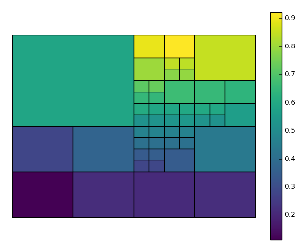
aggplotwill output what’s known as a quadtree: it will break your data down into recursive squares, and use them to aggregate the data. This is a very experimental format, is very fiddly to make, and has not yet been optimized for speed; but it provides a useful baseline which requires no additional work and can be used to expose interesting geospatial correlations right away. And, if you have enough observations, it can be a pretty good approximation (collisions in New York City pictured).Our first few examples are of just such figures. A simple
aggplotquadtree can be generated with just a dataset, a data column of interest, and, optionally, a projection.import geoplot as gplt import geoplot.crs as gcrs gplt.aggplot(collisions, projection=gcrs.PlateCarree(), hue='LATDEP')
To get the best output, you often need to tweak the
nminandnmaxparameters, controlling the minimum and maximum number of observations per box, respectively, yourself. In this case we’ll also choose a different matplotlib colormap, using thecmapparameter.aggplotwill satisfy thenmaxparameter before trying to satisfynmin, so you may result in spaces without observations, or ones lacking a statistically significant number of observations. This is necessary in order to break up “spaces” that the algorithm would otherwise end on. You can control the maximum number of observations in the blank spaces using thensigparameter.gplt.aggplot(collisions, nmin=20, nmax=500, nsig=5, projection=gcrs.PlateCarree(), hue='LATDEP', cmap='Reds')
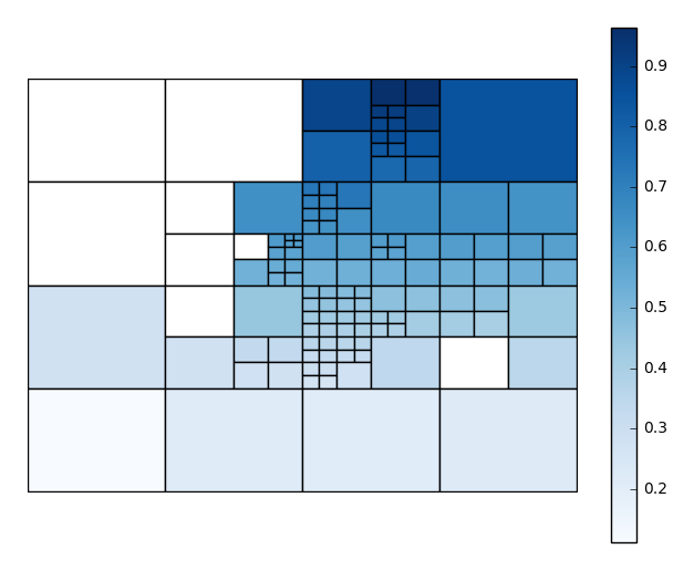
You’ll have to play around with these parameters to get the clearest picture.
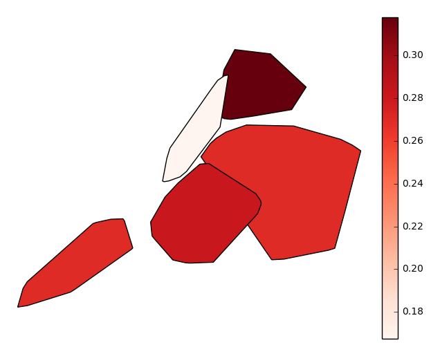
Usually, however, observations with a geospatial component will be provided with some form of spatial categorization. In the case of our collisions example, this comes in the form of a postal zip code. With the simple addition of this data column via the
byparameter, our output changes radically, taking advantage of the additional context we now have to sort and aggregate our observations by (hopefully) geospatially meaningful, if still crude, grouped convex hulls.gplt.aggplot(collisions, projection=gcrs.PlateCarree(), hue='NUMBER OF PERSONS INJURED', cmap='Reds', by='BOROUGH')
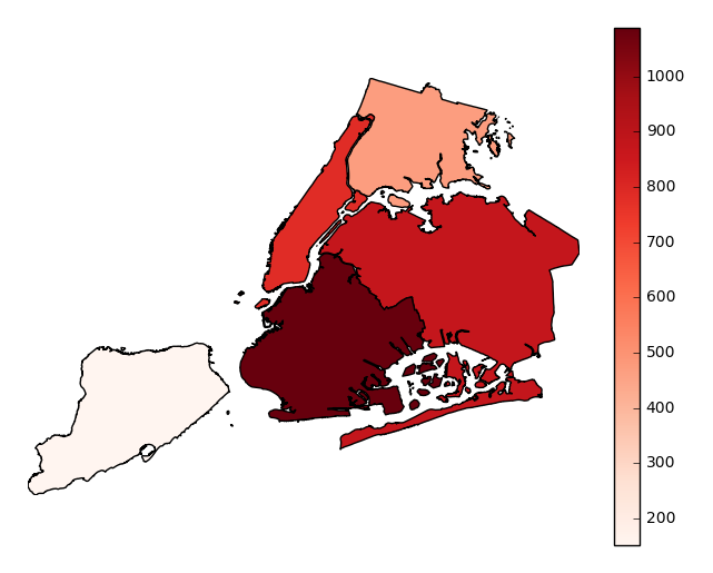
Finally, suppose you actually know exactly the geometries that you would like to aggregate by. Provide these in the form of a
geopandasGeoSeries, one whose index matches the values in yourbycolumn (soBROOKLYNmatchesBROOKLYNfor example), to thegeometryparameter. Your output will now be an ordinary choropleth.gplt.aggplot(collisions, projection=gcrs.PlateCarree(), hue='NUMBER OF PERSONS INJURED', cmap='Reds', by='BOROUGH', geometry=boroughs)
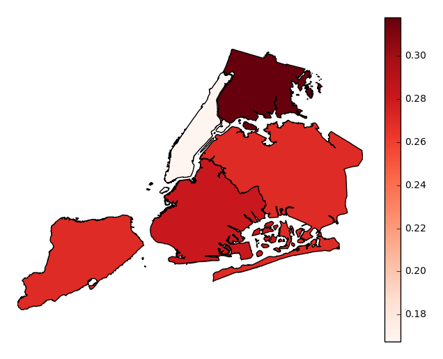
Observations will be aggregated by average, by default. In our example case, our plot shows that accidents in Manhattan tend to result in significantly fewer injuries than accidents occuring in other boroughs.
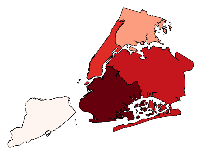
Choose which aggregation to use by passing a function to the
aggparameter.gplt.aggplot(collisions, projection=gcrs.PlateCarree(), hue='NUMBER OF PERSONS INJURED', cmap='Reds', geometry=boroughs_2, by='BOROUGH', agg=len)
legendtoggles the legend.gplt.aggplot(collisions, projection=gcrs.PlateCarree(), hue='NUMBER OF PERSONS INJURED', cmap='Reds', geometry=boroughs_2, by='BOROUGH', agg=len, legend=False)
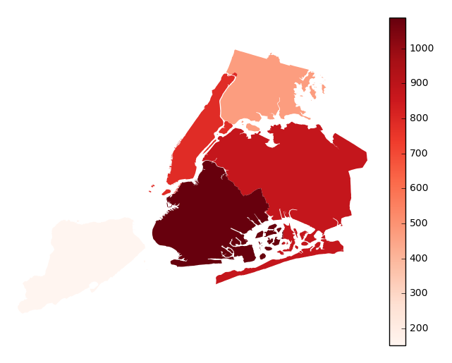
Additional keyword arguments are passed to the underlying
matplotlib.patches.Polygoninstances (ref).gplt.aggplot(collisions, projection=gcrs.PlateCarree(), hue='NUMBER OF PERSONS INJURED', cmap='Reds', geometry=boroughs_2, by='BOROUGH', agg=len, linewidth=0)
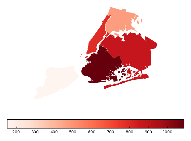
Additional keyword arguments for styling the colorbar legend are passed using
legend_kwargs.gplt.aggplot(collisions, projection=gcrs.PlateCarree(), hue='NUMBER OF PERSONS INJURED', cmap='Reds', geometry=boroughs_2, by='BOROUGH', agg=len, linewidth=0, legend_kwargs={'orientation': 'horizontal'})