Pointplot scale functions
Python source code: [download source: usa-city-elevations]
# This example plots United States cities by their elevation. Several different possible scaling functions for
# determining point size are demonstrated.
# Load the data (uses the `quilt` package).
import geopandas as gpd
from quilt.data.ResidentMario import geoplot_data
cities = gpd.read_file(geoplot_data.usa_cities())
contiguous_usa = gpd.read_file(geoplot_data.contiguous_usa())
# Plot the data.
import geoplot as gplt
import geoplot.crs as gcrs
import numpy as np
import matplotlib.pyplot as plt
f, axarr = plt.subplots(2, 2, figsize=(12, 8), subplot_kw={
'projection': gcrs.AlbersEqualArea(central_longitude=-98, central_latitude=39.5)
})
polyplot_kwargs = {
'projection': gcrs.AlbersEqualArea(), 'facecolor': (0.9, 0.9, 0.9),
'zorder': -100, 'linewidth': 0
}
pointplot_kwargs = {
'projection': gcrs.AlbersEqualArea(), 'scale': 'ELEV_IN_FT',
'edgecolor': 'white', 'linewidth': 0.5, 'color': 'black'
}
ylim = (-1647757.3894385984, 1457718.4893930717)
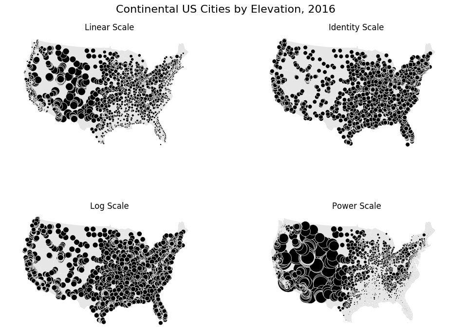
# Our first plot is a default linear-scale one. We can see from the results that this is clearly the most appropriate
# one for this specific data.
gplt.polyplot(contiguous_usa.geometry, ax=axarr[0][0], **polyplot_kwargs)
gplt.pointplot(cities.query("POP_2010 > 10000"), ax=axarr[0][0], limits=(0.1, 10), **pointplot_kwargs)
axarr[0][0].set_title("Linear Scale")
axarr[0][0].set_ylim(ylim)
# Next, a trivial identity scale. This results in a plot where every city has the same size.
def identity_scale(minval, maxval):
def scalar(val):
return 2
return scalar
gplt.polyplot(contiguous_usa.geometry, ax=axarr[0][1], **polyplot_kwargs)
gplt.pointplot(cities.query("POP_2010 > 10000"), ax=axarr[0][1], scale_func=identity_scale, **pointplot_kwargs)
axarr[0][1].set_title("Identity Scale")
axarr[0][1].set_ylim(ylim)
# A more interesting scale is the logarithmic scale. This scale works very well when the data in question is
# "log-linear", that is, it is distributed linearly with respect to its own logarithm. In our demonstratory case the
# data is linear and not logorithmic in shape, so this doesn't come out too well, but in other cases using the logorithm
# is the way to go.
def log_scale(minval, maxval):
# The minimum value in this dataset is -112, so we need to adjust inputs.
def scalar(val):
val = val + abs(minval) + 1
return np.log10(val)
return scalar
gplt.polyplot(contiguous_usa.geometry, ax=axarr[1][0], **polyplot_kwargs)
gplt.pointplot(cities.query("POP_2010 > 10000"), ax=axarr[1][0], scale_func=log_scale, **pointplot_kwargs)
axarr[1][0].set_title("Log Scale")
axarr[1][0].set_ylim(ylim)
# Finally, our last demo, a power scale. This is useful for data that follows a power law distribution of some
# kind. Again, this doesn't work too well in our case, but this example is just meant for demonstration!
def power_scale(minval, maxval):
# The minimum value in this dataset is -112, so we need to adjust inputs.
def scalar(val):
val = val + abs(minval) + 1
return (val/1000)**2
return scalar
gplt.polyplot(contiguous_usa.geometry, ax=axarr[1][1], **polyplot_kwargs)
gplt.pointplot(cities.query("POP_2010 > 10000"), ax=axarr[1][1], scale_func=power_scale, **pointplot_kwargs)
axarr[1][1].set_title("Power Scale")
axarr[1][1].set_ylim(ylim)
plt.suptitle('Continental US Cities by Elevation, 2016', fontsize=16)
plt.subplots_adjust(top=0.95)
plt.savefig("usa-city-elevations.png", bbox_inches='tight')