Presentation of Accesability
Before making our site for the final assignment, we discussed what the site had to contain for it to be accessible as possible. We concluded that we had to focus on the following three things:
- Legibility
- Easy to navigate
- Easy to understand
When making the website, we made sure to implement these points as best as possible. For instance, we made sure that the background color was distinguishable from the foreground, and that text background was a color that was high in contrast to the text colors. Navigation was one of the things that we used some time to do it right. We made sure that it was not large enough, but also easy to navigate/understand. We also implemented a version of the navigation bar for mobile devices that was. Most if not all the pictures that we used in our website either has an alternative text or a description for visually impaired users. We also used a font that was both easy to read, but also easy to understand. Headers for the sites are both relevant and explains the text. The last thing that we implemented was making the paragraph look neater by using text-align property in CSS.
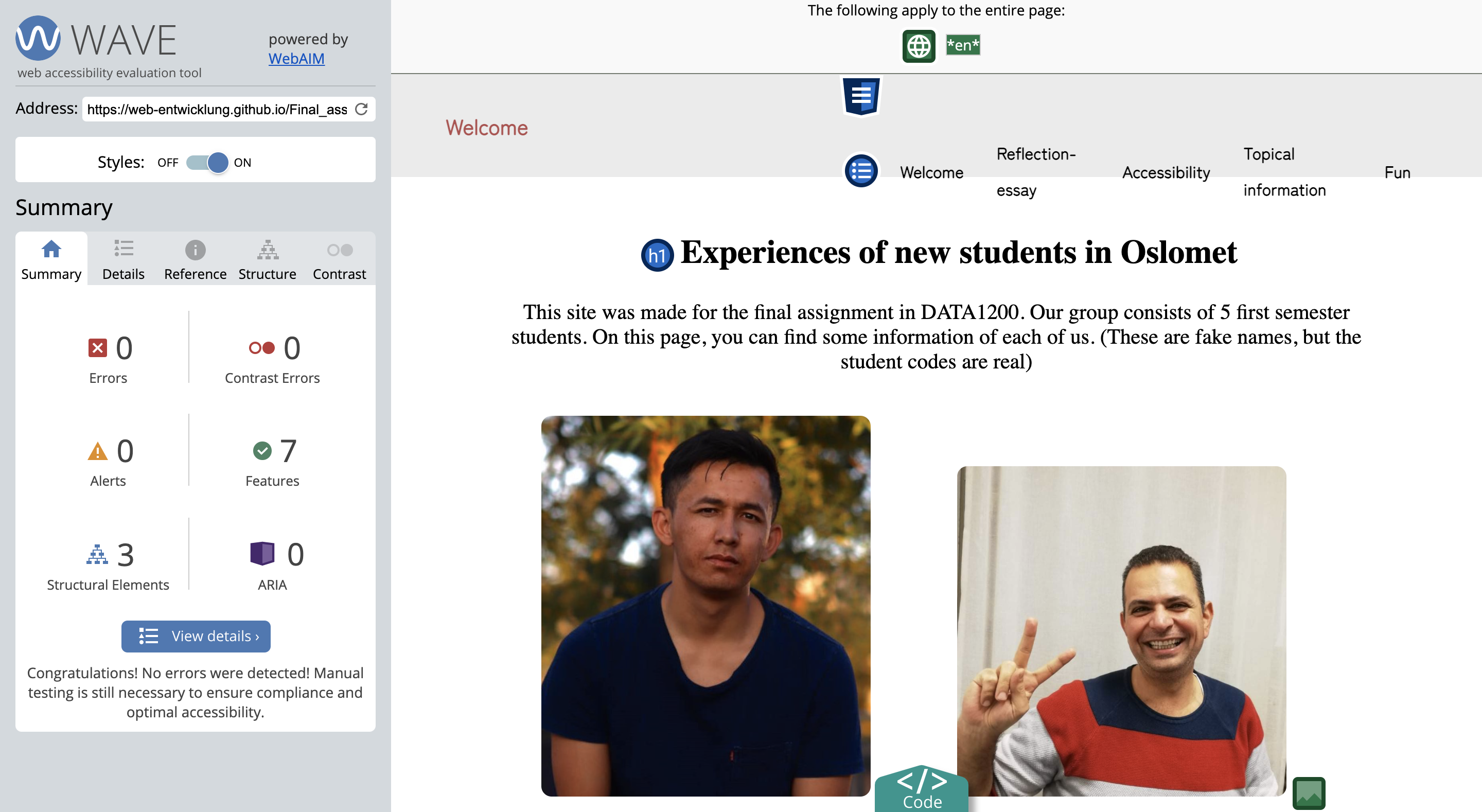
After finishing the site, we checked the code for accessibility and validated it by using automated tests. We ended up using mainly WAVE (Web Accessibility Evaluation Tool) to checking for accessibility, and W3’s validating tool to validate our code.
When using WAVE, we only got a few alerts, but these were neglected because it was alerting about the pictures’ alternative text is the same as the description of the picture.
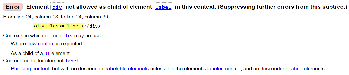
When running the code through W3 validator, we also got a few warnings. This time, the warnings were about having div elements inside a label (menu button). We decided to leave it in because it was the simplest way to make a menu button without using JavaScript (that we have not learned yet)