Logistic regression model
Rationale and formulation
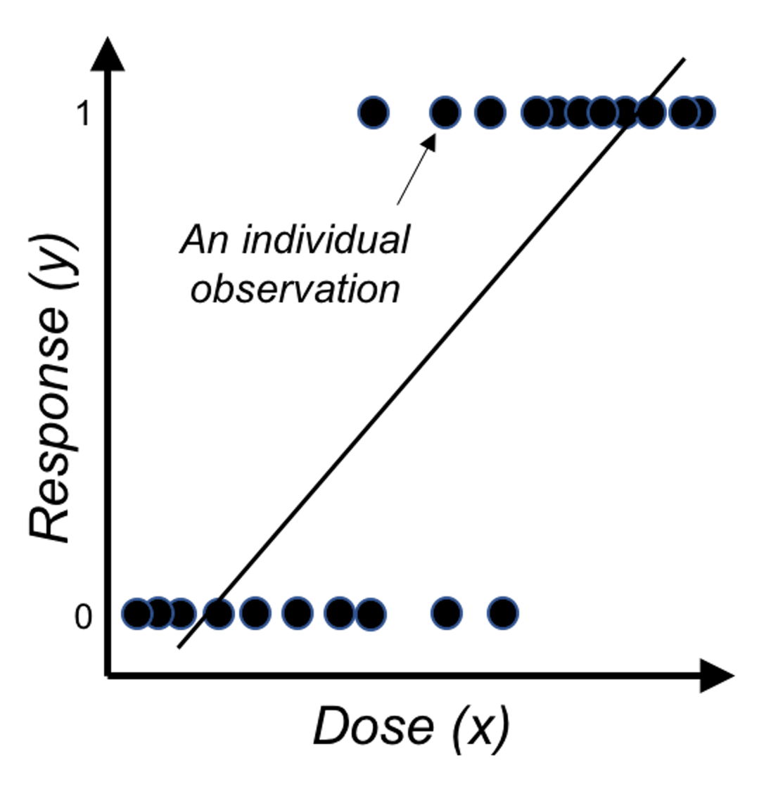 Figure 25: Direct application of linear regression on binary outcome, i.e., illustration of Eq. (23) on a one-predictor problem where \(x\) is the dose of a treatment and \(y\) is the binary outcome variable.
Linear regression models are introduced in Chapter 2 as a tool to predict a continuous response using a few input variables. In some applications, the response variable is a binary variable that denotes two classes. For example, in the AD dataset, we have a variable called DX_bl that encodes the diagnosis information of the subjects, i.e., 0 denotes normal, while 1 denotes diseased.
We have learned about linear regression models to connect the input variables with the outcome variable. It is natural to wonder if the linear regression framework could still be useful here. If we write the regression equation
\[\begin{equation} \text{The goal: } \underbrace{y}_{\text{Binary}}=\underbrace{\beta_{0}+\sum_{i=1}^{p} \beta_{i} x_{i}+\varepsilon.}_{\text{Continuous and unbounded}} \tag{23} \end{equation}\]
Something doesn’t make sense. The reason is obvious: the right-hand side of Eq. (23) is continuous without bounds, while the left hand side of the equation is a binary variable. A graphical illustration is shown in Figure 25. So we have to modify this equation, either the right-hand side or the left-hand side.
Since we want it to be a linear model, it is better not to modify the right-hand side. So look at the left-hand side. Why we have to stick with the natural scale of \(y\)? We could certainly work out a more linear-model-friendly scale. For example, instead of predicting \(y\), how about predicting the probability \(Pr(y=1|\boldsymbol{x})\)? If we know \(Pr(y=1|\boldsymbol{x})\), we can certainly convert it to the scale of \(y\).53 I.e., if \(Pr(y=1|\boldsymbol{x}) \geq 0.5\), we conclude \(y = 1\); otherwise, \(y=0\).
Thus, we consider the following revised goal
\[\begin{equation} \text{Revised goal: } \underbrace{Pr(y=1|\boldsymbol{x})}_{\text{Continuous but bounded}}=\underbrace{\beta_{0}+\sum_{i=1}^{p} \beta_{i} x_{i}+\varepsilon.}_{\text{Continuous and unbounded}} \tag{24} \end{equation}\]
Changing our outcome variable from \(y\) to \(Pr(y=1|\boldsymbol{x})\) is a good move, since \(Pr(y=1|\boldsymbol{x})\) is on a continuous scale. However, as it is a probability, it has to be in the range of \([0,1]\). We need more modifications to make things work.
If we make a lot of modifications and things barely work, we may have lost the essence. What is the essence of the linear model that we would like to leverage in this binary prediction problem? Interpretability—sure, the linear form seems easy to understand, but as we have pointed out in Chapter 2, this interpretability comes with a price, and we need to be cautious when we draw conclusions about the linear model, although there are easy conventions for us to follow. On the other hand, it would sound absurd if we dig into the literature and found there had been no linear model for binary classification problems. Linear model is the baseline of the data analytics enterprise. It is the starting point of our data analytics adventure. That is how important it is.
Back to the business to modify the linear formalism for a binary classification problem. Now our outcome variable is \(Pr(y=1|\boldsymbol{x})\), and we realize it still doesn’t match with the linear form \(\beta_0+\sum_{i=1}^p \beta_i x_i\). What is the essential task here? If we put the puzzle in a context, it may give us some hints. For example, if our goal is to predict the risk of Alzheimer’s disease for subjects who are aged \(65\) years or older, we have known the average risk from recent national statistics is \(8.8\%\). Now if we have a group of individuals who are aged 65 years or older, we could make a risk prediction for them as a group, i.e., 8.8%. But this is not the best we could do for each individual. We could examine an individual’s characteristics such as the gene APOE54 APOE polymorphic alleles play a major role in determining the risk of Alzheimer’s disease (AD): individuals carrying the \(\epsilon4\) allele are at increased risk of AD compared with those carrying the more common \(\epsilon3\) allele, whereas the \(\epsilon2\) allele decreases risk. and see if an individual has higher (or lower) risk than the average. Now comes the inspiration: what if we can rank the risk of the individuals based on their characteristics, can it help with the final goal that is to predict the outcome variable \(y\)?
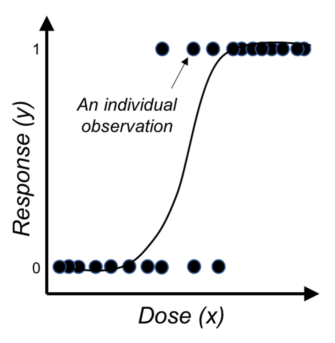 Figure 26: Application of the logistic function on binary outcome
Now we look closer into the idea of a linear form, and we realize it is more useful in ranking the possibilities rather than directly being eligible probabilities.
\[\begin{equation} \text{Revised goal: } Pr(y=1|\boldsymbol{x})\propto\beta_0+\sum_{i=1}^p\, \beta_i x_i. \tag{25} \end{equation}\]
In other words, a linear form can make a comparison of two inputs, say, \(\boldsymbol{x}_i\) and \(\boldsymbol{x}_j\), and evaluates which one leads to a higher probability of \(Pr(y=1|\boldsymbol{x})\).
It is fine that we use the linear form to generate numerical values that rank the subjects. We just need one more step to transform those ranks into probabilities. Statisticians have found that the logistic function is suitable here for the transformation
\[\begin{equation} Pr(y=1|\boldsymbol{x}) = \frac{1}{1+e^{-\left(\beta_0+\sum\nolimits_{i=1}\nolimits^{p}\, \beta_i x_i\right)}}. \tag{26} \end{equation}\]
Figure 26 shows that the logistic function indeed provides a better fit of the data than the linear function as shown in Figure 25.
Eq. (26) can be rewritten as Eq. (27)
\[\begin{equation} \log {\frac{Pr(y=1|\boldsymbol{x})}{1-Pr(y=1|\boldsymbol{x})}}=\beta_0+\sum\nolimits_{i=1}\nolimits^{p}\beta_i x_i. \tag{27} \end{equation}\]
This is the so-called logistic regression model. The name stems from the transformation of \(Pr(y=1|\boldsymbol{x})\) used here, i.e., the \(\log \frac{Pr(y=1|\boldsymbol{x})}{1-Pr(y=1|\boldsymbol{x})}\), which is the logistic transformation that has been widely used in many areas such as physics and signal processing.
Note that we have mentioned that we can predict \(y=1\) if \(Pr(y=1|\boldsymbol{x})\geq0.5\), and \(y=0\) if \(Pr(y=1|\boldsymbol{x})<0.5\). While \(0.5\) seems naturally a cut-off value here, it is not necessarily optimal in every application. We could use the techniques discussed in Chapter 5 such as cross-validation to decide what is the optimal cut-off value in practice.
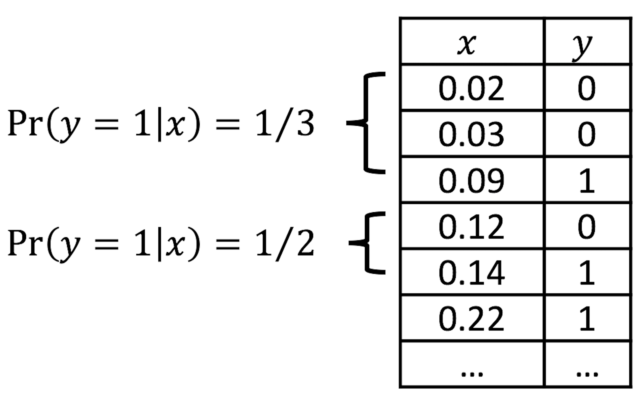 Figure 27: Illustration of the discretization process, e.g., two categories (\(0.0-0.1\) and \(0.1-0.2\)) of \(x\) are shown
Visual inspection of data. How do we know that our data could be characterized using a logistic function?
We can discretize the predictor \(x\) in Figure 26 into a few categories, compute the empirical estimate of \(Pr(y=1|x)\) in each category, and create a new data table. This procedure is illustrated in Figure 27.
Suppose that we discretize the data in Figure 26 and obtain the result as shown in Table 6.
Table 6: Example of a result after discretization
| Level of \(x\) | \(1\) | \(2\) | \(3\) | \(4\) | \(5\) | \(6\) | \(7\) | \(8\) |
|---|---|---|---|---|---|---|---|---|
| \(Pr(y=1\)|\(x)\) | \(0.00\) | \(0.04\) | \(0.09\) | \(0.20\) | \(0.59\) | \(0.89\) | \(0.92\) | \(0.99\) |
Then, we revise the scale of the \(y\)-axis of Figure 26 to be \(Pr(y=1|x)\), and create Figure 28. It could be seen that the empirical curve does fit the form of Eq. (26).
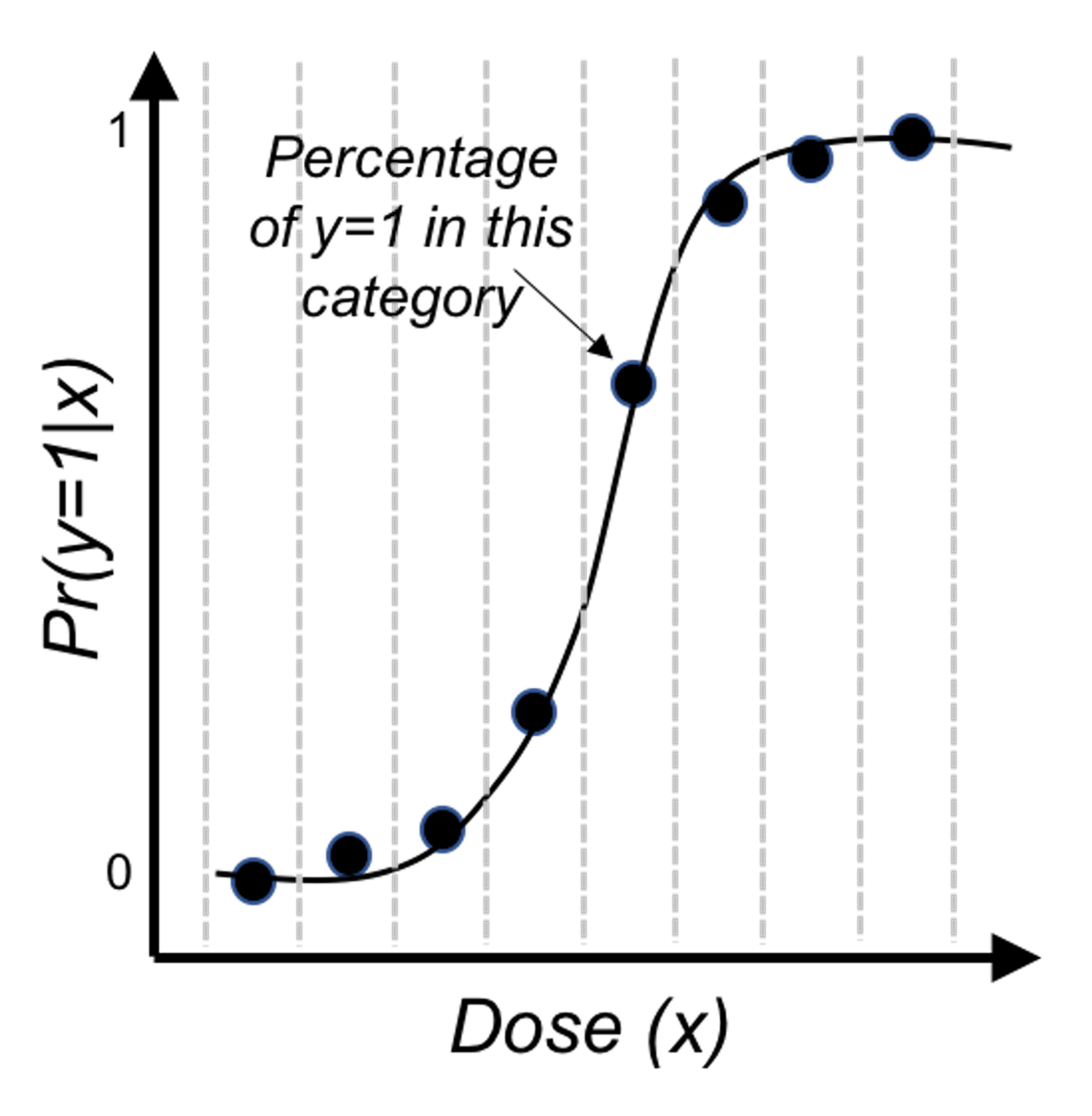 Figure 28: Revised scale of the \(y\)-axis of Figure 26, i.e., illustration of Eq. (26)
Theory and method
We collect data to estimate the regression parameters of the logistic regression in Eq. (27). Denote the sample size as \(N\). \(\boldsymbol{y} \in R^{N \times 1}\) denotes the \(N\) measurements of the outcome variable, and \(\boldsymbol{X} \in R^{N \times (p+1)}\) denotes the data matrix that includes the \(N\) measurements of the \(p\) input variables plus the dummy variable for the intercept coefficient \(\beta_0\). As in a linear regression model, \(\boldsymbol{\beta}\) is the column vector form of the regression parameters.
The likelihood function. The likelihood function evaluates how well a given set of parameters fit the data55 The least squares loss function we derived in Chapter 2 could also be derived based on the likelihood function of a linear regression model.. The likelihood function has a specific definition, i.e., the conditional probability of the data conditional on the given set of parameters. Here, the dataset is \(D = \left \{\boldsymbol{X}, \boldsymbol{y} \right\}\), so the likelihood function is defined as \(Pr(D | \boldsymbol{\beta})\). It could be broken down into \(N\) components56 Note that, it is assumed that \(D\) consists of \(N\) independent data points.
\[ Pr(D | \boldsymbol{\beta}) = \prod\nolimits_{n=1}\nolimits^{N}Pr(\boldsymbol{x}_n, {y_n} | \boldsymbol{\beta}). \]
For data point \((\boldsymbol{x}_n, {y_n})\), the conditional probability \(Pr(\boldsymbol{x}_n, {y_n} | \boldsymbol{\beta})\) is
\[\begin{equation} Pr(\boldsymbol{x}_n, {y_n} | \boldsymbol{\beta})=\begin{cases} p(\boldsymbol{x}_n), & if \, y_n = 1 \\ 1-p(\boldsymbol{x}_n), & if \, y_n = 0. \\ \end{cases} \end{equation}\]
Here, \(p(\boldsymbol{x}_n) = Pr(y=1|\boldsymbol{x})\).
A succinct form to represent these two scenarios together is
\[Pr(\boldsymbol{x}_n, {y_n} | \boldsymbol{\beta}) = p(\boldsymbol{x}_n)^{y_n}\left[1-p(\boldsymbol{x}_n)\right]^{1-y_n}.\]
Then we can generalize this to all the \(N\) data points, and derive the complete likelihood function as
\[ Pr(D | \boldsymbol{\beta})=\prod\nolimits_{n=1}\nolimits^{N}p(\boldsymbol{x}_n)^{y_n}\left[1-p(\boldsymbol{x}_n)\right]^{1-y_n}. \]
It is common to write up its log-likelihood function , defined as \(l(\boldsymbol \beta) = \log Pr(D | \boldsymbol{\beta})\), to turn products into sums
\[l(\boldsymbol \beta)=\sum\nolimits_{n=1}\nolimits^N\, \left \{ y_n \log p(\boldsymbol{x}_n)+(1-y_n)\log [1-p(\boldsymbol{x}_n)]\right\}.\]
By plugging in the definition of \(p(\boldsymbol{x}_n)\), this could be further transformed into
\[\begin{equation} \begin{split} l(\boldsymbol \beta) = \sum\nolimits_{n=1}\nolimits^N -\log \left(1+e^{\beta_0+\sum\nolimits_{i=1}\nolimits^p\, \beta_i x_{ni}} \right) - \\ \sum\nolimits_{n=1}\nolimits^N y_n(\beta_0+\sum\nolimits_{i=1}\nolimits^p\, \beta_i x_{ni}). \end{split} \tag{28} \end{equation}\]
Note that, for any probabilistic model57 A probabilistic model has a joint distribution for all the random variables concerned in the model. Interested readers can read this comprehensive book: Koller, D. and Friedman, N., Probabilistic Graphical Models: Principles and Techniques, The MIT Press, 2009., we could derive the likelihood function in one way or another, in a similar fashion as we have done for the logistic regression model.
Algorithm. Eq. (28) provides the objective function of a maximization problem, i.e., the parameter that maximizes \(l(\boldsymbol \beta)\) is the best parameter. Theoretically, we could use the First Derivative Test to find the optimal solution. The problem here is that there is no closed-form solution found if we directly apply the First Derivative Test.
Instead, the Newton-Raphson algorithm is commonly used to optimize the log-likelihood function of the logistic regression model. It is an iterative algorithm that starts from an initial solution, continues to seek updates of the current solution using the following formula
\[\begin{equation} \boldsymbol \beta^{new} = \boldsymbol \beta^{old} - (\frac{\partial^2 l(\boldsymbol \beta)}{\partial \boldsymbol \beta \partial \boldsymbol \beta^T})^{-1} \frac{\partial l(\boldsymbol \beta)}{\partial \boldsymbol \beta}. \tag{29} \end{equation}\]
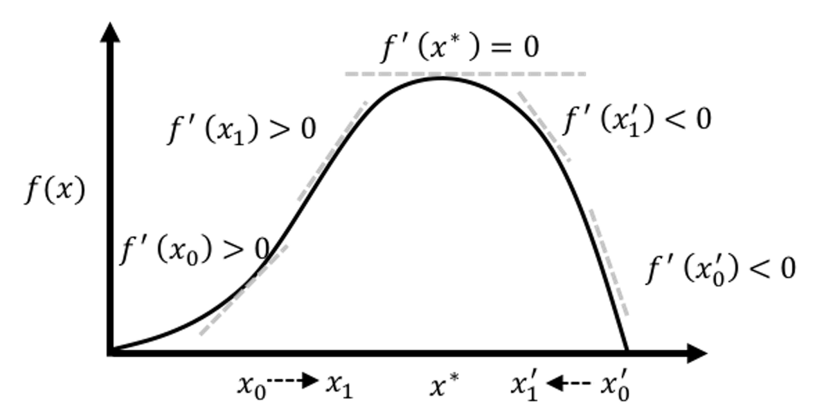
Here, \(\frac{\partial l(\boldsymbol \beta)}{\partial \boldsymbol \beta}\) is the gradient of the current solution, that points to the direction following which we should increment the current solution to improve on the objective function. On the other hand, how far we should go along this direction is decided by the step size factor, defined as \((\frac{\partial^2 l(\boldsymbol \beta)}{\partial \boldsymbol \beta \partial \boldsymbol \beta^T})^{-1}\). Theoretical results have shown that this formula could converge to the optimal solution. An illustration is given in Figure 29.
Figure 29: Illustration of the gradient-based optimization algorithms that include the Newton-Raphson algorithm as an example. An algorithm starts from an initial solution (e.g., \(x_0\) and \(x_0'\) are two examples of initial solutions in the figure), uses the gradient to find the direction, and moves the solution along that direction with the computed step size, until it finds the optimal solution \(x^*\).
The Newton-Raphson algorithm presented in Eq. (29) is general. To apply it in a logistic regression model, since we have an explicit form of \(l(\boldsymbol \beta)\), we can derive the gradient and step size as shown below
\[\begin{align*} \frac{\partial l(\boldsymbol{\beta})}{\partial \boldsymbol{\beta}} &= \sum\nolimits_{n=1}^{N}\boldsymbol{x}_n\left[y_n -p(\boldsymbol{x}_n)\right], \\ \frac{\partial^2 l(\boldsymbol{\beta})}{\partial \boldsymbol{\beta} \partial \boldsymbol{\beta}^T} &= -\sum\nolimits_{n=1}^N \boldsymbol{x}_n\boldsymbol{x}_n^T p(\boldsymbol{x}_n)\left[1-p(\boldsymbol{x}_n)\right]. \end{align*}\]
A certain structure can be revealed if we rewrite it in matrix form58 \(\boldsymbol{p}(\boldsymbol{x})\) is a \(N\times1\) column vector of \(p(\boldsymbol{x}_n)\), and \(\boldsymbol{W}\) is a \(N\times N\) diagonal matrix with the \(n^{th}\) diagonal element as \(p(\boldsymbol{x}_n )\left[1-p(\boldsymbol{x}_n)\right]\).
\[\begin{align} \frac{\partial l(\boldsymbol{\beta})}{\partial \boldsymbol{\beta}} = \boldsymbol{X}^T\left[\boldsymbol{y}-\boldsymbol{p}(\boldsymbol{x})\right], \\ \frac{\partial^2 l(\boldsymbol{\beta})}{\boldsymbol{\beta} \boldsymbol{\beta}^T} = -\boldsymbol{X}^T\boldsymbol{W}\boldsymbol{X}. \tag{30} \end{align}\]
Plugging Eq. (30) into the updating formula as shown in Eq. (29), we can derive a specific formula for logistic regression
\[\begin{align} &\boldsymbol{\beta}^{new} = \boldsymbol{\beta}^{old} + (\boldsymbol{X}^T\boldsymbol{WX})^{-1}\boldsymbol{X}^T\left[ \boldsymbol{y}-\boldsymbol{p}(\boldsymbol{x}) \right], \\ & = (\boldsymbol{X}^T\boldsymbol{WX})^{-1}\boldsymbol{X}^T\boldsymbol{W} \left(\boldsymbol{X}\boldsymbol{\beta}^{old}+\boldsymbol{W}^{-1} \left[ \boldsymbol{y} - \boldsymbol{p}(\boldsymbol{x})\right] \right), \\ & = (\boldsymbol{X}^T\boldsymbol{WX})^{-1}\boldsymbol{X}^T\boldsymbol{Wz}. \tag{31} \end{align}\]
Here, \(\boldsymbol{z}=\boldsymbol{X}\boldsymbol{\beta}^{old} + \boldsymbol{W}^{-1}(\boldsymbol{y} - \boldsymbol{p}(\boldsymbol{x}))\).
Putting all these together, a complete flow of the algorithm is shown below
Initialize \(\boldsymbol{\beta}.\)59 I.e., use random values for \(\boldsymbol{\beta}\).
Compute \(\boldsymbol{p}(\boldsymbol{x}_n)\) by its definition: \(\boldsymbol{p}(\boldsymbol{x}_n )=\frac{1}{1+e^{-(\beta_0+\sum_{i=1}^p\, \beta_i x_{ni})}}\) for \(n=1,2,\ldots,N\).
Compute the diagonal matrix \(\boldsymbol{W}\), with the \(n^{th}\) diagonal element as \(\boldsymbol{p}\left(\boldsymbol{x}_{n}\right)\left[1-\boldsymbol{p}\left(\boldsymbol{x}_{n}\right)\right]\) for \(n=1,2,…,N\).
Set \(\boldsymbol{z}\) as \(= \boldsymbol{X} \boldsymbol{\beta}+\boldsymbol{W}^{-1}[\boldsymbol{y}-\boldsymbol{p}(\boldsymbol{x})]\).
Set \(\boldsymbol{\beta} = \left(\boldsymbol{X}^{T} \boldsymbol{W X}\right)^{-1} \boldsymbol{X}^{T} \boldsymbol{W} \boldsymbol{z}\).
If the stopping criteria60 A common stopping criteria is to evaluate the difference between two consecutive solutions, i.e., if the Euclidean distance between the two vectors, \(\boldsymbol{\beta}^{new}\) and \(\boldsymbol{\beta}^{old}\), is less than \(10^{-4}\), then it is considered no difference and the algorithm stops. is met, stop; otherwise, go back to step 2.
Generalized least squares estimator. The estimation formula as shown in Eq. (31) resembles the generalized least squares (GLS) estimator of a regression model, where each data point \((\boldsymbol{x}_n,y_n)\) is associated with a weight \(w_n\). This insight revealed by the Newton-Raphson algorithm suggests a new perspective to look at the logistic regression model. The updating formula shown in Eq. (31) suggests that, in each iteration of parameter updating, we actually solve a weighted regression model as
\[\boldsymbol{\beta}^{new} \leftarrow \mathop{\arg\min}_{\boldsymbol{\beta}} (\boldsymbol{z}-\boldsymbol{X}\boldsymbol \beta)^T\boldsymbol{W}(\boldsymbol{z}-\boldsymbol{X}\boldsymbol{\beta}).\]
For this reason, the algorithm we just introduced is also called the Iteratively Reweighted Least Squares (IRLS) algorithm. \(\boldsymbol{z}\) is referred to as the adjusted response.
R Lab
In the AD dataset, the variable DX_bl encodes the diagnosis information, i.e.,0 denotes normal while 1 denotes diseased. We build a logistic regression model using DX_bl as the outcome variable.
The 7-Step R Pipeline. Step 1 is to import data into R.
# Step 1 -> Read data into R workstation
# RCurl is the R package to read csv file using a link
library(RCurl)
url <- paste0("https://raw.githubusercontent.com",
              "/analyticsbook/book/main/data/AD.csv")
AD <- read.csv(text=getURL(url))
# str(AD)
Step 2 is for data preprocessing.
# Step 2 -> Data preprocessing
# Create your X matrix (predictors) and Y vector (outcome variable)
X <- AD[,2:16]
Y <- AD$DX_bl

# The following code makes sure the variable "DX_bl" is a "factor".
# It denotes "0" as "c0" and "1" as "c1", to highlight the fact
# that "DX_bl" is a factor variable, not a numerical variable.

Y <- paste0("c", Y)
# as.factor is to convert any variable into the
# format as "factor" variable.
Y <- as.factor(Y)

# Then, we integrate everything into a data frame
data <- data.frame(X,Y)
names(data)[16] = c("DX_bl")

set.seed(1) # generate the same random sequence
# Create a training data (half the original data size)
train.ix <- sample(nrow(data),floor( nrow(data)/2) )
data.train <- data[train.ix,]
# Create a testing data (half the original data size)
data.test <- data[-train.ix,]
Step 3 is to use the function glm() to build a logistic regression model61 Typehelp(glm) in R Console to learn more of the function..
# Step 3 -> Use glm() function to build a full model
# with all predictors
logit.AD.full <- glm(DX_bl~., data = data.train,
                     family = "binomial")
summary(logit.AD.full)
And the result is shown below
## Call:
## glm(formula = DX_bl ~ ., family = "binomial", data = data.train)
##
## Deviance Residuals:
##     Min       1Q   Median       3Q      Max
## -2.4250  -0.3645  -0.0704   0.2074   3.1707
##
## Coefficients:
##              Estimate Std. Error z value Pr(>|z|)
## (Intercept)  43.97098    7.83797   5.610 2.02e-08 ***
## AGE          -0.07304    0.03875  -1.885  0.05945 .
## PTGENDER      0.48668    0.46682   1.043  0.29716
## PTEDUCAT     -0.24907    0.08714  -2.858  0.00426 **
## FDG          -3.28887    0.59927  -5.488 4.06e-08 ***
## AV45          2.09311    1.36020   1.539  0.12385
## HippoNV     -38.03422    6.16738  -6.167 6.96e-10 ***
## e2_1          0.90115    0.85564   1.053  0.29225
## e4_1          0.56917    0.54502   1.044  0.29634
## rs3818361    -0.47249    0.45309  -1.043  0.29703
## rs744373      0.02681    0.44235   0.061  0.95166
## rs11136000   -0.31382    0.46274  -0.678  0.49766
## rs610932      0.55388    0.49832   1.112  0.26635
## rs3851179    -0.18635    0.44872  -0.415  0.67793
## rs3764650    -0.48152    0.54982  -0.876  0.38115
## rs3865444     0.74252    0.45761   1.623  0.10467
## ---
## Signif. codes:  0 ‘***’ 0.001 ‘**’ 0.01 ‘*’ 0.05 ‘.’ 0.1 ‘ ’ 1
##
## (Dispersion parameter for binomial family taken to be 1)
##
##     Null deviance: 349.42  on 257  degrees of freedom
## Residual deviance: 139.58  on 242  degrees of freedom
## AIC: 171.58
##
## Number of Fisher Scoring iterations: 7
Step 4 is to use the step() function for model selection.
# Step 4 -> use step() to automatically delete
# all the insignificant
# variables
# Also means, automatic model selection
logit.AD.reduced <- step(logit.AD.full, direction="both",
                         trace = 0)
summary(logit.AD.reduced)
## Call:
## glm(formula = DX_bl ~ AGE + PTEDUCAT + FDG + AV45 + HippoNV +
## rs3865444, family = "binomial", data = data.train)
##
## Deviance Residuals:
## Min 1Q Median 3Q Max
## -2.38957 -0.42407 -0.09268 0.25092 2.73658
##
## Coefficients:
## Estimate Std. Error z value Pr(>|z|)
## (Intercept) 42.68795 7.07058 6.037 1.57e-09 ***
## AGE -0.07993 0.03650 -2.190 0.02853 *
## PTEDUCAT -0.22195 0.08242 -2.693 0.00708 **
## FDG -3.16994 0.55129 -5.750 8.92e-09 ***
## AV45 2.62670 1.18420 2.218 0.02655 *
## HippoNV -36.22215 5.53083 -6.549 5.79e-11 ***
## rs3865444 0.71373 0.44290 1.612 0.10707
## ---
## Signif. codes: 0 ‘***’ 0.001 ‘**’ 0.01 ‘*’ 0.05 ‘.’ 0.1 ‘ ’ 1
##
## (Dispersion parameter for binomial family taken to be 1)
##
## Null deviance: 349.42 on 257 degrees of freedom
## Residual deviance: 144.62 on 251 degrees of freedom
## AIC: 158.62
##
## Number of Fisher Scoring iterations: 7You may have noticed that some variables included in this model are actually not significant.
Step 4 compares the final model selected by the step() function with the full model.
# Step 4 continued
anova(logit.AD.reduced,logit.AD.full,test = "LRT")
# The argument, test = "LRT", means that the p-value
# is derived via the Likelihood Ratio Test (LRT).
And we can see that the two models are not statistically different, i.e., p-value is \(0.8305\).
Step 5 is to evaluate the overall significance of the final model62 Step 4 compares two models. Step 5 tests if a model has a lack-of-fit with data. A model could be better than another, but it is possible that both of them fit the data poorly..
# Step 5 -> test the significance of the logistic model
# Test residual deviance for lack-of-fit
# (if > 0.10, little-to-no lack-of-fit)
dev.p.val <- 1 - pchisq(logit.AD.reduced$deviance,
                        logit.AD.reduced$df.residual)
And it can be seen that the model shows no lack-of-fit as the p-value is \(1\).
dev.p.val## [1] 1Step 6 is to use your final model for prediction. We can do so using the predict() function.
# Step 6 -> Predict on test data using your
# logistic regression model
y_hat <- predict(logit.AD.reduced, data.test)
Step 7 is to evaluate the prediction performance of the final model.
# Step 7 -> Evaluate the prediction performance of
# your logistic regression model
# (1) Three main metrics for classification: Accuracy,
# Sensitivity (1- False Positive),
# Specificity (1 - False Negative)
y_hat2 <- y_hat
y_hat2[which(y_hat > 0)] = "c1"
# Since y_hat here is the values from the linear equation
# part of the logistic regression model, by default,
# we should use 0 as a cut-off value (only by default,
# not optimal though), i.e., if y_hat < 0, we name it
# as one class, and if y_hat > 0, it is another class.
y_hat2[which(y_hat < 0)] = "c0"

library(caret)
# confusionMatrix() in the package "caret" is a powerful
# function to summarize the prediction performance of a
# classification model, reporting metrics such as Accuracy,
# Sensitivity (1- False Positive),
# Specificity (1 - False Negative), to name a few.
library(e1071)
confusionMatrix(table(y_hat2, data.test$DX_bl))

# (2) ROC curve is another commonly reported metric for
# classification models
library(pROC)
# pROC has the roc() function that is very useful here
plot(roc(data.test$DX_bl, y_hat),
     col="blue", main="ROC Curve")
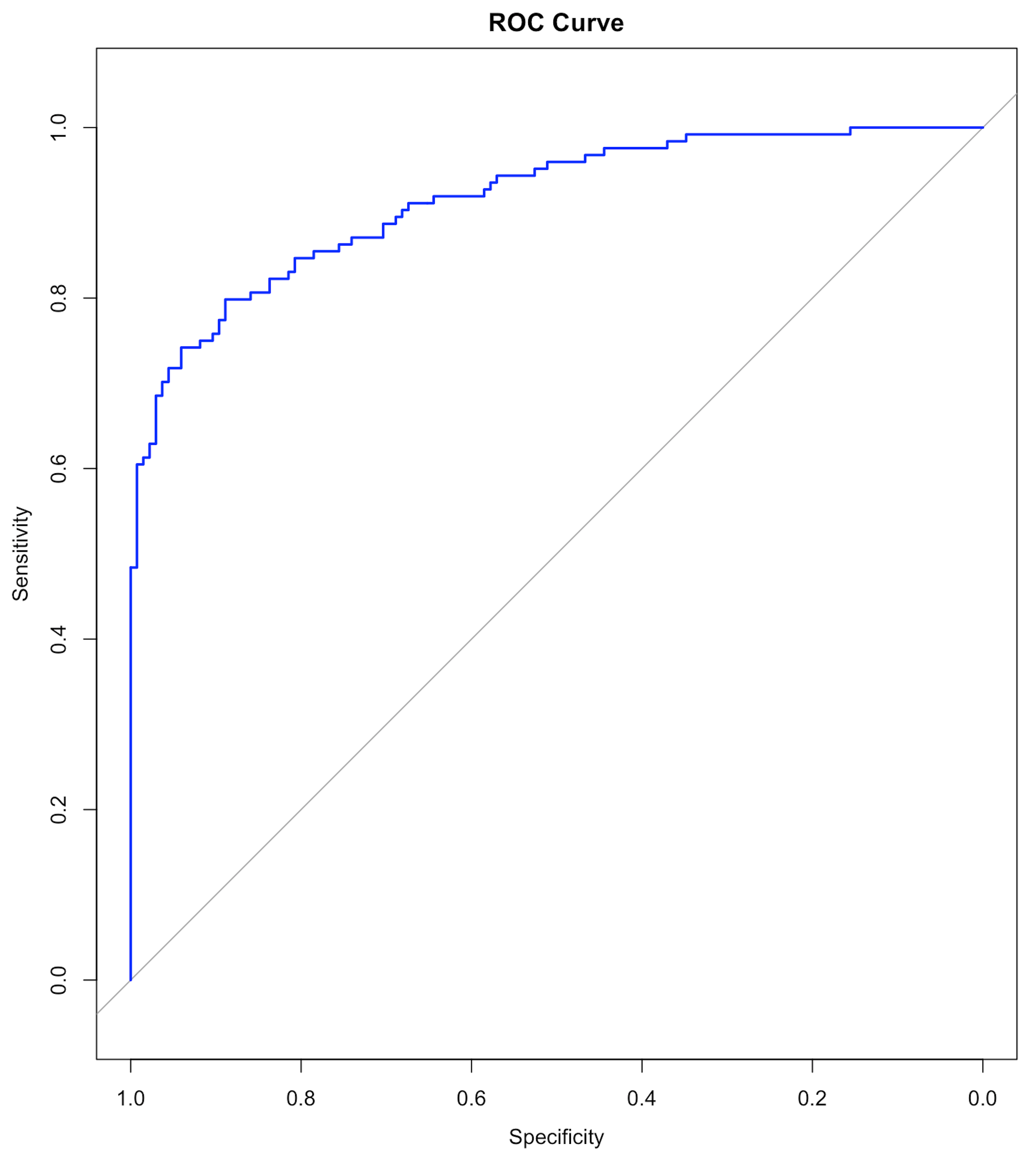 Figure 30: The ROC curve of the final model
Results are shown below. We haven’t discussed the ROC curve yet, which will be a main topic in Chapter 5. At this moment, remember that a model with a ROC curve that has a larger Area Under the Curve (AUC) is a better model. And a model whose ROC curve ties with the diagonal straight line (as shown in Figure 30) is equivalent with random guess.
## y_hat2  c0  c1
##     c0 117  29
##     c1  16  97
##
##                Accuracy : 0.8263
##                  95% CI : (0.7745, 0.8704)
##     No Information Rate : 0.5135
##     P-Value [Acc > NIR] : < 2e-16
##
##                   Kappa : 0.6513
##
##  Mcnemar's Test P-Value : 0.07364
##
##             Sensitivity : 0.8797
##             Specificity : 0.7698
##          Pos Pred Value : 0.8014
##          Neg Pred Value : 0.8584
##              Prevalence : 0.5135
##          Detection Rate : 0.4517
##    Detection Prevalence : 0.5637
##       Balanced Accuracy : 0.8248
##
##        'Positive' Class : c0
Model uncertainty. The \(95 \%\) confidence interval (CI) of the regression coefficients can be derived, as shown below
## coefficients and 95% CI
cbind(coef = coef(logit.AD.reduced), confint(logit.AD.reduced))
Results are
##                     coef       2.5 %       97.5 %
## (Intercept)  42.68794758  29.9745022  57.88659748
## AGE          -0.07993473  -0.1547680  -0.01059348
## PTEDUCAT     -0.22195425  -0.3905105  -0.06537066
## FDG          -3.16994212  -4.3519800  -2.17636447
## AV45          2.62670085   0.3736259   5.04703489
## HippoNV     -36.22214822 -48.1671093 -26.35100122
## rs3865444     0.71373441  -0.1348687   1.61273264
Prediction uncertainty. As in linear regression, we could derive the variance of the estimated regression coefficients \(\operatorname{var}(\hat{\boldsymbol{\beta}})\); then, since \(\boldsymbol{\hat{y}} = \boldsymbol{X} \hat{\boldsymbol{\beta}}\), we can derive \(\operatorname{var}(\boldsymbol{\hat{y}})\)63 The linearity assumption between \(\boldsymbol{x}\) and \(y\) enables the explicit characterization of this chain of uncertainty propagation.. Skipping the technical details, the \(95\%\) CI of the predictions are obtained using the R code below
# Remark: how to obtain the 95% CI of the predictions
y_hat <- predict(logit.AD.reduced, data.test, type = "link",
                 se.fit = TRUE)
# se.fit = TRUE, is to get the standard error in the predictions,
# which is necessary information for us to construct
# the 95% CI of the predictions
data.test$fit    <- y_hat$fit
data.test$se.fit <- y_hat$se.fit
# We can readily convert this information into the 95% CIs
# of the predictions (the way these 95% CIs are
# derived are again, only in approximated sense).
# CI for fitted values
data.test <- within(data.test, {
# added "fitted" to make predictions at appended temp values
fitted    = exp(fit) / (1 + exp(fit))
fit.lower = exp(fit - 1.96 * se.fit) / (1 +
                                          exp(fit - 1.96 * se.fit))
fit.upper = exp(fit + 1.96 * se.fit) / (1 +
                                          exp(fit + 1.96 * se.fit))
})
Odds ratio. The odds ratio (OR) quantifies the strength of the association between two events, A and B. It is defined as the ratio of the odds of A in the presence of B and the odds of A in the absence of B, or equivalently due to symmetry.
If the OR equals \(1\), A and B are independent;
If the OR is greater than \(1\), the presence of one event increases the odds of the other event;
If the OR is less than \(1\), the presence of one event reduces the odds of the other event.
A regression coefficient of a logistic regression model can be converted into an odds ratio, as done in the following codes.
## odds ratios and 95% CI
exp(cbind(OR = coef(logit.AD.reduced),
          confint(logit.AD.reduced)))
The odds ratios and their \(95\%\) CIs are
##                       OR        2.5 %       97.5 %
## (Intercept) 3.460510e+18 1.041744e+13 1.379844e+25
## AGE         9.231766e-01 8.566139e-01 9.894624e-01
## PTEDUCAT    8.009520e-01 6.767113e-01 9.367202e-01
## FDG         4.200603e-02 1.288128e-02 1.134532e-01
## AV45        1.382807e+01 1.452993e+00 1.555605e+02
## HippoNV     1.857466e-16 1.205842e-21 3.596711e-12
## rs3865444   2.041601e+00 8.738306e-01 5.016501e+00
Exploratory Data Analysis (EDA). EDA essentially conceptualizes the analysis process as a dynamic one, sometimes with a playful tone64 And it is probably because of this conceptual framework, EDA happens to use a lot of figures to explore the data. Figures are rich in information, some are not easily generalized into abstract numbers. EDA could start with something simple. For example, we can start with a smaller model rather than throw everything into the analysis.
Let’s revisit the data analysis done in the 7-step R pipeline and examine a simple logistic regression model with only one predictor, FDG.
# Fit a logistic regression model with FDG
logit.AD.FDG <- glm(DX_bl ~ FDG, data = AD, family = "binomial")
summary(logit.AD.FDG)
##
## Call:
## glm(formula = DX_bl FDG, family = "binomial", data = AD)
##
## Deviance Residuals:
## Min 1Q Median 3Q Max
## -2.4686 -0.8166 -0.2758 0.7679 2.7812
##
## Coefficients:
## Estimate Std. Error z value Pr(>|z|)
## (Intercept) 18.3300 1.7676 10.37 <2e-16 ***
## FDG -2.9370 0.2798 -10.50 <2e-16 ***
## ---
## Signif. codes: 0 '***' 0.001 '**' 0.01 '*' 0.05 '.' 0.1 ' ' 1
##
## (Dispersion parameter for binomial family taken to be 1)
##
## Null deviance: 711.27 on 516 degrees of freedom
## Residual deviance: 499.00 on 515 degrees of freedom
## AIC: 503
##
## Number of Fisher Scoring iterations: 5It can be seen that the predictor FDG is significant, as the p-value is \(<2e-16\) that is far less than \(0.05\). On the other hand, although there is no R-Squared in the logistic regression model, we could observe that, out of the total deviance of \(711.27\), \(711.27 - 499.00 = 212.27\) could be explained by FDG.
This process could be repeated for every variable in order to have a sense of what are their marginal contributions in explaining away the variation in the outcome variable. This practice, which seems dull, is not always associated with an immediate reward. But it is not uncommon in practice, particularly when we have seen in Chapter 2 that, in regression models, the regression coefficients are interdependent, the regression models are not causal models, and, when you throw variables into the model, they may generate interactions just like chemicals, etc. Looking at your data from every possible angle is useful to conduct data analytics.
Back to the simple model that only uses one variable, FDG. To understand better how well it predicts the outcome, we can draw figures to visualize the predictions. First, let’s get the predictions and their \(95\%\) CI values.
logit.AD.FDG <- glm(DX_bl ~   FDG, data = data.train,
                    family = "binomial")
y_hat <- predict(logit.AD.FDG, data.test, type = "link",
                 se.fit = TRUE)
data.test$fit    <- y_hat$fit
data.test$se.fit <- y_hat$se.fit

# CI for fitted values
data.test <- within(data.test, {
# added "fitted" to make predictions at appended temp values
  fitted    = exp(fit) / (1 + exp(fit))
  fit.lower = exp(fit - 1.96 * se.fit) / (1 + exp(fit - 1.96 *
                                                    se.fit))
  fit.upper = exp(fit + 1.96 * se.fit) / (1 + exp(fit + 1.96 *
                                                    se.fit))
})
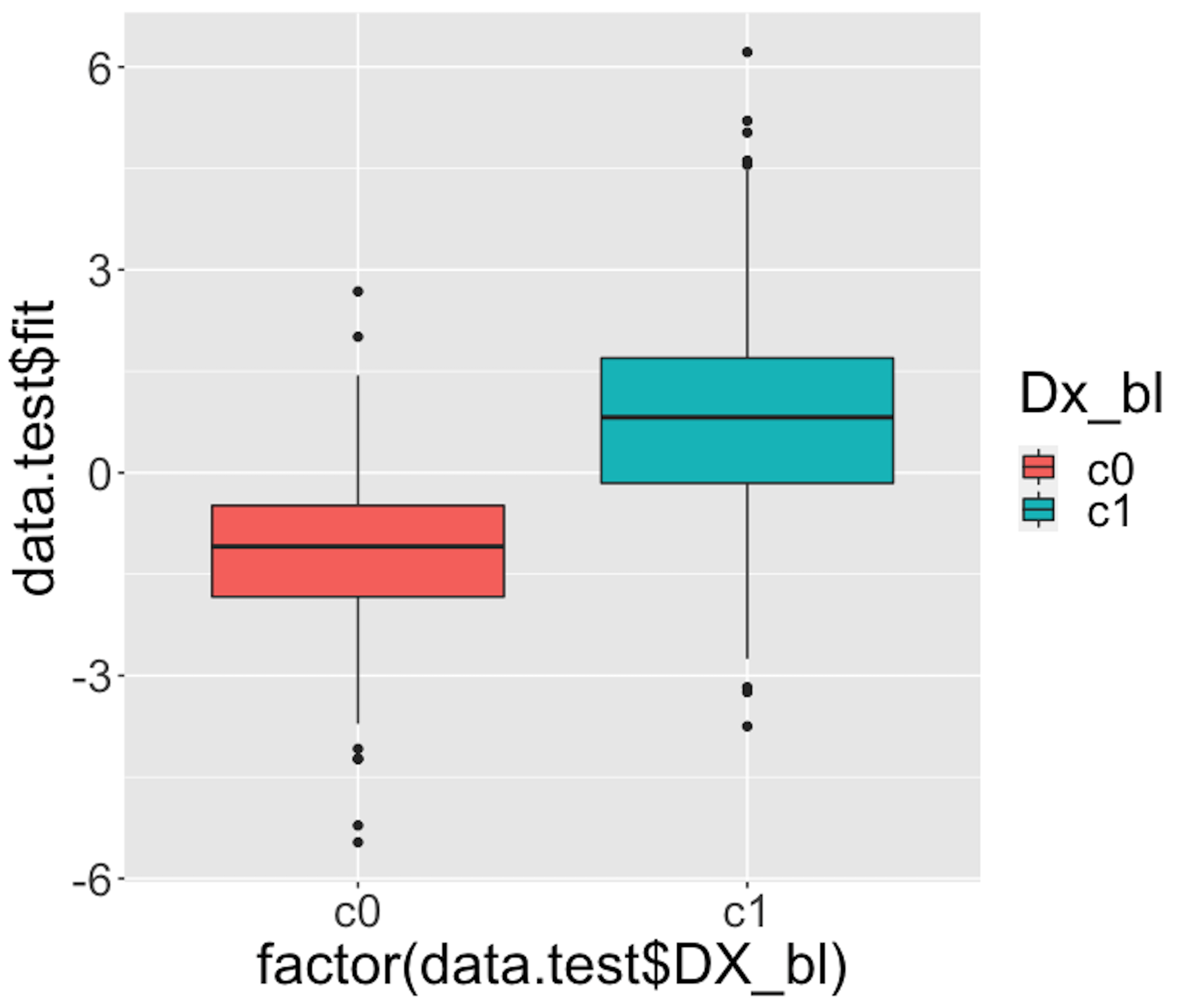 Figure 31: Boxplots of the predicted probabilities of diseased, i.e., the \(Pr(y=1|\boldsymbol{x})\)
We then draw Figure 31 using the following script.
# Use Boxplot to evaluate the prediction performance
require(ggplot2)
p <- qplot(factor(data.test$DX_bl), data.test$fit, data = data.test,
      geom=c("boxplot"), fill = factor(data.test$DX_bl)) +
      labs(fill="Dx_bl") +
      theme(text = element_text(size=25))
Figure 31 indicates that the model can separate the two classes significantly (while not being good enough). It gives us a global presentation of the prediction. We can draw another figure, Figure 32, to examine more details, i.e., look into the “local” parts of the predictions to see where we can improve.
library(ggplot2)
newData <- data.test[order(data.test$FDG),]
newData$DX_bl = as.numeric(newData$DX_bl)
newData$DX_bl[which(newData$DX_bl==1)] = 0
newData$DX_bl[which(newData$DX_bl==2)] = 1
newData$DX_bl = as.numeric(newData$DX_bl)
p <- ggplot(newData, aes(x = FDG, y = DX_bl))
# predicted curve and point-wise 95\% CI
p <- p + geom_ribbon(aes(x = FDG, ymin = fit.lower,
                         ymax = fit.upper), alpha = 0.2)
p <- p + geom_line(aes(x = FDG, y = fitted), colour="red")
# fitted values
p <- p + geom_point(aes(y = fitted), size=2, colour="red")
# observed values
p <- p + geom_point(size = 2)
p <- p + ylab("Probability") + theme(text = element_text(size=18))
p <- p + labs(title =
                "Observed and predicted probability of disease")
print(p)
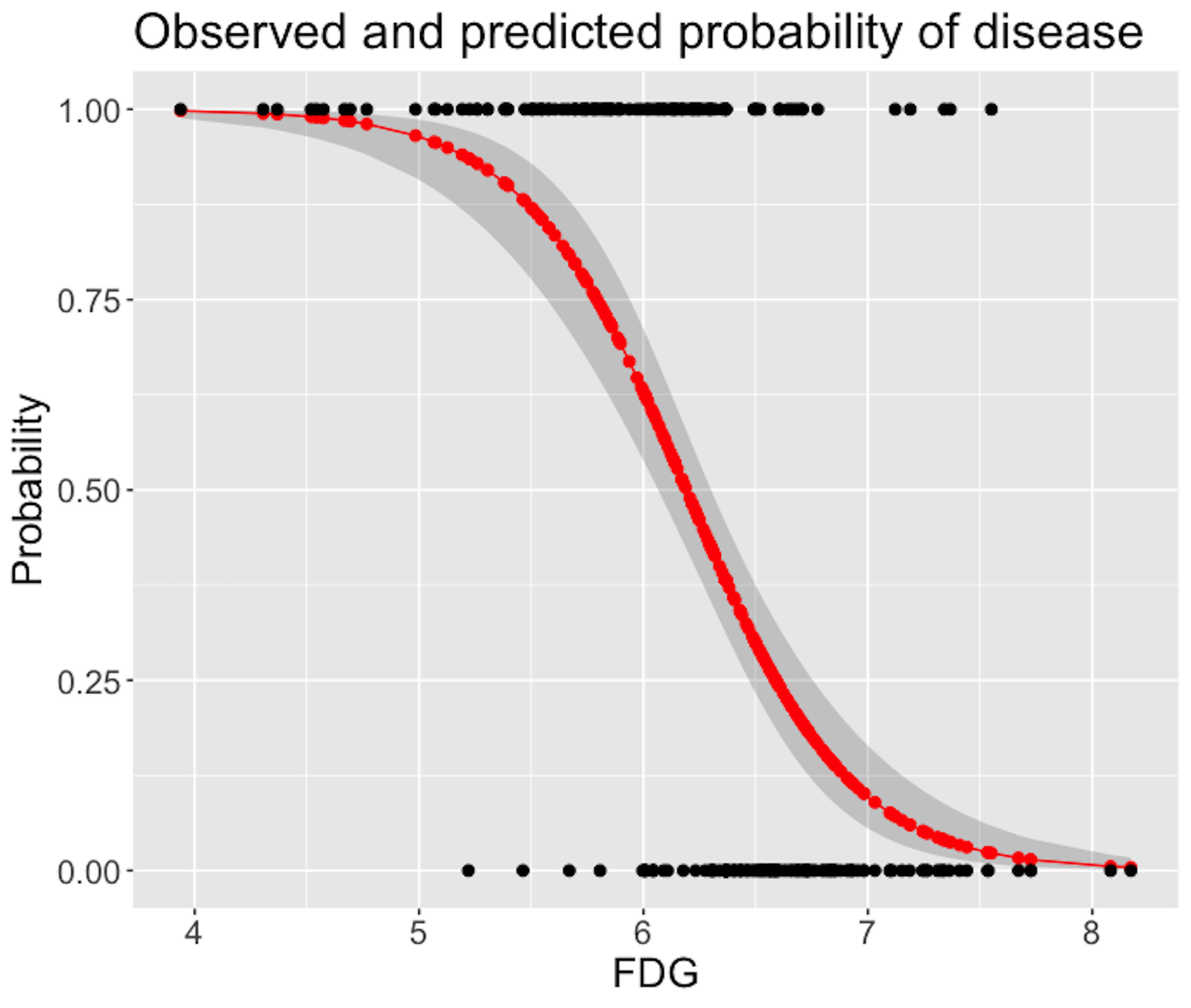 Figure 32: Predicted probabilities (the red curve) with their 95% CIs (the gray area) versus observed outcomes in data (the dots above and below)
Figure 32 shows that the model captures the relationship between FDG with DX_bl with a smooth logit curve, and the prediction confidences are fairly small (evidenced by the tight 95% CIs). On the other hand, it is also obvious that the single-predictor model does well on the two ends of the probability range (i.e., close to \(0\) or \(1\)), but not in the middle range where data points from the two classes could not be clearly separated.
We can add more predictors to enhance its prediction power. To decide on which predictors we should include, we can visualize the relationships between the predictors with the outcome variable. For example, continuous predictors could be presented in Boxplot to see if the distribution of the continuous predictor is different across the two classes, i.e., if it is different, it means the predictor could help separate the two classes. The following R codes generate Figure 33.
Figure 33: Boxplots of the continuous predictors in the two classes
# install.packages("reshape2")
require(reshape2)
data.train$ID <- c(1:dim(data.train)[1])
AD.long <- melt(data.train[,c(1,3,4,5,6,16,17)],
                id.vars = c("ID", "DX_bl"))
# Plot the data using ggplot
require(ggplot2)
p <- ggplot(AD.long, aes(x = factor(DX_bl), y = value))
# boxplot, size=.75 to stand out behind CI
p <- p + geom_boxplot(size = 0.75, alpha = 0.5)
# points for observed data
p <- p + geom_point(position = position_jitter(w = 0.05, h = 0),
                    alpha = 0.1)
# diamond at mean for each group
p <- p + stat_summary(fun = mean, geom = "point", shape = 18,
                      size = 6, alpha = 0.75, colour = "red")
# confidence limits based on normal distribution
p <- p + stat_summary(fun.data = "mean_cl_normal",
                      geom = "errorbar", width = .2, alpha = 0.8)
p <- p + facet_wrap(~ variable, scales = "free_y", ncol = 3)
p <- p + labs(title =
    "Boxplots of variables by diagnosis (0 - normal; 1 - patient)")
print(p)
Figure 33 shows that some variables, e.g., FDG and HippoNV, could separate the two classes significantly. Some variables, such as AV45 and AGE, have less prediction power, but still look promising. Note these observations cautiously, since these figures only show marginal relationship among variables65 Boxplot is nice but it cannot show synergistic effects among the variables..
 Figure 34: Boxplots of the predicted probabilities of diseased, i.e., the \(Pr(y=1|\boldsymbol{x})\)
Figure 34 shows the boxplot of the predicted probabilities of diseased made by the final model identified in Step 4 of the 7-step R pipeline. This figure is to be compared with Figure 31. It indicates that the final model is much better than the model that only uses the predictor FDG alone.