17 The principle of proportional ink
In many different visualization scenarios, we represent data values by the extent of a graphical element. For example, in a bar plot, we draw bars that begin at 0 and end at the data value they represent. In this case, the data value is not only encoded in the end point of the bar but also in the height or length of the bar. If we drew a bar that started at a different value than 0, then the length of the bar and the bar endpoint would convey contradicting information. Such figures are internally inconsistent, because they show two different values with the same graphical element. Contrast this to a scenario where we visualize the data value with a dot. In this case, the value is only encoded in the location of the dot but not in the size or shape of the dot.
Similar issues will arise whenever we use graphical elements such as bars, rectangles, shaded areas of arbitrary shape, or any other elements that have a clear visual extent which can be either consistent or inconsistent with the data value shown. In all these cases, we need to make sure that there is no inconsistency. This concept has been termed by Bergstrom and West as the principle of proportional ink (Bergstrom and West 2016):
The principle of proportional ink: The sizes of shaded areas in a visualization need to be proportional to the data values they represent.
(It is common practice to use the word “ink” to refer to any part of a visualization that deviates from the background color. This includes lines, points, shared areas, and text. In this chapter, however, we are talking primarily about shaded areas.) Violations of this principle are quite common, in particular in the popular press and in the world of finance.
17.1 Visualizations along linear axes
We first consider the most common scenario, visualization of amounts along a linear scale. Figure 17.1 shows the median income in the five counties that make up the state of Hawaii. It is a typical figure one might encounter in a newspaper article. A quick glance at the figure suggests that the county of Hawaii is incredibly poor while the county of Honolulu is much richer than the other counties. However, Figure 17.1 is quite misleading, because all bars begin at $50,000 median income. Thus, while the endpoint of each bar correctly represents the actual median income in each county, the bar height represents the extent to which median incomes exceed $50,000, an arbitrary number. And human perception is such that the bar height is the key quantity we perceive when looking at this figure, not the location of the bar endpoint relative to the y axis.
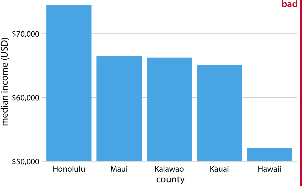
Figure 17.1: Median income in the five counties of the state of Hawaii. This figure is misleading, because the y axis scale starts at $50,000 instead of $0. As a result, the bar heights are not proportional to the values shown, and the income differential between the county of Hawaii and the other four counties appears much bigger than it actually is. Data source: 2015 Five-Year American Community Survey.
An appropriate visualization of these data makes for a less exciting story (Figure 17.2). While there are differences in median income between the counties, they are nowhere near as big as Figure 17.1 suggested. Overall, the median incomes in the different counties are somewhat comparable.
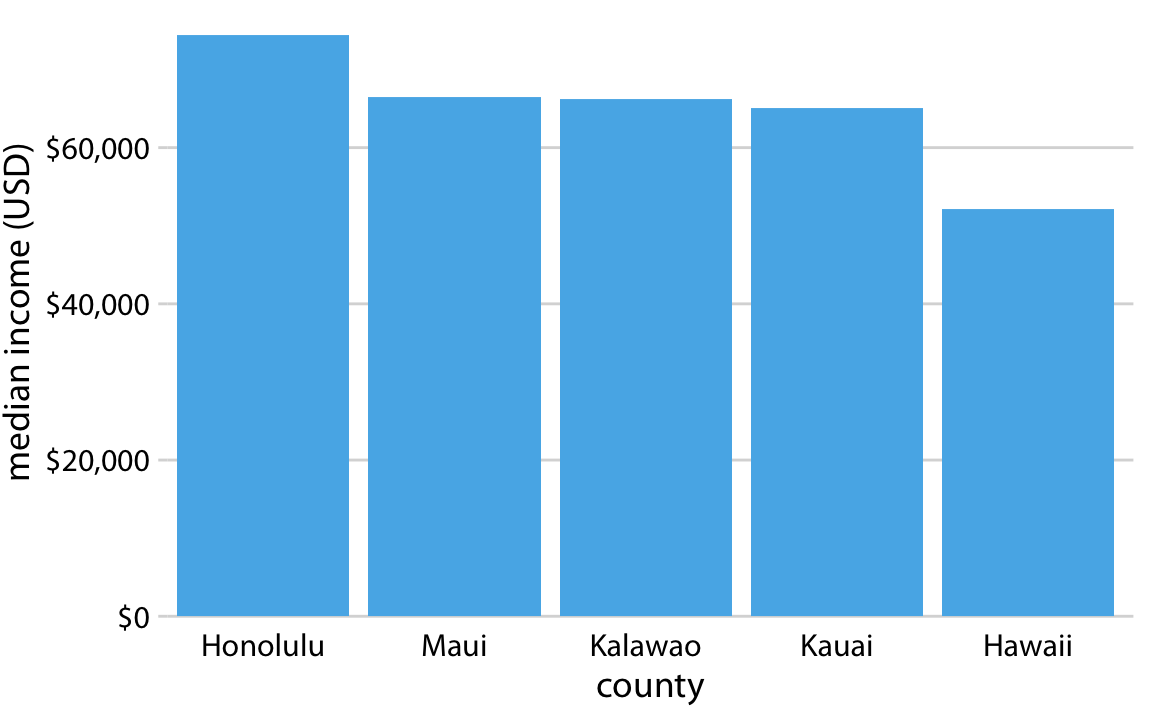
Figure 17.2: Median income in the five counties of the state of Hawaii. Here, the y axis scale starts at $0 and therefore the relative magnitudes of the median incomes in the five counties are accurately shown. Data source: 2015 Five-Year American Community Survey.
Bars on a linear scale should always start at 0.
Similar visualization problems frequently arise in the visualization of time series, such as those of stock prices. Figure 17.3 suggests a massive collapse in the stock price of Facebook occurred around Nov. 1, 2016. In reality, the price decline was moderate relative to the total price of the stock (Figure 17.4). The y-axis range in Figure 17.3 would be questionable even without the shading undearneath the curve. But with the shading, the figure becomes particularly problematic. The shading emphasizes the distance from the location of the x axis to the specific y values shown, and thus it creates the visual impression that the height of the shaded area at a given day represents the stock price of that day. Instead, it only represents the difference in stock price from the baseline, which is $110 in Figure 17.3.
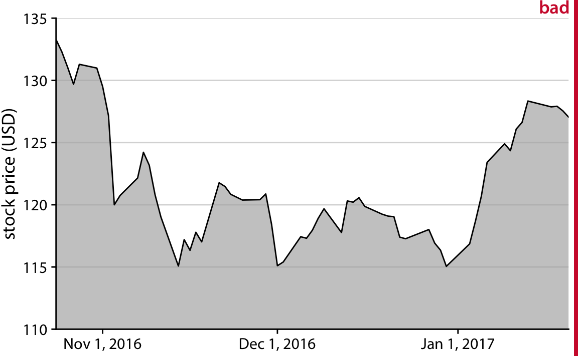
Figure 17.3: Stock price of Facebook (FB) from Oct. 22, 2016 to Jan. 21, 2017. This figure seems to imply that the Facebook stock price collapsed around Nov. 1, 2016. However, this is misleading, because the y axis starts at $110 instead of $0.
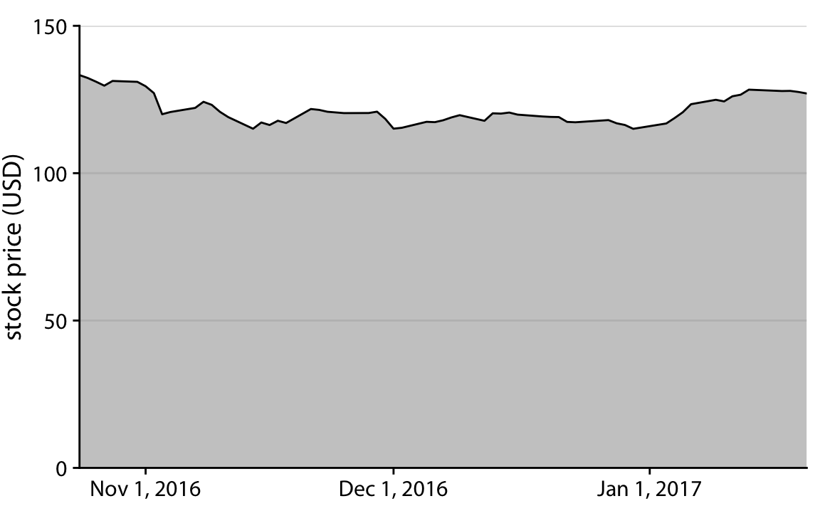
Figure 17.4: Stock price of Facebook (FB) from Oct. 22, 2016 to Jan. 21, 2017. By showing the stock price on a y scale from $0 to $150, this figure more accurately relays the magnitude of the FB price drop around Nov. 1, 2016.
The examples of Figures 17.2 and Figure 17.4 could suggest that bars and shaded areas are not useful to represent small changes over time or differences between conditions, since we always have to draw the whole bar or area starting from 0. However, this is not the case. It is perfectly valid to use bars or shaded areas to show differences between conditions, as long as we make it explicit which differences we are showing. For example, we can use bars to visualize the change in median income in Hawaiian counties from 2010 to 2015 (Figure 17.5). For all counties except Kalawao, this change amounts to less than $5000. (Kalawao is an unusual county, with fewer than 100 inhabitants, and it can experience large swings in median income from a small number of people moving into or out of the county.) And for Hawaii County, the change is negative, i.e., the median income in 2015 was lower than it was in 2010. We represent negative values by drawing bars that go in the opposite direction, i.e., that extend from 0 down rather than up.
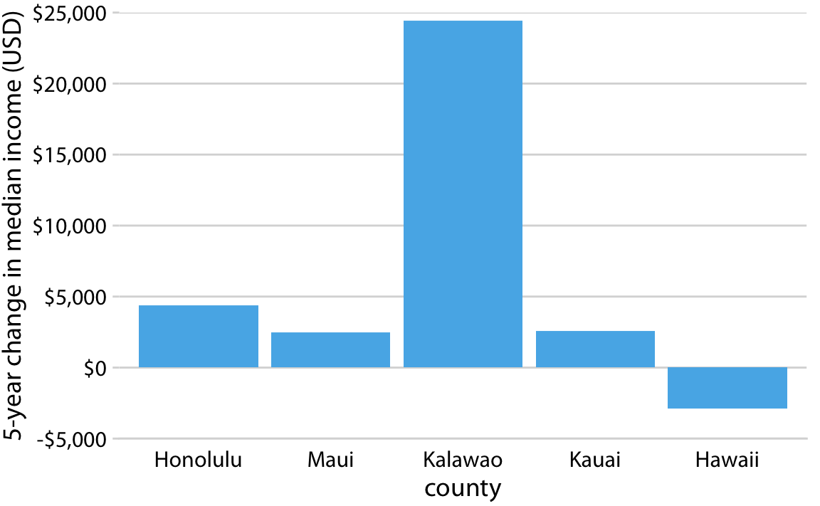
Figure 17.5: Change in median income in Hawaiian counties from 2010 to 2015. Data source: 2010 and 2015 Five-Year American Community Surveys.
Similarly, we can draw the change in Facebook stock price over time as the difference from its temporary high point on Oct. 22, 2016 (Figure 17.6). By shading an area that represents the distance from the high point, we are accurately representing the absolute magnitude of the price drop without making any implicit statement about the magnitude of the price drop relative to the total stock price.
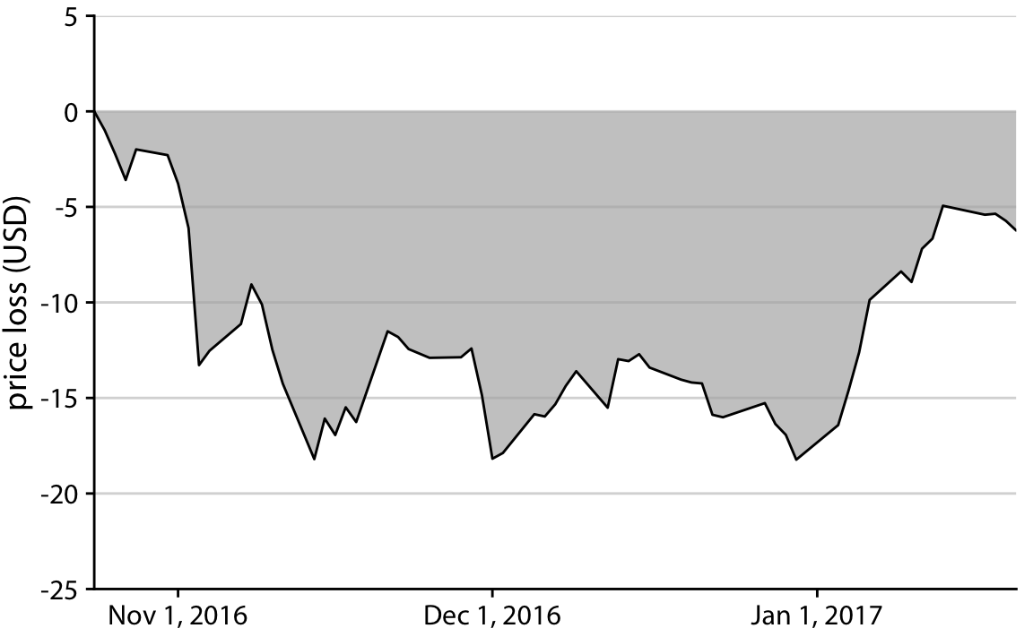
Figure 17.6: Loss in Facebook (FB) stock price relative to the price of Oct. 22, 2016. Between Nov. 1, 2016 and Jan. 1, 2017, the price remained approximately $15 lower than it was at its high point on Oct. 22, 2016. But then the price started to recover in Jan. 2017.
17.2 Visualizations along logarithmic axes
When we are visualizing data along a linear scale, the areas of bars, rectangles, or other shapes are automatically proportional to the data values. The same is not true if we are using a logarithmic scale, because data values are not linearly spaced along the axis. Therefore, one could argue that, for example, bar graphs on a log scale are inherently flawed. On the flip side, the area of each bar will be proportional to the logarithm of the data value, and thus bar graphs on a log scale satisfy the principle of proportional ink in log-transformed coordinates. In practice, I think neither of these two arguments can resolve whether log-scale bar graphs are appropriate. Instead, the relevant question is whether we want to visualize amounts or ratios.
In Chapter 3, I have explained that a log scale is the natural scale to visualize ratios, because a unit step along a log scale corresponds to multiplication with or division by a constant factor. In practice, however, log scales are often used not specifically to visualize ratios but rather just because the numbers shown vary over many orders of magnitude. As an example, consider the gross domestic products (GDPs) of countries in Oceania. In 2007, these varied from less than a billion U.S. dollars (USD) to over 300 billion USD (Figure 17.7). Visualizing these numbers on a linear scale would not work, because the two countries with the largest GDPs (New Zealand and Australia) would dominate the figure.
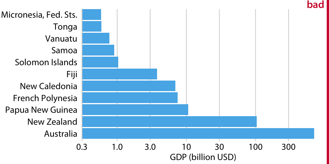
Figure 17.7: GDP in 2007 of countries in Oceania. The lengths of the bars do not accurately reflect the data values shown, since bars start at the arbitrary value of 0.3 billion USD. Data source: Gapminder.
However, the visualization with bars on a log scale (Figure 17.7) does not work either. The bars start at an arbitrary value of 0.3 billion USD, and at a minimum the figure suffers from the same problem of Figure 17.1, that the bar lengths are not representative of the data values. The added difficulty with a log scale, though, is that we cannot simply let the bars start at 0. In Figure 17.7, the value 0 would lie infinitely far to the left. Therefore, we could make our bars arbitrary long by pushing their origin further and further way, see e.g. Figure 17.8. This problem always arises when we try to visualize amounts (which is what the GDP values are) on a log scale.
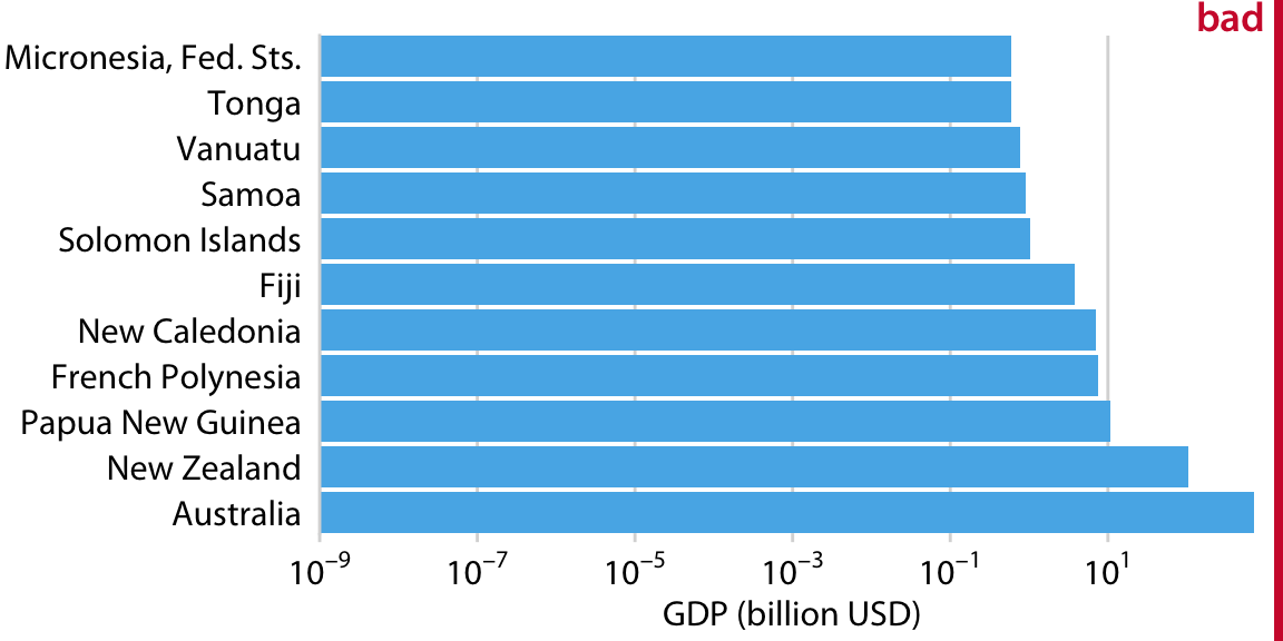
Figure 17.8: GDP in 2007 of countries in Oceania. The lengths of the bars do not accurately reflect the data values shown, since bars start at the arbitrary value of 10-9 billion USD. Data source: Gapminder.
For the data of Figure 17.7, I think bars are inappropriate. Instead, we can simply place a dot at the appropriate location along the scale for each country’s GDP and avoid the issue of bar lengths altogether (Figure 17.9). Importantly, by placing the country names right next to the dots rather than along the y axis, we avoid generating the visual perception of a magnitude conveyed by the distance from the country name to the dot.
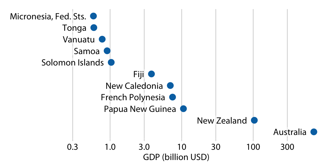
Figure 17.9: GDP in 2007 of countries in Oceania. Data source: Gapminder.
If we want to visualize ratios rather than amounts, however, bars on a log scale are a perfectly good option. In fact, they are preferable over bars on a linear scale in that case. As an example, let’s visualize the GDP values of countries in Oceania relative to the GDP of Papua New Guinea. The resulting figure does a good job highlighting the key relationships between the GDPs of the various countries (Figure 17.10). We can see that New Zealand has over eight times the GDP of Papua New Guinea and Australia over 64 times, while Tonga and the Federated States of Micronesia have less than one-sixteenth of the GDP of Papua New Guinea. French Polynesia and New Caledonia are close but have a slightly smaller GDPs than Papua New Guinea does.
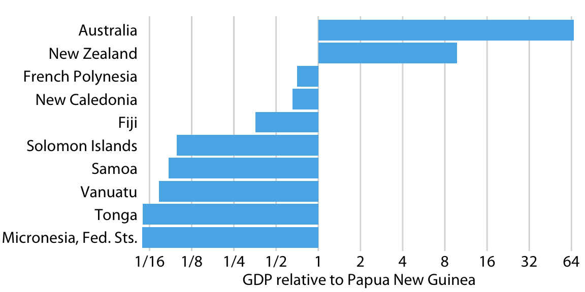
Figure 17.10: GDP in 2007 of countries in Oceania, relative to the GDP of Papua New Guinea. Data source: Gapminder.
Figure 17.10 also highlights that the natural midpoint of a log scale is 1, with bars representing numbers above 1 going in one direction and bars representing numbers below one going in the other direction. Bars on a log scale represent ratios and must always start at 1, and bars on a linear scale represent amounts and must always start at 0.
When bars are drawn on a log scale, they represent ratios and need to be drawn starting from 1, not 0.
17.3 Direct area visualizations
All preceding examples visualized data along one linear dimension, so that the data value was encoded both by area and by location along the x or y axis. In these cases, we can consider the area encoding as incidental and secondary to the location encoding of the data value. Other visualization approaches, however, represent the data value primarily or directly by area, without a corresponding location mapping. The most common one is the pie chart (Figure 17.11). Even though technically the data values are mapped onto angles, which are represented by location along a circular axis, in practice we are typically not judging the angles of a pie chart. Instead, the dominant visual property we notice is the size of the areas of each pie wedge.
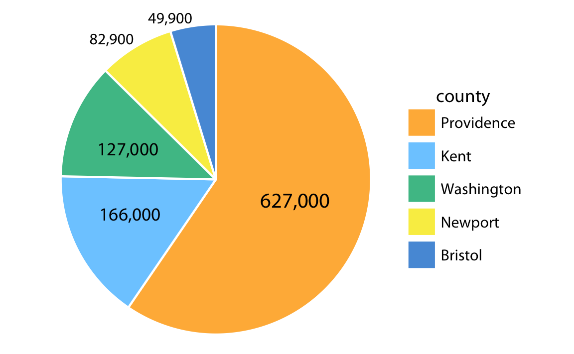
Figure 17.11: Number of inhabitants in Rhode Island counties, shown as a pie chart. Both the angle and the area of each pie wedge are proportional to the number of inhabitants in the respective county. Data source: 2010 Decennial U.S. Census.
Because the area of each pie wedge is proportional to its angle which is proportional to the data value the wedge represents, pie charts satisfy the principle of proportional ink. However, we perceive the area in a pie chart differently from the same area in a bar plot. The fundamental reason is that human perception primarily judges distances and not areas. Thus, if a data value is encoded entirely as a distance, as is the case with the length of a bar, we perceive it more accurately than when the data value is encoded through a combination of two or more distances that jointly create an area. To see this difference, compare Figure 17.11 to Figure 17.12, which shows the same data as bars. The difference in the number of inhabitants between Providence County and the other counties appears larger in Figure 17.12 than in Figure 17.11.
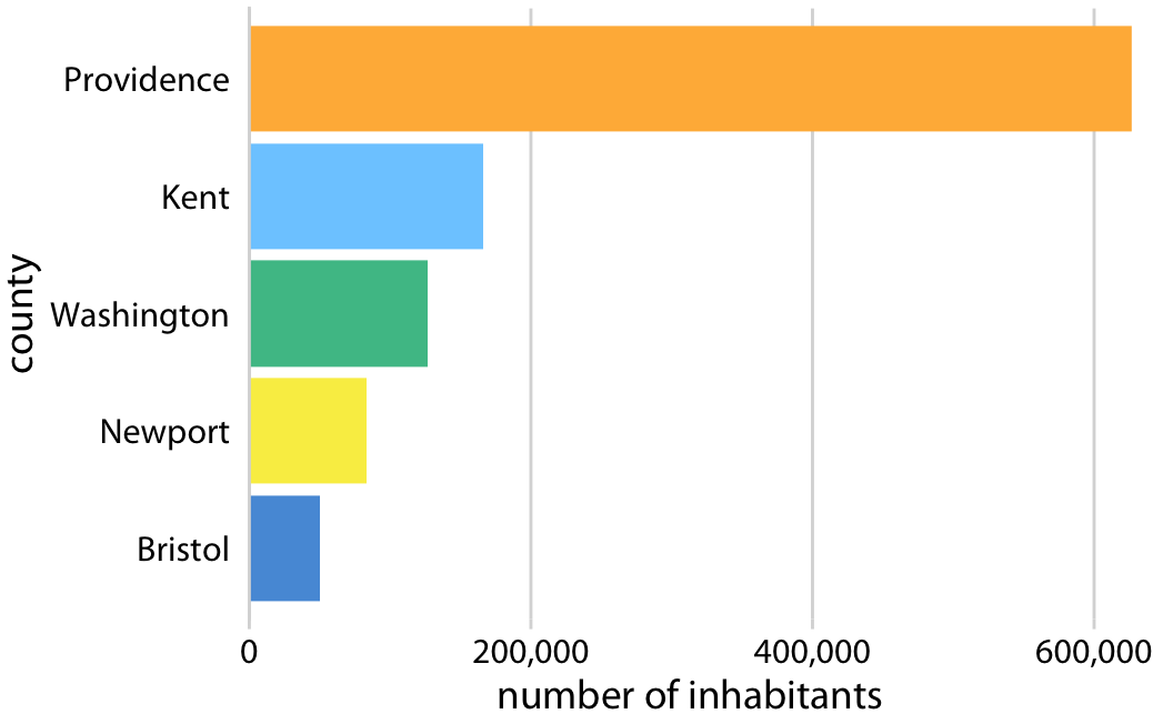
Figure 17.12: Number of inhabitants in Rhode Island counties, shown as bars. The length of each bar is proportional to the number of inhabitants in the respective county. Data source: 2010 Decennial U.S. Census.
The problem that human perception is better at judging distances than at judging areas also arises in treemaps (Figure 17.13), which can be thought of as a square versions of pie charts. Again, in comparison to Figure 17.12, the differences in the number of inhabitants among the counties appears less pronounced in Figure 17.13.
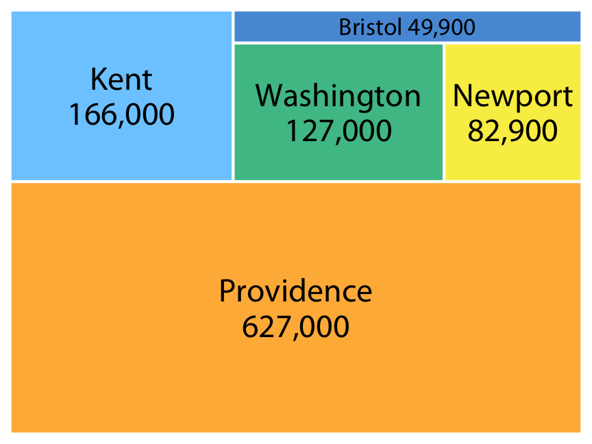
Figure 17.13: Number of inhabitants in Rhode Island counties, shown as a treemap. The area of each rectangle is proportional to the number of inhabitants in the respective county. Data source: 2010 Decennial U.S. Census.
References
Bergstrom, C. T., and J. West. 2016. “The Principle of Proportional Ink.” http://callingbullshit.org/tools/tools_proportional_ink.html.