Most basic scatterplot
The plot() function of R allows to build a
scatterplot. Both numeric variables
of the input dataframe must be specified in the x and
y argument.
Customizations
Here is a description of the most common customization:
cex: circle size-
xlimandylim: limits of the X and Y axis -
pch: shape of markers. See all here. -
xlabandylab: X and Y axis labels col: marker colormain: chart title
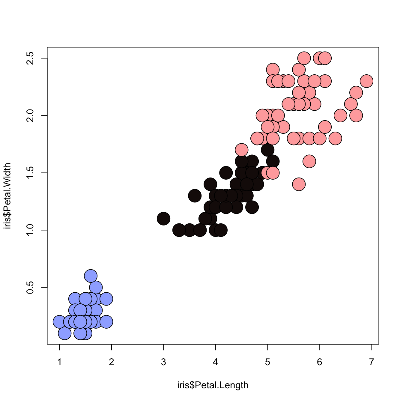
Map the marker color to a categorical variable
# the iris dataset is provided by R natively

# Create a color palette
library(paletteer)
colors = paletteer_c("scico::berlin", n=3)

# Scatterplot with categoric color scale
plot(
  x = iris$Petal.Length,
  y = iris$Petal.Width,
  bg = colors[ unclass(iris$Species) ],
  cex = 3,
  pch=21
)
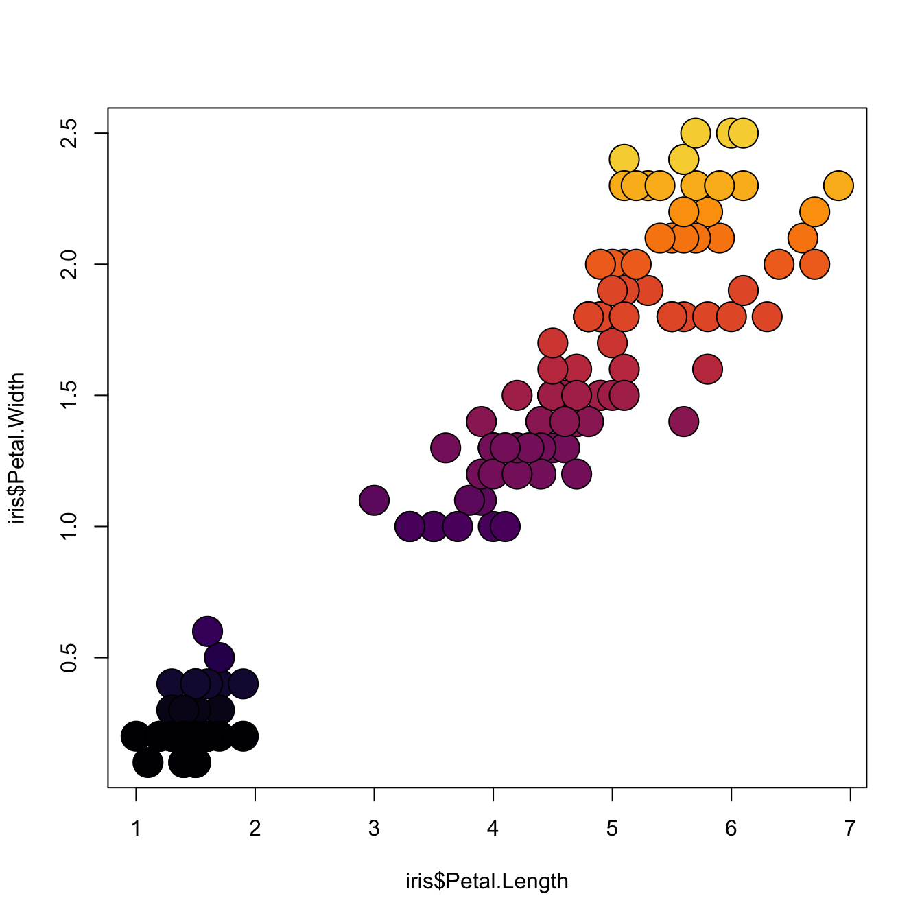
Map the marker color to a numeric variable
# the iris dataset is provided by R natively

# Create a color palette
library(paletteer)
nColor <- 20
colors = paletteer_c("viridis::inferno", n=nColor)

# Transform the numeric variable in bins
rank <- as.factor( as.numeric( cut(iris$Petal.Width, nColor)))

# Scatterplot with color gradient
plot(
  x = iris$Petal.Length,
  y = iris$Petal.Width,
  bg = colors[ rank ],
  cex = 3,
  pch=21
)