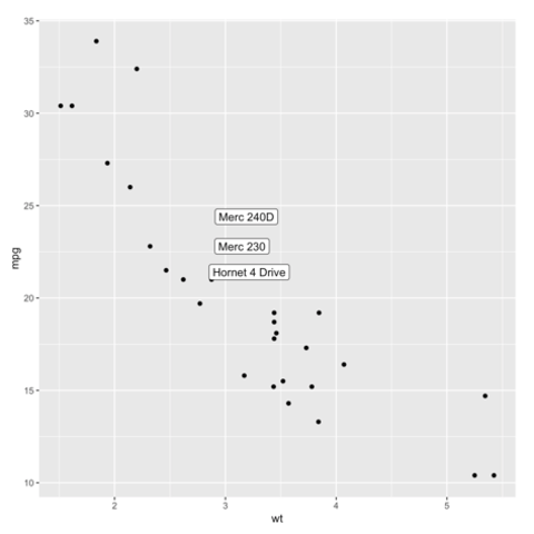
ggplot2 package
Scatterplots are built with
ggplot2 thanks to the
geom_point() function. Discover a basic use case in
graph #272, and
learn how to custom it with next examples below.
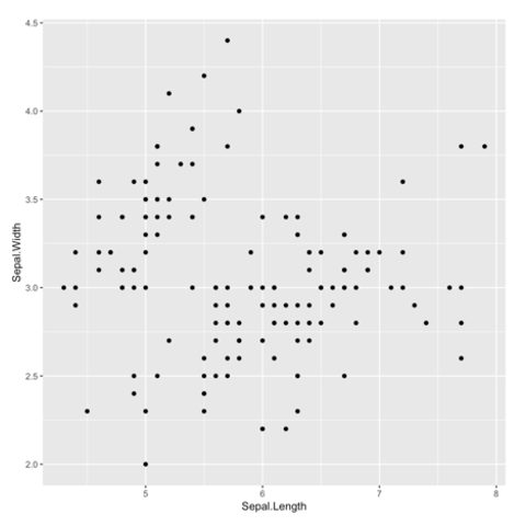
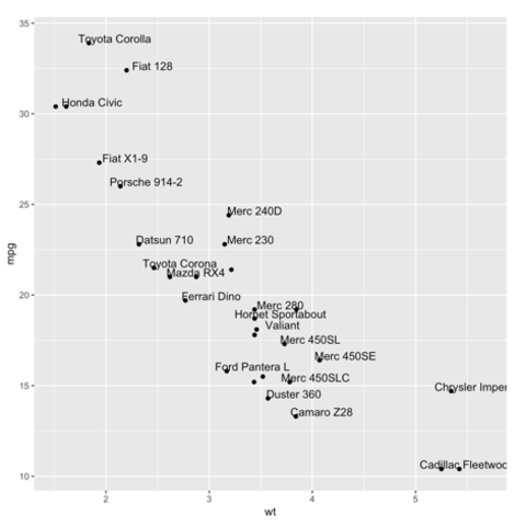
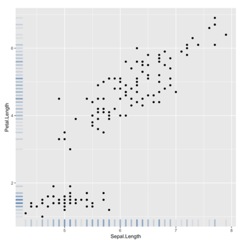
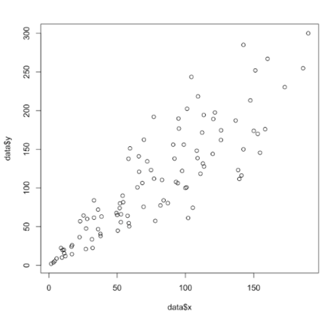
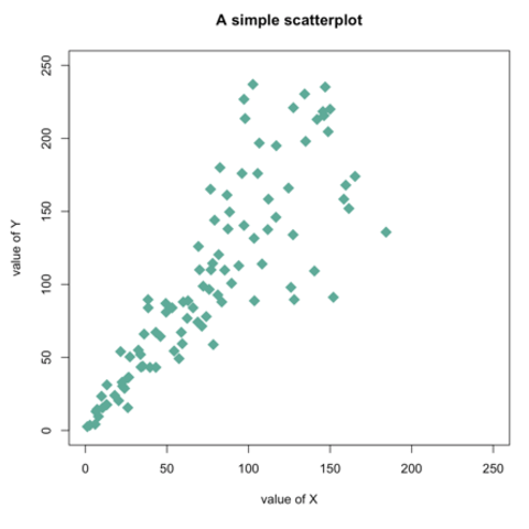
Base R is also a good option to build a scatterplot, using the
plot() function. The
chart #13 below will guide you
through its basic usage. Following examples allow a greater level of
customization.
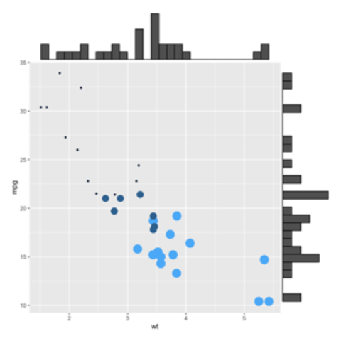
Interactivity is a great way to enhance your graphics, and the ggiraph package makes it very easy! The following graphic shows what an interactive scatter plot can look like. Try hovering over it!
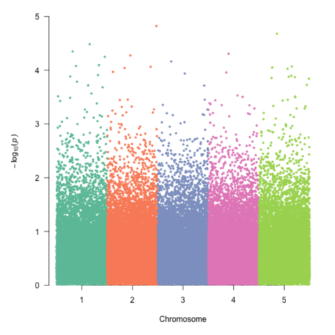
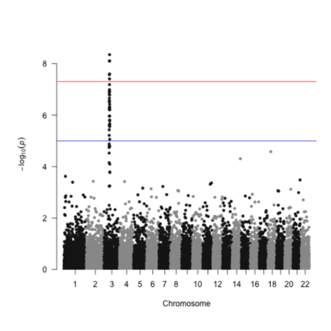
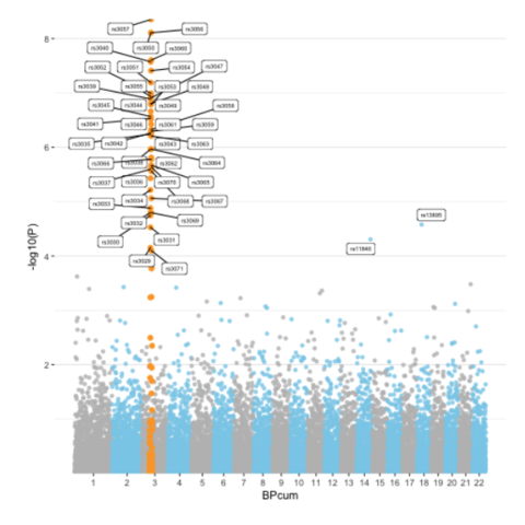
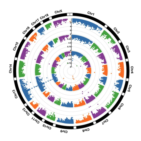
CodeA Manhattan plot is a particular type of scatterplot used in genomics. The X axis displays the position of a genetic variant on the genome. Each chromosome is usually represented using a different color. The Y axis shows p-value of the association test with a phenotypic trait.