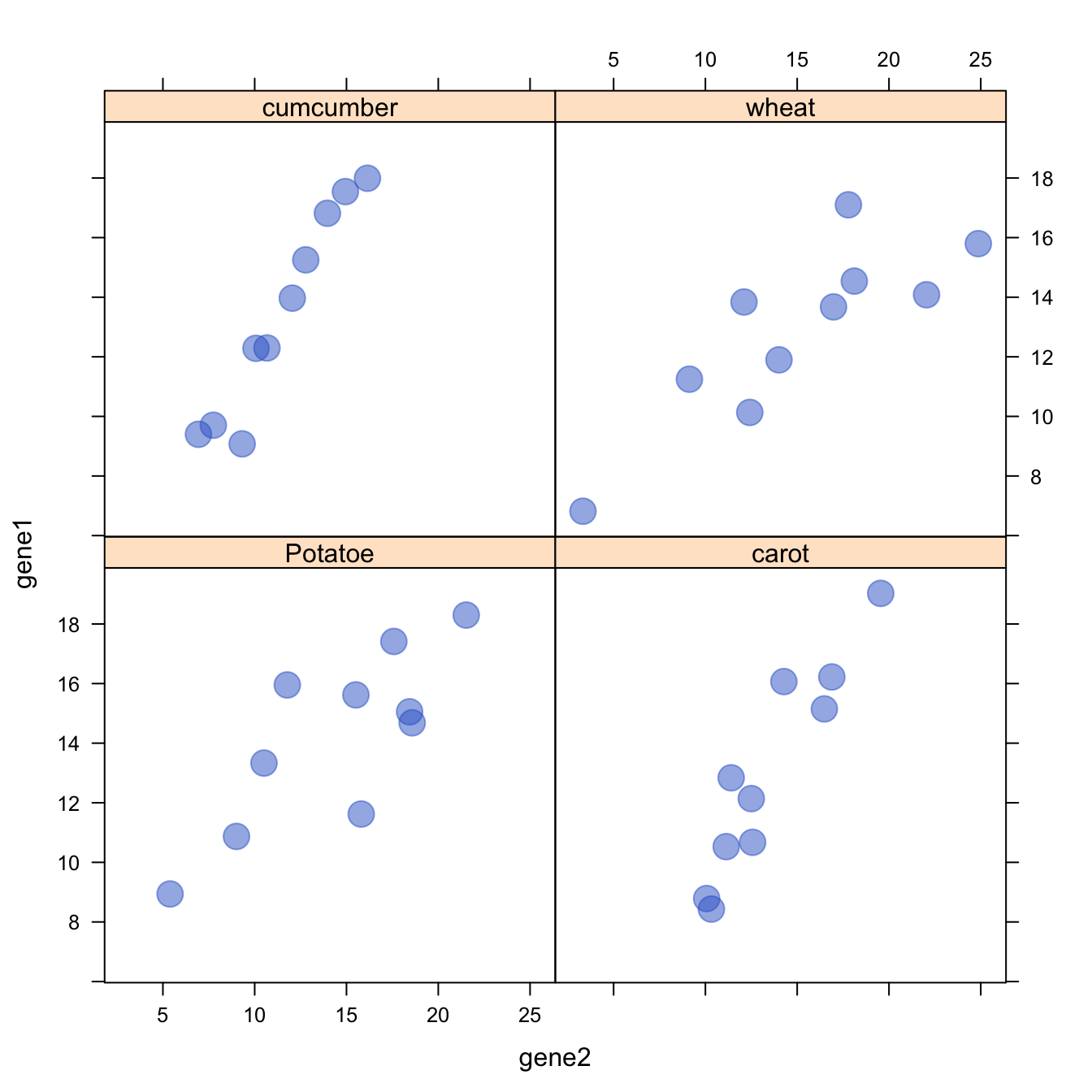
The lattice library offers the
xyplot() function. It builds a
scatterplot for each levels of a
factor automatically.
It is actually the ancestor of the geom_wrap() function
of ggplot2 than you can see in
action here.
# Library
library(lattice)

# create data :
sample <- paste(rep("sample_",40) , seq(1,40) , sep="")
specie <- c(rep("carot" , 10) , rep("cumcumber" , 10) , rep("wheat" , 10) , rep("Potatoe" , 10) )
gene1 <- c( seq(5,14)+rnorm(10 , 4 , 1) , seq(5,14)+rnorm(10 , 4 , 1) , seq(5,14)+rnorm(10 , 4 , 1) , seq(5,14)+rnorm(10 , 4 , 1) )
gene2 <- c( seq(5,14)+rnorm(10 , 4 , 1) , seq(5,14)+rnorm(10 , 2 , 0.2) , seq(5,14)+rnorm(10 , 4 , 4) , seq(5,14)+rnorm(10 , 4 , 3) )
data <- data.frame(sample,specie,gene1,gene2)

# Make the graph
xyplot(gene1 ~ gene2 | specie , data=data , pch=20 , cex=3 , col=rgb(0.2,0.4,0.8,0.5) )