This example follows the previous chart #44 that explained how to add polynomial curve on top of a scatterplot in base R.
Here, a confidence interval is added using the
polygon() function.
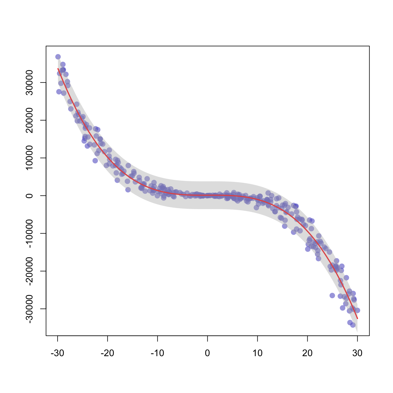
# We create 2 vectors x and y. It is a polynomial function.
x <- runif(300, min=-30, max=30)
y <- -1.2*x^3 + 1.1 * x^2 - x + 10 + rnorm(length(x),0,100*abs(x))

# Basic plot of x and y :
plot(x,y,col=rgb(0.4,0.4,0.8,0.6), pch=16 , cex=1.3 , xlab="" , ylab="")

# Can we find a polynome that fit this function ?
model <- lm(y ~ x + I(x^2) + I(x^3))

# I can get the features of this model :
#summary(model)
#model$coefficients
#summary(model)$adj.r.squared

#For each value of x, I can get the value of y estimated by the model, and the confidence interval around this value.
myPredict <- predict( model , interval="predict" )

#Finally, I can add it to the plot using the line and the polygon function with transparency.
ix <- sort(x,index.return=T)$ix
lines(x[ix], myPredict[ix , 1], col=2, lwd=2 )
polygon(c(rev(x[ix]), x[ix]), c(rev(myPredict[ ix,3]), myPredict[ ix,2]), col = rgb(0.7,0.7,0.7,0.4) , border = NA)